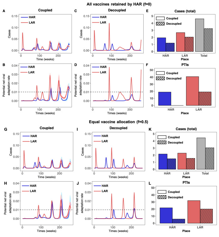
Fig. 5. Time series of cases and potential net viral adaptation rates.
(A to F) Infections in the HAR (blue) and LAR (red) for the first 5 years after pandemic onset for the coupled (left) and decoupled (middle) frameworks. Each simulation is run 100 times, with the average indicated by the solid line and the standard deviation shown with the corresponding ribbon. The average number of cumulative cases over all simulations from the time of vaccine onset through the end of the 5 year period are shown in the rightmost figure for the HAR, LAR, and both countries combined for the coupled (solid) and decoupled (dashed) frameworks. (G to L) Time series of the potential viral adaptation rate in both regions for the coupled (left) and decoupled (right) frameworks. The colors, averages and standard deviations are as described above. The dashed horizontal line denotes , the assumed threshold for the occurrence of a PTI (see Materials and methods). The average number of PTIs at the end of the 5 year period are shown in the rightmost figure for the HAR and LAR for the coupled (solid) and decoupled (dashed) frameworks. The top panel [(A) to (F)] corresponds to the HAR retaining all vaccines (f = 0), while the bottom panel [(G) to (L)] corresponds to equal vaccine sharing (f = 0.5). In all simulations, we take , η = 0.01, and assume that infection after waned natural immunity contributes primarily to evolution (i.e., , , and ). All other parameters are identical to those in Fig. 4.

