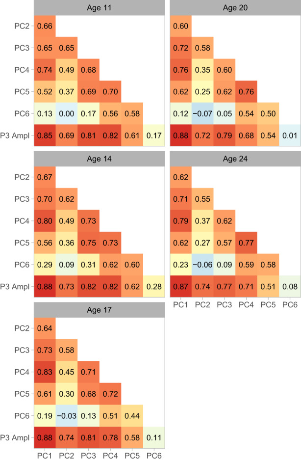
FIGURE 6.

Correlations among components and P3. Matrices of Pearson correlation coefficients are depicted as heatmaps. Red indicates the most positive correlations, yellow the intermediate values, and light blue the smallest values (values near 0). Assessment waves are arrayed top to bottom and left to right.
