

Abstract
Aim
The use of information-based solutions such as dashboards is on the rise for taking fact-based actions against the COVID-19 crisis. This scoping review aimed to comprehensively investigate COVID-19 dashboards from different technical perspectives.
Subject and methods
Three main bibliographic databases, PubMed, Web of Science, and Scopus, were searched on 28 August 2021 to retrieve relevant studies. Arksey and O'Malley’s (Int J Soc Res Methodol 8(1):19–32, 2005) methodological framework and the enhanced version of this methodology developed by Levac et al. (Implement Sci 5(1):1–9, 2010) were adopted for conducting this review.
Results
In total, 26 articles were included. The COVID-19 dashboards mainly focused on the infected (n = 25), deceased (n = 17), and recovered cases (n = 13), as well as the performed test (n = 10). Most of the dashboards were interactive, with public accessibility targeting various user groups. While some dashboards were both informative and supportive (38%), most were mainly informative (92%). The dashboard data were generally analyzed using simple techniques (58%) and delivered through web-based applications (88%).
Conclusion
Dashboards can help immediately manage, analyze, and summarize a huge amount of information about a COVID-19 outbreak. The findings revealed that the developed COVID-19 dashboards share more or less analogous characteristics that could lay the groundwork for designing and developing dashboards for any other pandemic.
Keywords: COVID-19, Coronavirus, Dashboard, Pandemic, Information management, Health information systems
Introduction
In December 2019, healthcare authorities in China reported an increase in the number of people exposed to a type of pneumonia with an unknown etiology (Ashofteh and Bravo 2020; Ulahannan et al. 2020). Due to the global spread of the disease, detailed and comprehensive investigations and follow-ups were conducted by health-related organizations such as the World Health Organization (WHO). The results determined that the SARS-CoV-2 virus was responsible for this unusual outbreak (Aristizábal-Torres et al. 2020). Therefore, WHO declared this new viral disease, which they named COVID-19, as a pandemic on 12 March 2020 (Hossam et al. 2021). Due to the rapid spread of the disease, a dearth of accurate knowledge about the nature of the virus, suspected multiple modes of transmission, and a wide range of clinical manifestations, healthcare organizations were in a critical situation and facing numerous challenges (Hirschmann et al. 2020; Indini et al. 2020; Kolifarhood et al. 2020; Kwee and Kwee 2020). Given the priority of COVID-19 treatment, these organizations had to allocate most of their human resources and medical facilities to combat the pandemic (Pinho 2020). Making correct decisions and taking appropriate measures by health officials are crucial to managing such crise (Jamaati et al. 2020).
Controlling crises such as the COVID-19 pandemic and responding promptly require a systematic and administrative approach to interventions such as regular triaging and screening, predicting events, precise monitoring of mortality and infected cases, optimal referral management, integrated care delivery, and analyzing the infection data (Al-Dabbagh 2020; Krausz et al. 2020). Hence, traditional and conventional approaches will not be effective for tackling and managing this complex crisis (Lee et al. 2020). Nowadays, information technologies (ITs) play a prominent role in all industries, especially the healthcare industry. ITs are used not only in day-to-day activities but also in critical situations. Given the challenges posed to policy-makers, decision-makers, and health professionals during the COVID-19 pandemic, the use of novel ITs is indispensable to optimally manage and inform the public about such a widespread and complicated situation (Mehraeen et al. 2020; Wang and Wu 2020). In such emergency circumstances, the use of IT-based solutions such as dashboards that can collect, integrate, display, and analyze data and information related to COVID-19 from various sources can assist decision-makers in making more informed decisions and intervening appropriately (Asadzadeh et al. 2020; Manalu et al. 2020).
Dashboards are appropriate tools for data visualization that can integrate, display, and visually explore a huge amount of information, thereby providing stakeholders with the ability to observe and examine this information from different perspectives (Santos et al. 2017). Therefore, data and information on daily and cumulative infected cases, mortalities, recovered cases, and performed tests are required to monitor and track the outbreak of the disease. So far, dashboards have been highly valuable solutions developed by various organizations at global, national, and institutional levels to enable their stakeholders, such as policy-makers, managers, healthcare professionals, and general users, to conveniently access the analyzed information about COVID-19 on demand (Kaul et al. 2020; Ulahannan et al. 2020; Wimba et al. 2020).
Few reviews have investigated the IT-based solutions, such as dashboards, adopted during the COVID-19 pandemic from different perspectives (Asadzadeh et al. 2020; Khaleghi et al. 2020; Maspero et al. 2020; Mbunge et al. 2020). To the best of our knowledge, no review has been conducted on the technical aspect of COVID-19 dashboards. The current review, therefore, aimed to investigate COVID-19 dashboards developed by various organizations during the pandemic from two main technical perspectives of data specifications and dashboard characteristics. To offer a better understanding of this topic, the current review addressed the following questions:
What are the main specifications of the data used by COVID-19 dashboards described in the literature?
What are the main characteristics of dashboards developed for the COVID-19 pandemic described in the literature?
Methods
This scoping review assessed the original research papers published in journals and full-text conference papers on the application of dashboards for COVID-19. A scoping review is a fairly new method for synthesizing pieces of evidence that belong to a research area and mapping the concepts underpinning that area. Arksey and O'Malley’s (2005) methodological framework and the enhanced version of this methodology developed by Levac et al. (2010) were adopted to conduct this study. We also used the Preferred Reporting Items for Systematic Reviews and Meta-Analyses Extension for Scoping Reviews (PRISMA-ScR) checklist to report key items for this study (Tricco et al. 2018).
Searching for relevant studies
Three main bibliographic databases, namely PubMed, Web of Science, and Scopus, were searched to find relevant studies. The search strategy was designed separately for each database according to its characteristics. The selected keywords for searching papers were limited to the title, abstract, and keywords. The search strategies for each database are presented in Table 1. The search was performed on 28 August 2021 without any time limitation. The retrieved records in each database were exported for further evaluation in the form of bibliographic information and abstracts, and then input to EndNote reference management software. At this stage, to perform a more comprehensive search, the reference list of each relevant paper (backward citation searching) and documents citing the relevant papers (forward citation searching) were also checked in Google Scholar.
Table 1.
Selected databases and their respective search strategies
| Database name | Search string |
|---|---|
| PubMed | ("COVID-19"[MeSH Terms] OR "SARS-CoV-2"[MeSH Terms] OR "Coronaviridae"[Mesh] OR "COVID-19"[Title/Abstract] OR "COVID19"[Title/Abstract] OR "COVID-2019"[Title/Abstract] OR "COVID2019"[Title/Abstract] OR "SARS-CoV-2"[Title/Abstract] OR "SARS CoV 2"[Title/Abstract] OR "coronavirus*"[Title/Abstract] OR Coronaviridae[Title/Abstract] OR Coronavirinae [Title/Abstract] OR "2019-nCoV"[Title/Abstract] OR "2019 nCoV"[Title/Abstract] OR "HCoV-19"[Title/Abstract] OR "HCoV 19"[Title/Abstract] OR "nCoV-2019"[Title/Abstract] OR "nCoV 2019"[Title/Abstract] OR "corona virus"[Title/Abstract] OR "sarscov*"[Title/Abstract] OR "ncov*"[Title/Abstract] OR "new cov"[Title/Abstract] OR "novel cov"[Title/Abstract]) AND ("dashboard*"[Title/Abstract]) |
| Scopus | (TITLE-ABS-KEY(covid-19) OR TITLE-ABS-KEY(covid19) OR TITLE-ABS-KEY(covid-2019) OR TITLE-ABS-KEY(covid2019) OR TITLE-ABS-KEY(sars-cov-2) OR TITLE-ABS-KEY(sars cov 2) OR TITLE-ABS-KEY(coronavirus*) OR TITLE-ABS-KEY(coronavirinae) OR TITLE-ABS-KEY(Coronaviridae) OR TITLE-ABS-KEY(2019-ncov) OR TITLE-ABS-KEY(2019 ncov) OR TITLE-ABS-KEY(hcov-19) OR TITLE-ABS-KEY(hcov 19) OR TITLE-ABS-KEY(ncov-2019) OR TITLE-ABS-KEY(ncov 2019) OR TITLE-ABS-KEY(corona virus) OR TITLE-ABS-KEY(sarscov*) OR TITLE-ABS-KEY(ncov*) OR TITLE-ABS-KEY(new cov) OR TITLE-ABS-KEY(novel cov) ) AND ( TITLE-ABS-KEY(dashboard*)) |
| Web of Science | TS = (COVID-19 OR COVID19 OR COVID-2019 OR COVID 2019 OR SARS-CoV-2 OR SARS CoV 2 OR coronavirus* OR 2019-nCoV OR 2019 nCoV OR HCoV-19 OR HCoV 19 OR nCoV-2019 OR nCoV 2019 OR corona virus OR coronavirinae OR Coronaviridae OR sarscov* OR ncov* OR new cov OR novel cov) AND TS = (dashboard*) |
Study selection
To select relevant studies, the extracted articles were filtered with three inclusion criteria (IC) and seven exclusion criteria (EC):
IC1. Developed a dashboard specifically for COVID-19
IC2. Collected and/or analyzed data related to COVID-19
IC3. Written in English
EC1. Collected, analyzed, identified, and/or reported suspected fake, counterfeit, and/or unapproved COVID-19-related news, posts, social media, and/or products
EC2. Provided users with information to help them avoid and/or be protected against COVID-19 (identifying safe markets, less crowded places and times, traffic, etc.)
EC3. Investigated applications and/or tools for collecting and analyzing COVID-19 data, or helping to do this
EC4. Investigated the design of an appropriate dashboard, evaluation of the quality of collected information, or description of challenges and opportunities of developing such a dashboard
EC5. Investigated telehealth dashboards used for purposes other than managing or controlling COVID-19 itself, e.g., monitoring vital symptoms for chronic diseases or blood inventory management during the COVID-19 outbreak
EC6. Using data of a pre-existing and already developed COVID-19 dashboard to answer the research questions
EC7. Conference abstracts, review articles, commentaries, editorials, correspondences, conference posters, letters, news, or retracted and erratum publications
Charting the data
At this stage, two researchers independently reviewed five studies to specify the variables that should be extracted from the selected studies. If there was no consensus on a variable, a third researcher would help resolve the conflict. Finally, the data to be extracted from the selected studies were categorized into two general themes of data specifications and dashboard characteristics.
Variables
We defined some variables and categorized them into groups to give the readers a better sense of the data. These variables and the descriptions of the related categories are provided in Table 2.
Table 2.
The defined variables, their categories, and descriptions
| Variable | Category | Description |
|---|---|---|
| Data source | Primary | All resources by which the required data were directly obtained from healthcare centers, hospitals, clinics, primary care centers, medical records, individuals, etc. |
| Secondary | All data obtained by other approaches, e.g., from existing or publicly available databases, government reports, media, web-scraping/web-crawling, etc. | |
| Level of data granularity | Global | The data displayed by the dashboard belong to multiple countries |
| National | The data displayed by the dashboard belong to a single country (national) or multiple states or provinces of a country | |
| State | The data displayed by the dashboard belong to one or more counties/cities of a single state/province | |
| County | Data displayed at a more detailed level compared to the state level, e.g., institutional level | |
| Organizational | Dashboards that belonged to one or more health institutes and/or organizations; such dashboards are mainly used only by the organizations in question | |
| Main indicators of COVID-19 | Death | The total and/or new number of fatalities caused by COVID-19 |
| Active/new cases | Includes total confirmed cases and/or active/new cases, which may or may not include hospitalized patients. Critical and severe cases are considered separately as ancillary indicators | |
| Recovered | Patients who have recovered from the infection | |
| Tests | Negative/positive and/or total tests carried out on suspected patients | |
| Ancillary indicators of COVID-19 (other) | Patient status | Patients’ clinical/physiological status (e.g., vital signs (heart rate, body temperature, respiratory rate, blood oxygen saturation), abnormal symptoms (e.g., chest X-ray abnormalities), any laboratory and radiology tests, etc.) |
| ICU hosted | Any COVID-19 infected case with a severe clinical situation (normally defined by COVID-19 severity score) admitted to the ICU, hosted in ICU, or dead in ICU | |
| Tests | Tests, test types, and any test result (positive or negative) | |
| Demographic data | Case identification data (e.g., age, sex, race, ethnicity, nationality) | |
| Geographic data | Any kind of data related to locations and population (e.g., city/state/region details, distance data, GIS data) | |
| Population data | Any population-related data (e.g., population demographics, travels data, occupational data) | |
| Hospitalized | Any case infected with COVID-19 hosted in the hospital to receive clinical care | |
| Data processing | Simple | Data processed in a simple way, mainly carried out by descriptive statistics indicators such as frequency, mean, average, and variance. |
| Advanced | Data processed by more advanced techniques such as machine learning, data mining, time-series algorithms, and mathematical models to estimate the future behavior of the disease, intensity of contagion, predictions, etc. |
Collating, summarizing, and reporting the results
At this stage, the full texts of the selected papers were evaluated separately by two researchers, and the required data were extracted from the selected papers and summarized and organized in tabular form. The other two researchers evaluated the validity of the extracted data and resolved any disagreements between the aforementioned researchers.
Results
In total, 26 studies out of 573 primary records retrieved from the selected databases were included to be reviewed. More detailed steps are sketched in Fig. 1 based on the PRISMA flowchart.
Fig. 1.

PRISMA (Preferred Reporting Items for Systematic Reviews and Meta-Analyses) flow diagram
After reviewing the included articles, we categorized the extracted data into two main categories of data specifications and dashboard characteristics, organized in Tables 3 and 4, respectively. To make the content easier to read and understand, we allocated a distinct number from S1 to S26 to each study.
Table 3.
Data specifications used by reviewed COVID-19 dashboards
| Study # (Ref ) |
Country | Source of data | Level of granularity | Input data | |||||||||
|---|---|---|---|---|---|---|---|---|---|---|---|---|---|
| Primary | Secondary | Global | National | State-wide | County-wide | Organizational | Deaths | Active/new cases | Recovered | Tests | Other | ||
|
S1 (Salehi et al. 2021) |
Iran, South Africa | ✕ |
- WHO - CDC |
✓ | ✓ | ✕ | ✕ | ✕ | ✓ | ✓ | ✓ | ✓ |
- Home isolation - Hospitalized - ICU hosted - Vaccination |
|
S2 (Santhanavanich et al. 2020) |
Germany | ✕ |
- JHU - Worldometer - Robert Koch Institute (RKI, Germany) |
✓ | ✓ | ✓ | ✓ | ✕ | ✓ | ✓ | ✓ | ✕ | ✕ |
|
S3 (Yang et al. 2021) |
Taiwan, UK | ✕ | - COVID-19 outbreak numbers for 189 infected countries/regions from the GitHub websites | ✓ | ✕ | ✕ | ✕ | ✕ | N/S | ✓ | N/S | N/S | ✕ |
|
S4 (Zhu et al. 2021) |
USA | ✕ |
- JHU - NYT - COVID Tracking Project - Tweets (COVID-19 related tweets from 1 January 2020–16 May 2020) - Catalog and taxonomy of COVID-19 related facts |
✓ | ✕ | ✕ | ✕ | ✕ | ✓ | ✓ | ✓ | ✕ | COVID-19-related tweets |
|
S5 (Aristizábal-Torres et al. 2020) |
Colombia | ✕ | - Data provided by the Instituto Nacional de Salud (INS) | ✕ | ✓ | ✓ | ✓ | ✓ | ✓ | ✓ | ✓ | ✓ |
- Demographic data - Geographic data - Home isolation - Hospitalized - ICU hosted - Patient status |
|
S6 (Hodgson et al. 2020) |
UK | laboratory reporting system | ✕ | ✕ | ✕ | ✕ | ✕ | ✓ | ✕ | ✓ | ✕ | ✓ |
- Location of patient - Patient status - Test status (suspected, awaiting test, confirmed) |
|
S7 (Raj et al. 2020) |
India | ✕ | - Six COVID-19 data websites (covidindia.org, oneindia.com, mygov.in, grainmart.in, ndtv.com, tooloogle.com) | N/S | N/S | N/S | N/S | N/S | ✓ | ✓ | ✓ | ✓ | ✕ |
|
S8 (Ravinder et al. 2020) |
India | ✕ |
- WHO - Population data of Italy, USA, and India - Distance between capital cities of states |
✕ | ✕ | ✓ | ✓ | ✕ | ✕ | ✓ | ✓ | ✕ |
- Geographic data - Population data |
|
S9 (Ulahannan et al. 2020) |
India | ✕ |
- Daily bulletins released by Department of Health Services (DHS), Government of Kerala - Various news outlets |
✕ | ✕ | ✓ | ✕ | ✕ | ✓ | ✓ | ✓ | ✓ |
- Demographic data - Home isolation - Hospitalized - ICU hosted - Vaccination |
|
S10 (Wissel et al. 2020) |
USA | ✕ |
- NYT - JHU - Data of tests from COVID Tracking Project |
✕ | ✓ | ✓ | ✓ | ✕ | ✓ | ✓ | ✕ | ✓ | ✕ |
|
S11 (Peddireddy et al. 2020) |
USA | ✕ |
- 1Point3Acres - National data on Wikipedia and WHO - USA coronavirus cases and deaths - COVID-19 India - Government of Canada - Government of Greece - COVID Tracking Project - Worldometer - World Population Review for USA - WorldAtlas - Esri Demographics for USA |
✓ | ✓ | ✓ | ✓ | ✕ | ✓ | ✓ | ✓ | ✓ |
- Demographic data - Geographic data |
|
S12 (Bae et al. 2020) |
South Korea | EHR | ✕ | ✕ | ✕ | ✕ | ✕ | ✓ | ✕ | ✓ | ✕ | ✕ |
- Admission/discharge data - Patient status |
|
S13 (Florez and Singh 2020) |
Colombia, India | ✕ |
- WHO - World Population Review |
✓ | ✓ | ✕ | ✕ | ✕ | ✓ | ✓ | ✕ | ✕ |
- Geographic data - Population data |
|
S14 (Pathak et al. 2020) |
USA | ✕ |
- Department of Health webpages from 50 states - COVID-19 webpages from 50 states - COVID Tracking Project’s racial data dashboard |
✕ | ✕ | ✓ | ✓ | ✕ | ✓ | ✓ | ✕ | ✕ | - Demographic data |
|
S15 (Ibrahim et al. 2020) |
United Arab Emirates | EHR | ✕ | ✕ | ✕ | ✕ | ✕ | ✓ | ✕ | ✓ | ✕ | ✕ |
- Demographic data - ICU hosted - Patient status |
|
S16 (Chande et al. 2020) |
USA | ✕ |
- Population demographics from USA Census Bureau - State-level cases from COVID Tracking Project - County-level cases from NTT GitHub site |
✕ | ✓ | ✓ | ✓ | ✕ | ✕ | ✓ | ✕ | ✕ |
- Geographic data - Population data |
|
S17 (Marivate and Combrink 2020) |
South Africa | ✕ |
- National Institute for Communicable Diseases (NICD) - National Department of Health |
✕ | ✓ | ✓ | ✕ | ✕ | ✓ | ✓ | ✓ | ✓ |
- Demographic data - Geographic data - ICU hosted - Population data |
|
S18 (Hohl et al. 2020) |
USA | ✕ |
- JHU - USA census website |
✕ | ✓ | ✓ | ✓ | ✕ | ✕ | ✓ | ✕ | ✕ | - Population data |
|
S19 (Carroll and Prentice 2021) |
USA | ✕ |
- JHU - USA Census Bureau - USA Transportation Department - USA Bureau of Transportation Statistics - USA Bureau of Labor Statistics |
✕ | ✓ | ✓ | ✓ | ✕ | ✓ | ✓ | ✕ | ✓ |
- Home isolation - Population data |
|
S20 (da Costa et al. 2021) |
Portugal | ✕ |
- Directorate General of Health - WHO - ECDC |
✓ | ✓ | ✓ | ✓ | ✕ | ✓ | ✓ | ✓ | ✕ |
- Hospitalized - Suspected cases - Vaccination |
|
S21 (Hyman et al. 2021) |
USA | ✕ |
- ECDC - Worldometer - CDC - WHO - JHU - Worldbank - Bureau of Economic Analysis - Yahoo Finance |
✓ | ✓ | ✕ | ✕ | ✕ | ✓ | ✕ | ✕ | ✕ |
- Economic data - Geographic data |
|
S22 (Clement et al. 2020) |
Canada | ✕ | - JHU | ✓ | ✓ | ✓ | ✓ | ✕ | ✓ | ✓ | ✓ | ✕ | ✕ |
|
S23 (Dixon et al. 2021) |
USA | ✕ |
- Indiana Network for Patient Care (INPC) - Indiana Health Information Exchange (IHIE) |
✕ | ✕ | ✓ | ✓ | ✕ | ✓ | ✓ | ✓ | ✓ |
- Demographic data - Discharges - Emergency department visits - Hospitalized - ICU hosted - Length of stay - Patient status |
|
S24 (Arias-Carrasco et al. 2021) |
Chile | ✕ | Geographic and temporal data (provided by users) | ✓ | ✓ | ✓ | ✓ | ✕ | ✕ | ✓ | ✕ | ✕ |
- Geographic data - Temporal data |
|
S25 (Chauhan et al. 2021) |
India | ✕ |
- ECDC - WHO - BNO News - CDC - Worldometer - India Ministry of Health and Family Welfare - 1Point3Acres |
✓ | ✓ | ✓ | ✓ | ✕ | ✓ | ✓ | ✓ | ✕ | ✕ |
|
S26 (Barone et al. 2020) |
Italy | ✕ | ECDC | ✓ | ✕ | ✕ | ✕ | ✕ | ✕ | ✓ | ✕ | ✕ | ✕ |
N/S, not specified; JHU, COVID-19 Data Repository by the Center for Systems Science and Engineering (CSSE) at Johns Hopkins University; CDC, Centers for Disease Control and Prevention of the United States of America (USA); NYT, New York Times; EHR, Electronic Health Record; ECDC, European Centre for Disease Prevention and Control; WHO, World Health Organization; ICU, Intensive Care Unit; USA, United States of America
Table 4.
Characteristics of reviewed COVID-19 dashboards
| Study # | Platform | Dashboard users | Public accessibility | Update frequency | Data analysis | Goal | Interactive | Presentation | Features | |||
|---|---|---|---|---|---|---|---|---|---|---|---|---|
| Web | Mobile | Desktop | Informative | Supportive | ||||||||
| S1 | ✓ | ✕ | ✕ |
- GP - AR |
✓ | Real-time | MS | ✓ | ✕ | ✓ |
- Map - Chart - Trend |
- Comparison over time - Reporting - Plots downloadable |
| S2 | ✓ | ✕ | ✕ | - GP | ✓ | Real-time | SA | ✓ | ✕ | ✕ | List mode | |
| S3 | ✕ | ✓ | ✕ | - GP | ✓ | Daily | - Algorithm developed by authors for classifying countries/regions into four quadrants in GSM - MS | ✓ | ✕ | ✕ |
- Map - Trend |
|
| S4 | ✓ | ✕ | ✕ | - GP | ✓ | Daily | ML | ✓ | ✕ | ✓ |
- Map - Chart |
- The most prevalent factual information among Twitter users in any user-selected USA geographic region - COVID-19 chatbot |
| S5 | ✓ | ✕ | ✕ |
- GP - PM |
✓ | Daily | SA | ✓ | Generation of structured data for decision-making at government level | ✓ |
- Map - Chart |
|
| S6 | ✓ | ✕ | ✕ | - HP | ✕ | Irregular | SA | ✕ |
Highlighting of the patients less likely to require intubation - Color-coded system (yellow, amber, red) to highlight patients with extremes of respiratory dysfunction. |
✓ | - Table | |
| S7 | ✓ | ✕ | ✕ | - GP | ✓ | Daily | SA | ✓ | ✕ | ✕ |
- Chart - Table |
- User accounts (normal user, admin user) - Data sent via email to users |
| S8 | ✓ | ✕ | ✕ | - GP | ✓ | >1 day | MS | ✓ | ✓ | ✕ | N/S | |
| S9 | ✓ | ✕ | ✕ | - GP | ✓ | Daily | SA | ✓ | ✕ | ✓ | - Trend | |
| S10 | ✓ | ✕ | ✕ | - GP | ✓ | Real-time | SA | ✓ | ✕ | ✓ |
- Map - Trend |
- Rankings of worst-affected areas - Plots downloadable |
| S11 | ✓ | ✕ | ✕ |
- GP - AR - PM |
✓ | Real-time | SA | ✓ | Estimation of confirmed cases, active cases, new cases, and deaths | ✓ | - Color map - Chart - Table |
- Zooming - Filtering - Categorizing - Visualizing multiple time series - Details-on-demand - SQL-like query tool - Filter text box - Navigating through data table - Interactive queries for analytics - Semantic textual similarity - User query dataset - Drills down to different levels of data |
| S12 | ✕ | ✓ | ✓ |
- GP - HP |
✕ | Real-time | SA | ✓ | Visual display of COVID-19 patient information for physicians | ✓ | - Color graphic symbols | |
| S13 | ✓ | ✕ | ✕ |
- GP - AR - PM |
✓ | Real-time | MS | ✓ | Projection regarding future trend of cases and deaths worldwide | ✓ |
- Geographic chart - Color map - Chart |
|
| S14 | ✓ | ✕ | ✕ |
- GP - AR - PM |
✓ | Real-time | SA | ✕ | Investigating of impact of racial disparities on both cases and deaths due to COVID-19 | N/S | - Chart | |
| S15 | ✕ | ✕ | ✓ | - HP | ✕ | Real-time | Calculation of COVID-19 severity score for each patient based on predefined algorithm that included clinical parameters, age, lab results, and comorbidities | ✓ | ✕ | ✓ |
- Color-coding schema - Chart - Table |
drill down |
| S16 | ✓ | ✕ | ✕ |
- GP - PM |
✓ | Daily | Binomial statistical model | ✓ | Estimation of risk of individuals contracting COVID-19 | ✓ |
- Cartogram - Static map - Interactive map - Chart |
|
| S17 | ✓ | ✕ | ✕ |
- GP - PM |
✓ | Daily | SA | ✓ | ✕ | ✕ | - Chart | |
| S18 | ✓ | ✕ | ✕ |
- GP - AR |
✓ | Daily | Poisson prospective space-time scan statistic | ✓ | ✕ | ✓ |
- Bivariate choropleth map - Bubble map |
- Pan and zoom tools - Time slider - Animation - Popup boxes |
| S19 | ✓ | ✕ | ✕ | - AR | ✓ | Real-time | Bayesian spatio-temporal model Poisson Knorr–Held model | ✓ |
- Estimation of confirmed cases, active cases, new cases and deaths - Display of impact of stay-at-home variable according to data on confirmed cases, active cases, new cases, and deaths |
✓ |
- Color map - Black and white map - Chart |
|
| S20 | ✓ | ✕ | ✕ |
- GP - PM |
✓ | Real-time | SA | ✓ | ✕ | ✓ |
- Color map - Chart |
- Spatial-time indicators - Multi-temporal and multi-scale information |
| S21 | ✓ | ✕ | ✕ |
- GP - PM |
✓ | Daily | - Time-series forecasting model to understand prevalence of COVID-19 based on the Holt-Winters (HW) seasonal method - Multiple linear regression (MLR) method - Machine learning techniques | ✓ | Analysis of global and regional job and stock markets, and model to predict their future trend by considering state of COVID-19 outbreak | ✓ |
- Color map - Chart |
|
| S22 | ✓ | ✕ | ✕ |
- GP - PM |
✓ | Real-time | Auto regression using Seasonal AutoRegressive Integrated Moving Average with exogenous regressors (SARIMAX) | ✓ | Forecasting of trends and patterns of outbreak, and complications of COVID-19 pandemic | ✓ |
- World heat map - Bubble map - Chart - Trend - Table |
- Data entry component - Text input - Radio button - Play/pause - Sliders component - Drop-down component - Interactive graphs - Global trend display - Canada trend display |
| S23 | ✓ | ✕ | ✕ |
- GP - AR - PM |
✓ | Real-time | SA | ✓ | Forecast of trends, patterns of outbreak, and complications of corona pandemic | ✓ |
- Color map - Chart - Table |
- Dynamic visualized data - Drill down to county-level data - Subpopulation selection - Filtering - Radio button |
| S24 | ✓ | ✕ | ✕ |
- GP - AR |
✓ | Real-time | SA | ✓ | ✕ | ✓ |
- Color map - Chart |
- Zooming - Categorizing - Generation of dynamic graphics - Animation display to play, pause, and restart options |
| S25 | ✓ | ✕ | ✕ |
- GP - AR |
✓ | Real-time | SA | ✓ | ✕ | ✓ |
- Color map - Chart |
- Drill down to different levels of data - Subpopulation selection |
| S26 | ✓ | ✕ | ✕ |
- GP - PM |
✓ | Daily | SA | ✓ | ✕ | ✕ |
- Chart - Table |
|
N/S, not specified; SA, simple analysis (e.g., calculating counts, average, median, aggregate of data, etc.); MS, mathematical/statistical models; ML, machine learning techniques; GP, general public; HP, healthcare professionals; PM, policy-makers, public authorities, managers; AR, analysts, academics, researchers; GSM, Global System for Mobile Communications; USA, United States of America; SQL, Structured Query Language
The reviewed studies originated from 14 countries. The USA (nine studies, 35%), India (five studies, 19%), Colombia, South Africa, and the UK (two studies, 8%) were the most active countries in terms of the number of published works. Studies S1, S3, and S13 (12%) were collaborations between two or more countries.
In terms of data source, the majority of the developed dashboards (88%, 23 studies) used secondary data sources. WHO (30%, including S1, S8, S11, S13, S20, S21, and S25), Johns Hopkins University (JHU) (30%, including S2, S4, S10, S18, S19, S21, and S22), and/or the COVID-19 tracking project (22%, including S4, S10, S11, S14, and S16) datasets were the most frequently used COVID-19 data sources.
No dashboard displayed COVID-19-related data in all the specified levels of data granularity. The global, national, state-wide, and county-wide levels together were covered by 27% of the studies (S2, S7, S11, S20, S22, S24, and S25). The most frequently used levels of data granularity were state, national, county, global, and organizational, used by 17 (65%), 16 (62%), 15 (58%), 13 (50%), and 4 (15%) of the reviewed dashboards, respectively. In terms of data granularity, COVID-19-related data were reported at only one specified level by S3, S4, and S26 for the global level, by S6, S12, and S15 for the organizational level, and by S9 for the state-wide level. In this respect, there was no study that reported data at only the nation- or state-wide level.
Among the main indicators (death, new/active cases, recovered cases, and tests) reported by the reviewed dashboards, the number of infected people (new/active cases) was the most frequently reported indicator, reported by almost all the reviewed dashboards (25 studies, 96%), of which 14 studies (54%) reported one or more of the other three indicators as well. Studies S1, S5, S7, S9, S11, S17, and S23 (27%), studies S2, S4, S20, S22, and S25 (19%), and studies S13 and S14 (8%) reported three (death, recovered cases, and tests), two (death and recovered cases), and one (death) of the other main indicators in addition to the infected cases, respectively.
However, 73% (19 studies) of the reviewed dashboards reported some other indicators in addition to the four main indicators. Of these additional indicators, geographic data (eight studies, 42%), demographic data (seven studies, 37%), ICU hosted cases (six studies, 32%), population data (six studies, 32%), hospitalized cases (five studies, 26%), patient status data (five studies, 26%), home isolation cases (four studies, 21%), and vaccination data (three studies, 16%) were the data items most frequently considered as ancillary indicators by the reviewed dashboards.
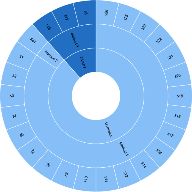
According to the data sources used by the dashboards, three main data collection methods were used by the included studies. Method 1 involved extracting data with different formats from various secondary data sources (S1–S5, S7–S11, S13, S14, S16–S23, S25, S26). Method 2 involved extracting data from organizational primary data sources such as electronic health records (EHR) (S6, S12, S15), and method 3 encompassed uploading input data files by users based on a predefined data format (S24) (Fig. 2).
Fig. 2.
Sources of data and data collection strategies considered by the included studies
Among all the reviewed COVID-19 dashboards, web-based dashboards were considerably more prevalent (88%, 23 studies) than desktop-based (8%, S12 and S15) and mobile-based (8%, S3 and S12) dashboards. S12 was the only study to develop a COVID-19 dashboard for both mobile and desktop platforms.
The users targeted by the reviewed dashboards were more diverse. The general public (GP) (23 studies, 88%), policy-makers and managers (PM) (11 studies, 42%), academic users and researchers (AR) (nine studies, 35%), and healthcare professionals (HP) (12%, three studies) were the main user groups of the COVID-19 dashboards. Of the reviewed dashboards, 62% (16 studies) were suitable for more than one group of users. The GP and PM, the GP and AR, the GP, PM, and AR, and GP and HP user groups were targeted by 27% (S5, S16, S17, S20, S21, S22, and S26), 15% (S1, S18, S24, and S25), 15% (S11, S13, S14, and S23), and 4% (S12) of the reviewed dashboards, respectively.
Eighty-eight percent (23 studies) of the reviewed dashboards had public accessibility. However, the process of updating data was more heterogeneous. In 54% of dashboards, the data displayed were mainly updated in real time, as soon as new data became available. In 38% of dashboards, data was updated on a daily basis. However, this process was slower, taking more than one day, and more irregular for S8 and S6, respectively.
From a data processing point of view, more than half of the reviewed dashboards (58%, 15 studies) used simple data processing techniques to analyze the COVID-19 data. The reviewed dashboards mainly (92%) aimed to inform their users rather than providing them with decision-support data and analysis.
Most of the reviewed dashboards (92%) were developed to inform users about the status of the different COVID-19 indicators; however, 38% had both informative and supportive information. In our study, being informative or supportive was considered as the main goal of a reviewed dashboard. By supportive we mean the provision of features such as those supporting decision-making, alerting, warning, preventing, and monitoring, and advanced on-demand reporting functions, in addition to providing statistics and displaying information as charts, tables, maps, etc.
Seventy-three percent (19 out of 26 studies) of the reviewed dashboards were also enriched with interactive features, such as comparing data over time, reporting, sorting, and filtering of data. These features enabled convenient interaction with the dashboards compared to non-interactive ones. The main formats for displaying data were various types of charts (69%, 18 studies) and maps (62%, 16 studies). Nevertheless, there were also two other preferred formats, namely tables and trends, used by 27% and 19% of the dashboards, respectively.
In addition to identifying and categorizing dashboard characteristics and data specifications, the purposes and outcomes of the included studies were also examined and classified into five main categories (Fig. 3).
Fig. 3.

Purposes and outcomes of the included studies
Discussion
Dashboard data specifications
A major component of dashboards is the data sources that feed them. Data sources are used to ensure the achievement of the intended key performance indicators and the potential users’ information needs. Therefore, identifying relevant data sources is crucial in the dashboard development process (Furmankiewicz et al. 2015; Ghazisaeidi et al. 2015; Vilarinho et al. 2018), which seems to be well covered by the reviewed COVID-19 dashboards. The developers of these types of dashboards had different goals, such as monitoring the spread of COVID-19, tracking infected people, reviewing the mortality rate, informing the public, and predicting the future behavior of the disease from various perspectives. Additionally, the reviewed dashboards pursued different objectives, such as to be informative, supportive, or both, and therefore targeted different types of users at different levels with various levels of access to the data and information displayed by the dashboards. Findings have shown that choosing various data sources, data granularity levels, and types of data to develop dashboards mainly depends on the dashboard’s objective and users’ needs (Florez and Singh 2020; Ibrahim et al. 2020; Peddireddy et al. 2020; Ulahannan et al. 2020). For example, in most of the reviewed dashboards that used only primary data sources, the targeted users were generally healthcare professionals, and the data granularity was institutional level (Bae et al. 2020; Hodgson et al. 2020; Ibrahim et al. 2020). Since the data sources used by the dashboards were primarily collected by authorized organizations, such as Centers for Disease Control and Prevention (CDC), WHO, and European Centre for Disease Prevention and Control (ECDC), the users could use these data more confidently to make fact-based decisions and take more appropriate actions at organizational, national, or global levels. This phenomenon has also been observed in dashboards developed for other respiratory infection outbreaks such as H1N1 influenza and severe acute respiratory syndrome (SARS) (Campbell et al. 2014; Cheng et al. 2011; Kostkova et al. 2014).
Evidently, the data and information related to COVID-19 are essential for taking suitable actions such as social distancing, optimal allocation of health resources, identification of effective therapeutic and pharmacological methods, and provision of valid and timely information to epidemiologists, managers, researchers, and the public during the COVID-19 pandemic (Bae et al. 2020; Dawson et al. 2020; Gao et al. 2020). Therefore, compared to the beginning of the outbreak, various organizations with different perspectives and intentions are making more efforts to gain more knowledge and information about COVID-19. There are several data sources storing various pieces of data about this disease in different formats. A major priority of the reviewed dashboards has been managing and controlling the current critical situation, along with informing the public. Since data related to the number of infected cases, deaths, recovered cases, and diagnostic tests provides comprehensive and useful information based on the dashboards’ goals, the majority of the reviewed dashboards have concentrated on such data. Moreover, many of the examined dashboards focused on controlling and managing the crisis in their regions or counties, rather than globally. This could be why the data granularity level in the developed dashboards was mostly state, county, or national, rather than global.
Data gathering is a critical activity in the process of dashboard development. The data used in dashboards can be curated from multiple data sources and in different formats (Ellis et al. 2019; Wilbanks and Langford 2014). Since achieving the predetermined objectives and expected outcomes depends on the dashboard’s input data, appropriate strategies and solutions should be adopted by the developers to ensure the quality and timeliness of these data. Nowadays, communication technologies and modern IT-based tools have greatly facilitated the process of data collection from different data sources (Farmanbar and Rong 2020), which is reflected in the data collection strategies utilized by most of the reviewed studies (Aristizábal-Torres et al. 2020; Bae et al. 2020; Chande et al. 2020; Chang et al. 2020; Florez and Singh 2020; Hohl et al. 2020; Ibrahim et al. 2020; Li Bassi et al. 2020; Marivate and Combrink 2020; Marvel et al. 2020; Pathak et al. 2020; Peddireddy et al. 2020; Raj et al. 2020; Ulahannan et al. 2020; Wimba et al. 2020; Wissel et al. 2020).
Dashboards characteristics
Designing and developing a web-based COVID-19 dashboard was the most favorable choice for researchers. This could be due to the pandemic nature of COVID-19 and the need for providing a large-scale, informative, and assistive tool to help control and manage the pandemic. Some other reasons could be the nature of web-based applications that makes them more suitable for COVID-19 dashboards. A web-based dashboard is more accessible, requiring just any Internet-rich device, more manageable, in that making changes in one place will be viewed by everyone, and more convenient to use, having zero installation processes, being more familiar to users, etc., compared to other platforms such as mobile phones or PCs. These characteristics could serve as an incentive for someone when choosing a platform for COVID-19 dashboards.
We identified two potential groups of users for COVID-19 dashboards, including the public or general users seeking to be informed about the infection, and professional users, such as policy-makers, public health authorities, managers, academics, researchers, analysts, and healthcare professionals, in charge of control and preventive measures. The first target group for managing and mitigating a pandemic is the public at large. Perhaps this is why most of the reviewed dashboards were informative and designed for general use.
However, dashboards equipped with supportive features could make professional users more productive and help them to make better decisions. Such tools can assist policy-makers and public health authorities in taking appropriate measures, especially in critical situations, such as restrictions at the peak of the COVID-19 waves, helping them to better manage resources and control the infection.
A key advantage of a dashboard is its ability to provide the user with ongoing events such that the core information is captured at a glance. Hence, it is important what, when, and how information is provided to the user. The examined COVID-19 dashboards were mostly interactive and illustrative, displaying information via charts and maps, and thus giving their users more freedom in gaining the information they need and providing more convenient ways to capture the necessary information. However, the data provided by these dashboards was generally produced by simple analysis techniques, which could be more informative than supportive. In other words, this type of dashboard is more appropriate for informing general users than supporting advanced users. Nevertheless, many of the reviewed dashboards updated the data in real time or on a daily basis, which offered a fairly good standard of information.
Strengths and limitations
The use of a clear and strong methodology to identify and extract the related studies, applying the methodological framework of Arksey and O'Malley’s (2005) and the advanced version of this framework to conduct this study were the strengths of this scoping review. In addition, we tried to provide a relatively comprehensive view for researchers, health managers, and designers of similar dashboards by comprehensively and accurately examining the characteristics and specifications of the designed dashboards from different aspects.
However, since the present study was conducted based on the proposed methodology, we believe our study has some limitations that should be considered before drawing any conclusions. In this research, only studies in English and published in the selected databases were included. Therefore, studies in the field of dashboard design in other languages and/or not indexed in the selected databases were not examined in this study.
Conclusion
Due to the rapid and sudden outbreak of COVID-19 worldwide, healthcare systems faced many challenges in terms of workforce and resources. Managing the huge amount of information and rapidly responding to stakeholders require novel approaches and tools that can properly manage this complex and critical situation. In such scenarios, dashboards are useful and practical tools that can be used by health authorities at different organizational levels and also by the public audience to be informed. Dashboards can help immediately manage, analyze, and summarize a huge amount of information about the COVID-19 outbreak.
This study provided a comprehensive overview of the dashboards targeting the COVID-19 crisis in terms of dashboard characteristics and data specifications. The findings revealed that the developed COVID-19 dashboards share more or less analogous characteristics, which could lay the ground for designing and developing dashboards for other pandemics. The effectiveness of dashboards in managing and controlling the pandemic remains unclear. Therefore, a systematic review on their effectiveness can provide a comprehensive view of COVID-19 dashboards and demonstrate the necessity of each function and feature addressed here. In this way, effective dashboards can be designed for this and other pandemics.
Authors’ contributions
Taleb Khodaveisi: Conceptualization; Data curation, Validation. Hossein Dehdarirad: Methodology, Investigation. Hamid Bouraghi: Validation, Visualization, Writing - original draft. Ali Mohammadpour: Validation, Visualization, Writing - original draft. Fereydun Sajadi: Writing - review & editing, Formal analysis. Mohammad Hosseiniravandi: Project administration, Supervision, Writing - review & editing.
All authors read and approved the manuscript.
Funding
The authors declare that no funds, grants, or other support were received during the preparation of this manuscript.
Availability of data and material
All data generated or analyzed during this study are included in this published article.
Code availability
Not applicable.
Declarations
Ethics approval
The present study is a research project (research project No: 140004083029) approved by Hamadan University of Medical Sciences with the Ethics code of IR.UMSHA.REC.1400.238.
Consent to participate
Not applicable.
Consent for publication
Not applicable.
Conflicts of interest
The authors declare that they have no conflict of interest.
Footnotes
Publisher’s note
Springer Nature remains neutral with regard to jurisdictional claims in published maps and institutional affiliations.
Contributor Information
Taleb Khodaveisi, Email: t.khodaveisi@gmail.com.
Hossein Dehdarirad, Email: dehdari.hossein@gmail.com.
Hamid Bouraghi, Email: bouraghi@umsha.ac.ir.
Ali Mohammadpour, Email: mohammadpur2000@gmail.com.
Fereydun Sajadi, Email: sajadifereydun@gmail.com.
Mohammad Hosseiniravandi, Email: hosseiniravandi.m@gmail.com.
References
- Al-Dabbagh ZS. The role of decision-maker in crisis management: a qualitative study using grounded theory (COVID-19 pandemic crisis as a model) J Public Aff. 2020;20(4):e2186. doi: 10.1002/pa.2186. [DOI] [PMC free article] [PubMed] [Google Scholar]
- Arias-Carrasco R, Giddaluru J, Cardozo LE, Martins F, Maracaja-Coutinho V, Nakaya HI. OUTBREAK: a user-friendly georeferencing online tool for disease surveillance. Biol Res. 2021;54(1):20. doi: 10.1186/s40659-021-00343-5. [DOI] [PMC free article] [PubMed] [Google Scholar]
- Aristizábal-Torres D, Peñuela-Meneses C, Barrera-Rodríguez A. An interactive web-based dashboard to track COVID-19 in Colombia. Case study: five main cities. Rev Salud Publica. 2020;22(2):1–6. doi: 10.15446/rsap.V22n2.87668. [DOI] [PubMed] [Google Scholar]
- Arksey H, O'Malley L. Scoping studies: towards a methodological framework. Int J Soc Res Methodol. 2005;8(1):19–32. doi: 10.1080/1364557032000119616. [DOI] [Google Scholar]
- Asadzadeh A, Pakkhoo S, Saeidabad MM, Khezri H, Ferdousi R. Information technology in emergency management of COVID-19 outbreak. Inform Med Unlocked. 2020;21:100475. doi: 10.1016/j.imu.2020.100475. [DOI] [PMC free article] [PubMed] [Google Scholar]
- Ashofteh A, Bravo J. A study on the quality of novel coronavirus (COVID-19) official datasets. Stat J IAOS. 2020;36(2):291–301. doi: 10.3233/SJI-200674. [DOI] [Google Scholar]
- Bae Y, Kim K, Choi S, Ko T, Jeong C, Cho B, Kim M, Kang E. Information technology-based management of clinically healthy COVID-19 patients: lessons from a living and treatment support center operated by Seoul National University Hospital. J Med Internet Res. 2020;22(6):e19938. doi: 10.2196/19938. [DOI] [PMC free article] [PubMed] [Google Scholar]
- Barone S, Chakhunashvili A, Comelli A. Building a statistical surveillance dashboard for COVID-19 infection worldwide. Qual Eng. 2020;32(4):754–763. doi: 10.1080/08982112.2020.1770791. [DOI] [Google Scholar]
- Campbell T, Mistry Z, Gorelick-Feldman G, Hodanics C, Babin S, Lewis S (2014) Development of the respiratory disease dashboard for the identification of new and emerging respiratory pathogens. Johns Hopkins APL technical digest, Laurel, Maryland. https://www.jhuapl.edu/Content/techdigest/pdf/V32-N04/32-04-Campbell_RDD.pdf. Accessed 28 Feb 2022
- Carroll R, Prentice CR. Using spatial and temporal modeling to visualize the effects of U.S. state issued stay at home orders on COVID-19. Sci Rep. 2021;11(1):13939. doi: 10.1038/s41598-021-93433-z. [DOI] [PMC free article] [PubMed] [Google Scholar]
- Chande A, Lee S, Harris M, Hilley T, Andris C, Weitz J. Real-time, interactive website for US-county level Covid-19 event risk assessment. Nat Hum Behav. 2020;4(12):1313–1319. doi: 10.1101/2020.08.24.20181271. [DOI] [PMC free article] [PubMed] [Google Scholar]
- Chang C, Yeh Y, Chien T, Lin J, Cheng B, Kuo S. The computation of case fatality rate for novel coronavirus (COVID-19) based on Bayes theorem: An observational study. Med. 2020;99(21):e19925. doi: 10.1097/md.0000000000019925. [DOI] [PMC free article] [PubMed] [Google Scholar]
- Chauhan R, Goel P, Kumar V, Soni N, Singh N. Understanding Covid-19 using data visualization. In: 2021 International Conference on Advance Computing and Innovative Technologies in Engineering (ICACITE) India: Greater Noida; 2021. pp. 555–559. [Google Scholar]
- Cheng CK, Ip D, Cowling B, Ho LM, Leung GM, Lau EH. Digital dashboard design using multiple data streams for disease surveillance with influenza surveillance as an example. J Med Internet Res. 2011;13(4):e85. doi: 10.2196/jmir.1658. [DOI] [PMC free article] [PubMed] [Google Scholar]
- Clement F, Kaur A, Sedghi M, Krishnaswamy D, Punithakumar K (2020) Interactive data driven visualization for COVID-19 with trends, analytics and forecasting. In: 24th International Conference Information Visualisation (IV), Melbourne, Australia. pp 593-598. https://ieeexplore.ieee.org/document/9373291
- da Costa NM, Mileu N, Alves A. Dashboard comprime_compri_mov: multiscalar spatio-temporal monitoring of the covid-19 pandemic in Portugal. Future Internet. 2021;13(2):1–17. doi: 10.3390/fi13020045. [DOI] [Google Scholar]
- Dawson A, Isaacs D, Jansen M, Jordens C, Kerridge I, Kihlbom U, Kilham H, Preisz A, Sheahan L, Skowronski G. An ethics framework for making resource allocation decisions within clinical care: responding to COVID-19. J Bioeth Inq. 2020;17(4):749–755. doi: 10.1007/s11673-020-10007-w. [DOI] [PMC free article] [PubMed] [Google Scholar]
- Dixon BE, Grannis SJ, McAndrews C, Broyles AA, Mikels-Carrasco W, Wiensch A, Williams JL, Tachinardi U, Embi PJ. Leveraging data visualization and a statewide health information exchange to support COVID-19 surveillance and response: Application of public health informatics. J Am Med Inform Assoc. 2021;28(7):1363–1373. doi: 10.1093/jamia/ocab004. [DOI] [PMC free article] [PubMed] [Google Scholar]
- Ellis G, Taggart A, Lepley T, Lacanienta A (2019) Method for monitoring quality of extension programs: a dashboard construction process. Clemson University Press. https://tigerprints.clemson.edu/joe/vol57/iss1/24/. Accessed 25 May 2022
- Farmanbar M, Rong C. Triangulum City Dashboard: an interactive data analytic platform for visualizing smart city performance. Process. 2020;8(2):250–271. doi: 10.3390/pr8020250. [DOI] [Google Scholar]
- Florez H, Singh S. Online dashboard and data analysis approach for assessing COVID-19 case and death data. F1000Research. 2020;9:570–582. doi: 10.12688/f1000research.24164.1. [DOI] [PMC free article] [PubMed] [Google Scholar]
- Furmankiewicz J, Furmankiewicz M, Ziuziański P (2015) Implementation of business intelligence performance dashboard for the knowledge management in organization. Silesian University of Technology. http://yadda.icm.edu.pl/baztech/element/bwmeta1.element.baztech-d22152d4-3cd7-4f90-9913-087e7ba56573. Accessed 10 June 2022
- Gao F, Tao L, Huang Y, Shu Z. Management and data sharing of COVID-19 pandemic information. Biopreserv Biobank. 2020;18(6):570–580. doi: 10.1089/bio.2020.0134. [DOI] [PubMed] [Google Scholar]
- Ghazisaeidi M, Safdari R, Torabi M, Mirzaee M, Farzi J, Goodini A. Development of performance dashboards in healthcare sector: key practical issues. Acta Inform Med. 2015;23(5):317–321. doi: 10.5455/aim.2015.23.317-321. [DOI] [PMC free article] [PubMed] [Google Scholar]
- Hirschmann M, Hart A, Henckel J, Sadoghi P, Seil R, Mouton C. COVID-19 coronavirus: recommended personal protective equipment for the orthopaedic and trauma surgeon. Knee Surg Sports Traumatol Arthrosc. 2020;28(6):1690. doi: 10.1007/s00167-020-06022-4. [DOI] [PMC free article] [PubMed] [Google Scholar]
- Hodgson LE, Leckie T, Hunter A, Prinsloo N, Venn R, Forni L. COVID-19 recognition and digital risk stratification. Future Healthc J. 2020;7(3):e47–e49. doi: 10.7861/fhj.2020-0037. [DOI] [PMC free article] [PubMed] [Google Scholar]
- Hohl A, Delmelle E, Desjardins M, Lan Y. Daily surveillance of COVID-19 using the prospective space-time scan statistic in the United States. Spat Spatiotemporal Epidemiol. 2020;34:100354–100361. doi: 10.1016/j.sste.2020.100354. [DOI] [PMC free article] [PubMed] [Google Scholar]
- Hossam A, Magdy A, Fawzy A, Abd El-Kader SM. An integrated IoT system to control the spread of COVID-19 in Egypt. In: Hassanien AE, Slowik A, Snasel V, El-Deeb H, Tolba FM, editors. Advances in intelligent systems and computing. Cairo: Springer Cham; 2021. pp. 336–346. [Google Scholar]
- Hyman M, Mark C, Imteaj A, Ghiaie H, Rezapour S, Sadri AM, Amini MH. Data analytics to evaluate the impact of infectious disease on economy: case study of COVID-19 pandemic. Patterns (N Y) 2021;2(8):100315. doi: 10.1016/j.patter.2021.100315. [DOI] [PMC free article] [PubMed] [Google Scholar]
- Ibrahim H, Sorrell S, Nair S, Al Romaithi A, Al Mazrouei S, Kamour A. Rapid development and utilization of a clinical intelligence dashboard for frontline clinicians to optimize critical resources during COVID-19. Acta Inform Med. 2020;28(3):209–213. doi: 10.5455/aim.2020.28.209-213. [DOI] [PMC free article] [PubMed] [Google Scholar]
- Indini A, Rijavec E, Ghidini M, Bareggi C, Cattaneo M, Galassi B, Gambini D, Grossi F. Coronavirus infection and immune system: an insight of COVID-19 in cancer patients. Crit Rev Oncol Hematol. 2020;153:103059. doi: 10.1016/j.critrevonc.2020.103059. [DOI] [PMC free article] [PubMed] [Google Scholar]
- Jamaati H, Dastan F, Esmaili Dolabi S, Varahram M, Hashemian SM, Nasirirayeini S, Farzanegan B, Monjazebi F. COVID-19 in Iran: a model for crisis management and current experience. Iran J Pharm Res. 2020;19(2):1–8. doi: 10.22037/ijpr.2020.113365.14255. [DOI] [PMC free article] [PubMed] [Google Scholar]
- Kaul S, Coleman C, Gotz D. A rapidly deployed, interactive, online visualization system to support fatality management during the coronavirus disease 2019 (COVID-19) pandemic. J Am Med Inform Assoc. 2020;27(12):1943–1948. doi: 10.1093/jamia/ocaa146. [DOI] [PMC free article] [PubMed] [Google Scholar]
- Khaleghi A, Mohammadi MR, Pirzad Jahromi G, Zarafshan H. New ways to manage pandemics: using technologies in the era of COVID-19: a narrative review. Iran J Psychiatry. 2020;15(3):236–242. doi: 10.18502/ijps.v15i3.3816. [DOI] [PMC free article] [PubMed] [Google Scholar]
- Kolifarhood G, Aghaali M, Mozafar Saadati H, Taherpour N, Rahimi S, Izadi N, Hashemi Nazari SS. Epidemiological and clinical aspects of COVID-19; a narrative review. Arch Acad Emerg Med. 2020;8(1):e41–e41. doi: 10.22037/aaem.v8i1.620. [DOI] [PMC free article] [PubMed] [Google Scholar]
- Kostkova P, Garbin S, Moser J, Pan W (2014) Integration and visualization public health dashboard: the medi+board pilot project. Association for Computing Machinery. https://archive.thewebconf.org/proceedings/www2014/companion/p657.pdf. Accessed 27 Oct 2022
- Krausz M, Westenberg JN, Vigo D, Spence RT, Ramsey D. Emergency response to COVID-19 in Canada: platform development and implementation for eHealth in crisis management. JMIR Public Health Surveill. 2020;6(2):e18995. doi: 10.2196/18995. [DOI] [PMC free article] [PubMed] [Google Scholar]
- Kwee T, Kwee R. Chest CT in COVID-19: What the Radiologist Needs to Know. RadioGraphics. 2020;40(7):1848–1865. doi: 10.1148/rg.2020200159. [DOI] [PMC free article] [PubMed] [Google Scholar]
- Lee S, Yeo J, Na C. Learning from the past: distributed cognition and crisis management capabilities for tackling COVID-19. Am Rev Public Adm. 2020;50(6-7):729–735. doi: 10.1177/0275074020942412. [DOI] [Google Scholar]
- Levac D, Colquhoun H, O'Brien KK. Scoping studies: advancing the methodology. Implement Sci. 2010;5(1):1–9. doi: 10.1186/1748-5908-5-69. [DOI] [PMC free article] [PubMed] [Google Scholar]
- Li Bassi G, Suen J, Barnett AG, Corley A, Millar J, Fanning J, Lye I, Colombo S, Wildi K, Livingstone S, Abbate G, Hinton S, Liquet B, Shrapnel S, Dalton H, Fraser JF. Design and rationale of the COVID-19 Critical Care Consortium international, multicentre, observational study. BMJ open. 2020;10(12):e041417. doi: 10.1136/bmjopen-2020-041417. [DOI] [PMC free article] [PubMed] [Google Scholar]
- Manalu E, Muditomo A, Adriana D, Trisnowati Y (2020) Role of information technology for successful responses to Covid-19 pandemic. In: 2020 International Conference on Information Management and Technology (ICIMTech), Bandung, Indonesia. https://ieeexplore.ieee.org/abstract/document/9211290
- Marivate V, Combrink HM. Use of available data to inform the COVID-19 outbreak in South Africa: a case study. Data Sci J. 2020;19(1):1–7. doi: 10.5334/dsj-2020-019. [DOI] [Google Scholar]
- Marvel S, House J, Wheeler M, Song K, Zhou Y, Wright F, Chiu W, Rusyn I, Motsinger-Reif A, Reif DM (2020) The COVID-19 Pandemic Vulnerability Index (PVI) Dashboard: monitoring county level vulnerability. Environ Health Perspect 129(1). 10.1101/2020.08.10.20169649 [DOI] [PMC free article] [PubMed]
- Maspero C, Abate A, Cavagnetto D, El Morsi M, Fama A, Farronato M. Available technologies, applications and benefits of teleorthodontics. A literature review and possible applications during the COVID-19 pandemic. J Clin Med. 2020;9(6):1891. doi: 10.3390/jcm9061891. [DOI] [PMC free article] [PubMed] [Google Scholar]
- Mbunge E, Akinnuwesi B, Fashoto S, Metfula AS, Mashwama P (2020) A critical review of emerging technologies for tackling COVID-19 pandemic. Hum Behav Emerg Technol 3(1). 10.1002/hbe2.237 [DOI] [PMC free article] [PubMed]
- Mehraeen M, Dadkhah M, Mehraeen A. Investigating the capabilities of information technologies to support policymaking in COVID-19 crisis management; a systematic review and expert opinions. Eur J Clin Invest. 2020;50(11):e13391. doi: 10.1111/eci.13391. [DOI] [PubMed] [Google Scholar]
- Pathak I, Choi Y, Jiao D, Yeung D, Liu L (2020) Racial-ethnic disparities in case fatality ratio narrowed after age standardization: A call for race-ethnicity-specific age distributions in State COVID-19 data. medRxiv. https://pubmed.ncbi.nlm.nih.gov/33024984/. Accessed 8 June 2022
- Peddireddy A, Xie D, Patil P, Wilson M, Machi D, Venkatramanan S, Klahn B, Porebski P, Bhattacharya P, Dumbre S, Marathe M (2020) From 5Vs to 6Cs: Operationalizing Epidemic Data Management with COVID-19 Surveillance. medRxiv. 10.1101/2020.10.27.20220830
- Pinho M. The challenge posed by the COVID-19 pandemic: how to decide who deserves life-saving medical devices? Int J Health Gov. 2020;26(1):28–41. doi: 10.1108/IJHG-08-2020-0090. [DOI] [Google Scholar]
- Raj P, Kumar C, Rawat M. Automatic retrieval of updated information related to COVID-19 from web portals. Eur J Mol Clin Med. 2020;7(3):5130–5136. [Google Scholar]
- Ravinder R, Singh S, Bishnoi S, Jan A, Sharma A, Kodamana H, Krishnan NMA. An adaptive, interacting, cluster-based model for predicting the transmission dynamics of COVID-19. Heliyon. 2020;6(12):e05722. doi: 10.1016/j.heliyon.2020.e05722. [DOI] [PMC free article] [PubMed] [Google Scholar]
- Salehi M, Arashi M, Bekker A, Ferreira J, Chen DG, Esmaeili F, Frances M (2021) A Synergetic R-Shiny Portal for Modeling and Tracking of COVID-19 Data. Front Public Health 8. 10.3389/fpubh.2020.623624 [DOI] [PMC free article] [PubMed]
- Santhanavanich T, Kim C, Coors V (2020) Integration of heterogeneous coronavirus disease covid-19 data sources using OGC sensorthings API. International Society for Photogrammetry and Remote Sensing. https://www.proquest.com/openview/3a89f290aa4e754ce27f3215573add8f/1?pq-origsite=gscholar&cbl=2037681. Accessed 16 July 2022
- Santos H, Dantas V, Furtado V, Pinheiro P, McGuinness DL (2017) From data to city indicators: a knowledge graph for supporting automatic generation of dashboards. In: Blomqvist E, Maynard D, Gangemi A, Hoekstra R, Hitzler P, Hartig O (eds) Lecture notes in computer science, Portorož, Slovenia. The Semantic Web. Springer, Cham, pp 94-108
- Tricco A, Lillie E, Zarin W, O'Brien KK, Colquhoun H, Levac D, Moher D, Peters MD, Horsley T, Weeks L. PRISMA extension for scoping reviews (PRISMA-ScR): checklist and explanation. Ann Intern Med. 2018;169(7):467–473. doi: 10.7326/M18-0850. [DOI] [PubMed] [Google Scholar]
- Ulahannan J, Narayanan N, Thalhath N, Prabhakaran P, Chaliyeduth S, Suresh S, Mohammed M, Rajeevan E, Joseph S, Balakrishnan A, Uthaman J, Karingamadathil M, Thomas S, Sureshkumar U, Balan S, Vellichirammal N. A citizen science initiative for open data and visualization of COVID-19 outbreak in Kerala. India. J Am Med Inform Assoc. 2020;27(12):1913–1920. doi: 10.1093/jamia/ocaa203. [DOI] [PMC free article] [PubMed] [Google Scholar]
- Vilarinho S, Lopes I, Sousa S. Developing dashboards for SMEs to improve performance of productive equipment and processes. J Ind Inf Integr. 2018;12:13–22. doi: 10.1016/j.jii.2018.02.003. [DOI] [Google Scholar]
- Wang W-T, Wu S-Y. Knowledge management based on information technology in response to COVID-19 crisis. Knowl Manag Pract Res. 2020;19:1–7. doi: 10.1080/14778238.2020.1860665. [DOI] [Google Scholar]
- Wilbanks B, Langford P. A review of dashboards for data analytics in nursing. Comput Inform Nurs. 2014;32(11):545–549. doi: 10.1097/cin.0000000000000106. [DOI] [PubMed] [Google Scholar]
- Wimba P, Bazeboso J, Katchunga P, Tshilolo L, Longo-Mbenza B, Rabilloud M, Vanhems P, Iwaz J, Étard J, Écochard R. A dashboard for monitoring preventive measures in response to COVID-19 outbreak in the Democratic Republic of Congo. Trop Med Health. 2020;48(1):1–8. doi: 10.1186/s41182-020-00262-3. [DOI] [PMC free article] [PubMed] [Google Scholar]
- Wissel B, Van Camp P, Kouril M, Weis C, Glauser TA, White PS, Kohane IS, Dexheimer JW. An interactive online dashboard for tracking COVID-19 in U.S. counties, cities, and states in real time. J Am Med Inform Assoc. 2020;27(7):1121–1125. doi: 10.1093/jamia/ocaa071. [DOI] [PMC free article] [PubMed] [Google Scholar]
- Yang DH, Chien TW, Yeh YT, Yang TY, Chou W, Lin JK. Using the absolute advantage coefficient (AAC) to measure the strength of damage hit by COVID-19 in India on a growth-share matrix. Eur J Med Res. 2021;26(1):61. doi: 10.1186/s40001-021-00528-4. [DOI] [PMC free article] [PubMed] [Google Scholar]
- Zhu Z, Meng K, Caraballo J, Jaradat I, Shi X, Zhang Z, Akrami F, Liao H, Arslan F, Jimenez D, Saeef MS, Pathak P, Li C (2021) A dashboard for mitigating the COVID-19 misinfodemic. Association for Computational Linguistics. https://aclanthology.org/2021.eacl-demos.12.pdf. Accessed 20 May 2022
Associated Data
This section collects any data citations, data availability statements, or supplementary materials included in this article.
Data Availability Statement
All data generated or analyzed during this study are included in this published article.
Not applicable.