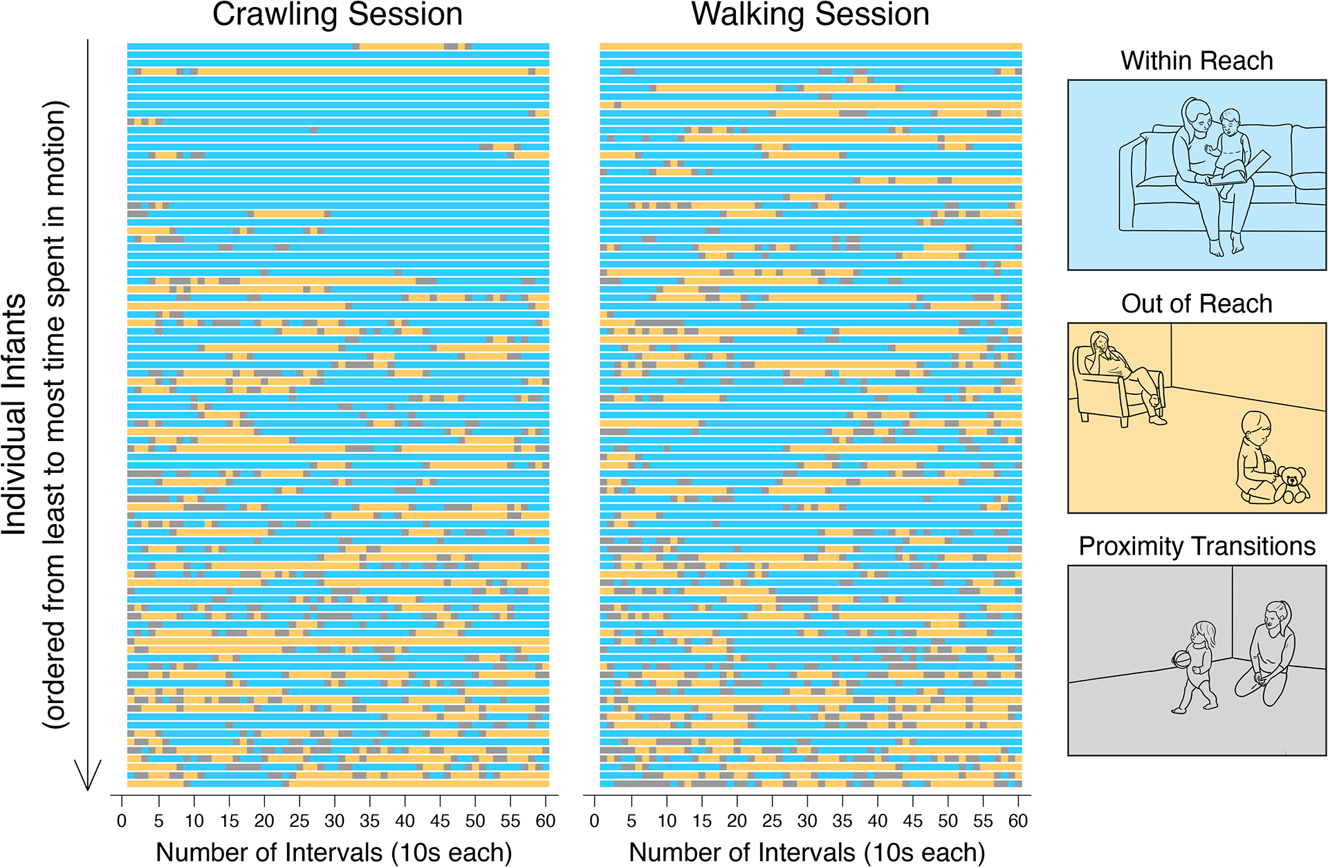
Figure 1.

Data on infant-adult proximity across the transition to walking. The raster plot presents individual timelines for each infants’ patterns of proximity to adults across sixty, 10-second intervals spanning a total of ten minutes of play. The data represent both the real-time distributions of proximity states during each 10-second interval within a session and change in patterns of proximity between sessions. Each row displays data from a single infant. Rows are ordered from least to most time in motion within each session. Proximity states for each interval are color-coded, and the line drawings serve as a legend. Each color represents a proximity state: blue = within reach; yellow = out of reach; and grey = proximity transitions.
