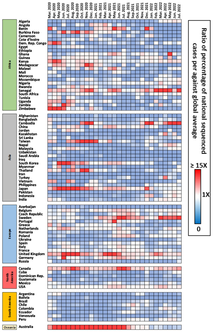
Figure 4.
Heat map contextualizing the relative percentage of sequenced genomes in each country against the average percentages worldwide. Red points indicate that the percentage in that country/month was higher than the average worldwide, white represents a similar average, while tones of blue indicate that the average of sequenced genomes was lower than the worldwide average.

