Abstract
The analysis of county-level COVID-19 pandemic data faces computational and analytic challenges, particularly when considering the heterogeneity of data sources with variation in geographic, demographic, and socioeconomic factors between counties. This study presents a method to join relevant data from different sources to investigate underlying typological effects and disparities across typologies. Both consistencies within and variations between urban and non-urban counties are demonstrated. When different county types were stratified by age group distribution, this method identifies significant community mobility differences occurring before, during, and after the shutdown. Counties with a larger proportion of young adults (age 20–24) have higher baseline mobility and had the least mobility reduction during the lockdown.
Keywords: COVID-19, Health informatics, Urban informatics, Unsupervised learning, Data science, Epidemiology
Introduction
The COVID-19 pandemic has showcased the need for a multi-disciplinary exploration, interpretation, and presentation of data. In comparison with the SARS-CoV-1 outbreak from 2002 to 2004, advances in cloud storage, analytic infrastructure, and platforms for dissemination of information have dramatically expanded the data resources available for studying virus transmission in communities, as well as the interplay between individual and geographical factors, including the socio-political landscape. Policy experts increasingly seek to leverage data, machine learning, and cloud computing in their response strategies. Unfortunately, data heterogeneity, a dearth of data standards, and poorly interoperable data-sharing platforms complicate the quality and availability of analyzable data, marring both data value and methodological reproducibility.
These challenges notwithdtanding, the New York Times (TNYT) developed a live data repository with daily county-level coronavirus cases and deaths [1]. County-level data has emerged as the primary geographical level of analysis, self-contained for reporting purposes while additionally responsible for the execution of epidemic policy response. Moreover, disaster funding is allocated at the county-level. Analyzing data at the county-level has significant benchmarking challenges: for instance, counties have fundamental differences in geographic, demographic, political, and socioeconomic characteristics, which lead to differing and unique epidemiological trajectories that go uncaptured in a static pooled analysis. In response to this, the U.S Centers for Disease Control and Prevention (CDC) in 2011 created a Social Vulnerability Index (SVI) aimed at quantifying the resilience of communities to disasters and disease outbreaks [2], an index that has been expanded throughout this pandemic. Based on these indicators, the CDC has identified 220 “most vulnerable” counties and other jurisdictions that are at highest risk for outbreaks, with consequent impact on federal resource distribution, aid, and policy.
However, without a deep understanding of the underlying variation across the counties and the states, modeling leads to error, bias, and flawed interpretations, leading to downstream deleterious impacts on the ability for a community – and the nation – to respond to this crisis. A recent paper from Bosancianu and colleagues [3] found that a county’s political leaning, social structures, and local government effectiveness also explain, in part, COVID-19 mortality. These findings cannot solely be explained by the urban/rural divide, nor racial and ethnic disparities, between counties [4,5]. County-level analysis has similarly demonstrated a link between political beliefs and compliance with social distancing [6], as well as connections between COVID-19 transmission to air pollution and other factors [7]. A robust analytical system capable of identifying granular patterns and trends, track county-level case incidence, mortality, and excess mortality, and thereby disentangle causal, mitigative, and correlative effects [8], is critical for healthcare resource allocation during this and future pandemics.
This project introduces a methodology to specifically address the computational and analytical challenges of aggregating county-level heterogeneous data sources for COVID-19 research. This captures the first steps necessary to reliably frame and analyze county-level data, including incorporation of higher resolution, individual-level data in analysis. The purpose of this study is to summarize publicly available and relevant COVID-19 data sources, to address the benchmarking challenge from the data heterogeneity through clustering, and to classify counties based on their underlying variations. Through these methodologies, greater understanding of the spread of COVID-19 and future pandemics may be attained, leading to better data-driven policies.
Data & methods
We represent socioeconomic characteristics by integrating multiple county-level data sources (Table S1). These include baseline measures from population census data, geographical information systems data, business pattern censuses, and other sources that report relatively time-invariant variables. Spatial data was collected by quantifying geographical attributes per county and integrating this with other datasets. County land area is enumerated through evaluation of county geometry from TIGER/Line Shapefiles, with subsequent estimation of county-level population density (1000 people per square km). The CDC publishes spatial data representing the top 500 cities’ boundaries ranked by population. Using spatial geometry, the intersection of county and city borders are evaluated to approximate the total urban area. Based on the total county-level urban area, areas that were greater than 25% were classified as “urban” while the rest were classified as “non-urban”.
We calculated county-level total population, gender-, race-, and age group distribution using 2018 population estimates. Using data reported from the Small-Area Life Expectancy Estimates Project (USALEEP), county-level average life expectancy was estimated as a proxy for local quality-of-life differences [9]. Further, education was represented as the percentage of adults with a bachelor’s degree or higher (2014–2018) as reported by the U.S. Census Bureau. We further aggregated the age groups1 and computed underlying typologies using clustering techniques. K-means clustering is an unsupervised machine learning method that partitions observations into k groups (as clusters) based on their distance to the group means (as clusters’ centroids) [10]. It is one of the most common non-hierarchical clustering methods [11]. We first identified the optimal number of clusters, denoted by k, by computing the silhouette score in line with Lloyd et al. and then generated categorical variables as typology indicating different age distributions across counties.
Recent studies identify the importance of the timing of COVID-19 spread in different counties [12]. Another analytical challenge is how to take these varying timelines into account when comparing virus transmission across different counties. Recent studies identify the importance of the timing of COVID-19 spread in different counties [12]. TNYT live data repository reports the county-level cumulative COVID-19 case and death counts daily. Multiple measures were then quantified at the county-level, including: [a] cumulative cases; [b] cumulative deaths; [c] date of first case(s); [d] date of first death(s); [e] number of days since the first case(s). Two additional indicators were calculated by combining the above direct measures with other baseline measures: [f] case rate, representing the cumulative number of confirmed cases per 100 k local population; [g] death rate, reporting the cumulative number of deaths per 100 k local population. The death rate was selected given underlying geographical disparities in case reporting and testing mentioned by previous studies [13]. Finally, the slope of the growth in death rate over time was estimated via a linear fit for each county.
Human mobility was evaluated as a dependent and independent variable during the pandemic, with particular emphasis on how mobility changed responding to local policy and affected outbreak trajectory. County-level mobility change was quantified using exposure indices derived from PlaceIQ Movement Data based on mobile phone data [14]. The county-level device exposure index (DEX) is a proxy for local human mobility, which reports the county-level average spatial-temporal co-existence of unique mobile devices. This index measures daily average exposure to other people and/or crowds, reflecting local social distancing policy and compliance. DEX measures the absolute change of mobility density, demonstrating both weekly patterns and county-level variations. To generate a less-noisy and comparable measure across counties, values were computed by normalizing the county-level DEX time-series raw data to enable cross-county comparison.
Findings
County population characteristics and pandemic outcome
The mechanism with which urbanization impacts vulnerability to a pandemic and the subsequent health outcomes is not fully elucidated. Between the correlation matrices for urban and non-urban environments, consistency is seen but with subtle variation (Fig. 1). Both matrices reveal a correlation between some baseline measures: counties with higher educational attainment have higher income levels and life expectancy. Race and sex have a weaker correlation with income, unemployment, and education in urban areas compared to non-urban areas. When looking at the correlations between baseline measures and pandemic outcome measures, counties with a comparatively larger population, higher income and education attainment, and/or life expectancy had the earliest cases. Consistent correlations were observed between case rate and population, density, unemployment, income, and education.
Fig. 1.
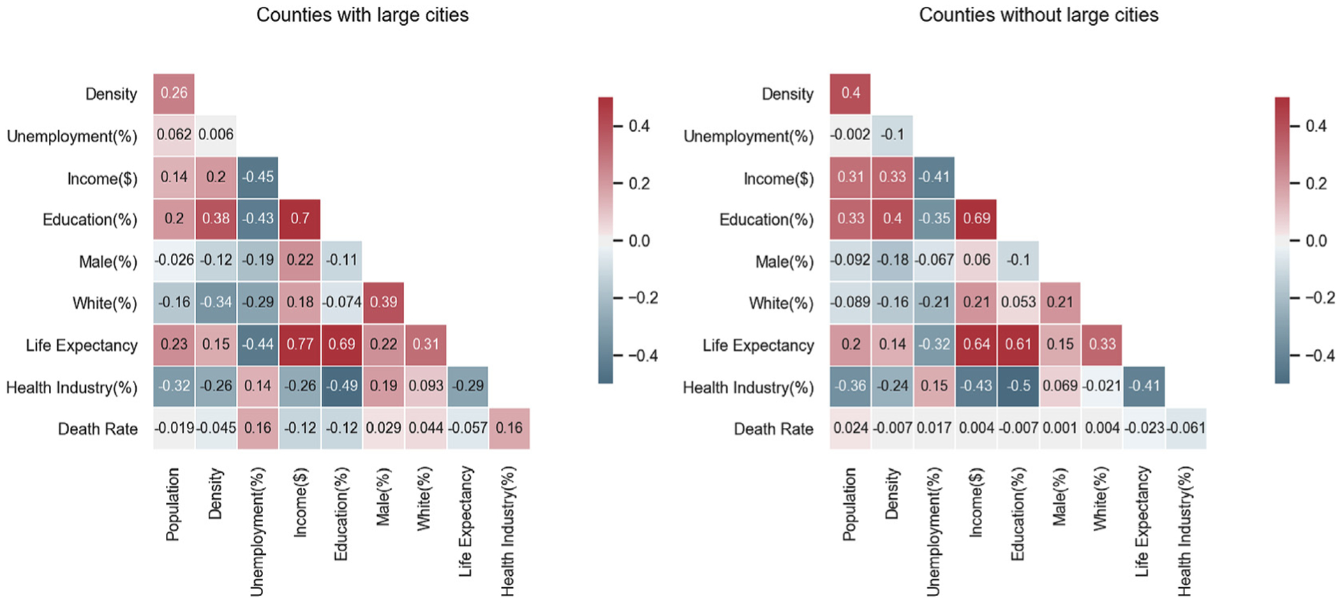
Correlation heatmaps among county-level variables in urban and non-urban counties. Colors indicate correlation coefficients between variables (warm colors indicate positive correlation and cold colors indicate negative correlation).
Urban/non-urban disparities
Fig. 2 provides an overview of how the COVID-19 pandemic hit different areas of the United States. Our study identifies the initial urban outbreaks that occurred during the COVID-19 pandemic, including metropolitan regions such as Pacific Northwest, Southern California, Northeast (Tri-state and New England Area), Great Lakes, Texas Triangle, Front Range (Colorado), Florida, and Gulf Coast. Evaluation of these geographical patterns suggests that urban areas may not be the “epi-centers” but rather the “vanguards” of pandemic spread [15]. Fig. 3a and b reveal the disparities between urban and non-urban counties in terms of variation in death rate over time, as well as in number of days from the first local death. Notably, non-urban counties have steeper slopes than urban counties, are hit later in the total pandemic timeline, and experience death rates higher than in urban areas. Fig. 3c bins the counties by death rate slope, highlighting that most counties are classified as non-urban areas, and that these had a long-tail distribution of death rate growth slope as compared to urban counties. Fig. 3d compares the density curves of the two county types, demonstrating the more dispersed death rate slope variations in non-urban counties.
Fig. 2.
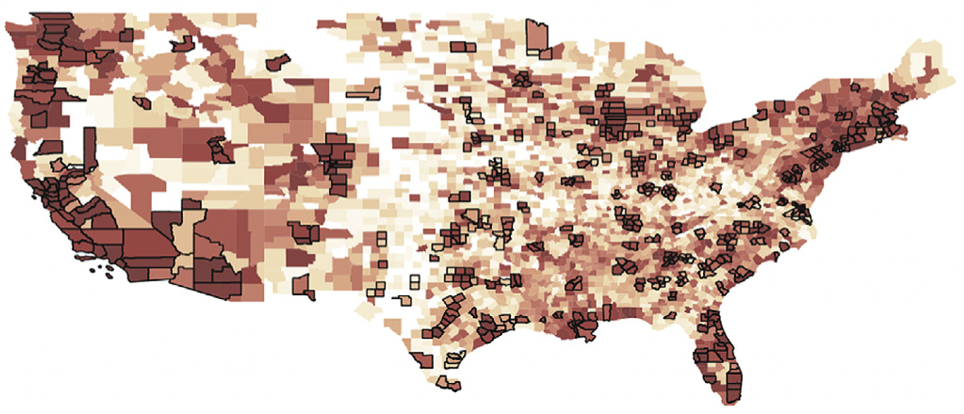
U.S. county-level geometry with urban counties (with bold boundary) and colored by the sequence of its first case (the redness indicates how early the first case occurred).
Fig. 3.
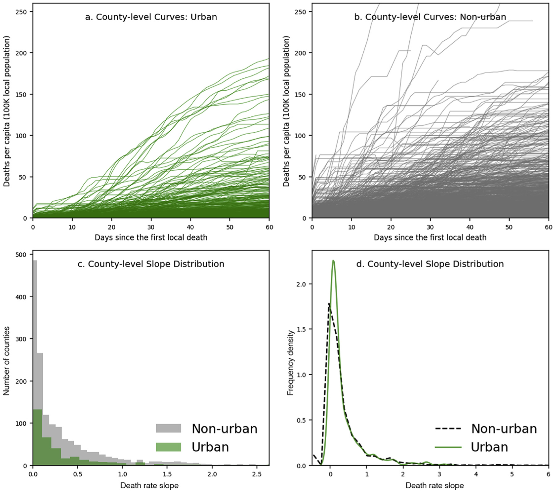
County-level population-adjusted cases and death rate slope distribution.
Age typology and mobility changes reacting to the pandemic
The K-means clustering algorithm labels all counties into three groups using age group distribution typology. As Fig. 4 indicated, Type A (in red) represents counties with a predominantly young population, defined as in their 20s. Type B (in blue) represents counties with more older adults (age ≥ 60). Type C (in green) represents most counties, which contain relatively “typical” age patterns. This method highlights dynamic patterns in county-level age distribution differences versus traditional analytical methods.
Fig. 4.
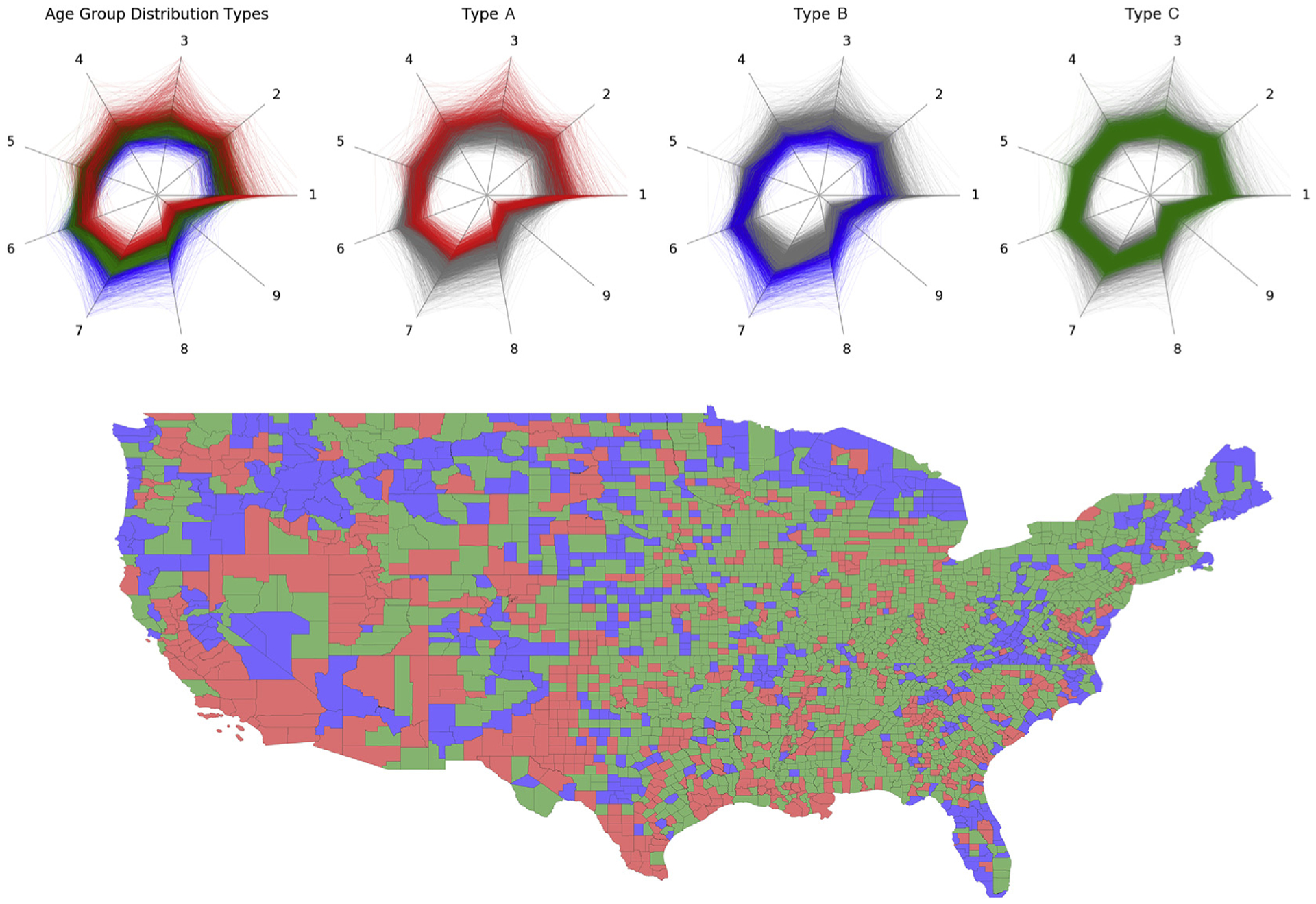
U.S. counties colored by classified age group distribution typology based on clustering results.
We identify three phases for each county according to its normalized human mobility changes (Fig. 5). Phase one prior to March 2020, during which most counties experienced increasing mobility density. Phase two occurred in March, when most counties witnessed drastically reduced local mobility density, reaching a nadir in early April. Finally, phase three began in early April, marking a slow return to mobility pre-pandemic. Counties with different age group distributions demonstrate various mobility changes before, during, and after the U.S. Federal Government announced the national emergency on March 13th. Counties with a largely young population (Type A in red) saw less mobility reduction (Fig. 6). During the “shelter-in-place” policy implementation period in which most places experienced a drastic decline in mobility, these counties had the largest drop in mobility compared to other counties (in green and blue). Furthermore, in the third phase, as businesses have started reopening, these counties demonstrated a relatively similar normalized mobility change as Type B and the largest return of absolute mobility.
Fig. 5.
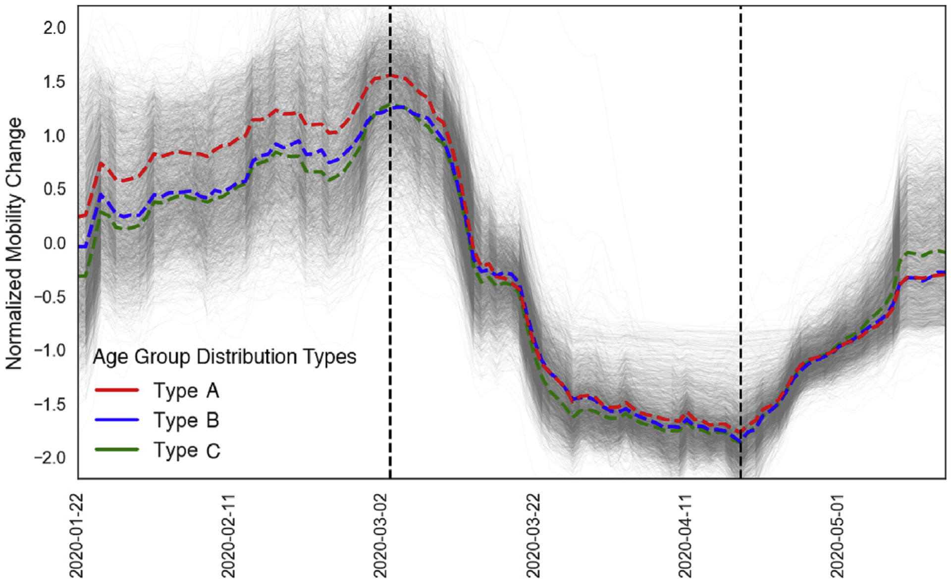
Normalized county-level human mobility changes. The group average changes (defined by the age pattern typology) are in bold-dash lines colored accordingly. Two vertical lines represent the median dates when counties experienced maximum and minimum human mobility.
Fig. 6.
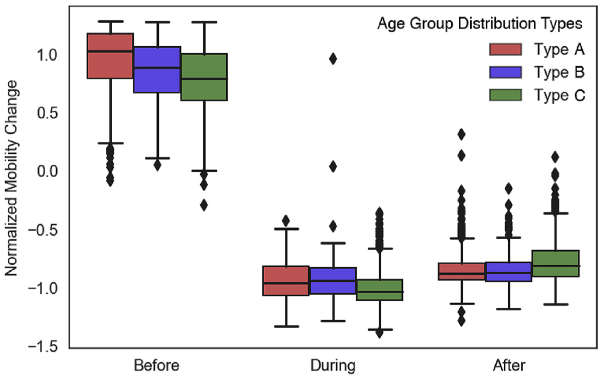
Box plot of local mobility change grouped by age pattern type and time period (before, during, and after shutdown).
Discussion
This study contributes to both data integration and analytical methods that are critical for pandemic research. Analyzing demographic, geographical, and socioeconomic characteristics can inform the local public health response and decision-making [16]. However, such comprehensive insights require multi-disciplinary and long-term efforts to collect, integrate, and analyze data from heterogeneous sources. Limitations of data sources and quality bemire analysis and interpretation, since representativeness and quality depend on particular sources and collection methods. Such data variations bring challenges for integrating heterogeneous data relevant to this pandemic. For example, county-level demographic and socioeconomic census provide long-term baseline measures, but often lack high temporal frequency and spatial granularity. Mobile phone data, as another example, provide nearly real-time digital representation of human mobility at high spatiotem-poral granularity, but suffer from noisy data and underlying sampling bias. That said, our study extends the exploration of information sources and integration methods considering there is no central source for all available data.
This study demonstrates the clustering technique using health-related data for pandemic research. Identifying the underlying county typology provides critical value in comparing health outcomes across counties [17]. Recent systematic review of K-means clustering in air pollution epidemiology-related literature has demonstrated significant utility for typology discovery and knowledge mining [18]. Further, K-means clustering is widely used for population segmentation analysis, classifying underlying subgroups with an eye toward evaluating specific healthcare demands and policy interventions [19]. Particularly at the county-level, previous studies have implemented clustering techniques to analyze various data sources relating to demographic, geographic, environment, and socioeconomic determinants of health and disease. Two use case applications of clustering include discovery of underlying patterns based on high-dimensional data [20,21] and prediction of counterfactuals for population health policy intervention [22]. According to the Situation Report & Public Health Guidance published by Johns Hopkins University on March 19th, 2020, people over 60 and those with chronic health conditions are at the highest risk for COVID-19 complications [19]. Though this simple measure evaluates the percentage of the population aged 60 and above, it may fail to capture more dynamic county-level age distribution differences. Clustering technique may identify underlying county types defined by age group distributions. In the future, we plan to scale up the clustering method by integrating more variables to identify county typology at higher dimensions.
There is no singular source of human mobility data. Multiple digital product vendors, data brokers, and research institutes have published mobility data or processed metrics, including PlaceIQ, SafeGraph, Descartes Labs, Apple Mobility Trends Report, and Google Community Mobility Reports [14,23–26]. Product provider-generated mobility measures, such as data shared by Apple and Google, are limited to data collected by their own digital product line (e.g., Google Maps or Apple Maps), customer segments, and user-product interactions. The DEX index from PlaceIQ data only represents a fraction of the actual population as samples. Even though such data sampling processes are randomly conducted for estimating human mobility, understanding sampling biases, population representativeness, and the resulting accuracy requires a more in-depth investigation, possibly with other human mobility-related data from different sources as validation. Moreover, integration of data between multiple sources is complicated by vendor-specific methods for data reporting, collecting, sharing, sampling, aggregation, and quantification. Further opportunities exist with regard to integration of mobility data with specific events, such as election or protests [27]. The human mobility data presented here may not fully reflect the compliance (or lack thereof) to local stay-at-home orders and the effects of social distancing [28].
This study only evaluated data from January 22nd to May 15th. The results and interpretations only represent this specific period and may not necessarily translate to future resurgence of the pandemic. While data is updated on TNYT and the PlaceIQ data portals daily, the descriptive summary, clustering results, and death growth rates change with each update. This raises questions on the trade-off between timeliness and accuracy, which is a core challenge in real-time or near real-time data analysis. We excluded New York City (NYC) from this analysis. We believe it would be more appropriate to study NYC in a separate research for several reasons. TNYT’s data reports NYC differently by treating it as one entity without specific counties including New York County (Man-hattan), Kings County (Brooklyn), Bronx County (The Bronx), Richmond County (Staten Island), and Queens County (Queens). Besides, since NYC was the epicenter during this study’s time frame, it has much greater numbers of cases and deaths that will skew the overall distribution.
In this preliminary study, a simple outcome measure (death growth rate since local first death) was used; the focus was primarily on modeling the independent variables and county baseline characteristics. Future iterations of this method will evaluate various outcome measures, such as those integrating death growth curve modeling, for instance Refs. [29]. Other future investigations include examining age-adjusted death rate stratified by race, ethnicity, and sex, and estimating excess mortality based on historical county-level non-COVID-19 deaths.
Conclusion
This study presents integration of various data sources to investigate the drivers of the community spread of COVID-19 based on county typologies. Both similarities and variations between urban and non-urban counties are demonstrated by the methodology. While previous findings reveal possible geographical clusters of COVID-19 cases at the county-level, our study indicates this is from the underlying typology based on high-dimensional variables. Counties vary by geographic, demographic, and socioeconomic characteristics, with associated collective behavior during a pandemic.
COVID-19 has accelerated data sharing at scale to crowdsource knowledge generation that can inform national and international policy. We showcased a method for data integration to investigate the spread of the pandemic in the United States. The dissonance in presentation between urban and non-urban areas was highlighted, as well as the impact of population age and mobility during the lockdown. Just as policy occurs at levels from local to (inter)national, so too must data analysis: this study is a first step toward that end.
Supplementary Material
Acknowledgments
LAC is funded by the National Institute of Health through NIBIB R01 EB017205.
Footnotes
Declaration of competing interest
None declared.
Age group 1 = Age 0–9, group 2 = Age 10–19, group 3 = Age 20–29, group 4 = Age 30–39, group 5 = Age 40–49, group 6 = Age 50–59, group 7 = Age 60–69, group 8 = Age 70–79, group 9 = Age 80 and above.
References
- [1].TNYT. The New York Times COVID-19 data. Retrieved from The New York Times, https://github.com/nytimes/covid-19-data; 2020.
- [2].Centers for Disease Control and Prevention (CDC). Social vulnerability index (SVI). 2011. Retrieved from CDC: https://svi.cdc.gov/.
- [3].Bosancianu CM, Dionne KY, Hilbig H, Humphreys M, Sampada KC, Lieber N, Scacco A. Political and social correlates of covid-19 mortality. 2020. [Google Scholar]
- [4].Bassett MT, Chen JT, Krieger N. The unequal toll of COVID-19 mortality by age in the United States: quantifying racial/ethnic disparities. Harvard Center for Population and Development Studies (HCPDS) Working Paper, https://cdn1.sph.harvard.edu/wp-content/uploads/sites/1266/2020/06/20_Bassett-Chen-Krieger_COVID-19_plus_age_working-paper_0612_Vol-19_No-3_with-cover.pdf; 2020. 19, No. 3. [Google Scholar]
- [5].Chen JT, Krieger N. Revealing the unequal burden of COVID-19 by income, race/ethnicity, and household crowding: US county vs ZIP code analyses. Harvard Center for Population and Development Studies (HCPDS) Working Paper Series, https://tinyurl.com/ya44we2r; 2020. 19, No 1. [Google Scholar]
- [6].Painter M, Qiu T. Political beliefs affect compliance with covid-19 social distancing orders. 2020. Available at: SSRN 3569098.
- [7].Wu X, Nethery RC, Sabath BM, Braun D, Dominici F. Exposure to air pollution and COVID-19 mortality in the United States. medRxiv. 2020. [DOI] [PMC free article] [PubMed] [Google Scholar]
- [8].Knittel CR, Ozaltun B. What does and does not correlate with COVID-19 death rates. medRxiv; 2020. [Google Scholar]
- [9].USALEEP. U.S. small-area life expectancy estimates project - USALEEP. 2015. Retrieved from CDC: https://www.cdc.gov/nchs/nvss/usaleep/usaleep.html.
- [10].Lloyd S Least squares quantization in PCM. IEEE Trans Inf Theor 1982;28(2): 129–37. [Google Scholar]
- [11].Steinley D K-means clustering: a half-century synthesis. Br J Math Stat Psychol 2006;59(1):1–34. [DOI] [PubMed] [Google Scholar]
- [12].Bialek S, et al. Geographic differences in COVID-19 cases, deaths, and incidence — United States, February 12–April 7, 2020 MMWR. Morb Mortal Wkly Rep 2020;69. [DOI] [PMC free article] [PubMed] [Google Scholar]
- [13].Jia JS, et al. Population flow drives spatio-temporal distribution of COVID-19 in China. Nature 2020:1–11 April. [DOI] [PubMed] [Google Scholar]
- [14].PlaceIQ. Exposure indices derived from PlaceIQ movement data. Retrieved from PlaceIQ: https://github.com/COVIDExposureIndices/COVIDExposureIndices; 2020.
- [15].Angel S, Blei AM, Lamson-Hall P, Tamayo MMS. The coronavirus and the cities: variations in the onset of infection and in the number of reported cases and deaths in. 2020. U.S. Metropolitan Areas as of 27 March 2020, https://marroninstitute.nyu.edu/uploads/content/The_Coronavirus_and_the_Cities%2C_27_March_data%2C_final_draft_31_March_2020_VersApril3.pdf. [Google Scholar]
- [16].Lai Y, Yeung W, Celi LA. Urban intelligence for pandemic response. JMIR Publ Health Surveill 2020;6(2):e18873. [DOI] [PMC free article] [PubMed] [Google Scholar]
- [17].Wallace M, Sharfstein JM, Kaminsky J, Lessler J. Comparison of US county-level public health performance rankings with county cluster and national rankings: assessment based on prevalence rates of smoking and obesity and motor vehicle crash death rates. JAMA network open 2019;2(1):e186816 e186816. [DOI] [PMC free article] [PubMed] [Google Scholar]
- [18].Colin B, Jabbar MS, Osornio-Vargas A. A systematic review of data mining and machine learning for air pollution epidemiology. BMC Publ Health 2017;17(1):907. [DOI] [PMC free article] [PubMed] [Google Scholar]
- [19].Sharfstein J COVID-19 situation report & public health guidance. Retrieved from Johns Hopkins Bloomberg School of Public Health; 2020. https://ash.harvard.edu/files/ash/files/jhu-situationalbriefingslides.final_.pdf. [Google Scholar]
- [20].Cossman JS, Cossman RE, James WL, Campbell CR, Blanchard TC, Cosby AG. Persistent clusters of mortality in the United States. Am J Publ Health 2007;97(12): 2148–50. [DOI] [PMC free article] [PubMed] [Google Scholar]
- [21].Chi SH, Grigsby-Toussaint DS, Bradford N, Choi J. Can geographically weighted regression improve our contextual understanding of obesity in the US? Findings from the USDA Food Atlas. Appl Geogr 2013;44:134–42. [Google Scholar]
- [22].Strutz KL, Luo Z, Raffo JE, Meghea CI, Meulen PV, Roman LA. Determining county-level counterfactuals for evaluation of population health interventions: a novel application of K-means cluster analysis. medRxiv; 2020. [DOI] [PMC free article] [PubMed] [Google Scholar]
- [23].Graph Safe. Social distancing metrics. 2020. Retrieved from Safe Graph: https://docs.safegraph.com/docs/social-distancing-metrics.
- [24].Descartes Labs. Retrieved from Descartes Labs: https://www.descarteslabs.com/; 2020.
- [25].Apple. Apple mobility trends report. Retrieved from Apple: https://www.apple.com/covid19/mobility,; 2020.
- [26].Google. Google community mobility reports. 2020. Retrieved from Google: https://www.google.com/covid19/mobility.
- [27].Cotti CD, Engelhardt B, Foster J, Nesson ET, Niekamp PS. The relationship between in-person voting, consolidated polling locations, and absentee voting on covid-19: evidence from the Wisconsin primary (No. w27187). National Bureau of Economic Research; 2020. [Google Scholar]
- [28].Gao S, Rao J, Kang Y, Liang Y, Kruse J. Mapping county-level mobility pattern changes in the United States in response to COVID-19. SIGSPATIAL Special 2020; 12(1):16–26. [Google Scholar]
- [29].Rao JS, Zhang H, Mantero A. Contextualizing covid-19 spread: a county-level analysis, urban versus rural, and implications for preparing for the next wave. medRxiv; 2020. [Google Scholar]
Associated Data
This section collects any data citations, data availability statements, or supplementary materials included in this article.


