

Abstract
We explored how place shapes mortality by examining 35 consecutive years of US mortality data. Mapping age-adjusted county mortality rates showed both persistent temporal and spatial clustering of high and low mortality rates. Counties with high mortality rates and counties with low mortality rates both experienced younger population out-migration, had economic decline, and were predominantly rural. These mortality patterns have important implications for proper research model specification and for health resource allocation policies.
Although US research has identified effects of socioeconomic and environmental conditions on mortality, these approaches have tended to be aspatial, because they ignore how place may contribute to mortality. Yet research also has shown that community factors influence mortality beyond individual factors.1,2 We mapped US mortality rates across 35 years to identify place-based mortality patterns as a precursor to more formal exploratory spatial analyses.
METHODS
The National Center for Health Statistics Compressed Mortality File measures all deaths by underlying cause and decedent’s age, race, gender, and place of residence.3 We calculated 5-year mean all-cause mortality rates (providing rate stability in rural counties) for seven 5-year periods from 1968 to 2002. The rates were expressed as deaths per 100 000 and were age adjusted (to the 2000 standard million) to allow for county comparisons (N = 3108 counties). Further standardizations by gender and race were unnecessary because they resulted in the same spatial pattern.4
RESULTS
We used SDs for each 5-year period to define “high” and “low” mortality rates. The spatial summary of 35 years of county-level mortality data is shown in Figure 1 ▶.5 To simplify spatial and temporal patterns, only 3 categories of mortality rates are shown. Counties within 1 SD of the national mean are shown in white. Counties with “high” mortality (black pattern) had mortality rates more than 1 SD greater than the US mean rate for at least 4 of the 7 (i.e., more than half) time periods. Counties with “low” mortality (black dotted pattern) had mortality rates more than 1 SD less than the US mean rate for at least 4 of the 7 time periods. The results were mapped with ArcGIS Geographic Information Systems software version 8.0 (Environmental Systems Research Institute Inc, Redlands, Calif ).
FIGURE 1—
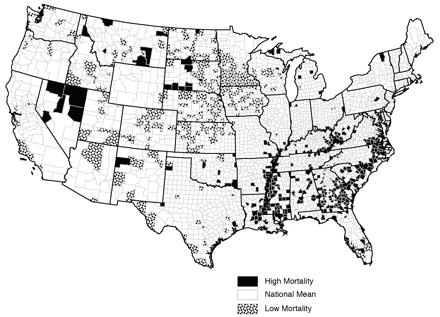
US counties that had high or low age-adjusted mortality rates in at least four of seven 5-year periods.
Note. Rates for Alaska and Hawaii were calculated, but they were not included in these analyses. Counties within 1 SD of the national average for 4 or more periods are shown in white. Counties with “high” mortality (black pattern) had mortality rates more than 1 SD greater than the US mean rate for at least 4 of the 7 (i.e., more than half) time periods. Counties with “low” mortality (black dotted pattern) had mortality rates more than 1 SD less than the US mean rate for at least 4 of the 7 time periods.
DISCUSSION
The same counties met the crieteria to be categorized as statistically significant high or low mortality rate counties compared with other counties. Patterns changed little across time, even when mapping each 5-year rate individually (data not shown). Because each time period represents a relative comparison, trend analyses were not appropriate.
The location of many counties with low mortality in the Upper Great Plains was an unexpected result. Despite economic decline and rapid outmigration, it was the healthiest region. In contrast, portions of the South, such as the southeastern United States, Appalachia, and the Mississippi Delta, had an expected pattern of high mortality while experiencing similar levels of population loss and economic contraction.
Our results extend analyses of general patterns of persistent clusters of mortality by another 5 years and mimic the spatial concentration of US mortality from previous time periods.6 This spatial autocorrelation (i.e., that those places close together are more similar than those that are far apart7) can be useful in analysis, but it violates the assumption of independent observations. Spatial autocorrelation that is not accounted for creates biased estimates and spurious significance levels.8
The United States has a persistent geographic pattern of county-level mortality rates spanning at least 35 years, consistent with earlier research.9 Mapping shows that these patterns have persisted despite regional population restructuring, advances in medicine, and policies aimed at alleviating socioeconomic inequality. Most interesting is the counterintuitive overlap in the sociodemographic characteristics of many counties with high or low mortality rates. Research on counties with high or low mortality indicated that a correlation exists between the percentage of Black people living in a county and high mortality rates in a county, but it is not particularly strong. No correlation was found between the percentage of Native Americans living in a county and counties with high mortality; the percentage of persons living in poverty in a county and outmigration rates also do not correlate highly.6
These findings underscore the importance of further investigation of “people versus place” in the study of mortality. Do population characteristics or environmental characteristics lead to spatial concentrations of mortality rates? Further analyses of other potential covariates may shed further light on the topic, but these results indicate that spatial autocorrelation must be explained by ecological mortality models. Policymakers also should be informed about where best to direct limited resources to specific unhealthy regions.
Acknowledgments
This study was funded by the Office of Rural Health Policy of the Department of Health and Human Services (grant 4-D1A-RH-00005-01-01) through the Rural Health Safety and Security Institute, Social Science Research Center, Mississippi State University.
We would like to thank Debra Street and 3 anonymous reviewers for comments on earlier drafts of the brief.
Note. The contents of this brief are solely the responsibility of the authors and do not necessarily represent the official views of the Office of Rural Health Policy.
Human Participant Protection No protocol approval was needed for this study.
Peer Reviewed
Contributors J. S. Cossman assisted in the analysis and led the writing of the brief. R. E. Cossman directed the calculations, mapping, and spatial analysis. W. L. James assisted in the calculation of mortality rates and mapped the results. C. R. Campbell assisted in the calculation of mortality rates and edited and formatted the brief. T. C. Blanchard assisted in the calculation and analysis of mortality rates and spatial patterns. A. G. Cosby originated the study and provided guidance.
References
- 1.Blanchard TC, Cossman JS, Levin ML. Multiple meanings of minority concentration: incorporating contextual explanations into the analysis of individual-level U.S. black mortality outcomes. Popul Res Policy Rev. 2004;23:309–326. [Google Scholar]
- 2.LeClere FB, Rogers RG, Peters K. Neighborhood social context and racial differences in women’s heart disease mortality. J Health Soc Behav. 1998;39:91–107. [PubMed] [Google Scholar]
- 3.US Department of Health and Human Services. Compressed Mortality File. Hyattsville, Md: National Center for Health Statistics. Available at: http://www.cdc.gov/nchs/products/elec_prods/subject/mcompres.htm. Accessed April 10, 2006.
- 4.James WL, Cossman RE, Cossman JS, Campbell C, Blanchard T. A brief visual primer for the mapping of mortality trend data. Int J Health Geogr. 2004;3:7. Available at: http://www.ij-healthgeographics.com/content/3/1/7. Accessed April 10, 2006. [DOI] [PMC free article] [PubMed] [Google Scholar]
- 5.Ormsby T, Napoleon E, Burke R, Groessl C, Feaster L. Getting to Know ArcGIS™ Desktop. Redlands, Calif: ESRI Press; 2001.
- 6.Cossman RE, Cossman JS, Jackson R, Cosby A. Mapping high or low mortality places across time in the United States: a research note on a health visualization and analysis project. Health Place. 2003;9: 361–369. [DOI] [PubMed] [Google Scholar]
- 7.Tobler WR. A computer movie simulating urban growth in the Detroit region. Econ Geogr. 1970;46: 234–240. [Google Scholar]
- 8.Meade M, Florin J, Gesler W. Vignette 7–3 spatial autocorrelation. In: Meade M, Florin J, Gesler W, eds. Medical Geography. New York, NY: Guilford Press; 1988:227–230.
- 9.Murray MA. The geography of death in the United States and the United Kingdom. Ann Assoc Am Geogr. 1967;57:301–314. [Google Scholar]