

Abstract
Recent publications have described and applied a novel metric that quantifies the genetic distance of an individual with respect to two population samples, and have suggested that the metric makes it possible to infer the presence of an individual of known genotype in a sample for which only the marginal allele frequencies are known. However, the assumptions, limitations, and utility of this metric remained incompletely characterized. Here we present empirical tests of the method using publicly accessible genotypes, as well as analytical investigations of the method's strengths and limitations. The results reveal that the null distribution is sensitive to the underlying assumptions, making it difficult to accurately calibrate thresholds for classifying an individual as a member of the population samples. As a result, the false-positive rates obtained in practice are considerably higher than previously believed. However, despite the metric's inadequacies for identifying the presence of an individual in a sample, our results suggest potential avenues for future research on tuning this method to problems of ancestry inference or disease prediction. By revealing both the strengths and limitations of the proposed method, we hope to elucidate situations in which this distance metric may be used in an appropriate manner. We also discuss the implications of our findings in forensics applications and in the protection of GWAS participant privacy.
Author Summary
In this report, we evaluate a recently-published method for resolving whether individuals are present in a complex genomic DNA mixture. Based on the intuition that an individual will be genetically “closer” to a sample containing him than to a sample not, the method investigated here uses a distance metric to quantify the similarity of an individual relative to two population samples. Although initial applications of this approach showed a promising false-negative rate, the accuracy of the assumed null distribution (and hence the true false-positive rate) remained uninvestigated; here, we explore this question analytically and describe tests of this method to assess the likelihood that an individual who is not in the mixture is mistakenly classified as being a member. Our results show that the method has a high false-positive rate in practice due to its sensitivity to underlying assumptions, limiting its utility for inferring the presence of an individual in a population. By revealing both the strengths and limitations of the proposed method, we elucidate situations in which this distance metric may be used in an appropriate manner in forensics and medical privacy policy.
Introduction
In the recently published article “Resolving Individuals Contributing Trace Amounts of DNA to Highly Complex Mixtures Using High-Density SNP Genotyping Microarrays” [1], the authors describe a method by which the presence of a individual with a known genotype may be inferred as being part of a mixture of genetic material for which marginal minor allele frequencies (MAFs), but not sample genotypes, are known.
The method [1] is motivated by the idea that the presence of a specific individual's genetic material will bias the MAFs of a sample of which they are part in a subtle but systematic manner, such that when considering multiple loci, the bias introduced by a specific individual can be detected even when his DNA comprises only a small fraction of the mixture. More generally, it is well known that samples of a population will exhibit slightly different MAFs due to sampling variance following a binomial distribution; the genotype of the individual in question contributes to this variation, and so may be “closer” to a sample containing him than to a sample which does not. Based on this intuition, the article [1] defines a genetic distance statistic to measure the distance of an individual relative to two samples, summarized as follows:
Consider an underlying population  from which two samples
  (of size
  ) and
) and  (of size
  ) are drawn independently and identically distributed (i.i.d.)
[in [1], these are referred to as
“reference” and “mixture”
respectively]. Consider now an additional sample
) are drawn independently and identically distributed (i.i.d.)
[in [1], these are referred to as
“reference” and “mixture”
respectively]. Consider now an additional sample  ; we wish to detect whether
  was drawn from
  , versus the null hypothesis that
  was drawn from
  independent of
  and
and  . Given the MAFs
  and
and  at locus
  for
for  and
and  , respectively, and given the MAFs
  for sample
  with
with  (corresponding to homozygous major, heterozygous, and homozygous
minor alleles) at each locus
(corresponding to homozygous major, heterozygous, and homozygous
minor alleles) at each locus  , [1] defines the relative distance of sample
  from
from  and
and  at
at  as:
as:
| (1) |
By assuming only independent loci are chosen and invoking the central
limit theorem for the large number of loci genotyped in modern studies, the article
[1]
asserts that the z-score of  across all loci will be normally distributed,
| (2) |
where  denotes the average over all SNPs
  ,
,  is the number of SNPs, and Equation 2 exploits the assumption
[1]
that an individual who is in neither
is the number of SNPs, and Equation 2 exploits the assumption
[1]
that an individual who is in neither  nor
nor  will be on average equidistant to both under the null hypothesis,
i.e.,
will be on average equidistant to both under the null hypothesis,
i.e.,  . Per Equation 2, the null hypothesis that
  is in neither
  nor
nor  is rejected for values of
  which exceed the quantiles of
  at the chosen significance level.
The article [1] proposes using this approach in a forensics context,
in which  is a mixture of genetic material of unknown composition (e.g.,
from a crime scene), and
is a mixture of genetic material of unknown composition (e.g.,
from a crime scene), and  is suspect's genotype; by choosing an appropriate
reference sample for group
is suspect's genotype; by choosing an appropriate
reference sample for group  , it is hypothesized that large, positive
  will be obtained for individuals whose genotypes are included in
  , and hence bias
  , while individuals whose genotypes are not in
  should have insignificant
  since they should intuitively be no more similar to the mixture
sample
since they should intuitively be no more similar to the mixture
sample  than they are to the reference sample
  . In [1], the authors applied this test to a multitude of
individuals
. In [1], the authors applied this test to a multitude of
individuals  , each of which are present in the samples constructed by them for
  or
or  , and report near-zero false negative rates. The article concludes
that it is possible to identify the presence of DNA of specific individuals within a
series of highly complex genomic mixtures, and that these “findings show a
clear path for identifying whether specific individuals are within a study based on
summary-level statistics.” In response, many GWAS data sources have
retracted the publicly available frequency data pending further study of this method
due to the concern that the privacy of study participants can be compromised.
However, because no samples absent from both
, and report near-zero false negative rates. The article concludes
that it is possible to identify the presence of DNA of specific individuals within a
series of highly complex genomic mixtures, and that these “findings show a
clear path for identifying whether specific individuals are within a study based on
summary-level statistics.” In response, many GWAS data sources have
retracted the publicly available frequency data pending further study of this method
due to the concern that the privacy of study participants can be compromised.
However, because no samples absent from both  and
and  were used, false positive rates—significant
  for individuals neither in
  nor
nor  —are not assessed in practice; rather, they are simply
assumed (Equation 2) to follow the nominal false-positive rate
—are not assessed in practice; rather, they are simply
assumed (Equation 2) to follow the nominal false-positive rate  given by quantiles of the standard normal.
The conclusion that  is comparable to a standard normal rests on several assumptions:
that
 ,
,  and
and  are all samples of the same underlying population
  ;
;that
 and
and  are similarly sized samples; and
that the SNPs
 used to compute
  are independent.
Because these assumptions are difficult to control in practice, the effect of
deviations from these assumptions is of interest. In this manuscript, we expand on
[1] by
investigating these effects both analytically and by applying Equations 1, 2 to null
samples (those present in neither  nor
nor  ). We also consider the accuracy of the classification when a
relative of
). We also consider the accuracy of the classification when a
relative of  is present in sample
  .
.
Our tests reveal a good separation of the distributions for positive (i.e., in  or
or  ) and null (in neither) samples, suggesting that a suprising amount
of information remains in pooled data. However, our results indicate that membership
classification via Equation 2 is sensitive to the underlying assumptions such that
the distribution for null samples does not follow
) and null (in neither) samples, suggesting that a suprising amount
of information remains in pooled data. However, our results indicate that membership
classification via Equation 2 is sensitive to the underlying assumptions such that
the distribution for null samples does not follow  , yielding misleadingly large
  for null samples. As a result, applying the method from [1] is tricky
in practice since additional information is often necessary to set appropriate
thresholds for significance. Finally, we conclude with a discussion of the
implications of our findings, both in forensics as well as regarding identification
of individuals contributing DNA in GWAS.
for null samples. As a result, applying the method from [1] is tricky
in practice since additional information is often necessary to set appropriate
thresholds for significance. Finally, we conclude with a discussion of the
implications of our findings, both in forensics as well as regarding identification
of individuals contributing DNA in GWAS.
Methods
We explore the performance of the method described in [1] both analytically and empirically. For the empirical studies, we attempt to classify sample genotypes derived from publicly available data sources in order to assess the chances that an individual is mistakenly classified into a group which does not contain his specific genotype.
Genotype data
2287 genotypes were obtained from the Cancer Genomic Markers of Susceptibility
(CGEMS) breast cancer study. The samples were sourced as described in [2].
Briefly, the samples comprised 1145 breast cancer cases and a comparable number
(1142) of matched controls from the participants of the Nurses Health Study. All
the participants were American women of European descent. The samples were
genotyped against the Illumina 550K arrays, which assays over 550,000 SNPs
across the genome. To assess the genetic identity shared between samples, we
computed the fraction of SNPs with identical alleles for all possible pairs of
individuals; none exceeded  .
.
Additionally, 90 genotypes of American individuals of European descent (CEPH) and 90 genotypes of Yoruban individuals were obtained from the HapMap Project [3]. In both cases, the 90 individuals were members of 30 family trios comprising two unrelated parents and their offspring. SNPs in common with those assayed by the CGEMS study and located on chromosomes 1–22 were kept in the analysis (sex chromosomes were excluded since the CGEMS participants were uniformly female); a total of 481,482 SNPs met these criteria.
Classification of genotypes
The method as described in [1] and summarized in the Introduction was implemented using R [4]. Subsets of the data
described above were used to construct pools  and
and  , using the remaining genotypes as test samples for which the
null hypothesis is true. A summary of the tests is provided in Table 1. In each test, SNPs
which did not achieve a minor allele frequency
, using the remaining genotypes as test samples for which the
null hypothesis is true. A summary of the tests is provided in Table 1. In each test, SNPs
which did not achieve a minor allele frequency  in both
  and
and  were excluded from the computation.
Table 1. Summary of tests performed.
 individuals individuals |
 population population |
 population population |
 distribution distribution |
100 CGEMS cases not in 
|
1042 CGEMS controls | 1045 CGEMS cases | Figure 1 |
100 CGEMS controls not in 
|
|||
| 90 HapMap CEPH | |||
| 90 HapMap YRI | |||
| HapMap YRI mothers 16–30 | HapMap YRI mothers 1–15 and fathers 1–15 | HapMap YRI children 1–15 and fathers 16–30 | Figure 2 |
| HapMap YRI children 16–30 | |||
| HapMap CEPH mothers 16–30 | HapMap CEPH mothers 1–15 and fathers 1–15 | HapMap CEPH children 1–15 and fathers 16–30 | Figure 2 |
| HapMap CEPH children 16–30 |
Summary of tests described. In the last four rows, the numbers refer to the families in the HapMap YRI and CEPH populations, such that child 1 is the offspring of mother 1 and father 1, et cetera.
Results
The assertion that  as given in Equation 2 follows a standard normal distribution
under the null hypothesis that
as given in Equation 2 follows a standard normal distribution
under the null hypothesis that  is in neither
  nor
nor  is based upon the assumptions that
 ,
,  and
and  are all samples of the same underlying population
  ;
; and
and  are similarly sized samples; and
the SNPs
 used to compute
  are independent.
We investigated the effect of deviation from these assumptions. A full treatment is
presented in Text
S1, and we summarize the results briefly here. In the case where  ,
,  , and
, and  are not samples of the same underlying population, the differences
in the minor allele frequencies of the source populations dominate
are not samples of the same underlying population, the differences
in the minor allele frequencies of the source populations dominate  such that deviations from zero are no longer attributable to the
subtle influence of Y's presence in
such that deviations from zero are no longer attributable to the
subtle influence of Y's presence in  or
or  . In the case where
  ,
,  , and
, and  are samples of the same population but
  and
and  are of differing sizes, the larger one will be a more
representative sample of the underlying population and hence closer, on average, to
a future sample
are of differing sizes, the larger one will be a more
representative sample of the underlying population and hence closer, on average, to
a future sample  . Both violations of assumptions 1 and 2 above will lead to
non-zero
. Both violations of assumptions 1 and 2 above will lead to
non-zero  for null samples. Considering that the difference in
  with and without the
  assumption in Equation 2 is
| (3) |
and that the number of SNPs  is on the order of
  , even slight deviations away from the assumed
  can have a pronounced effect when comparing
  against a standard normal as given by Equation 2. Equation 2 also
presumes that the SNPs are independent, such that the variance of the mean of
against a standard normal as given by Equation 2. Equation 2 also
presumes that the SNPs are independent, such that the variance of the mean of  can be estimated as
  in the denominator of Equation 2; as shown in Text S1, even a
slight average correlation amongst the SNPs (due, for instance, to linkage
disequilibrium) will cause the distribution of
in the denominator of Equation 2; as shown in Text S1, even a
slight average correlation amongst the SNPs (due, for instance, to linkage
disequilibrium) will cause the distribution of  in practice to be much wider than that assumed in Equation 2, once
again owing to the large number of SNPs considered. Because it appears that slight
deviations from the assumptions outlined above may have a strong effect on the
obtained
in practice to be much wider than that assumed in Equation 2, once
again owing to the large number of SNPs considered. Because it appears that slight
deviations from the assumptions outlined above may have a strong effect on the
obtained  values, the false-positive rate of the method proposed in [1] may in
practice be considerably higher than the nominal false-positive rate
values, the false-positive rate of the method proposed in [1] may in
practice be considerably higher than the nominal false-positive rate  given by quantiles of
  .
.
Empirical tests
To explore the performance of the method in realistic situations, we carried out
the computations described by Equations 1,2 for various  ,
,  , and
, and  as described in Table 1. Distributions of
  for each of the tests described in Table 1 are shown in the corresponding
figures listed in the table. We find that while the distributions of
in-F, in-G and in-neither values of
for each of the tests described in Table 1 are shown in the corresponding
figures listed in the table. We find that while the distributions of
in-F, in-G and in-neither values of  are distinct, calibrating thresholds for classifying an
unknown sample is difficult without additional information. This is due to the
fact that the distribution of
are distinct, calibrating thresholds for classifying an
unknown sample is difficult without additional information. This is due to the
fact that the distribution of  for null samples deviates strongly from a standard normal in
practice.
for null samples deviates strongly from a standard normal in
practice.
We begin first by considering a best-case situation in which  and
and  are both large samples of the same underlying population
  , and the samples to be classified are also from
  . Here, we randomly select 100 cases and 100 controls from
CGEMS to form an out-of-pool test sample set comprising 200 individuals, using
the remaining 1045 CGEMS cases and 1042 CGEMS controls as pools
. Here, we randomly select 100 cases and 100 controls from
CGEMS to form an out-of-pool test sample set comprising 200 individuals, using
the remaining 1045 CGEMS cases and 1042 CGEMS controls as pools  and
and  , respectively. (Several such random subsets were created; the
results were consistent and hence we present a single representative one.)
, respectively. (Several such random subsets were created; the
results were consistent and hence we present a single representative one.)  (Equation 1, 2) was computed for all the samples and compared
to a standard normal (
(Equation 1, 2) was computed for all the samples and compared
to a standard normal ( yields a nominal
  (p-value) of 0.05 and
  yields a nominal
  ). The sensitivity and specificities obtained are given in
Table 2.
). The sensitivity and specificities obtained are given in
Table 2.
Table 2. Empirical sensitivity and specificity for the tests shown in Figure 1 assuming  .
.
| 481,382 SNPs | 50,000 SNPs | |||

|

|

|

|
|
| Sensitivity | 99.8% | 97.5% | 96.3% | 36.3% |
| Specificity, 200 CGEMS | 31.0% | 70.5% | 79.0% | 99.5% |
| Specificity, 90 HapMap CEPH | 5.5% | 27.7% | 45.5% | 100.0% |
| Specificity, 90 HapMap YRI | 0.0% | 0.0% | 4.4% | 97.7% |
Classification results are given for two different nominal false
positive rates  and
and  .
.
Distributions of  values for all three groups of CGEMS samples are shown in
Figure 1A. Notably, the
distributions of in-F, in-G, and in-neither
samples are all quite distinct. For the positive samples (those in
values for all three groups of CGEMS samples are shown in
Figure 1A. Notably, the
distributions of in-F, in-G, and in-neither
samples are all quite distinct. For the positive samples (those in  or
or  ), the classifier performs fairly well, correctly classifying
2083 samples (and calling 4 as in neither
), the classifier performs fairly well, correctly classifying
2083 samples (and calling 4 as in neither  nor
nor  ). However, of the 200 test samples which were in neither
  nor
nor  , only 62 have
  ; the rate of false positives is thus 69% if
  is used as an indicator of group membership under the
assumptions in [1] at the nominal
is used as an indicator of group membership under the
assumptions in [1] at the nominal  (see Table
2).
(see Table
2).
Figure 1. Comparison of T distributions.

Comparison of T distributions for true positive and null
samples versus putative null distribution, starting with 481,382 SNPs in
(A,B) and 50,000 SNPs in (C,D). In all plots, true positive  (1042 CGEMS controls) is shown as a solid green curve,
true positive
(1042 CGEMS controls) is shown as a solid green curve,
true positive  (1045 CGEMS cases) is shown as a solid red curve, and
the putative null
(1045 CGEMS cases) is shown as a solid red curve, and
the putative null  is given as a thin grey curve. The dark and light grey
regions represent the areas for which the null hypothesis would be
accepted at
is given as a thin grey curve. The dark and light grey
regions represent the areas for which the null hypothesis would be
accepted at  and
and  , respectively. In plots (A,C), CGEMS test samples in
neither
, respectively. In plots (A,C), CGEMS test samples in
neither  nor
nor  (100 CGEMS cases and 100 CGEMS controls) are given by
a heavy black curve. The CGEMS case and CGEMS control distributions
within this group are shown as dashed red and green lines, respectively.
In plots (B,D),
(100 CGEMS cases and 100 CGEMS controls) are given by
a heavy black curve. The CGEMS case and CGEMS control distributions
within this group are shown as dashed red and green lines, respectively.
In plots (B,D),  distributions are given for HapMap CEPHs (cyan) and
YRIs (blue). Vertical lines mark the 0.05 and 0.95 quantiles of the
negative CGEMS samples (black), HapMap CEPHs (cyan), and HapMap YRIs
(blue).
distributions are given for HapMap CEPHs (cyan) and
YRIs (blue). Vertical lines mark the 0.05 and 0.95 quantiles of the
negative CGEMS samples (black), HapMap CEPHs (cyan), and HapMap YRIs
(blue).
Next, we consider a less ideal, yet probable, case in which the null samples are
not from the same underlying population  . Here, we leave
  and
and  as above, and apply Equation 1, 2 to 90 HapMap American
individuals of European descent (whom, one might assume, would be relatively
similar to the Americans of European descent comprising groups
as above, and apply Equation 1, 2 to 90 HapMap American
individuals of European descent (whom, one might assume, would be relatively
similar to the Americans of European descent comprising groups  and
and  ). A plot of the
  value distributions is given in cyan in Figure 1B. Again, there is little overlap
with the true positive distributions, but when comparing the
value distributions is given in cyan in Figure 1B. Again, there is little overlap
with the true positive distributions, but when comparing the  values against
  , the sensitivity is quite low (see Table 2). A yet more extreme case, in which
90 HapMap Yoruban individuals were classified with respect to
, the sensitivity is quite low (see Table 2). A yet more extreme case, in which
90 HapMap Yoruban individuals were classified with respect to  and
and  , results in a distribution of
  values that overlaps with the
  values from group
  (Figure
1B, blue curve) and exceedingly low specificity (Table 2). We thus see in practice a strong
dependence of
(Figure
1B, blue curve) and exceedingly low specificity (Table 2). We thus see in practice a strong
dependence of  upon the assumption that
  ,
,  , and
, and  are samples of the same population.
The reason for the high false-positive rates in practice despite the stringent
nominal false positive rate is clear from the plots Figure 1A and 1B: namely, it can be seen that
the putative null distribution (light grey line,  , cf Equation 2) does not correspond to the observed
distribution for samples for which the null hypothesis is correct, with
differences in both the location and width.
, cf Equation 2) does not correspond to the observed
distribution for samples for which the null hypothesis is correct, with
differences in both the location and width.
The overall shift in the location of the distributions is a result of violations
of the assumption that each sample  ,
,  , and
, and  are drawn on from the same underlying population
  . The magnitude of this effect is derived in Text S1 as
 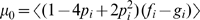 , where
  are the MAFs of the population from which
  is drawn (hence the different rightward shifts of the CGEMS,
CEPH, and YRI distributions). Because of the large number of SNPs
is drawn (hence the different rightward shifts of the CGEMS,
CEPH, and YRI distributions). Because of the large number of SNPs  in Equation 2, small deviations from
  are magnified; even ancestrally similar populations, such as
the 200 CGEMS test samples and the HapMap CEPHS, have different distributions of
are magnified; even ancestrally similar populations, such as
the 200 CGEMS test samples and the HapMap CEPHS, have different distributions of  .
.
The broadening of the  distribution is a result of correlation between SNPs. In
Equation 2, it is assumed that the variance of the mean of
distribution is a result of correlation between SNPs. In
Equation 2, it is assumed that the variance of the mean of  be estimable by the mean of the variance, ie,
 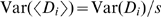 , which is true for independent SNPs. However, if there exists
average correlation
, which is true for independent SNPs. However, if there exists
average correlation  amongst the SNPs (due to linkage disequilibrium),
| (4) |
which can be quite large even for small average correlation  due to the high number
  of SNPs. The result of increased LD is a broader distribution
of
of SNPs. The result of increased LD is a broader distribution
of  values, as observed in Figure 1A and 1B: we observe a narrower
distribution of
values, as observed in Figure 1A and 1B: we observe a narrower
distribution of  for the HapMap YRI samples versus the Caucasian CGEMS
participants and HapMap CEPHs (the Yoruban individuals, who come from an older
population, have lower average LD).
for the HapMap YRI samples versus the Caucasian CGEMS
participants and HapMap CEPHs (the Yoruban individuals, who come from an older
population, have lower average LD).
The effect of LD on the distribution of  may be countered by selecting fewer SNPs; the results of this
approach can be seen in Figure 1C
and 1D and in Table
2. Here, 50,000 SNPs were selected, uniformly distributed across of the
may be countered by selecting fewer SNPs; the results of this
approach can be seen in Figure 1C
and 1D and in Table
2. Here, 50,000 SNPs were selected, uniformly distributed across of the  SNPs used in Figure 1A and 1B. 50,000 SNPs was shown in [1] to be a reasonable
lower bound to detect at nominal
SNPs used in Figure 1A and 1B. 50,000 SNPs was shown in [1] to be a reasonable
lower bound to detect at nominal  one individual amongst 1000, which is the concentration of
true positive individuals in this test. As is clear from Figure 1, reducing the number of SNPs narrows
the distributions considerably, yet at the same time brings them closer together
such that the crisp separation previously obtained is reduced. Using this
method, we see that the 200 CGEMS samples now have a distribution closer to that
of the putative null
one individual amongst 1000, which is the concentration of
true positive individuals in this test. As is clear from Figure 1, reducing the number of SNPs narrows
the distributions considerably, yet at the same time brings them closer together
such that the crisp separation previously obtained is reduced. Using this
method, we see that the 200 CGEMS samples now have a distribution closer to that
of the putative null  such that using a threshold of
  yields an improved—yet still larger than
nominal—21% false-positive rate while maintaining a high
96.3% true positive rate. However, the misclassification rate is
still over 50% for both HapMap samples, and improving these values
requires compromising the sensitivity, a direct result of the overlapping
yields an improved—yet still larger than
nominal—21% false-positive rate while maintaining a high
96.3% true positive rate. However, the misclassification rate is
still over 50% for both HapMap samples, and improving these values
requires compromising the sensitivity, a direct result of the overlapping  distributions for the
  and HapMap samples.
Despite the low sensitivities obtained in our tests, it is apparent from Figure 1 that the true
positive individuals have a significantly different distribution of  values than do the null samples, such that if appropriate
thresholds were selected the classification could be improved (note that in
practice, the distributions of the true positive individuals are unknown, since
reconstructing them requires full genotypes, not just the MAFs, of
values than do the null samples, such that if appropriate
thresholds were selected the classification could be improved (note that in
practice, the distributions of the true positive individuals are unknown, since
reconstructing them requires full genotypes, not just the MAFs, of  and
and  ). One simple apprach, motivated by the observed separation of
distributions in Figure 1,
would be to collect a set of presumed-null genotypes from which to estimate the
null
). One simple apprach, motivated by the observed separation of
distributions in Figure 1,
would be to collect a set of presumed-null genotypes from which to estimate the
null  distribution. Consider a situation in which we have
  and
and  , along with an individual
  who is one of the 200 CGEMS samples not in
  or
or  , but no other genotypes. We might reasonably turn to publicly
available HapMap genotypes as a group from which to construct an empirical null
distribution for setting thresholds. The lines in Figure 1A and 1C depict this case. Using the
0.05 and 0.95 quantiles obtained from the HapMap CEPH
, but no other genotypes. We might reasonably turn to publicly
available HapMap genotypes as a group from which to construct an empirical null
distribution for setting thresholds. The lines in Figure 1A and 1C depict this case. Using the
0.05 and 0.95 quantiles obtained from the HapMap CEPH  distribution (cyan bars) as thresholds improves the accuracy
relative to using
distribution (cyan bars) as thresholds improves the accuracy
relative to using  quantiles, but still incorrectly classifies half of the 200
CGEMS samples; the false positive rate is yet greater (and the true-positive
rate smaller) when using the HapMap YRI quantiles (blue bars). Likewise, roughly
a quarter of the HapMap CEPHs and the majority of HapMap YRIs lie outside the
thresholds set from the 200 CGEMS samples in Figure 1B and 1D.
quantiles, but still incorrectly classifies half of the 200
CGEMS samples; the false positive rate is yet greater (and the true-positive
rate smaller) when using the HapMap YRI quantiles (blue bars). Likewise, roughly
a quarter of the HapMap CEPHs and the majority of HapMap YRIs lie outside the
thresholds set from the 200 CGEMS samples in Figure 1B and 1D.
These examples, as well as the analytical results described in Text S1,
show that deviations from the assumptions that  ,
,  , and
, and  are i.i.d. samples of the same population
  can produce misleadingly large values of
  . While Equations 1, 2 produce good separation of the
  ,
,  and null sample distributions, appropriately calibrating the
thresholds for classification is difficult in practice.
and null sample distributions, appropriately calibrating the
thresholds for classification is difficult in practice.
Classification of relatives
We briefly consider the classification of individuals who are relatives of true positives. This can be investigated by using HapMap trios, since we can reasonably expect that the children will bear a greater resemblance to their parents than their parents do to one another. Recalling that the HapMap pools consist of thirty individual mother-father-offspring pedigrees, we construct pools as follows:
 = Mothers from
pedigrees 1–15 and fathers from pedigrees
1–15
= Mothers from
pedigrees 1–15 and fathers from pedigrees
1–15 = Children from
pedigrees 1–15 and fathers from pedigrees
16–30
= Children from
pedigrees 1–15 and fathers from pedigrees
16–30
and then compute  for mothers and children from pedigrees 16–30
using the same SNP criteria as before. The results of these tests for both
the CEPH and YRI pedigrees, given in Figure 2, are as expected, with the
children having a significantly higher distribution of
for mothers and children from pedigrees 16–30
using the same SNP criteria as before. The results of these tests for both
the CEPH and YRI pedigrees, given in Figure 2, are as expected, with the
children having a significantly higher distribution of  than the mothers; the
  values for all the children were so large that
p-values
values for all the children were so large that
p-values  were obtained when comparing to
  . By contrast, 5/15 of the YRI mothers from pedigrees
16–30 and 10/15 of the CEPH mothers from pedigrees 16–30
yielded
. By contrast, 5/15 of the YRI mothers from pedigrees
16–30 and 10/15 of the CEPH mothers from pedigrees 16–30
yielded  (with distributions roughly centered about
  ). The wider distribution amongst the CEPHS again reflects
the effect of LD. In Figure
2 we can see that the method has the power to resolve three groups:
those in a group, those related to members of a group, and those who are
neither. Note, however, that without having the distribution of
). The wider distribution amongst the CEPHS again reflects
the effect of LD. In Figure
2 we can see that the method has the power to resolve three groups:
those in a group, those related to members of a group, and those who are
neither. Note, however, that without having the distribution of  for true positives (which necessitates knowing the
genotypes of true positives), it is not clear that setting a threshold to
distinguish between true positives and their relatives is possible.
for true positives (which necessitates knowing the
genotypes of true positives), it is not clear that setting a threshold to
distinguish between true positives and their relatives is possible.
Figure 2. Distribution of T.

Distributions of T for out-of-group samples who are
related (red line) and unrelated (blue line) to individuals in
G for HapMap YRI (A) and HapMap CEPH (B)
populations. (C) and (D) show the same distributions as (A) and (B)
respectively, with the addition (green line) of individuals who are
in G and unrelated to F (i.e.,
true positives). Dashed black lines indicate the T
significance thresholds of ±1.64 at nominal  .
.
Positive predictive value of the method
The effect of the modest specificity—even in the best of cases
described above—on the posterior probability that the individual  is in
is in  or
or  is considerable, given that the prior probability is
likely to be relatively small in most applications of this method. Let us
consider the positive predictive value (PPV), which quantifies the post-test
probability that an individual
is considerable, given that the prior probability is
likely to be relatively small in most applications of this method. Let us
consider the positive predictive value (PPV), which quantifies the post-test
probability that an individual  with a positive result (i.e., significant
  ) is in
  or
or  . This probability depends on the prior probability that
the individual is in
. This probability depends on the prior probability that
the individual is in  or
or  , i.e., on the prevalence of being a member of
  or
or  . PPV follows directly from Bayes' theorem, and is
defined as
. PPV follows directly from Bayes' theorem, and is
defined as
| (5) |
where the PPV is the posterior probability that  is in
is in  given a prior probability of
  . We can write this equivalently in terms of the positive
likelihood ratio
. We can write this equivalently in terms of the positive
likelihood ratio  ,
,
| (6) |
| (7) |
A plot of PPV vs. prevalence is given in Figure 3. Even with the best sensitivity
(96.3%) and specificity (79%) obtained in Table 2—that
in which  ,
,  , and
, and  were strictly drawn on the same underlying population
  ,
,  SNPs were used, and a nominal
  was used as a threshold—the prior probability
(prevalence) of
was used as a threshold—the prior probability
(prevalence) of  being in
  needs to exceed 66% in order to achieve a
90% post-test probability that the subject is in
needs to exceed 66% in order to achieve a
90% post-test probability that the subject is in  . For a PPV of 99%, the prior probability needs
to exceed 72% for any specificity under 95%, assuming
the observed sensitivity of 99%. The low specificities obtained
in practice thus require a strong prior belief that
. For a PPV of 99%, the prior probability needs
to exceed 72% for any specificity under 95%, assuming
the observed sensitivity of 99%. The low specificities obtained
in practice thus require a strong prior belief that  is in
is in  or
or  .
.
Figure 3. Positive predictive value (PPV) as a function of prevalence and specificity given 99% sensitivity.

In (A), PPV is shown on the y axis and color corresponds to specificity. The black curve depicts the 87% sensitivity line—the best sensitivity obtained in the empirical tests in Table 2. In (B), PPV is shown by color, and the y axis corresponds to specificity.
The difference between the empirical false-positive rate and the nominal
false-positive rate based on the standard normal has a strong effect on the
posterior probabilities. Consider that  at 87% specificity and 99%
sensitivity is 7.6, versus 990000 if the nominal false-positive rate
at 87% specificity and 99%
sensitivity is 7.6, versus 990000 if the nominal false-positive rate  were correct. For prior probability of 1/1000, the first
case yields a posterior probability of 1.1/1000, while the second yields a
posterior probability of 998/1000. These differences, which are difficult to
measure without additional, well-matched null sample genotypes and which
depend strongly on the degree to which the assumptions underlying the method
are met (consider the differences between the CGEMS and HapMap CEPH
specificities in Table
2), pose a severe limitation on the utility of using Equations 1,2 to
resolve Y's membership in samples
were correct. For prior probability of 1/1000, the first
case yields a posterior probability of 1.1/1000, while the second yields a
posterior probability of 998/1000. These differences, which are difficult to
measure without additional, well-matched null sample genotypes and which
depend strongly on the degree to which the assumptions underlying the method
are met (consider the differences between the CGEMS and HapMap CEPH
specificities in Table
2), pose a severe limitation on the utility of using Equations 1,2 to
resolve Y's membership in samples  or
or  .
.
Discussion
In this work, we have further characterized and tested the genetic distance metric
initially proposed in [1]. This metric, summarized here by Equations 1,2,
quantifies the distance of an individual genotype  with respect to two samples
  and
and  using the marginal minor allele frequencies
  and
and  of the two samples and the genotype
  . The article [1] proposes to use this metric to infer the presence
of the individual in one of the two samples, and the authors demonstrate the utility
of their classifier on known positive samples (i.e., samples which are in either
. The article [1] proposes to use this metric to infer the presence
of the individual in one of the two samples, and the authors demonstrate the utility
of their classifier on known positive samples (i.e., samples which are in either  or
or  ) showing that in this situation their method yields
classifications of high sensitivity. Our investigations confirm that the sensitivity
is quite high (correctly classifying true positives into groups
) showing that in this situation their method yields
classifications of high sensitivity. Our investigations confirm that the sensitivity
is quite high (correctly classifying true positives into groups  and
and  ) and that in-F, in-G, and null
samples have distinct distributions of
) and that in-F, in-G, and null
samples have distinct distributions of  values. However, we also find that the distribution of
  for null samples does not follow the presumed standard normal, and
thus the specificity is considerably less than that predicted by the quantiles of
the putative null distribution
for null samples does not follow the presumed standard normal, and
thus the specificity is considerably less than that predicted by the quantiles of
the putative null distribution  . Calibrating a more accurate set of thresholds is difficult in
practice, limiting the utility of Equations 1, 2 to positively identify
Y's presence in samples
. Calibrating a more accurate set of thresholds is difficult in
practice, limiting the utility of Equations 1, 2 to positively identify
Y's presence in samples  or
or  .
.
In this work we have shown that high  values, significant when compared against
  , may be obtained for samples that are in neither of the pools due
to violations of the assumptions that
, may be obtained for samples that are in neither of the pools due
to violations of the assumptions that  ,
,  and
and  are all samples of the same underlying population; that
  and
and  are similarly sized samples; and that the SNPs
  used to compute
  are independent. The high false positive rates in Table 2 result from deviations
of the first and third assumptions. These assumptions are difficult to meet; for
instance, HapMap CEPH and CGEMS samples are sufficiently dissimilar that the HapMap
CEPH samples exhibit greater deviation from violations of the first assumption,
despite the fact that both samples are Americans of European descent. Additionally,
the conclusion that high
are independent. The high false positive rates in Table 2 result from deviations
of the first and third assumptions. These assumptions are difficult to meet; for
instance, HapMap CEPH and CGEMS samples are sufficiently dissimilar that the HapMap
CEPH samples exhibit greater deviation from violations of the first assumption,
despite the fact that both samples are Americans of European descent. Additionally,
the conclusion that high  values result from Y's presence in
  relies upon the questionable assumption that individuals in
neither
relies upon the questionable assumption that individuals in
neither  nor
nor  will be equidistant from both, resulting in false positives for
relatives of true positive individuals, even when the other assumptions are met.
will be equidistant from both, resulting in false positives for
relatives of true positive individuals, even when the other assumptions are met.
The low false positive rate in practice, resulting from the difficulty in accurately
calibrating the significance of  , results in a likelihood ratio (and hence post-test probability)
that is also low. When the prior probability of Y's
presence in
, results in a likelihood ratio (and hence post-test probability)
that is also low. When the prior probability of Y's
presence in  or
or  is modest, strong evidence (i.e., high specificity) is needed to
outweigh this prior, which was not achieved in our tests. On the other hand, when
samples were known a priori to be in one of the groups
F/G, Equations 1,2 correctly identify the
sample of which the individual is part.
is modest, strong evidence (i.e., high specificity) is needed to
outweigh this prior, which was not achieved in our tests. On the other hand, when
samples were known a priori to be in one of the groups
F/G, Equations 1,2 correctly identify the
sample of which the individual is part.
These findings have implications both in forensics (for which the method [1] was proposed) and GWAS privacy (which has become a topic of considerable interest in light of [1]). We briefly consider each:
Forensics implications
The stated purpose [1] of the method—namely, to positively
identify the presence of a particular individual in a mixed pool of genetic data
of unknown size and composition—is difficult to achieve. In this
scenario, we have  (from forensic evidence) and a suspect genotype
  . To apply the method, we would need 1) to assume that
  and
and  are indeed i.i.d. samples of the same population
  ; 2) to obtain a sample
  which is also a sample of the underlying
population
which is also a sample of the underlying
population  , well-matched in size and composition to
  ; 3) to obtain an estimate of the sample size of
  such that sample-size effects can be appropriately discounted
(see Text
S1); and 4) to assume that the p-values at the selected
classification thresholds are accurate. The high false-positive rates which
result from even small violations of these criteria make it exceedingly likely
that an innocent party will be wrongly identified as suspicious; it is even more
likely for a relative of an individual whose DNA is present in
such that sample-size effects can be appropriately discounted
(see Text
S1); and 4) to assume that the p-values at the selected
classification thresholds are accurate. The high false-positive rates which
result from even small violations of these criteria make it exceedingly likely
that an innocent party will be wrongly identified as suspicious; it is even more
likely for a relative of an individual whose DNA is present in  .
.
GWAS privacy implications
Here the scenario of concern is that of a malefactor with the genotype of one (or
many) individuals, and access to the case and control MAFs from published
studies; could the malefactor use this method to discern whether one of the
genotypes in his possession belongs to a GWAS subject? In this case,  and
and  are known to be samples of the same underlying population
  (due to the careful matching in GWAS), and their sample sizes
are large and known. However, the malefactor still needs 1) to assure that
(due to the careful matching in GWAS), and their sample sizes
are large and known. However, the malefactor still needs 1) to assure that  is a member of this population as well (as shown by the poor
results when HapMap samples were classified using CGEMS MAFs) and 2) to assume
that the p-values at the selected classification thresholds are
accurate. Additionally, the prior probability that any of the genotypes in the
malefactor's possession comes from a GWAS subject is likely to be quite
small, since GWAS samples are a tiny fraction of the population from which they
are drawn. Even if the malefactor were able to narrow down the prior probability
to one in three, a sensitivity of 99% and a specificity of
95% is needed to obtain a 90% posterior probability that
the individual is truly a participant.
is a member of this population as well (as shown by the poor
results when HapMap samples were classified using CGEMS MAFs) and 2) to assume
that the p-values at the selected classification thresholds are
accurate. Additionally, the prior probability that any of the genotypes in the
malefactor's possession comes from a GWAS subject is likely to be quite
small, since GWAS samples are a tiny fraction of the population from which they
are drawn. Even if the malefactor were able to narrow down the prior probability
to one in three, a sensitivity of 99% and a specificity of
95% is needed to obtain a 90% posterior probability that
the individual is truly a participant.
On the other hand, if the malefactor does have prior knowledge
that the individual  participated in a certain GWAS but does not know
Y's case status, Equations 1, 2 permit the malefactor
to discover with high accuracy which group
participated in a certain GWAS but does not know
Y's case status, Equations 1, 2 permit the malefactor
to discover with high accuracy which group  was in. Additionally, in the case of a priori
knowledge, the participant's genotype is not strictly necessary, since
a relative's DNA will yield a large
was in. Additionally, in the case of a priori
knowledge, the participant's genotype is not strictly necessary, since
a relative's DNA will yield a large  score that falls on the appropriate
  side of null.
Despite these limitations, we observe that the distributions of  values for in-F, in-G, and
null samples separate strongly, suggesting that each individual contributes a
pattern of allele frequencies that remains in the pooled data. While calibrating
thresholds to distinguish these distributions without additional information is
not presently possible, the potential for more sophisticated methods to overcome
these barriers cannot be discounted and presents an avenue for future work.
values for in-F, in-G, and
null samples separate strongly, suggesting that each individual contributes a
pattern of allele frequencies that remains in the pooled data. While calibrating
thresholds to distinguish these distributions without additional information is
not presently possible, the potential for more sophisticated methods to overcome
these barriers cannot be discounted and presents an avenue for future work.
Moreover, we believe that the distance metric (Equations 1, 2) as presented may
still have forensic and research utility. It is clear from both our studies and
the original paper [1] that the sensitivity is quite high; in the
(rare) case that a sample has an insignificant  , it is very likely that
  is in neither
  nor
nor  . We can also see that genetically distinct groups have
  distributions with little overlap (Figure 1), and so it may be worth
investigating the utility of Equations 1,2 for ancestry inference.
distributions with little overlap (Figure 1), and so it may be worth
investigating the utility of Equations 1,2 for ancestry inference.
On this note, let us once more consider the quantity which Equation 1 measures,
namely the distance of  from
from  relative to the distance of
  from
from  . Referring to Figure 1A and 1C, we can see that samples
  which are more like those in sample
  have a distribution that lies to the right of samples which
are more similar to
have a distribution that lies to the right of samples which
are more similar to  , as expected; that is, in Figure 1A and 1C, the distribution of null
(not in
, as expected; that is, in Figure 1A and 1C, the distribution of null
(not in  ) CGEMS cases (dashed red line) is shifted to the right with
respect to the distribution of null CGEMS controls, as might be expected from
Equation 1, i.e., the CGEMS case Ys are closer to CGEMS case
Gs than are the CGEMS control Ys. Although
this difference is not statistically significant, one could imagine that it may
be possible to select SNPs for which the shift is significant, i.e., a selection
of SNPs for which unknown cases are statistically more likely to be closer (via
Equation 1) to the cases in
) CGEMS cases (dashed red line) is shifted to the right with
respect to the distribution of null CGEMS controls, as might be expected from
Equation 1, i.e., the CGEMS case Ys are closer to CGEMS case
Gs than are the CGEMS control Ys. Although
this difference is not statistically significant, one could imagine that it may
be possible to select SNPs for which the shift is significant, i.e., a selection
of SNPs for which unknown cases are statistically more likely to be closer (via
Equation 1) to the cases in  and unknown controls are statistically more likely to be
closer to the controls in
and unknown controls are statistically more likely to be
closer to the controls in  . In this case, a subset of SNPs known to be associated with
disease may potentially be used with Equations 1, 2 to predict the case status
of new individuals; conversely, finding a subset of SNPs which produce
significant separations of the test samples may be indicative of a group of SNPs
which play a role in disease. Because this type of application would use fewer
SNPs and would involve the comparison of two distributions of
. In this case, a subset of SNPs known to be associated with
disease may potentially be used with Equations 1, 2 to predict the case status
of new individuals; conversely, finding a subset of SNPs which produce
significant separations of the test samples may be indicative of a group of SNPs
which play a role in disease. Because this type of application would use fewer
SNPs and would involve the comparison of two distributions of  (cases
  vs. controls
  ), it may be possible to circumvent some of the problems
stemming from the unknown width and location of the null distribution described
above; still, much work is needed to investigate this possible application. If
successful, the metric proposed in [1], while failing to
function as a tool to positively identify the presence of a specific
individual's DNA in a finite genetic sample, may if refined be a useful
tool in the analysis of GWAS data.
), it may be possible to circumvent some of the problems
stemming from the unknown width and location of the null distribution described
above; still, much work is needed to investigate this possible application. If
successful, the metric proposed in [1], while failing to
function as a tool to positively identify the presence of a specific
individual's DNA in a finite genetic sample, may if refined be a useful
tool in the analysis of GWAS data.
Supporting Information
Di and T under the null hypothesis.
(0.22 MB PDF)
Footnotes
The authors have declared that no competing interests exist.
This research was supported by the Intramural Research Program of the National Cancer Institute, National Institutes of Health, Bethesda, MD. RB was supported by the Cancer Prevention Fellowship Program, National Cancer Institute, National Institutes of Health, Bethesda, MD. The funders had no role in study design, data collection and analysis, decision to publish, or preparation of the manuscript.
References
- 1.Homer N, Szelinger S, Redman M, Duggan D, Tembe W, et al. Resolving individuals contributing trace amounts of DNA to highly complex mixtures using high-density SNP genotyping microarrays. PLoS Genet. 2008;4:e1000167. doi: 10.1371/journal.pgen.1000167. doi: 10.1371/journal.pgen.1000167. [DOI] [PMC free article] [PubMed] [Google Scholar]
- 2.Hunter DJ, Kraft P, Jacobs KB, Cox DG, Yeager M, et al. A genome-wide association study identifies alleles in FGFR2 associated with risk of sporadic postmenopausal breast cancer. Nat Genet. 39:870–874. doi: 10.1038/ng2075. [DOI] [PMC free article] [PubMed] [Google Scholar]
- 3.The International HapMap Consortium. The International HapMap Project. Nature. 426:789–796. doi: 10.1038/nature02168. [DOI] [PubMed] [Google Scholar]
- 4.R Development Core Team. A language and environment for statistical computing. Vienna, Austria: 2004. [Google Scholar]
Associated Data
This section collects any data citations, data availability statements, or supplementary materials included in this article.
Supplementary Materials
Di and T under the null hypothesis.
(0.22 MB PDF)