Abstract
Objectives
To compare the extent to which late 20th century patterns of mortality in London are predicted by contemporary patterns of poverty and by late 19th century patterns of poverty. To test the hypothesis that the pattern of mortality from causes known to be related to deprivation in early life can be better predicted by the distribution of poverty in the late 19th century than by that in the late 20th century.
Design
Data from Charles Booth's survey of inner London in 1896 were digitised and matched to contemporary local government wards. Ward level indices of relative poverty were derived from Booth's survey and the 1991 UK census of population. All deaths which took place within the surveyed area between 1991 and 1995 were identified and assigned to contemporary local government wards. Standardised mortality ratios for various causes of death were calculated for each ward for all ages, under age 65, and over age 65. Simple correlation and partial correlation analysis were used to estimate the contribution of the indices of poverty from 1896 and 1991 in predicting ward level mortality ratios in the early 1990s.
Setting
Inner London.
Results
For many causes of death in London, measures of deprivation made around 1896 and 1991 both contributed strongly to predicting the current spatial distribution. Contemporary mortality from diseases which are known to be related to deprivation in early life (stomach cancer, stroke, lung cancer) is predicted more strongly by the distribution of poverty in 1896 than that in 1991. In addition, all cause mortality among people aged over 65 was slightly more strongly related to the geography of poverty in the late 19th century than to its contemporary distribution.
Conclusions
Contemporary patterns of some diseases have their roots in the past. The fundamental relation between spatial patterns of social deprivation and spatial patterns of mortality is so robust that a century of change in inner London has failed to disrupt it.
Introduction
“They [left the busy scene, and] went into an obscure part of the town, where Scrooge had never penetrated before, although he recognised its situation, and its bad repute. The ways were foul and narrow; the shops and houses wretched; the people half-naked, drunken, slip-shod, ugly. Alleys and archways, like so many cesspools, disgorged their offences of smell, and dirt, and life, upon the straggling streets; and the whole quarter reeked with crime, with filth, and misery.”1
With these words Charles Dickens describes Scrooge's journey with the Spirit of Christmas Yet to Come into the poorest streets of London to view the body of Tiny Tim, the child his miserliness will kill if it continues unchecked. Dickens's A Christmas Carol also helped open the eyes of non-fictitious Londoners to the extent of poverty in their city at a time when social views were rapidly changing. Charles Booth was a contemporary chronicler of fact rather than fiction; together with his researchers he surveyed these same streets so that we can see today where the Tiny Tims of the past lived. Using Booth's map of poverty at the end of the 19th century we test the hypothesis of the Spirit of Christmas Yet to Come: that miserliness in the past and present leads to future inequalities in health.
Today, poverty at all stages of life is implicated in determining the risk of mortality,2 and relationships between the spatial distribution of poverty and mortality are well known and robust.3 It is also clear that there are specific relationships between adverse circumstances in childhood and the subsequent risk of particular causes of death in adulthood.4 We seek to illustrate here one example of where the spirits of Christmases past—even those before childhood—have a strong influence on inequalities in health today.
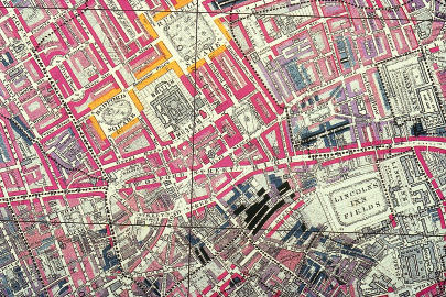
Charles Booth's study of poverty in London was published between 1889 and 1903 in 17 volumes under the title of Life and Labour of the People of London.5–19 Booth's survey covered over 120 000 households, an area bounded by Pentonville prison to the north, Millwall docks to the east, Stockwell smallpox hospital to the south, and Kensington Palace to the west. The information that Booth and his 20 researchers collected was projected on to a series of detailed and exact maps,the most important of which was the Descriptive Map of London Poverty (see fig 1).20 This map shows the streets of London, building by building, coloured to correspond to a classification of the resident population of the time. Booth's seven category classification scheme is described in table 1.
Figure 1.
Detail of Booth's map of London poverty.20 Yellow indicates the highest social class, black the lowest
Table 1.
Booth's classes (1896) and registrar general's classes (1991)
| Colour on 1896 map | Booth's description | % of households in 1896 | Equivalent registrar general's class | % of households in 1991* | 1896 SEP indicator† | 1991 SEP indicator† |
|---|---|---|---|---|---|---|
| Black | Lowest class; vicious, semi-criminal | 1.5 ‡ | ||||
| Blue | Very poor; casual labour, chronic want | 3.7 ‡ | V§ | 6.9 | 0.937 | 0.965 |
| Light blue | Poor; 18-21 shillings a week for a moderate family | 7.4 ‡ | ||||
| Purple | Mixed; some comfortable, others poor | 16.2 | IV | 12.8 | 0.794 | 0.867 |
| Pink | Fairly comfortable; good ordinary earnings | 35.2 | III | 33.8 | 0.537 | 0.634 |
| Red | Well to do; middle class | 27.7 | II | 37.3 | 0.223 | 0.278 |
| Yellow | Wealthy; upper middle and upper classes | 8.4 | I | 9.2 | 0.042 | 0.046 |
Excludes households with no social class allocation in the 1991 census (those described as in the army, inadequately described, and others without a social class).
Socioeconomic position indicators are cumulative proportions: for class I, (I/2)/(I+II+III+IV+V); for class II, (I+II/2)/(I+II+III+IV+V); for class III, (I+II+III/2)/(I+II+III+IV+V); for class IV, (I+II+III+IV/2)/(I+II+III+IV+V); for class V, (I+II+III+IV+V/2)/(I+II+III+IV+V).
Poor families made up 12.6% of households in 1896.
Includes people of working age who have not worked in the last 10 years.
This area of London was surveyed again in 1991 as part of the UK census of population. The registrar general's social classification scheme used in the census is similar to Booth's scheme21; indeed the former was in part derived from Booth's work.22–24 The similarity between the two schemes makes it possible to derive a hybrid which can be used as the basis for comparison between the two time periods. Table 1 shows how these two classification schemes fit together.
Method
To create an empirical measure of Dickens's fictitious description of 19th century London, Booth's map was digitised and its street by street data aggregated to contemporary ward boundaries using a geographical information system. Wards are administrative areal units used in UK local government. Booth's survey area included 104 complete modern wards and the major part of 28 additional wards. The distribution of household social class within each ward was calculated for both 1896 and 1991.
A ward index of poverty was calculated by computing the proportion of households in each social class, weighting that proportion by the relative position of the class in the social hierarchy of the time, and summing the weighted proportions. The index of poverty thus assumes (as Booth showed) that social class is a proxy for poverty and that the extent of poverty in a class is related to its position within the class hierarchy. The extent of poverty within a class has thus been estimated using the number of people in higher social classes. The index for a particular ward is:
Ward Poverty Index=
(I*wI+II*wII+III*wIII+IV*wIV+V*wV)/
(I+II+III+IV+V)
where I is the number of households in class I in the ward at that time and wI is the socioeconomic position indicator associated with that class shown in table 1. This indicator relates to the proportion of the population that is at a higher socioeconomic level than the midpoint of the group. For 1991, 9.2% of households are in social class I, so 4.6% of them are above the midpoint of this category and the indicator is 0.046; 37.3% of households are in social class II and it is assumed that all social class I households and half of social class II households are at a higher socioeconomic level than the midpoint of this group. Thus the indicator for social class II households is 0.092+0.186=0.278. Similar logic is applied to calculation of the indicators for social classes III to V. The formulas to calculate indicators of socioeconomic position are given in the footnote to table 1.
The index was low (approaching 0) in areas where large numbers of the resident households were in more affluent social classes and high in areas where they were in less affluent social classes. Similar logic was applied to calculation of the 1896 indicators. The use of such indicators takes into account the fact that the distributions of socioeconomic groups in 1896 and 1991 were different (such indicators have been widely used in inequalities in health research25–27). This index measures level of affluence for each ward in the study area and not inequality within them.
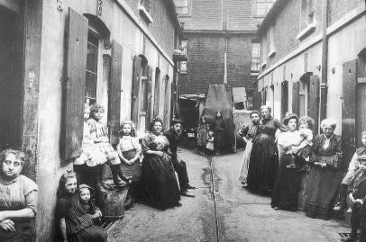
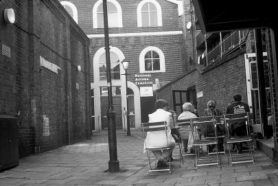
Figure 2 shows two images of Providence Place in Islington, north London, taken more than 100 years apart. Note how the number of people has fallen, as it has fallen in London as a whole over this period, and that the open drain has been covered. However, the social position of Providence Place in the geographical ranking of London streets remains much the same.
Figure 2.
Providence Place, Islington, c1900 (left) and 2000 (right)
We compared the relative predictive power of the two poverty measures as they varied for specific causes of death and for different age groups. In particular, stroke and stomach cancer, as causes shown to be related to deprivation in early life, may be better predicted by a historical poverty measure.5,28 Age and sex standardised mortality ratios for each ward were thus calculated for the causes of death shown in table 2 and for all deaths which took place between 1991 and 1995. The analysis comprised simple weighted and partial correlations in which ward mortality ratios were predicted by the two measures of poverty. The population of each ward provided the weights. Partial correlation analysis was also used to ascertain the extent to which predictive power was duplicated between the indices. All analyses were carried out in SPSS.
Table 2.
Strength of relation between poverty in 1896 (Booth index) and 1991 (modern index) and standardised mortality ratios for all ages for deaths in 1991-5
| Correlation of Booth index and mortality
|
Partial correlation of Booth index and mortality (controlling for modern index)
|
Correlation of modern index and mortality
|
Partial correlation of modern index and mortality (controlling for Booth index)
|
||||||||
|---|---|---|---|---|---|---|---|---|---|---|---|
| r value | P value | r value | P value | r value | P value | r value | P value | ||||
| All causes | 0.56 | <0.001 | 0.22 | 0.012 | 0.60 | <0.001 | 0.35 | <0.001 | |||
| Coronary heart disease | 0.58 | <0.001 | 0.21 | 0.015 | 0.65 | <0.001 | 0.41 | <0.001 | |||
| Stroke | 0.40 | <0.001 | 0.22 | 0.013 | 0.36 | <0.001 | 0.11 | 0.20 | |||
| All cardiovascular disease | 0.56 | <0.001 | 0.20 | 0.023 | 0.61 | <0.001 | 0.37 | <0.001 | |||
| Chronic obstructive pulmonary disease | 0.58 | <0.001 | 0.24 | 0.005 | 0.61 | <0.001 | 0.35 | <0.001 | |||
| Pneumonia | 0.26 | 0.002 | 0.07 | 0.45 | 0.30 | <0.001 | 0.17 | 0.055 | |||
| Lung cancer | 0.61 | <0.001 | 0.30 | 0.001 | 0.62 | <0.001 | 0.33 | <0.001 | |||
| Stomach cancer | 0.49 | <0.001 | 0.24 | 0.007 | 0.47 | <0.001 | 0.20 | 0.020 | |||
| Accidents and suicide | 0.05 | 0.56 | −0.14 | 0.10 | 0.21 | 0.012 | 0.24 | 0.005 | |||
Results
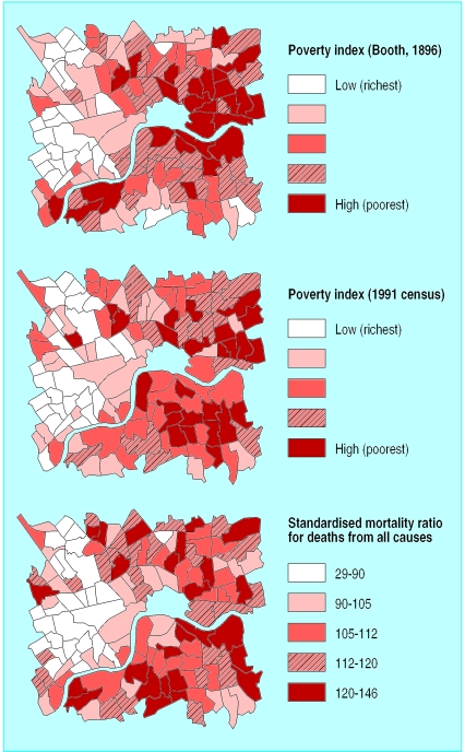
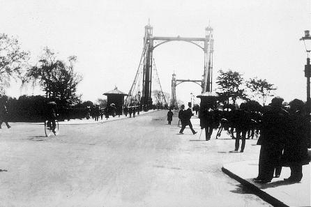
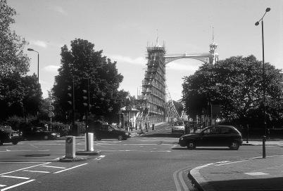
Figure 3 shows three maps of the study area in inner London, allowing a comparison of the geography of poverty in the late 19th century (top) with that in the late 20th century (middle) and with mortality ratios for all causes for all ages (bottom). The correlation coefficient between the two measures is 0.73 (P<0.001). The blank area in the middle of the maps marks the City of London, which was not surveyed by Charles Booth. Figure 3 shows that there has been little change in the distribution of poverty in inner London between the 19th and 20th centuries. Areas in which some groups of immigrants settled in the middle of the 20th century have moved down the social scale slightly, notably south of the River Thames, while others have gentrified. On the whole, though, affluent places have remained affluent and poor places have remained relatively poor—two images of the Albert Bridge 100 years apart (fig 4) show part of the reason for this continuity—the perseverance of transport infrastructure. The map of all age ratios, showing all cause mortality, demonstrates the close relation between poverty and mortality.
Figure 3.
London poverty in 1896 (top) and 1991 (middle) and mortality in the 1990s (bottom)
Figure 4.
Albert Bridge, Chelsea c1900 (top) and 2000 (bottom). The main change is that the trees have grown: 100 years is long in the lifespan of humans but not in that of a city
Table 2 shows the simple and partial correlations between the poverty measures and the standardised mortality ratios for 1991-5. Both indices of poverty were related to all cause ratios. The partial correlation coefficients in the table also show that the index of poverty derived from Booth's 19th century observations (Booth index) contributed more to predicting deaths from stroke and stomach cancer in the late 20th century than that derived from the 1991 census (modern index). For other causes of death, the modern index contributed more.
The results of further correlation analyses suggest that for deaths under the age of 65 the modern index makes a slightly greater contribution to predicting all cause mortality in 1991-5 (r= 0.56, P<0.001) than does the Booth index (r=0.46, P<0.001). This is substantiated by the results of the partial correlation analyses, where r=0.39 (P=<0.001) when mortality is correlated with the Booth index, controlling for the modern index, but r=0.08 (P=0.36) when mortality is correlated with the latter, controlling for the former.
When only deaths at ages greater than 65 are considered, however, both indices make a similar contribution to the model; the correlation coefficients are r=0.56 (P<0.001) and r=0.57 (P<0.001) respectively. Here the results of the partial correlations also suggest a similar contribution from each index (r=0.28, P=0.001 for the Booth index, controlling for the modern; r=0.26, P=0.002 when the indices are reversed).
Discussion
Almost everyone who was surveyed by Booth at the end of the 19th century will have died or left London before 1991. This means that the 19th century poverty index is truly ecological—it describes “area type” rather than the aggregate characteristics of the resident population. The fact that it performs so strongly as a predictor of mortality is perhaps partly because the median age of death of the people dying in the period 1991-5 is approximately 78. This means that, while very few would have been alive at the time Booth surveyed London, approximately half of these people would have been born before 1915. The Booth index is thus an indicator of the early life circumstances of those dying in the period 1991-5. The majority of those people, however, will have migrated in the intervening period. Thus the predictive power of the Booth index is also an illustration of how the nature (and hierarchy) of different parts of London has remained relatively stable despite constant changeover of the resident individuals (illustrated by the similarities between the top and middle maps in fig 3). One might have expected to see considerable change in London's social and spatial structure given a century which included the Blitz in the second world war and the development of London into an ever more dynamic major world city, but it is perhaps the continuity over this period which is most remarkable. Even the big wheel built to celebrate the millennium is not new—one just three quarters of its size was built a century ago in London (see fig 5).
Figure 5.
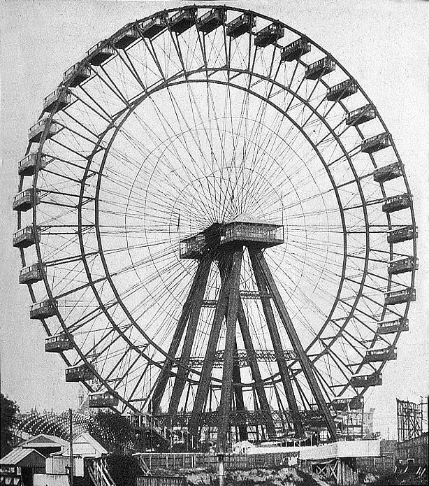
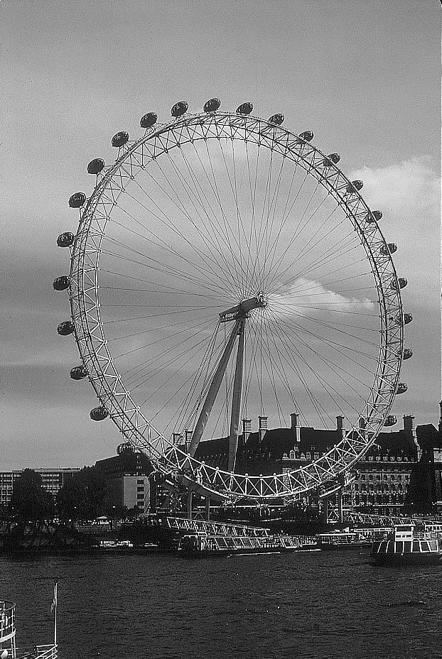
The big wheel at Earl's Court (1896, left) was three quarters the size of the London Eye (2000, right)
The social segregation of London is maintained through many processes. One that is particularly important is through the maintenance of differential housing values across the capital, which help steer patterns of migration within London. However, we have no way of knowing the migration histories of the individuals who died between 1991 and 1995. Thus these results will not reveal whether the high rates of mortality found in areas which have been continuously poor throughout are due to the continuous inward migration of a population at relatively higher risk of mortality (perhaps forced into cheaper accommodation, for example) or to some accumulative mortality risk raising the effects of day to day life in the area. The fact that the index of poverty derived from Booth's survey is related more strongly to causes of death that have previously been shown to be sensitive to deprivation in early life—that is, stroke and stomach cancer5,28—suggests that to some degree the ecological associations with past and present deprivation levels of areas do reflect individual level associations of deprivation at different stages of the life course and health outcomes. In short, the longer people spend both in poverty and in poor places, the earlier they tend to die. The maps and models also show that 100 years of policy initiatives have had almost no impact on the patterns of inequality in inner London and on the relationship between people's socioeconomic position and their relative chances of dying.
What is already known on this topic
People's health is strongly related to their material circumstances throughout their lives and particularly in childhood
Places in which people had poor health in the past tend still to contain people with relatively poor health today
What this study adds
At least in central London, a measure of the relative poverty and affluence of places made over 100 years ago is, for many causes of death, as useful a predictor of current inequalities in health as is the 1991 census
Together, the last census and the Booth index of 1896 better predict inequalities in health seen across London in the 1990s
The key message of A Christmas Carol—that redistribution of wealth reduces inequalities in mortality—is as relevant today as when it was written over 150 years ago; the fact that inequalities in health persist and match the 19th century pattern of inequalities in wealth so well suggests that that message has yet to be heeded
We thus have a different ending to A Christmas Carol from that given by Dickens below. The hypothesis of the Spirit of Christmas Yet to Come seems to be true—inequalities in health have not declined, partly because miserliness in the past does lead to future inequalities in health. Dickens advocated redistribution of wealth at the end of his tale. Wilkinson has suggested that greater income equality is beneficial for the health of the whole population—including the relatively affluent—not just for those who are badly off.29 In Dickens's story such redistribution not only aided the family of Tiny Tim, it also benefited Scrooge himself.
“A merrier Christmas, Bob, my good fellow, than I have given you for many a year! I'll raise your salary, and endeavour to assist your struggling family . . . Scrooge was better than his word. He did it all, and infinitely more; and to Tiny Tim, who did NOT die, he was a second father . . . His own heart laughed: and that was quite enough for him.”1
Acknowledgments
We thank Kevin Holohan for digitising work, Nichola Tooke for historical research, and Jonathan Tooby for photographic advice.
Footnotes
Funding: The study was supported by ESRC Health Variations Programme grants L128251009, L128251007, and L128251037; ESRC fellowship R000271045; and Joseph Rowntree Foundation project Inequalities in Life and Death.
Competing interests: None declared.
References
- 1.Dickens C. A Christmas carol. London: Chapman and Hall; 1843. [Google Scholar]
- 2.Davey Smith G, Hart C, Gillis C, Hawthorne V. Lifetime socioeconomic position and mortality: prospective observational study. BMJ. 1997;314:547–552. doi: 10.1136/bmj.314.7080.547. [DOI] [PMC free article] [PubMed] [Google Scholar]
- 3.Shaw M, Gordon D, Dorling D, Davey Smith G. The widening gap: health inequalities and policy in Britain. Bristol: Policy Press; 1999. [Google Scholar]
- 4.Davey Smith G, Hart C, Blane D, Hole D. Adverse socioeconomic conditions in childhood and cause specific adult mortality: prospective observational study. BMJ. 1998;316:1631–1635. doi: 10.1136/bmj.316.7145.1631. [DOI] [PMC free article] [PubMed] [Google Scholar]
- 5.Aves E. Obituary: Charles Booth. Econ J. 1916;26:537–542. [Google Scholar]
- 6.Bales K. Lives and labours in the emergence of organised research, 1886-1907. J Historical Sociol. 1996;9:113–138. [Google Scholar]
- 7.Bales K. Popular reactions to sociological research: the case of Charles Booth. Sociology. 1999;33:153–168. [Google Scholar]
- 8.Booth C. The inhabitants of Tower Hamlets (school board division) their condition and occupations. J R Stat Soc. 1887;50:326–401. [Google Scholar]
- 9.Booth C. Life and labour of the people. First series, poverty (i) east, central and south London. London: Macmillan; 1889. . (Republished 1969.) [Google Scholar]
- 10.Booth C. Life and labour of the people. First series, poverty (ii) streets and population classified. London: Macmillan; 1902. . (Republished 1969.) [Google Scholar]
- 11.Booth C. Life and labour of the people in London. Final volume. Notes on social influences and conclusions. London: Macmillan; 1902. [Google Scholar]
- 12.Cullen M. Charles Booth's poverty survey: some new approaches. In: Smout TC, editor. The search for wealth and stability: essays in economic and social history presented to MV Flinn. London: Macmillan; 1979. pp. 115–174. [Google Scholar]
- 13.Davies WJD. Charles Booth and the measurement of urban social character. Area. 1978;10:290–296. [Google Scholar]
- 14.Fried A, Elman RM. Charles Booth's London: a portrait of the poor at the turn of the century, drawn from his “Life and labour of the people in London”. London: Hutchinson; 1969. [Google Scholar]
- 15.O'Day R, Englander D. Mr Charles Booth's inquiry: life and labour of the people in London reconsidered. London: Hambledon; 1993. [Google Scholar]
- 16.Pfautz HW. On the city: physical pattern and social structure: selected writing of Charles Booth. Chicago: Chicago University Press; 1967. [Google Scholar]
- 17.Spicker P. Charles Booth: the examination of poverty. Social Policy and Administration. 1990;24:21–38. [Google Scholar]
- 18.Simey TS, Simey MB. Charles Booth: social scientist. London: Oxford University Press; 1960. [Google Scholar]
- 19.Townsend P, Corrigan P, Kowarzik U. Poverty and labour in London: interim report of a centenary survey. London: Low Pay Unit; 1987. . (Survey of Londoners' living standards No 1.) [Google Scholar]
- 20.Reeder DA. Charles Booth's descriptive map of London poverty 1889. London: London Topographical Society; 1984. . (Publication No 130.) [Google Scholar]
- 21.Gillie A. The origin of the poverty line. Econ Hist Rev. 1996;49:715–730. [Google Scholar]
- 22.Stevenson THC. The vital statistics of wealth and poverty. J R Stat Soc. 1928;91:207–230. [Google Scholar]
- 23.Szreter SRS. The genesis of the registrar-general's social classification of occupations. Br J Sociol. 1984;35:522–546. [Google Scholar]
- 24.Szreter SRS. The first scientific social structure of modern Britain 1875-1883. In: Bonfield L, Smith RM, Wrightson K, editors. The world we have gained: histories of population and social structure. Oxford: Blackwell; 1986. pp. 337–354. [Google Scholar]
- 25.Pamuk ER. Social class inequality in mortality from 1921 to 1972 in England and Wales. Popul Stud. 1985;39:17–31. doi: 10.1080/0032472031000141256. [DOI] [PubMed] [Google Scholar]
- 26.Kunst AE, Mackenbach JP. The size of mortality differences associated with educational level in 9 industrialised countries. Am J Public Health. 1994;84:932–937. doi: 10.2105/ajph.84.6.932. [DOI] [PMC free article] [PubMed] [Google Scholar]
- 27.Davey Smith G, Hart C, Hole D, MacKinnon P, Gillis C, Watt G, et al. Education and occupational social class: which is the more important indicator of mortality risk? J Epidemiol Community Health. 1998;52:153–160. doi: 10.1136/jech.52.3.153. [DOI] [PMC free article] [PubMed] [Google Scholar]
- 28.Leon D, Davey Smith G. Infant mortality, stomach cancer, stroke, and coronary heart disease: ecological analysis. BMJ. 2000;320:1705–1706. doi: 10.1136/bmj.320.7251.1705. [DOI] [PMC free article] [PubMed] [Google Scholar]
- 29.Wilkinson RG. Unhealthy societies: the afflictions of inequality. London: Routledge; 1996. [Google Scholar]


