Abstract
A single social phenomenon (such as crime, unemployment, or birthrate) can be observed through temporal series corresponding to units at different levels (i.e., cities, regions, and countries). Units at a given local level may follow a collective trend imposed by external conditions, but also may display fluctuations of purely local origin. The local behavior is usually computed as the difference between the local data and a global average (e.g, a national average), a viewpoint that can be very misleading. We propose here a method for separating the local dynamics from the global trend in a collection of correlated time series. We take an independent component analysis approach in which we do not assume a small average local contribution in contrast with previously proposed methods. We first test our method on synthetic series generated by correlated random walkers. We then consider crime rate series (in the United States and France) and the evolution of obesity rate in the United States, which are two important examples of societal measures. For the crime rates in the United States, we observe large fluctuations in the transition period of mid-70s during which crime rates increased significantly, whereas since the 80s, the state crime rates are governed by external factors and the importance of local specificities being decreasing. In the case of obesity, our method shows that external factors dominate the evolution of obesity since 2000, and that different states can have different dynamical behavior even if their obesity prevalence is similar.
Keywords: time series analysis, global trend, crime rate, obesity, independent component analysis
Large complex systems are composed of various interconnected components. The measure of the behavior of a single component thus results from the superimposition of different factors acting at different levels. Common factors such as global trends or external socioeconomic conditions obviously play a role but usually different subunits (such as users of the Internet and states or regions in a country) will react in different ways and add their local dynamics to the collective pattern. For example, the number of downloads on a website depends on factors such as the time of the day but one can also observe fluctuations from a user to another one (1). In the case of criminality, favorable socioeconomic conditions will impose a global decreasing trend whereas local policies will affect the regional time series. In the case of financial series, the market imposes its own trend and some stocks respond to it more or less dramatically. In all these cases it is important to be able to distinguish if the stocks or regions are at the source of their fluctuations or if on the opposite, they just follow the collective trend.
Extracting local effects in a collection of time series is thus a crucial problem in assessing the efficiency of local policies and more generally, for the understanding of the causes of fluctuations. This problem is very general and as the availability of data is always increasing particularly in social sciences, it becomes always more important for the modeling (2) and the understanding of these systems. There is obviously a huge literature on studying stochastic signals (3) ranging from standard methods to more recent ones such as the detrended fluctuation analysis (4), independent component analysis (5–7), and separation of external and internal variables (8, 9). Most of these methods treat the internal dynamics as a small unbiased local perturbation that is in contrast with the method proposed here.
In a first part we present the method. In a second part, we test it on synthetic series generated by correlated random walkers. We then apply the method to empirical data of crime rates in the United States and France, and obesity rates in the United States, for which no general quantitative method is known to provide a separation between global and local trends.
Model and Method
In general, one has a set of time series {fi}i=1,…,N(t) where t = 1,…,T. The index i refers to a particular unit on a specific scale such as a region, city, or a country. The problem we address consists of extracting the collective trend and the effect of local contributions. One way to do so is to assume the signal fi(t) to be of the form
| [1] |
where the “external” part,  , represents the impact on the region i of a global trend, whereas the “internal” part,
  , represents the contribution due to purely local factors. Usually, to discuss the impact of local policies, one compares a regional (local) curve fi to the average (the national average in case of regions of a country) computed as
 |
[2] |
(or  if one has intensive variables and populations ni). Although reasonable at first sight, this assumes that the local component is purely additive: fi(t) = fav(t) + local term. In this article, following (8, 9), we will rather consider the possibility of having both multiplicative and additive contributions. More specifically, we assume
| [3] |
where w(t) is a collective trend common to all series, and which affects each region i with a corresponding prefactor ai. These coefficients are assumed to depend weakly on the period considered; i.e., to vary slowly with time. We thus write
| [4] |
We first note that the global trend w is known up to a multiplicative factor only (one cannot distinguish aiw from (aiz)(w/z) whatever z ≠ 0) and we will come back to this issue of scale later. Also, the purely additive case is recovered if the ais are independent of i. If on the contrary the ais are different from one region to the other, the national average [2],  , is then given by
| [5] |
Here and in the following we denote the sample average, that is the average over all units i, by a bar,  , and the temporal average by brackets 〈·〉. The “naïve” local contribution is then estimated by the difference with the national average
| [6] |
The estimated local contribution  can thus be very different from the original one,
  , and the difference
  will be very large at all times t where w(t) is large (note that the conclusion would be the same by taking the national average as
  ). This demonstrates that comparing local time series with the naive average could in general be very misleading. Beside the correct computation of the external and internal contributions, the existence of both multiplicative and additive local contributions implies that the effect of local policies must be analyzed by considering both how the local unit i follows the global trend (ai) and how evolves the purely internal contribution (
 ).
).
In a previous study (8), de Menezes and Barabasi proposed a simple method to separate the two contributions, internal ( ) and external (
 written as aiw(t)). They assume that the temporal average
  is zero, and compute the external and internal parts by writing
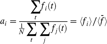 |
[7] |
and  . This method can be shown to be correct in very specific situations, such as the case where fi is the fluctuating number of random walkers at node i in a network, but in many cases however, one can expect that the local contributions have a non-zero sample average and the method of refs. 8 and 9 will yield incorrect results. Indeed, if the hypothesis [4] is exact, this method would give for w the estimate
  , and in the limit |w(t)| → ∞ for t → ∞ would lead to the estimates
  and
and  , which are different from the exact results, except if
  .
.
To separate the two contributions we propose in this article a totally different approach, by taking an independent component analysis point of view in which we do not assume that the local contribution has a zero average (over time and/or over the regions). To express the idea that the internal contribution is by definition what is specifically independent of the global trend, and that the correlations between regions exist essentially only through their dependence in the global trend, we impose that the global trend is statistically independent from local fluctuations
| [8] |
(we denote by 〈.〉c the connected correlation 〈AB〉c = 〈AB〉-〈A〉〈B〉), and that these local fluctuations are essentially independent from region to region, that is for i ≠ j
| [9] |
where this statement will be made more precise below. We show that, for large N, these constraints [8] and [9] are sufficient to extract estimates of the global trend w and of the ais.
We denote by μw the average of w and by σw its dispersion, so that we write
| [10] |
with 〈W〉 = 0 and 〈W2〉 = 1. If we denote by Fi(t) = fi(t) - 〈fi〉 and  , we have
| [11] |
with
| [12] |
Note that  . If we now consider the correlations between these centered quantities, Cij = 〈FiFj〉, we find
| [13] |
If we assume that for i ≠ j 〈GiGj〉 is negligible (of order 1/N) compared to AiAj (which is what we mean by having small correlations between internal components in Eq. 9), from this last expression we can show that at the dominant order in N, we have
 |
[14] |
 |
[15] |
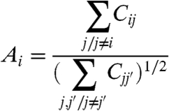
These equations lead to
 |
[16] |
which is valid when  . We note that our method has a meaning only if strong correlations exist between the different fis and if it is not the case, the definition of a global trend makes no sense and the approximation used in our calculations are not valid.
In SI Text section 1, we show that the factors Ais can also be computed as the components of the eigenvector corresponding to the largest eigenvalue of Cij—a method that is valid under the weaker assumption of having a small number (compared to N) of nondiagonal terms of the matrix Dij = 〈GiGj〉 that are not negligible.
Once the quantities Ai are known, we can compute the global normalized pattern W(t) with the reasonable estimator given by  ,
,
 |
[17] |
Indeed,
 |
[18] |
and because the quantity  is a sum of independent variables with zero mean, we can expect it to behave as
  . We can show that this actually results from the initial assumptions. Indeed, by construction
  and the second moment is
 |
[19] |
By assumption, we have 〈GiGj〉 ≈ 0 if i ≠ j and we thus obtain  .
.
The computation of the Ais and of W is equivalent to an independent component analysis (ICA) (5–7) with a single source (the global trend) and a large number N of sensors. However, in contrast with the standard ICA, we are not interested in getting only the sources (here the trend W), but also the internal contributions (which, in a standard ICA framework, would be considered as noise terms, typically assumed to be small). We have already the Ais, and because W(t) has been calculated we can compute Gi = Fi(t) - AiW(t). We thus obtain at this stage
 |
[20] |
This is a set of N equations for N + 1 unknown (μw/σw and the  s) and we are thus left with one free parameter, the ratio μw/σw. Knowing its value would give the N local averages, the
  s. Less importantly, one may want also to fix the average μw (hence both μw and σw) to fully determine the pattern w(t): This will be of interest only for making a direct comparison between this pattern and the national average [2]. Eq. 20 suggests a statistical linear correlation between 〈fi〉 and Ai, with a slope given by μw/σw. We will indeed observe a linear correlation in the datasets (see next section). However, it could be that the
  s themselves are correlated with the Ais. Hence, and unfortunately, a linear regression cannot be used to get an unbiased estimate of the parameter μw/σw. In the absence of additional information or hypothesis this parameter remains arbitrary. However, one may compare the qualitative results obtained for different choices of μw/σw: which properties are robust, and which ones are fragile. In particular one would like to be able to access how a given region is behaving, compared to another given region, and/or to the global trend. To do so, in the applications below we will in particular analyze: (i) the correlations between the two local terms, Ai and
  ; (ii) the robustness of the rank given by the
  s; (iii) the sign of
  ; and (iv) the quantitative and qualitative similarities between
  and the naive estimate
  .
.
We will focus on two particular scenarios. First, one may ask the global trend to fall right in the middle of the N series. There are different ways to quantify this. One way to do so is to note that, in the absence of internal contribution, fi/ai would be equal to w, hence 〈fi〉/Ai would be equal to μw/σw. Therefore we may compute μw/σw by imposing
 |
[21] |
which is thus equivalent to impose  An alternative is to ask the resulting
  to be as close as possible to the naive ones [6], by minimizing
  , which gives
 |
[22] |
In both cases one may then fix μw from μw = 〈fav〉 or by imposing w(t0) = fav(t0) for some arbitrary chosen t0. Finally, one may rather ask for a conservative comparison with the naive approach by minimizing the difference between w and fav: either by writing μw = 〈fav〉 (or w(t0) = fav(t0)) and σw = 〈(fav)2〉c, or by minimizing 〈(w - fav)2〉, which gives
| [23] |
For N is large, one can check that the results depend weakly on any one of these reasonable choices.
The second scenario considers the correlations between the  s and the Ais. As we will see, the first hypothesis leads to a strictly negative correlation. An alternative is thus to explore the consequences of assuming no correlations, hence asking for
| [24] |
which implies that the slope of the observed linear correlation 〈fi〉 with Ai gives the value of μw/σw. As explained above, for each application below we will discuss the robustness of the results with respect to these choices of the parameter μw/σw.
We can now summarize our method. It consists of (i) estimating the Ais using Eq. 16 [or using the eigenvector corresponding to the largest eigenvalue of the correlation matrix (SI Text)], (ii) computing W using Eq. 17, and finally (iii) comparing the results for different hypothesis on μw/σw as discussed above. We propose to call this method the External Trend and Internal Component Analysis (ETICA). We note that if the hypotheses [4], [8], and [9] are correct, the method gives estimates of W, the Ais (hence of  ), which become exact in the limit t and N large, and a good estimate of the full trend w (hence of the
  ) whenever this trend, qualitatively, does fall in the middle of the time series.
Once we have extracted with this method the local contribution  , and the collective pattern w(t) together with its redistribution factor ai for each local series, we can study different quantities, as illustrated below on different applications of the method. In general, although this method gives a pattern w(t) very similar to the sample average
  , we will see that there is nontrivial structure in the prefactors ais leading to non trivial local contributions
  .
.
In some cases one may expect to have, in addition to the local contribution, a linear combination of several global trends (a small number of “sources”): We leave for future work the extension of our method to several external trends.
Applications: Correlated Random Walkers, Crime Rates in the United States and France, and Obesity in the United States.
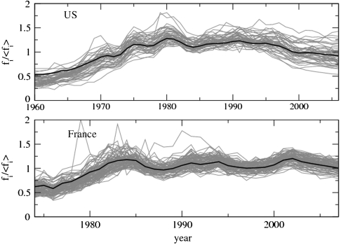
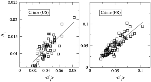
We first test our method on synthetic series and we then illustrate it on crime rate series (in the United States and in France) and on US obesity rate series. For the crime rates, a plot of the time series shows that obviously a common trend exists (Fig. 1). After computing the internal and external terms, we perform different tests to assess the validity of the approach. In particular, Fig. 2 shows a plot of the local factors Ais versus the data time-averages, the 〈fi〉s. One observes a statistical linear correlation in the four set of time series. We stress that the Ais are computed from the covariance matrix of the data, hence after removing the means from the time series. The fact that we do observe a linear correlation is thus a hint that our hypothesis on the data structure is reasonable (in contrast the very good linear correlation observed in refs. 8 and 9 can be shown to be an artifact of the method used in these works, leading to an exact proportionality independently of the data structure (SI Text). We now discuss in more detail the synthetic series, each one of the crime rate datasets, and the obesity rate.
Fig. 1.
Collective pattern. Crime rates for the United States (Upper) and France (Lower) normalized by their time average. The black thick line represent the collective pattern w(t) computed with our method.
Fig. 2.
Existence of a linear correlation. We plot the prefactors Ai versus the time average 〈fi〉 for the two crime rate datasets.
Synthetic Series: Correlated Random Walkers.
We can illustrate our method on the case of correlated random walkers described by the equation
 |
[25] |
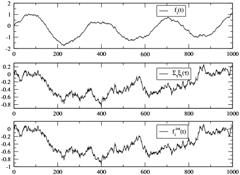
where F(t) is the global trend imposed to all walkers and the ξi(t) are Gaussian noises of zero mean and with correlations of the form  where α and M are tunable parameters (SI Text, section 3). For M = 0, the random noises ξi(t) are independent and our method is very accurate: We choose, for example, a sinusoidal trend F(t) = sin(ωt) and we plot, in Fig. 3, the original signal, the exact local contribution, and the local contribution computed with our method. When the correlation between walkers is increasing we study the Pearson correlation coefficient between the original local contribution and the estimate provided by our method, and we observe that our method is indeed accurate as long as the correlations between the Gis are not too large, which corresponds here to the condition α2M ≪ 1 (SI Text, section 3).
Fig. 3.
(A) Original signal composed of the superimposition of a sinusoidal trend and Gaussian noises (for N = 100 walkers). (B) Exact local contribution. (C) Local contribution extracted with our method.
Crime Rates in the United States and France.
In criminology an essential question concerns the impact of local policies, a subject of much debate (10, 11). To assess these local effects (at the level of a state or a region), most authors consider the difference of a state evolution with the national average. As we noticed above, this may lead to incorrect predictions. In this second part of applications, we thus illustrate our method on the analysis of the series of crime rates in 50 states in the United States (12) for the period 1965–2005, and about 100 départements of France (13) for the period 1974–2007. In Fig. 1, we represent these time series normalized by their time average. The observed data collapse confirms the existence of a collective pattern (we also show on this plot the collective pattern w(t) obtained with our method). For the French case, we have withdrawn outliers that do not satisfy our initial assumptions. The series of these départements are indeed uncorrelated with the rest of crime rates and cannot be incorporated in the calculation of the collective pattern. We apply our method to these data and extract w(t), the Ais and  . As already mentioned, we plot, in Fig. 2, the Ais vs. the averages 〈fi〉, exhibiting a statistical linear correlation. We can check a posteriori that all conditions assumed in our calculation are fulfilled [zero
  and small 〈GiGj〉 (SI Text, section 1)]. Also, we checked that the coefficients ai do not vary too much the period considered, which is an important condition for our method (see discussion on different datasets in SI Text, section 4).
To assess quantitatively the importance of local versus external fluctuations, we study in particular the ratio of dispersions defined by
 |
[26] |
where the external contribution is the standard deviation of  , that is
  , and the internal one is given by
  . Note that these quantities ηi, being based on fluctuations, does not depend on μw/σw. This quantity is found in both cases in France and in the United States larger than one. This indicates that external factors always dominate over local fluctuations, whereas local policies seem to play a minor role. In the case of crime, these external effects might be socioeconomic factors such as unemployment, density, etc.
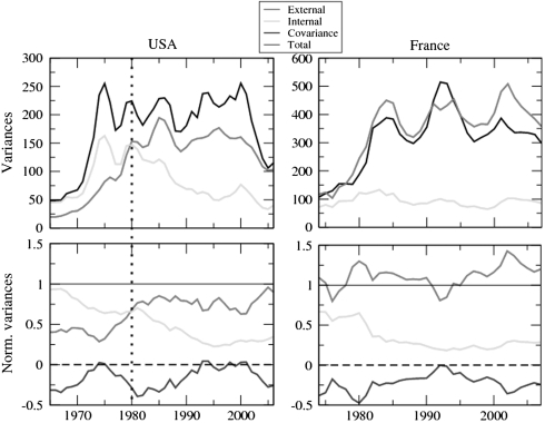
In addition, to compute the average of the ηis, we can also observe the time evolution of the heterogeneity defined by the sample variances of the different components. We first observe in Fig. 4 that large fluctuations are observed in the transition period of mid-70s during which crime rates increased significantly. We also observe for the United States that until 1980, fluctuations were essentially governed by local effects but that this trend is inverted and increases in the period post-1980s. In particular, during the period 1980–2000, during which one observes a decline of crime rates (11), it is the collective trend which determines the fluctuations.
Fig. 4.
Comparison of internal and external fluctuations. We present results for the United States (Left Column) and France (Right Column). In the upper panels, we represent the total variance of the signal, the external and the internal contribution. In the lower panels, we represent the external, internal, and the covariances normalized by the variance of the signal. We can observe that for the United States, the external contribution is dominating since the 80s.
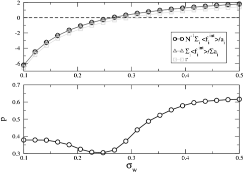
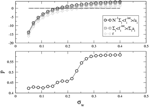
Even if we have presented results for reasonable choices of the parameter σw (in the following we make the harmless choice μw = 1), one can ask the question of the robustness of different observed properties. First, we can compare the predictions for σw obtained for the different assumptions used in this paper. In the upper panels for Figs. 5 and 6 we show for the United States (France), the quantities  ,
,  , and
, and  .
.
Fig. 5.
Determination of σw in the US crime rate case. We can use various conditions to determine  ,
,  , or r = 0 (r is defined in the text). We see in this plot that they all give very similar values. (Lower Panels) Average fraction of time for which
  has the same sign as the naive calculation
  .
.
Fig. 6.
As in Fig. 5, we can determine σw in the case of the crime rate in France, by using different conditions:  , or
, or  , or r = 0. Here also, these conditions give very similar values of σw. (Lower Panels) Average fraction of time for which
  has the same sign as the naive calculation
  .
.
We see in these figures that these quantities are zero for values of σw, which are very close. We also compute the fraction of time pi for which  and the naive calculation
  have different signs. We plot in the lower panels of Figs. 4 and 5, the quantity
  showing that for this range of σw, the signs of
  and
and  are the same for about 60% of the time period. We can also study the sign
  vs. σw and we can observe some robustness. In particular, in the US case, approximately 6 states (CA, NV, MO, MI, NY, and AZ) have a positive local contribution (in the range σw∈[0.24,0.32] whereas 6 states have always a negative local contribution (VT, GA, LA, NH, CT, and MS). In these cases we can reasonably imagine that local policies have a noticeable effect.
Finally, we can also analyze the ranking of the local contributions  vs. σw by studying Kendall’s τ for the two consecutive series
  and
and  . In both cases (France and United States) we observe a value τ > 0.9 for the range chosen σw∈[0,0.5] (the control case for a random permutation being < 0.1) indicating a large robustness of the ranking. This means that independently of the assumption used to compute σw we can rank the different regions according to the importance of their local contribution.
Obesity in the United States.
The prevalence of obesity (defined as a body mass index—BMI, which is the ratio of the body mass to the square of the height—larger than 30 kg/m2) is rapidly increasing in the world (14) and reached epidemic proportion in the United States and is now a major public health concern (15–17).
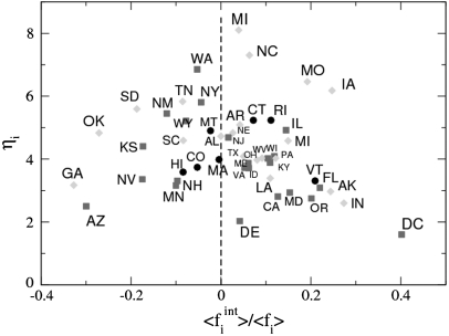
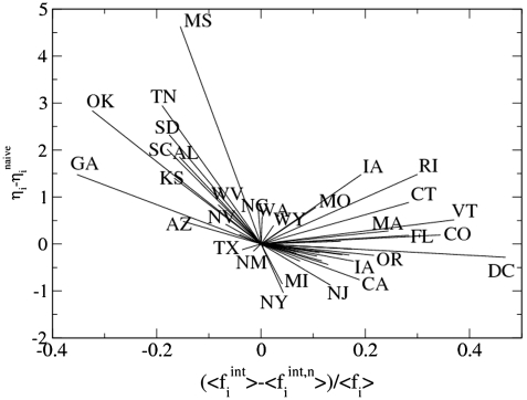
Disparities by sex and between ethnic groups have been observed in the prevalence of obesity (18), but few studies focus on the effect of local factors and policies on the obesity rate. We thus apply our method to data from the Center for Disease Control and Prevention (19), which describe the percentage of the population that is obese for each state in the United States and for the period 1995–2008. As in the crime rate case, we can compare the variances for the internal and external contributions (SI Text, section 5) and we observe that the external contribution is dominating since the year 2000. This result means that the global trend is the major cause of the evolution of obesity in different states. We can get more detailed information about the specific behavior of the states by studying the ratio ηi defined in Eq. 26 and the ratio yi of the time averages of the local contribution and the total signal  . We represent these two quantities in a plane (Fig. 7) and we first note that for all states ηi > 1, which means that fluctuations are mainly governed by the global trend. We can also divide the states into two groups with yi > 0 and yi < 0. For large and positive yi (such as DC and IN for example), the states have a small ai, which means that these states are the less susceptible to the global trend, whereas in the opposite case (such as GA or AZ), the states are governed by the global trend. Within each group we can then distinguish the states according to their level of fluctuations (ηi close to or much larger than one). The states Arizona, Georgia, and Oklahoma for example have all a local contribution of the same order but their fluctuations properties are different (with larger external fluctuations for OK, for example). More generally, we can see in this figure that states with large prevalence display very different values of (yi,ηi). This result points toward the fact that describing states by their prevalence only can be very misleading and can hide important dynamical behaviors. Finally, we also computed the quantities yi and ηi using the naive local contribution defined by
  (see Eqs. 2 and 6). We represent, in Fig. 8, the difference as vectors of components given by
  and we can see in this figure that for roughly half of the states the naive calculation of the local contribution can be very misleading.
Fig. 7.
Fluctuations versus importance of the local contribution. We plot the quantity ηi versus  for the United States. We divide the states in three groups: obese percentage < 22% (Circles), percentage in the interval 22 and 26% (Squares), and percentage > 26% (Diamonds). Low prevalence states seem to concentrate in the same region yi ≈ 0, whereas medium- and large-prevalence states display very different values of ηi and yi.
Fig. 8.
Difference with the naive fluctuations and local contribution. We represent for the different states the difference vectors  where
where  . We observe that for about half of the states the difference between the naive calculation and our method is not negligible {for the sake of clarity, we indicated the name of the corresponding state for most vectors except for those close to (0,0)].
Discussion
In this article we adressed the crucial problem of extracting the local components of a system governed by a global trend. In this case, comparing the local signal to the average is very misleading and can lead to wrong conclusions. We applied this method to the example of crime rates series in the United States and France and our analysis revealed surprising facts. The important result is about the importance of fluctuations, which after the 80s in the United States are governed by external factors. This result suggest that understanding the evolution of crime rates relies mostly on the identification of global socioeconomic behavior and not on local effects such as state policies etc. In particular, this result could also help in understanding the decreasing trend observed in the United States and which so far remains a puzzle (11, 20). In the case of obesity, we show that since the year 2000, external factors dominate, and maybe more importantly that states with the same level of prevalence have very different dynamical behaviors, thus calling for the need of a detailed study state by state.
However, one may expect an even better signal analysis by assuming that there are several independent external trends: It will be interesting to see if our approach, combined with the more standard ICA techniques, can be generalized to the case of several global trends (a small number of sources). The recent availability of large amounts of data in social systems call for the need of tools able to analyze them and to extract meaningful information and we hope that our present contribution will help in the understanding of these systems where the local dynamics is superimposed to collective trends.
Supplementary Material
Acknowledgments.
We thank the anonymous referees for constructive remarks, in particular about the applicability conditions of our method. This work is part of the project “DyXi” supported by the French National Research Agency Grant ANR-08-SYSC-008.
Footnotes
The authors declare no conflict of interest.
This article is a PNAS Direct Submission.
This article contains supporting information online at www.pnas.org/lookup/suppl/doi:10.1073/pnas.0910259107/-/DCSupplemental.
References
- 1.Huberman BA. The Laws of the Web. Cambridge, MA: MIT Press; 2001. [Google Scholar]
- 2.Castellano C, Fortunato S, Loreto V. Statistical physics of social dynamics. Rev Mod Phys. 2009;81:591–646. [Google Scholar]
- 3.Kautz H, Schreiber T. Nonlinear time series analysis. Cambridge, U.K.: Cambridge University Press; 1997. [Google Scholar]
- 4.Peng CK, et al. Mosaic organization of DNA nucleotides. Phys Rev E. 1994;49:1685–1689. doi: 10.1103/physreve.49.1685. [DOI] [PubMed] [Google Scholar]
- 5.Comon P. Independent component analysis: A new concept? Signal Process. 1994;36(3):287–314. [Google Scholar]
- 6.Cardoso J-F. Statistical principles of source separation; Proceedings of the 11th IFAC Symposium on System Identification; Fukuoka, Japan: IFAC; 1997. pp. 1837–1844. [Google Scholar]
- 7.Hyvrinen AJ, Karhunen J, Oja E. Independent Component Analysis. New York: Wiley; 2001. [Google Scholar]
- 8.de Menezes MA, Barabasi A-L. Fluctuations in network dynamics. Phys Rev Lett. 2004;92:028701. doi: 10.1103/PhysRevLett.92.028701. [DOI] [PubMed] [Google Scholar]
- 9.de Menezes MA, Barabasi A-L. Separating internal and external dynamics of complex systems. Phys Rev Lett. 2004;93:068701. doi: 10.1103/PhysRevLett.93.068701. [DOI] [PubMed] [Google Scholar]
- 10.de Maillard J, Roché S. Crime and justice in France: Time trends, policies and political debate. European Journal of Criminology. 2004;1:111–151. [Google Scholar]
- 11.Zimring F. The Great American Crime Decline. Oxford: Oxford University Press; 2007. [Google Scholar]
- 12.United States. Uniform Crime Report—State Statistics from 1960–2007. Available at http://www.disastercenter.com/crime/
- 13.France: Institut National des Hautes Etudes de Sécurité. La Documentation française: Criminalité et délinquance constatées en France—Tome I : données générales, nationales, régionales et départementales. Available at http://www.inhes.interieur.gouv.fr/Bulletin-annuel-112.html and http://www.ladocumentationfrancaise.fr/rapports-publics/084000201/
- 14.James PT, Leach R, Kalamara E, Shayeghi M. The worldwide obesity epidemic. Obes Res. 2001;9:228S–233S. doi: 10.1038/oby.2001.123. [DOI] [PubMed] [Google Scholar]
- 15.Mokdad AH, et al. The spread of obesity epidemic in the United States, 1991–1998. J Amer Med Assoc. 1999;282:1519–1522. doi: 10.1001/jama.282.16.1519. [DOI] [PubMed] [Google Scholar]
- 16.Ogden CL, et al. Prevalence of overweight and obesity in the United States 1999–2004. J Amer Med Assoc. 2006;295:1549–1555. doi: 10.1001/jama.295.13.1549. [DOI] [PubMed] [Google Scholar]
- 17.Hedley AA. Prevalence of overweight and obesity among US children, adolescents, and adults 1999–2002. J Amer Med Assoc. 2004;291:2847–2850. doi: 10.1001/jama.291.23.2847. [DOI] [PubMed] [Google Scholar]
- 18.Wang Y, Beydoun MA. The obesity epidemic in the United States—gender, age, socioeconomic, racial/ethnic, and geographic characteristics: A systematic review and meta-regression analysis. Epidemiol Rev. 2007;29:6–28. doi: 10.1093/epirev/mxm007. [DOI] [PubMed] [Google Scholar]
- 19.Centers for Disease Control and Prevention. Behavioral Risk Factor Surveillance System. Available at http://apps.nccd.cdc.gov/brfss/
- 20.Levitt SD. Understanding why crime fell in the 1990s: Four factors that explain the decline and six that do not. J Econ Perspect. 2004;18:163–190. [Google Scholar]
Associated Data
This section collects any data citations, data availability statements, or supplementary materials included in this article.


