

Abstract
Prognostic models applied in medicine must be validated on independent samples, before their use can be recommended. The assessment of calibration, i.e., the model's ability to provide reliable predictions, is crucial in external validation studies. Besides having several shortcomings, statistical techniques such as the computation of the standardized mortality ratio (SMR) and its confidence intervals, the Hosmer–Lemeshow statistics, and the Cox calibration test, are all non-informative with respect to calibration across risk classes. Accordingly, calibration plots reporting expected versus observed outcomes across risk subsets have been used for many years. Erroneously, the points in the plot (frequently representing deciles of risk) have been connected with lines, generating false calibration curves. Here we propose a methodology to create a confidence band for the calibration curve based on a function that relates expected to observed probabilities across classes of risk. The calibration belt allows the ranges of risk to be spotted where there is a significant deviation from the ideal calibration, and the direction of the deviation to be indicated. This method thus offers a more analytical view in the assessment of quality of care, compared to other approaches.
Introduction
Fair, reliable evaluation of quality of care has always been a crucial but difficult task. According to the classical approach proposed by Donabedian [1], indicators of the structure, process, or outcome of care can be variably adopted, depending on the resources available, the purpose and the context of the analysis. Whichever indicator is adopted, quality of care is assessed by comparing the value obtained in the evaluated unit with a reference standard. Unfortunately, this approach is hampered by more or less important differences between the case-mix under scrutiny and the case-mix providing the reference standard, thereby precluding direct comparison. To solve this problem, multipurpose scoring systems have been developed in different fields of medicine. Their aim is to provide standards tailored on different case-mixes, enabling the quality of care to be measured in varying contexts. Most of these systems are prognostic models, designed to estimate the probability of an adverse event occurring (e.g., patient death), basing quality of care assessment on an outcome indicator. These models are created on cohorts representative of the populations to which they will be applied [2].
A simple tool to measure clinical performance is the ratio between the observed and
score-predicted (i.e. standard) probability of the event. For
instance, if the observed-to-expected event probability ratio is significantly lower
than 1, performance is judged to be higher than standard, and vice
versa. A more sophisticated approach is to evaluate the calibration of
the score, which represents the level of accordance between observed and predicted
probability of the outcome. Since most prognostic models are developed through
logistic regression, calibration is usually evaluated through the two
Hosmer–Lemeshow goodness-of-fit statistics,  and
and
 [3]. The main
limitations of this approach [4], [5] are overcome by Cox calibration analysis [6], [7], although this
method is less popular. All these tests investigate only the degree of deviation
between observed and predicted values, without providing any clue as to the region
and the direction of this deviation. Nevertheless, the latter information is of
paramount importance in interpreting the calibration of a model. As a result,
expected-to-observed outcome across risk subgroups is usually reported in
calibrations plots, without providing any formal statistical test. Calibration plots
comprise as many points as the number of subgroups considered. Since these points
are expected to be related by an underlying curve, they are often connected in the
so-called ‘calibration curve’. However, one can more correctly estimates
this curve by fitting a parametric model to the observed data. In this perspective,
the analysis of standard calibrations plot can guide the choice of the appropriate
model.
[3]. The main
limitations of this approach [4], [5] are overcome by Cox calibration analysis [6], [7], although this
method is less popular. All these tests investigate only the degree of deviation
between observed and predicted values, without providing any clue as to the region
and the direction of this deviation. Nevertheless, the latter information is of
paramount importance in interpreting the calibration of a model. As a result,
expected-to-observed outcome across risk subgroups is usually reported in
calibrations plots, without providing any formal statistical test. Calibration plots
comprise as many points as the number of subgroups considered. Since these points
are expected to be related by an underlying curve, they are often connected in the
so-called ‘calibration curve’. However, one can more correctly estimates
this curve by fitting a parametric model to the observed data. In this perspective,
the analysis of standard calibrations plot can guide the choice of the appropriate
model.
In this paper we use two illustrative examples to show how to fit such a model, in order to plot a true calibration curve and estimate its confidence band.
Analysis
Two illustrative examples
Every year GiViTI (Italian Group for the Evaluation of Interventions in Intensive Care Medicine) develops a prognostic model for mortality prediction based on the data collected by general ICUs that join a project for the quality-of-care assessment [8]. In our first example, we applied the GiViTI mortality prediction model to 194 patients admitted in 2008 to a single ICU participating to the GiViTI project.
In the second example, we applied the SAPS II [9] scoring system to predict mortality in a cohort of 2644 critically ill patients recruited by 103 Italian ICUs during 2007, to evaluate the calibration of different scoring systems in predicting hospital mortality.
In the two examples we evaluated the calibration of the models through both traditional tools and the methodology we are proposing. The main difference between the two examples is the sample size: quite small in the former, quite large in the latter example. Any valuable approach designed to provide quality-of-care assessment should be able to return trustworthy and reliable results, irrespective of the level of application (e.g., single physician, single unit, group of units). Unfortunately, due to the decreasing sample size, the closer the assessment is to the final healthcare provider (i.e. the single physician), the more the judgment varies. In this sense, it is crucial to understand how different approaches behave according to different sample sizes.
In the first example, the overall observed ICU mortality was 32% (62 out of 194), compared to 33% predicted by the GiViTI model. The corresponding standardized mortality ratio (SMR) was 0.96 (95% confidence interval (CI): 0.79, 1.12), suggesting an on-average behavior of the observed unit. However, the SMR does not provide detailed information on the calibration of the model. For instance, an SMR value of 1 (perfect calibration) may be obtained even in the presence of significant miscalibration across risk classes, which can globally compensate for each other if they are in opposite directions.
The Hosmer–Lemeshow goodness-of-fit statistics are an improvement in this
respect. In the two proposed tests ( and
and
 ), patients are in fact ordered by risk of dying and then
grouped in deciles (of equal-size for the
), patients are in fact ordered by risk of dying and then
grouped in deciles (of equal-size for the  test, of
equal-risk for the
test, of
equal-risk for the  test). The
statistics are finally obtained by summing the relative squared distances
between expected and observed mortality. In this way, every decile-specific
miscalibration leads to an increase in the overall statistic, independently of
the sign of the difference between expected and observed mortality. The
Hosmer–Lemeshow
test). The
statistics are finally obtained by summing the relative squared distances
between expected and observed mortality. In this way, every decile-specific
miscalibration leads to an increase in the overall statistic, independently of
the sign of the difference between expected and observed mortality. The
Hosmer–Lemeshow  -statistic in our
sample yielded a
-statistic in our
sample yielded a  -value of 32.4 with
10 degrees of freedom (
-value of 32.4 with
10 degrees of freedom ( ), the
 -statistic a
  -value of 32.7
(
-value of 32.7
( ). These values contradict the reassuring message given
by the SMR and suggest a problem of miscalibration. Unfortunately, the
Hosmer–Lemeshow statistics only provide an overall measure of calibration.
Hence, any ICU interested in gaining deeper insight into its own performance
should explore data with different techniques. More information is usually
obtained by plotting the calibration curve (reported in the left panel of Fig. 1), which is the
graphical representation of the rough numbers at the basis of the
). These values contradict the reassuring message given
by the SMR and suggest a problem of miscalibration. Unfortunately, the
Hosmer–Lemeshow statistics only provide an overall measure of calibration.
Hence, any ICU interested in gaining deeper insight into its own performance
should explore data with different techniques. More information is usually
obtained by plotting the calibration curve (reported in the left panel of Fig. 1), which is the
graphical representation of the rough numbers at the basis of the
 -statistic. In the example, the curve shows that the
mortality is greater than expected across low risk deciles, lower in medium risk
deciles, greater in medium-high risk deciles and, again, lower in high-risk
deciles. Unfortunately, this plot does not provide any information about the
statistical significance of deviations from the bisector. In particular, the
wide oscillations that appear for expected mortality greater than 0.5 are very
difficult to interpret from a clinical perspective and may simply be due to the
small sample size of these deciles. Finally, it is worth remarking that
connecting the calibration points gives the wrong idea that an observed
probability corresponding to each expected probability can be read from the
curve even between two points. This is clearly not correct, given the procedure
used to build the plot.
-statistic. In the example, the curve shows that the
mortality is greater than expected across low risk deciles, lower in medium risk
deciles, greater in medium-high risk deciles and, again, lower in high-risk
deciles. Unfortunately, this plot does not provide any information about the
statistical significance of deviations from the bisector. In particular, the
wide oscillations that appear for expected mortality greater than 0.5 are very
difficult to interpret from a clinical perspective and may simply be due to the
small sample size of these deciles. Finally, it is worth remarking that
connecting the calibration points gives the wrong idea that an observed
probability corresponding to each expected probability can be read from the
curve even between two points. This is clearly not correct, given the procedure
used to build the plot.
Figure 1. Calibration plots through representation of observed mortality versus expected mortality (bisector, dashed line).

Left panel: Data of 194 patients staying longer than 24 hours in a single Intensive Care Unit (ICU) taking part in GiViTI (Italian Group for the Evaluation of Interventions in Intensive Care Medicine) in 2008; expected mortality calculated with a prediction model developed by GiViTI in 2008. Right panel: Data of 2644 critically ill patients admitted to 103 ICUs in Italy from January to March 2007; expected mortality calculated with SAPS II.
In the second example, the SMR was significantly different from 1 (0.83,
95% CI: 0.79, 0.88), indicating a lower than expected mortality in our
sample. The two Hosmer–Lemeshow goodness-of-fit statistics
( -value: 226.7,
  ;
;
 -value: 228.5,
  ) confirm poor
overall calibration. Finally, the calibration curve (Fig. 1, right panel) tells us that the lower
than expected mortality is proportional to patient severity, as measured by
expected mortality. The first two dots are so close to the bisector that they do
not modify the general message, despite being above it. Since expected mortality
is calculated using an old model, the most natural interpretation is that, as
expected, ICUs performed consistently better in 2008 than in 1993, when the SAPS
II score was developed.
) confirm poor
overall calibration. Finally, the calibration curve (Fig. 1, right panel) tells us that the lower
than expected mortality is proportional to patient severity, as measured by
expected mortality. The first two dots are so close to the bisector that they do
not modify the general message, despite being above it. Since expected mortality
is calculated using an old model, the most natural interpretation is that, as
expected, ICUs performed consistently better in 2008 than in 1993, when the SAPS
II score was developed.
In summary, the above-mentioned tools for assessing quality of care based on dichotomous outcomes suffer from various drawbacks, which are only partially balanced by their integrated assessment. The SMR and Hosmer–Lemeshow goodness-of-fit statistics only provide information on the overall behavior, which is almost invariably insufficient for good clinical understanding, for which a detailed information on specific values of mortality would be necessary. The calibration curve seems to provide complementary information, but at least two main disadvantages undermine its interpretation: first, it is not really a curve; second, it is not accompanied by any information on the statistical significance of deviations from the bisector. In the following sections, we propose a method to fit the calibration curve and to compute its confidence band. This method is applied to both the examples.
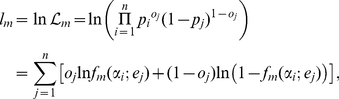
The calibration curve
We define  the probability of the dichotomous outcome experienced
by a patient admitted to the studied unit and
the probability of the dichotomous outcome experienced
by a patient admitted to the studied unit and  the expected
probability of the same outcome, provided by an external model representing the
reference standard of care. The quality of care is assessed by determining the
relationship between
the expected
probability of the same outcome, provided by an external model representing the
reference standard of care. The quality of care is assessed by determining the
relationship between  and
and
 described by a function
  . In the ICU
example, if a patient has a theoretical probability
. In the ICU
example, if a patient has a theoretical probability
 of dying, his actual probability
 differs from
  depending on the
level of care the admitting unit is able to provide. If he has entered a
well-performing unit,
depending on the
level of care the admitting unit is able to provide. If he has entered a
well-performing unit,  will be lower than
 and vice versa. Hence, we can
write
and vice versa. Hence, we can
write
| (1) |
The function
 , to be determined, represents the level of care provided
or, in mathematical terms, the calibration function of the reference model to
the given sample.
, to be determined, represents the level of care provided
or, in mathematical terms, the calibration function of the reference model to
the given sample.
We start to note that, from a clinical standpoint,
 represents an infinitely severe patient with no chance
of survival. The opposite happens in the case of
represents an infinitely severe patient with no chance
of survival. The opposite happens in the case of  , an infinitely
healthy patient with no chance of dying. Moreover, in the vast majority of real
cases, the expected probability of death is provided by a logistic regression
model
, an infinitely
healthy patient with no chance of dying. Moreover, in the vast majority of real
cases, the expected probability of death is provided by a logistic regression
model
| (2) |
where  are the
patient's physiological and demographic parameters and
are the
patient's physiological and demographic parameters and
 are the logistic parameters. In this case the values
 or
or  can only be
obtained with non-physical infinite values of the variables
can only be
obtained with non-physical infinite values of the variables
 , which therefore correspond to infinite (theoretical)
values of physiological or demographic parameters.
, which therefore correspond to infinite (theoretical)
values of physiological or demographic parameters.
This feature can be made more explicit by a standard change of variables. Instead
of  and
and  , ranging between 0
and 1, we used two new variables
, ranging between 0
and 1, we used two new variables  and
and
 , ranging over the whole real axis
 , such that
  and
and
 . A traditional way of doing so is to log-linearize the
probabilities through a logit transformation, where the logit of
. A traditional way of doing so is to log-linearize the
probabilities through a logit transformation, where the logit of
 is the natural logarithm of
 . Hence, Eq. (1) is rewritten as
| (3) |
In a very general way, one can approximate  with a polynomial
 of degree
  :
:
| (4) |
Once the relation between the logits  has been
determined, the function
has been
determined, the function  , as expressed in
Eq. (1), is approximated up to the order
, as expressed in
Eq. (1), is approximated up to the order  by
by
| (5) |
where  is given in Eq.
(3).
is given in Eq.
(3).
When  , Eq. (5) reduces to the Cox calibration function [6]. In this
particular case, the probability
, Eq. (5) reduces to the Cox calibration function [6]. In this
particular case, the probability  is a logistic
function of the logit of the expected probability
is a logistic
function of the logit of the expected probability
 . The value of the parameters
 can be estimated through the maximum likelihood method,
from a given set of observations
can be estimated through the maximum likelihood method,
from a given set of observations  ,
,
 , where
  is the
patient's final dichotomous outcome (0 or 1). Consequently, the estimators
is the
patient's final dichotomous outcome (0 or 1). Consequently, the estimators
 are obtained by maximizing
 |
(6) |
where  is the likelihood
function and
is the likelihood
function and  is its natural logarithm.
The optimal value of  can be determined
with a likelihood-ratio test. Defining
can be determined
with a likelihood-ratio test. Defining  the maximum of the
log-likelihood
the maximum of the
log-likelihood  , for a given
 , the variable
| (7) |
is
distributed as a  with 1 degree of
freedom, under the hypothesis that the system is truly described by a polynomial
with 1 degree of
freedom, under the hypothesis that the system is truly described by a polynomial
 of order
  . Starting from
 , a new parameter
  is added to the
model only if the improvement in the likelihood provided by this new parameter
is significant enough, that is when
is added to the
model only if the improvement in the likelihood provided by this new parameter
is significant enough, that is when
| (8) |
where  is the inverse of
the
is the inverse of
the  cumulative distribution with 1 degree of freedom. In the
present paper we use
cumulative distribution with 1 degree of freedom. In the
present paper we use  . The iterative
procedure stops at the first value of
. The iterative
procedure stops at the first value of  for which the
above inequality is not satisfied. That is, the final value of
for which the
above inequality is not satisfied. That is, the final value of
 is such that for each
  ,
,
 and
and  .
.
The choice of a quite large value of  (i.e. retaining only very significant coefficients) is
supported by clinical reasons. In the quality-of-care setting, the calibration
function should indeed avoid multiple changes in the relationship between
observed and expected probabilities. Whilst it is untenable to assume that the
performance is uniform along the whole spectrum of severity, it is even less
likely it changes many times. We can imagine a unit that is better (or worse) at
treating sicker patients than healthy ones, but it would be very odd to find a
unit that performs well (or poorly) in less severe, poorly (or well) in
medium-severe, and well (or poorly) in more severe patients. Large values of
(i.e. retaining only very significant coefficients) is
supported by clinical reasons. In the quality-of-care setting, the calibration
function should indeed avoid multiple changes in the relationship between
observed and expected probabilities. Whilst it is untenable to assume that the
performance is uniform along the whole spectrum of severity, it is even less
likely it changes many times. We can imagine a unit that is better (or worse) at
treating sicker patients than healthy ones, but it would be very odd to find a
unit that performs well (or poorly) in less severe, poorly (or well) in
medium-severe, and well (or poorly) in more severe patients. Large values of
 assure to spot only significant phenomena without
spurious effects related to the statistical noise of data.
assure to spot only significant phenomena without
spurious effects related to the statistical noise of data.
A measure of the quality of care can thus be derived from the coefficients
 . If
. If  and
and
 for
for  , the considered
unit performs exactly as the general model (i.e., the
calibration curve matches the bisector). Overall calibration can be assessed
through a Likelihood-ratio test or a Wald test, applied to the coefficients
, the considered
unit performs exactly as the general model (i.e., the
calibration curve matches the bisector). Overall calibration can be assessed
through a Likelihood-ratio test or a Wald test, applied to the coefficients
 , with the null hypothesis
 ,
,  for
for
 , which corresponds to perfect calibration. In the
particular case in which
, which corresponds to perfect calibration. In the
particular case in which  ,
,
 and
and  can be
respectively identified with the Cox parameters
can be
respectively identified with the Cox parameters  and
and
 [6]. Cox referred
to them respectively as the bias and the spread because
[6]. Cox referred
to them respectively as the bias and the spread because
 represents the average behavior with respect to the
perfect calibration, while
represents the average behavior with respect to the
perfect calibration, while  signals the
presence of different behaviors across risk classes.
signals the
presence of different behaviors across risk classes.
In the first example (single ICU), the iterative procedure described above stops
at  , that is the linear approximation of the calibration
function. The Likelihood-ratio test gives a
, that is the linear approximation of the calibration
function. The Likelihood-ratio test gives a  -value of 0.048 and
the Wald test gives
-value of 0.048 and
the Wald test gives  . Both tests warn
that the model is not calibrating well in the sample. Notably, this approach
discloses a miscalibration which the SMR fails to detect (see section
Two illustrative examples), confirming the result of the
. Both tests warn
that the model is not calibrating well in the sample. Notably, this approach
discloses a miscalibration which the SMR fails to detect (see section
Two illustrative examples), confirming the result of the
 and
and  tests. In the
second example (a group of ICUs), the iterative procedure described above
stopped at
tests. In the
second example (a group of ICUs), the iterative procedure described above
stopped at  . The Likelihood-ratio test gives a
 -value of
  and the Wald test
a
and the Wald test
a  -value of
  , indicating a
miscalibration of the model.
, indicating a
miscalibration of the model.
One approach to obtain more detailed information about the range of probabilities
in which the model does not calibrate well, is to plot the calibration function
of Eq. (5), built through the estimated coefficients
 , with
  , where
 is fixed by the above described procedure. In Fig. 2, we plot such a curve
for our examples in the range of expected probability for which observations are
present, in order to avoid extrapolation. The model calibrates well when the
calibration curve is close to the bisector. This curve is clearly more
informative than the traditional calibration plot of expected against observed
outcomes, averaged over subgroups (Fig. 1). In fact, spurious effects related to statistical noise due
to low populated subgroups (in high risk deciles) are completely suppressed in
this new plot. However, no statistically meaningful information concerning the
deviation of the curve from the bisector has yet been provided.
is fixed by the above described procedure. In Fig. 2, we plot such a curve
for our examples in the range of expected probability for which observations are
present, in order to avoid extrapolation. The model calibrates well when the
calibration curve is close to the bisector. This curve is clearly more
informative than the traditional calibration plot of expected against observed
outcomes, averaged over subgroups (Fig. 1). In fact, spurious effects related to statistical noise due
to low populated subgroups (in high risk deciles) are completely suppressed in
this new plot. However, no statistically meaningful information concerning the
deviation of the curve from the bisector has yet been provided.
Figure 2. Calibration functions (solid line) compared to the bisector (dashed line) for the two discussed examples.

The stopping criterion yielded  for the
left curve and
for the
left curve and  for the
right one. To avoid extrapolation the curve have been plotted in the
range of mortality where data are present. Refer to the caption of Fig. 1 for information
about the data sets.
for the
right one. To avoid extrapolation the curve have been plotted in the
range of mortality where data are present. Refer to the caption of Fig. 1 for information
about the data sets.
The calibration belt
To estimate the degree of uncertainty around the calibration curve, we have to
compute the curve's confidence belt. In general, given a confidence level
 , by performing lots of experiments, the whole unknown
true curve
, by performing lots of experiments, the whole unknown
true curve  will be contained in the confidence belt in a fraction
 of experiments. The problem of drawing a confidence band
for a general logistic response curve (
of experiments. The problem of drawing a confidence band
for a general logistic response curve ( ) has been solved
in [10], [11]. In Appendix
S1, the analysis of [10] is generalized to the case in which
) has been solved
in [10], [11]. In Appendix
S1, the analysis of [10] is generalized to the case in which
 . In this section we report only the result.
Determining a confidence region for the curve 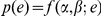 is equivalent to
determining a confidence region in the
is equivalent to
determining a confidence region in the  -dimensional space
of parameters
-dimensional space
of parameters  . This is easy once one notes that, for large
 , the estimated
  , obtained by
maximizing the likelihood of Eq. (6), have a multivariate normal distribution
with mean values
, obtained by
maximizing the likelihood of Eq. (6), have a multivariate normal distribution
with mean values  , variances
 , and covariances
  (see Eq. (S2) in
Appendix
S1).
(see Eq. (S2) in
Appendix
S1).
Given a confidence level  , it is possible to
show (see Appendix S1) that the confidence band for
, it is possible to
show (see Appendix S1) that the confidence band for
 is
is
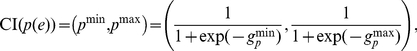 |
(9) |
where the confidence interval of the logit
 is
is
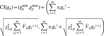 |
(10) |
and  is the inverse of
the
is the inverse of
the  cumulative distribution with 2 degrees of freedom. The
above the variances denotes that the values are estimated through the maximum
likelihood method.
cumulative distribution with 2 degrees of freedom. The
above the variances denotes that the values are estimated through the maximum
likelihood method.
It is worth noting the one-to-one correspondence between this procedure to build
the confidence band and the Wald test applied to the set of parameters
 . In fact, when the test
  -value is less than
 , the band at
  confidence level
does not include the bisector and vice versa.
confidence level
does not include the bisector and vice versa.
We are now able to plot the confidence belt to estimate the observed probability
 , as a function of the estimated probability
 , given by a reference model. Since the parameters of the
calibration curve and belt are estimated through a fitting procedure, in order
to prevent incorrect extrapolation, one must not extend them outside the range
of expected probability
, given by a reference model. Since the parameters of the
calibration curve and belt are estimated through a fitting procedure, in order
to prevent incorrect extrapolation, one must not extend them outside the range
of expected probability  in which
observations are present. In Fig.
3 we plot two confidence belts, for both examples, using
in which
observations are present. In Fig.
3 we plot two confidence belts, for both examples, using
 (inner belt, dark gray) and
 (outer belt, light gray). Statistically significant
information on the region where the calibration curve calibrates poorly can now
be derived from this plot, where the bisector is not contained in the belt.
(outer belt, light gray). Statistically significant
information on the region where the calibration curve calibrates poorly can now
be derived from this plot, where the bisector is not contained in the belt.
Figure 3. Calibration belts for the two discussed examples at two confidence levels.

 (dark shaded area) and
 (light shaded area);
 for the
first example (left panel),
for the
first example (left panel),  for the
second (right panel). bisector (dashed line). As in
Fig. 2, the
calibrations bands have been plotted in the range of mortality where
data are present. Refer to the caption of Fig. 1 for information about the data
sets.
for the
second (right panel). bisector (dashed line). As in
Fig. 2, the
calibrations bands have been plotted in the range of mortality where
data are present. Refer to the caption of Fig. 1 for information about the data
sets.
In the first example ( ), the confidence
belts do not contain the bisector for expected mortality values higher than 0.56
(80% confidence level) and 0.83 (95% confidence level). This
clarifies the result of the Hosmer–Lemeshow tests which have already
highlighted the poor miscalibration of the model for the particular ICU. Now it
is possible to claim with confidence that this miscalibration corresponds to
better performance of the studied ICU compared to the national average for high
severity patients.
), the confidence
belts do not contain the bisector for expected mortality values higher than 0.56
(80% confidence level) and 0.83 (95% confidence level). This
clarifies the result of the Hosmer–Lemeshow tests which have already
highlighted the poor miscalibration of the model for the particular ICU. Now it
is possible to claim with confidence that this miscalibration corresponds to
better performance of the studied ICU compared to the national average for high
severity patients.
In the second example, given the larger sample, the number of significant
parameters is 3 ( ) and the
information provided by the calibration belt is very precise, as proven by the
very narrow bands. From the calibration belt, the observed mortality is lower
than the expected one when this is greater than 0.25, while the model is well
calibrated for low-severity patients. The lower-than-expected mortality is not
surprising and can be attributed to improvements of the quality of care since
SAPS II was developed, about 15 years before data collection.
) and the
information provided by the calibration belt is very precise, as proven by the
very narrow bands. From the calibration belt, the observed mortality is lower
than the expected one when this is greater than 0.25, while the model is well
calibrated for low-severity patients. The lower-than-expected mortality is not
surprising and can be attributed to improvements of the quality of care since
SAPS II was developed, about 15 years before data collection.
Discussion
Calibration, which is the ability to correctly relate the real probability of an event to its estimation from an external model, is pivotal in assessing the validity of predictive models based on dichotomous variables. This problem can be approached in two ways. First, by using statistical methods which investigate the overall calibration of the model with respect to an observed sample. This is the case with the SMR, the Hosmer–Lemeshow statistics, and the Cox calibration test. As shown in this paper, all these statistics have drawbacks that limit their application as useful tools in quality of care assessment. The aim of the second approach is to localize possible miscalibration as a function of expected probability. An easy but misleading way to achieve this target is to plot averages of observed and expected probability over subsets. As illustrated above, this procedure might lead to non-informative or even erroneous conclusions.
We propose a solution to assess the dependence of calibration on the expected probability, by fitting the observed data with a very general calibration function, and plotting the corresponding curve. This method also enables confidence intervals to be computed for the curve, which can be plotted as a calibration belt. This approach allows to finely discriminate the ranges in which the model miscalibrates, in addition to indicating the direction of this phenomenon. This method thus offers a substantial improvement in the assessment of quality of care, compared to other available tools.
Supporting Information
Computation of the confidence band. In this Appendix, we compute
the confidence band for the calibration curve. By generalizing the procedure
given in [10] to the case in which
 , we demonstrate the results reported in Eqs. (9) and
(10).
, we demonstrate the results reported in Eqs. (9) and
(10).
(PDF)
Acknowledgments
The authors have substantially contributed to the conception and interpretation of data, drafting the article or critically revising it. All authors approved the final version of the manuscript. None of the authors has any conflict of interest in relation to this work. The authors acknowledge Laura Bonavera, Marco Morandotti and Carlotta Rossi for stimulating discussions. The authors also thank all the participants from the ICUs who took part in the project providing the data for the illustrative examples. The authors wish finally to thank an anonymous referee whose suggestions considerably contributed to improve and generalize our treatment.
Footnotes
Competing Interests: The authors have declared that no competing interests exist.
Funding: These authors have no support or funding to report.
References
- 1.Donabedian A. The quality of care. how can it be assessed? JAMA. 1988;260:1743–1748. doi: 10.1001/jama.260.12.1743. [DOI] [PubMed] [Google Scholar]
- 2.Wyatt J, Altman D. Prognostic models: clinically useful or quickly forgotten? Bmj. 1995;311:1539–1541. [Google Scholar]
- 3.Lemeshow S, Hosmer D. A review of goodness of fit statistics for use in the development of logistic regression models. Am J Epidemiol. 1982;115:92–106. doi: 10.1093/oxfordjournals.aje.a113284. [DOI] [PubMed] [Google Scholar]
- 4.Bertolini G, D'Amico R, Nardi D, Tinazzi A, Apolone G, et al. One model, several results: the paradox of the hosmer–lemeshow goodness-of-fit test for the logistic regression model. J Epidemiol Biostat. 2000;5:251–253. [PubMed] [Google Scholar]
- 5.Kramer A, Zimmerman J. Assessing the calibration of mortality benchmarks in critical care: The hosmer–lemeshow test revisited. Crit Care Med. 2007;35:2052–2056. doi: 10.1097/01.CCM.0000275267.64078.B0. [DOI] [PubMed] [Google Scholar]
- 6.Cox D. Two further applications of a model for a method of binary regression. Biometrika. 1958;45:562–565. [Google Scholar]
- 7.Miller M, Hui S, Tierney W. Validation techniques for logistic regression models. Stat Med. 1991;10:1213–1226. doi: 10.1002/sim.4780100805. [DOI] [PubMed] [Google Scholar]
- 8.Rossi C, Pezzi A, Bertolini G. RAPPORTO 2008. Bergamo: Edizioni Sestante; 2009. Progetto Margherita - Promuovere la ricerca e la valutazione in Terapia Intensiva. [Google Scholar]
- 9.Gall JL, Lemeshow S, Saulnier F. A new simplified acute physiology score (saps ii) based on a european/north american multicenter study. JAMA. 1993;270:2957–2963. doi: 10.1001/jama.270.24.2957. [DOI] [PubMed] [Google Scholar]
- 10.Hauck W. A note on confidence bands for the logistic response curve. The American Statistician. 1983;37:158–160. [Google Scholar]
- 11.Brand R, Pinnock D, Jackson K. Large sample confidence bands for the logistic response curve and its inverse. The American Statistician. 1973;27:157–160. [Google Scholar]
Associated Data
This section collects any data citations, data availability statements, or supplementary materials included in this article.
Supplementary Materials
Computation of the confidence band. In this Appendix, we compute
the confidence band for the calibration curve. By generalizing the procedure
given in [10] to the case in which
, we demonstrate the results reported in Eqs. (9) and
(10).
(PDF)