

Abstract
High-throughput biological data, whether generated as sequencing, transcriptional microarrays, proteomic, or other means, continues to require analytic methods that address its high dimensional aspects. Because the computational part of data analysis ultimately identifies shape characteristics in the organization of data sets, the mathematics of shape recognition in high dimensions continues to be a crucial part of data analysis. This article introduces a method that extracts information from high-throughput microarray data and, by using topology, provides greater depth of information than current analytic techniques. The method, termed Progression Analysis of Disease (PAD), first identifies robust aspects of cluster analysis, then goes deeper to find a multitude of biologically meaningful shape characteristics in these data. Additionally, because PAD incorporates a visualization tool, it provides a simple picture or graph that can be used to further explore these data. Although PAD can be applied to a wide range of high-throughput data types, it is used here as an example to analyze breast cancer transcriptional data. This identified a unique subgroup of Estrogen Receptor-positive (ER+) breast cancers that express high levels of c-MYB and low levels of innate inflammatory genes. These patients exhibit 100% survival and no metastasis. No supervised step beyond distinction between tumor and healthy patients was used to identify this subtype. The group has a clear and distinct, statistically significant molecular signature, it highlights coherent biology but is invisible to cluster methods, and does not fit into the accepted classification of Luminal A/B, Normal-like subtypes of ER+ breast cancers. We denote the group as c-MYB+ breast cancer.
Keywords: applied topology, p53, systems biology
Increasingly it has become clear that, for most cancers, understanding the disease demands exploring biological processes as complex functioning systems and the pathology observed as a disruption in the coordinated performance of such systems. This viewpoint necessitates incorporating high-throughput data in the study of these diseases and consequently demands the continued development of mathematical analytic methods geared specifically to such data. The fundamental mathematical challenges in extracting meaningful information from high-throughput biological data stem, ultimately, from the difficulty in understanding the intrinsic shape of data in high dimensions (1). Shape characteristics such as kurtosis, modality, or the presence of outliers have always played a crucial role in the analysis of data, but the high dimensionality of genomic data poses mathematical difficulties in identifying its geometry. Additionally, biological phenomena are intrinsically highly variable and stochastic in nature, and notions of biological similarity are less rigid. Consequently, analysis methods for biomedical data need to identify shape characteristics that are fairly robust to changes by rescaling of distances and therefore become more qualitative in nature. This has led us to use methods adapted from the mathematics area of topology, which studies precisely the characteristics of shapes that are not rigid. The particular method we introduce in the present article is intermediate between clustering and more distance-sensitive methods like Principal Component Analysis (PCA) and multidimensional scaling. This hybrid approach is able to extract unique biology from data sets. As an example, we applied our method of analysis to breast cancer transcriptional genomic data and identified a molecularly distinct unique breast cancer subgroup of Estrogen Receptor-positive (ER+) tumors that have 100% overall survival and whose molecular signature is distinct from normal tissue and other breast cancers.
This article introduces Progression Analysis of Disease (PAD), an approach to data analysis of disease that unravels the geometry of data sets and provides an easily accessible picture of the outcome. This method is an application of Mapper (2), a mathematical tool that builds a simple geometric representation of data along preassigned guiding functions called filters. Mapper provides both a method for mathematical data analysis and a visualization tool; the filter functions introduced through Mapper define a framework for supervised analysis. The output of the analysis approximates a collapse of the data into a simple, low dimensional shape, and the filter functions act as guides along which the collapse is done. Mapper has already been used successfully to uncover unique subtle aspects of the folding patterns of RNA (3). Here we define an application of Mapper to the analysis of transcriptionally genomic data from disease, with guiding filter functions provided by Disease-Specific Genomic Analysis (DSGA) (4). DSGA is a method of mathematical analysis of genomic data that highlights the component of data relevant to disease, by defining a transformation that measures the extent to which diseased tissue deviates from healthy tissue. DSGA has been shown to both (i) outperform traditional methods of analysis, and (ii) highlight unique biology. In combination with Mapper, DSGA transformations provide a means to define the guiding filter function, essentially by unraveling the data according to the extent of overall deviation from a healthy state.
We make PAD available as a Web tool, with options for DSGA only, Mapper only, or a combination of the two (5).
Our method, PAD, is able to identify geometric characteristics of these data that are obscured when using cluster analysis. Long gradual drifts in the graphs of these data are visible, as for example are expected when the results consist of patients with progressively advanced stages of disease. More importantly, by preserving the geometry of these data, PAD has identified a unique subset of breast cancers that exhibit clear and coherent clinical characteristics. Specifically, we applied PAD to breast cancer transcriptional microarray data (6) and identified two distinct ER+ molecular subtypes with 100% overall survival, whose molecular signatures are distinct from one another. It is important to note that survival information, given above, was not incorporated into the original analysis; rather, these two groups of patients were identified solely on the basis of gene expression data and its geometry in space. When the survival characteristics of each group were explored after PAD analysis was completed, each group turned out to have 100% overall survival. Both groups are ER+ and her2-amplification negative (her2−). One of these groups has a molecular signature that is similar to that of normal tissue and has been observed before and denoted as Normal-like (7). The other group is previously uncharacterized: it is composed of tumors that (i) are ER+ and her2−, (ii) express high levels of the c-MYB gene, (iii) express very low levels of a number of innate immune inflammatory genes, (iv) have a molecular signature that is distinct from normal tissue, and (v) do not fit into the previously accepted molecular subtypes of breast cancer (7). We have named this group the c-MYB+ group, and it constitutes 10% of ER tumors. This c-MYB+ group was identified and validated in an independent breast cancer data set (8).
1. Preliminary Mathematical Tools
The method consists in applying Mapper to genomic data from a disease state, along with the data transformation defined by DSGA. Mapper is one tool developed under the heading of topological data analysis, a recently developed form of data analysis that has a greater degree of robustness to noise and to changes in notions of distance and similarity than more distance-rigid methods like PCA and multidimensional scaling. Specifically, Mapper has the following properties: (i) its output is a combinatorial graph, rather than a linear subspace or a scattered set of points in a low-dimensional Euclidean space; (ii) the output has a multiresolution form (i.e., the data may be viewed at various scales of resolution), which is useful in distinguishing between real features and artifacts; (iii) the method has the ability to capture detail even in a large data set, in situations in which standard methods would tend to wash out the detail in question; and (iv) the method can be applied to any situation in which there is a notion of similarity or nearness, not only in Euclidean data.
1.1. Mapper.
Mapper (2) is a mathematical tool that uses recent developments in the area of applied topology to identify shape characteristics of data sets. Topological approaches generally preserve a notion of nearness between points but can distort large-scale distances. This can be highly desirable when working with certain types of data in which, whereas small distances between points carry a notion of similarity or nearness, large distances often carry little meaning. This property often fits biological data especially well. The key idea is to identify local clusters within the data and then to understand the interaction between these small clusters by connecting them to form a graph whose shape captures aspects of the topology of the data set. Mapper is a mathematical tool that identifies the shape of a data set along a preassigned filter function. In its simplest form, the method works essentially as follows: we begin with a function f defined on the data and fragment the range of f into overlapping pieces. We then cluster separately the portion of the data that is mapped to each single piece. Each such local cluster can be viewed as a bin of data points. Once all data points have been assigned to bins, edges connecting bins are added: two bins that have data points in common are connected by an edge, thereby creating a graph whose shape captures important aspects of the data shape. Bins are then colored by the average value of the filter function defined on the data points inside the bin. Numeric values of these means are translated into colors. just as numeric entries in a data matrix are turned into color to produce heat maps.
Fig. 1 illustrates how the Mapper construction turns a set of points with a roughly circular shape into a graph capturing this shape. Mapper extends a concept from topology called the nerve of a covering to the more difficult setting of working with discrete sets of points. Clearly similar shapes have similar graphs, even when the shape is somewhat distorted. However, different shapes produce different graphs that cannot be mapped into each other. Thus, Mapper graphs associated to data sets preserve a wealth of information about the original shapes, while providing a simplified mathematical object. Applying Mapper to genomic data can produce an equally simple graph from a shape that is much less accessible, because the data are both extremely high dimensional and very sparse.
Fig. 1.

Mapper starts with a set of data points and a filter function f and produces a colored graph that captures the shape of the data. (A) The image of the function f is subdivided into overlapping intervals. (B) Each piece is clustered separately. (C) Each cluster is represented by a colored disk: a bin of points. The color of each bin corresponds to the average value of the filter function f on the data points inside the bin. (D) Identify pairs of bins that have points in common and (E) connect pairs of bins that have points in common by an edge.
1.2. Disease-Specific Genomic Analysis.
DSGA (4) is a mathematical method for transforming omic data from diseased tissue as a sum of two terms: the normal component of these data best mimics healthy tissue, whereas the disease component measures the error or deviation from normal:
This decomposition is defined by computing a linear model of the diseased tissue data onto a Healthy State Model (HSM) estimated from normal tissue data, to obtain the normal component. The disease component is then the vector of error terms from the linear model fit. The HSM is constructed from the normal tissue data using the FLAT construction: a combination of mathematical data desparsing—a method to make data in very high dimensions less sparse—followed by dimension reduction through PCA. The FLAT construction was introduced by Nicolau et al. (4), and details are found in the Math Supplement of that article. Fig. 2 shows a schematic of the DSGA decomposition into disease and normal components. By working with the disease component—deviation from health vector—rather than the original data vector, several things are accomplished: (i) we emphasize the degree to which diseased tissue data are aberrant from healthy tissue data; (ii) we allow for a wide variability within the normal range; and (iii) we incorporate controls into the analysis. Working with the disease component of data has been shown both to outperform the use of original data and to bring out unique biology. Unlike direct comparison between normal and neoplastic tissue data, DSGA highlights the extent to which gene expression in a tumor is aberrant, whereas direct comparison tends to emphasize the background molecular signature of the progenitor cell type of the tumor. As we explain below, when combining the DSGA transformation with Mapper, we use as data the disease component of these data. We additionally define the guiding Mapper filter functions from the DSGA method.
Fig. 2.

DSGA decomposition of the original tumor vector  into the Normal component its linear models fit
  onto the Healthy State Model and the Disease component
  vector of residuals.
1.3. Progression Analysis of Disease.
We show now how to apply Mapper to DSGA-transformed data, with filter functions derived from the DSGA transformation. Importantly, the output of the procedure is a graph that highlights the core geometric shape of the data set of patients. As demonstrated in the next section, applying PAD to genomic data produces biologically meaningful insights and brings to light unique aspects of the biology of these tumors.
We begin with a data matrix from diseased tissue, in which columns are patients and rows are any genomic variable type, for example transcriptional microarray data. We assume we have tumor data vectors 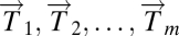 and normal tissue data vectors
 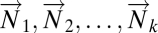 comprising the columns of the data matrix.
Step 1.
DSGA-transform all of the data and construct the following two matrices: (i) Dc.mat, the matrix whose columns 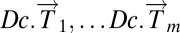 are the disease components of the original tumor vectors
  ; (ii) L1.mat, a matrix whose columns
 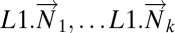 are leave-one-out estimates of the deviation from healthy state by normal tissue data. Note that the columns of L1.mat constitute an estimate of the disease component of normal tissue. (iii) L1Dc.mat, the concatenated matrix with normal and tumor columns
  .
.
Step 2.
Threshold data coordinates (genes, proteins, etc.) so that only the genes that show a significant deviation from the healthy state are retained in the data matrix from step 1. Any appropriate test for significance can be used.
Step 3.
Define Mapper filter functions on the data along which to perform the Mapper collapse to a graph. These functions should capture a biologically meaningful characteristic of the data. Essentially the data points are the individual columns of the DSGA-transformed data matrix, and for the filter functions we compute the vector magnitude in the Lp norm, as well as k powers of this magnitude. Below fp,k denotes the filter function, and  denotes the column vector: either
  or
or  . The coordinates are individual genes:
 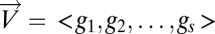 .
.
Note that if k = 1 and p = 2, the function simply computes the standard (Euclidean) vector magnitude of each column. Essentially, all these different filter functions, fp,k, measure the overall amount of deviation from the null hypothesis, which is the HSM. Roughly, 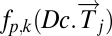 is large when a large number of genes deviates a lot from normal levels (the HSM) either in the positive direction (overexpression relative to normal) or the negative direction (underexpression relative to normal). Therefore, by using a variety of distance measurements, all these functions measure the extent to which a diseased tissue is different from normal tissue. A tissue sample that has many genes exhibiting either increased or decreased activity relative to normal would show a large value of the filter fp,k. A sample that resembles normal tissue in its gene activity will show a small value of fp,k, close to 0. The effect of the different choices of p determining the choice of Lp norm is that, for larger values of p the weight of genes with larger expression levels is greater. Thus, the choice of p acts as an additional smooth threshold of genes.
Step 4.
Apply Mapper to the data obtained in step 2, using the filter functions defined in step 3. Mapper also requires that we define a distance function on the data: a measure of similarity between individual data points. The distance function used is the correlation distance.
2. Application of PAD to Breast Cancer Microarray Data
We applied the steps defined in the previous section to a breast cancer microarray gene expression data set (6). Normal tissue data were a set of 13 microarrays (4): four from reduction mammoplasty and nine normal tissue samples from cancer patients. Details of this analysis can be found in SI Text. The DSGA transformation and gene thresholding (steps 1 and 2) produced a data matrix with 262 rows (genes). Mapper filter functions were computed for the following parameters: k powers of the Lp distance with p = 1,…5 and powers k = 1,…10. Fig. 3 shows the output of PAD analysis for p = 2 and k = 4. Each node is a bin of tumors, and its color encodes the value of the filter function averaged across all of the data points in the bin, with blue denoting a low value and red encoding a large value. Thus, bins that are blue contain tumors whose expression is close to normal, whereas bins that are red contain tumors that generally have large deviation from normal along multiple genes, in both the positive and the negative direction. There are several groups of tumors that stand out. Basal tumors occupy most of the bins in the tumor sequence denoted as ER− sequence. They are immediately visible and stand out with large value (red) in the filter function: overall deviation from normal. Normal tissue samples all fall in the same bin together with 15 additional ER+ tumors. These are colored blue and show minimal overall deviation from normal according to the filter function. The known group of her2+ tumors is not yet visible, owing to the well-understood problem that only a small number of genes (on 17q) identify it, making them mathematically less visible, despite the fact that the small number of coordinates (17q genes) are biologically important. This discrepancy between mathematical and biological significance will be addressed in a later article. An additional long tumor sequence on the graph, the ER+ sequence showing large deviation from normal, is visible, as defined by the filter. This tumor sequence also consists of ER+ tumors, but unlike the first (blue) group of tumors, these are distinct from normal tissue in that the value of the filter function—the Lp magnitudes of the tumor vectors  in these bins—is very large. The breakdown of genes that most deviate from normal within the ER+ sequence tumors is given below in sections 2.4 and 2.5, but much of the positive gene activity centers on Estrogen Receptor and c-MYB. A subgroup of tumor bins is flanked by areas of sparse bins and is termed c-MYB+ tumors, because, as we show later in section 2.5, the list of significant genes points to crucial involvement of this and related genes. The c-MYB+ subset of tumors was also chosen to be the most dense segment of the ER+ sequence because it remains in the PAD output even when small bins containing only one data point are thresholded from the graph. This is very helpful to consider, because dropping the smallest bins provides a schematic of the denser part of data and corresponds to removing outliers. The simplified PAD output with small bins removed can be seen in SI Text. For the remainder of this section we analyze properties of these two very different subsets of ER+ tumors.
Fig. 3.

PAD analysis of the NKI data. The output has three progression arms, because tumors (data points) are ordered by the magnitude of deviation from normal (the HSM). Each bin is colored by the mean of the filter map on the points. Blue bins contain tumors whose total deviation from HSM is small (normal and Normal-like tumors). Red bins contain tumors whose deviation from HSM is large. The image of f was subdivided into 15 intervals with 80% overlap. All bins are seen (outliers included). Regions of sparse data show branching. Several bins are disconnected from the main graph. The ER− arm consists mostly of Basal tumors. The c-MYB+ group was chosen within the ER arm as the tightest subset, between the two sparse regions.
The Normal-like (blue) group of tumors (15 tumors) constitutes 5% of the cohort. The low value of the filter function indicates little activity different from normal.
The c-MYB+ (red) group of tumors (22 tumors) constitutes 7.5% of the cohort, or the more compact subset (outliers removed 14 tumors) 5% of ER+ tumors. The high value of the filter function identifies these tumors as among the most distinct from normal tissue, showing extremely high activity in some gene groups (ER+, c-MYB+) and low activity in others (innate immune genes), relative to normal tissue. This extreme deviation from normal molecular profiles, together with the biology of the overly active gene groups, and the excellent overall survival suggests that these tumors have a mechanism to respond in a protective way, antagonizing the presence of neoplastic tissue. In the next paragraphs we give evidence for the following two points: (i) c-MYB+ breast cancer warrants being identified as a breast cancer group because it shows uniformity in molecular signature and clinical and survival properties, and because it is validated in other cancer data sets; and (ii) c-MYB+ breast cancer is a unique group that does not fit into previously identified breast cancer types.
2.1. Survival Analysis.
Survival analysis was performed on each of the two groups of ER+ tumors: the blue Normal-like group and the red group that shows altered transcriptional activity in a large number of genes compared with the normal tissue, c-MYB+ red group. Each group showed 100% overall survival, with no recurrence and no death from disease. Median time to follow-up was 10 y for the Normal-like group and 8.5 y for the c-MYB+ tumors. It is important to note that survival information was not incorporated in the DSGA decomposition or the Mapper progression. We simply tested survival of groups of tumors that our PAD analysis found to stand out, purely on the basis of our two-step analysis: (i) DSGA, highlighting the distinction between normal and disease data, and (ii) Mapper, identifying subtle aspects in the shape of the data.
2.2. Comparison with Cluster Analysis Applied to the Same Data Matrix.
The Normal-like tumor group (blue) is often observed through this type of analysis. However, the other group, c-MYB+ tumor group, was scattered across several clusters, as seen in Fig. 4. Thus, unlike PAD, cluster analysis was unable to identify this new group of tumors. This shows that the appearance of the new group of tumors was not due to the way data were transformed via DSGA nor to the specific method used for thresholding genes, but rather to the ability of PAD to identify subtle shape characteristics of the data set. Cluster analysis scattered the tumors in the ER+ tumor progression and even the very tight c-MYB+ tumor group. That the tumors in this group (22 in all, 14 without outliers) ought indeed to appear together is seen below, in sections 2.4–2.6, which show that the molecular signatures of these tumors are indeed very similar to one another and significantly distinct from other tumors.
Fig. 4.

Clustering vs. PAD. Can Mapper extract something new from the data that clustering does not? We compare the outputs of clustering (average linkage) vs. Mapper as applied to the same exact data matrix (DSGA-transformed NKI) to show that these two procedures are different. The bins defining the c-MYB+ group were marked on the cluster dendrogram (red for the tighter—no outliers—group, and orange for the larger c-MYB+ group containing outliers) The c-MYB+ tumors are scattered among different clusters, but PAD has been able to extract this group that turns out to be both statistically and biologically/clinically coherent.
2.3. Comparison with Molecular Subtype Classification.
The 22 tumors in the c-MYB+ group were analyzed for molecular subtype (Basal, ERBB2, Luminal A, Luminal B, and Normal-like) (7) as previously assigned (6). Of the 22 tumors, only six had correlation >0.1 to one of the five centroids, the rest having been left unclassified. Five were classified as Luminal A and one as Normal-like. The rest of the c-MYB+ tumors were partially classified by the centroid they were closest to as follows: seven Normal-Like, six Luminal A, and three Luminal B. These assignments to subtype have changed (9) to be two Normal-Like, two Luminal B, and 18 Luminal A. This new assignment changes the subtype of 77% of tumors (17 of the 22 tumors have different assignment from their original one).
2.4. Prediction Analysis of Microarrays (PAM).
PAM (10) was performed on DSGA-transformed data, using all genes, before thresholding (step 1 only). We wanted to investigate whether the two tumor groups, c-MYB+ and Normal-like, are good candidates for being molecular subtypes as far as their gene expression data were concerned. Using PAM, we wanted to determine whether they are (i) distinct from normal tissue, (ii) distinct from each other, and (iii) uniform within each group of tumors. Thus, we tested how successful PAM was in finding predictor variables for distinguishing these groups. The distinctions had extremely good error rates attained with very small numbers of genes, indicating that these groups of tumors satisfy all three conditions above. The output of the PAM analysis is found in SI Text. The distinction between c-MYB+ and normal is of particular interest: two predictor genes were able to distinguish between c-MYB+ group and normal tissue with error = 0. These predictor genes are TSH-releasing hormone, TRH, and proprotein convertase subtilisin/kexin type 1, PCSK1. Although it is important to remember that predictor variables need not be the most revealing about the underlying biology of the tumors, the fact that we are able to distinguish between c-MYB+ and normal with 0 error rate using only two genes is a strong indication that c-MYB+ is both significantly distinct from normal and significantly homogeneous as a class.
2.5. Significance of the Analysis of Microarrays (SAM).
SAM (11) was performed on groups of tumors. Of special interest are the genes that are significantly different between (i) the c-MYB+ group and normal samples and (ii) the c-MYB+ group and the rest of the ER+ sequence in the PAD output. Tables S1 and S2 show the top genes in the output of these SAM analyses and demonstrate a significant set of differences between groups, as indicated by these lists of genes.
2.6. Testing the c-MYB Signature in the c-MYB+ Tumor Group.
The SAM analysis identified the c-MYB gene to be among the significant top overexpressing genes (sixfold to 20-fold) in the c-MYB+ tumor group, both relative to normal tissue and relative to the rest of the ER+ tumor sequence in the PAD output. We wanted to find out whether other genes, known to be associated with (or downstream of) c-MYB overexpression (12), also show similar association in the c-MYB+ tumor group. We compared expression levels of known c-MYB-associated genes and computed P values using Student's t test; the results are found in Table S3. We tested the original rather than disease component values for the c-MYB signature. None of the genes listed as repressed by MYB overexpression showed significant reduction, but of the 45 genes listed as activated and present in the Nederlands Kanker Instituut (NKI) data, more than half (25 genes) had a P value <0.05 when values in the c-MYB+ group were compared with values in the normal group data.
2.7. Validation in Independent Breast Cancer Data.
We validated the presence of the c-MYB+ group of tumors in two other breast cancer data sets: Ullevål University Hospital (ULL) (8) of 80 breast cancers, of which 52 were of ductal histological types, as were the NKI tumors and HERSCH (13) set of 232 tumors, of which 188 were primary breast tumors with good-quality RNA. We found the subset that best resembled the c-MYB+ among the identified SAM genes. Specifically, we considered DSGA-transformed tumor data along the 262 genes identified as DSGA significant in the NKI data set, of which 255 genes were present in the ULL data and 221 in the HERSCH set. We further eliminated from the survival analysis step the tumors that had a very short follow-up time (<10 mo), as is standardly done because these short follow-up tumors affect negatively the reliability of survival analysis. Array mean-centered disease components were tested along the up and low sets of genes identified in the SAM analysis performed in the NKI data. Tumors were chosen on the basis of SAM genes in a two-step procedure: step 1 using two sets of SAM genes; step 2 using correlation along the 255 DSGA genes in common with the ULL set and the 221 DSGA genes in common with the HERSCH set. In step 1 we extracted tumors using two sets of SAM genes. First, we used the genes that were significant for the PAD progression arm ER+ sequence: the sequence of tumors leading up to the c-MYB+ group compared with normal, Basal, and Normal-like samples. Here we identified tumors which for at least 60% of the up SAM genes had expression levels higher than 33% of the tumors, and similarly, for 60% of the low SAM genes that had expression levels lower than 67% of the tumors. Second, we used the genes that were significantly distinct for the c-MYB+ subgroup compared with the rest of the tumors in ER+ sequence. This identified four tumors in the ULL set and 37 tumors in the HERSCH set. We then considered all of the tumors that were highly correlated (r > 0.68) to these top four tumors, along the 255 DSGA genes in the ULL set. Similarly, in the HERSCH set we identified tumors highly correlated (r > 0.60) to the top 37 tumors. This identified six tumors (13%) of the 46 total in ULL and 19 tumors (10%) of the total 188 in HERSCH. Finally, we tested survival in this group and again found them to have perfect survival and recurrence. Although this c-MYB+ subgroup consisted of only a few tumors, these constitute 13% of patients in ULL and 10% in HERSCH, thus higher than the 7.5% found in the first or NKI data set.
3. Discussion
We have introduced PAD, a method of analysis that takes into account the topology of data obtained from microarrays of disease tissue. First, DSGA highlights the expression pattern that deviates from normal (4). The second component of PAD consists in identifying the shape of DSGA-transformed data to access its topological properties beyond its cluster decomposition. Whereas cluster analysis identifies regions of higher density in these data, Mapper is able to find long gradual progressions, as is clearly demonstrated in this article. Here PAD identifies both quasi-parallel splits in progression, when a long string of data points suddenly splits into two gradually divergent progressions, as well as complete breaks, where data truly separate into disconnected regions. Moreover, Mapper creates a graph. This provides a means to visualize the shape of these data by way of a graph, and Mapper is flexible in the choice of guiding filter functions along which these data are collapsed to produce the graph. The filter functions are essentially a supervised step in the analysis, and different filter functions defined on the same data set highlight distinct shape features of these data. We note that Mapper is a much more general method to transform data into graphs, whereby filter functions can be chosen in a myriad possible ways. Different filter functions will highlight different aspects of the data. Indeed, several filter functions can be applied at once, thereby highlighting several aspects of the data at once. Moreover, owing in part to the simplicity of the graph output, the central problem of robustness of output can be addressed in a rigorous manner, using the concept of persistence (1). Thus, Mapper, in its complete generality, opens the door to study a wide range of data analysis problems. These and other aspects of Mapper will be discussed in further articles. Here we have attacked a very concrete type of omic data analysis problem, having defined the Mapper filter directly from the DSGA analysis as a measure of how aberrant the gene expression profile of a tumor is. As clearly demonstrated in the analysis of these breast cancer data, we were able to identify a unique subset of tumors—c-MYB+ breast cancers with a 100% overall survival—even though survival data were not taken into account for the PAD analysis. Indeed, no clinical information was incorporated into the analysis beyond the distinction between tumor and normal tissue samples. Cluster analysis completely missed the c-MYB+ group, by scattering the points in this subset of tumors across multiple clusters. Thus, although the c-MYB+ group is extremely coherent in terms of molecular profile, it is invisible to cluster analysis, which scatters these patients across multiple clusters. This fact highlights the value of mathematical analysis methods that are sensitive enough to go beyond cluster analysis in identifying the subtle geometry of these data.
We believe that topological data analysis, a group of methods for studying data from many different sources and of many different kinds, is particularly appropriate for the analysis of all kinds of biological data. These methods begin the process of uncovering the topology or special organization of genomic data sets. Topological data analysis provides a viewpoint of these data which is combinatorial and therefore easy to grasp, and it has a degree of robustness to the sort of distortions that can occur in studying biomedical data. Importantly, topological data analysis can uncover new subsets of disease processes, like the c-MYB+ class of breast cancers. Finally, the high expression of c-MYB+ by an ER+ breast cancer can help to explain why this group of 22 tumors has 100% survival and no metastasis. The c-MYB transcription factor activates the gene encoding HEP-27, which has been shown to inhibit MDM-2, which in turn activates p53 activity (14). So long as there are no p53 mutations in these tumors (and they belong to classes with few if any p53 mutations), this could help to provide a mechanism for the relatively nonaggressive nature of these breast cancers. It will now be useful to explore p53 activities in this new subset of tumors.
Supplementary Material
Acknowledgments
This work was supported by National Institutes of Health Grant I-U54_CA149145-01 (to M.N. and G.C.), Air Force Office of Scientific Research Grant FA9550-09-0-1-0531 (to M.N. and G.C.), Office of Naval Research Grant N00014-08-1-0931 (to G.C.), and National Science Foundation Grant DMS 0905823 (to G.C.); and by the Breast Cancer Foundation (A.J.L.) and National Cancer Institute (A.J.L.).
Footnotes
The authors declare no conflict of interest.
This article contains supporting information online at www.pnas.org/lookup/suppl/doi:10.1073/pnas.1102826108/-/DCSupplemental.
References
- 1.Carlsson G. Topology and data. Bull Am Math Soc. 2009;46:255–308. [Google Scholar]
- 2.Singh G, Memoli F, Carlsson G. Topological methods for the analysis of high dimensional data sets and 3D object recognition. In: Botsch M, Pajarola R, editors. Eurographics Symposium on Point-Based Graphics. Geneva: Eurographics Association; 2007. pp. 91–100. [Google Scholar]
- 3.Bowman GR, et al. Structural insight into RNA hairpin folding intermediates. J Am Chem Soc. 2008;130:9676–9678. doi: 10.1021/ja8032857. [DOI] [PMC free article] [PubMed] [Google Scholar]
- 4.Nicolau M, Tibshirani R, Børresen-Dale AL, Jeffrey SS. Disease-specific genomic analysis: Identifying the signature of pathologic biology. Bioinformatics. 2007;23:957–965. doi: 10.1093/bioinformatics/btm033. [DOI] [PubMed] [Google Scholar]
- 5.Mullner D, Nicolau M, Singh G. Progression Analysis of Disease Web Tool (2011) Available at: http://comptop.stanford.edu/pad/
- 6.van de Vijver MJ, et al. A gene-expression signature as a predictor of survival in breast cancer. N Engl J Med. 2002;347:1999–2009. doi: 10.1056/NEJMoa021967. [DOI] [PubMed] [Google Scholar]
- 7.Sorlie T, et al. Repeated observation of breast tumor subtypes in independent gene expression data sets. Proc Natl Acad Sci USA. 2003;100:8418–8423. doi: 10.1073/pnas.0932692100. [DOI] [PMC free article] [PubMed] [Google Scholar]
- 8.Langerød A, et al. TP53 mutation status and gene expression profiles are powerful prognostic markers of breast cancer. Breast Cancer Res. 2007;9:R30. doi: 10.1186/bcr1675. [DOI] [PMC free article] [PubMed] [Google Scholar]
- 9.Parker JS, et al. Supervised risk predictor of breast cancer based on intrinsic subtypes. J Clin Oncol. 2009;27:1160–1167. doi: 10.1200/JCO.2008.18.1370. [DOI] [PMC free article] [PubMed] [Google Scholar]
- 10.Tibshirani R, Hastie T, Narasimhan B, Chu G. Diagnosis of multiple cancer types by shrunken centroids of gene expression. Proc Natl Acad Sci USA. 2002;99:6567–6572. doi: 10.1073/pnas.082099299. [DOI] [PMC free article] [PubMed] [Google Scholar]
- 11.Tusher VG, Tibshirani R, Chu G. Significance analysis of microarrays applied to the ionizing radiation response. Proc Natl Acad Sci USA. 2001;98:5116–5121. doi: 10.1073/pnas.091062498. [DOI] [PMC free article] [PubMed] [Google Scholar]
- 12.Ramsay RG, Gonda TJ. MYB function in normal and cancer cells. Nat Rev Cancer. 2008;8:523–534. doi: 10.1038/nrc2439. [DOI] [PubMed] [Google Scholar]
- 13.Herschkowitz JI, He X, Fan C, Perou CM. The functional loss of the retinoblastoma tumour suppressor is a common event in basal-like and luminal B breast carcinomas. Breast Cancer Res. 2008;10:R75. doi: 10.1186/bcr2142. [DOI] [PMC free article] [PubMed] [Google Scholar]
- 14.Deisenroth C, Thorner AR, Enomoto T, Perou CM, Zhang Y. Mitochondrial Hep27 is a c-Myb target gene that inhibits Mdm2 and stabilizes p53. Mol Cell Biol. 2010;30:3981–3993. doi: 10.1128/MCB.01284-09. [DOI] [PMC free article] [PubMed] [Google Scholar]
Associated Data
This section collects any data citations, data availability statements, or supplementary materials included in this article.