

Abstract
In this article, the author demonstrates how geographic information system (GIS) software can be used to reconceptualize spatial relationships and ecological context and address the modifiable areal unit problem. In order to do this, the author uses GIS to (1) test an important category of spatial hypotheses (spatial proximity hypotheses), (2) overcome methodological problems that arise when data sets are not spatially comparable, and (3) measure ecological context. The author introduces a set of GIS variable construction techniques that are designed to accomplish these tasks, illustrates these techniques empirically by using them to test spatial proximity hypotheses drawn from the literature on environmental inequality, and demonstrates that results obtained using these techniques are methodologically superior to and substantively different from results obtained using traditional techniques. Finally, the author demonstrates that these techniques are the product of an alternative conceptualization of physical space that allows sociologists to develop new ways to think about and measure spatial relationships, ecological context, and place-based social inequality and that gives them the ability to reconceptualize spatially based methodological problems that have confronted them for years.
INTRODUCTION
In recent years, sociology has taken a significant spatial turn. Whether studying geographic access to abortion providers, urban poverty, corporate board interlocks, social capital, collective efficacy, or environmental inequality, sociologists are asking increasingly sophisticated substantive questions about space and ecological context (Anderton et al. 1994a; Kasarda 1989; Kono et al. 1998; Lichter, McLaughlin, and Ribar 1998; Mouw 2000; Sampson, Morenoff, and Earls 1999; Wilson 1987). This renewed interest in space and ecological context emerged simultaneously with the development of geographic information systems (GIS): mapping and database management software explicitly designed to analyze spatial data and test spatial hypotheses. However, sociologists have been slow to integrate GIS into their research. This is unfortunate, not only because GIS can improve our ability to test spatial hypotheses accurately, but just as importantly because GIS allows researchers to think about the spatial relationships that exist between social groups, social goods, objects, and events in a more sophisticated manner than is otherwise possible. This, in turn, allows researchers to (a) develop new ways to think about and measure ecological context and place-based social inequality and (b) devise new solutions for methodological problems that arise when data are spatially referenced—that is, when data contain observations tied to specific geographic coordinates.
In order to demonstrate the important role GIS can play in advancing these areas of sociological thinking and research, I will show how GIS can be used to (1) test an important category of spatial hypotheses (spatial proximity hypotheses), (2) overcome an important set of methodological problems (those that arise when the data sets researchers use are not spatially comparable), and (3) measure ecological context. In addition, I will demonstrate that the techniques researchers generally use to do these things produce inaccurate findings and that more accurate findings can be obtained using the GIS techniques introduced here.
In demonstrating the methodological advantages of these GIS techniques, I hope to convince researchers not only of the superiority of these techniques, but just as importantly, I hope to demonstrate that using GIS will change the way researchers think about spatial relationships, ecological context, and place-based social inequality, and that this, in turn, will have a substantive impact on the results researchers obtain and the conclusions researchers draw.
Thus, in the following section, I provide a general discussion of how GIS can help researchers to reconceptualize spatial relationships, ecological context, and place-based social inequality. This is followed by a more technical discussion of the methodological advantages of using GIS to construct ecological indicators, merge spatially incomparable data sets, and test spatial proximity hypotheses.
Because my goal is to demonstrate the advantages of using GIS to as broad an array of sociologists as possible, I have chosen to present more general and elementary GIS techniques than I otherwise would. On the one hand, this allows me to present these techniques in the most transparent and straightforward way possible, making them more accessible to a general sociological audience. On the other hand, in presenting these techniques without complicating twists that make sense for some research problems but not others, I will avoid giving the impression that these techniques can only be used in a very limited number of situations.
Clearly, there are many situations in which, and many research problems for which, using GIS makes little sense. Nevertheless, giving the impression that these techniques can only be used in a limited number of situations would be a serious mistake since these techniques can be used to solve a variety of research problems.
RECONCEPTUALIZING SPATIAL RELATIONSHIPS
GIS can help researchers reconceptualize spatial relationships and ecological context in several ways. For example, by making it relatively easy to map out the spatial distribution of social groups, social goods, and events in specific study areas, it becomes possible to examine visually where residentially segregated social groups live in relation to various social goods and ills. This allows researchers to think more clearly about questions such as Under what conditions are residentially segregated minority groups most likely to live near socially undesirable goods such as factory pollution? This is not the type of question researchers generally pose because the global measures of segregation that researchers generally use, such as the dissimilarity, isolation, and concentration indices, tell us the degree to which segregation exists in specific metropolitan areas, but not where segregated minority groups live within these metropolitan areas. However, knowing exactly where segregated minority groups live is important because the spatial distribution of socially desirable and undesirable goods varies across metropolitan areas and minorities are no longer confined solely to the inner city.2
For example, maps and analyses not presented here demonstrate that residential segregation in the urban core places minority groups near polluting manufacturing facilities in some metropolitan areas but not others. In addition, in some metropolitan areas, relatively low levels of residential segregation and concentration in the urban core actually increase minority group representation in polluted neighborhoods (maps and analyses available upon request).
GIS also allows researchers to map out changes in the spatial distributions of social groups, social goods, and events over time, giving researchers the ability to visually test hypotheses that make predictions about these changing spatial distributions. For example, I have generated maps (not presented here) that demonstrate that between 1920 and 1990, black neighborhoods in the Detroit metropolitan area expanded at their edges rather than into or along the region’s highly polluted industrial corridors. This contradicts the environmental inequality hypothesis that blacks move into environmentally hazardous neighborhoods in disproportionate numbers due to residential segregation and black/white income inequality (maps available upon request).
But perhaps the most important way in which GIS can help researchers to reconceptualize spatial relationships and ecological context is in allowing researchers to move back and forth between alternate representations of physical space. Quantitative sociologists typically think about physical space, and objects and events in physical space, as a set of discrete and bounded spatial units such as street addresses (points) and census tracts (polygons). This conception of physical space makes sense for many research questions, and its widespread use is understandable given the type of data and data manipulation tools generally available to sociologists. However, it does a poor job of representing many of the factors and processes that interest sociologists because people do not live in a world that is defined solely in discrete spatial terms.
Instead, people live in a world in which physical space is simultaneously discrete and continuous: a world in which space is divided into discrete and bounded spatial units for many purposes, but in which distance between points also matters because (a) the social impact of goods, objects, and events often declines continuously as distance from these goods, objects, and events increases, (b) the spheres of influence exerted by specific goods, objects, and events often fail to coincide with the boundaries of discrete and bounded units of analysis such as census tracts, and (c) ecological context tends to vary within discrete and bounded units of analysis.
Thus, in order to accurately measure ecological context, researchers must be able to model physical space as a continuous, unbounded surface in which variable values can vary continuously rather than being tied to specific analysis units. However, because people live in a world in which physical space is simultaneously discrete and continuous, and in which data are often collected for discrete units of analysis, researchers must also be able to move back and forth between continuous and discrete representations of the physical world. GIS allows researchers to do this.
Figures 1 and 2, which examine the spatial distribution of a subset of manufacturing facilities and manufacturing facility jobs in the Detroit metropolitan area, compare a continuous model of physical space to the discrete and bounded model of physical space that quantitative sociologists typically employ. The Detroit metropolitan area is defined here as the city of Detroit and the cities and townships immediately surrounding Detroit, and manufacturing facility location and employment data are drawn from the Environmental Protection Agency’s (EPA) 1990 Toxics Release Inventory (TRI) and the 1990 Michigan Manufacturers Directory (Pick Publications 1990). These data sets are described in more detail in a subsequent section of the article; however, it is important to note that the TRI does not provide data on all manufacturing facilities in the Detroit metropolitan area. Thus, figures 1 and 2 present information on a small, but important, subset of Detroit metropolitan area manufacturing facilities.
Fig. 1.

Discrete representations of physical space, the Detroit metropolitan area, 1990
Fig. 2.

Continuous representations of physical space, the Detroit metropolitan area, 1990
In figure 1, map (a) is a discrete representation of the Detroit metropolitan area in which each polygon represents a census tract and each dot represents a single manufacturing facility; map (b) is a discrete representation of the Detroit metropolitan area in which census tracts are categorized according to the number of TRI facility manufacturing jobs located in each tract. Researchers interested in metropolitan area residents’ access to manufacturing jobs could draw circles with a fixed radius around the center of each census tract and for each tract, count the number of manufacturing jobs that fall inside that tract’s circle or the number of manufacturing jobs that are located in tracts that are partially or completely encompassed by that tract’s circle (Mouw 2000). Researchers could also calculate the distance between each pair of census tracts in the metropolitan area and calculate, for each tract, the weighted sum of all the manufacturing jobs in the metropolitan area, using weights that decline from one to zero as the distance between tracts increases. Finally, researchers could determine the average distance from each tract to all the manufacturing jobs in the metropolitan area, using distance between tracts and the number of jobs in each tract to determine average distance (Boardman and Field 2002).
Maps (c) and (d) in figure 2 are continuous representations of the distribution of TRI facility manufacturing jobs in the Detroit metropolitan area. Map (c) was created by laying a 25 meter resolution grid—a rectangular grid with 25 meter square grid cells—on top of map (a) in figure 1 and calculating the number of TRI facility manufacturing jobs located within a one-kilometer radius of each grid cell. Map (d) was created by laying a 25 meter resolution grid on top of map (a) in figure 1 and calculating the number of manufacturing jobs located within a three-kilometer radius of each grid cell. The result for map (c) is a continuous surface with grid cell values ranging from 0 to 14,200. The result for map (d) is a continuous surface with grid cell values ranging from 0 to 26,036.
Maps (c) and (d) can be interpreted as describing the overlapping employment opportunity areas of each TRI facility in the Detroit metropolitan area, weighted by the number of manufacturing jobs in each TRI facility.3 A more realistic representation of these overlapping employment opportunity areas would use a larger radius to delineate the geographic extent of these areas as well as a distance decay function to account for the fact that as distance to a job increases, an individual’s ability to commute to that job decreases. Nevertheless, these maps are sufficient for illustrating how discrete and continuous representations of physical space shape the way we view spatial relationships and ecological context.
One of the first things we notice when we examine maps (c) and (d) is that continuous representations of physical space allow us to delineate the actual areas that are potentially impacted by the presence or absence of manufacturing jobs. Continuous representations allow us to do this because they treat map features, such as the TRI facilities in map (a), as objects with specific and measurable spheres of influence rather than as discrete points to be counted. Treating them as such allows us to model their joint sphere of influence in such a way as to accurately represent their spatial relationships to each other and precisely measure ecological context.
Of course, continuous representations of physical space can be used to model the spheres of influence of many ecological characteristics, including criminal activity, visible signs of social disorder, environmental amenities and disamenities, abortion clinic access, and built environment characteristics such as industrial activity and highways. Continuous representations can also be used to model individuals’ cognitive maps of their neighborhoods, including their perceptions of the boundaries of their neighborhoods and the positive and negative attributes of their neighborhoods and surrounding communities.4
Thus, continuous representations of physical space can be used to compare the spheres of influence of multiple social goods, objects, and events, both to each other and to the distribution of various social groups. Continuous representations of physical space can also be used to compare the spheres of influence of multiple attributes of the same social good. For example, as illustrated in a subsequent section of this article, continuous representations of physical space can be used to model factories’ positive (jobs) and negative (pollution) spheres of influence at the same time, allowing us to answer research questions that we might not otherwise be able to answer satisfactorily, such as, Is factory employment or factory pollution a better predictor of a neighborhood’s demographic characteristics?
As I will demonstrate below, GIS provides us with the tools to model these spheres of influence much more accurately than is possible using traditional methodological techniques, giving us the ability to construct more accurate ecological indicators than is otherwise possible. However, the point I want to make here is that because continuous representations of physical space allow us to think about social goods, objects, and events in terms of their nonbounded spheres of influence, such representations allow us to consider spatial relationships in a new light, giving us new ways to think about ecological context and place-based social inequality.
In addition, because GIS allows us to move back and forth between discrete and continuous representations of physical space, while simultaneously helping us to reconsider spatial relationships and ecological context, GIS also allows us to rethink the methods we use to construct ecological indicators, merge spatially incomparable data sets, and test spatial proximity hypotheses. Thus, the remainder of the article focuses on the methodological advantages of using GIS to do these things.
SPATIAL PROXIMITY HYPOTHESES AND SPATIALLY INCOMPARABLE DATA SETS
Spatial proximity hypotheses can be defined as hypotheses that include geographic distance as a predictor or outcome of some social process. Accurately measuring proximity can be difficult to do because researchers are either unable to obtain coordinate-specific location data or are forced to aggregate coordinate-specific location data to make that data comparable with aggregated data sets collected by others.
Spatially incomparable data sets can be defined as data sets that contain spatially referenced observations gathered from nonidentical, but geographically overlapping, units of analysis: units whose geographic boundaries change over time, such as census tracts, or units that overlap geographically but are based on different geographic coordinates, such as street addresses (points) and census tracts (polygons/areal units). Methodological problems arise when researchers alter spatially incomparable data sets to make them comparable. For example, when researchers merge dual-decade census tract data (census tract data drawn from two different decades) without using GIS-based application tools, they are generally forced to either (a) drop from their analyses all census tracts whose boundaries have changed or (b) merge census tract observations in each of the original data sets until the two data sets are spatially comparable (Bergesen and Herman 1998; Marchand 1986). In either case, the end result is the loss of a significant number of observations, and in the latter case the result is a significant increase in the size of many of the analysis units.
Methodological problems also arise when researchers aggregate address-specific data to make that data comparable with census tract data or use address-specific data to create tract-level dummy variables indicators (Anderton et al. 1994a, 1994b; Bergesen and Herman 1998; Bowen et al. 1995). In each of these cases, researchers lose important spatial information, and as a result they are generally forced to assume that their address-specific observations, or at least the impacts of these observations, are distributed evenly within their polygon-based units of analysis. They are also forced to assume that their address-specific observations do not affect adjacent areal units of analysis or that the effect of address-specific observations in one areal unit of analysis on outcomes in other areal units of analysis is equal to the sum of these observations’ independent effects divided by, or in some other way adjusted for, the distance between the host unit and the other analysis units.5
For example, spatial diffusion and spatial exposure correction models, such as those found in Myers (1997), Soule and Zylan (1997), Strang and Tuma (1993), and Tolnay, Deane, and Beck (1996), model the effect of events in one analysis unit on the presence of events in other analysis units, adjusting the magnitude of this effect to account for the distance between analysis units.
However, in making these adjustments, these models ignore the spatial distribution of events within host units and, therefore, the actual distance between specific events and specific nonhost analysis units. This is clearly appropriate in many cases. However, as figure 3 demonstrates, it is not appropriate in all cases.
Fig. 3.

The distribution of TRI facilities within census tracts, the Detroit metropolitan area, 1990
Figure 3 provides a close-up view of a subset of Detroit metropolitan area census tracts in 1990. Each polygon in the figure represents a census tract and each dot a TRI facility. In map (a), the four solid black dots are all located inside the boundaries of the same tract (this tract is approximately 4,800 meters long and the greatest distance between any two of the four highlighted facilities is approximately 2,200 meters; however, it is not the only large tract in the metropolitan area). Map (b) displays the TRI facilities’ overlapping one-kilometer-radius employment opportunity areas, and map (c) displays the TRI facilities’ overlapping three-kilometer-radius employment opportunity areas.
These maps show that facilities, events, and objects that are located in the same tract do not necessarily impact the same nonhost tracts and that even when they do impact the same nonhost tracts, they do not necessarily impact the same areas within these tracts. These maps also show that because TRI facilities’ individual employment opportunity areas partially overlap, their joint employment opportunity area can take on multiple values within a single tract (this is especially the case when distance decay functions are used to calculate individual and joint employment opportunity areas).6 Thus, ignoring the spatial distribution of events and objects within host units is problematic in cases where the distance between specific events and objects and specific analysis units, or between specific events and objects and specific points in space, is theoretically important, as is the case in many spatial proximity hypotheses.
Despite the methodological difficulties inherent in merging spatially incomparable data sets and testing spatial proximity hypotheses, a wide variety of sociologists have done one or both of these things. For example, Lichter et al. (1998) hypothesize that in the 1980s, decreased geographic access to abortion providers led to an increase in the proportion of households headed by women; Kono et al. (1998) hypothesize that geographic proximity plays an important role in shaping corporate board interlocks; spatial mismatch theorists hypothesize that the spatial disjuncture that exists between inner-city black neighborhoods and manufacturing facility employment opportunities has played an important role in the development of a black, urban underclass (Kasarda 1989; Wilson 1987); and environmental inequality researchers hypothesize that poor people and minorities live closer to environmental hazards than do wealthier individuals and whites (Anderton et al. 1994a, 1994b; Bryant and Mohai 1992).
In addition, Bergesen and Herman (1998), in their study of the 1992 Los Angeles race riot, merge street-intersection-specific riot fatality data with merged 1980/1990 census tract data; Mouw (2000), in his study of spatial mismatch in Detroit and Chicago, merges 1980 and 1990 census tract data for both metropolitan areas; South and Crowder (1998), in their study of black and white residential mobility, link individual-level Panel Study of Income Dynamics (PSID) data to 1980 census data using PSID respondent street addresses; McCarthy et al. (1988), in their study of social movement organization founding rates, merge address-specific car crash fatality data with county-level census data; and Anderton et al. (1994a), in their national study of environmental inequality, merge address-specific hazardous waste site data with 1980 census tract data.
Given the broad and varied use of spatial proximity hypotheses and spatially incomparable data sets within the discipline, it is important that we devise methodological techniques that overcome or minimize the problems that arise from both these activities. Thus, in the sections that follow, I set forth two GIS-based variable construction techniques that minimize these problems and illustrate these techniques empirically by using them to test four spatial proximity hypotheses drawn from the literature on environmental inequality. I compare results obtained using the variable construction techniques described in this article with results obtained using more traditional methodological approaches, and demonstrate that results obtained using these techniques are methodologically superior to and substantively different from results obtained using traditional techniques.
The remainder of the article is organized as follows. First, I demonstrate that the techniques researchers generally use to merge dual-decade census data and point and polygon data are methodologically problematic. I then describe the two GIS variable construction techniques noted above and use them to test the four spatial proximity hypotheses noted above.
Before proceeding, I should note that the techniques described below are not the only GIS techniques sociologists can use to overcome or minimize the methodological problems that arise when testing spatial proximity hypotheses, merging spatially incomparable data sets, and constructing ecological indicators. I should also note that although the following discussion is fairly technical, the GIS techniques described below are not merely technical fixes or neat methodological tools. They also represent an alternative approach to conceptualizing spatial relationships, ecological context, and place-based social inequality that allows researchers to develop new solutions to old methodological problems.
In other words, the solutions presented below are possible not only because GIS provides researchers with a new set of technical tools, but also because GIS provides researchers with a new way of thinking about physical space that allows them to reconceptualize many spatially based methodological problems. Thus, the following discussion not only provides researchers with new solutions to an important set of methodological problems, it also provides researchers with examples of how GIS can be used to solve similar spatially based methodological problems. It thereby demonstrates the potentially important role GIS can play in advancing sociological research.
THE MODIFIABLE AREAL UNIT PROBLEM
The methodological problems described in the previous section are specific instances of a more general methodological problem associated with spatially aggregated data sets, the modifiable areal unit problem (MAUP), which arises when the boundaries used to define areal-unit observations are modifiable and arbitrary, at least in relation to the underlying population distribution (Fotheringham and Wong 1991; Martin 1996; Openshaw and Taylor 1981).7
The MAUP consists of two related problems, a scale problem and a zoning problem. The scale problem refers to the fact that as the size of areal units of analysis increases, variable variation tends to decrease and covariation between different variable pairs tends to vary, sometimes quite drastically and not in a predictable fashion (Fotheringham and Wong 1991; Wong 1996).8
Equations (1), (2), and (3), which are used to calculate Pearson’s correlation coefficient (rxy), b̂ in a bivariate ordinary least squares (OLS) regression, and β̂2 in a trivariate OLS regression, demonstrate why decreasing variation and unstable covariation affect correlation coefficient and regression parameter estimates. In these equations Sx and Sy are the standard deviations of x and y respectively, var(xi) is the variance of xi, cov(x1, x2) is the covariance of the two independent variables, and cov(xi, y) is the covariance of xi and the dependent variable.
| (1) |
| (2) |
| (3) |
Looking first at equation (1), we see that as the variation in x and y decreases, the denominator in equation (1) also decreases. If cov(xy) remains stable, increases, or decreases at a slower rate than the denominator decreases, rxy will increase, which is, in fact, what generally happens (Arbia 1989; Openshaw and Taylor 1979). Turning our attention to equation (2), we see that the bivariate slope estimate, b̂, is derived by multiplying the correlation coefficient, rxy, by the ratio of the standard deviation of y to the standard deviation of x. Thus, variation in bivariate slope estimates due to data aggregation will differ from variation in correlation coefficient estimates due to data aggregation if the variances of x and y change at different rates as the data become increasingly aggregated (data aggregation refers here to the merging of census observations). For example, if the variance of x decreases at a faster rate than the variance of y as the data are increasingly aggregated, then b̂ will increase at a faster rate than rxy (assuming, of course, that rxy increases as the data are aggregated).
Finally, turning our attention to equation (3), we see that it quickly becomes very difficult to predict how data aggregation will affect regression slope estimates. For example, we know β̂2 will decrease if, holding the other terms in the equation constant, the covariance of x2 and y decreases at a faster rate than the covariance of x1 and y as the data are increasingly aggregated. Similarly, we know β̂2 will increase if, holding the other terms in the equation constant, the variance of x2 decreases as the data are increasingly aggregated (this does not hold true if the denominator switches from positive to negative as x2 decreases). However, because (a) variances and covariances do not remain constant as data are increasingly aggregated, (b) the variances of different variables do not decrease at the same rate as data are increasingly aggregated, and (c) it is impossible to predict how covariances will vary when data are aggregated (see n. 8), it is virtually impossible to predict how data aggregation will affect regression slope estimates (Fotheringham and Wong 1991).
Given the great difficulty inherent in trying to predict how data aggregation will affect bivariate and multivariate parameter estimates, many researchers have turned to data simulations to gain a better understanding of the problem. For example, Openshaw (1978), merging county-level data from the 1970 U.S. census to create ever-larger units of analysis, shows that in a bivariate regression, the slope coefficient tends to increase as the data become increasingly aggregated. Similarly, Fotheringham and Wong (1991) examine the effect that analysis unit size has on multivariate estimates by aggregating 1980 census block group data to create increasingly large units of analysis. Randomly aggregating contiguous block groups to create 120 different zoning systems at six levels of aggregation, and running OLS and logit regression models with four independent variables each, they found systematic variation in most, but not all, of their slope coefficient estimates as the data became increasingly aggregated.
However, the direction of this variation was not constant across independent variables. For example, in their logit models, the coefficients for two of their independent variables tended to increase, and the coefficients for one of their independent variables tended to decrease, as the data became increasingly aggregated; and in their OLS models, the coefficients for two of their independent variables tended to decrease, and the coefficients for one of their independent variables tended to increase, as the data became increasingly aggregated.
Finally, Fotheringham and Wong (1991) also found that R2 values and the standard errors of their parameter estimates tended to increase as analysis units became larger and fewer in number. Thus, merging census tract observations to make dual-decade census tract data sets comparable is a highly problematic endeavor, made more problematic by the fact that it is exceedingly difficult, if not impossible, to predict how data aggregation will affect regression results.9
The zoning problem
The zoning problem refers to the fact that if we hold the number of polygon-based analysis units in a study area constant, but change the boundaries used to define the analysis units, we can dramatically affect correlation coefficient and regression parameter estimates (Arbia 1989; Flowerdew, Geddes, and Green 2001; Fotheringham and Wong 1991; Openshaw and Taylor 1979). This has implications for the merging of point and polygon data—which is typically done by summing together point-specific data values in each polygon unit or creating polygon-level dummy variables to record the presence or absence of point-level observations in each polygon unit—because even if the boundaries used to define the polygons were not designed arbitrarily, they are very likely to be arbitrary in relation to the spatial distribution of the point-level data.
For example, although census tracts are “designed to be relatively homogeneous units with respect to population characteristics, economic status, and living conditions” (U.S. Census Bureau 2004), their boundaries are relatively arbitrary with respect to the spatial distribution of point-specific observations such as polluting manufacturing facilities, riot fatalities, and violent crimes.
Figure 4 illustrates the arbitrary nature of census tract boundaries in relation to the distribution of Detroit metropolitan area manufacturing facilities in 1990. As in the previous figures, the Detroit metropolitan area is defined as the city of Detroit and the cities and townships immediately surrounding Detroit (this definition will be used throughout the remainder of the article). However, the manufacturing facilities shown in figure 4 are drawn from the region’s four most highly polluting industrial sectors—transportation equipment, chemicals, primary metals, and fabricated metal products—rather than from the TRI. These facilities were selected because they represent a larger sample than do TRI facilities and because a similar data set is used later in the article.
Fig. 4.

Factory location and census tract boundaries, the Detroit metropolitan area, 1990
As is true in many urban areas, Detroit metropolitan area manufacturing facilities are generally located along major transportation routes that often serve as census tract boundaries. The result, illustrated in figure 4, is not only that the size and shape of Detroit’s industrial neighborhoods and corridors fail to match the size and shape of the region’s census tracts (see the highlighted areas), but also that many manufacturing facilities are located near the boundaries of multiple census tracts.
The fact that so many of the factories shown in figure 4 are located near census tract boundaries means that they are likely to affect people in multiple censustracts.10 Moreover, because a facility’s host census tract can be relatively large, pollution from that facility, or positive or negative perceptions of that facility, may have a greater impact on people in adjacent tracts than on people located at the far end of the host tract. However, when we sum together the number of facilities, pounds of pollution, or number of factory jobs in each census tract, or create a dummy variable to indicate the presence or absence of manufacturing facilities in a census tract, we ignore the possibility that facilities in one tract may affect people in adjacent tracts, perhaps to a greater degree than they affect people in the host tract. We also ignore the possibility that facilities may not affect every square inch of their host tract or adjacent tracts equally.11
Moreover, it is likely that these considerations hold for at least some other point-specific data. For example, it is not unreasonable to assume that violent crime and drug dealing can influence perceptions of neighborhood order and disorder across tract boundaries and unevenly within tract boundaries or that the effect of abortion clinics on out-of-wedlock births is poorly captured by county, zip code, or census tract boundaries. As a result, it is likely that aggregating point data to the polygon level will, in many cases, produce results that are more highly dependent on the zoning scheme used to define researchers’ aerial unit boundaries than on the underlying relationships researchers wish to investigate.
Given the serious methodological problems that arise when researchers aggregate point data to the polygon level or merge census tract observations to make dual-decade census tract data sets spatially comparable, it is imperative that researchers devise new methodological techniques for doing both of these things. Thus, in the sections that follow, I describe two GIS variable construction techniques that minimize the methodological problems associated with merging point and polygon data and dual-decade census data, use these techniques to test four hypotheses drawn from the literature on environmental inequality, and compare the results of these tests to results obtained using more traditional data merging techniques. I begin with a brief discussion of the four environmental inequality hypotheses.
ENVIRONMENTAL INEQUALITY HYPOTHESES
Environmental inequality is a relatively new field of study that attempts to evaluate the claim that the poor, the working class, and people of color are disproportionately burdened by environmental hazards (Anderton et al. 1994a, 1994b; Bowen et al. 1995; Bryant and Mohai 1992; Szasz and Meuser 1997). In order to ascertain the validity of this claim, environmental inequality researchers have set forth several spatial proximity hypotheses, four of which will be tested in this article.
-
Hypothesis 1.—
Neighborhood proximity to environmental hazards is positively associated with the percentage of blacks in a neighborhood (Mohai and Bryant 1992; Sadd et al. 1999).
-
Hypothesis 2.—
Neighborhood proximity to environmental hazards is negatively associated with neighborhood income levels (Hamilton 1995; Mohai and Bryant 1992; Szasz and Meuser 1997).
-
Hypothesis 3.—
Neighborhood proximity to industrial pollution is a stronger predictor than neighborhood proximity to industrial employment of neighborhood racial composition (Bullard 1992).12
-
Hypothesis 4.—
Blacks move into environmentally hazardous neighborhoods in disproportionate numbers (Godsil 1991; Hamilton 1995; Mohai and Bryant 1992).
These hypotheses raise unique methodological challenges. The first and second force us to measure proximity, the third to compare the predictive power of variables—employment opportunities and pollution—that operate at different spatial scales, and the fourth to measure change over time. However, what unites them conceptually and makes testing them especially challenging is that the data sets sociologists use to evaluate them typically contain spatially noncomparable units of analysis. Thus, these hypotheses provide an ideal platform for demonstrating the methodological advantages of using the GIS techniques introduced in this article.
A VERY BRIEF INTRODUCTION TO GIS
A GIS is a software package that unites spatial data, such as the location of factories and census tracts, with data about the features making up the spatial database, such as the number of people living in each census tract or the number of employees in each factory.13 In a GIS, data are stored as map layers that can be precisely positioned on top of each other.14 There are two basic types of map layers in a GIS, vector map layers and raster map layers. A vector map uses points, lines, and polygons to represent physical features (vector maps are what most people think of when they think of maps). A raster map stores and displays spatially referenced numeric data in rectangular grids composed of square cells that are described in terms of resolution.
The procedures described in this article convert vector-based census tract maps and vector-based manufacturing facility maps into raster grids, mathematically manipulate these grids, and then convert them back into vector-based census tract maps, using tract boundaries to aggregate the manipulated raster data.15 In the examples presented below, the raster data is aggregated either by summing together the cell values that fall inside each vector-based census tract or by calculating the mean or median cell value in each vector-based census tract.16
As we shall see, these procedures minimize the problems associated with merging point and polygon data by allowing researchers to mathematically manipulate grid cells without regard to census tract boundaries, thereby allowing point-specific data in one census tract to affect grid cells located in other census tracts, to have an uneven effect on cells located in the host tract, and to have an uneven effect on cells located in nonhost tracts.
These procedures also minimize the problems associated with merging dual-decade census tract data. They do this by allowing researchers to reallocate grid cells from one set of census tract boundaries to another, thereby allowing researchers to easily reapportion data from one set of census tract boundaries to another.
MEASURING POLLUTION PROXIMITY IN DETROIT
In this section, I test the hypothesis that neighborhood proximity to environmental hazards is positively associated with the percentage of blacks in a neighborhood (%black) and negatively associated with neighborhood income levels, comparing results obtained using a traditional environmental hazard indicator (the total pounds of factory emissions in a census tract) to results obtained using two GIS-based environmental hazard indicators (defined below). Data are drawn from the Detroit metropolitan area. Tract-level demographic data were obtained from the 1990 U.S. census, and facility-level pollution data were obtained from the Environmental Protection Agency’s 1990 Toxics Release Inventory (TRI). The TRI records the number of pounds of specified toxic chemicals released into the environment each year by manufacturing facilities that employ the equivalent of 10 or more full-time workers and manufacture, process, or otherwise use specified chemicals in specified quantities. In 1990, the specified quantities were 25,000 pounds for facilities that manufactured or processed TRI chemicals and 10,000 pounds for facilities that otherwise used TRI chemicals.17
In order to test the black proximity and income proximity hypotheses, environmental inequality researchers generally aggregate site-specific environmental hazard data to create variables such as the total pounds of TRI emissions in a census tract or the number of hazardous waste facilities in a zip code. They then correlate these aggregated indicators with demographic variables such as median household income and %black.18 In most studies, only people who live in analysis units containing hazards or emissions (hazardous analysis units) are considered to be living in proximity to hazards and emissions. However, in some studies, people living in analysis units adjacent to hazardous units are also considered to be living in proximity to hazards and emissions.
As noted above, this methodological approach is problematic in a number of respects. First, it forces us to assume that environmental hazards (or at least their negative effects) are distributed evenly within analysis units. However, manufacturing facilities tend to cluster along major transportation routes (Northam 1979) that often serve as census tract boundaries. Second, it forces us to assume that environmental hazards affect every square inch of their host unit equally. Third, it forces us to assume that environmental hazards do not affect people in adjacent units of analysis or that the effect of environmental hazards in one unit of analysis on outcomes in other units of analysis is equal to the sum of the hazards’ independent effects divided by, or in some other way adjusted for, the distance between the host unit and the other analysis units.
Fourth, simple summing fails to take analysis unit size into account. However, analysis units generally become larger as you move away from the urban core. In the Detroit metropolitan area, for example, distance from the central business district is significantly correlated with %black, median household income, and census tract size. As a result, in the Detroit metropolitan area, median household income and %black are both correlated with tract size, a potentially important determinant of the number of facilities and pounds of emissions in a tract.
In order to overcome these problems, I located the TRI facilities on a vector-based 1990 census tract map and then converted this map into two, 25-meter resolution raster maps (maps in which the outer dimensions of each cell are 25 meters × 25 meters in length).19 Each cell in the first raster map was set equal to the distance from the center of that cell to the nearest TRI facility. Each cell in the second raster map was set equal to the pounds of TRI pollutants emitted within a one-quarter kilometer radius of the center of that cell. I then took the sum of the values of all the cells falling into each 1990 census tract and divided this sum by the number of cells in each tract. This gave me two new tract-level variables: the average minimum distance in a tract, or the distance from the average tract cell to its nearest TRI facility, and the average exposure in a tract, or the pounds of TRI pollutants emitted within a one-quarter kilometer radius of the average tract cell.20
Figure 5 compares average exposure to a traditional pollution proximity indicator, the total pounds of TRI pollutants emitted in each census tract (total emissions). In this figure, tracts A, C, and D each represent a single 16-parcel tract, while tract B represents an 8-parcel tract. For simplicity’s sake, we will assume that the center of each parcel lies within a one-quarter kilometer radius of the center of every parcel it touches but outside a one-quarter kilometer radius of the center of all the other parcels, and that each facility is located in the center of its parcel. Average exposure is calculated by assigning a value to each parcel equal to the pounds of pollutants emitted within a one-quarter kilometer radius of its center point, summing up the parcel values for each tract and dividing each tract total by the number of parcels in that tract. For example, there are 10,500 pounds of pollutants emitted within a one-quarter kilometer radius of the parcel in the top left-hand corner of tract B, and average exposure in that tract equals [(10,500 × 2) + (500 × 4)]/8 = 2,875.
Fig. 5.

Comparing facility presence indicators
Comparing tracts A and B, we see that although total emissions are much greater in tract A than in tract B, average exposure is 15% greater in tract B than in tract A. Comparing tracts C and D, we see that although total emissions in tract C equals total emissions in tract D, average exposure is significantly lower in tract D than it is in tract C due to the spatial distribution of facilities in each tract. It should be clear, then, that average exposure minimizes the problems associated with the MAUP by taking tract size, facility location, and the boundary problem into consideration. The same is true of average minimum distance, which also takes tract size, facility location, and the boundary problem into consideration. As a result, average exposure and average minimum distance are more valid indicators of proximity than is total emissions.
Testing the Hypotheses
In order to test the black proximity and income proximity hypotheses, %black and median household income are correlated with average exposure, average minimum distance, and total emissions (table 1).21 I use Kendall correlation coefficients rather than Pearson’s correlation coefficients because the data are not distributed normally, and correlation coefficients rather than multiple regression because I am not testing causal hypotheses.
TABLE 1.
Kendall Tau b Correlation Coefficients for Facility Presence, % black, and Median Household Income, 1990
| % black | Median Houshold Income | |
|---|---|---|
| Total emissions | −.002 | −.115*** |
| Average exposure | .118** | −.233*** |
| Average minimum distance | −.277** | .449*** |
P < .05.
P < .01.
P < .001.
Table 1 shows that in the Detroit metropolitan area, total emissions is significantly correlated with median household income, but not with %black. Average minimum distance and average exposure, on the other hand, are both significantly correlated with %black and median household income in the expected direction. As average exposure increases, %black increases and median household income decreases, and as the distance from the average tract cell to its nearest facility increases, %black decreases and median household income increases.22
These results indicate that addressing the MAUP is not simply a methodological concern. It has substantive implications as well. If we were to focus solely on the aggregated proximity indicator, total emissions, we would be forced to conclude that in the Detroit metropolitan area, TRI emissions are distributed inequitably according to income but not race, and that income-based environmental inequality in the region is relatively weak. However, using the GIS-based proximity indicators, we find that Detroit metropolitan area TRI emissions are distributed inequitably according to both income and race, and that income-based environmental inequality in the region is relatively strong. Thus, using GIS to reconceptualize and measure spatial relationships and ecological context has had a statistically significant and substantively important impact on the results reported here.
IS IT JOBS OR POLLUTION?
An interesting problem that arises when studying environmental inequality is that manufacturing facilities produce jobs as well as pollution, forcing researchers to ask whether manufacturing facilities are socially desirable, socially undesirable, or both, and whether the pollution burdens and employment benefits of manufacturing activity are borne by the same individuals, neighborhoods, and social groups (Bullard 1992). Nevertheless, to my knowledge, no environmental inequality researcher has conducted a study that asks whether manufacturing facility employment or pollution is a stronger predictor of neighborhood demographic composition.
One possible explanation for this is that when researchers think about physical space, they tend do so in discrete and bounded terms and, as a result, are unlikely to think about comparing the spheres of influence or relative predictive power of different attributes of the same social good. A more likely explanation for this is that this is a very difficult question to answer. This is because the size of the area affected by facility emissions is likely to be much different than the size of the area affected by facility employment opportunities. Thus, in order to measure accurately manufacturing facilities’ socially desirable and undesirable properties, we must measure characteristics that operate at different spatial scales.
In this section, I demonstrate how the GIS variable construction technique introduced in the preceding section can be used to do this, using data drawn from the Detroit metropolitan area to determine whether manufacturing facility pollution or employment is a stronger predictor of neighborhood racial composition. As in the previous section, I do not employ plume or distance decay modeling techniques to create the pollution and employment indicators used below because I want to simplify the presentation and avoid giving readers the impression that the techniques introduced here can only be used to study environmental inequality and spatial mismatch theory.
In addition, because the emphasis in this article is to illustrate the important role GIS can play in advancing sociological thinking and research, and not to settle substantive debates, I do not attempt to determine the actual scales at which employment and pollution have an impact. Instead, I assume that facility emissions exert a strong negative impact on a relatively small scale (within a one-quarter kilometer radius of each facility) and that manufacturing employment opportunities exert a strong positive impact on a larger, albeit still relatively small, geographic scale (within a one-, three-, or five-kilometer radius of each facility).
While these relatively small radii would make little sense in a plume or distance decay modeling context, their use makes sense here because EPA and census data suggest that as the distance from manufacturing facilities increases, manufacturing facilities’ pollution and employment impacts decline fairly rapidly at first and then more slowly as distance increases further.23 In addition, these data suggest that pollution impacts decline much more rapidly than employment impacts. Thus, if I were to increase the length of the radii used to create the indicators employed here, it is quite likely that I would overestimate the pollution and employment impacts of the TRI facilities in the database.
The data used in this section were obtained from the following sources: tract-level demographic data were obtained from the 1990 U.S. census, pollution data were obtained from the 1990 Toxics Release Inventory, and employment data were obtained from the 1990 Michigan Manufacturers Directory (Pick Publications, 1990). The Michigan Manufacturers Directory lists the names, addresses, and number of employees of manufacturing facilities throughout the state. Because employee data are not available for every facility in the directory, only those TRI facilities with employee data are included in the analysis.24
In order to determine whether manufacturing facility employment or pollution is a stronger predictor of neighborhood racial composition, I regress %black on two grid-based indicators, average employment and average exposure, controlling for median family income, median family income squared, the percentage of housing units in a tract that are owner occupied, the percentage of housing units built before 1960, the percentage of housing units that are vacant, the median property value of owner-occupied housing, median gross rent, and a set of spatial trend variables that take into account the distance and compass direction from the central business district to each census tract.25
I include the spatial trend variables because the procedures I use to control for spatial autocorrelation assume spatial stationarity, which “implies that the relationships within any subset of points remain the same no matter where the points reside in space” (Kaluzny et al. 1998, p. 6).26 However, because it is not my goal to examine the association between the spatial trend variables and the dependent variable, I do not report the spatial trend coefficients below.
Average exposure and average employment are both calculated at the tract level using 25-meter resolution grid cells and the variable construction technique introduced in the previous section. Average exposure is defined as the pounds of TRI pollutants emitted within a one-kilometer radius of the average tract cell, average employment 1 is defined as the number of TRI facility workers employed within a one-kilometer radius of the average tract cell, average employment 3 is defined as the number of TRI facility workers employed within a three-kilometer radius of the average tract cell, and average employment 5 is defined as the number of TRI facility workers employed within a five-kilometer radius of the average tract cell.
Table 2, models 1–3, show that average employment 1, 3, and 5 are all stronger predictors than average exposure of the percentage of blacks in a tract. Whereas average employment is significantly and negatively associated with %black at all three scales of spatial measurement, average exposure is not significantly associated with the dependent variable even when average employment is dropped from the model (model 4). Thus, the lack of statistical association between average exposure and %black is not the result of multicollinearity between average exposure and average employment.
TABLE 2.
Regression of % black on Average Exposure and Average Employment, 1990
| Model 1 (1-km radius) | Model 2 (3-km radius) | Model 3 (5-km radius) | Model 4 | Model 5 | |
|---|---|---|---|---|---|
| Intercept | −118.1770*** | −107.8500*** | −89.8750*** | −119.7085*** | −25.1384** |
| Average exposure | .0120 | .0090 | .0074 | .0004 | |
| Average employment 1 | −.0053* | ||||
| Average employment 3 | −.0026*** | ||||
| Average employment 5 | −.0016*** | ||||
| Total emissions (in 1,000s) | .0044 | ||||
| Total employment (in 1,000s) | −2.0267 | ||||
| Median property value | −.0001 | −.0001 | −.0001 | −.0001 | −.0001* |
| Median gross rent | .0292* | .0258* | .0259* | .0283* | .0308* |
| % owner occupied | −.1124 | −.0958 | −.0205 | −.1064 | −.2083* |
| % housing built before 1960 | .1495** | .1547** | .1180* | .1476* | .1608** |
| % vacant housing units | .0200 | .0192 | .0215 | .0201 | .0011 |
| Median family income | −.0007* | −.0007 | −.0009* | −.0007* | −.0003 |
| Median family income squared | .0000* | .0000 | .0000* | .0000 | .0000 |
| ρ | .1388* | .1388* | .1388* | .1388* | .1390* |
| Log likelihood | −3,798 | −3,778 | −3,780 | −3,801 | −3,791 |
Note.—N of observations is 594 for all models. Spatial trend variables were utilized in the models but not reported here.
P < .05.
P < .01.
P < .001.
In order to compare these results to results obtained using a traditional variable construction technique, I inserted total emissions and total employment into the regression equation in place of average exposure and average employment. Total emissions is defined as the total pounds of TRI pollutants emitted in each census tract in 1990 divided by 1,000, and total employment is defined as the number of TRI facility workers employed within the boundaries of each census tract in 1990 divided by 1,000. When these variables are inserted into the regression equation (model 5), neither of them is significantly associated with the dependent variable.
These results demonstrate that using GIS to construct ecological indicators and address the MAUP can have a substantive impact not only on correlation results (table 1), but on regression results as well. If we were to focus solely on the results for model 5, we would be forced to conclude that in the Detroit metropolitan area in 1990, neither TRI emissions nor TRI employment was significantly associated with the percentage of blacks in a tract. Our conclusions are quite different, however, when we focus our attention on the results found in models 1–3. These results indicate that in the Detroit metropolitan area in 1990, TRI facility employment was a more important determinant than TRI facility pollution of neighborhood racial composition and that as TRI facility employment increased, the percentage of blacks in a tract decreased.
On the one hand, these findings contradict the environmental inequality argument that net of other factors, manufacturing facility pollution is still an important determinant of neighborhood racial composition (Mohai and Bryant 1992). On the other hand, in showing that in the Detroit metropolitan area, %black is negatively associated with average employment, but insignificantly associated with average exposure, these analyses provide tentative support for the argument that for blacks the burdens of industrial production outweigh its benefits (Bullard 1992).
In order to provide more complete support for this argument, we would need to carefully specify the precise distance decay functions and plume modeling parameters needed to estimate TRI facilities’ employment and pollution impacts. Nevertheless, the findings reported in table 2 demonstrate that GIS can be used to convert point data into substantively meaningful aerial-unit indicators that accurately measure observational characteristics operating at different spatial scales. These indicators minimize the methodological problems associated with merging point and polygon data by taking facility location and the boundary problem into consideration and can be constructed whenever researchers merge spatially referenced point data with spatially referenced aerial-unit data such as that provided by the U.S. census.
USING CENSUS DATA TO EXAMINE CHANGE OVER TIME
As noted above, a major problem confronting researchers who use census data to examine change over time is that census boundaries change from one decade to the next, forcing many researchers to either (a) drop from their analyses all census units whose boundaries have changed or (b) merge census units in each of the original data sets until their observations are comparable over time (Bergesen and Herman 1998; Marchand 1986). This is problematic for at least two reasons. First, regardless of which approach is taken, a large number of observations are lost. Second, even when a study is restricted to two time points, the number of census units that need to be merged can be quite large, resulting in the creation of analysis units that are larger (in some cases much larger) and more heterogeneous than the nonmerged analysis units to which they are being compared. These are serious problems, as my earlier discussion made clear. Not only can data aggregation have a dramatic effect on correlation coefficient and regression parameter estimates, it can also increase R2-values and the standard errors of the parameter estimates.
Thus, in this section, I introduce a GIS procedure that allows researchers to merge census data from different decades without merging or dropping census observations. It does this by reapportioning data from one set of census boundaries to another, using raster maps as a bridge between the different sets of census boundaries.
After describing the procedure, I use it to test the hypothesis that blacks move into environmentally hazardous neighborhoods in disproportionate numbers. I test this hypothesis by regressing the tract-level change in %black from one decade to the next (%black1990 – %black1980) on average exposure1980 and a set of control variables also measured in 1980, comparing regression results obtained using merged observation data to results obtained using the GIS procedure described below.
Before proceeding, I should note that this procedure is not the only GIS procedure that has been developed to reapportion data from one set of census boundaries to another. For example, the University of Missouri’s Office of Social and Economic Data Analysis provides internet users with a free “geographic correspondence engine” called MABLE/Geocorr that allows researchers to convert U.S. census data from one census geography to another (within a single census year or across different censuses); and Geolytics, Inc., sells a data set that allows researchers to, in their words, “normalize” 1970, 1980, and 1990 U.S. census tract data to 2000 census tract boundaries.27
However, neither of these applications allows researchers to reapportion data to or from analysis units not covered by its correspondence engine. Thus, MABLE/Geocorr does not allow researchers to reapportion census data collected prior to 1980, the Geolytics data set does not allow researchers to reapportion census data collected prior to 1970 or to reap-portion 1970, 1980, or 1990 census data to pre-2000 boundaries, and neither application allows researchers to reapportion data to or from non-census analysis units.28
As we shall see, the procedure described below does not limit researchers in these ways. Its only major limitation is one that is common to many GIS applications: researchers must be able to input their analysis unit boundaries into a GIS using a common projection and common datum (see n. 14 for definitions of these terms).
Constructing the New Variables
One of the advantages of GIS is its ability to precisely position raster and vector maps on top of each other and convert these maps from one format to the other. Thus, we can convert a 1990 vector-based census tract map into a series of raster grids—one for each 1990 variable in our analysis—lay a 1980 vector-based census tract map on top of these grids, and for each 1980 census tract calculate (a) the sum of the values of all the cells that fall into that tract and (b) the mean and median cell value in that tract. In other words, we can “rasterize” our 1990 census tract data and then reaggregate it using 1980 census tract boundaries.
When doing this, each grid cell is assigned to the tract that overlaps the center of the cell, and all cells belonging to the same tract are assigned the same value, the value of the variable in that tract. However, when reapportioning count variables (i.e., total population, number of housing units), each count variable observation must be divided by the number of cells in its 1990 tract before it is rasterized and reaggregated. For example, if I want to calculate the number of people in 1990 who live within the boundaries of each 1980 tract, I must first divide “total population1990” by the number of cells in each 1990 tract—which gives me “total population per cell1990”—rasterize this new variable, and then sum the “population per cell1990” cell values that fall in each 1980 tract (Grannis [1998] uses a similar, non-raster-based method to reapportion census data).29
Figure 6 illustrates this process and compares it to tract merging. Object 1 in figure 6 contains three fictitious 1990 census tracts, with total populations of 50, 75, and 100 respectively; object 2 contains their corresponding 1980 census tract boundaries; object 3 contains the boundary and population value obtained through the tract merging process (225 = 100 + 75 + 50); and object 4 is the raster grid created by calculating and rasterizing a “total population per cell” variable. In order to calculate the 1990 population that lives in each 1980 tract and the 1990 population that lives in the merged supertract, object 5 sums the cell values in object 4 that fall into each 1980 tract, and object 6 sums the cell values in object 4 that fall into the merged supertract.
Fig. 6.
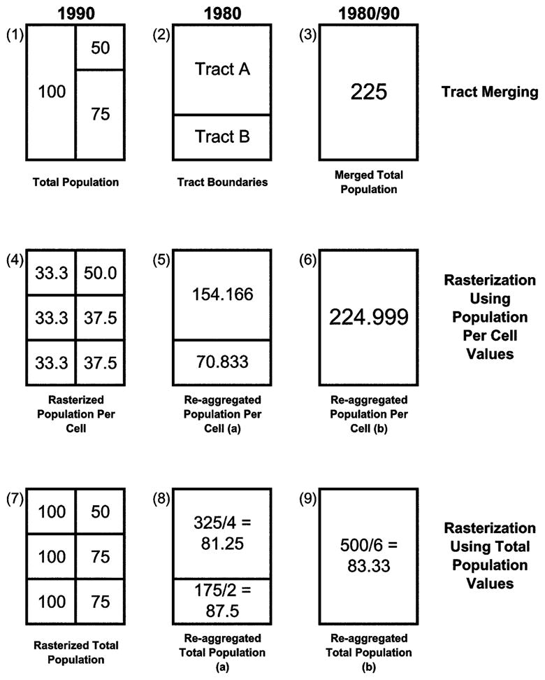
Reaggregation and tract merging
Objects 1–6 highlight several important points. First, when converting census maps to raster grids all the cells belonging to the same tract must take on the same value. Second, merged census data provide less precise population distribution information than do reaggregated census data. Third, when we sum the cell values in object 4 to create object 6, we obtain virtually the same population value (224.999) as we do when we use the tract merging process illustrated in object 3 (the cell values in object 6 do not add up to 225 due to rounding errors). Thus, if we are to obtain accurate results when reapportioning count variable data, we must rasterize population-per-cell values rather than total population values.
The opposite is true when rasterizing and reaggregating median value variables. In this case, the actual median values must be rasterized (object 7) and then reaggregated by calculating the mean or median cell value in each 1980 tract (the mean cell value in each 1980 tract can be found in object 8).30 Thus, if the values in object 1 actually represented median tract incomes, we would conclude that the median income in the larger of the two 1980 tracts equals 81.25 (the mean cell value found in tract A, object 8) or 87.5 (the median cell value), and that the median income in the smaller of the two tracts equals 87.5 (the mean and median cell value).
Comparing the Methods
In order to test the hypothesis that blacks move into environmentally hazardous neighborhoods in disproportionate numbers, I regress the change in %black from one decade to the next (%black1990 – %black1980) on average exposure1980, %black1980, and a set of control variables also measured in 1980, comparing results obtained using reaggregated data with results obtained using merged observation data.31
As argued earlier, it is extremely difficult, if not impossible, to make specific predictions about how census tract merging (data aggregation) will affect regression results. Nevertheless, prior research demonstrates that data aggregation can increase and decrease slope coefficient estimates within the same regression model and inflate the standard errors of parameter estimates. Prior research also demonstrates that aggregated data set coefficients can be significantly different from nonaggregated data set coefficients and that coefficients can change sign as the data are increasingly aggregated (Fotheringham and Wong 1991; Wong 1996). Thus, it is likely that some of the variable coefficients that are statistically significant in the reaggregated data model will be statistically insignificant in the merged data model, that some coefficient values will increase and others will decrease as we move from one data model to the other, and that these differences will be statistically significant in some cases. Finally, some coefficients may even change sign as we move from one data model to the other.
As in the previous examples, data were drawn from the Detroit metropolitan area. Tract-level demographic data were obtained from the 1980 and 1990 U.S. census, and manufacturing facility data were obtained from the 1980 Directory of Michigan Manufacturers (Pick Publications 1980). Facility data were drawn from the 1980 Directory of Michigan Manufacturers rather than from the TRI database, because the Environmental Protection Agency did not begin collecting TRI data until 1987. Thus, average exposure1980 is defined as the number of manufacturing facilities located within a one-quarter kilometer radius of the average tract cell.
In order to ensure that the manufacturing facilities included in the data set were among the most hazardous in the region, the data set is restricted to facilities in four highly polluting industrial sectors: transportation equipment, chemicals, primary metals, and fabricated metal products. These industries are well represented in Detroit’s industrial economy and according to the TRI were the four most highly polluting industrial sectors in the Detroit metropolitan area in 1992, responsible for approximately 99% of the region’s TRI emissions that year.
The control variables are drawn from the literature on racial succession, which is defined as “the replacement of whites by nonwhites within the boundaries of a given neighborhood” (White 1984, p. 165). Racial succession is generally viewed as a function of white geographic mobility (Steinnes 1977), the age and condition of the housing stock (Wilson 1983), and the proximity of white neighborhoods to nonwhite neighborhoods (Massey and Denton 1993; Steinnes 1977). In the regression models reported below, black neighborhood proximity is measured as “the highest %black in any adjacent tract,” and indicators of geographic mobility include the percentage of housing units that are owner occupied, the percentage of families with children, the percentage of people who lived in the same house five years ago, the percentage of people 25 years old and older who are high school graduates, median family income, and median family income squared (Galster 1990; Steinnes 1977; Vandell 1981). Indicators of housing stock age and condition include median property value, median gross rent, the percentage of housing units built before 1940, and the percentage of housing units built between 1940 and 1949, 1950 and 1959, and 1960 and 1969. Although not reported below, spatial trend variables are also included in the analysis because the autoregressive procedures used to control for spatial autocorrelation assume spatial stationarity.
Finally, because all the independent variables are measured in 1980, only two variables in the reaggregated data set are actually reaggregated: total population1990 and total black population1990. These variables, along with %black1980, are used to calculate the dependent variable, the change in %black from 1980 to 1990.
Table 3 compares the results obtained using the reaggregated and merged observation data sets.32 Although neither data set provides support for the hypothesis that blacks move into environmentally hazardous neighborhoods in disproportionate numbers, results clearly differ across the two models. For example, comparing the two models, we see that the coefficients for “the percentage of housing units that are owner-occupied” are significantly different from each other in the two models, as are the coefficients for “the percentage of families with children” and the coefficients for “the percentage of people who lived in the same house five years ago.” In addition, average exposure, % owner occupied, and “the percentage of housing units built from 1940 to 1949” are significantly associated with the dependent variable when the reaggregated data are used but not when the merged observation data are used.
TABLE 3.
Regression of Change in % black from One Decade to the Next on Test and Control Variables, 1980–90
| Model 1 (Reaggregated) | Model 2 (Merged) | |
|---|---|---|
| Intercept | −26.5145* | 36.5098* |
| Average exposure | −2.9304* | −1.8254 |
| Highest %black in any adjacent tract | .1854*** | .1259*** |
| %black1980 | −.2134*** | −.1183*** |
| Median property value | −.0001 | −.0001 |
| Median gross rent | −.0016 | −.0140 |
| % owner occupied | −.0996* | .0531a |
| % families with children | .1194** | −.1167* a |
| % housing built before 1940 | .0690 | .0687 |
| % housing built 1940–49 | .1457* | .0582 |
| % housing built 1950–59 | .1045 | .0586 |
| % housing built 1960–69 | .0837 | .0880 |
| % same house as five years ago | .0302** | −.3001*** a |
| % high school graduates | .0752 | .0966 |
| Median family income | .0006 | −.0002 |
| Median family income squared | .0001 | .0001 |
| ρ | .1311* | .1392* |
| Log likelihood | −3,415 | −2,681 |
| N | 607 | 504 |
This pair of variable coefficients (model 1 and model 2) are significantly different from one another. Spatial trend variables were utilized in the models but not reported here.
P < .05.
P < .01.
P < .001.
Thus, according to the reaggregated data, but not the merged data, as average exposure1980 increases, the change in %black from 1980 to 1990 decreases, a surprising finding that runs counter to much environmental inequality theorizing.33 Not only does it contradict the hypothesis that blacks move into environmentally hazardous neighborhoods in disproportionate numbers, it also raises the possibility that during the 1980s Detroit metropolitan area blacks moved away from such neighborhoods. In addition, because blacks and whites constituted nearly all of the region’s population in 1980 and 1990, it raises the possibility that whites moved into polluting manufacturing neighborhoods in disproportionate numbers during these years.
A final difference between the two models listed in table 3 is that the coefficient signs for “the percentage of families with children” and “the percentage of people who lived in the same house five years ago” are not stable across the two models despite the fact that these variables are significantly associated with the dependent variable in both models.
This finding is not entirely surprising given what we know about the MAUP (Fotheringham and Wong 1991; Wong 1996). Nevertheless, it merits some explanation. Inspection of the data shows that data merging had a pronounced effect on many of the observations that were located at the tail ends of the reaggregated dependent variable distribution, increasing the value of many of the lowest-value reaggregated dependent variable observations and decreasing the value of several of the highest-value reaggregated dependent variable observations. This effect was particularly pronounced at the low end of the dependent variable distribution because many of the lowest-value dependent variable observations were merged with multiple higher-value observations, producing merged observations with dependent variable values closer to the mean of the distribution than to the lower tail of the distribution (e.g., one low-value dependent variable observation was merged with six higher-value observations, another was merged with five higher-value observations, and several were merged with two-to-four higher-value observations).34
Moreover, it turns out that many of these tail-end, reaggregated, dependent variable observations are also found at or near the tails of the distributions of “the percentage of families with children” and “the percentage of people who lived in the same house five years ago.” Thus, one possible explanation for why the coefficients for these independent variables are so unstable across the two models is that for these two variables, the tail-end dependent variable observations had a high degree of leverage in the reaggregated data set but not in the merged data set.35 However, given the complexity of the equations used to estimate regression coefficients, this explanation is at best tentative and most likely incomplete.
DISCUSSION
The findings reported in this section are the product of two very different approaches to the problem of boundary noncomparability. Tract merging, which is rooted in a discrete conception of physical space, overcomes this problem by merging tracts whose boundaries have changed over time. In the process it creates a whole new set of methodological problems, those associated with the MAUP.
Reaggregation, which is rooted in a continuous conception of physical space, overcomes the boundary problem by reapportioning data from one set of census tract boundaries to another, thereby avoiding tract merging altogether. As a result, reaggregated data contain more precise population distribution information than do merged data (this is true for all the variables in the reaggregated data set, not just those that have been reaggregated). Reaggregated data also contain observations that are smaller and more closely identical to each other in size than are merged observations. Finally, reaggregated data contain a greater number of observations than do merged data: in table 3, for example, the reaggregated data set has 607 observations but the merged observation data set has only 504 observations, despite the fact that the merged observation data set was created in such a way as to maximize the number of observations in the data set.
Most important, in overcoming the boundary problem without merging census observations, reaggregation avoids the methodological problems associated with the MAUP. In doing this, it provides researchers with an important new tool for merging dual-decade census data and other spatially incomparable, polygon-based data sets. Moreover, reaggregation is not merely a technical fix. As I have just demonstrated, reaggregation can also have a theoretically significant impact on research findings.
CONCLUSION
This article makes three important contributions to sociological thinking and research. First, it demonstrates that modeling physical space as a continuous, unbounded surface can change the way sociologists think about spatial relationships and ecological context, allowing sociologists to reconceptualize spatially based methodological problems that have been troubling them for years. Second, because GIS provides researchers with new methodological tools and new ways of conceptualizing physical space, GIS also allows sociologists to answer questions about spatial relationships, ecological context, and social inequality that they might not otherwise ask or be able to answer satisfactorily.
Third, this article introduces sociologists to a set of GIS techniques that minimize the serious methodological problems associated with testing spatial proximity hypotheses and merging spatially incomparable data sets. These techniques do not provide perfect solutions to these methodological problems, nor are they the only GIS techniques that can be used to overcome or minimize them. Nevertheless, they are particularly effective in dealing with these problems and can be used whenever sociologists need to merge spatially referenced point and polygon data or data whose boundaries change over time.
As a result, these techniques can be used to study a wide variety of research topics, including mental health, crime, collective efficacy, neighborhood disorder, social movements, urban poverty, and spatial mismatch. For example, using these techniques, site-specific crime data can be merged with survey and census data to examine the effect of crime on community cohesion, collective efficacy, and social movement activism, site-specific industrial location data can be merged with survey and census data to examine the effect of industrial activity on neighborhood disorder and depression (see Downey and Van Willigen 2005), and site-specific church and synagogue data can be merged with dual-decade census data to examine the effect that the presence of Catholic, Jewish, and Protestant institutions have on neighborhood racial composition and racial succession.
In making these contributions, this article highlights the fact that GIS provides sociologists with a new set of research tools and a new way of thinking about physical space that have the potential to change the way sociologists conduct ecological research and think about spatially based social processes. Thus, if they have not already done so, sociologists who study spatial and ecological processes should seriously consider incorporating GIS into their research.
Footnotes
I would like to thank Tom Mayer, Ted Mouw, Jason Boardman, and the AJS reviewers for their helpful comments on previous drafts of this article.
The point I am making here is that GIS allows researchers to pose research questions they would otherwise be unable or unlikely to pose because GIS gives them the tools to answer otherwise unanswerable or difficult-to-answer questions. However, I would also like to suggest that GIS can sometimes help researchers pose new research questions or reformulate old research questions because it allows them to “see” spatial relationships that might not otherwise be evident to them. For example, although one does not need GIS to wonder about the conditions under which residentially segregated minority groups are most likely to live near socially undesirable goods, I am not sure that I would have thought to pose this question without the use of GIS, and my thinking about this issue would certainly be much different if I did not use GIS in my research.
Several of the TRI facilities included in map (a), figure 1, are located outside the metropolitan area, but within three kilometers of its border. They are included in map (a) because portions of their employment opportunity areas lie within the metropolitan area.
Although many of the factors and processes sociologists study are either continuous or discrete in nature, it is likely that many ecological characteristics operate both discretely and continuously. For example, the negative effect of crime on social disorder, or of social disorder on mental health, may spread continuously until a major barrier—such as a highway, major road, or waterway—intervenes, at which point the negative effect may drop abruptly to zero. Because highways, major roads, and waterways delineate many, but not all, tract boundaries, the effects of some ecological characteristics are likely to spread continuously across some tract boundaries but not others. This highlights an important point: to accurately measure the effects of many ecological characteristics, it is likely that researchers will have to use theoretically significant discrete map features, such as major roads and rivers, to create continuous surfaces in which the hypothesized effect of some event or object declines continuously until the magnitude of the effect reaches zero or until the effect reaches a theoretically specified “ecological barrier,” at which point the magnitude of the effect abruptly drops to zero. In addition, because individuals’ geographic mobility and sense of neighborhood boundaries can vary significantly according to their stage in the life course (Burton, Price-Spratlen, and Spencer 1997), it is likely that the theoretical significance of certain kinds of barriers may also vary as individuals progress through the life course.
The sum of these observations’ independent effects equals one for a dummy variable. In addition, distance can be coded in binary terms, equal to one if the nonhost analysis unit is considered to be in close proximity to the host unit and zero otherwise. Finally, researchers can take the average value of all the observations that are adjacent to each analysis unit and insert these values into their regression equations as a new variable, thereby controlling for spatial autocorrelation.
These points hold true even when the radius used to calculate the individual employment opportunity areas is increased (at least up to a certain point) or the size of the host census tract is relatively small. They also hold true for events and objects other than TRI facilities.
Census tracts, which are one of the most frequently used areal units of analysis in sociology, are not designed arbitrarily with respect to their underlying population distribution (U.S. Census Bureau 2004). However, their boundaries do become relatively arbitrary when they are merged to make dual-decade census tract data sets comparable with one another. In addition, census tract boundaries tend to be arbitrary with respect to the spatial distribution of address-specific observations such as environmental hazards, employment opportunities, protest events, and riot fatalities.
For example, Wong (1996) uses variance-covariance matrices for seven census-derived variables at four different levels of analysis (county, town, census tract, and census block group) to demonstrate that the covariances between some variable pairs can shift sign more than once as we move to ever larger units of analysis at the same time as the covariances for other variable pairs decrease as we move to ever larger units of analysis.
Although the majority of census tract boundaries do not change between censuses, the number of tracts that need to be merged to make dual-decade census tract data sets comparable with one another can still be quite large and can vary greatly depending on the years that are being merged and the geographic area under consideration. For example, many more census tracts have to be merged to make 1970 and 1980 Detroit metropolitan area census tract data comparable with one another than have to be merged to make 1980 and 1990 Detroit metropolitan area census tract data comparable with one another. In addition, the largest merged census tracts are much bigger in the merged 1970/1980 data set than they are in the merged 1980/1990 data set, suggesting that methodological problems associated with merging dual-decade census tract data may be more serious in some cases than in others. Nevertheless, as I demonstrate below, tract merging can still have a substantive impact on regression results even when relatively few tracts need to be merged (see my discussion of table 3). Thus, even though the severity of the problem may vary from case to case, researchers still need to take this problem seriously and take measures to minimize it whenever possible.
None of the facilities in fig. 4 are located right on top of a tract boundary. They only appear to be so because the dots have to be large enough to see easily.
Please recall from my earlier discussion that although it is relatively easy to create spatial lags that allow researchers to model the effect of a variable in one analysis unit on variables in other analysis units, such lags assume that this effect is constant within each adjacent unit. In other words, even when spatial lags assume variation in a variable’s effect across analysis units, they still assume invariance within analysis units.
Strictly speaking, I am not aware of any other researcher specifically formulating this hypothesis. However, Bullard (1992) argues quite forcefully that industrial facilities are more likely to pollute minority neighborhoods than offer jobs to the residents of these neighborhoods. Spatial mismatch theorists, on the other hand, do not typically discuss pollution, but their arguments suggest that manufacturing facilities are a social good whose positive impact (employment) outweighs their negative impacts (Darden et al. 1987; Massey and Denton 1993; Wilson 1987). Thus, it is quite logical to set up a hypothesis test between these two competing perspectives. Moreover, testing this hypothesis allows me to demonstrate an important application of the GIS techniques discussed in this article.
Two points: First, I use ArcView GIS and ArcInfo in my research. Second, spatial data can be obtained from several sources: free census boundary and street network data can be obtained from http://www.esri.com/data/download/census2000_tigerline/index.html, http://www.census.gov/geo/www/cob, and http://www.geocomm.com; geo-referenced pollution data can be obtained from the Environmental Protection Agency, from many state environmental agencies, and from http://www.rtknet.org and http://www.mapcruzin.com; and georeferenced demographic data can be purchased from vendors such as GeoLytics and Applied Geographic Solutions.
In order to precisely position map layers on top of each other, the map layers must use a common projection and datum. Projection refers to the way in which earth’s three-dimensional surface is represented on a two-dimensional map. A datum defines a map’s coordinate system. Because mapmakers use multiple projections and datum, researchers often have to convert, or reproject, their map layers so that they have the same projection and datum. GIS software packages provide researchers with automated tools to do this.
Instead of converting raster maps back into vector maps, researchers could convert all of their data into raster grids and then sample cell values from each grid to create their variables. The advantage of this approach is that it retains the full spatial accuracy of the raster data. The disadvantage is that in a multivariate regression context it would require some sort of adjustment for spatial autocorrelation and for the selection of multiple observations from the same vector-based units of analysis (you would need to adjust for both problems because some of the raster data would vary continuously across space, but other raster data, in particular the demographic raster data, would be tied explicitly to the original vector-based analysis unit boundaries). Thus, converting raster maps back into vector maps—the approach taken in this article—makes much more sense when researchers want to conduct regression analyses. Moreover, the variables that are created using this latter approach still measure ecological context and spatial relationships more accurately than is possible using traditional methodological techniques.
Many methods exist for turning vector maps into raster maps. For example, when converting polygon-based vector maps into grids, we can assign all the cells that fall inside the same polygon the same value or we can find the centroid of each polygon, assign the cell that encompasses each polygon centroid the value of a variable associated with that polygon, and then apply a smoothing function to the grid to determine the values of all the other cells in the grid, producing a continuous surface without polygon boundaries. Similar procedures can be applied to point themes too, using smoothing or distance decay functions. Readers interested in interpolating continuous surfaces from point and polygon maps should see Goodchild et al. (1993), Martin (2002, 1996), and Martin and Bracken (1991). Readers interested in learning more about using GIS should consult the following introductory texts: Burrough (1986), Chou (1997), Cromley and McLafferty (2002), Longley et al. (2001), and Martin (1996). Finally, researchers interested in other GIS approaches that have been used to examine environmental inequality and environmental health should see Chakraborty and Armstrong (2001); Cromley and McLafferty (2002); Glickman (1994); Harner et al. (2002); Margai (2001); McMaster, Leitner, and Sheppard (1997); Reader (2000); and Sheppard et al. (1999).
Since 1990, TRI reporting requirements have been extended to include facilities in six non manufacturing industrial sectors: metal mining, coal mining, electric generating facilities that combust coal or oil, chemical wholesale distributors, petroleum terminals, and bulk storage.
Some researchers use dummy variables to indicate the presence or absence of environmental hazards in specific analysis units (Anderton 1994a, 1994b).
There are several ways to locate “unmapped” events and objects on a GIS map, three of which will be described here. First, many data sets provide geographic coordinates for each observation in the data set. In these cases, it is a relatively straightforward matter to invoke an automated procedure that will convert the raw data into a map layer. Second, many data sets provide street addresses that can be used to locate events and objects on a map. When researchers have such data, they can invoke an automated procedure called geocoding that uses a street network map to determine the approximate location of each observation: each street in the street network map is divided into segments, and the location of each observation is determined by (a) matching the observation to the correct street segment and (b) interpolating its placement along the segment based on its street number and the street segment endpoint numbers. Third, researchers can convert paper maps into GIS maps using a time-intensive procedure called digitizing in which researchers use a mouse and a digitizer to trace all the features on the paper map that they want in their GIS.
Two points: First, I chose a fairly small radius to calculate average exposure in order to avoid the accusation that my results were biased in favor of an environmental racism interpretation (see Anderton et al. 1994a, 1994b; Bowen et al. 1995). Second, this methodological approach assumes that pollution spreads evenly around manufacturing facilities and that there is no pollution decay within the one-quarter kilometer radius. Although it is possible to model pollution plumes more realistically than this, plume modeling does not make sense for many sociological applications of this technique (applications where the variable of interest does, in fact, have a relatively even spatial effect). In addition, plume modeling and distance decay modeling (weighting inversely by distance) are fairly complicated procedures that require extensive explanation. Thus, incorporating plume modeling or distance decay modeling into the technique would make it seem less useful and transparent to many sociologists than the approach taken here and would, as a result, undercut the purpose of this article, which is to demonstrate the advantages of using GIS to as broad a range of sociologists as possible.
Average exposure, average minimum distance, and total emissions were all created using the same TRI data. Thus, differences in correlation results across these three indicators are due solely to the variable construction techniques used to calculate them.
In order to determine whether the differences in table 1 between the GIS-based variable coefficients and the total emissions coefficients exist because the GIS-based variables take tract size into account, I correlated %black and median household income with “total emissions per kilometer squared.” Although not reported here, the results for these correlations are virtually identical to those reported in table 1 for total emissions. Thus, the differences found in table 1 do not arise simply because the GIS-based variables take tract size into account.
For example, pollution plume models derived from the EPA’s Risk Screening Environmental Indicators (RSEI) project show that as the distance from TRI facilities increases, TRI air pollutant concentration levels decline fairly rapidly at first and then more slowly as distance increases further. Similarly, commuting data drawn from the U.S. Census Bureau’s American Household Survey (AHS) suggest that as the distance from a job increases, the percentage of Detroit metropolitan area residents who are able or willing to commute to that job decreases fairly rapidly at first and then more slowly as distance increases further.
The TRI employment data are problematic in two respects: they are incomplete (have missing data values) and do not provide any information about where TRI employees actually live. Unfortunately, complete TRI employment data are unavailable from any source and the data that are available do not provide enough information to impute missing data values with any degree of confidence. Nevertheless, Allison (2002) argues that imputing missing data values actually increases bias, and spatial mismatch researchers generally use data that provide information on where jobs are located rather than on where the people employed in these jobs live (Boardman and Field 2002). Thus, although complete data that also provide information on where TRI employees live would be preferable to the data employed here, such data are unavailable, imputation is problematic, and employee residence data have not been employed in the literature.
The spatial trend variables include (a) the distance from the center of each tract to the center of the central business district, (b) the angles, measured in degrees, formed by the intersection of a north-south line running through the center of the central business district and the lines drawn from the center of each tract to the center of the central business district, and (c) the cross-products and squares of these terms. These variables were created using the spatial analyst extension in ArcView GIS. Spatial analyst allows you to calculate the distance from each grid cell in a raster map to the nearest object in a different map. In this case, I used spatial analyst’s “find distance” function to calculate the distance from each grid cell in the raster map to the point representing the center of the central business district. Spatial analyst also allows you to calculate the angles defined above in point (b). In this case, I used spatial analyst’s “derive aspect” function to calculate a raster map in which each grid cell took on a value equal to the angle formed by the intersection of a north-south line running through the center of the central business district and the line drawn from the center of that grid cell to the center of the central business district. After calculating the distance and aspect raster maps, I used an ArcInfo sampling procedure that allowed me to determine the distance and angle values of the grid cell located in the center of each tract.
I use S-plus spatial statistics software to control for spatial autocorrelation. S-plus links directly to ArcView GIS, allowing researchers to create the adjacency matrices necessary to test and control for spatial autocorrelation. In this article, census tracts are considered to be adjacent to one another if they share a common border that consists of more than a single common point. However, S-plus allows researchers to define adjacency in several different ways, as do other spatial statistics programs such as SpaceStat and GeoDA, both of which also link directly to ArcView GIS.
There are additional techniques available in ArcView GIS, ArcInfo, and ArcGIS that can be used to reapportion data from one set of census boundaries to another. However, I find the technique described here to be more straightforward than these other techniques.
Technically, of course, MABLE/Geocorr and Geolytics could expand their coverage to allow for the reapportioning of polygon-based data sets that are not currently covered by their correspondence engines. However, this technical potential is not very useful to researchers who want to reapportion data that are not currently covered by these correspondence engines.
The method used here assumes an even distribution of population and population characteristics within each census tract. Other methods exist that do not make this assumption; however they make their own problematic assumptions, are more difficult to implement, or are just more complicated extensions of the approach outlined in this article. For example, satellite imagery can be used to roughly estimate the population distribution within census block groups and census tracts (Mennis 2002), and census block data can be used to estimate the population distribution within larger census units. Using either of these approaches to estimate the population distribution within each of their original census units, researchers can rasterize their newly distributed data (if it still needs to be rasterized) and can then reaggregate the rasterized data to the appropriate polygon level. I have chosen to illustrate the technique used in this article, rather than one of these other techniques, because the technique I illustrate is relatively straightforward and transparent, making it more accessible to a general sociological audience, and because it can be used in a greater variety of situations than these other techniques. In addition, the satellite imagery approach that Mennis employs uses degree of urbanization, not population density, to estimate population distribution, and both the satellite imagery and census block approaches are really just more complicated extensions of the technique employed in this article.
We can also reaggregate median value data by calculating the weighted mean of the cell values in each tract, weighting by total population per cell. This is analogous to calculating medians for merged tract data, which is done by taking the weighted mean of the original medians, weighting by the number of observations used to calculate the original medians (Grannis 1998; Marchand 1986). Finally, we can avoid using median value data wherever possible by using mean values in place of median values (i.e., mean family income rather than median family income).
Some scholars argue that blacks are drawn into highly polluted neighborhoods because highly polluted neighborhoods attract low-income residents and blacks tend to have lower incomes than whites (Hamilton 1995; Mohai and Bryant 1992). Other scholars argue that residential segregation reduces the housing options available to blacks, forcing them to move into undesirable neighborhoods shunned by whites (Godsil 1991; Mohai and Bryant 1992).
The number of observations in table 3, model 1 (n = 607) differs from the number of observations in table 2 (n = 594) because table 3 uses 1980 census tract boundaries while table 2 uses 1990 census tract boundaries.
One possible explanation for this finding is that in 1980, census tracts with the highest average exposure levels also had extremely high percentages of blacks, making it impossible for %black to increase very much in high average exposure tracts. While this was the case in some high average exposure tracts, it was not the case in the majority of high average exposure tracts. Thus, this particular explanation is not supported.
Although most merges involved merging two census tracts into one merged tract, about one-third of all merges merged three or more census tracts into a single merged tract.
In order to determine the impact that these high leverage obervations had on the reaggregated regression results, I ran a reaggregated regression model that excluded these observations from the analysis. When I did this, the coefficients for the two variables were positive but insignificant. Nevertheless, they were still significantly different from their corresponding merged data model coefficients.
References
- Allison Paul D. Missing Data. Thousand Oaks, Calif: Sage Publications; 2002. [Google Scholar]
- Anderton Douglas L, Anderson Andy B, Oakes John Michael, Fraser Michael R. Environmental Equity: The Demographics of Dumping. Demography. 1994a;31:229–48. [PubMed] [Google Scholar]
- Anderton Douglas L, Anderson Andy B, Rossi Peter H, Oakes John Michael, Fraser Michael R, Weber Eleanor W, Calabrese Edward J. Hazardous Waste Facilities: ‘Environmental Equity’ Issues in Metropolitan Areas. Evaluation Review. 1994b;18:123–40. [Google Scholar]
- Arbia Giuseppe. Spatial Data Configuration in Statistical Analysis of Regional Economic and Related Problems. Boston: Kluwer Academic Publishers; 1989. [Google Scholar]
- Bergesen Albert, Herman Max. Immigration, Race, and Riot: The 1992 Los Angeles Uprising. American Sociological Review. 1998;63:39–54. [Google Scholar]
- Boardman Jason D, Field Samuel H. Spatial Mismatch and Race Differentials in Male Joblessness: Cleveland and Milwaukee, 1990. Sociological Quarterly. 2002;43:237–55. [Google Scholar]
- Bowen William M, Salling Mark J, Haynes Kingsley E, Cyran Ellen J. Toward Environmental Justice: Spatial Equity in Ohio and Cleveland. Annals of the Association of American Geographers. 1995;85:641–63. [Google Scholar]
- Bryant Bunyan, Mohai Paul. Race and the Incidence of Environmental Hazards. Boulder, Colo: Westview; 1992. [Google Scholar]
- Bullard Robert. Environmental Blackmail in Minority Communities. In: Bryant B, Mohai P, editors. Race and the Incidence of Environmental Hazards. Boulder, Colo: Westview; 1992. pp. 82–95. [Google Scholar]
- Burrough Peter. Principles of Geographical Information Systems for Land Resources Assessment. Oxford: Clarendon; 1986. [Google Scholar]
- Burton Linda M, Price-Spratlen Townsand, Spencer Margaret Beale. On Ways of Thinking about Measuring Neighorhoods: Implications for Studying Context and Developmental Outcomes for Children. In: Brooks-Gunn J, Duncan GJ, Aber JL, editors. Neighborhood Poverty: Policy Implications in Studying Neighborhoods. Vol. 2. New York: Russell Sage Foundation; 1997. pp. 132–44. [Google Scholar]
- Chakraborty Jayajit, Armstrong Marc. Assessing the Impact of Airborne Toxic Releases on Populations with Special Needs. Professional Geographer. 2001;53:119–31. [Google Scholar]
- Chou Yue-Hong. Exploring Spatial Analysis in Geographic Information Systems. Santa Fe: OnWord Press; 1997. [Google Scholar]
- Cromley Ellen, McLafferty Sara. GIS and Public Health. New York: Guilford; 2002. [Google Scholar]
- Darden Joe T, Hill Richard Child, Thomas June, Thomas Richard. Detroit: Race and Uneven Development. Philadelphia: Temple University Press; 1987. [Google Scholar]
- Downey Liam, Van Willigen Marieke. Environmental Stressors: The Mental Health Impacts of Living near Industrial Activity. Journal of Health and Social Behavior. 2005;46:289–305. doi: 10.1177/002214650504600306. [DOI] [PMC free article] [PubMed] [Google Scholar]
- Flowerdew Robin, Geddes Alistair, Green Mick. Behavior of Regression Models under Random Aggregation. In: Tate NJ, Atkinson PM, editors. Modeling Scale in Geographical Information Science. New York: John Wiley; 2001. pp. 89–104. [Google Scholar]
- Fotheringham AS, Wong DWS. The Modifiable Areal Unit Problem in Multivariate Statistical Analysis. Environment and Planning A. 1991;23:1025–44. [Google Scholar]
- Galster George C. White Flight from Racially Integrated Neighbourhoods in the 1970s: The Cleveland Experience. Urban Studies. 1990;27:385–99. [Google Scholar]
- Glickman Theodore S. Measuring Environmental Equity with Geographic Information Systems. Resources. 1994;116:2–6. [Google Scholar]
- Godsil Rachel. Remedying Environmental Racism. Michigan Law Review. 1991;90:394–425. [Google Scholar]
- Goodchild MF, Anselin L, Deichmann U. A Framework for the Areal Interpolation of Socioeconomic Data. Environment and Planning A. 1993;25:383–97. [Google Scholar]
- Grannis Rick. The Importance of Trivial Streets: Residential Streets and Residential Segregation. American Journal of Sociology. 1998;103:1530–64. [Google Scholar]
- Hamilton James T. Testing for Environmental Racism: Prejudice, Profits, Political Power? Journal of Policy Analysis and Management. 1995;14:107–32. [Google Scholar]
- Harner John, Warner Kee, Pierce John, Huber Tom. Urban Environmental Justice Indices. Professional Geographer. 2002;54:318–31. [Google Scholar]
- Kaluzny Stephen P, Vega Silvia C, Cardoso Tamre P, Shelly Alice A. S+ Spatial Stats: User’s Manual for Windows and UNIX. New York: Springer-Verlag; 1998. [Google Scholar]
- Kasarda John. Urban Industrial Transition and the Underclass. Annals of the American Academy of Political and Social Sciences. 1989;501:26–47. [Google Scholar]
- Kono Clifford, Palmer Donald, Friedland Roger, Zafonte Matthew. Lost in Space: The Geography of Corporate Interlocking Directorates. American Journal of Sociology. 1998;103:863–911. [Google Scholar]
- Lichter Daniel T, McLaughlin Diane K, Ribar David C. State Abortion Policy, Geographic Access to Abortion Providers, and Changing Family Formation. Family Planning Perspectives. 1998;30:280–86. [PubMed] [Google Scholar]
- Longley Paul, Goodchild Michael, Maguire David, Rhind David, Lobley Joe. Geographic Information Systems and Science. New York: Wiley; 2001. [Google Scholar]
- Marchand B. The Emergence of Los Angeles: Population and Housing in the City of Dreams, 1940–1970. London: Pion Ltd; 1986. [Google Scholar]
- Margai Florence. Health Risks and Environmental Inequity: A Geographical Analysis of Accidental Releases of Hazardous Materials. Professional Geographer. 2001;53:422–34. [Google Scholar]
- Martin David. Geographic Information Systems: Socioeconomic Applications. New York: Routledge; 1996. [Google Scholar]
- Martin David. Census Population Surfaces. In: Rees P, Martin D, Williamson P, editors. The Census Data System. New York: Wiley; 2002. pp. 139–48. [Google Scholar]
- Martin D, Bracken I. Techniques for Modelling Population-Related Raster Databases. Environment and Planning A. 1991;23:1069–75. [PubMed] [Google Scholar]
- Massey Douglas S, Denton Nancy A. American Apartheid: Segregation and the Making of the Underclass. Cambridge, Mass: Harvard University Press; 1993. [Google Scholar]
- McCarthy John D, Wolfson Mark, Baker David P, Mosakowski Elaine. The Founding of Social Movement Organizations: Local Citizens’ Groups Opposing Drunken Driving. In: Carroll GR, editor. Ecological Models of Organizations. Cambridge, Mass: Ballinger; 1988. pp. 71–84. [Google Scholar]
- McMaster Robert, Leitner Helga, Sheppard Eric. GIS-based Environmental Equity and Risk Assessment: Methodological Problems and Prospects. Cartography and Geographic Information Systems. 1997;24:172–89. [Google Scholar]
- Mennis Jeremy. Using Geographic Information Systems to Create and Analyze Statistical Surfaces of Population and Risk for Environmental Justice Analysis. Social Science Quarterly. 2002;83:281–97. [Google Scholar]
- Mohai Paul, Bryant Bunyan. Environmental Racism: Reviewing the Evidence. In: Bryant B, Mohai P, editors. Race and the Incidence of Environmental Hazards. Boulder: Westview; 1992. pp. 163–76. [Google Scholar]
- Mouw Ted. Job Relocation and the Racial Gap in Unemployment in Detroit and Chicago, 1980–1990. American Sociological Review. 2000;65:730–53. [Google Scholar]
- Myers Daniel J. Racial Rioting in the 1960s: An Event History Analysis of Local Conditions. American Sociological Review. 1997;62:94–112. [Google Scholar]
- Northam Ray M. Urban Geography. New York: Wiley; 1979. [Google Scholar]
- Openshaw S. An Empirical Study of Some Zone-Design Criteria. Environment and Planning A. 1978;10:781–94. [Google Scholar]
- Openshaw S, Taylor PJ. A Million or So Correlation Coefficients: Three Experiments on the Modifiable Areal Unit Problem. In: Wrigley N, editor. Statistical Applications in the Spatial Sciences. London: Pion; 1979. pp. 127–44. [Google Scholar]
- Openshaw S, Taylor PJ. The Modifiable Areal Unit Problem. In: Wrigley N, Bennett RJ, editors. Quantitative Geography: A British View. London: Routledge; 1981. pp. 60–70. [Google Scholar]
- Pick Publications. The Directory of Michigan Manufacturers, 1980. Detroit: Pick Publications; 1980. [Google Scholar]
- Pick Publications. Michigan Manufacturers Directory, 1990. Southfield, Mich: Pick Publications; 1990. [Google Scholar]
- Reader Steven. Using Survival Analysis to Study Spatial Point Patterns in Geographical Epidemiology. Social Science and Medicine. 2000;50:985–1000. doi: 10.1016/s0277-9536(99)00349-4. [DOI] [PubMed] [Google Scholar]
- Sadd James L, Pastor Manuel, Jr, Thomas Boer J, Snyder Lori D. ‘Every Breath You Take …’: The Demographics of Toxic Air Releases in Southern California. Economic Development Quarterly. 1999;13:107–23. [Google Scholar]
- Sampson Robert J, Morenoff Jeffrey D, Earls Felton. Beyond Social Capital: Spatial Dynamics of Collective Efficacy for Children. American Sociological Review. 1999;64:633–60. [Google Scholar]
- Sheppard Eric, Leitner Helga, McMaster Robert, Tian Hongguo. GIS-based Measures of Environmental Equity: Exploring Their Sensitivity and Significance. Journal of Exposure Analysis and Environmental Epidemiology. 1999;9:18–28. doi: 10.1038/sj.jea.7500023. [DOI] [PubMed] [Google Scholar]
- Soule Sarah, Zylan Yvonne. Runaway Train? The Diffusion of State-level Reform in ADC/ADFC Eligibility Requirements, 1950–1967. American Journal of Sociology. 1997;103:733–62. [Google Scholar]
- South Scott J, Crowder Kyle D. Leaving the ‘Hood’: Residential Mobility between Black, White, and Integrated Neighborhoods. American Sociological Review. 1998;63:17–26. [Google Scholar]
- Steinnes Donald N. Alternative Models of Neighborhood Change. Social Forces. 1977;55:1043–57. [Google Scholar]
- Strang David, Tuma Nancy Brandon. Spatial and Temporal Heterogeneity in Diffusion. American Journal of Sociology. 1993;99:614–39. [Google Scholar]
- Szasz Andrew, Meuser Michael. Environmental Inequalities: Literature Review and Proposals for New Directions in Research and Theory. Current Sociology. 1997;45:99–120. [Google Scholar]
- Tolnay Stewart E, Deane Glenn, Beck EM. Vicarious Violence: Spatial Effects on Southern Lynchings, 1890–1919. American Journal of Sociology. 1996;102:788–815. [Google Scholar]
- U.S. Census Bureau. US Census Bureau Technical Documentation. Washington, D.C: U.S. Census Bureau; 2004. https://ask.census.gov/cgi-bin/askcensus.cfg/php/enduser/std_alp.php) [Google Scholar]
- Vandell Kerry D. The Effects of Racial Composition on Neighbourhood Succession. Urban Studies. 1981;18:315–33. [Google Scholar]
- White Michael J. Racial and Ethnic Succession in Four Cities. Urban Affairs Quarterly. 1984;20:165–83. doi: 10.1177/004208168402000203. [DOI] [PubMed] [Google Scholar]
- Wilson Thomas C. White Response to Neighborhood Racial Change. Sociological Focus. 1983;16:305–18. [Google Scholar]
- Wilson William Julius. The Truly Disadvantaged: The Inner City, the Underclass, and Public Policy. Chicago: University of Chicago Press; 1987. [Google Scholar]
- Wong David. Aggregation Effects in Geo-Referenced Data. In: Arlinghaus S, editor. Practical Handbook of Spatial Statistics. New York: CRC Press; 1996. pp. 83–106. [Google Scholar]