It all began with a few doodles. When Dr. David Fleisher, a Quebec surgeon, spoke to people diagnosed with cancer about their treatment options, presenting the pros and cons of various procedures, he found that drawing pictures helped patients better understand the information. That gave Fleisher an idea. And that idea — providing illustration-based patient education online — has become a well-received reality.
“These patients are in a state of fear and are also trying to consolidate these relatively complex ideas, which can be difficult for anyone, let alone someone who doesn’t know the jargon,” says Fleisher, an associate professor of surgery at McGill University in Montréal, Quebec. “Telling the story in pictures seems to be a major step ahead.”
Fleisher and colleagues at the McGill University Health Centre have created patient education guides that are “learning made easy” and “use pictures and animations to explain anatomy, tests, treatments, tips, and other important information” (http://patienteducation.muhc.ca/). Input for the guides are gathered from professionals in various disciplines — social work, nursing and nutrition, among others — and also from patients. The first module, on breast cancer treatment options, explores topics such as types of breast cancer, surgery, radiotherapy, chemotherapy and hormone therapy.
“The response to our first module has been quite overwhelming,” says Fleisher. “We have been getting people from as far away as Cambodia and Vietnam. We just received a donation from Singapore. We haven’t marketed this thing at all. We just stuck it up on a website.”
Of course, the concept of using images to enhance patient education isn’t new. A review on research into the role of images in improving health communication found that adding pictures to written and oral instruction increases attention, comprehension, recall and adherence to instructions (Patient Educ Couns 2006;61:173–90). It can be particularly beneficial for patients with low literacy skills, because health professionals have a tendency to use technical language, which is more precise and, for them, more familiar.
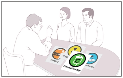
Adding pictures to patient education materials can increase attention, comprehension, recall and adherence to instructions.
Image courtesy of McGill University Health Centre
Throwing in any old picture, though, would do little good. A detailed drawing or photograph that might appeal to a medical student, for example, would probably contain too many details for the average patient. “Realistic photographs may be effective in drawing attention, but because the camera captures so many details, the details may interfere with comprehension,” the paper states.
That advice echoed an earlier paper, which advised medical illustrators to “save artistic flourishes for commercial art: for patient education, the simpler the better” (Patient Educ Couns 1990; 15:73–5). Other factors that can affect comprehension include picture size, labelling and colour. It is also important that illustrations convey only one idea at a time, the paper states, and neither be too cluttered nor too sparse.
If done poorly, image-based education can lead to confusion, according to Linda Rohret, a health education instructional designer and writing consultant from Raleigh, North Carolina, and the lead author of the paper. But if done well, it can be of immense help to patients, such as those newly diagnosed with breast cancer.
“For those individuals who are diagnosed, having materials that are easily understood will contribute to better understanding, the ability to make appropriate decisions in care options, the ability to ask appropriate questions or discuss issues and concerns with health care providers, and the ability to cope overall,” Rohret writes in an email. “Therefore, the issues of appropriate illustrations are very important and should be used to enhance messages rather than to serve to distract from the content.”
After perusing the McGill education module on breast cancer, Rohret recommended several improvements. It has too many pastel colours that are difficult to see, especially for older readers, and the lines of the illustrations aren’t dark enough, she says. Also, the text should be darker and in a larger font, the language of the text should be simplified and there is much wasted space in the layout.
“Overall, it is a nice module,” writes Rohret. “It simply needs to take overall learner characteristics into consideration.”
And although illustrations might help make medical concepts easier to understand, it is important for health organizations to realize that there is no one-size-fits-all approach to patient education, says Donna Czukar, senior director of support programs for the Ontario division of the Canadian Cancer Society. “The first rule is to not make too many assumptions about what people want,” says Czukar. “Some people are information-seekers who want to know everything, and some people want to keep it simple. It depends on personal preference.”


