F1000Research logoLink to F1000Research
. 2016 Aug 2;5:1438. Originally published 2016 Jun 20. [Version 2] doi: 10.12688/f1000research.8987.2

From reads to genes to pathways: differential expression analysis of RNA-Seq experiments using Rsubread and the edgeR quasi-likelihood pipeline

Yunshun Chen 1,2, Aaron T L Lun 3, Gordon K Smyth 1,4,a
PMCID: PMC4934518  PMID: 27508061

Version Changes

Revised. Amendments from Version 1

A URL is now given via which readers can download the data and source code files. Further explanations have been added regarding sample sizes, quality scores, filtering, normalization and glmTreat. An MD plot of sample 11 has been added with more discussion of normalization factors. A plot of sequence quality scores for the first FASTQ file has been added.

Abstract

In recent years, RNA sequencing (RNA-seq) has become a very widely used technology for profiling gene expression. One of the most common aims of RNA-seq profiling is to identify genes or molecular pathways that are differentially expressed (DE) between two or more biological conditions. This article demonstrates a computational workflow for the detection of DE genes and pathways from RNA-seq data by providing a complete analysis of an RNA-seq experiment profiling epithelial cell subsets in the mouse mammary gland. The workflow uses R software packages from the open-source Bioconductor project and covers all steps of the analysis pipeline, including alignment of read sequences, data exploration, differential expression analysis, visualization and pathway analysis. Read alignment and count quantification is conducted using the Rsubread package and the statistical analyses are performed using the edgeR package. The differential expression analysis uses the quasi-likelihood functionality of edgeR.

Keywords: RNA sequencing, molecular pathways, gene expression, R software

Introduction

In recent years, RNA sequencing (RNA-seq) has become a very widely used technology for profiling transcriptional activity in biological systems. One of the most common aims of RNA-seq profiling is to identify genes or molecular pathways that are differentially expressed (DE) between two or more biological conditions. Changes in expression can then be associated with differences in biology, providing avenues for further investigation into potential mechanisms of action.

This article provides a detailed workflow for analyzing an RNA-seq study from the raw reads through to differential expression and pathway analysis using Bioconductor packages 1. The article gives a complete analysis of RNA-seq data that were collected to study the effects of pregnancy and lactation on the luminal cell lineage in the mouse mammary gland 2. The pipeline uses the Rsubread package 3 for mapping reads and assigning them to genes, and the edgeR package 4 for statistical analyses.

RNA-seq analysis involves a number of steps, including read alignment, read summarization, differential expression and pathway analysis. Here we use the Subread aligner 3 for mapping and featureCounts 5 for assigning reads to genes. As well as being fast and efficient, these algorithms have the advantage of having native implementations as R functions in the Rsubread package. This means that the entire analysis can be conducted efficiently within the R environment.

The workflow uses edgeR’s quasi-likelihood pipeline (edgeR-quasi) for differential expression. This statistical methodology uses negative binomial generalized linear models 6 but with F-tests instead of likelihood ratio tests 7. This method provides stricter error rate control than other negative binomial based pipelines, including the traditional edgeR pipelines 6, 8, 9 or DESeq2 10. The edgeR-quasi pipeline is based on similar statistical methodology to that of the QuasiSeq package 7, which has performed well in third-party comparisons 11. Compared to QuasiSeq, the edgeR functions offer speed improvements and some additional statistical refinements 12. The RNA-seq pipelines of the limma package also offer excellent error rate control 13, 14. While the limma pipelines are recommended for large-scale datasets, because of their speed and flexibility, the edgeR-quasi pipeline gives better performance in low-count situations 15, 16. For the data analyzed here, the edgeR-quasi, limma-voom and limma-trend pipelines are all equally suitable and give similar results.

The analysis approach illustrated in this article can be applied to any RNA-seq study that includes some replication, but it is especially appropriate for designed experiments with multiple treatment factors and with small numbers of biological replicates. The approach assumes that RNA samples have been extracted from cells of interest under two or more treatment conditions, that RNA-seq profiling has been applied to each RNA sample and that there are independent biological replicates for at least one of the treatment conditions. The Rsubread part of the workflow takes FASTQ files of raw sequence reads as input, while the edgeR part of the pipeline takes a matrix of genewise read counts as input.

Description of the biological experiment

This workflow demonstrates a complete bioinformatics analysis of an RNA-seq study that is available from the GEO repository as series GSE60450. The RNA-seq data were collected to study the lineage of luminal cells in the mouse mammary gland and in particular how the expression profiles of the members of the lineage change upon pregnancy and lactation 2. Specifically, the study examined the expression profiles of basal stem-cell enriched cells (B) and committed luminal cells (L) in the mammary glands of virgin, pregnant and lactating mice. There are therefore six groups of RNA samples, one for each combination of cell type and mouse status. Two biological replicates were collected for each group.

This study used an Illumina Hiseq sequencer to generate about 30 million 100bp single-end reads for each sample. Subread version 1.4.4 ( http://subread.sourceforge.net) was used to align the reads to the mouse mm10 genome and featureCounts was used to assign reads to Entrez Genes using RefSeq gene annotation. The FASTQ files containing the raw sequence reads were deposited to the Sequence Read Archive (SRA) repository and the read counts were deposited to GEO.

This experimental design is summarized in the table below, where the basal and luminal cell types are abbreviated with B and L respectively. The GEO and SRA identifiers for each RNA sample are also shown:

                    > targets 
                    <- 
                    read.delim
                    (
                    "targets.txt"
                    , 
                    stringsAsFactors
                    =
                    FALSE
                    )
> targets

               GEO        SRA CellType    Status
MCL1.DG GSM1480297 SRR1552450        B    virgin
MCL1.DH GSM1480298 SRR1552451        B    virgin
MCL1.DI GSM1480299 SRR1552452        B  pregnant
MCL1.DJ GSM1480300 SRR1552453        B  pregnant
MCL1.DK GSM1480301 SRR1552454        B lactating
MCL1.DL GSM1480302 SRR1552455        B lactating
MCL1.LA GSM1480291 SRR1552444        L    virgin
MCL1.LB GSM1480292 SRR1552445        L    virgin
MCL1.LC GSM1480293 SRR1552446        L  pregnant
MCL1.LD GSM1480294 SRR1552447        L  pregnant
MCL1.LE GSM1480295 SRR1552448        L lactating
MCL1.LF GSM1480296 SRR1552449        L lactating
                

The experiment can be viewed as a one-way layout with six groups. For later use, we combine the treatment factors into a single grouping factor:

                    > group 
                    <- 
                    paste
                    (targets
                    $
                    CellType, targets
                    $
                    Status, 
                    sep
                    =
                    "."
                    )
> group 
                    <- 
                    factor
                    (group)
> 
                    table
                    (group)

group
B.lactating B.pregnant B.virgin L.lactating L.pregnant L.virgin
          2          2        2           2          2        2
                

Note. This study isolated carefully sorted cell populations obtained from genetically indentical mice under controlled laboratory conditions. As will be shown during the analysis below, the relatively small sample size ( n = 2 in each group) here is justified by the low background variability and by the fact that the expression profiles of the different groups are distinctly different. Studies with more variability (for example on human subjects) or with smaller effect sizes may well require more biological replicates for reliable results.

Preliminary analysis

Downloading the read counts

Readers wishing to reproduce the analysis presented in this article can either download the matrix of read counts from GEO or recreate the read count matrix from the raw sequence counts. We will present first the analysis using the downloaded matrix of counts. At the end of this article we will present the R commands needed to recreate this matrix.

The following commands download the genewise read counts for the GEO series GSE60450. The zipped tab-delimited text file GSE60450_Lactation-GenewiseCounts.txt.gz will be downloaded to the working R directory:

                        > FileURL 
                        <- 
                        paste
                        (
+   
                        "
                            http://www.ncbi.nlm.nih.gov/geo/download/?acc=GSE60450"
                        ,
+   
                        "format=file"
                        ,
+   
                        "file=GSE60450_Lactation-GenewiseCounts.txt.gz"
                        ,

                        +   
                        sep
                        =
                        "&"
                        )
> 
                        download.file
                        (FileURL, 
                        "GSE60450_Lactation-GenewiseCounts.txt.gz"
                        )
                    

The counts can then be read into a data.frame in R:

                        > GenewiseCounts 
                        <- 
                        read.delim
                        (
                        "GSE60450_Lactation-GenewiseCounts.txt.gz"
                        ,
+                                 
                        row.names
                        =
                        "EntrezGeneID"
                        )
> 
                        colnames
                        (GenewiseCounts) 
                        <- 
                        substring
                        (
                        colnames
                        (GenewiseCounts),
                        1
                        ,
                        7
                        )
> 
                        dim
                        (GenewiseCounts)

[1] 27179    13

> 
                        head
                        (GenewiseCounts)

          Length MCL1.DG MCL1.DH MCL1.DI MCL1.DJ MCL1.DK MCL1.DL MCL1.LA MCL1.LB
497097      3634     438     300      65     237     354     287       0       0
100503874   3259       1       0       1       1       0       4       0       0
100038431   1634       0       0       0       0       0       0       0       0
19888       9747       1       1       0       0       0       0      10       3
20671       3130     106     182      82     105      43      82      16      25
27395       4203     309     234     337     300     290     270     560     464
          MCL1.LC MCL1.LD MCL1.LE MCL1.LF
497097          0       0       0       0
100503874       0       0       0       0     
100038431       0       0       0       0
19888          10       2       0       0
20671          18       8       3      10
27395         489     328     307     342
                    

The row names of GenewiseCounts are the Entrez Gene Identifiers. The first column contains the length of each gene, being the total number of bases in exons and UTRs for that gene. The remaining 12 columns contain read counts and correspond to rows of targets.

The edgeR package stores data in a simple list-based data object called a DGEList. This object is easy to use as it can be manipulated like an ordinary list in R, and it can also be subsetted like a matrix. The main components of a DGEList object are a matrix of read counts, sample information in the data.frame format and optional gene annotation. We enter the counts into a DGEList object using the function DGEList in edgeR:

                        > 
                        library
                        (edgeR)
> y 
                        <- 
                        DGEList
                        (GenewiseCounts[,-
                        1
                        ], 
                        group
                        =group,
+               
                        genes
                        =GenewiseCounts[,
                        1
                        ,
                        drop
                        =
                        FALSE
                        ])
> 
                        options
                        (
                        digits
                        =
                        3
                        )
> y
                        $
                        samples

              group lib.size norm.factors
MCL1.DG    B.virgin 23227641            1
MCL1.DH    B.virgin 21777891            1
MCL1.DI  B.pregnant 24100765            1
MCL1.DJ  B.pregnant 22665371            1
MCL1.DK B.lactating 21529331            1
MCL1.DL B.lactating 20015386            1
MCL1.LA    L.virgin 20392113            1
MCL1.LB    L.virgin 21708152            1
MCL1.LC  L.pregnant 22241607            1
MCL1.LD  L.pregnant 21988240            1
MCL1.LE L.lactating 24723827            1
MCL1.LF L.lactating 24657293            1
                    

Adding gene annotation

The Entrez Gene Ids link to gene information in the NCBI database. The org.Mm.eg.db package can be used to complement the gene annotation information. Here, a column of gene symbols is added to y$genes:

                        > 
                        library
                        (org.Mm.eg.db)
> y
                        $
                        genes
                        $
                        Symbol 
                        <- 
                        mapIds
                        (org.Mm.eg.db, 
                        rownames
                        (y),
+                             
                        keytype
                        =
                        "ENTREZID"
                        , 
                        column
                        =
                        "SYMBOL"
                        )
> 
                        head
                        (y
                        $
                        genes)

          Length   Symbol
497097      3634     Xkr4
100503874   3259  Gm19938
100038431   1634  Gm10568
19888       9747      Rp1
20671       3130    Sox17
27395       4203   Mrpl15
                    

Entrez Ids that no longer have official gene symbols are dropped from the analysis. The whole DGEList object, including annotation as well as counts, can be subsetted by rows as if it was a matrix:

                        > y 
                        <- 
                        y[
                        !
                        is.na
                        (y
                        $
                        genes
                        $
                        Symbol), ]
> 
                        dim
                        (y)

[1] 26357    12
                    

Filtering to remove low counts

Genes that have very low counts across all the libraries should be removed prior to downstream analysis. This is justified on both biological and statistical grounds. From biological point of view, a gene must be expressed at some minimal level before it is likely to be translated into a protein or to be considered biologically important. From a statistical point of view, genes with consistently low counts are very unlikely be assessed as significantly DE because low counts do not provide enough statistical evidence for a reliable judgement to be made. Such genes can therefore be removed from the analysis without any loss of information.

As a rule of thumb, we require that a gene have a count of at least 10–15 in at least some libraries before it is considered to be expressed in the study. We could explicitly select for genes that have at least a couple of counts of 10 or more, but it is slightly better to base the filtering on count-per-million (CPM) values so as to avoid favoring genes that are expressed in larger libraries over those expressed in smaller libraries. For the current analysis, we keep genes that have CPM values above 0.5 in at least two libraries:

                        > keep 
                        <- 
                        rowSums
                        (
                        cpm
                        (
                        y) 
                        > 
                        0.5
                        ) 
                        >= 
                        2

                        > 
                        table
                        (keep)


                        keep
FALSE  TRUE
10704 15653
                    

Here the cutoff of 0.5 for the CPM has been chosen because it is roughly equal to 10 /L where L is the minimum library size in millions. The library sizes here are 20–25 million. We used a round value of 0.5 just for simplicity; the exact value is not important because the downstream differential expression analysis is not sensitive to the small changes in this parameter. The requirement of ≥ 2 libraries is because each group contains two replicates. This ensures that a gene will be retained if it is expressed in both the libraries belonging to any of the six groups.

The above filtering rule attempts to keep the maximum number of interesting genes in the analysis, but other sensible filtering criteria are also possible. For example keep <-rowSums(y$counts) > 50 is a very simple criterion that would keep genes with a total read count of more than 50. This would give similar downstream results for this dataset to the filtering actually used. Whatever the filtering rule, it should be independent of the information in the targets file. It should not make any reference to which RNA libraries belong to which group, because doing so would bias the subsequent differential expression analysis.

The DGEList object is subsetted to retain only the non-filtered genes:

                        > y 
                        <- 
                        y[keep, , 
                        keep.lib.sizes
                        =
                        FALSE
                        ]
                    

The option keep.lib.sizes=FALSE causes the library sizes to be recomputed after the filtering. This is generally recommended, although the effect on the downstream analysis is usually small.

Normalization for composition bias

Normalization by trimmed mean of M values (TMM) 17 is performed by using the calcNormFactors function, which returns the DGEList argument with only the norm.factors changed. It calculates a set of normalization factors, one for each sample, to eliminate composition biases between libraries. The product of these factors and the library sizes defines the effective library size, which replaces the original library size in all downstream analyses.

                        > y 
                        <- 
                        calcNormFactors
                        (y)
> y
                        $
                        samples

              group lib.size norm.factors
MCL1.DG    B.virgin 23139638        1.235
MCL1.DH    B.virgin 21689576        1.213
MCL1.DI  B.pregnant 23976634        1.126
MCL1.DJ  B.pregnant 22546909        1.069
MCL1.DK B.lactating 21422164        1.036
MCL1.DL B.lactating 19918278        1.087
MCL1.LA    L.virgin 20276400        1.370
MCL1.LB    L.virgin 21571124        1.368
MCL1.LC  L.pregnant 22120647        1.006
MCL1.LD  L.pregnant 21879947        0.924
MCL1.LE L.lactating 24660577        0.529
MCL1.LF L.lactating 24602860        0.535
                    

The normalization factors of all the libraries multiply to unity. A normalization factor below one indicates that a small number of high count genes are monopolizing the sequencing, causing the counts for other genes to be lower than would be usual given the library size. As a result, the effective library size will be scaled down for that sample. Here we see that the luminal-lactating samples have low normalization factors. This is a sign that these samples contain a number of very highly upregulated genes.

Note. In general, we find TMM normalization to be satisfactory for almost all well-designed mRNA gene expression experiments. Single-cell RNA-seq is an exception, for which specialized normalization methods are needed 18. Another, less common, type of study requiring special treatment is that with global differential expression, with more than half of the genome differentially expressed between experimental conditions in the same direction 19. Global differential expression should generally be avoided in well designed experiments. When it can’t be avoided, then some normalization reference such as spike-ins needs to be built into the experiment for reliable normalization to be done 20.

Exploring differences between libraries

The RNA samples can be clustered in two dimensions using multi-dimensional scaling (MDS) plots. This is both an analysis step and a quality control step to explore the overall differences between the expression profiles of the different samples. Here we decorate the MDS plot to indicate the cell groups:


                    > pch 
                    <- c
                    (
                    0
                    ,
                    1
                    ,
                    2
                    ,
                    15
                    ,
                    16
                    ,
                    17
                    )

                    > colors 
                    <- rep
                    (
                    c
                    (
                    "darkgreen"
                    , 
                    "red"
                    , 
                    "blue"
                    ), 
                    2
                    )

                    > 
                    plotMDS
                    (y, 
                    col
                    =colors[group], 
                    pch
                    =pch[group])

                    > 
                    legend
                    (
                    "topleft"
                    , 
                    legend
                    =
                    levels
                    (group), 
                    pch
                    =pch, 
                    col
                    =colors, 
                    ncol
                    =
                    2
                    )

(see Figure 1). In the MDS plot, the distance between each pair of samples can be interpreted as the leading log-fold change between the samples for the genes that best distinguish that pair of samples. By default, leading fold-change is defined as the root-mean-square of the largest 500 log2-fold changes between that pair of samples. Figure 1 shows that replicate samples from the same group cluster together while samples from different groups are well separated. In other words, differences between groups are much larger than those within groups, meaning that there are likely to be statistically significant differences between the groups. The distance between basal cells on the left and luminal cells on the right is about six units on the x-axis, corresponding to a leading fold change of about 64-fold between the two cell types. The differences between the virgin, pregnant and lactating expression profiles appear to be magnified in luminal cells compared to basal.

Figure 1. The MDS plot of the data set.

Figure 1.

Samples are separated by the cell type in the first dimension, and by the mouse status in the second dimension.

The expression profiles of individual samples can be explored more closely with mean-difference (MD) plots. An MD plot visualizes the library size-adjusted log-fold change between two libraries (the difference) against the average log-expression across those libraries (the mean). The following command produces an MD plot that compares sample 1 to an artificial reference library constructed from the average of all the other samples:


                    > 
                    plotMD
                    (y, 
                    column
                    =
                    1
                    )

                    > 
                    abline
                    (
                    h
                    =
                    0
                    , 
                    col
                    =
                    "red"
                    , 
                    lty
                    =
                    2
                    , 
                    lwd
                    =
                    2
                    )

(see Figure 2). The bulk of the genes are centered around the line of zero log-fold change. The diagonal lines in the lower left of the plot correspond to genes with counts of 0, 1, 2 and so on in the first sample.

Figure 2. MD plot of log2-expression in sample 1 versus the average log2-expression across all other samples.

Figure 2.

Each point represents a gene, and the red line indicates a log-ratio of zero. The majority of points cluster around the red line.

It is good practice to make MD plots for all the samples as a quality check. We now look at one of the luminal lactating samples that were observed have low normalization factors:


                    > 
                    plotMD
                    (y, 
                    column
                    =
                    11
                    )

                    > 
                    abline
                    (
                    h
                    =
                    0
                    , 
                    col
                    =
                    "red"
                    , 
                    lty
                    =
                    2
                    , 
                    lwd
                    =
                    2
                    )

(see Figure 3). For this sample, the log-ratios show noticeable positive skew, with a number of very highly upregulated genes. In particular, there are a number of points in the upper right of the plot, corresponding to genes that are both highly expressed and highly up-regulated in this sample compared to others. These genes explain why the normalization factor for this sample is well below one. By contrast, the log-ratios for sample 1 were somewhat negatively skewed, corresponding to a normalization factor above one.

Figure 3. MD plot of log2-expression in sample 11 versus the average log2-expression across all other samples.

Figure 3.

The plot shows a number of genes that are both highly expressed and highly up-regulated.

Design matrix

Linear modeling and differential expression analysis in edgeR requires a design matrix to be specified. The design matrix records which treatment conditions were applied to each samples, and it also defines how the experimental effects are parametrized in the linear models. The experimental design for this study can be viewed as a one-way layout and the design matrix can be constructed in a simple and intuitive way by:

                    > design 
                    <- 
                    model.matrix
                    (
                    
                        ~
                    
                    0
                    +
                    group)
> 
                    colnames
                    (design) 
                    <- 
                    levels
                    (group)
> design

   B.lactating B.pregnant B.virgin L.lactating L.pregnant L.virgin
1            0          0        1           0          0        0
2            0          0        1           0          0        0
3            0          1        0           0          0        0
4            0          1        0           0          0        0
5            1          0        0           0          0        0
6            1          0        0           0          0        0
7            0          0        0           0          0        1
8            0          0        0           0          0        1
9            0          0        0           0          1        0
10           0          0        0           0          1        0
11           0          0        0           1          0        0
12           0          0        0           1          0        0
attr(,"assign")
[1] 1 1 1 1 1 1
attr(,"contrasts")
attr(,"contrasts")$group
[1] "contr.treatment"
                

This design matrix simply links each group to the samples that belong to it. Each row of the design matrix corresponds to a sample whereas each column represents a coefficient corresponding to one of the six groups.

Dispersion estimation

edgeR uses the negative binomial (NB) distribution to model the read counts for each gene in each sample. The dispersion parameter of the NB distribution accounts for variability between biological replicates 6. edgeR estimates an empirical Bayes moderated dispersion for each individual gene. It also estimates a common dispersion, which is a global dispersion estimate averaged over all genes, and a trended dispersion where the dispersion of a gene is predicted from its abundance. Dispersion estimates are most easily obtained from the estimateDisp function:

                        > y 
                        <- 
                        estimateDisp
                        (y, design, 
                        robust
                        =
                        TRUE
                        )
                    

This returns a DGEList object with additional components ( common.dispersion, trended.dispersion and tagwise.dispersion) added to hold the estimated dispersions. Here robust=TRUE has been used to protect the empirical Bayes estimates against the possibility of outlier genes with exceptionally large or small individual dispersions 21.

The dispersion estimates can be visualized with plotBCV:

                    > 
                    plotBCV
                    (y)
                

(see Figure 4). The vertical axis of the plotBCV plot shows square-root dispersion, also known as biological coefficient of variation (BCV) 6.

Figure 4. Scatterplot of the biological coefficient of variation (BCV) against the average abundance of each gene.

Figure 4.

The plot shows the square-root estimates of the common, trended and tagwise NB dispersions.

For RNA-seq studies, the NB dispersions tend to be higher for genes with very low counts. The dispersion trend tends to decrease smoothly with abundance and to asymptotic to a constant value for genes with larger counts. From our past experience, the asymptotic value for the BCV tends to be in range from 0.05 to 0.2 for genetically identical mice or cell lines, whereas somewhat larger values ( > 0.3) are observed for human subjects.

The NB model can be extended with quasi-likelihood (QL) methods to account for gene-specific variability from both biological and technical sources 7, 12. Under the QL framework, the NB dispersion trend is used to describe the overall biological variability across all genes, and gene-specific variability above and below the overall level is picked up by the QL dispersion. In the QL approach, the individual (tagwise) NB dispersions are not used.

The estimation of QL dispersions is performed using the glmQLFit function:

                    > fit 
                    <- 
                    glmQLFit
                    (y, design, 
                    robust
                    =
                    TRUE
                    )
> 
                    head
                    (fit
                    $
                    coefficients)

       B.lactating B.pregnant B.virgin L.lactating L.pregnant L.virgin
497097      -11.13     -12.01   -11.22       -19.0     -19.03    -19.0
20671       -12.76     -12.51   -12.15       -14.5     -14.30    -14.1
27395       -11.27     -11.29   -11.53       -10.6     -10.86    -10.9
18777       -10.15     -10.21   -10.76       -10.1     -10.38    -10.4
21399        -9.89      -9.73    -9.78       -10.2      -9.97    -10.0
58175       -16.15     -14.85   -15.98       -13.3     -12.29    -12.0
                

This returns a DGEGLM object with the estimated values of the GLM coefficients for each gene. It also contains a number of empirical Bayes (EB) statistics including the QL dispersion trend, the squeezed QL dispersion estimates and the prior degrees of freedom (df). The QL dispersions can be visualized by plotQLDisp:

                    > 
                    plotQLDisp
                    (fit)
                

(see Figure 5).

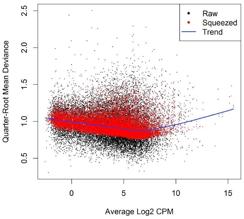
Figure 5. A plot of the quarter-root QL dispersion against the average abundance of each gene.

Figure 5.

Estimates are shown for the raw (before EB moderation), trended and squeezed (after EB moderation) dispersions. Note that the QL dispersions and trend shown here are relative to the NB dispersion trend shown in Figure 4.

The QL functions moderate the genewise QL dispersion estimates in the same way that the limma package moderates variances 22. The raw QL dispersion estimates are squeezed towards a global trend, and this moderation reduces the uncertainty of the estimates and improves testing power. The extent of the squeezing is governed by the value of the prior df estimated from the data. Large prior df estimates indicate that the QL dispersions are less variable between genes, meaning that strong EB moderation should be performed. Smaller prior df estimates indicate that the true unknown dispersions are highly variable, so weaker moderation towards the trend is appropriate.

                    > 
                    summary
                    (fit
                    $
                    df.prior)

   Min. 1st Qu. Median Mean 3rd Qu. Max.
   3.00    6.77   6.77 6.63    6.77 6.77
                

Setting robust=TRUE in glmQLFit is usually recommended 21. This allows gene-specific prior df estimates, with lower values for outlier genes and higher values for the main body of genes. This reduces the Chance of getting false positives from genes with extremely high or low raw dispersions, while at the same time increasing statistical power to detect differential expression for the main body of genes.

Differential expression analysis

Testing for differential expression

The next step is to test for differential expression between the experimental groups. One of the most interesting comparisons is that between the basal pregnant and lactating groups. The contrast corresponding to any specified comparison can be constructed conveniently using the makeContrasts function:

                    > B.LvsP 
                    <- 
                    makeContrasts
                    (B.lactating
                    -
                    B.pregnant, 
                    levels
                    =design)
                

In subsequent results, a positive log 2-fold-change (logFC) will indicate a gene up-regulated in lactating mice relative to pregnant, whereas a negative logFC will indicate a gene more highly expressed in pregnant mice. We will use QL F-tests instead of the more usual likelihood ratio tests (LRT) as they give stricter error rate control by accounting for the uncertainty in dispersion estimation:

                    > res 
                    <- 
                    glmQLFTest
                    (fit, 
                    contrast
                    =B.LvsP)
                

The top DE genes can be viewed with topTags:

                    > 
                    topTags
                    (res)

Coefficient:   1*B.lactating -1*B.pregnant
       Length   Symbol logFC logCPM   F   PValue      FDR
12992     765  Csn1s2b  6.08  10.19 421 4.78e-11 7.48e-07
211577   2006   Mrgprf  5.15   2.75 343 1.32e-10 7.99e-07
226101   7094     Myof  2.32   6.45 322 1.97e-10 7.99e-07
381290   8292   Atp2b4  2.14   6.15 320 2.04e-10 7.99e-07
140474  11281     Muc4 -7.17   6.06 308 2.60e-10 8.15e-07
231830   3346  Micall2 -2.25   5.19 282 4.41e-10 1.15e-06
24117    2242     Wif1 -1.82   6.77 261 7.13e-10 1.60e-06
12740    1812    Cldn4 -5.32   9.87 298 9.12e-10 1.74e-06
21953     667    Tnni2  5.75   3.86 313 1.00e-09 1.74e-06
231991   2873    Creb5  2.57   4.87 240 1.17e-09 1.83e-06
                

In order to control the false discovery rate (FDR), multiple testing correction is performed using the Benjamini-Hochberg method. The top DE gene Csn1s2b has a large positive logFC, showing that it is far more highly expressed in the basal cells of lactating than pregnant mice. This gene is indeed known to be a major source of protein in milk.

The total number of DE genes identified at an FDR of 5% can be shown with decideTestsDGE. There are in fact more than 5000 DE genes in this comparison:

                    > is.de 
                    <- 
                    decideTestsDGE
                    (res)
> 
                    summary
                    (is.de)

   [,1]
-1  2757
0  10408
1   2488
                

The magnitude of the differential expression changes can be visualized with a fitted model MD plot:

                    > 
                    plotMD
                    (res, 
                    status
                    =is.de, 
                    values
                    =
                    c
                    (
                    1
                    ,
                    -
                    1
                    ), 
                    col
                    =
                    c
                    (
                    "red"
                    ,
                    "blue"
                    ),

                    +         
                    legend
                    =
                    "topright"
                    )
                

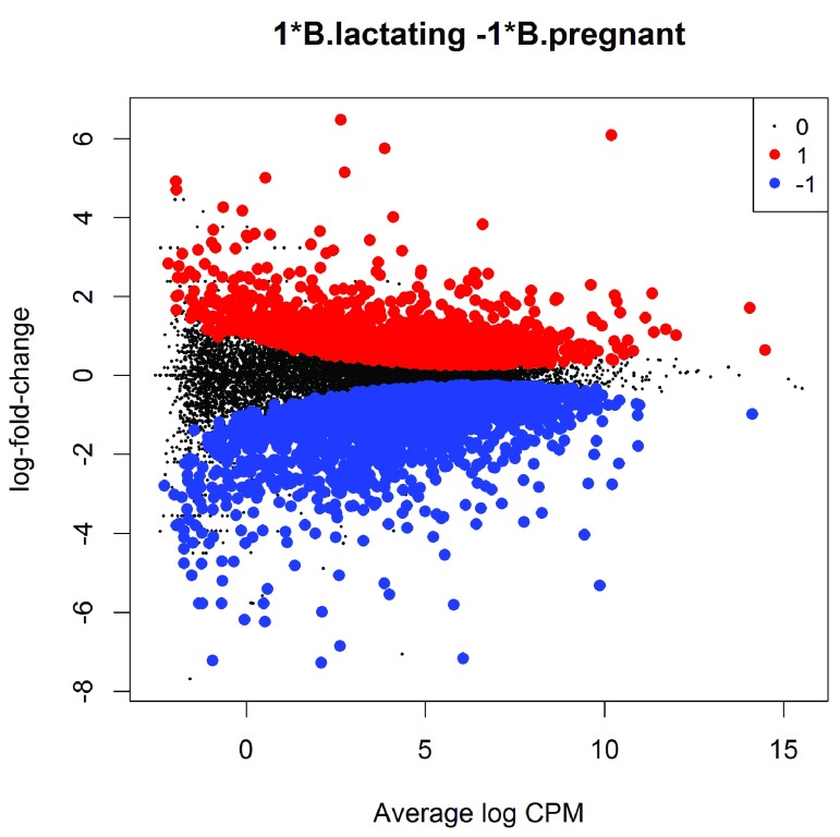
(see Figure 6). The logFC for each gene is plotted against the average abundance in log2-CPM, i.e., logCPM in the table above. Genes that are significantly DE are highlighted:

Figure 6. MD plot showing the log-fold change and average abundance of each gene.

Figure 6.

Significantly up and down DE genes are highlighted in red and blue, respectively.

Differential expression relative to a fold-change threshold

glmQLFTest identifies differential expression based on statistical significance regardless of how small the difference might be. For some purposes we might be interested only in genes with reasonably large expression changes. The above analysis found more than 5000 DE genes between the basal pregnant and lactating groups. With such a large number of DE genes, it makes sense to narrow down the list to genes that are more biologically meaningful.

A commonly used approach is to apply FDR and logFC cutoffs simultaneously. However this tends to favor lowly expressed genes, and also fails to control the FDR correctly. A better and more rigorous approach is to modify the statistical test so as to detect expression changes greater than a specified threshold. In edgeR, this can be done using the glmTreat function. This function is analogous to the TREAT method for microarrays 23 but is adapted to the NB framework. Here we test whether the differential expression fold changes are significantly greater than 1.5, that is, whether the logFCs are significantly greater than log 2(1.5):

                    > tr 
                    <- 
                    glmTreat
                    (fit, 
                    contrast
                    =B.LvsP, 
                    lfc
                    =
                    log2
                    (
                    1.5
                    ))
> 
                    topTags
                    (tr)

Coefficient:   1*B.lactating -1*B.pregnant
       Length   Symbol logFC unshrunk.logFC logCPM   PValue      FDR
12992     765  Csn1s2b  6.08           6.09  10.19 5.94e-11 9.30e-07
211577   2006   Mrgprf  5.15           5.15   2.75 1.77e-10 1.38e-06
140474  11281     Muc4 -7.17          -7.34   6.06 3.98e-10 2.07e-06
226101   7094     Myof  2.32           2.32   6.45 7.82e-10 2.69e-06
381290   8292   Atp2b4  2.14           2.14   6.15 1.01e-09 2.69e-06
12740    1812    Cldn4 -5.32          -5.32   9.87 1.14e-09 2.69e-06
21953     667    Tnni2  5.75           5.76   3.86 1.20e-09 2.69e-06
231830   3346  Micall2 -2.25          -2.25   5.19 1.90e-09 3.71e-06
231991   2873    Creb5  2.57           2.57   4.87 3.55e-09 6.18e-06
16012    1289   Igfbp6  2.87           2.87   3.68 4.60e-09 7.20e-06
                

Note that the argument lfc is an abbreviation for “log-fold-change”. About 1100 genes are detected as DE with a FC significantly above 1.5 at an FDR cut-off of 5%.

                    > is.de 
                    <- 
                    decideTestsDGE
                    (tr)
> 
                    summary
                    (is.de)

   [,1]
-1   723
0  14530
1    400
                

The p-values from glmTreat are larger than those from glmQLFTest, and the number of significantly DE genes is fewer, because it is testing an interval null hypothesis and requires stronger evidence for differential expression than does a conventional test. It provides greater specificity for identifying the most important genes with large fold changes.

The test results can be visualized in an MD plot:

                    > 
                    plotMD
                    (tr, 
                    status
                    =is.de, 
                    values
                    =
                    c
                    (
                    1
                    ,
                    -
                    1
                    ), 
                    col
                    =
                    c
                    (
                    "red"
                    ,
                    "blue"
                    ),
+         
                    legend
                    =
                    "topright"
                    )
                

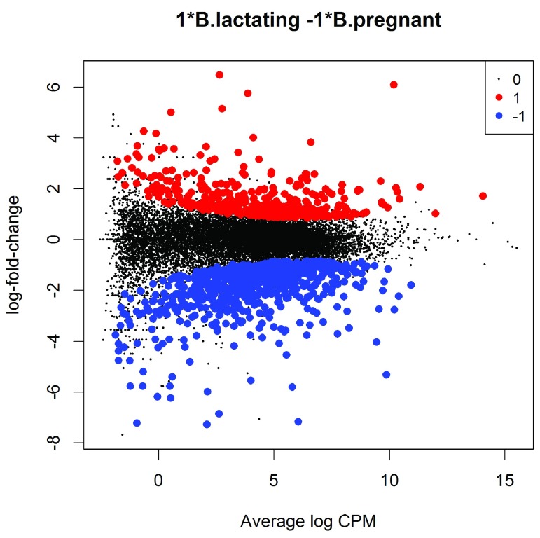
(see Figure 7). The glmTreat method evaluates variability as well as the magnitude of change of expression values and therefore is not equivalent to a simple fold change cutoff. Nevertheless, all the statistically significant expression changes have logFC greater than 0.8 and almost all (97%) are greater than 0.9. These values compare to the threshold value of log 2(1.5) = 0.58. In general, an estimated logFC must exceed the TREAT threshold by a number of standard errors for it to be called significant. In other words, the whole confidence interval for the logFC must clear the threshold rather than just the estimated value itself. It is better to interpret the threshold as the FC below which we are definitely not interested in the gene rather than the FC above which we are interested in the gene.

Figure 7. MD plot showing the log-fold change and average abundance of each gene.

Figure 7.

Genes with fold-changes significantly greater than 1.5 are highlighted.

The value of the FC threshold can be varied depending on the dataset. In the presence of a huge number of DE genes, a relatively large FC threshold may be appropriate to narrow down the search to genes of interest. In the absence of DE genes, on the other hand, a small or even no FC threshold shall be used. If the threshold level is set to zero, then glmTreat becomes equivalent to glmQLFTest in the workflow shown here.

In general, using glmTreat to reduce the number of DE genes is better than simply reducing the FDR cutoff, because glmTreat prioritizes genes with larger changes that are likely to be more biologically significant. glmTreat can also be used with edgeR pipelines other than quasi-likelihood, although we don’t demonstrate that here.

Heat map clustering

Heatmaps are a popular way to display differential expression results for publication purposes. To create a heatmap, we first convert the read counts into log2-counts-per-million (logCPM) values. This can be done with the cpm function:

                    > logCPM 
                    <- 
                    cpm
                    (y, 
                    prior.count
                    =
                    2
                    , 
                    log
                    =
                    TRUE
                    )
> 
                    rownames
                    (logCPM) 
                    <- 
                    y
                    $
                    genes
                    $
                    Symbol 
> 
                    colnames
                    (logCPM) 
                    <- 
                    paste
                    (y
                    $
                    samples
                    $
                    group, 
                    1
                    :
                    2
                    , 
                    sep
                    =
                    "-"
                    )
                

The introduction of prior.count is to avoid undefined values and to reduce the variability of the logCPM values for genes with low counts. Larger values for prior.count shrink the logFCs for low count genes towards zero.

We will create a heatmap to visualize the top 30 DE genes according to the TREAT test between B.lactating and B.pregnant. The advantage of a heatmap is that it can display the expression pattern of the genes across all the samples. Visualization of the results is aided by clustering together genes that have correlated expression patterns. First we select the logCPM values for the 30 top genes:

                    > o 
                    <- 
                    order
                    (tr
                    $
                    table
                    $
                    PValue)
> logCPM 
                    <- 
                    logCPM[o[
                    1
                    :
                    30
                    ],]
                

Then we scale each row (each gene) to have mean zero and standard deviation one:

                    > logCPM 
                    <- 
                    t
                    (
                    scale
                    (
                    t
                    (logCPM)))
                

This scaling is commonly done for heatmaps and ensures that the heatmap displays relative changes for each gene. A heat map can then be produced by the heatmap.2 function in the gplots package:

                    > 
                    library
                    (gplots)
> col.pan 
                    <- 
                    colorpanel
                    (
                    100
                    , 
                    "blue"
                    , 
                    "white"
                    , 
                    "red"
                    )

                    > 
                    heatmap.2
                    (logCPM, 
                    col
                    =col.pan, 
                    Rowv
                    =
                    TRUE
                    , 
                    scale
                    =
                    "none"
                    ,

                    +     
                    trace
                    =
                    "none"
                    , 
                    dendrogram
                    =
                    "both"
                    , 
                    cexRow
                    =
                    1
                    , 
                    cexCol
                    =
                    1.4
                    , 
                    density.info
                    =
                    "none"
                    ,

                    +     
                    margin
                    =
                    c
                    (
                    10
                    ,
                    9
                    ), 
                    lhei
                    =
                    c
                    (
                    2
                    ,
                    10
                    ), 
                    lwid
                    =
                    c
                    (
                    2
                    ,
                    6
                    ))
                

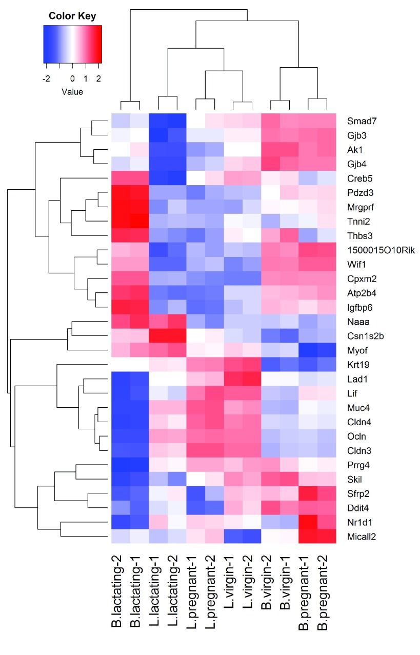
(see Figure 8). By default, heatmap.2 clusters genes and samples based on Euclidean distance between the expression values. Because we have pre-standardized the rows of the logCPM matrix, the Euclidean distance between each pair of genes is proportional to (1 − r) 2, where r is the Pearson correlation coefficient between the two genes. This shows that the heatmap will cluster together genes that have positively correlated logCPM values, because large positive correlations correspond to small distances.

Figure 8. Heat map across all the samples using the top 30 most DE genes between the basal lactating group and the basal pregnancy group.

Figure 8.

The positioning of the samples in the heatmap is dependent on how the genes in the display have been chosen. Here we are displaying those genes that are most DE between B.lactating and B.pregnant, so those two cell populations are well separated on the plot. As expected, the two replicate samples from each group are clustered together.

Analysis of deviance

The differential expression analysis comparing two groups can be easily extended to comparisons between three or more groups. This is done by creating a matrix of independent contrasts. In this manner, users can perform a one-way analysis of deviance (ANODEV) for each gene 24.

Suppose we want to compare the three groups in the luminal population, i.e., virgin, pregnant and lactating. An appropriate contrast matrix can be created as shown below, to make pairwise comparisons between all three groups:

                    > con 
                    <- 
                    makeContrasts
                    (
+      
                    L.PvsL 
                    = L.pregnant 
                    - 
                    L.lactating,
+      
                    L.VvsL 
                    = L.virgin 
                    - 
                    L.lactating,
+      
                    L.VvsP 
                    = L.virgin 
                    - 
                    L.pregnant, 
                    levels
                    =design)
                

The QL F-test is then applied to identify genes that are DE between the three groups. This combines the three pairwise comparisons into a single F-statistic and p-value. The top set of significant genes can be displayed with topTags:

                    > res 
                    <- 
                    glmQLFTest
                    (fit, 
                    contrast
                    =con)
> 
                    topTags
                    (res)

Coefficient:  LR test of 2 contrasts
      Length  Symbol logFC.L.PvsL logFC.L.VvsL logCPM     F   PValue      FDR
19242   2021     Ptn        -1.54         7.26   7.97  2386 3.73e-17 5.84e-13
13645   4757     Egf        -5.36        -7.22   3.67  1124 4.47e-15 3.15e-11
52150   4089   Kcnk6        -2.42        -7.00   5.91  1020 8.27e-15 3.15e-11
15439   1345      Hp         1.08         5.42   4.93   992 9.89e-15 3.15e-11
12992    765 Csn1s2b        -8.55       -11.36  10.19  1050 1.01e-14 3.15e-11
14183   5346   Fgfr2        -1.15         3.95   7.38   953 1.28e-14 3.17e-11
20856   1793    Stc2        -1.81         3.20   6.11   919 1.60e-14 3.17e-11
11941   7050  Atp2b2        -7.37       -10.56   6.60  1134 1.78e-14 3.17e-11
13358   1678 Slc25a1        -4.13        -4.91   7.50   888 1.99e-14 3.17e-11
17068    691    Ly6d         3.42         9.24   4.69   886 2.02e-14 3.17e-11
                

Note that the three contrasts of pairwise comparisons are linearly dependent. Constructing the contrast matrix with any two of the contrasts would be sufficient for an ANODEV test. If the contrast matrix contains all three possible pairwise comparisons, then only the log-fold changes of the first two contrasts are shown in the output of topTags.

Complicated contrasts

The flexibility of the GLM framework makes it possible to specify arbitrary contrasts for differential expression tests. Suppose we are interested in testing whether the change in expression between lactating and pregnant mice is the same for basal cells as it is for luminal cells. In statistical terminology, this is the interaction effect between mouse status and cell type. The contrast corresponding to this testing hypothesis can be made as follows.

                    > con 
                    <- 
                    makeContrasts
                    (
+      (L.lactating
                    -
                    L.pregnant)
                    -
                    (B.lactating
                    -
                    B.pregnant),
+       
                    levels
                    =design)
                

Then the QL F-test is conducted to identify genes that are DE under this contrast. The top set of DE genes are viewed with topTags.

                    > res 
                    <- 
                    glmQLFTest
                    (fit, 
                    contrast
                    =con)
> 
                    topTags
                    (res)

Coefficient: -1*B.lactating  1*B.pregnant 1*L.lactating -1*L.pregnant
       Length   Symbol logFC logCPM   F   PValue      FDR
19041    6277      Ppl -4.62   6.96 524 9.55e-12 1.49e-07
231991   2873    Creb5 -5.61   4.87 438 2.91e-11 2.13e-07
20512    4206   Slc1a3  5.03   3.65 415 4.09e-11 2.13e-07
217294   1952 BC006965 -3.88   4.68 372 8.11e-11 2.86e-07
14598    2022     Ggt1  3.17   6.38 357 1.04e-10 2.86e-07
13358    1678  Slc25a1  3.47   7.50 354 1.10e-10 2.86e-07
192166   4558    Sardh  2.92   5.11 342 1.36e-10 3.04e-07
19659    2628     Rbp1 -4.40   6.83 337 1.63e-10 3.18e-07
67547    3707  Slc39a8  6.19   5.07 376 1.83e-10 3.18e-07
14063    2768    F2rl1 -3.92   5.61 302 2.93e-10 4.20e-07
                

Pathway analysis

Gene ontology analysis

We now consider the problem of interpreting the differential expression results in terms of higher order biological processes or molecular pathways. One of the most common used resources is gene ontology (GO) databases, which annotate genes according to a dictionary of annotation terms. A simple and often effective way to interpret the list of DE genes is to count the number of DE genes that are annotated with each possible GO term. GO terms that occur frequently in the list of DE genes are said to be over-represented or enriched. In edgeR, GO analyses can be conveniently conducted using the goana function. Here were apply goana to the output of the TREAT analysis comparing B.lactating to B.pregnant. The top most significantly enriched GO terms can be viewed with topGO.

                    > go 
                    <- 
                    goana
                    (tr, 
                    species
                    =
                    "Mm"
                    )
> 
                    topGO
                    (go, 
                    n
                    =
                    15
                    )

                                     Term Ont    N Up Down  P.Up   P.Down
GO:0022402             cell cycle process  BP  931 19  118 0.913 2.69e-23
GO:0000280               nuclear division  BP  460 10   78 0.789 3.58e-23
GO:1903047     mitotic cell cycle process  BP  628  8   92 0.995 1.56e-22
GO:0048285              organelle fission  BP  500 11   78 0.785 7.35e-21
GO:0007067       mitotic nuclear division  BP  376  4   66 0.991 1.51e-20
GO:0007049                     cell cycle  BP 1301 21  138 0.997 6.22e-20
GO:0000278             mitotic cell cycle  BP  736  8   96 0.999 7.97e-20
GO:0007059         chromosome segregation  BP  237  1   49 0.998 1.50e-18
GO:0051301                  cell division  BP  550  6   77 0.997 8.95e-18
GO:0000776                    kinetochore  CC  112  1   33 0.952 8.99e-18
GO:0000775 chromosome, centromeric region  CC  163  1   38 0.988 1.77e-16
GO:0098813 nuclear chromosome segregation  BP  171  1   38 0.990 9.64e-16
GO:0042254            ribosome biogenesis  BP  223  1   42 0.998 1.43e-14
GO:0098687             chromosomal region  CC  278  6   47 0.756 2.69e-14
GO:0005730                      nucleolus  CC  663  4   78 1.000 9.72e-14
                

The goana function automatically extracts DE genes from the tr object, and conducts overlap tests for the up- and down-regulated DE genes separately. By default, an FDR cutoff of 5% is used when extracting DE genes, but this can be varied. The row names of the output are the universal identifiers of the GO terms and the Term column gives the human-readable names of the terms. The Ont column shows the ontology domain that each GO term belongs to. The three domains are: biological process (BP), cellular component (CC) and molecular function (MF). The N column represents the total number of genes annotated with each GO term. The Up and Down columns indicate the number of genes within the GO term that are significantly up- and down-regulated in this differential expression comparison, respectively. The P.Up and P.Down columns contain the p-values for over-representation of the GO term in the up- and down-regulated genes, respectively. Note that the p-values are not adjusted for multiple testing—we would usually ignore GO terms with p-values greater than about 10 −5.

By default the output table from topGO is sorted by the minimum of P.Up and P.Down. Other options are available. For example, topGO(go, sort="up") lists the top GO terms that are over-represented in the up-regulated genes. The domain of the enriched GO terms can also be specified by users. For example, topGO(go, ontology="BP") restricts to the top GO terms belonging to the biological process domain while topGO(go, ontology="MF") restricts to molecular function terms.

The goana function uses the NCBI RefSeq annotation and requires the use of Entrez Gene Identifiers.

KEGG pathway analysis

Another popular annotation database is the Kyoto Encyclopedia of Genes and Genomes (KEGG). Much smaller than GO, this is a curated database of molecular pathways and disease signatures. A KEGG analysis can be done exactly as for GO, but using the kegga function:

                    > keg 
                    <- 
                    kegga
                    (tr, 
                    species
                    =
                    "Mm"
                    )

                    > 
                    topKEGG
                    (keg, 
                    n
                    =
                    15
                    , 
                    truncate
                    =
                    34
                    )
			
					 Pathway    N Up Down     P.Up   P.Down
path:mmu03008 Ribosome biogenesis in eukaryot...   75  1   19 4.04e-01 3.23e-19
path:mmu01100                 Metabolic pathways 1030 28   51 3.42e-10 1.11e-15
path:mmu04110                         Cell cycle  120  1   19 5.63e-01 3.78e-15
path:mmu00230                  Purine metabolism  152  2   18 2.80e-01 3.45e-12
path:mmu00240              Pyrimidine metabolism   96  0   15 1.00e+00 3.86e-12
path:mmu05150    Staphylococcus aureus infection   30  0   10 1.00e+00 4.78e-12
path:mmu04510                     Focal adhesion  191 13    9 7.22e-10 1.34e-03
path:mmu04060 Cytokine-cytokine receptor inte...  167  9   16 2.34e-06 1.35e-09
path:mmu04514     Cell adhesion molecules (CAMs)  112  2   13 1.79e-01 4.72e-09
path:mmu04972               Pancreatic secretion   63  8    4 1.14e-08 1.10e-02
path:mmu04970                 Salivary secretion   63  8    7 1.14e-08 2.45e-05
path:mmu04610 Complement and coagulation casc...   47  2    9 4.14e-02 1.32e-08
path:mmu05166                   HTLV-I infection  245  5   17 2.71e-02 5.39e-08
path:mmu00100               Steroid biosynthesis   18  5    0 1.13e-07 1.00e+00
path:mmu04114                     Oocyte meiosis  101  2   11 1.53e-01 1.43e-07
                

The output from topKEGG is the same as from topGO except that row names become KEGG pathway IDs, Term becomes Pathway and there is no Ont column. Both the GO and KEGG analyses show that the cell cycle pathway is strongly down-regulated upon lactation in mammary stem cells.

By default, the kegga function automatically reads the latest KEGG annotation from the Internet each time it is run. The KEGG database uses Entrez Gene Ids, and the kegga function assumes these are available as the row names of tr.

FRY gene set tests

The GO and KEGG analyses shown above are relatively simple analyses that rely on a list of DE genes. The list of DE genes is overlapped with the various GO and KEGG annotation terms. The results will depend on the significance threshold that is used to assess differential expression.

If the aim is to test for particular gene expression signatures or particular pathways, a more nuanced approach is to conduct a roast or fry gene set test 25. These functions test whether a set of genes is DE, assessing the whole set of genes as a whole. Gene set tests consider all the genes in the specified set and do not depend on any pre-emptive significance cutoff. The set of genes can be chosen to be representative of any pathway or phenotype of interest.

roast gives p-values using random rotations of the residual space. In the edgeR context, fry is generally recommended over roast.fry gives an accurate analytic approximation to the results that roast would give, with default settings, if an extremely large number of rotations was used.

Here, suppose we are interested in three GO terms related to cytokinesis. Each GO term is used to define a set of genes annotated with that term. The names of these terms are shown below:


                    > 
                    library
                    (GO.db)

                    > cyt.go 
                    <- 
                    c
                    (
                    "GO:0032465"
                    , 
                    "GO:0000281"
                    , 
                    "GO:0000920"
                    )

                    > term 
                    <- 
                    select
                    (GO.db, 
                    keys
                    =cyt.go, 
                    columns
                    =
                    "TERM"
                    )

                    > term

        GOID                              TERM
1 GO:0032465         regulation of cytokinesis
2 GO:0000281               mitotic cytokinesis
3 GO:0000920 cell separation after cytokinesis
                

The first step is to extract the genes associated with each GO term from the GO database. This produces a list of three components, one for each GO term. Each component is a vector of Entrez Gene IDs for that GO term:

                    > 
                    Rkeys
                    (org.Mm.egGO2ALLEGS) 
                    <- 
                    cyt.go

                    > cyt.go.genes 
                    <- 
                    as.list
                    (org.Mm.egGO2ALLEGS)
                

Suppose the comparison of interest is between the virgin and lactating groups in the basal population. We can use fry to test whether the cytokinesis GO terms are DE for this comparison:

                    > B.VvsL 
                    <- 
                    makeContrasts
                    (B.virgin-B.lactating, 
                    levels
                    =design)

                    > 
                    fry
                    (y, 
                    index
                    =cyt.go.genes, 
                    design
                    =design, 
                    contrast
                    =B.VvsL)

                    
           NGenes Direction   PValue     FDR PValue.Mixed FDR.Mixed
GO:0032465     48        Up 0.000464 0.00139     3.71e-06  7.02e-06
GO:0000920     16      Down 0.001902 0.00285     4.68e-06  7.02e-06
GO:0000281     30        Up 0.007277 0.00728     2.50e-05  2.50e-05
                

Each row of the output corresponds to a gene set. The NGenes column provides the number of genes in each set. The Direction column indicates the net direction of change. The PValue column gives the two-sided p-value for testing whether the set is DE as a whole, either up or down. The PValue.Mixed column gives a p-value for testing whether genes in the set tend to be DE, without regard to direction. The PValue column is appropriate when genes in the set are expected to be co-regulated, all or most changing expression in the same direction. The PValue.Mixed column is appropriate when genes in the set are not necessarily co-regulated or may be regulated in different directions for the contrast in question. FDRs are calculated from the corresponding p-values across all sets.

The results of a gene set test can be viewed in a barcode plot produced by the barcodeplot function. Suppose visualization is performed for the gene set defined by the GO term GO:0032465:

                    > res 
                    <- 
                    glmQLFTest
                    (fit, 
                    contrast
                    =B.VvsL)

                    > index 
                    <- 
                    rownames
                    (fit) 
                    %in% 
                    cyt.go.genes[[
                    1
                    ]]
> 
                    barcodeplot
                    (res
                    $
                    table
                    $
                    logFC, 
                    index
                    =index, 
                    labels
                    =
                    c
                    (
                    "B.virgin"
                    ,
                    "B.lactating"
                    ),
+               
                    main
                    =cyt.go[
                    1
                    ])
                

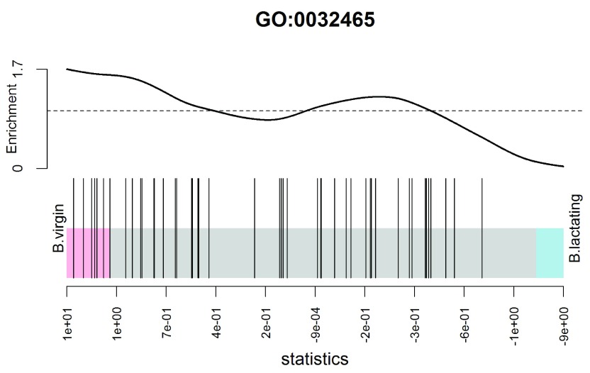
(see Figure 9). In the plot, all genes are ranked from left to right by decreasing log-fold change for the contrast and the genes within the gene set are represented by vertical bars, forming the barcode-like pattern. The curve (or worm) above the barcode shows the relative local enrichment of the bars in each part of the plot. The dotted horizontal line indicates neutral enrichment; the worm above the dotted line shows enrichment while the worm below the dotted line shows depletion. In this particular barcode plot the worm shows enrichment on the left for positive logFCs, and depletion on the right for negative logFCs. The conclusion is that genes associated with this GO term tend to be up-regulated in the basal cells of virgin mice compared to lactating mice, confirming the result of the fry test above.

Figure 9. Barcode plot showing enrichment of the GO term GO:0032465 in the basal virgin group compared to the basal lactating group.

Figure 9.

X-axis shows logFC for B.virgin vs B.lactating. Black bars represent genes annotated with the GO term. The worm shows relative enrichment.

Camera gene set enrichment analysis

Finally we demonstrate a gene set enrichment style analysis using the Molecular Signatures Database (MSigDB) 26. We will use the C2 collection of the MSigDB, which is a collection of nearly 5000 curated gene sets, each representing the molecular signature of a particular biological process or phenotype. The MSigDB itself is purely human, but the Walter and Eliza Hall Institute (WEHI) maintains a mouse version of the database. We load the mouse version of the C2 collection from the WEHI website:

                    > 
                    load
                    (
                    url
                    (
                    "
                        http://bioinf.wehi.edu.au/software/MSigDB/mouse_c2_v5p1.rdata"
                    ))
                

This will load Mm.c2, which is a list of gene sets, each a vector of Entrez Ids. This can be converted to a list of index numbers:

                    > idx 
                    <- 
                    ids2indices
                    (Mm.c2,
                    id
                    =
                    rownames
                    (y))
                

First we compare virgin stem cells to virgin luminal cells:

                    > BvsL.v 
                    <- 
                    makeContrasts
                    (B.virgin - L.virgin, 
                    levels
                    =design)

                    > cam 
                    <- 
                    camera
                    (y, idx, design, 
                    contrast
                    =BvsL.v, 
                    inter.gene.cor
                    =
                    0.01
                    )

                    > 
                    options
                    (
                    digits
                    =
                    2
                    )

                    > 
                    head
                    (cam,
                    14
                    )
                                                    NGenes Direction  PValue
LIM_MAMMARY_STEM_CELL_UP                               782        Up 2.0e-43
LIM_MAMMARY_LUMINAL_MATURE_DN                          169        Up 3.7e-25
SASAI_RESISTANCE_TO_NEOPLASTIC_TRANSFROMATION           80        Up 4.1e-20
LIM_MAMMARY_STEM_CELL_DN                               664      Down 2.2e-19
FARMER_BREAST_CANCER_CLUSTER_4                          74        Up 2.9e-19
NABA_BASEMENT_MEMBRANES                                 52        Up 1.6e-17
HAEGERSTRAND_RESPONSE_TO_IMATINIB                       35        Up 4.0e-17
ROZANOV_MMP14_TARGETS_SUBSET                            83        Up 5.2e-16
REACTOME_COLLAGEN_FORMATION                             70        Up 1.3e-15
REACTOME_NCAM1_INTERACTIONS                             71        Up 2.2e-15
OXFORD_RALB_TARGETS_UP                                  27        Up 4.5e-15
ANASTASSIOU_CANCER_MESENCHYMAL_TRANSITION_SIGNATURE    148        Up 7.1e-15
PAPASPYRIDONOS_UNSTABLE_ATEROSCLEROTIC_PLAQUE_DN        68        Up 1.3e-14
LIM_MAMMARY_LUMINAL_PROGENITOR_UP                       92      Down 2.0e-14
                                                        FDR
LIM_MAMMARY_STEM_CELL_UP                            9.3e-40
LIM_MAMMARY_LUMINAL_MATURE_DN                       8.9e-22
SASAI_RESISTANCE_TO_NEOPLASTIC_TRANSFROMATION       6.4e-17
LIM_MAMMARY_STEM_CELL_DN                            2.7e-16
FARMER_BREAST_CANCER_CLUSTER_4                      2.8e-16
NABA_BASEMENT_MEMBRANES                             1.2e-14
HAEGERSTRAND_RESPONSE_TO_IMATINIB                   2.7e-14
ROZANOV_MMP14_TARGETS_SUBSET                        3.0e-13
REACTOME_COLLAGEN_FORMATION                         6.8e-13
REACTOME_NCAM1_INTERACTIONS                         1.0e-12
OXFORD_RALB_TARGETS_UP                              1.9e-12
ANASTASSIOU_CANCER_MESENCHYMAL_TRANSITION_SIGNATURE 2.8e-12
PAPASPYRIDONOS_UNSTABLE_ATEROSCLEROTIC_PLAQUE_DN    4.9e-12
LIM_MAMMARY_LUMINAL_PROGENITOR_UP                   6.8e-12
                

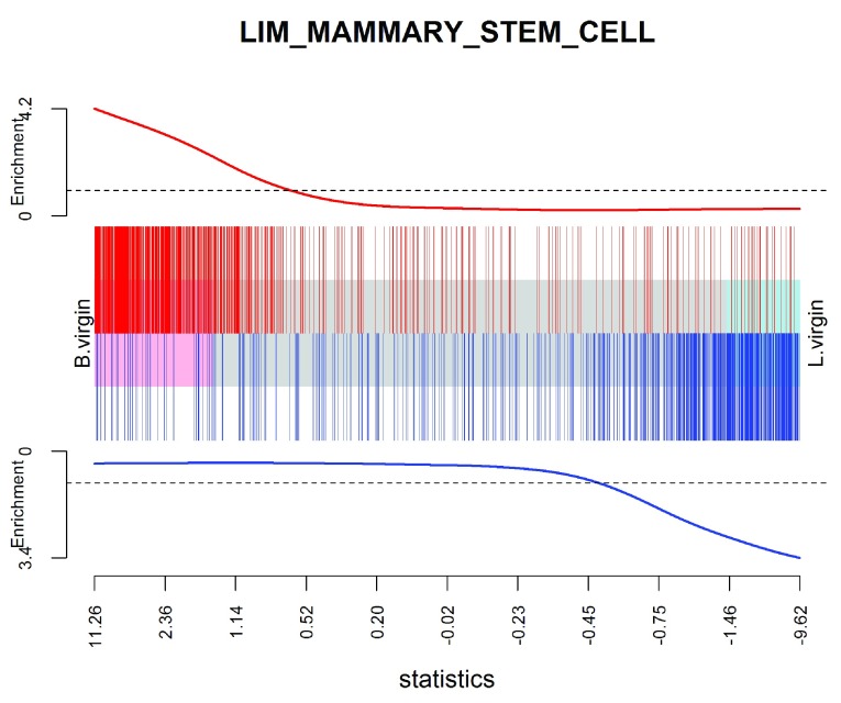
With a large gene set collection, setting inter.gene.cor = 0.01 gives a good compromise between biological interpretability and FDR control. As expected, the mammary stem cell and mammary luminal cell signatures from Lim et al. 27 are top-ranked, and in the expected directions.

We can visualize the top signature, combining the up and down mammary stem cell signatures to make a bi-directional signature set:

                    > res 
                    <- 
                    glmQLFTest
                    (fit, 
                    contrast
                    =BvsL.v)
> 
                    barcodeplot
                    (res
                    $
                    table
                    $
                    logFC,
+               
                    index
                    =idx[[
                    "LIM_MAMMARY_STEM_CELL_UP"
                    ]],
+               
                    index2
                    =idx[[
                    "LIM_MAMMARY_STEM_CELL_DN"
                    ]],
+               
                    labels
                    =
                    c
                    (
                    "B.virgin"
                    ,
                    "L.virgin"
                    ),
+               
                    main
                    =
                    "LIM_MAMMARY_STEM_CELL"
                    ,
+               
                    alpha
                    =
                    1
                    ,)
                

(see Figure 10).

Figure 10. Barcode plot showing strong enrichment of mammary stem cell signature in the stem cell vs luminal cell comparison.

Figure 10.

Red bars show up signature genes, blue bars show down genes. The worms show relative enrichment.

Packages used

This workflow depends on various packages from version 3.3 of the Bioconductor project, running on R version 3.3.0 or higher. The complete list of the packages used for this workflow are shown below:

                > 
                sessionInfo
                ()

R version 3.3.1 (2016-06-21)
Platform: x86_64-w64-mingw32/x64 (64-bit)
Running under: Windows 7 x64 (build 7601) Service Pack 1

locale:
[1] LC_COLLATE=English_Australia.1252    LC_CTYPE=English_Australia.1252
[3] LC_MONETARY=English_Australia.1252   LC_NUMERIC=C
[5] LC_TIME=English_Australia.1252

attached base packages:
[1] parallel  stats4   stats   graphics  grDevices  utils    datasets  methods
[9] base

other attached packages:
 [1] GO.db_3.3.0          gplots_3.0.1        org.Mm.eg.db_3.3.0
 [4] AnnotationDbi_1.34.3 IRanges_2.6.0       S4Vectors_0.10.2
 [7] Biobase_2.32.0       BiocGenerics_0.18.0 edgeR_3.14.0
[10] limma_3.28.6         BiocStyle_2.0.2     knitr_1.13

loaded via a namespace (and not attached):
 [1] magrittr_1.5       splines_3.3.1      statmod_1.4.24   lattice_0.20-33
 [5] stringr_1.0.0      highr_0.6          caTools_1.17.1   tools_3.3.1
 [9] grid_3.3.1         KernSmooth_2.23-15 DBI_0.4-1        gtools_3.5.0
[13] formatR_1.4        bitops_1.0-6       evaluate_0.9     RSQLite_1.0.0
[17] gdata_2.17.0       stringi_1.1.1      locfit_1.5-9.1
            

Read alignment and quantification

Download raw sequence files from the SRA

We now revisit the question of recreating the matrix of read counts from the raw sequence reads. Unlike the above workflow, which works for any version of R, read alignment requires Unix or Mac OS and, in practice, a high performance Unix server is recommended. Read alignment and read counting require only one Bioconductor package, Rsubread. However the fastq-dump utility from the SRA Toolkit is also required to convert from SRA to FASTQ format. This can be downloaded from the NCBI website ( http://www.ncbi.nlm.nih.gov/Traces/sra/?view=software) and installed on any Unix system.

The first task is to download the raw sequence files, which are stored in SRA format on the SRA repository. The SRA files need to be unpacked into FASTQ format using the fastq-dump utility. The following R code makes a system call to fastq-dump to download each SRA file and convert it to FASTQ format:

                    > for (sra in targets$SRA) system(paste("fastq-dump", sra))
                

The fastq-dump utility automatically downloads the specified SRA data set from the internet. The above code will produce 12 FASTQ files, in the current working directory, with file names given by the following vector:

                    > all.fastq <- paste0(targets$SRA, ".fastq")
                

Accuracy of base-calling

Sequencers typically store base-calling quality scores for each read in the FASTQ files. Rsubread’s qualityScores function can be used to extract these scores from any particular file:


                    > QS <- qualityScores("SRR1552444.fastq")

The boxplot function provides a compact way to view the quality scores by position across all reads:


> boxplot(QS, ylab="Quality score", xlab="Base position",
+         main="SRR1552444.fastq", cex=0.25, col="orange")


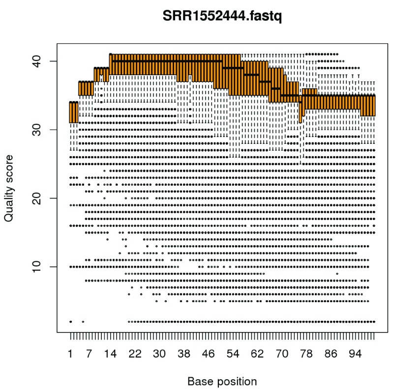
(see Figure 11). The vertical axis shows the Phred quality score, equal to 10 log 10 ( p) where p is the probability of an erroneous call. The maximum possible value is 40, and all values above 10 correspond to extremely small error probabilities. The horizontal axis shows position within a read. The file contains 100bp single-end reads, so the scale is from 1 to 100. The plot displays a compact boxplot at each base position. As is very commonly observed, the quality scores are best in the middle of the reads and decrease slightly towards the start and end of the reads. However the quality remains generally good even near the ends of the reads: the scores would need to be very much lower than this before they would cause problems for the alignment. Similar plots can be made for each of the FASTQ files.

Figure 11. Boxplots of quality scores by base position for the first FASTQ file.

Figure 11.

Build a genome index

Before the sequence reads can be aligned, we need to build an index for the GRCm38/mm10 (Dec 2011) build of the mouse genome. Most laboratories that use Rsubread regularly will already have an index file prepared, as this is a once-off operation for each genome release. If you are using Rsubread for mouse for the first time, then the latest mouse genome build can be downloaded from the NCBI location ftp://ftp.ncbi.nlm.nih.gov/genomes/all/GCA_000001635.6_GRCm38.p4/GCA_000001635.6_GRCm38.p4_genomic.fna.gz. (Note that this link is for patch 4 of mm10, which is valid at the time of writing in May 2016. The link will change as new patches are released periodically.) An index can then be built by:

                    > library(Rsubread)
> buildindex(basename = "mm10",
+            reference = "GCA_000001635.6_GRCm38.p4_genomic.fna.gz")
                

Aligning reads

The sequence reads can now be aligned to the mouse genome using the align function:

                    > all.bam <- sub(".fastq", ".bam", all.fastq)
> align(index="mm10", readfile1=all.fastq, input_format="FASTQ",
+       output_file=all.bam)
                

This produces a set of BAM files containing the read alignments for each RNA library. The mapping proportions can be summarized by the propmapped function:

                    > propmapped(all.bam)
          Samples NumTotal NumMapped PropMapped
1  SRR1552450.bam 30109290  26577308      0.883
2  SRR1552451.bam 28322351  24794251      0.875
3  SRR1552452.bam 31688348  27937620      0.882
4  SRR1552453.bam 29614284  26074034      0.880
5  SRR1552454.bam 27225012  24381742      0.896
6  SRR1552455.bam 25433157  22813815      0.897
7  SRR1552444.bam 27919481  23927833      0.857
8  SRR1552445.bam 29731031  25487822      0.857
9  SRR1552446.bam 29879070  25500318      0.853
10 SRR1552447.bam 29245388  25187577      0.861
11 SRR1552448.bam 31425424  27326500      0.870
12 SRR1552449.bam 31276061  27204156      0.870
                

Ideally, the proportion of mapped reads should be above 80%. By default, only reads with unique mapping locations are reported by Rsubread as being successfully mapped. Restricting to uniquely mapped reads is recommended, as it avoids spurious signal from non-uniquely mapped reads derived from, e.g., repeat regions.

Quantifying read counts for each gene

The read counts for each gene can be quantified using the featureCounts function in Rsubread. Conveniently, the Rsubread package includes inbuilt NCBI RefSeq annotation of the mouse and human genomes. featureCounts generates a matrix of read counts for each gene in each sample:

                    > fc <- featureCounts(all.bam, annot.inbuilt="mm10")
                

The output is a simple list, containing the matrix of counts ( counts), a data frame of gene characteristics ( annotation), a vector of file names ( targets) and summary mapping statistics ( stat):

                    > names(fc)
[1] "counts"		"annotation"	"targets"  "stat"
                

The row names of fc$counts are the Entrez gene identifiers for each gene. The column names are the output file names from align, which we simplify here for brevity:

                    > colnames(fc$counts) <- rownames(targets)
                

The first six rows of the counts matrix are shown below.

                    > head(fc$counts)
          MCL1.DG MCL1.DH MCL1.DI MCL1.DJ MCL1.DK MCL1.DL MCL1.LA MCL1.LB MCL1.LC
497097        438     299      65     237     354     287       0       0       0
100503874       1       0       1       1       0       4       0       0       0
100038431       0       0       0       0       0       0       0       0       0
100038431       0       0       0       0       0       0       0       0       0
19888           1       1       0       0       0       0      10       3      10
20671         106     181      82     104      43      83      16      25      18
27395         309     232     339     290     291     270     558     468     488
          MCL1.LD MCL1.LE MCL1.LF
497097          0       0       0
100503874       0       0       0
100038431       0       0       0
19888           2       0       0
20671           8       3      10
27395         332     312     344
                

Finally, a DGEList object can be assembled by:

                    > y <- DGEList(fc$counts, group=group)
> y$genes <- fc$annotation[, "Length", drop=FALSE]
                

Data and software availability

Except for the targets file targets.txt, all data analyzed in the workflow is read automatically from public websites as part of the code. All software used is publicly available as part of Bioconductor 3.3, except for the fastq-dump utility, which can be downloaded from NCBI website as described in the text. The article includes the complete code necessary to reproduce the analyses shown.

The LaTeX version of this article was generated automatically by running knitr::knit on an Rnw file of R commands. It is planned to make the code and data available as an executable Bioconductor workflow at http://www.bioconductor.org/help/workflows. In the meantime, the files are available from http://bioinf.wehi.edu.au/edgeR/F1000Research2016/.

Acknowledgments

The authors thank Wei Shi and Yang Liao for advice with Rsubread and Yifang Hu for creating the mouse version of the MSigDB. We also wish to acknowledge the early developers of the quasi-likelihood testing approach. Davis McCarthy authored the first versions of the quasi-likelihood functions in edgeR in February 2011 and Steve Lund and Dan Nettleton worked independently on QuasiSeq around the same time. We thank Steve Lund and Dan Nettleton for a valuable and enjoyable collaboration that lead to Lund et al. 7.

Funding Statement

This work was supported by the National Health and Medical Research Council (Fellowship 1058892 and Program 1054618 to G.K.S, Independent Research Institutes Infrastructure Support to the Walter and Eliza Hall Institute) and by a Victorian State Government Operational Infrastructure Support Grant.

[version 2; referees: 5 approved]

References

  • 1. Huber W, Carey VJ, Gentleman R, et al. : Orchestrating high-throughput genomic analysis with Bioconductor. Nat Methods. 2015;12(2):115–121. 10.1038/nmeth.3252 [DOI] [PMC free article] [PubMed] [Google Scholar]
  • 2. Fu NY, Rios AC, Pal B, et al. : EGF-mediated induction of Mcl-1 at the switch to lactation is essential for alveolar cell survival. Nat Cell Biol. 2015;17(4):365–375. 10.1038/ncb3117 [DOI] [PubMed] [Google Scholar]
  • 3. Liao Y, Smyth GK, Shi W: The Subread aligner: fast, accurate and scalable read mapping by seed-and-vote. Nucleic Acids Res. 2013;41(10):e108. 10.1093/nar/gkt214 [DOI] [PMC free article] [PubMed] [Google Scholar]
  • 4. Robinson MD, McCarthy DJ, Smyth GK: edgeR: a Bioconductor package for differential expression analysis of digital gene expression data. Bioinformatics. 2010;26(1):139–140. 10.1093/bioinformatics/btp616 [DOI] [PMC free article] [PubMed] [Google Scholar]
  • 5. Liao Y, Smyth GK, Shi W: featureCounts: an efficient general purpose program for assigning sequence reads to genomic features. Bioinformatics. 2014;30(7):923–930. 10.1093/bioinformatics/btt656 [DOI] [PubMed] [Google Scholar]
  • 6. McCarthy DJ, Chen Y, Smyth GK: Differential expression analysis of multifactor RNA-Seq experiments with respect to biological variation. Nucleic Acids Res. 2012;40(10):4288–4297. 10.1093/nar/gks042 [DOI] [PMC free article] [PubMed] [Google Scholar]
  • 7. Lund SP, Nettleton D, McCarthy DJ, et al. : Detecting differential expression in RNA-sequence data using quasi-likelihood with shrunken dispersion estimates. Stat Appl Genet Mol Biol. 2012;11(5): Article 8, pii: /j/sagmb.2012.11.issue-5/1544-6115.1826/1544-6115.1826.xml. 10.1515/1544-6115.1826 [DOI] [PubMed] [Google Scholar]
  • 8. Robinson MD, Smyth GK: Small-sample estimation of negative binomial dispersion, with applications to SAGE data. Biostatistics. 2008;9(2):321–332. 10.1093/biostatistics/kxm030 [DOI] [PubMed] [Google Scholar]
  • 9. Robinson MD, Smyth GK: Moderated statistical tests for assessing differences in tag abundance. Bioinformatics. 2007;23(21):2881–2887. 10.1093/bioinformatics/btm453 [DOI] [PubMed] [Google Scholar]
  • 10. Love MI, Huber W, Anders S: Moderated estimation of fold change and dispersion for RNA-seq data with DESeq2. Genome Biol. 2014;15(12):550. 10.1186/s13059-014-0550-8 [DOI] [PMC free article] [PubMed] [Google Scholar]
  • 11. Burden CJ, Qureshi SE, Wilson SR: Error estimates for the analysis of differential expression from RNA-seq count data. PeerJ. 2014;2:e576. 10.7717/peerj.576 [DOI] [PMC free article] [PubMed] [Google Scholar]
  • 12. Lun AT, Chen Y, Smyth GK: It’s DE-licious: A Recipe for Differential Expression Analyses of RNA-seq Experiments Using Quasi-Likelihood Methods in edgeR. Methods Mol Biol. 2016;1418:391–416. 10.1007/978-1-4939-3578-9_19 [DOI] [PubMed] [Google Scholar]
  • 13. Law CW, Chen Y, Shi W, et al. : voom: Precision weights unlock linear model analysis tools for RNA-seq read counts. Genome Biol. 2014;15(2):R29. 10.1186/gb-2014-15-2-r29 [DOI] [PMC free article] [PubMed] [Google Scholar]
  • 14. Ritchie ME, Phipson B, Wu D, et al. : limma powers differential expression analyses for RNA-sequencing and microarray studies. Nucleic Acids Res. 2015;43(7):e47. 10.1093/nar/gkv007 [DOI] [PMC free article] [PubMed] [Google Scholar]
  • 15. Lun AT, Smyth GK: De novo detection of differentially bound regions for ChIP-seq data using peaks and windows: controlling error rates correctly. Nucleic Acids Res. 2014;42(11):e95. 10.1093/nar/gku351 [DOI] [PMC free article] [PubMed] [Google Scholar]
  • 16. Lun AT, Smyth GK: diffHic: a Bioconductor package to detect differential genomic interactions in Hi-C data. BMC Bioinformatics. 2015;16:258. 10.1186/s12859-015-0683-0 [DOI] [PMC free article] [PubMed] [Google Scholar]
  • 17. Robinson MD, Oshlack A: A scaling normalization method for differential expression analysis of RNA-seq data. Genome Biol. 2010;11(3):R25. 10.1186/gb-2010-11-3-r25 [DOI] [PMC free article] [PubMed] [Google Scholar]
  • 18. Lun AT, Bach K, Marioni JC: Pooling across cells to normalize single-cell RNA sequencing data with many zero counts. Genome Biol. 2016;17:75. 10.1186/s13059-016-0947-7 [DOI] [PMC free article] [PubMed] [Google Scholar]
  • 19. Wu D, Hu Y, Tong S, et al. : The use of miRNA microarrays for the analysis of cancer samples with global miRNA decrease. RNA. 2013;19(7):876–888. 10.1261/rna.035055.112 [DOI] [PMC free article] [PubMed] [Google Scholar]
  • 20. Risso D, Ngai J, Speed TP, et al. : Normalization of RNA-seq data using factor analysis of control genes or samples. Nat Biotechnol. 2014;32(9):896–902. 10.1038/nbt.2931 [DOI] [PMC free article] [PubMed] [Google Scholar]
  • 21. Phipson B, Lee S, Majewski IJ, et al. : Robust hyperparameter estimation protects against hypervariable genes and improves power to detect differential expression. Ann Appl Stat. 2016;10 Reference Source [DOI] [PMC free article] [PubMed] [Google Scholar]
  • 22. Smyth GK: Linear models and empirical Bayes methods for assessing differential expression in microarray experiments. Stat Appl Genet Mol Biol. 2004;3(1): Article 3. 10.2202/1544-6115.1027 [DOI] [PubMed] [Google Scholar]
  • 23. McCarthy DJ, Smyth GK: Testing significance relative to a fold-change threshold is a TREAT. Bioinformatics. 2009;25(6):765–771. 10.1093/bioinformatics/btp053 [DOI] [PMC free article] [PubMed] [Google Scholar]
  • 24. McCullagh P, Nelder JA: Generalized Linear Models. Chapman & Hall/CRC, Boca Raton, Florida, 2nd edition,1989. Reference Source [Google Scholar]
  • 25. Wu D, Lim E, Vaillant F, et al. : ROAST: rotation gene set tests for complex microarray experiments. Bioinformatics. 2010;26(17):2176–2182. 10.1093/bioinformatics/btq401 [DOI] [PMC free article] [PubMed] [Google Scholar]
  • 26. Subramanian A, Tamayo P, Mootha VK, et al. : Gene set enrichment analysis: a knowledge-based approach for interpreting genome-wide expression profiles. Proc Natl Acad Sci U S A. 2005;102(43):15545–15550. 10.1073/pnas.0506580102 [DOI] [PMC free article] [PubMed] [Google Scholar]
  • 27. Lim E, Wu D, Pal B, et al. : Transcriptome analyses of mouse and human mammary cell subpopulations reveal multiple conserved genes and pathways. Breast Cancer Res. 2010;12:R21. 10.1186/bcr2560 [DOI] [PMC free article] [PubMed] [Google Scholar]
F1000Res. 2016 Aug 8. doi: 10.5256/f1000research.9996.r15361

Referee response for version 2

Conrad J Burden 1,2

I have read this submission. I believe that I have an appropriate level of expertise to confirm that it is of an acceptable scientific standard.

F1000Res. 2016 Aug 2. doi: 10.5256/f1000research.9996.r15360

Referee response for version 2

Nicholas J Schurch 1

I have read this submission. I believe that I have an appropriate level of expertise to confirm that it is of an acceptable scientific standard.

F1000Res. 2016 Aug 2. doi: 10.5256/f1000research.9996.r15362

Referee response for version 2

Devon P Ryan 1

I have read this submission. I believe that I have an appropriate level of expertise to confirm that it is of an acceptable scientific standard.

F1000Res. 2016 Jul 18. doi: 10.5256/f1000research.9667.r14474

Referee response for version 1

Steve Lianoglou 1

General Comments

I'd like to first thank the authors for having a long history of providing key contributions to the filed of bioinformatics in terms of methodological advances which are manifested in robust software (limma and edgeR), and further for being most generous with their time by providing extensive support for their software and its use by writing (epic) user guides and answering an innumerably many questions on the bioconductor support forum -- especially since the latter is likely not considered "important" (citable(!)) under most models of academic recognition. The community owes you a large debt of gratitude.

Now, for this workflow: The authors have provided a complete tutorial on the analysis of RNA-seq data that addresses many of the considerations required while performing these tasks. I'm particularly happy to see that the authors draw people's attention to the use of their "treat" framework, the brief (but important) ANODEV section, as well as discussing different ways to perform gene set enrichment analysis.

My strongest comment is that this is very well written and should prove very useful to the community at large -- and most useful to the "casual" analyst, one who isn't well versed in the various avenues of research that are now so conveniently wrapped up behind a single call to `glmTreat` or `camera`. In this vein, I feel the authors have done a commendable job of touching upon many of the more subtle parts of the data preparation steps in an RNA-seq analysis (ie. the importance of filtering, how normalization factors are used to adjust library size, explanation of an MDS plot, etc).

Of course one can't comment on every corner case that might arise during an rna-seq analysis, but to benefit this audience most, I'd like to point out some points that I feel could benefit from further clarification. Other readers would likely wish the authors clarify another set of points. The set of points that are most important to discuss is going to be subjective and based on our own experience in analyzing datasets (and helping others do the same), but for me I feel at least these could use some more elaboration:

  1. After the `plotMD` code example, the authors mention that "the bulk of genes should be centered at a line of zero log-fold change ...", it might be worth mentioning a few options to consider when a vanilla call to `calcNormFactors` doesn't produce that result.

  2. It is ultimately the user's responsibility to keep up with the primary publications in the field, but I think the authors can help with just a few clarifying comments.

  • In the Introduction, the authors cite [12] (A. Lun, et al. It's DE-licious ...) when they mention edgeR's QLF framework offers some additional statistical refinements when compared to QuasiSeq, but [12] doesn't seem to mention any direct comparisons to QuasiSeq at all. As far as I can tell, [12] only mentions that QuasiSeq also uses quasi-likelihood F-tests, and that these account for gene-specific variability from both biological and technical sources. Could the authors clarify what these refinements might be? (In retrospect, this comment seems a bit trivial to make. I intended to chase more comments to publications, but unfortunately don't have the time ... I doubt that there's any need to, just trying to help the casual analyst connect some dots here, is all)

  • From previous experience of putting camera's `inter.gene.cor` parameter to use, I can say it's both awesome and mysterious. Awesome because camera's rankings in this mode are often very useful, but mysterious because: what do the p-values now mean, really? How much should the analyst care? The original camera paper goes to some length to discuss the importance of type I error control and that camera's approach of estimating and accounting for inter-gene correlation is an improvement there. Given that the user can now override it, what can the analyst reasonably say about type I error control, now? Some guidance on choice of the value, or (perhaps) comment on why it's not so critical could be useful.

Minor Comments

  • The authors have done a good job of enabling easy reproducibility of this workflow. Keeping with that spirit, it might be useful to change the code that materializes the `targets` object to be executable without the use of an external file. Leveraging R's ability to read from a `textConnection` might be one day to do that without loosing readability of the workflow, since the targes file would also be printed to the document without having to output its value:

            targets <- read.delim(textConnection("

                       GEO        SRA CellType    Status

        MCL1.DG GSM1480297 SRR1552450        B    virgin

        MCL1.DH GSM1480298 SRR1552451        B    virgin

        MCL1.DI GSM1480299 SRR1552452        B  pregnant

        MCL1.DJ GSM1480300 SRR1552453        B  pregnant

        MCL1.DK GSM1480301 SRR1552454        B lactating

        MCL1.DL GSM1480302 SRR1552455        B lactating

        MCL1.LA GSM1480291 SRR1552444        L    virgin

        MCL1.LB GSM1480292 SRR1552445        L    virgin

        MCL1.LC GSM1480293 SRR1552446        L  pregnant

        MCL1.LD GSM1480294 SRR1552447        L  pregnant

        MCL1.LE GSM1480295 SRR1552448        L lactating

        MCL1.LF GSM1480296 SRR1552449        L lactating

        "), sep="")

  • In the "Downloading the read counts" section, the authors say that the first column of the downloaded read counts is the total number of bases in exons or UTRs for the gene, but UTRs *are* exons (sorry, pet peeve of mine) -- perhaps "total number of of basepairs from coding and non-coding exons(?)"

  • When construction the DGEList, why not show that you can now easily drop the `targets` data.frame into the DGEList's `$samples` slot like so:


    y <- DGEList(GenewiseCounts[,-1], group=group, samples=targets,

                     genes=GenewiseCounts[,1,drop=FALSE])

Grammar / Spelling


  • In the "Filtering to remove low counts" section

        - 'Genes that have *with* very low counts across all the libraries ...'

        - As a rule of thumb, we require that gene have a count of ...'

            + fix this sentence in a few places to support the use of "gene" or "genes"

  • After `plotBCV`: "The dispersion trend tends [to] decrease smoothly with abundance and (to -> is) asymptotic to a constant ..."

  • When the concept of dispersion estimation is introduced, the different types of dispersions are briefly discussed (each individual gene, common dispersion, trended dispersion of a gene). Then, in the QL approach, you mention that the "tagwise NB dispersions" are not used. Would be useful to use same naming convention (ie. which of the previous types of dispersions introduced is the tagwise dispersion referenced here?)

  • Remove third "the" here: "The QL functions moderte the genewise the QL dispersion estimates ..."

  • Under *complicated contrasts*: Suppose we are interested in testing whether the change in expression between lactating and pregnant mice is the same for basal cells [as] it is for luminal cells.

I have read this submission. I believe that I have an appropriate level of expertise to confirm that it is of an acceptable scientific standard.

F1000Res. 2016 Jul 22.
Gordon Smyth 1

Thanks, Steve, for your positive comments. Here are some responses to your extra suggestions.

After the `plotMD` code example, the authors mention that "the bulk of genes should be centered at a line of zero log-fold change ...", it might be worth mentioning a few options to consider when a vanilla call to `calcNormFactors` doesn't produce that result.

A paragraph has been added at the end of the normalization section. The MD plots have been moved to the next section with some added discussion of the relationship to normalization factors.

In the Introduction, the authors cite [12] when they mention edgeR's QLF framework offers some additional statistical refinements when compared to QuasiSeq ... Could the authors clarify what these refinements might be?

Robust empirical Bayes (robust=TRUE) is one refinement. Another is more careful treatment of zero counts when modelling the residual deviances. See our response to reviewer 1 (Conrad Burden).

From previous experience of putting camera's `inter.gene.cor` parameter to use, I can say it's both awesome and mysterious. ... Some guidance on choice of the value, or (perhaps) comment on why it's not so critical could be useful.

See our response to reviewer 2 (Devon Ryan).

The authors have done a good job of enabling easy reproducibility of this workflow. Keeping with that spirit, it might be useful to change the code that materializes the `targets` object to be executable without the use of an external file. Leveraging R's ability to read from a `textConnection` might be one day to do that without loosing readability of the workflow

That's a interesting suggestion. Alternatively of course we could have simply created the CellType and Status vectors in R without reading a targets frame at all. The reason why we read from an external file is we feel that doing so has pedagogic value. We think it is generally good practice for experimenters to create the targets file outside of R, using a spreadsheet editor like Excel. This forces the experimenter to check the correspondence between sample IDs and experimental factors. We want the workflow to mimic how a real analysis will go.

In the "Downloading the read counts" section, the authors say that the first column of the downloaded read counts is the total number of bases in exons or UTRs for the gene, but UTRs *are* exons

We agree, but the text nevertheless seems simple and clear. In our experience, it helps to explicitly mention UTRs. We've changed it to "exons and UTRs".

When constructing the DGEList, why not show that you can now easily drop the `targets` data.frame into the DGEList's `$samples` slot like so:

Good suggestion. We don't do it just so that the output from y$samples on pages 4 and 5 doesn't exceed the window width.


Grammar / Spelling

Fixed.

When the concept of dispersion estimation is introduced, the different types of dispersions are briefly discussed (each individual gene, common dispersion, trended dispersion of a gene). Then, in the QL approach, you mention that the "tagwise NB dispersions" are not used. Would be useful to use same naming convention (ie. which of the previous types of dispersions introduced is the tagwise dispersion referenced here?)

Good suggestion, done.

F1000Res. 2016 Jul 13. doi: 10.5256/f1000research.9667.r14480

Referee response for version 1

Tsung Fei Khang 1

First of all, please accept my apologies for not being able to complete the review earlier. I would like to thank the editor for the opportunity to review this interesting paper. EdgeR is one of the more popular methods for performing RNA-Seq data analysis, and the authors’ efforts in writing this expository tutorial will surely be welcome by students and researchers who need to work with analysis of RNA-Seq data.

I think entry-level readers with basic R skills will find the workflow described easy to follow; and having actually worked out an example data set, will have less difficulty in adapting it to the needs of their own data analysis. However, intermediate or experienced readers might find the presentation of some parts of the workflow overly simplistic (as pointed out by one of the reviewers N.J.Schurch) - but this is not a weakness of the paper, since it is too much to expect that all the nuances of a refined RNA-Seq data analysis can be covered in this tutorial paper. Nonetheless, I believe the discussion of these points will potentially add value to the paper – they do not necessarily imply the necessity of revising the work to include the points raised, because the appending of reviewers’ comments enables readers to assess how relevant are the points raised to their own work.

To ease discussion of the paper, I will itemize my comments as follows.

  1. Despite declaring “From reads to genes to pathways” in their title, the authors choose not to develop the contents of their paper in this sequence. Rather, they start immediately with the count table, and then develop the material going from genes to pathways. The section on read mapping is presented at the end instead.

    I understand the focus of their sequence of writing, which is to get the readers into the heart of the action quickly, using the tool that they are most familiar with, edgeR. However, read processing is an important upstream checkpoint, and the things that one chooses to do at this stage has more important consequences than choices of which contrasts to make, optimizing plots, etc. Personally, I feel that insufficient attention has been given to this section, which can benefit from more discussion. It troubles me that there is no mention of short read quality control, a standard (and important) requirement for data quality check, which I am sure the authors are aware of. This is typically visualized using the standard tool FastQC. Subsequently, depending on the diagnostics, one can use a tool like FastX or Trimmomatic 1 to remove problematic segments, usually the 3' end. Then, there is a plethora of read mapping methods that can be used  (of which Rsubread is just one of them), and also methods of constructing the count table from the mapped reads. Optimal combinations of methods for performing both tasks were recently investigated by Fonseca et al. 2, who suggested combinations such as OSA+HTSeq for producing the reliable count tables. While the authors do not really need to show how these can be done, I think they should devote a short paragraph to discuss these issues because of their fundamental nature.

  2. The authors demonstrate the use of mean difference (MD / a.k.a MA) plots as a diagnostic plot for checking data distributional properties. These are useful for checking whether variances increase as counts get larger in samples (the “fanning patterns”), for example. Less clear is the appropriate course of action in the event observing such undesirable patterns. Do we try to carry on the analysis, using log-transformed data? Do we discard problematic samples? Admittedly these are delicate issues that require more space for discussion than is possible in the paper. Nevertheless, providing some guidelines or pointing out useful references for further exploration will surely help readers appreciate the use of these plots.

  3. There is strangely no illustration of how to make a volcano plot in the tutorial, which is a common graphical plot for assessing the joint relationship between statistical and biological significance. From experience, I find such plots important for understanding how different DE methods pick DE gene candidates.

    I was motivated to understand how glmQLFTest and glmTreat functions call DE genes compared to a simple method based on hyperbolic decision rules proposed by Xiao et al. 3 using the volcano plot. The method of Xiao constructs the decision rule as follows: Declare a fold change  (FC) cut-off below which one is not interested in a gene as a DE candidate. So if we desire FC > 2 for up-regulated genes (and conversely FC < 1/2 for down-regulated genes), then |log2(FC)| > 1. Next, we set the level of statistical significance, above which a gene is considered to be an unlikely DE candidate. Suppose we use the adjusted p-value, and require p < 0.01. This implies that –log10(p) > 2. If we denote y = -log10(p) and x = log2(FC), then the product of these two inequalities gives |x|y >  2, so that y > 2/|x|. This translates to a hyperbolic decision rule, such that genes with x and y values lying in the rejection region are selected as DE candidates. This rule allows one to include genes with very large FC but higher p-value. If we care a lot about managing false positives, then we could add a hard requirement for –log10(p) = 2, meaning that we will only considering genes that demonstrate adjusted p-values below 0.01.

    The result of my exploration is attached here. Non-DE genes are in black. The genes picked using glmQLFTest are in green; note the majority of them are also picked by the hyperbolic decision rule (blue). Candidates returned from glmTreat are boxed in purple, and seems to form a subset of the candidates returned from the hyperbolic decision rule. However, they show a peculiar distribution pattern, in that some genes with large log2(FC) and –log10(p) do not get picked. It is unclear to me why such genes are not detected by the algorithm. Regardless, a volcano plot is an important instrument that readers can have at their disposal for understanding the behaviour of DE gene calling algorithms.

  4. The heatmap (Fig.7) is an important graphical plot of any gene expression analysis project, but there are some subtleties to its proper generation. I think it is not easy to explain the clustering pattern of the samples in Fig. 7, where basal and luminal cell samples are grouped together. Fortunately, this is often just a problem of the choice of clustering algorithm used. The default method in heatmap.2 for clustering is complete linkage, which is often not the best method. From experience, changing it to the ward.D algorithm frequently produced biologically meaningful results, which is the case in the current analysis.

    The figure here shows a possible modification of the heatmap. Here, the basal and luminal samples nicely separate out into two clusters, following biological intuition. Columns of interest (e.g. lactating state in both basal and luminal cells) can be boxed to draw reader’s attention.

    May I also recommend that the srtCol argument in the heatmap be introduced to users, since sooner or later one would have to deal with space issues with labels on a heatmap, and what better way to handle this than having them oblique instead of perpendicular to the plot? Additionally, I think the outcome of customizing the heatmap using the given margin, lhei and lwid arguments will produce variable results in different computers (I got a "figure margins too large" error message initially), and so a note to users may be useful.

  5. In the output table produced using the topTags function, there is a column named “FDR”. Should this be “Adjusted p-value”? In the Benjamini-Hochberg correction method that the authors’ used, FDR is a parameter determined by the user. Depending on one’s taste for false positive tolerance, one can tune it low or high (maybe useful to let users tune it?), so synonymizing “FDR” with “adjusted p-value” leads to conceptual confusion. By the way, how did the authors compute the adjusted p-value?

  6. While testing out the codes, I noted that the output that I got differed slightly from those shown by the authors.  Additionally, like N.J.Schurch, I also encountered problems running the fry code example:

    > fry(y, index=cyt.go.genes, design=design, contrast=B.VvsL)

    Error in array(x, c(length(x), 1L), if (!is.null(names(x))) list(names(x),  : 'data' must be of a vector type, was 'NULL'

    Only much later in the end did I read, on page 21, that the authors made their analysis using R version 3.3.0 or higher, with Bioconductor version 3.3. Since my versions for both were 3.2, I suppose that the variation in output, as well as the error message seen, could be just a consequence of different versions. Would it be better if the versions used are announced right at the beginning of the paper? Additionally, it would also help if the packages needed for running the analysis are all installed at the beginning of the R script provided (e.g. readers who had not run biocLite(“GO.db”) to install the package from Bioconductor would get an error running  library(GO.db) – this is not mentioned in the text I think, and can trouble beginners)

  7. Minor comments:

    (i)Subject-verb agreement issue (page 6): “We require that gene(s) have a count ….”.(ii)ANOVDEV - analysis of deviance, a citation is useful. 

Note: Codes for producing the volcano plot and heatmap are available here.

I have read this submission. I believe that I have an appropriate level of expertise to confirm that it is of an acceptable scientific standard.

References

  • 1. Bolger AM, Lohse M, Usadel B: Trimmomatic: a flexible trimmer for Illumina sequence data. Bioinformatics.2014;30(15) : 10.1093/bioinformatics/btu170 2114-20 10.1093/bioinformatics/btu170 [DOI] [PMC free article] [PubMed] [Google Scholar]
  • 2. Fonseca NA, Marioni J, Brazma A: RNA-Seq gene profiling--a systematic empirical comparison. PLoS One.2014;9(9) : 10.1371/journal.pone.0107026 e107026 10.1371/journal.pone.0107026 [DOI] [PMC free article] [PubMed] [Google Scholar]
  • 3. Xiao Y, Hsiao TH, Suresh U, Chen HI, Wu X, Wolf SE, Chen Y: A novel significance score for gene selection and ranking. Bioinformatics.2014;30(6) : 10.1093/bioinformatics/btr671 801-7 10.1093/bioinformatics/btr671 [DOI] [PMC free article] [PubMed] [Google Scholar]
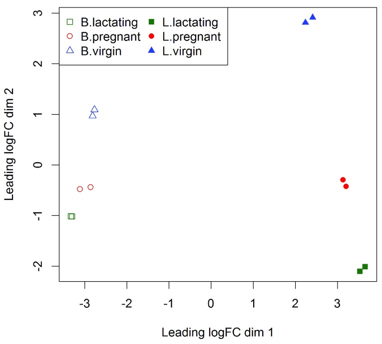
F1000Res. 2016 Jul 22.
Gordon Smyth 1

We thank the reviewer for his thoughtful comments, although we have different views on some of the specific issues raised.

The reviewer is right that this is a tutorial aimed at entry-level readers. We went to some trouble to make the tutorial simple, but we do not think it is "simplistic". The article alludes to many data analysis issues in a concise style. It includes material that is new and interesting for an advanced reader, as the reviewer reports show.

Our article is "live" in the sense that readers can regenerate the analysis and the article themselves automatically from a knitr file containing R code. In this revision, we have added a link to the code files. It isn't practical to include the read alignment in a live analysis because it is so much more computationally demanding than the rest of the analysis. Requiring readers to undertake the alignment step to obtain the read counts would drastically limit the audience who could go through the rest of the analysis.

We have added a note to the article about plotting quality scores. However we think that trimming poor quality segments is an old-fashioned step that is generally unnecessary given improved sequencing protocols and high quality robust aligners like subread. Trimming is more likely to be harmful than helpful for a gene-level RNA-seq study. Indeed we think that encouraging entry-level users to make ad hoc edits of their sequence data is quite dangerous. It is far better to allow a quality-score-aware aligner like subread to make decisions on a per-read basis.

We are not sure why the reviewer cites Fonseca et al (FMB), but we make the following points. FMB evaluated pipelines for quantifying absolute expression, which is not directly relevant in a differential expression study such as ours. FMB only compared pipelines available at the time. The OSA+HTSeq pipeline is not particularly popular, for example it has not been adopted by any of the FMB authors themselves for any published study of real data. By contrast, the Rsubread+featureCounts pipeline that we suggest is newer, faster and more widely used.

We could cite references to claim superiority for the Rsubread and featureCounts tools, for example the SEQC study (Su et al, 2014), but a review of the literature would be out of place in our article. What is undoubtedly true is that Rsubread+featureCounts is more than good enough and easily the fastest and most convenient in an R context because of its native implementation as an R package.

The reviewer may have misinterpreted the purpose of the MD plots. They are designed to display differential expression, either for individual samples or for a fitted model. They are not designed to check distributional properties. They do not check whether variances increase with count size. They are not used to suggest transformations of the data.

Volcano plots were originally motivated by the shortcomings of ordinary t-tests, which can give very small p-values even for genes with tiny fold changes. However this problem has been overcome by empirical Bayes test statistics, and we do not generally recommend volcano plots in the context of an edgeR analysis. Volcano plots tend to encourage fold change cutoffs, which we also don't recommend. We much prefer the MD plot (Figure 5) because it shows clearly how larger fold changes are required to reliably call DE for lower expressed genes.

The decision rule of Xiao et al (2014) doesn't give rigorous control of the FDR, and it has the tendency to prioritize genes with small counts that have large fold changes and large variances. We prefer not to prioritize lowly expressed genes. Again, this is made clear by the MD plot.

Thank you for the suggestions and code for the heatmap. The pattern seen in our heatmap is because we chose to display genes that are DE between B.pregnant and B.lactating, hence it is natural that these two populations are separated at the far left and right of the plot. We agree that slanted labels are useful, as are some of the other options you demonstrate. The choice of clustering algorithm is controversial, especially so as the ward.D algorithm is not a correct representation of Ward's method, with some writers claiming that only ward.D2 should be used. Anyway, our article is not about heatmaps per se. Our aim is simply to provide an example of how results can be transferred to a heatmap, so it is best to keep the heatmap call as simple as possible. Users are then free to add as many embellishments as they like.

There is no conceptual confusion with FDRs. For any FDR tolerance that a user might have, the genes for which the FDR value from topTags() is less than this cutoff are exactly the same genes that would be judged statistically significant by Benjamini-Hochberg's 1995 algorithm.

Obviously the results from the workflow will differ slightly if older versions of R and Bioconductor are used. The software versions were stated on page 18 as well as on page 21. The journal format is that software requirements are described at the end of the article. The requirements seem to us to be well sign-posted in sections called "Packages used" and "Data and software availability". In any case, we are a bit surprised that readers should need special prompting to install the current versions of R and Bioconductor.

Package installation is a "once off" operation, so we prefer not to make it part of the workflow code that a user might run many times.

A citation for ANODEV has been added.

Reference

Su, Z, et al (2014). A comprehensive assessment of RNA-seq accuracy, reproducibility and information content by the Sequencing Quality Control Consortium. Nature Biotechnology 32(9), 903-914.

F1000Res. 2016 Jul 6. doi: 10.5256/f1000research.9667.r14478

Referee response for version 1

Devon P Ryan 1

RNAseq is easily one of the most prevalent NGS experiment types and edgeR one of the most heavily used tools for analyzing the results of these experiments. Given that, I'm quite pleased to see this article from Chen and colleagues that provides a very convenient walk-through of how to perform a typical analysis, including pathway and GO enrichment.

I have no real reservations regarding this article. Below I'd like to point to a few parts of the paper that could use caveats or further explanation.

  1. The example experiment has only two samples per group. That suffices in some circumstances, but at least in my experience the lay reader has the unfortunate habit of reading too much into the the number of samples used in papers like this and then trying to use that as justification for similar sample numbers for their much lower effect size experiments. A caveat or note of warning to those new to RNAseq would have been nice.

  2. There's typically filtering done, such as the "rowSums(cpm(y) > 0.5) >= 2" in this paper. It would have been nice to include some recommendations regarding how to choose a filtering threshold.

  3. The p-values produced by goana() and topKEGG() are presumably unadjusted for multiple testing. It would have been nice if there had been a note to not then use the typical 0.05 cut off.

  4. While playing around with the code presented in the paper, I noticed that the choice of 0.01 for the "inter.gene.cor" parameter in camera() has a drastic affect on the resulting p-values. It would be incredibly useful to know when one should override the default value and how one should then derive an appropriate value. My concern is primarily that many will see these commands as "the one true method" for performing such an analysis and blindly apply the option in cases where it might not be appropriate.

I have read this submission. I believe that I have an appropriate level of expertise to confirm that it is of an acceptable scientific standard.

F1000Res. 2016 Jul 22.
Gordon Smyth 1

Thank you for your thoughtful report.

We have added a note about small sample numbers to the end of the section describing the experiment.

To be honest, we thought that we had already explained how to choose the filtering threshold in some detail. Admittedly we explained in words how the 0.5 and the 2 values in the filter formula were derived, and why they are appropriate for this experiment, rather than giving a formula. Anyway, we have edited the filtering section and added a couple of sentences.

We have added a note about the p-values from topGO() and topKEGG(). We generally ignore p-values above about 1e-5.

You ask a good question about inter.gene.cor for camera(). We have recently made inter.gene.cor=0.01 the default setting for camera(). Previously the default was to estimate the correlation separately for each gene set. The old default gives rigorous control of the type I error rate but is conservative and doesn't always rank the most biological interpretable sets most highly. The ranking issues occurs because of the need to penalize highly co-regulated sets with positive inter-gene correlations. We and others (Tarca et al, 2013) have noticed that much simpler methods like limma's geneSetTest() tend to give a better ranking of the biologically significant sets although they do not control the error rate correctly. Our recent use of a preset value for inter.gene.cor in camera() is an attempt to strike a compromise between the original camera() and geneSetTest(). Note the latter is equivalent to camera() with inter.gene.cor=0. The compromise gains the advantages of geneSetTest() while keeping reasonable, although not perfect, error rate control. You are right that the camera p-values are sensitive to the value for inter.gene.cor. Nevertheless, after quite a bit of experimentation, we have chosen the value of 0.01 as a reasonable compromise between ranking and error rate control that gives good results across a range of datasets. So we are happy to offer it for general use and would prefer that most users kept to the default value. The p-values will often be somewhat optimistic, but probably not more so than other commonly used methods like the Fisher tests for GO and KEGG terms. It gives vastly better error control than gene sets methods that permute genes and ignore inter-gene correlations, especially for larger sets.

Reference

Tarca AL, Bhatti G, Romero R (2013) A comparison of gene set analysis methods in terms of sensitivity, prioritization and specificity. PLoS ONE 8(11): e79217. http://dx.doi.org/10.1371/journal.pone.0079217

F1000Res. 2016 Jul 1. doi: 10.5256/f1000research.9667.r14475

Referee response for version 1

Nicholas J Schurch 1

This paper lays out a clear and relatively concise example of a linear workflow for analysing an RNA-seq based Differential Gene Expression experiment. The workflow focuses on doing all the analysis steps within R using the author's preferred tools (Rsubread & edgeR) and extends usefully to common aspects of pathway analysis with GO terms, Kegg terms and Gene Set testing.

While I'm sure this paper will be useful for a section of the community (particularly newcomers to this kind of analysis), I find the paper to be quite simplistic and lacking in depth and discussion. In particular, there is no discussion of the subtleties involved in performing this kind of analysis at the coalface of scientific research.

Some particular points I would like to have seen discussed are:

  1. How many replicates should be used for this kind of analysis.

    The example study uses a very poorly replicated dataset. In this case two replicates per condition *may* be sufficient, but not only is it not discussed but for most experiments this is highly misleading! For new RNA-seq experiments a significantly higher number of replicates should be used, both to guard against problem samples/libraries and to ensure sufficient statistical power to identify significant differential expression (in particular because it is rare to know how large the changes in the data will be before you do the experiment).

  2. How might one identify problematic issues with datasets that aren't as cooperative as the example dataset.

    For example, what would significant structure or curvature in the point cloud of the MD plot signify? If the samples don't cluster nicely on the MDS plot by condition, what might this mean (mislabelling, bad replicates, etc)?

  3. How one might remedy or deal with the problems in such uncooperative datasets.

    For example, what general approaches could be used for isolating the root cause of the observed problems? How might we adjust the analysis to ameliorate the problems and their downstream impact (dropping datasets, changing mapping parameters, filtering the data)?

  4. How one might go about choosing sensible selections and thresholds for the data.

    In my opinion the use of 'standard' and/or 'default' parameters, thresholds and selections (e.g. unique=TRUE, FDR>0.05, log2(FC)>1, cpm>0.5, etc) is a significant and endemic problem in this field. Often these are used solely because they have been used widely before, rather than considering whether they are appropriate for the specific data being analysed. What caused the authors to choose the values they use for this data and what key plots or pieces of information are valuable for choosing these appropriately?

  5. How the various selection steps, thresholds and even the version of the software used, might impact on the downstream results.

    For example, if you change the FDR threshold from 0.05 to 0.01, how does this impact the downstream pathway analysis? Are some of these analyses insensitive to threshold values (e.g. gene set analysis) and does this make them better/more useful? If you change the cpm threshold to 1.0, or if you allow non-unique read mappings, how does this impact the number of identified SDE genes and the downstream pathway analyses?

I am not suggesting that the authors should have given an exhaustive account of the issues. Rather, I think the paper would benefit from briefly discussing some of the more subtle and complex issues surrounding these types of analyses and perhaps highlight some key problems, parameters and thresholds that should be thought about carefully. Without this the paper really presents a very linear, idealized, example of what, in practice, are complex analyses that may require considerably more thought and investigation.

I also encountered some more specific issues:

  1. The link provided does not (currently) link to the actual bioconductor workflow.

  2. I ran all the R commands and they all work (except 'fry' see point 4 below), however I didn't get exactly the same results when (and after) filtering out genes without a symbol.

    The paper has:

    > head(y$genes)

                       Length  Symbol

    497097          3634     Xkr4

      100503874    3259     Gm19938

      100038431    1634     Gm10568

    19888            9747     Rp1

    20671            3130     Sox17

    27395            4203     Mrpl15

    > y <- y[!is.na(y$genes$Symbol), ]

    > dim(y)

    [1] 26357    12

    I had:

    > head(y$genes)

                     Length  Symbol

    497097         3634     Xkr4

      100503874   3259     Gm19938

      100038431   1634     Gm10568

    19888           9747     Rp1

    20671           3130     Sox17

    27395           4203     Mrpl15

    > y <- y[!is.na(y$genes$Symbol), ]

    > dim(y)

    [1] 26608    12

    The change is relatively small but it cascades causing differences in the genes that pass cpm filtering, differences in the normalization factors and differences in the DE results and the downstream analyses. I suspect this is the result of using a slightly older version of org.Mm.eg.db (3.2.3, vs 3.3.0) due to using an older version of R (3.2 vs 3.3). This goes nicely to point (5) above.

  3. There is no real description of the reasoning behind scaling of the heatmap values to a mean of zero and std dev of one.

  4. The 'fry' command failed for me, producing the error:

    > fry(y, index=cyt.go.genes, design=design, contrast=B.VvsL)

    Error in array(x, c(length(x), 1L), if (!is.null(names(x))) list(names(x),  :

     'data' must be of a vector type, was 'NULL'

I have read this submission. I believe that I have an appropriate level of expertise to confirm that it is of an acceptable scientific standard.

F1000Res. 2016 Jul 22.
Gordon Smyth 1

We thank the reviewer for approving our article.

We also thank the reviewer for his comments about RNA-seq analysis in general, but we didn't find the suggestions for revisions to be helpful. One problem is that the reviewer did not follow the instructions given in the article regarding software requirements. In general, Bioconductor workflows and Bioconductor channel articles are intended to be run using the latest release of Bioconductor. This was explicitly explained in the article, which said "This workflow depends on various packages from version 3.3 of the Bioconductor project, running on R version 3.3.0 or higher." The article went on to give the version numbers of all packages used. Unfortunately the reviewer tested the workflow using an earlier version of Bioconductor, with the result that one of the function calls didn't work and there were slight changes in the annotation.

We make no apology for providing a "linear" workflow demonstrating an easy, robust, fast and flexible workflow from RNA-seq reads through to pathway analysis. That was clearly the purpose of the article. We are pleased that the reviewer found our analysis to be "idealized" because it is in fact a typical example of our own biomedical research that we published recently in Nature Cell Biology. The article gives an insight, as far as is possible in a short journal article, of our own analysis process "at the coalface of scientific research".

The reviewer wants us to take lots of sidepaths, discussing problems that did not in fact occur, but we think that readers will not want to be distracted by hypothetical dead-ends in this way. The instructions for writing these articles (available from https://support.bioconductor.org/p/80077) advised authors to take a pragmatic task-orientated approach and not to get bogged down with extensive discussions of options. One has to start with an example of how an analysis should work in order to have a firm basis from which to deal with problematic studies that might arise in the future.

The reviewer also wants us to discuss the consequences of myriad perturbations of thresholds and parameters in the analysis pipeline. On one hand, we are disappointed that the reviewer failed to acknowledge the many explanations that were given in the article. On the other, we think that the specific parameter settings questioned by the reviewer are not particularly crucial and are not the most important issues that we would like researchers to be thinking about when they conduct an analysis.

Regarding sample sizes, the minimum appropriate sample size depends very much on the context. n=2 may be sufficient when comparing well sorted cell types from genetically identical mice whereas n=10 may be not nearly enough when comparing whole blood from diseased vs normal patients. For the study analyzed in our article, the cell types have distinct and highly reproducible expression profiles. The results were validated in the biological publication (Fu et al, 2015) in a number of ways. The repeatability of the results was also demonstrated in our current article by the strong correlation between the current results and earlier microarray results on similar cell populations (Figure 9). We disagree with the reviewer's position that sample size recommendations can be made independently of the biological context and the purpose of the scientific study.

We now give responses to specific issues raised by the reviewer:

1. How many replicates should be used for this kind of analysis.

This is not an article about experimental design.

2. How might one identify problematic issues with datasets that aren't as cooperative as the example dataset.

The article already shows users how to create appropriate plots from which problems can be identified.

3. How one might remedy or deal with the problems in such uncooperative datasets.

Trying to give a solution to every possible problem that might arise is clearly beyond the scope of the current article. In many cases it might be that no special action needs to be taken as the pipeline we give is quite robust.

4. How one might go about choosing sensible selections and thresholds for the data. What caused the authors to choose the values they use for this data and what key plots or pieces of information are valuable for choosing these appropriately?

This has already been explained where relevant in the article.

In my opinion the use of 'standard' and/or 'default' parameters, thresholds and selections (e.g. unique=TRUE, FDR>0.05, log2(FC)>1, cpm>0.5, etc) is a significant and endemic problem in this field. Often these are used solely because they have been used widely before, rather than considering whether they are appropriate for the specific data being analysed.

The reviewer is entitled to his point of view about the field in general, but all these issues are addressed from first principles in our article.

The reason for setting unique=TRUE in the call to align() was explained at the top of page 23. We see no point in unique=FALSE for a gene-level expression analysis.

We did not use a 'standard' cpm cutoff but rather explained how to work out a useful threshold for this specific data set. In fact the pipeline is robust to the filtering and tends to give similar results for a range of filtering methods and thresholds, as explained in the article.

We provided an extended discussion of DE cutoffs on pages 12-13 (nearly two whole pages). We presented a sophisticated solution using glmTreat() that is better than using a FC cutoff or making the FDR cutoff more stringent.

5. How the various selection steps, thresholds and even the version of the software used, might impact on the downstream results.

Already explained where appropriate. For example, page 18 says "Gene set tests consider all the genes in the specified set and do not depend on any pre-emptive significance cutoff."

In most cases, changes to the thresholds either have obvious effects (a lower FDR cutoff produces fewer DE genes) or have less impact than the reviewer seems to imply.

1. The link provided does not (currently) link to the actual bioconductor workflow.

We submitted our workflow to Bioconductor at about the same time as submitting to F1000Research but it has not yet appeared on the Bioconductor website. Unfortunately, none of the Bioconductor channel articles on F1000Research link to a corresponding code workflow.

In the meantime, we have made our code and data available from http://bioinf.wehi.edu.au/edgeR/F1000Research2016 and have added this link to the revised article. Note that the entire LaTeX article is generated automatically by running knit() on a Rnw file.

2. I ran all the R commands and they all work (except 'fry' see point 4 below), however I didn't get exactly the same results when (and after) filtering out genes without a symbol.

You used out-of-date versions of R and Bioconductor.

The change is relatively small but it cascades causing differences in the genes that pass cpm filtering, differences in the normalization factors and differences in the DE results and the downstream analyses.

In fact the DE results are almost identical using either Bioconductor 3.2 or 3.3, demonstrating the robustness of the pipeline.

3. There is no real description of the reasoning behind scaling of the heatmap values to a mean of zero and std dev of one.

The rationale was explained (it makes Euclidean distance a function of correlation). We have added one more sentence to the revised article.

4. The 'fry' command failed for me, producing the error:

There was no DGEList method for fry in the Bioconductor 3.2.

F1000Res. 2016 Jun 29. doi: 10.5256/f1000research.9667.r14473

Referee response for version 1

Conrad J Burden 1,2

There are two main contenders for off-the-shelf software packages for detecting differential expression from RNA-Seq count data: edge R and DESeq2, both of which model over-dispersed count data with a negative binomial distribution. A complete work flow built around DESeq2 was published recently 1, and this is the analogous complete work flow, starting from raw sequence counts, for edgeR. The example given goes further in that it also includes an analysis right through to a molecular pathway analysis of the most highly differentially expressed genes.  

The work flow is built around a number of edgeR functions which have been developed and improved over years. The most recent development is the inclusion of a method employed in an earlier package, called QuasiSeq, which combines a quasi-likelihood approach to estimating estimating over-dispersion with edgeR’s traditional approach of sharing information across genes. In my own review of packages designed for profiling differential expression from count data 2 (cited as ref. 11 in this paper) I observed using synthetic data that QuasiSeq easily outperformed the then existing available packages in terms of accuracy of claimed p-values and false discovery rates. However, it did have the disadvantage of very poor performance in terms of speed. The functions glmQLFit() and glmQLFtest() in the current work flow perform the quasi-likelihood method, but have overcome the speed performance problem completely and run very rapidly. Incidentally I can confirm that I and my co-authors of 2 have no particular connection with either the edgeR or DESeq groups, or the developers of QuasiSeq.  

One problem I have with the example used in the workflow is that there are only two biological replicates in each condition. In ref. 2 we observed using synthetic data that to get consistently accurate estimates of p-values and false discovery rates it is best to use at least 3 and preferably 4 biological replicates in each condition, even with QuasiSeq. See also the recent review by Schurch et al. 3 whose analysis recommends far more than two biological replicates in general with various software packages available at the time of their analysis. A similar independent analysis of the number of biological replicates recommended for the latest edgeR work flow would be welcome.  

I have worked through the example given in the paper, starting with “Downloading the read counts” on page 4, working through to pathway analysis ending on page 20. I have not worked through the “Read alignment and quantification” section starting on page 22. In general I found the work flow easy to follow and informative.  I have made the following observations: 

  1. When I got to the line 

    y <- DGEList(…, group=group, …)

    on page 5, the parameter ‘group’ had not been set. I had to do a bit of detective work and, as a workaround, set it up using the following lines of code: 


    CellType <- c(rep("B", 6), rep("L", 6))

    Status <- rep(c(rep("virgin", 2), rep("pregnant", 2), rep("lactating", 2)),2)

    group <- paste(CellType, Status, sep=".")

    group <- factor(group)

    This should be fixed.

  2. Suggestion: For ease of use, could calculating the TMM normalisation factors be built into the function DGEList()? If culling the low-count genes makes a noticeable difference, perhaps this could be done just as easily to the original data frame of counts before applying DGEList().

  3. Regarding the diagnostic plot Figure 1, can it happen that the TMM normalisation doesn’t give an MD plot which is symmetric about zero? And if it does, is there a fix?

  4. As a future enhancement, could a more user-friendly version of the differential expression analysis be made with estimateDisp(), glmQLFit() and glmQLFtest() all built into a single function? The point is that the job of the first two functions, i.e. calculating the trend dispersion and GLM coefficients, can’t be avoided anyway if you are a biologist wanting to do a differential expression analysis. For many users who are not familiar with the negative binomial model, the diagnostic plots of the BCV (Figure 3) and QL dispersion (Figure 4) are likely to be too arcane to be helpful. In fact the tagwise dispersions in Figure 3 are not actually used by the QL method.

  5. A couple of trivial typos: 

    Page 5, 4th last line: “Genes that have with very low counts …”, remove “with”.

    Caption to Figure 4: “trend show in Figure effig:plotBCV” should be “trend shown in Fig.3”

    Page 16 last line: “B.pregant” should be B.pregnant”.

I have read this submission. I believe that I have an appropriate level of expertise to confirm that it is of an acceptable scientific standard.

References

  • 1. Love MI, Anders S, Kim V, Huber W: RNA-Seq workflow: gene-level exploratory analysis and differential expression. F1000Res.2015;4: 10.12688/f1000research.7035.1 1070 10.12688/f1000research.7035.1 [DOI] [PMC free article] [PubMed] [Google Scholar]
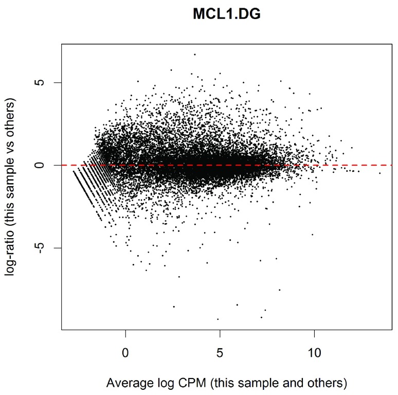
  • 2. Burden CJ, Qureshi SE, Wilson SR: Error estimates for the analysis of differential expression from RNA-seq count data. PeerJ.2014;2: 10.7717/peerj.576 e576 10.7717/peerj.576 [DOI] [PMC free article] [PubMed] [Google Scholar]
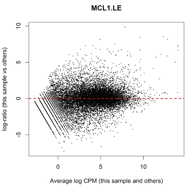
  • 3. Schurch NJ, Schofield P, Gierliński M, Cole C, Sherstnev A, Singh V, Wrobel N, Gharbi K, Simpson GG, Owen-Hughes T, Blaxter M, Barton GJ: How many biological replicates are needed in an RNA-seq experiment and which differential expression tool should you use?. RNA.2016;22(6) : 10.1261/rna.053959.115 839-51 10.1261/rna.053959.115 [DOI] [PMC free article] [PubMed] [Google Scholar]
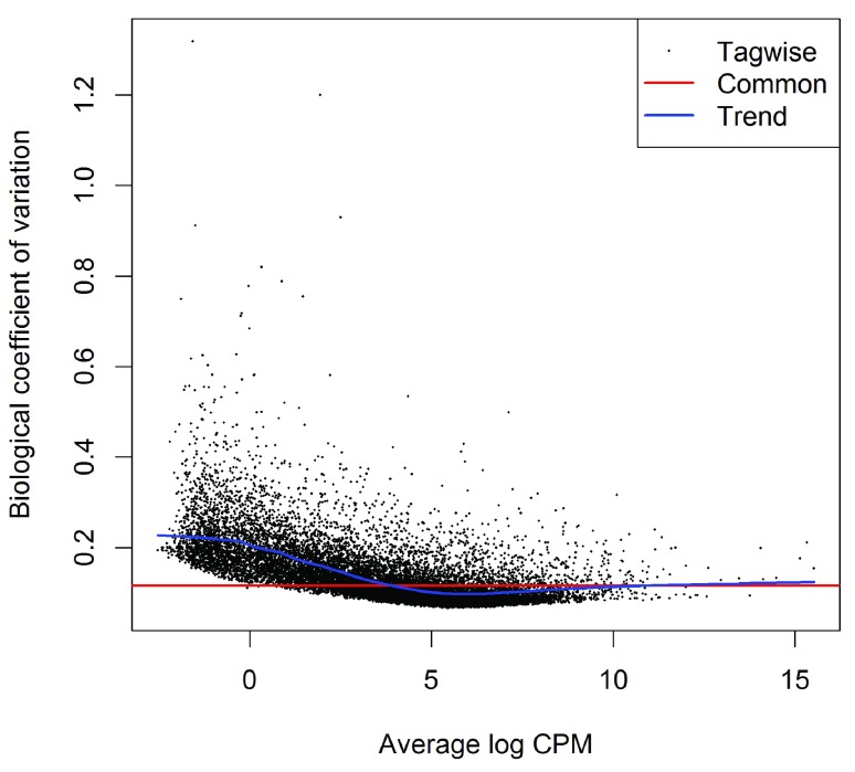
F1000Res. 2016 Jul 22.
Gordon Smyth 1

Dear Conrad,

Thank you for your thoughtful review and for your positive remarks about the performance of the quasi-likelihood pipeline.

We understand that the code as given in the article would not run for you completely without the 'targets.txt' file that is read in the first code line. The whole LaTeX article and all the results are actually generated from a knitr Rnw file. The code and associated files have been submitted to Bioconductor as a workflow but are not yet available from the Bioconductor website. In the meantime, we have made the code and associated files available from our own website at http://bioinf.wehi.edu.au/edgeR/F1000Research2016.

We find TMM normalization works well for almost all regular gene expression studies. Different normalization methods are more appropriate for other technologies that yield a lot of zeros, for example single-cell RNA-seq, CRISPR, ChIP-seq and Hi-C. Discussion of those is beyond the scope of this article but we have added a couple of references. Note that the MD plot in Figure 1 does not need to be symmetric, as long as the majority of points cluster around the line, and the article now clarifies this point.

Our preference is to provide a modular pipeline, encouraging analysts to examine the results at each step. For example, we can't decide whether filtering or TMM normalization is appropriate for a particular study at the time of forming the DGEList. We also like to encourage users to examine the BCV plot. We find this an informative diagnostic plot even as part of limma pipelines that do use the estimateDisp() results. On the other hand, if the number of samples was very large, one might choose to compute just the NB dispersion trend and not the tagwise values.

Thanks for pointing out the typos. They will be fixed in the next revision.

Regarding sample sizes, the minimum appropriate sample size depends very much on the context. For example, n=2 may be sufficient when comparing well sorted cell types from genetically identical mice whereas n=10 may not be not nearly enough when comparing whole blood for diseased vs normal patients. The repeatability of the results in our workflow is demonstrated by, among other things, the strong correlation between the current results and earlier microarray results on similar cell populations (Figure 9).

For cutting edge biomedical experiments, RNA samples can be very difficult to obtain. While larger sample sizes are always preferable, our philosophy is to perform the best possible data analysis for any experiment that our colleagues believe is scientifically worthwhile. It is our aim that edgeR-QL and limma should give statistically correct results for any sample size, even down to n=2 vs n=1. On this topic, we note that the current edgeR-QL code is more robust than the original QuasiSeq method when the sample sizes are very small. Note that QuasiSeq was based on our best understanding of the mathematics at the time of Lund et al (2012), but some important refinements have been added to the edgeR version since. Here is a very small simulated example with n=2 vs n=1 and no true differential expression. Here QuasiSeq gives FDR values as small as 0 or 0.01, whereas the smallest FDR from glmQLFTest is 0.97:

> y <- matrix(rpois(10000*3,lambda=10),10000,3)

> library(QuasiSeq)

> design0 <- matrix(1,3,1)

> design1 <- cbind(1,c(0,1,1))

> design.list<-vector("list",2)

> design.list[[1]] <- design1

> design.list[[2]] <- design0

> fit <- QL.fit(y, design.list)

> res <- QL.results(fit)

> lapply(res$Q.values, min)

$QL

[1] 0

$QLShrink

[1] 0.0138122

$QLSpline

[1] 0.01351794

> library(edgeR)

Loading required package: limma

> dge <- DGEList(counts=y)

> dge <- estimateDisp(dge, design1)

> fit <- glmQLFit(dge, design1)

> ql <- glmQLFTest(fit)

> topTags(ql)

Coefficient:   

         logFC   logCPM        F      PValue       FDR

7645 -1.911573 6.981129 42.64028 0.008218779 0.9733061

4209  3.366857 6.640090 41.30839 0.008583583 0.9733061

4669  2.451686 7.159465 35.31776 0.010624873 0.9733061

8608 -1.645226 6.942654 34.64701 0.010904508 0.9733061

8402  2.224008 6.981127 33.15403 0.011573724 0.9733061

2152  2.173823 6.942653 32.70039 0.011790966 0.9733061

6240  2.568286 6.777594 32.50399 0.011887171 0.9733061

7053 -1.743023 6.777595 32.50192 0.011888190 0.9733061

6984  2.780434 6.942653 32.01302 0.012133576 0.9733061

6057 -1.964729 6.488089 30.77110 0.012797066 0.9733061


Articles from F1000Research are provided here courtesy of F1000 Research Ltd

RESOURCES