F1000Research logoLink to F1000Research
. 2016 Oct 31;5:2122. Originally published 2016 Aug 31. [Version 2] doi: 10.12688/f1000research.9501.2

A step-by-step workflow for low-level analysis of single-cell RNA-seq data with Bioconductor

Aaron TL Lun 1,a, Davis J McCarthy 2,3, John C Marioni 1,2,4
PMCID: PMC5112579  PMID: 27909575

Version Changes

Revised. Amendments from Version 1

This version of the workflow contains a number of improvements based on the referees' comments. We have re-compiled the workflow using the latest packages from Bioconductor release 3.4, and stated more explicitly the dependence on these package versions. We have added a reference to the Bioconductor workflow page, which provides user-friendly instructions for installation and execution of the workflow. We have also moved cell cycle classification before gene filtering as this provides more precise cell cycle phase classifications. Some minor rewording and elaborations have also been performed in various parts of the article.

Abstract

Single-cell RNA sequencing (scRNA-seq) is widely used to profile the transcriptome of individual cells. This provides biological resolution that cannot be matched by bulk RNA sequencing, at the cost of increased technical noise and data complexity. The differences between scRNA-seq and bulk RNA-seq data mean that the analysis of the former cannot be performed by recycling bioinformatics pipelines for the latter. Rather, dedicated single-cell methods are required at various steps to exploit the cellular resolution while accounting for technical noise. This article describes a computational workflow for low-level analyses of scRNA-seq data, based primarily on software packages from the open-source Bioconductor project. It covers basic steps including quality control, data exploration and normalization, as well as more complex procedures such as cell cycle phase assignment, identification of highly variable and correlated genes, clustering into subpopulations and marker gene detection. Analyses were demonstrated on gene-level count data from several publicly available datasets involving haematopoietic stem cells, brain-derived cells, T-helper cells and mouse embryonic stem cells. This will provide a range of usage scenarios from which readers can construct their own analysis pipelines.

Keywords: Single cell, RNA-seq, bioinformatics, Bioconductor, workflow

Introduction

Single-cell RNA sequencing (scRNA-seq) is widely used to measure the genome-wide expression profile of individual cells. From each cell, mRNA is isolated and reverse transcribed to cDNA for high-throughput sequencing ( Stegle et al., 2015). This can be done using microfluidics platforms like the Fluidigm C1 ( Pollen et al., 2014), protocols based on microtiter plates like Smart-seq2 ( Picelli et al., 2014), or droplet-based technologies like inDrop ( Klein et al., 2015; Macosko et al., 2015). The number of reads mapped to each gene is then used to quantify its expression in each cell. Alternatively, unique molecular identifiers (UMIs) can be used to directly measure the number of transcript molecules for each gene ( Islam et al., 2014). Count data are analyzed to detect highly variable genes (HVGs) that drive heterogeneity across cells in a population, to find correlations between genes and cellular phenotypes, or to identify new subpopulations via dimensionality reduction and clustering. This provides biological insights at a single-cell resolution that cannot be achieved with conventional bulk RNA sequencing of cell populations.

Strategies for scRNA-seq data analysis differ markedly from those for bulk RNA-seq. One technical reason is that scRNA-seq data are much noisier than bulk data ( Brennecke et al., 2013; Marinov et al., 2014). Reliable capture (i.e., conversion) of transcripts into cDNA for sequencing is difficult with the low quantity of RNA in a single cell. This increases the frequency of drop-out events where none of the transcripts for a gene are captured. Dedicated steps are required to deal with this noise during analysis, especially during quality control. In addition, scRNA-seq data can be used to study cell-to-cell heterogeneity, e.g., to identify new cell subtypes, to characterize differentiation processes, to assign cells into their cell cycle phases, or to identify HVGs driving variability across the population ( Fan et al., 2016; Trapnell et al., 2014; Vallejos et al., 2015). This is simply not possible with bulk data, meaning that custom methods are required to perform these analyses.

This article describes a computational workflow for basic analysis of scRNA-seq data, using software packages from the open-source Bioconductor project (release 3.4) ( Huber et al., 2015). Starting from a count matrix, this workflow contains the steps required for quality control to remove problematic cells; normalization of cell-specific biases, with and without spike-ins; cell cycle phase classification from gene expression data; data exploration to identify putative subpopulations; and finally, HVG and marker gene identification to prioritize interesting genes. The application of different steps in the workflow will be demonstrated on several public scRNA-seq datasets involving haematopoietic stem cells, brain-derived cells, T-helper cells and mouse embryonic stem cells, generated with a range of experimental protocols and platforms ( Buettner et al., 2015; Kolodziejczyk et al., 2015; Wilson et al., 2015; Zeisel et al., 2015). The aim is to provide a variety of modular usage examples that can be applied to construct custom analysis pipelines.

Analysis of haematopoietic stem cells

Overview

To introduce most of the concepts of scRNA-seq data analysis, we use a relatively simple dataset from a study of haematopoietic stem cells (HSCs) ( Wilson et al., 2015). Single mouse HSCs were isolated into microtiter plates and libraries were prepared for 96 cells using the Smart-seq2 protocol. A constant amount of spike-in RNA from the External RNA Controls Consortium (ERCC) was also added to each cell’s lysate prior to library preparation. High-throughput sequencing was performed and the expression of each gene was quantified by counting the total number of reads mapped to its exonic regions. Similarly, the quantity of each spike-in transcript was measured by counting the number of reads mapped to the spike-in reference sequences. Counts for all genes/transcripts in each cell were obtained from the NCBI Gene Expression Omnibus (GEO) as a supplementary file under the accession number GSE61533 ( http://www.ncbi.nlm.nih.gov/geo/query/acc.cgi?acc=GSE61533).

For simplicity, we forego a description of the read processing steps required to generate the count matrix, i.e., read alignment and counting into features. These steps have been described in some detail elsewhere ( Chen et al., 2016; Love et al., 2015), and are largely the same for bulk and single-cell data. The only additional consideration is that the spike-in information must be included in the pipeline. Typically, spike-in sequences can be included as additional FASTA files during genome index building prior to alignment, while genomic intervals for both spike-in transcripts and endogenous genes can be concatenated into a single GTF file prior to counting. For users favouring an R-based approach to read alignment and counting, we suggest using the methods in the Rsubread package ( Liao et al., 2013; Liao et al., 2014). Alternatively, rapid quantification of expression with alignment-free methods such as kallisto ( Bray et al., 2016) or Salmon ( Patro et al., 2015) can be performed using the functions runKallisto and runSalmon in the scater package.

Count loading

The first task is to load the count matrix into memory. In this case, some work is required to retrieve the data from the Gzip-compressed Excel format. Each row of the matrix represents an endogenous gene or a spike-in transcript, and each column represents a single HSC. For convenience, the counts for spike-in transcripts and endogenous genes are stored in a SCESet object from the scater package ( McCarthy et al., 2016).

                        library
                        (R.utils)

                        gunzip
                        (
                        "GSE61533_HTSEQ_count_results.xls.gz"
                        , 
                        remove=
                        FALSE
                        , 
                        overwrite=
                        TRUE
                        )

                        library
                        (gdata)

                        all.counts <- 
                        read.xls
                        (
                        ’GSE61533_HTSEQ_count_results.xls’
                        , 
                        sheet=
                        1
                        , 
                        header=
                        TRUE
                        , 
                        row.names=
                        1
                        )

                        library
                        (scater)

                        sce <- 
                        newSCESet
                        (
                        countData=
                        all.counts)

                        dim
                        (sce)
                    
                        ## Features Samples
##    38498      96
                    

We identify the rows corresponding to ERCC spike-ins and mitochondrial genes. For this dataset, this information can be easily extracted from the row names. In general, though, identifying mitochondrial genes from standard identifiers like Ensembl requires extra annotation (this will be discussed later in more detail).

                        is.spike <- 
                        grepl
                        (
                        "^ERCC"
                        , 
                        rownames
                        (sce))

                        is.mito <- 
                        grepl
                        (
                        "^mt-"
                        , 
                        rownames
                        (sce))
                    

For each cell, we calculate quality control metrics such as the total number of counts or the proportion of counts in mitochondrial genes or spike-in transcripts. These are stored in the pData of the SCESet for future reference.

                        sce <- 
                        calculateQCMetrics
                        (sce, 
                        feature_controls=list
                        (
                        ERCC=
                        is.spike, 
                        Mt=
                        is.mito))

                        head
                        (
                        colnames
                        (
                        pData
                        (sce)))
                    
                        ## [1] "total_counts"          "log10_total_counts"       "filter_on_total_counts"
## [4] "total_features"        "log10_total_features"     "filter_on_total_features"
                    

We need to explicitly indicate that the ERCC set is, in fact, a spike-in set. This is necessary as spike-ins require special treatment in some downstream steps such as variance estimation and normalization. We do this by supplying the name of the spike-in set to isSpike.

                        library
                        (scran)

                        isSpike
                        (sce) <- 
                        "ERCC"
                    

Quality control on the cells

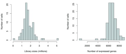
Low-quality cells need to be removed to ensure that technical effects do not distort downstream analysis results. Two common measures of cell quality are the library size and the number of expressed features in each library. The library size is defined as the total sum of counts across all features, i.e., genes and spike-in transcripts. Cells with relatively small library sizes are considered to be of low quality as the RNA has not been efficiently captured (i.e., converted into cDNA and amplified) during library preparation. The number of expressed features in each cell is defined as the number of features with non-zero counts for that cell. Any cell with very few expressed genes is likely to be of poor quality as the diverse transcript population has not been successfully captured. The distributions of both of these metrics are shown in Figure 1.

Figure 1. Histograms of library sizes (left) and number of expressed genes (right) for all cells in the HSC dataset.

Figure 1.

                        par
                        (
                        mfrow=c
                        (
                        1
                        ,
                        2
                        ))

                        hist
                        (sce$total_counts/
                        1e6
                        , 
                        xlab=
                        "Library sizes (millions)"
                        , 
                        main=
                        ""
                        ,
     
                        breaks=
                        20
                        , 
                        col=
                        "grey80"
                        , 
                        ylab=
                        "Number of cells"
                        )

                        hist
                        (sce$total_features, 
                        xlab=
                        "Number of expressed genes"
                        , 
                        main=
                        ""
                        ,
     
                        breaks=
                        20
                        , 
                        col=
                        "grey80"
                        , 
                        ylab=
                        "Number of cells"
                        )
                    

Picking a threshold for these metrics is not straightforward as their absolute values depend on the protocol and biological system. For example, sequencing to greater depth will lead to more reads, regardless of the quality of the cells. To obtain an adaptive threshold, we assume that most of the dataset consists of high-quality cells. We remove cells with log-library sizes that are more than 3 median absolute deviations (MADs) below the median log-library size. (A log-transformation improves resolution at small values, especially when the MAD of the raw values is comparable to or greater than the median.) We also remove cells where the log-transformed number of expressed genes is 3 MADs below the median.

                        libsize.drop <- 
                        isOutlier
                        (sce$total_counts, 
                        nmads=
                        3
                        , 
                        type=
                        "lower"
                        , 
                        log=
                        TRUE
                        )

                        feature.drop <- 
                        isOutlier
                        (sce$total_features, 
                        nmads=
                        3
                        , 
                        type=
                        "lower"
                        , 
                        log=
                        TRUE
                        )
                    

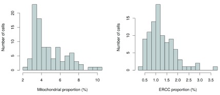
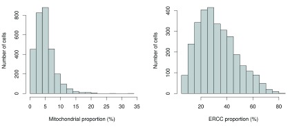
Another measure of quality is the proportion of reads mapped to genes in the mitochondrial genome. High proportions are indicative of poor-quality cells ( Ilicic et al., 2016; Islam et al., 2014), possibly because of increased apoptosis and/or loss of cytoplasmic RNA from lysed cells. Similar reasoning applies to the proportion of reads mapped to spike-in transcripts. The quantity of spike-in RNA added to each cell should be constant, which means that the proportion should increase upon loss of endogenous RNA in low-quality cells. The distributions of mitochondrial and spike-in proportions across all cells are shown in Figure 2.

Figure 2. Histogram of the proportion of reads mapped to mitochondrial genes (left) or spike-in transcripts (right) across all cells in the HSC dataset.

Figure 2.

                        par
                        (
                        mfrow=c
                        (
                        1
                        ,
                        2
                        ))

                        hist
                        (sce$pct_counts_feature_controls_Mt, 
                        xlab=
                        "Mitochondrial proportion (%)"
                        ,
     
                        ylab=
                        "Number of cells"
                        , 
                        breaks=
                        20
                        , 
                        main=
                        ""
                        , 
                        col=
                        "grey80"
                        )

                        hist
                        (sce$pct_counts_feature_controls_ERCC, 
                        xlab=
                        "ERCC proportion (%)"
                        ,
     
                        ylab=
                        "Number of cells"
                        , 
                        breaks=
                        20
                        , 
                        main=
                        ""
                        , 
                        col=
                        "grey80"
                        )
                    

Again, the ideal threshold for these proportions depends on the cell type and the experimental protocol. Cells with more mitochondria or more mitochondrial activity may naturally have larger mitochondrial proportions. Similarly, cells with more endogenous RNA or that are assayed with protocols using less spike-in RNA will have lower spike-in proportions. If we assume that most cells in the dataset are of high quality, then the threshold can be set to remove any large outliers from the distribution of proportions. We use the MAD-based definition of outliers to remove putative low-quality cells from the dataset.

                        mito.drop <- 
                        isOutlier
                        (sce$pct_counts_feature_controls_Mt, 
                        nmads=
                        3
                        , 
                        type=
                        "higher"
                        )

                        spike.drop <- 
                        isOutlier
                        (sce$pct_counts_feature_controls_ERCC, 
                        nmads=
                        3
                        , 
                        type=
                        "higher"
                        )
                    

Subsetting by column will retain only the high-quality cells that pass each filter described above. We examine the number of cells removed by each filter as well as the total number of retained cells. Removal of a substantial proportion of cells (> 10%) may be indicative of an overall issue with data quality. It may also reflect genuine biology in extreme cases (e.g., low numbers of expressed genes in erythrocytes) for which the filters described here are inappropriate.

                        sce <- sce[,!(libsize.drop | feature.drop | mito.drop | spike.drop)]

                        data.frame
                        (
                        ByLibSize=sum
                        (libsize.drop), 
                        ByFeature=sum
                        (feature.drop),
     
                        ByMito=sum
                        (mito.drop), 
                        BySpike=sum
                        (spike.drop), 
                        Remaining=ncol
                        (sce))
                    
                        ##         ByLibSize ByFeature ByMito BySpike Remaining
## Samples         2         2      6       3        86
                    

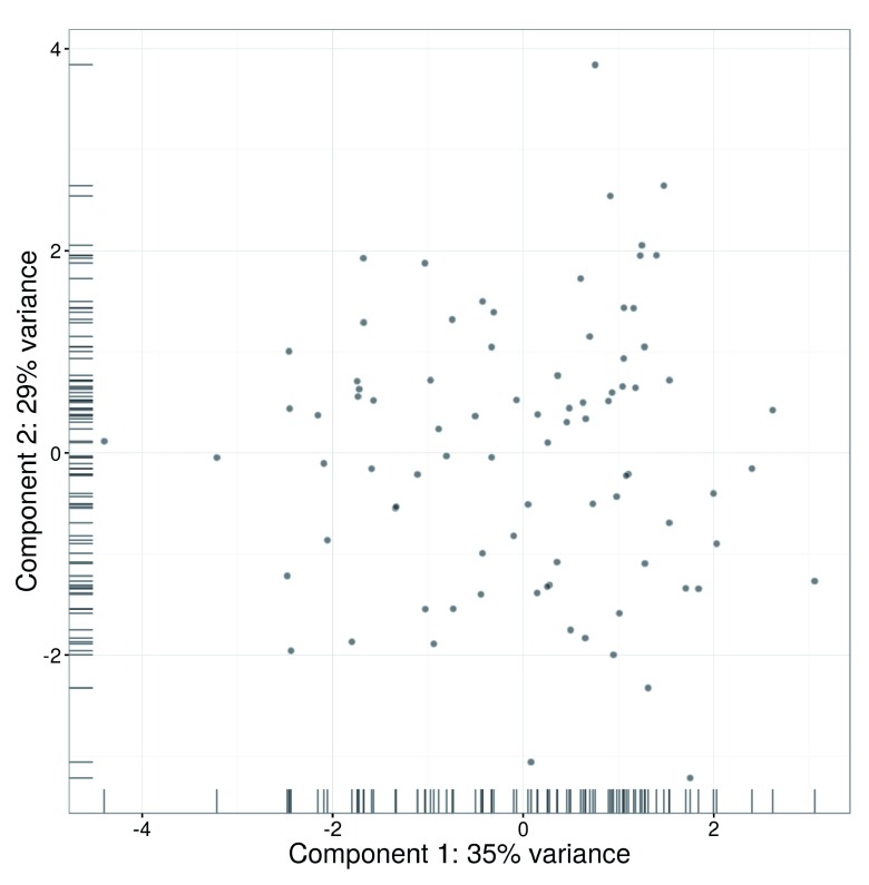
An alternative approach to quality control is to perform a principal components analysis (PCA) based on the quality metrics for each cell, e.g., the total number of reads, the total number of features and the proportion of mitochondrial or spike-in reads. Outliers on a PCA plot may be indicative of low-quality cells that have aberrant technical properties compared to the (presumed) majority of high-quality cells. In Figure 3, no obvious outliers are present, which is consistent with the removal of suspect cells in the preceding quality control steps.

Figure 3. PCA plot for cells in the HSC dataset, constructed using quality metrics.

Figure 3.

The first and second components are shown on each axis, along with the percentage of total variance explained by each component. Bars represent the coordinates of the cells on each axis.

                        fontsize <- 
                        theme
                        (
                        axis.text=element_text
                        (
                        size=
                        12
                        ), 
                        axis.title=element_text
                        (
                        size=
                        16
                        ))

                        plotPCA
                        (sce, 
                        pca_data_input=
                        "pdata"
                        ) + fontsize
                    

Methods like PCA-based outlier detection and support vector machines can provide more power to distinguish low-quality cells from high-quality counterparts ( Ilicic et al., 2016). This is because they are able to detect subtle patterns across many quality metrics simultaneously. However, this comes at some cost to interpretability, as the reason for removing a given cell may not always be obvious. Thus, for this workflow, we will use the simple approach whereby each quality metric is considered separately. Users interested in the more sophisticated approaches are referred to the scater and cellity packages.

Classification of cell cycle phase

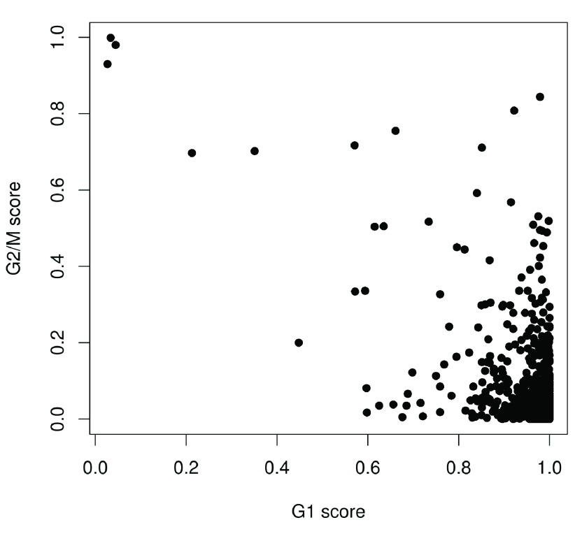
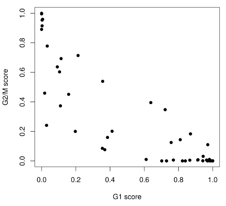
We use the prediction method described by Scialdone et al. (2015) to classify cells into cell cycle phases based on the gene expression data. Using a training dataset, the sign of the difference in expression between two genes was computed for each pair of genes. Pairs with changes in the sign across cell cycle phases were chosen as markers. Cells in a test dataset can then be classified into the appropriate phase, based on whether the observed sign for each marker pair is consistent with one phase or another. This approach is implemented in the cyclone function using a pre-trained set of marker pairs for mouse data. The result of phase assignment for each cell in the HSC dataset is shown in Figure 4. (Some additional work is necessary to match the gene symbols in the data to the Ensembl annotation in the pre-trained marker set.)

Figure 4. Cell cycle phase scores from applying the pair-based classifier on the HSC dataset, where each point represents a cell.

Figure 4.

                        mm.pairs <- 
                        readRDS
                        (
                        system.file
                        (
                        "exdata"
                        , 
                        "mouse_cycle_markers.rds"
                        , 
                        package=
                        "scran"
                        ))

                        library
                        (org.Mm.eg.db)

                        anno <- 
                        select
                        (org.Mm.eg.db, 
                        keys=rownames
                        (sce), 
                        keytype=
                        "SYMBOL"
                        , 
                        column=
                        "ENSEMBL"
                        )
ensembl <- anno$ENSEMBL[
                        match
                        (
                        rownames
                        (sce), anno$SYMBOL)]
assignments <- 
                        cyclone
                        (sce, mm.pairs, 
                        gene.names=
                        ensembl)

                        plot
                        (assignments$score$G1, assignments$score$G2M, 
                        xlab=
                        "G1 score"
                        , 
                        ylab=
                        "G2/M score"
                        , 
                        pch=
                        16
                        )
                    

Cells are classified as being in G1 phase if the G1 score is above 0.5 and greater than the G2/M score; in G2/M phase if the G2/M score is above 0.5 and greater than the G1 score; and in S phase if neither score is above 0.5. Here, the vast majority of cells are classified as being in G1 phase. We will focus on these cells in the downstream analysis. Cells in other phases are removed to avoid potential confounding effects from cell cycle-induced differences. Alternatively, if a non-negligible number of cells are in other phases, we can use the assigned phase as a blocking factor in downstream analyses. This protects against cell cycle effects without discarding information.

                        sce <- sce[,assignments$phases==
                        "G1"
                        ]
                    

Pre-trained classifiers are available in scran for human and mouse data. While the mouse classifier used here was trained on data from embryonic stem cells, it is still accurate for other cell types ( Scialdone et al., 2015). This may be due to the conservation of the transcriptional program associated with the cell cycle ( Bertoli et al., 2013; Conboy et al., 2007). The pair-based method is also a non-parametric procedure that is robust to most technical differences between datasets. However, it will be less accurate for data that are substantially different from those used in the training set, e.g., due to the use of a different protocol. In such cases, users can construct a custom classifier from their own training data using the sandbag function. This will also be necessary for other model organisms where pre-trained classifiers are not available.

Filtering out low-abundance genes

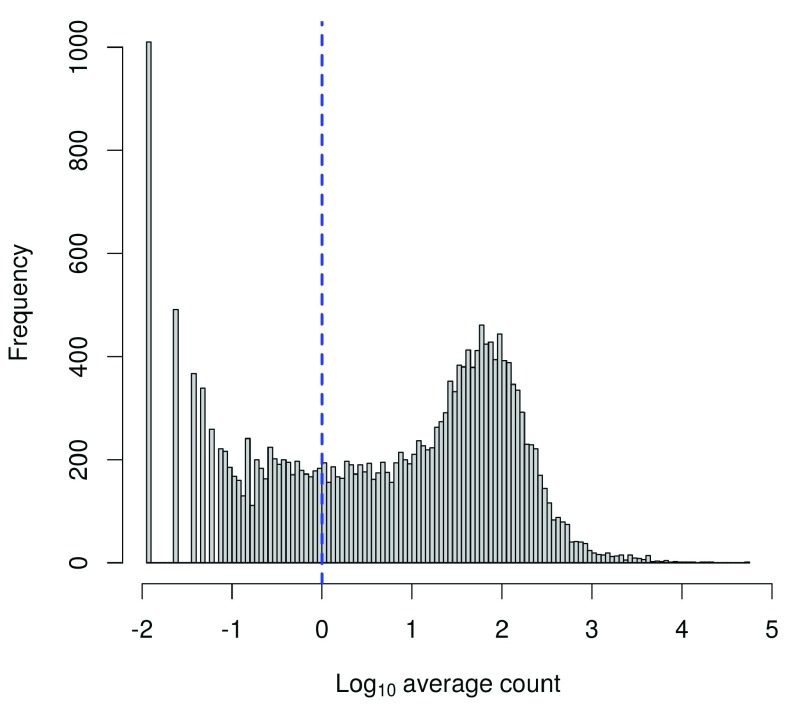
Low-abundance genes are problematic as zero or near-zero counts do not contain enough information for reliable statistical inference ( Bourgon et al., 2010). In addition, the discreteness of the counts may interfere with downstream statistical procedures, e.g., by compromising the accuracy of continuous approximations. Here, low-abundance genes are defined as those with an average count below a filter threshold of 1. These genes are likely to be dominated by drop-out events ( Brennecke et al., 2013), which limits their usefulness in later analyses. Removal of these genes mitigates discreteness and reduces the amount of computational work without major loss of information.

                        ave.counts <- 
                        rowMeans
                        (
                        counts
                        (sce))

                        keep <- ave.counts >= 
                        1

                        sum
                        (keep)
                    
                        ## [1] 13965
                    

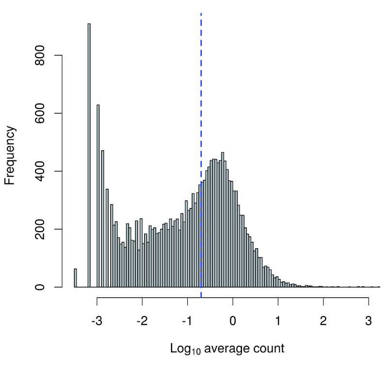
To check whether the chosen threshold is suitable, we examine the distribution of log-means across all genes ( Figure 5). The peak represents the bulk of moderately expressed genes while the rectangular component corresponds to lowly expressed genes. The filter threshold should cut the distribution at some point along the rectangular component to remove the majority of low-abundance genes.

Figure 5. Histogram of log-average counts for all genes in the HSC dataset.

Figure 5.

The filter threshold is represented by the blue line.

                        hist
                        (
                        log10
                        (ave.counts), 
                        breaks=
                        100
                        , 
                        main=
                        ""
                        , 
                        col=
                        "grey80"
                        ,
     
                        xlab=expression
                        (Log[
                        10
                        ]
                            ~
                        
                        "average count"
                        ))

                        abline
                        (
                        v=log10
                        (
                        1
                        ), 
                        col=
                        "blue"
                        , 
                        lwd=
                        2
                        , 
                        lty=
                        2
                        )
                    

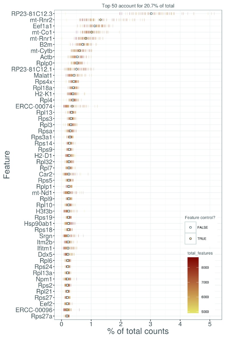
We also look at the identities of the most highly expressed genes ( Figure 6). This should generally be dominated by constitutively expressed transcripts, such as those for ribosomal or mitochondrial proteins. The presence of other classes of features may be cause for concern if they are not consistent with expected biology. For example, a top set containing many spike-in transcripts suggests that too much spike-in RNA was added during library preparation, while the absence of ribosomal proteins and/or the presence of their pseudogenes are indicative of suboptimal alignment.

Figure 6. Percentage of total counts assigned to the top 50 most highly-abundant features in the HSC dataset.

Figure 6.

For each feature, each bar represents the percentage assigned to that feature for a single cell, while the circle represents the average across all cells. Bars are coloured by the total number of expressed features in each cell, while circles are coloured according to whether the feature is labelled as a control feature.

                        plotQC
                        (sce, 
                        type = 
                        "highest-expression"
                        , 
                        n=
                        50
                        ) + fontsize
                    

An alternative approach to gene filtering is to select genes that have non-zero counts in at least n cells. This provides some more protection against genes with outlier expression patterns, i.e., strong expression in only one or two cells. Such outliers are typically uninteresting as they can arise from amplification artifacts that are not replicable across cells. (The exception is for studies involving rare cells where the outliers may be biologically relevant.) An example of this filtering approach is shown below for n set to 10, though smaller values may be necessary to retain genes expressed in rare cell types.

                        numcells <- 
                        nexprs
                        (sce, 
                        byrow=
                        TRUE
                        )

                        alt.keep <- numcells >= 
                        10

                        sum
                        (alt.keep)
                    
                        ## [1] 11988
                    

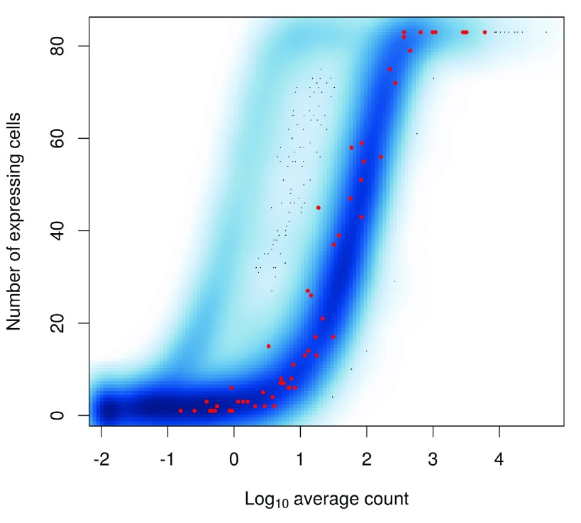
The relationship between the number of expressing cells and the mean is shown in Figure 7. The two statistics tend to be well-correlated so filtering on either should give roughly similar results.

Figure 7. Number of expressing cells against the log-mean expression for each gene in the HSC dataset.

Figure 7.

Spike-in transcripts are highlighted in red.

                        smoothScatter
                        (
                        log10
                        (ave.counts), numcells, 
                        xlab=expression
                        (Log[
                        10
                        ]
                            ~
                        
                        "average count"
                        ),
    
                         ylab=
                        "Number of expressing cells"
                        )

                        is.ercc <- 
                        isSpike
                        (sce, 
                        type=
                        "ERCC"
                        )

                        points
                        (
                        log10
                        (ave.counts[is.ercc]), numcells[is.ercc], 
                        col=
                        "red"
                        , 
                        pch=
                        16
                        , 
                        cex=
                        0.5
                        )
                    

In general, we prefer the mean-based filter as it tends to be less aggressive. A gene will be retained as long as it has sufficient expression in any subset of cells. Genes expressed in fewer cells require higher levels of expression in those cells to be retained, but this is not undesirable as it avoids selecting uninformative genes (with low expression in few cells) that contribute little to downstream analyses, e.g., HVG detection or clustering. In contrast, the “at least n” filter depends heavily on the choice of n. With n = 10, a gene expressed in a subset of 9 cells would be filtered out, regardless of the level of expression in those cells. This may result in the failure to detect rare subpopulations that are present at frequencies below n. While the mean-based filter will retain more outlier-driven genes, this can be handled by choosing methods that are robust to outliers in the downstream analyses.

Thus, we apply the mean-based filter to the data by subsetting the SCESet object as shown below. This removes all rows corresponding to endogenous genes or spike-in transcripts with abundances below the specified threshold.

                        sce <- sce[keep,]
                    

Normalization of cell-specific biases

Using the deconvolution method to deal with zero counts. Read counts are subject to differences in capture efficiency and sequencing depth between cells ( Stegle et al., 2015). Normalization is required to eliminate these cell-specific biases prior to downstream quantitative analyses. This is often done by assuming that most genes are not differentially expressed (DE) between cells. Any systematic difference in count size across the non-DE majority of genes between two cells is assumed to represent bias and is removed by scaling. More specifically, “size factors” are calculated that represent the extent to which counts should be scaled in each library.

Size factors can be computed with several different approaches, e.g., using the estimateSizeFactorsFromMatrix function in the DESeq2 package ( Anders & Huber, 2010; Love et al., 2014), or with the calcNormFactors function ( Robinson & Oshlack, 2010) in the edgeR package. However, single-cell data can be problematic for these bulk data-based methods due to the dominance of low and zero counts. To overcome this, we pool counts from many cells to increase the count size for accurate size factor estimation ( Lun et al., 2016). Pool-based size factors are then “deconvolved” into cell-based factors for cell-specific normalization.

                        sce <- 
                        computeSumFactors
                        (sce, 
                        sizes=c
                        (
                        20
                        , 
                        40
                        , 
                        60
                        , 
                        80
                        ))

                        summary
                        (
                        sizeFactors
                        (sce))
                    
                        ##     Min.  1st Qu.   Median     Mean  3rd Qu.     Max.

                        ##   0.4161   0.8055   0.9434   1.0000   1.1890   1.8410
                    

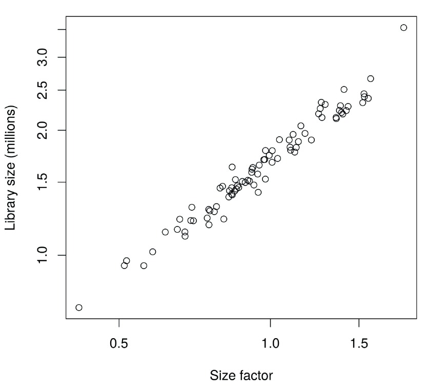
In this case, the size factors are tightly correlated with the library sizes for all cells ( Figure 8). This suggests that the systematic differences between cells are primarily driven by differences in capture efficiency or sequencing depth. Any DE between cells would yield a non-linear trend between the total count and size factor, and/or increased scatter around the trend. This does not occur here as strong DE is unlikely to exist within a homogeneous population of cells.

Figure 8. Size factors from deconvolution, plotted against library sizes for all cells in the HSC dataset.

Figure 8.

Axes are shown on a log-scale.

                        plot
                        (
                        sizeFactors
                        (sce), sce$total_counts/
                        1e6
                        , 
                        log=
                        "xy"
                        ,
     
                        ylab=
                        "Library size (millions)"
                        , 
                        xlab=
                        "Size factor"
                        )
                    

Computing separate size factors for spike-in transcripts. Size factors computed from the counts for endogenous genes are usually not appropriate for normalizing the counts for spike-in transcripts. Consider an experiment without library quantification, i.e., the amount of cDNA from each library is not equalized prior to pooling and multiplexed sequencing. Here, cells containing more RNA have greater counts for endogenous genes and thus larger size factors to scale down those counts. However, the same amount of spike-in RNA is added to each cell during library preparation. This means that the counts for spike-in transcripts are not subject to the effects of RNA content. Attempting to normalize the spike-in counts with the gene-based size factors will lead to over-normalization and incorrect quantification of expression. Similar reasoning applies in cases where library quantification is performed. For a constant total amount of cDNA, any increases in endogenous RNA content will suppress the coverage of spike-in transcripts. As a result, the bias in the spike-in counts will be opposite to that captured by the gene-based size factor.

To ensure normalization is performed correctly, we compute a separate set of size factors for the spike-in set. For each cell, the spike-in-specific size factor is defined as the total count across all transcripts in the spike-in set. This assumes that none of the spike-in transcripts are differentially expressed, which is reasonable given that the same amount and composition of spike-in RNA should have been added to each cell. (See below for a more detailed discussion on spike-in normalization.) These size factors are stored in a separate field of the SCESet object by setting general.use=FALSE in computeSpikeFactors. This ensures that they will only be used with the spike-in transcripts but not the endogenous genes.

                        sce <- 
                        computeSpikeFactors
                        (sce, 
                        type=
                        "ERCC"
                        , 
                        general.use=
                        FALSE
                        )
                    

Applying the size factors to normalize gene expression. The count data are used to compute normalized log-expression values for use in downstream analyses. Each value is defined as the log-ratio of each count to the size factor for the corresponding cell, after adding a prior count of 1 to avoid undefined values at zero counts. Division by the size factor ensures that any cell-specific biases are removed. If spike-in-specific size factors are present in sce, they will be automatically applied to normalize the spike-in transcripts separately from the endogenous genes.

                        sce <- 
                        normalize
                        (sce)
                    

The log-transformation provides some measure of variance stabilization ( Law et al., 2014), so that high-abundance genes with large variances do not dominate downstream analyses. The computed values are stored as an exprs matrix in addition to the other assay elements.

Checking for important technical factors

We check whether there are technical factors that contribute substantially to the heterogeneity of gene expression. If so, the factor may need to be regressed out to ensure that it does not inflate the variances or introduce spurious correlations. For this dataset, the simple experimental design means that there are no plate or batch effects to examine. Instead, we use the (log-transformed) total count for the spike-in transcripts as a proxy for the relative bias in each sample. This bias is purely technical in origin, given that the same amount of spike-in RNA should have been added to each cell. Thus, any association of gene expression with this factor is not biologically interesting and should be removed.

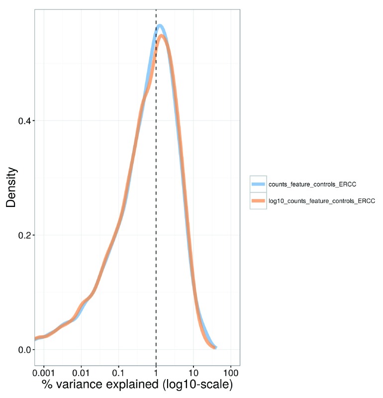
For each gene, we calculate the percentage of the variance of the expression values that is explained by the spike-in totals ( Figure 9). The percentages are generally small (1–3%), indicating that the expression profiles of most genes are not strongly associated with this factor. This result is consistent with successful removal of cell-specific biases by scaling normalization. Thus, the spike-in total does not need to be explicitly modelled in our downstream analyses.

Figure 9. Density plot of the percentage of variance explained by the (log-transformed) total spike-in counts across all genes in the HSC dataset.

Figure 9.

For each gene, the percentage of the variance of the normalized log-expression values across cells that is explained by each factor is calculated. Each curve corresponds to one factor and represents the distribution of percentages across all genes.

                        plotExplanatoryVariables
                        (sce, 
                        variables=c
                        (
                        "counts_feature_controls_ERCC"
                        ,
     
                        "log10_counts_feature_controls_ERCC"
                        )) + fontsize
                    

Note that the use of the spike-in total as an accurate proxy for the relative technical bias assumes that no library quantification is performed. Otherwise, the coverage of the spike-in transcripts would be dependent on the total amount of endogenous RNA in each cell. (Specifically, if the same amount of cDNA is used for sequencing per cell, any increase in the amount of endogenous RNA will suppress the coverage of the spike-in transcripts.) This means that the spike-in totals could be confounded with genuine biological effects associated with changes in RNA content.

Identifying HVGs from the normalized log-expression

We identify HVGs to focus on the genes that are driving heterogeneity across the population of cells. This requires estimation of the variance in expression for each gene, followed by decomposition of the variance into biological and technical components. HVGs are then identified as those genes with the largest biological components. This avoids prioritizing genes that are highly variable due to technical factors such as sampling noise during RNA capture and library preparation.

Ideally, the technical component would be estimated by fitting a mean-variance trend to the spike-in transcripts using the trendVar function. Recall that the same set of spike-ins was added in the same quantity to each cell. This means that the spike-in transcripts should exhibit no biological variability, i.e., any variance in their counts should be technical in origin. Given the mean abundance of a gene, the fitted value of the trend can be used as an estimate of the technical component for that gene. The biological component of the variance can then be calculated by subtracting the technical component from the total variance of each gene with the decomposeVar function.

In practice, this strategy is compromised by the small number of spike-in transcripts, the uneven distribution of their abundances and (for low numbers of cells) the imprecision of their variance estimates. This makes it difficult to accurately fit a complex mean-dependent trend to the spike-in variances. An alternative approach is to fit the trend to the variance estimates of the endogenous genes, using the use.spikes=FALSE setting as shown below. This assumes that the majority of genes are not variably expressed, such that the technical component dominates the total variance for those genes. The fitted value of the trend is then used as an estimate of the technical component. Obviously, this is the only approach that can be used if no spike-ins were added in the experiment.

                        var.fit <- 
                        trendVar
                        (sce, 
                        trend=
                        "loess"
                        , 
                        use.spikes=
                        FALSE
                        , 
                        span=
                        0.2
                        )

                        var.out <- 
                        decomposeVar
                        (sce, var.fit)
                    

We assess the suitability of the trend fitted to the endogenous variances by examining whether it is consistent with the spike-in variances ( Figure 10). The trend passes through or close to most of the spike-in variances, indicating that our assumption (that most genes have low levels of biological variability) is valid. This strategy exploits the large number of endogenous genes to obtain a stable trend, with the spike-in transcripts used as diagnostic features rather than in the trend fitting itself. However, if our assumption did not hold, we would instead fit the trend directly to the spike-in variances with the default use.spikes=TRUE. This sacrifices stability to reduce systematic errors in the estimate of the biological component for each gene. (In such cases, tinkering with the trend fitting parameters may yield a more stable curve – see ?trendVar for more details.)

Figure 10. Variance of normalized log-expression values for each gene in the HSC dataset, plotted against the mean log-expression.

Figure 10.

The blue line represents the mean-dependent trend fitted to the variances of the endogenous genes. Variance estimates for spike-in transcripts are highlighted in red.

                        plot
                        (var.out$mean, var.out$total, 
                        pch=
                        16
                        , 
                        cex=
                        0.6
                        , 
                        xlab=
                        "Mean log-expression"
                        ,
     
                        ylab=
                        "Variance of log-expression"
                        )

                        o <- 
                        order
                        (var.out$mean)

                        lines
                        (var.out$mean[o], var.out$tech[o], 
                        col=
                        "dodgerblue"
                        , 
                        lwd=
                        2)

                        cur.spike <- 
                        isSpike
                        (sce)

                        points
                        (var.out$mean[cur.spike], var.out$total[cur.spike], 
                        col=
                        "red"
                        , 
                        pch=
                        16
                        )
                    

HVGs are defined as genes with biological components that are significantly greater than zero at a false discovery rate (FDR) of 5%. These genes are interesting as they drive differences in the expression profiles between cells, and should be prioritized for further investigation. In addition, we only consider a gene to be a HVG if it has a biological component greater than or equal to 0.5. For transformed expression values on the log 2 scale, this means that the average difference in true expression between any two cells will be at least 2-fold. (This reasoning assumes that the true log-expression values are Normally distributed with variance of 0.5. The root-mean-square of the difference between two values is treated as the average log 2-fold change between cells and is equal to unity.) We rank the results by the biological component to focus on genes with larger biological variability.

                        hvg.out <- var.out[
                        which
                        (var.out$FDR <= 
                        0.05 
                        & var.out$bio >= 
                        0.5
                        ),]
hvg.out <- hvg.out[
                        order
                        (hvg.out$bio, 
                        decreasing=
                        TRUE
                        ),]

                        nrow
                        (hvg.out)
                    
                        ## [1] 193
                    
                        write.table
                        (
                        file=
                        "hsc_hvg.tsv"
                        , 
                        hvg.out, 
                        sep=
                        "\t"
                        , 
                        quote=
                        FALSE
                        , 
                        col.names=
                        NA
                        )

                        head
                        (hvg.out)
                    
                        ##              mean     total       bio      tech       p.value           FDR
## Fos      6.412282 20.167804 12.287746  7.880058  3.609804e-13  2.283693e-10
## Rgs1     5.214003 20.271925  9.430165 10.841761  3.065697e-06  5.019808e-04
## Dusp1    6.693026 16.074489  9.044983  7.029506  3.066936e-10  1.156266e-07
## H2-Aa    4.294426 19.390442  7.496497 11.893945  2.736909e-04  2.333494e-02
## Ppp1r15a 6.545438 14.964370  7.460786  7.503584  2.308822e-07  4.943721e-05
## Ctla2a   8.654347  9.471605  7.368337  2.103268  4.574748e-38  9.095906e-35
                    

We recommend checking the distribution of expression values for the top HVGs to ensure that the variance estimate is not being dominated by one or two outlier cells ( Figure 11).

Figure 11. Violin plots of normalized log-expression values for the top 10 HVGs in the HSC dataset.

Figure 11.

Each point represents the log-expression value in a single cell.

                        plotExpression
                        (sce, 
                        rownames
                        (hvg.out)[
                        1
                        :
                        10
                        ]) + fontsize
                    

There are many other strategies for defining HVGs, e.g., by using the coefficient of variation ( Brennecke et al., 2013; Kim et al., 2015; Kolodziejczyk et al., 2015), with the dispersion parameter in the negative binomial distribution ( McCarthy et al., 2012), or as a proportion of total variability ( Vallejos et al., 2015). Some of these methods are available in scran – for example, see DM or technicalCV2 for calculations based on the coefficient of variation. Here, we use the variance of the log-expression values because the log-transformation protects against genes with strong expression in only one or two cells. This ensures that the set of top HVGs is not dominated by genes with (mostly uninteresting) outlier expression patterns.

Identifying correlated gene pairs with Spearman’s rho

Another useful procedure is to identify the HVGs that are highly correlated with one another. This distinguishes between HVGs caused by random noise and those involved in driving systematic differences between subpopulations. Correlations between genes are quantified by computing Spearman's rho, which accommodates non-linear relationships in the expression values. Gene pairs with significantly large positive or negative values of rho are identified using the correlatePairs function. We only apply this function to the set of HVGs, because these genes have large biological components and are more likely to exhibit strong correlations driven by biology. In contrast, calculating correlations for all possible gene pairs would require too much computational time and increase the severity of the multiple testing correction. It may also prioritize uninteresting genes that have strong correlations but low variance, e.g., tightly co-regulated house-keeping genes.

                        set.seed
                        (
                        100
                        )

                        var.cor <- 
                        correlatePairs
                        (sce, 
                        subset.row=rownames
                        (hvg.out))

                        write.table
                        (
                        file=
                        "hsc_cor.tsv"
                        , var.cor
                        , 
                        sep=
                        "\t"
                        , 
                        quote=
                        FALSE
                        , 
                        row.names=
                        FALSE
                        )

                        head
                        (var.cor)
                    
                        ##      gene1   gene2       rho      p.value         FDR
## 1   mt-Nd2 mt-Rnr1 0.6037110 1.999998e-06 0.005293709
## 2     Egr1     Jun 0.5218295 1.999998e-06 0.005293709
## 3    Pdia6   Hspa5 0.5119852 1.999998e-06 0.005293709
## 4      Fos    Egr1 0.5035263 1.999998e-06 0.005293709
## 5 Ppp1r15a   Zfp36 0.4975862 1.999998e-06 0.005293709
## 6   Hnrpdl  mt-Nd2 0.4963688 1.999998e-06 0.005293709
                    

The significance of each correlation is determined using a permutation test. For each pair of genes, the null hypothesis is that the expression profiles of two genes are independent. Shuffling the profiles and recalculating the correlation yields a null distribution that is used to obtain a p-value for each observed correlation value ( Phipson & Smyth, 2010). Correction for multiple testing across many gene pairs is performed by controlling the FDR at 5%. Correlated gene pairs can be directly used for experimental validation with orthogonal techniques (e.g., fluorescence-activated cell sorting, immunohistochemistry or RNA fluorescence in situ hybridization) to verify that these expression patterns are genuinely present across the cell population.

                        sig.cor <- var.cor$FDR <= 
                        0.05

                        summary
                        (sig.cor)
                    
                        ##    Mode FALSE TRUE NA’s
## logical 18485   43    0
                    

Larger sets of correlated genes are assembled by treating genes as nodes in a graph and each pair of genes with significantly large correlations as an edge. In particular, an undirected graph is constructed using methods in the RBGL package. Highly connected subgraphs are then identified and defined as gene sets. This provides a convenient summary of the pairwise correlations between genes.

                        library
                        (RBGL)
g <- 
                        ftM2graphNEL
                        (
                        cbind
                        (var.cor$gene1, var.cor$gene2)[sig.cor,],
     
                        W=
                        NULL
                        , 
                        V=
                        NULL
                        , 
                        edgemode=
                        "undirected"
                        )
cl <- 
                        highlyConnSG
                        (g)$clusters
cl <- cl[
                        order
                        (
                        lengths
                        (cl), 
                        decreasing=
                        TRUE
                        )
                        ]

                        head
                        (cl)
                    
                        ## [[1]]
## [1] "Egr1"  "Fos"   "Zfp36" "Ier2"
##
## [[2]]
## [1] "mt-Nd2"  "Sh3bgrl" "mt-Rnr1"
##
## [[3]]
## [1] "Hspd1"   "Pik3ip1" "Srm"
##
## [[4]]
## [1] "Sqstm1" "Phgdh"  "Cct3"
##
## [[5]]
## [1] "Morf4l2" "Impdh2"  "Ncl"
##
## [[6]]
## [1] "Hsd17b12" "Srsf7"
                    

Significant correlations provide evidence for substructure in the dataset, i.e., subpopulations of cells with systematic differences in their expression profiles. The number of significantly correlated HVG pairs represents the strength of the substructure. If many pairs were significant, this would indicate that the subpopulations were clearly defined and distinct from one another. For this particular dataset, a relatively low number of HVGs exhibit significant correlations. This suggests that any substructure in the data will be modest, which is expected given that rigorous selection was performed to obtain a homogeneous population of HSCs ( Wilson et al., 2015).

Using correlated HVGs for further data exploration

We visualize the expression profiles of the correlated HVGs with a heatmap ( Figure 12). All expression values are mean-centred for each gene to highlight the relative differences in expression between cells. If any subpopulations were present, they would manifest as rectangular “blocks” in the heatmap, corresponding to sets of genes that are systematically up- or down-regulated in specific groups of cells. This is not observed in Figure 12, consistent with the lack of strong substructure. There may be a subpopulation of Fos and Jun-negative cells, but it is poorly defined given the small numbers of cells and genes involved.

Figure 12. Heatmap of mean-centred normalized log-expression values for correlated HVGs in the HSC dataset.

Figure 12.

Dendrograms are formed by hierarchical clustering on the Euclidean distances between genes (row) or cells (column).

                        chosen <- 
                        unique
                        (
                        c
                        (var.cor$gene1[sig.cor], var.cor$gene2[sig.cor]))
norm.exprs <- 
                        exprs
                        (sce)[chosen,,drop=
                        FALSE
                        ]
heat.vals <- norm.exprs - 
                        rowMeans
                        (norm.exprs)

                        library
                        (gplots)
heat.out <- 
                        heatmap.2
                        (heat.vals, 
                        col=
                        bluered, 
                        symbreak=
                        TRUE
                        , 
                        trace=
                        ’none’
                        , 
                        cexRow=
                        0.6
                        )
                    

We also apply dimensionality reduction techniques to visualize the relationships between cells. This is done by constructing a PCA plot from the normalized log-expression values of the correlated HVGs ( Figure 13). Cells with similar expression profiles should be located close together in the plot, while dissimilar cells should be far apart. We only use the correlated HVGs in plotPCA because any substructure should be most pronounced in the expression profiles of these genes. Even so, no clear separation of cells into distinct subpopulations is observed.

Figure 13. PCA plot constructed from normalized log-expression values of correlated HVGs, where each point represents a cell in the HSC dataset.

Figure 13.

First and second components are shown, along with the percentage of variance explained. Bars represent the coordinates of the cells on each axis. Each cell is coloured according to its total number of expressed features.

                        plotPCA
                        (sce, 
                        exprs_values=
                        "exprs"
                        , 
                        colour_by=
                        "total_features"
                        ,
     
                        feature_set=
                        chosen) + fontsize
                    

On a related note, we only show the first two components that contribute most to the variance in Figure 13. Additional components can be visualized by increasing the ncomponents argument in plotPCA to construct pairwise plots. The percentage of variance explained by each component can also be obtained by running plotPCA with return_SCESet=TRUE, and then calling reducedDimension on the returned object. This information may be useful for selecting high-variance components (possibly corresponding to interesting underlying factors) for further examination.

Another widely used approach is the t-stochastic neighbour embedding ( t-SNE) method ( Van der Maaten & Hinton, 2008). t-SNE tends to work better than PCA for separating cells in more diverse populations. This is because the former can directly capture non-linear relationships in high-dimensional space, whereas the latter must represent them (suboptimally) as linear components. However, this improvement comes at the cost of more computational effort and complexity. In particular, t-SNE is a stochastic method, so users should run the algorithm several times to ensure that the results are representative, and then set a seed to ensure that the chosen results are reproducible. It is also advisable to test different settings of the “perplexity” parameter as this will affect the distribution of points in the low-dimensional space. This is demonstrated below in Figure 14, though no consistent substructure is observed in all plots.

Figure 14. t-SNE plots constructed from normalized log-expression values of correlated HVGs, using a range of perplexity values.

Figure 14.

In each plot, each point represents a cell in the HSC dataset. Bars represent the coordinates of the cells on each axis. Each cell is coloured according to its total number of expressed features.

                        set.seed
                        (
                        100
                        )

                        out5 <- 
                        plotTSNE
                        (sce, 
                        exprs_values=
                        "exprs"
                        , 
                        perplexity=
                        5
                        , 
                        colour_by=
                        "total_features"
                        ,
     
                        feature_set=
                        chosen) + fontsize + 
                        ggtitle
                        (
                        "Perplexity = 5"
                        )

                        out10 <- 
                        plotTSNE
                        (sce, 
                        exprs_values=
                        "exprs"
                        , 
                        perplexity=
                        10
                        , 
                        colour_by=
                        "total_features"
                        ,
     
                        feature_set=
                        chosen) + fontsize + 
                        ggtitle
                        (
                        "Perplexity = 10"
                        )

                        out20 <- 
                        plotTSNE
                        (sce, 
                        exprs_values=
                        "exprs"
                        , 
                        perplexity=
                        20
                        , 
                        colour_by=
                        "total_features"
                        ,
     
                        feature_set=
                        chosen) + fontsize + 
                        ggtitle
                        (
                        "Perplexity = 20"
                        )

                        multiplot
                        (out5, out10, out20, 
                        cols=
                        3
                        )
                    

There are many other dimensionality reduction techniques that we do not consider here but could also be used, e.g., multidimensional scaling, diffusion maps. These have their own advantages and disadvantages – for example, diffusion maps (see plotDiffusionMap) place cells along a continuous trajectory and are suited for visualizing graduated processes like differentiation ( Angerer et al., 2016). For each visualization method, additional cell-specific information can be incorporated into the colour, size or shape of each point. Here, cells are coloured by the total number of expressed features to demonstrate that this metric does not drive any systematic differences across the population. The selectorPlot function from scran can also be used to interactively select groups of cells in two-dimensional space. This facilitates data exploration as visually identified subpopulations can be directly selected for further examination.

Finally, putative subpopulations can be computationally defined by cutting the dendrogram in heat.out$colDendrogram with cutree to form clusters. We do not attempt this here as the substructure is too weak for reliable clustering. In fact, users should generally treat clustering results with some caution. If the differences between cells are subtle, the assignment of cells into clusters may not be robust. Moreover, different algorithms can yield substantially different clusters by focusing on different aspects of the data. Experimental validation of the clusters is critical to ensure that the putative subpopulations actually exist.

Additional comments

Once the basic analysis is completed, it is often useful to save the SCESet object to file with the saveRDS function. The object can then be easily restored into new R sessions using the readRDS function. This allows further work to be conducted without having to repeat all of the processing steps described above.

                        saveRDS
                        (
                        file=
                        "hsc_data.rds"
                        , sce)
                    

A variety of methods are available to perform more complex analyses on the processed expression data. For example, cells can be ordered in pseudotime (e.g., for progress along a differentiation pathway) with monocle ( Trapnell et al., 2014) or TSCAN ( Ji & Ji, 2016); cell-state hierarchies can be characterized with the sincell package ( Julia et al., 2015); and oscillatory behaviour can be identified using Oscope ( Leng et al., 2015). HVGs can be used in gene set enrichment analyses to identify biological pathways and processes with heterogeneous activity, using packages designed for bulk data like topGO or with dedicated single-cell methods like scde ( Fan et al., 2016). Full descriptions of these analyses are outside the scope of this workflow, so interested users are advised to consult the relevant documentation.

Analysis of cell types in the brain

Overview

We proceed to a more heterogeneous dataset from a study of cell types in the mouse brain ( Zeisel et al., 2015). This contains approximately 3000 cells of varying types such as oligodendrocytes, microglia and neurons. Individual cells were isolated using the Fluidigm C1 microfluidics system and library preparation was performed on each cell using a UMI-based protocol. After sequencing, expression was quantified by counting the number of UMIs mapped to each gene. Count data for all endogenous genes, mitochondrial genes and spike-in transcripts were obtained from http://linnarssonlab.org/cortex.

Count loading

The count data are distributed across several files, so some work is necessary to consolidate them into a single matrix. We define a simple utility function for loading data in from each file. (We stress that this function is only relevant to the current dataset, and should not be used for other datasets. This kind of effort is generally not required if all of the counts are in a single file and separated from the metadata.)

                        readFormat <- function(infile) {
     
                        # First column is empty.
     
                        metadata <- 
                        read.delim
                        (infile, 
                        stringsAsFactors=
                        FALSE
                        , 
                        header=
                        FALSE
                        , 
                        nrow=
                        10
                        )[,-
                        1
                        ]
     
                        rownames
                        (metadata) <- metadata[,
                        1
                        ]
     
                        metadata <- metadata[,-
                        1
                        ]
     
                        metadata <- 
                        as.data.frame
                        (
                        t
                        (metadata))
     
                        # First column after row names is some useless filler.
     
                        counts <- 
                        read.delim
                        (infile, 
                        stringsAsFactors=
                        FALSE
                        , 
                        header=
                        FALSE
                        , 
                        row.names=
                        1
                        , 
                        skip=
                        11
                        )[,-
                        1
                        ]
     
                        counts <- 
                        as.matrix
                        (counts)
     
                        return
                        (
                        list
                        (
                        metadata=
                        metadata, 
                        counts=
                        counts))
}
                    

Using this function, we read in the counts for the endogenous genes, ERCC spike-ins and mitochondrial genes.

                        endo.data <- 
                        readFormat
                        (
                        "expression_mRNA_17-Aug-2014.txt"
                        )

                        spike.data <- 
                        readFormat
                        (
                        "expression_spikes_17-Aug-2014.txt"
                        )

                        mito.data <- 
                        readFormat
                        (
                        "expression_mito_17-Aug-2014.txt"
                        )
                    

We also need to rearrange the columns for the mitochondrial data, as the order is not consistent with the other files.

                        m <- 
                        match
                        (endo.data$metadata$cell_id, mito.data$metadata$cell_id)
mito.data$metadata <- mito.data$metadata[m,]
mito.data$counts <- mito.data$counts[,m]
                    

The counts are then combined into a single matrix for constructing a SCESet object. For convenience, metadata for all cells are stored in the same object for later access.

                        all.counts <- 
                        rbind
                        (endo.data$counts, mito.data$counts, spike.data$counts)
metadata <- 
                        AnnotatedDataFrame
                        (endo.data$metadata)
sce <- 
                        newSCESet
                        (
                        countData=
                        all.counts, 
                        phenoData=
                        metadata)

                        dim
                        (sce)
                    
                        ## Features Samples
##    20063    3005
                    

We also add annotation identifying rows that correspond to each class of features.

                        nrows <- 
                        c
                        (
                        nrow
                        (endo.data$counts), 
                        nrow
                        (mito.data$counts), 
                        nrow
                        (spike.data$counts))
is.spike <- 
                        rep
                        (
                        c
                        (
                        FALSE
                        , 
                        FALSE
                        , 
                        TRUE
                        ), nrows)
is.mito <- 
                        rep
                        (
                        c
                        (
                        FALSE
                        , 
                        TRUE
                        , 
                        FALSE
                        ), nrows)
                    

Quality control on the cells

The original authors of the study have already removed low-quality cells prior to data publication. Nonetheless, we compute some quality control metrics to check whether the remaining cells are satisfactory.

                        sce <- 
                        calculateQCMetrics
                        (sce, 
                        feature_controls=list
                        (
                        Spike=
                        is.spike, 
                        Mt=
                        is.mito))

                        isSpike
                        (sce) <- 
                        "Spike"
                    

We examine the distribution of library sizes and numbers of expressed genes across cells ( Figure 15).

Figure 15. Histograms of library sizes (left) and number of expressed genes (right) for all cells in the brain dataset.

Figure 15.

                        par
                        (
                        mfrow=c
                        (
                        1,
                        2
                        ))

                        hist
                        (sce$total_counts/
                        1e3
                        , 
                        xlab=
                        "Library sizes (thousands)"
                        , 
                        main=
                        ""
                        ,
     
                        breaks=
                        20
                        , 
                        col=
                        "grey80"
                        , 
                        ylab=
                        "Number of cells"
                        )

                        hist
                        (sce$total_features, 
                        xlab=
                        "Number of expressed genes"
                        , 
                        main=
                        ""
                        ,
     
                        breaks=
                        20
                        , 
                        col=
                        "grey80"
                        , 
                        ylab=
                        "Number of cells"
                        )
                    

We also examine the distribution of the proportions of UMIs assigned to mitochondrial genes or spike-in transcripts ( Figure 16). The spike-in proportions here are more variable than in the HSC dataset. This may reflect a greater variability in the total amount of endogenous RNA per cell when many cell types are present.

Figure 16. Histogram of the proportion of UMIs assigned to mitochondrial genes (left) or spike-in transcripts (right) across all cells in the brain dataset.

Figure 16.

                        par
                        (
                        mfrow=c
                        (
                        1
                        ,
                        2
                        ))

                        hist
                        (sce$pct_counts_feature_controls_Mt, 
                        xlab=
                        "Mitochondrial proportion (%)"
                        ,
     
                        ylab=
                        "Number of cells"
                        , 
                        breaks=
                        20
                        , 
                        main=
                        ""
                        , 
                        col=
                        "grey80"
                        )

                        hist
                        (sce$pct_counts_feature_controls_Spike, 
                        xlab=
                        "ERCC proportion (%)"
                        ,
     
                        ylab=
                        "Number of cells"
                        , 
                        breaks=
                        20
                        , 
                        main=
                        ""
                        , 
                        col=
                        "grey80"
                        )
                    

We remove small outliers in Figure 15 and large outliers in Figure 16, using a MAD-based threshold as previously described.

                        libsize.drop <- 
                        isOutlier
                        (sce$total_counts, 
                        nmads=
                        3
                        , 
                        type=
                        "lower"
                        , 
                        log=
                        TRUE
                        )
feature.drop <- 
                        isOutlier
                        (sce$total_features, 
                        nmads=
                        3
                        , 
                        type=
                        "lower"
                        , 
                        log=
                        TRUE
                        )
mito.drop <- 
                        isOutlier
                        (sce$pct_counts_feature_controls_Mt, 
                        nmads=
                        3
                        , 
                        type=
                        "higher"
                        )
spike.drop <- 
                        isOutlier
                        (sce$pct_counts_feature_controls_Spike, 
                        nmads=
                        3
                        , 
                        type=
                        "higher"
                        )
                    

Removal of low-quality cells is then performed by combining the filters for all of the metrics. The vast majority of cells are retained, which suggests that the original quality control procedures were generally adequate.

                        sce <- sce[,!(libsize.drop | feature.drop | spike.drop | mito.drop)]

                        data.frame
                        (
                        ByLibSize=sum
                        (libsize.drop), 
                        ByFeature=sum
                        (feature.drop),
    
                         ByMito=sum
                        (mito.drop), 
                        BySpike=sum
                        (spike.drop), 
                        Remaining=ncol
                        (sce))
                    
                        ## 	    ByLibSize ByFeature ByMito BySpike Remaining
##  Samples         8         3     87       8      2902
                    

Cell cycle classification

Application of cyclone to the brain dataset suggests that most of the cells are in G1 phase ( Figure 17). However, the intepretation of this result requires some caution due to the differences between the test and training datasets. The classifier was trained on C1 SMARTer data ( Scialdone et al., 2015) and accounts for the biases in that protocol. The brain dataset uses UMI counts, which has an entirely different set of biases, e.g., 3’-end coverage only, no length bias, no amplification noise. These new biases (and the absence of expected biases) may interfere with accurate classification of some cells.

Figure 17. Cell cycle phase scores from applying the pair-based classifier on the brain dataset, where each point represents a cell.

Figure 17.

                        anno <- 
                        select
                        (org.Mm.eg.db, 
                        keys=rownames
                        (sce), 
                        keytype=
                        "SYMBOL"
                        , 
                        column=
                        "ENSEMBL"
                        )
ensembl <- anno$ENSEMBL[
                        match
                        (
                        rownames
                        (sce), anno$SYMBOL)]
assignments <- 
                        cyclone
                        (sce, mm.pairs, 
                        gene.names=
                        ensembl)

                        plot
                        (assignments$score$G1, assignments$score$G2M, 
                        xlab=
                        "G1 score"
                        , 
                        ylab=
                        "G2/M score"
                        , 
                        pch=
                        16
                        )
                    

An additional complication is that many neuronal cell types are expected to lie in the G0 resting phase, which is distinct from the other phases of the cell cycle ( Coller et al., 2006). Application of cyclone to these cells may be suboptimal if each cell must be assigned into one of the G1, S or G2/Mphases. To avoid problems from misclassification, we will not perform any processing of this dataset by cell cycle phase. This is unlikely to be problematic for this analysis, as the cell cycle effect will be relatively subtle compared to the obvious differences between cell types in a diverse population. Thus, the former is unlikely to distort the conclusions regarding the latter.

Removing uninteresting genes

Low-abundance genes are removed by applying a simple mean-based filter. We use a lower threshold for UMI counts compared to that used for read counts. This is because the number of transcript molecules will always be lower than the number of reads generated from such molecules. While some information and power will be lost due to the decrease in the size of the counts, this is mitigated by a concomitant reduction in the variability of the counts. Specifically, the use of UMIs eliminates technical noise due to amplification biases ( Islam et al., 2014).

                        ave.counts <- 
                        rowMeans
                        (
                        counts
                        (sce))

                        keep <- 
                        rowMeans
                        (
                        counts
                        (sce)) >= 
                        0.2
                    

Figure 18 suggests that our choice of threshold is appropriate. The filter removes the bulk of lowly expressed genes while preserving the peak of moderately expressed genes.

Figure 18. Histogram of log-average counts for all genes in the brain dataset.

Figure 18.

The filter threshold is represented by the blue line.

                        hist
                        (
                        log10
                        (ave.counts), 
                        breaks=
                        100
                        , 
                        main=
                        ""
                        , 
                        col=
                        "grey"
                        ,
     
                        xlab=expression
                        (Log[
                        10
                        ]
                            ~
                        
                        "average count"
                        ))

                        abline
                        (
                        v=log10
                        (
                        0.2)
                        , 
                        col=
                        "blue"
                        , 
                        lwd=
                        2
                        , 
                        lty=
                        2
                        )
                    

The mean-based filter is applied to the dataset by subsetting sce as previously described. Despite the reduced threshold, the number of retained genes is lower than that in the HSC dataset, simply because the library sizes are much smaller with UMI counts.

                        sce <- sce[keep,]

                        nrow
                        (sce)
                    
                        ## Features
##     8939
                    

Some datasets also contain strong heterogeneity in mitochondrial RNA content, possibly due to differences in mitochondrial copy number or activity between cell types. This heterogeneity will cause mitochondrial genes to dominate the top set of results, e.g., for identification of correlated HVGs. However, these genes are largely uninteresting given that most studies focus on nuclear regulation. As such, we filter them out prior to further analysis. Other candidates for removal include pseudogenes or ribosome-associated genes, which might not be relevant for characterising cell types but can still interfere with the interpretation of the results.

                        sce <- sce[!
                        fData
                        (sce)$is_feature_control_Mt,]
                    

Normalization of cell-specific biases

Normalization of cell-specific biases is performed using the deconvolution method in the computeSumFactors function. Here, we cluster similar cells together and normalize the cells in each cluster using the deconvolution method. This improves normalization accuracy by reducing the number of DE genes between cells in the same cluster. Scaling is then performed to ensure that size factors of cells in different clusters are comparable.

                        clusters <- 
                        quickCluster
                        (sce)
sce <- 
                        computeSumFactors
                        (sce, 
                        cluster
                        =clusters)
                    

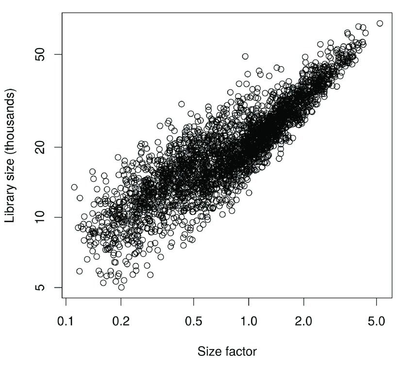
Compared to the HSC analysis, more scatter is observed around the trend between the total count and size factor for each cell ( Figure 19). This is consistent with an increased amount of DE between cells of different types, which compromises the accuracy of library size normalization ( Robinson & Oshlack, 2010). In contrast, the size factors are estimated based on median ratios and are more robust to the presence of DE between cells.

Figure 19. Size factors from deconvolution, plotted against library sizes for all cells in the brain dataset.

Figure 19.

Axes are shown on a log-scale.

                        plot
                        (
                        sizeFactors
                        (sce), sce$total_counts/
                        1e3
                        , 
                        log=
                        "xy"
                        ,
    
                        ylab=
                        "Library size (thousands)"
                        , 
                        xlab=
                        "Size factor"
                        )
                    

We also compute size factors specific to the spike-in set, as previously described.

                        sce <- 
                        computeSpikeFactors
                        (sce, 
                        type=
                        "Spike"
                        , 
                        general.use=
                        FALSE
                        )
                    

Finally, normalized log-expression values are computed for each endogenous gene or spike-in transcript using the appropriate size factors.

                        sce <- 
                        normalize
                        (sce)
                    

Checking for important technical factors

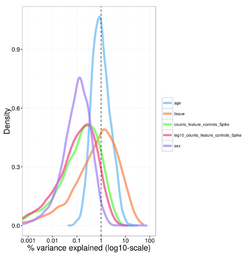
Larger experiments contain more technical factors that need to be investigated. In this dataset, factors include the sex of the animal from which the cells were extracted, the age of the animal, the tissue of origin for each cell, and the total spike-in count in each cell. Figure 20 shows that the tissue of origin explains a substantial proportion of the variance for a subset of genes. This is probably because each tissue contains a different composition of cell types, leading to systematic differences in gene expression between tissues. The other factors explain only a small proportion of the variance for most genes and do not need to be incorporated into our downstream analyses.

Figure 20. Density plot of the percentage of variance explained by each factor across all genes in the brain dataset.

Figure 20.

For each gene, the percentage of the variance of the normalized log-expression values that is explained by the (log-transformed) total spike-in counts, the sex or age of the mouse, or the tissue of origin is calculated. Each curve corresponds to one factor and represents the distribution of percentages across all genes.

                        plotExplanatoryVariables
                        (sce, 
                        variables=c
                        (
                        "counts_feature_controls_Spike"
                        ,
    
                        "log10_counts_feature_controls_Spike"
                        , 
                        "sex"
                        , 
                        "tissue"
                        , 
                        "age"
                        )) + fontsize
                    

Nonetheless, we demonstrate how to account for uninteresting technical factors by using sex as an example. We set up a design matrix with the sex of the animal as the explanatory factor for each cell. This ensures that any sex-specific changes in expression will be modelled in our downstream analyses. We do not block on the tissue of origin, despite the fact that it explains more of the variance than sex in Figure 20. This is because the tissue factor is likely to be associated with genuine differences between cell types, so including it in the model might regress out interesting biological effects.

                        design <- 
                        model.matrix
                        (
                            ~sce$sex)
                    

Other relevant factors include the chip or plate on which the cells were processed and the batch in which the libraries were sequenced. Blocking on these factors may be necessary to account for batch effects that are often observed in scRNA-seq data ( Hicks et al., 2015; Tung et al., 2016).

Identifying correlated HVGs

We identify HVGs that may be involved in driving population heterogeneity. This is done by fitting a trend to the technical variances for the spike-in transcripts. We then compute the biological component of the variance for each endogenous gene by subtracting the fitted value of the trend from the total variance.

                        var.fit <- 
                        trendVar
                        (sce, 
                        trend=
                        "loess"
                        , 
                        design=
                        design, 
                        span=
                        0.4
                        )
var.out <- 
                        decomposeVar
                        (sce, var.fit)
                    

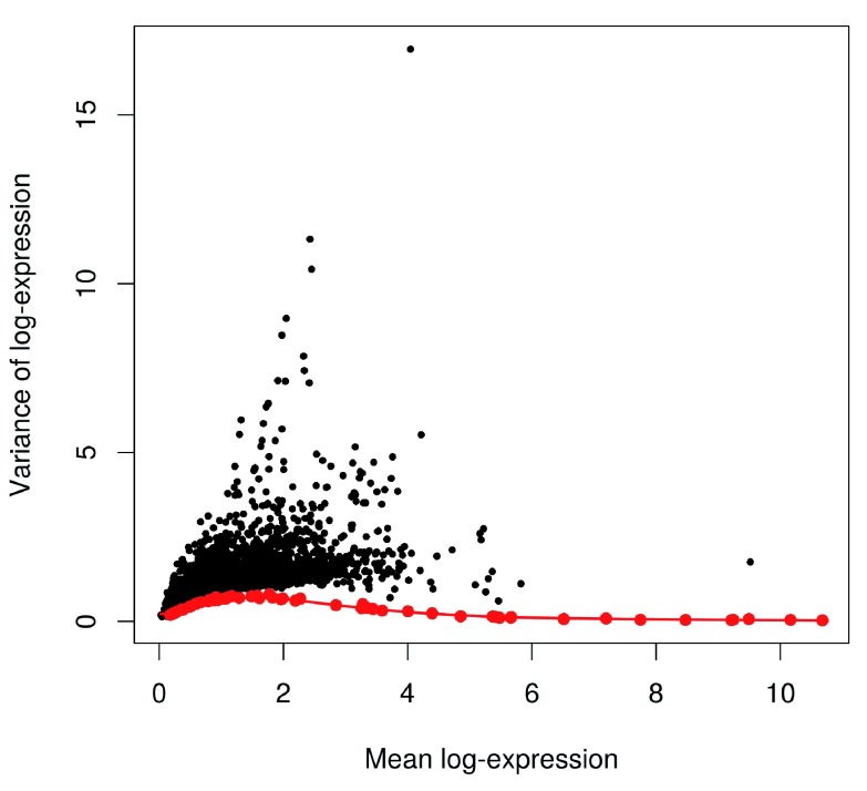
Figure 21 suggests that the trend is fitted accurately to the technical variances. Errors in fitting are negligible due to the precision of the variance estimates in a large dataset containing thousands of cells. The technical and total variances are also much smaller than those in the HSC dataset. This is due to the use of UMIs which reduces the noise caused by variable PCR amplification. Furthermore, the spike-in trend is consistently lower than the variances of the endogenous genes. This reflects the heterogeneity in gene expression across cells of different types. It also means the previous strategy of fitting a trend to the endogenous variances would not be appropriate here (or necessary, given the quality of the spike-in trend).

Figure 21. Variance of normalized log-expression values for each gene in the brain dataset, plotted against the mean log-expression.

Figure 21.

The red line represents the mean-dependent trend in the technical variance of the spike-in transcripts (also highlighted as red points).

                        plot
                        (var.out$mean, var.out$total, 
                        pch=
                        16
                        , 
                        cex=
                        0.6
                        , 
                        xlab=
                        "Mean log-expression"
                        ,
    
                        ylab=
                        "Variance of log-expression"
                        )

                        points
                        (var.fit$mean, var.fit$var, 
                        col=
                        "red"
                        , 
                        pch=
                        16
                        )
o <- 
                        order
                        (var.out$mean)

                        lines
                        (var.out$mean[o], var.out$tech[o], 
                        col=
                        "red"
                        , 
                        lwd=
                        2
                        )
                    

HVGs are identified as genes with large positive biological components. These are saved to file for future reference. Note that some of the p-values are reported as zero due to numerical imprecision.

                        hvg.out <- var.out[
                        which
                        (var.out$FDR <= 
                        0.05 
                        & var.out$bio >= 
                        0.5
                        ),]
hvg.out <- hvg.out[
                        order
                        (hvg.out$bio, 
                        decreasing=
                        TRUE
                        ),]

                        nrow
                        (hvg.out)
                    
                        ## [1] 1755
                    
                        write.table
                        (
                        file=
                        "brain_hvg.tsv"
                        , hvg.out, 
                        sep=
                        "\t"
                        , 
                        quote=
                        FALSE
                        , 
                        col.names=
                        NA
                        )

                        head
                        (hvg.out)
                    
                        ## 	    mean     total       bio      tech p.value FDR
## Plp1 4.045420 16.949056 16.681804 0.2672513       0   0
## Trf  2.427692 11.317924 10.745370 0.5725539       0   0
## Mal  2.454213 10.427362  9.860428 0.5669333       0   0
## Apod 2.044163  8.973862  8.319578 0.6542837       0   0
## Mog  1.974681  8.472565  7.803619 0.6689461       0   0
## Mbp  2.324417  7.853273  7.259729 0.5935431       0   0
                    

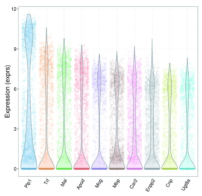
Again, we check the distribution of expression values for the top 10 HVGs to ensure that they are not being driven by outliers ( Figure 22). Some tweaking of the plotExpression parameters is necessary to visualize a large number of cells.

Figure 22. Violin plots of normalized log-expression values for the top 10 HVGs in the brain dataset.

Figure 22.

For each gene, each point represents the log-expression value for an individual cell.

                        plotExpression
                        (sce, 
                        rownames
                        (hvg.out)[
                        1
                        :
                        10
                        ], 
                        alpha=
                        0.05
                        , 
                        jitter=
                        "jitter"
                        ) + fontsize
                    

To identify genes involved in defining subpopulations, the set of HVGs is tested for significant pairwise correlations. Given the size of the set, we only use the top 500 HVGs to reduce computational work. Here, the number of significantly correlated pairs is much higher than in the HSC dataset, indicating that strong substructure is present. These results are also saved to file for use in designing validation experiments.

                        set.seed
                        (
                        100
                        )
var.cor <- 
                        correlatePairs
                        (sce, 
                        design=
                        design, 
                        subset.row=rownames
                        (hvg.out)[
                        1
                        :
                        500
                        ])

                        write.table
                        (
                        file=
                        "brain_cor.tsv"
                        , var.cor, 
                        sep=
                        "\t"
                        , 
                        quote=
                        FALSE
                        , 
                        row.names=
                        FALSE
                        )

                        head
                        (var.cor)
                    
                        ##    gene1  gene2 	 rho      p.value          FDR
## 1   Meg3 Snhg11 0.8542706 1.999998e-06 2.611414e-06
## 2 Snap25  Stmn2 0.8023813 1.999998e-06 2.611414e-06
## 3 Ppp3ca  Prkcb 0.7977351 1.999998e-06 2.611414e-06
## 4 Atp1b1   Rtn1 0.7959162 1.999998e-06 2.611414e-06
## 5  Stmn3  Stmn2 0.7958141 1.999998e-06 2.611414e-06
## 6 Snap25  Ndrg4 0.7938286 1.999998e-06 2.611414e-06
                    

                        sig.cor <- var.cor$FDR <= 
                        0.05

                        sum
                        (sig.cor)
                    

                        ## [1] 111798
                    

Further data exploration with the correlated HVGs

We first remove the sex effect using the removeBatchEffect function from the limma package ( Ritchie et al., 2015). This ensures that any sex-specific differences will not dominate the visualization of the expression profiles. In this manner, we maintain consistency with the use of design in the previous steps. (However, if an analysis method can accept a design matrix, blocking on nuisance factors in the design matrix is preferable to manipulating the expression values with removeBatchEffect. This is because the latter does not account for the loss of residual degrees of freedom, nor the uncertainty of estimation of the blocking factor terms.) We store these sex-corrected expression values in the norm_exprs field of the SCESet object for later use.


                        library
                        (limma)

                        adj.exprs <- 
                        exprs
                        (sce)

                        adj.exprs <- 
                        removeBatchEffect
                        (adj.exprs, 
                        batch=
                        sce$sex)

                        norm_exprs
                        (sce) <- adj.exprs
                    

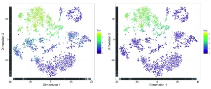
We perform dimensionality reduction on the correlated HVGs to check if there is any substructure. Cells separate into clear clusters in the t-SNE plot ( Figure 23), corresponding to distinct subpopulations. This is consistent with the presence of multiple cell types in the diverse brain population.

Figure 23. t-SNE plots constructed from the normalized and corrected log-expression values of correlated HVGs for cells in the brain dataset.

Figure 23.

Each point represents a cell and is coloured according to its expression of the top HVG (left) or Mog (right).

                        chosen <- 
                        unique
                        (
                        c
                        (var.cor$gene1[sig.cor], var.cor$gene2[sig.cor]))

                        top.hvg <- 
                        rownames
                        (hvg.out)[
                        1
                        ]

                        tsne1 <- 
                        plotTSNE
                        (sce, 
                        exprs_values=
                        "norm_exprs"
                        , 
                        colour_by=
                        top.hvg,
    
                        perplexity=
                        10
                        , 
                        rand_seed=
                        100
                        , 
                        feature_set=
                        chosen) + fontsize

                        tsne2 <- 
                        plotTSNE
                        (sce, 
                        exprs_values=
                        "norm_exprs"
                        , 
                        colour_by=
                        "Mog"
                        ,
    
                        perplexity=
                        10
                        , 
                        rand_seed=
                        100
                        , 
                        feature_set=
                        chosen) + fontsize

                        multiplot
                        (tsne1, tsne2, 
                        cols=
                        2
                        )
                    

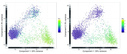
The PCA plot is less effective at separating cells into many different clusters ( Figure 24). This is because the first two principal components are driven by strong differences between specific subpopulations, which reduces the resolution of more subtle differences between some of the other subpopulations. Nonetheless, some substructure is still visible.

Figure 24. PCA plots constructed from the normalized and corrected log-expression values of correlated HVGs for cells in the brain dataset.

Figure 24.

Each point represents a cell and is coloured according to its expression of the top HVG (left) or Mog (right).

                        pca1 <- 
                        plotPCA
                        (sce, 
                        exprs_values=
                        "norm_exprs"
                        , 
                        colour_by=
                        top.hvg) + fontsize

                        pca2 <- 
                        plotPCA
                        (sce, 
                        exprs_values=
                        "norm_exprs"
                        , 
                        colour_by=
                        "Mog"
                        ) + fontsize

                        multiplot
                        (pca1, pca2, 
                        cols=
                        2
                        )
                    

For both methods, we colour each cell based on the expression of a particular gene. This is a useful strategy for visualizing changes in expression across the lower-dimensional space. It can also be used to characterise each cluster if the selected genes are known markers for particular cell types. For example, Mog can be used to identify clusters corresponding to oligodendrocytes.

Clustering cells into putative subpopulations

The normalized and sex-adjusted log-expression values for correlated HVGs are used to cluster cells into putative subpopulations. Specifically, we perform hierarchical clustering on the Euclidean distances between cells, using Ward’s criterion to minimize the total variance within each cluster. This yields a dendrogram that groups together cells with similar expression patterns across the chosen genes. An alternative approach is to cluster on a matrix of distances derived from correlations (e.g., as in quickCluster). This is more robust to noise and normalization errors, but is also less sensitive to subtle changes in the expression profiles.

                        chosen.exprs <- 
                        norm_exprs
                        (sce)[chosen,]

                        my.dist <- 
                        dist
                        (
                        t
                        (chosen.exprs))

                        my.tree <- 
                        hclust
                        (my.dist, 
                        method=
                        "ward.D2"
                        )
                    

Clusters are explicitly defined by applying a dynamic tree cut ( Langfelder et al., 2008) to the dendrogram. This exploits the shape of the branches in the dendrogram to refine the cluster definitions, and is more appropriate than cutree for complex dendrograms. Greater control of the empirical clusters can be obtained by manually specifying cutHeight in cutreeDynamic.

                        library
                        (dynamicTreeCut)

                        my.clusters <- 
                        unname
                        (
                        cutreeDynamic
                        (my.tree, 
                        distM=as.matrix
                        (my.dist), 
                        verbose=
                        0
                        ))
                    

Figure 25 contains a clear block-like pattern, representing systematic differences between clusters of cells with distinct expression profiles. This is consistent with the presence of well-defined subpopulations that were previously observed in the dimensionality reduction plots.

Figure 25. Heatmap of mean-centred normalized and corrected log-expression values for correlated HVGs in the brain dataset.

Figure 25.

Dendrograms are formed by hierarchical clustering on the Euclidean distances between genes (row) or cells (column). Column colours represent the cluster to which each cell is assigned after a dynamic tree cut.

                        heat.vals <- chosen.exprs - 
                        rowMeans
                        (chosen.exprs)

                        clust.col <- 
                        rainbow
                        (
                        max
                        (my.clusters))

                        heatmap.2
                        (heat.vals, 
                        col=
                        bluered, 
                        symbreak=
                        TRUE
                        , 
                        trace=
                        ’none’
                        , 
                        cexRow=
                        0.3
                        ,
    
                        ColSideColors=
                        clust.col[my.clusters], 
                        Colv=as.dendrogram
                        (my.tree))
                    

This heatmap can be stored at a greater resolution for detailed inspection later.

                        pdf
                        (
                        "brain_heat.pdf"
                        , 
                        width=
                        20
                        , 
                        height=
                        40
                        )

                        heatmap.2
                        (heat.vals, 
                        col=
                        bluered, 
                        symbreak=
                        TRUE
                        , 
                        trace=
                        ’none’
                        , 
                        cexRow=
                        0.3
                        ,
    
                        ColSideColors=
                        clust.col[my.clusters], 
                        Colv=as.dendrogram
                        (my.tree))

                        dev.off
                        ()
                    

Detecting marker genes between subpopulations

Once putative subpopulations are identified, we can identify marker genes for specific subpopulations of interest. This is done by identifying genes that are consistently DE in one subpopulation compared to the others. DE testing can be performed using a number of packages, but for this workflow, we will use the edgeR package ( Robinson et al., 2010). First, we set up a design matrix specifying which cells belong to each cluster. Each cluster* coefficient represents the average log-expression of all cells in the corresponding cluster. We also block on uninteresting factors such as sex.

                        cluster <- 
                        factor
                        (my.clusters)

                        de.design <- 
                        model.matrix
                        (
                            ~
                        
                        0 
                        + cluster + sce$sex)

                        head
                        (
                        colnames
                        (de.design))
                    
                        ## [1] "cluster1" "cluster2" "cluster3" "cluster4" "cluster5" "cluster6"
                    

We set up a DGEList object for entry into the edgeR analysis. This new object contains all relevant information from the original SCESet object, including the counts and (library size-adjusted) size factors.

                        library
                        (edgeR)

                        y <- 
                        convertTo
                        (sce, 
                        type=
                        "edgeR"
                        )
                    

edgeR uses negative binomial (NB) distributions to model the read/UMI counts for each sample. We estimate the NB dispersion parameter that quantifies the biological variability in expression across cells in the same cluster. Large dispersion estimates above 0.5 are often observed in scRNA-seq data due to technical noise, in contrast to bulk data where values of 0.05–0.2 are more typical. We then use the design matrix to fit a NB GLM to the counts for each gene ( McCarthy et al., 2012).

                        y <- 
                        estimateDisp
                        (y, de.design)

                        fit <- 
                        glmFit
                        (y, de.design)

                        summary
                        (y$tagwise.dispersion)
                    
                        ##    Min. 1st Qu.  Median    Mean 3rd Qu.      Max.
## 0.04733 0.35370 0.64530 1.28600 1.32400 102.40000
                    

We assume that one of the clusters corresponds to our subpopulation of interest. Each gene is tested for DE between the chosen cluster and every other cluster in the dataset. We demonstrate this below for cluster 1, though the same process can be applied to any other cluster by changing chosen.clust.

                        result.logFC <- result.PValue <- 
                        list
                        ()

                        chosen.clust <- 
                        which
                        (
                        levels
                        (cluster)==
                        "1"
                        ) 
                        # character, as ’cluster’ is a factor.

                        for (clust in 
                        seq_len
                        (
                        nlevels
                        (cluster))) {
    
                        if (clust==chosen.clust) { next }
    
                        contrast <- 
                        numeric
                        (
                        ncol
                        (de.design))
    
                        contrast[chosen.clust] <- 
                        1
    
                        contrast[clust] <- -
                        1
    
                        res <- 
                        glmLRT
                        (fit, 
                        contrast=
                        contrast)
    
                        con.name <- 
                        paste0
                        (
                        ’vs.’
                        , 
                        levels
                        (cluster)[clust])
    
                        result.logFC[[con.name]] <- res$table$logFC
    
                        result.PValue[[con.name]] <- res$table$PValue

                        }
                    

Potential marker genes are identified by taking the top set of DE genes from each pairwise comparison between clusters. We arrange the results into a single output table that allows a marker set to be easily defined for a user-specified size of the top set. For example, to construct a marker set from the top 10 genes of each comparison, one would filter marker.set to retain rows with Top less than or equal to 10.

                        collected.ranks <- 
                        lapply
                        (result.PValue, rank, 
                        ties=
                        "first"
                        )

                        min.rank <- 
                        do.call
                        (pmin, collected.ranks)

                        marker.set <- 
                        data.frame
                        (
                        Top=
                        min.rank, 
                        Gene=rownames
                        (y),
    
                        logFC=do.call
                        (cbind, result.logFC), 
                        stringsAsFactors=
                        FALSE
                        )

                        marker.set <- marker.set[
                        order
                        (marker.set$Top),]

                        head
                        (marker.set, 
                        10
                        )
                    
                        ##     Top    Gene  logFC.vs.2  logFC.vs.3 logFC.vs.4 logFC.vs.5 logFC.vs.6 logFC.vs.7
## 26    1  Gm9846 -2.69173561 -0.89238306 -4.2332332 -1.0222698 -0.5414615 -2.5287437
## 223   1 Slc32a1  0.09461874 -0.04485368  0.1585265 -4.5682143 -1.4174543 -0.2546009
## 297   1   Cspg5 -1.30778951 -2.54296437 -1.5771899 -1.9881673 -1.4086953 -5.0830952
## 298   1    Syt1  2.78822084 -0.25850578  1.4804092 -0.8895181  0.3458730  1.8327007
## 862   1   Mef2c -1.08816401 -4.45879597 -2.9639706 -2.7639706 -2.9780931 -0.8413323
## 2563  1    Scd2 -4.45332845 -0.26021806 -1.0034850  0.1048065 -2.7348760 -3.4221061
## 260   2   Rcan2 -3.22472364 -3.05410260 -2.1732655 -4.5132580 -2.6087020 -0.9949232
## 309   2   Ndrg4  3.83886951 -0.34125245  2.6623976 -0.9701018  0.3516469  2.8775459
## 763   2     Clu -1.59785766 -2.42881333 -2.7317868 -1.9346444 -0.8799791 -6.1547824
## 963   2   Ncald -2.87305577 -4.43604787 -2.1004299 -4.5752214 -3.5526851 -1.5981341
                    

We save the list of candidate marker genes for further examination. We also examine their expression profiles to verify that the DE signature is robust. Figure 26 indicates that most of the top markers have strong and consistent up- or downregulation in cells of cluster 1 compared to some or all of the other clusters. Thus, cells from the subpopulation of interest can be identified as those that express the upregulated markers and do not express the downregulated markers.

Figure 26. Heatmap of mean-centred normalized and corrected log-expression values for the top set of markers for cluster 1 in the brain dataset.

Figure 26.

Column colours represent the cluster to which each cell is assigned, as indicated by the legend.

                        write.table
                        (marker.set, 
                        file=
                        "brain_marker_1.tsv"
                        , 
                        sep=
                        "\t"
                        , 
                        quote=
                        FALSE
                        , 
                        col.names=
                        NA
                        )

                        top.markers <- marker.set$Gene[marker.set$Top <= 
                        10
                        ]

                        top.exprs <- 
                        norm_exprs
                        (sce)[top.markers,,drop=
                        FALSE
                        ]

                        heat.vals <- top.exprs - 
                        rowMeans
                        (top.exprs)

                        heatmap.2
                        (heat.vals, 
                        col=
                        bluered, 
                        symbreak=
                        TRUE
                        , 
                        trace=
                        ’none’
                        , 
                        cexRow=
                        0.6
                        ,
    
                        ColSideColors=
                        clust.col[my.clusters], 
                        Colv=as.dendrogram
                        (my.tree), 
                        dendrogram=
                        ’none’
                        )

                        legend
                        (
                        "bottomleft"
                        , 
                        col=
                        clust.col, 
                        legend=sort
                        (
                        unique
                        (my.clusters)), 
                        pch=
                        16
                        )
                    

Many of the markers in Figure 26 are not uniquely up- or downregulated in the chosen cluster. Testing for unique DE tends to be too stringent as it overlooks important genes that are expressed in two or more clusters. For example, in a mixed population of CD4 +-only, CD8 +-only, double-positive and double-negative T cells, neither Cd4 or Cd8 would be detected as subpopulation-specific markers because each gene is expressed in two subpopulations. With our approach, both of these genes will be picked up as candidate markers as they will be DE between at least one pair of subpopulations. A combination of markers can then be chosen to characterize a subpopulation, which is more flexible than trying to find uniquely DE genes.

It must be stressed that the p-values computed here cannot be interpreted as measures of significance. This is because the clusters have been empirically identified from the data. edgeR does not account for the uncertainty and stochasticity in clustering, which means that the p-values are much lower than they should be. As such, these p-values should only be used for ranking candidate markers for follow-up studies. However, this is not a concern in other analyses where the groups are pre-defined. For such analyses, the FDR-adjusted p-value can be directly used to define significant genes for each DE comparison, though some care may be required to deal with plate effects ( Hicks et al., 2015; Tung et al., 2016).

Additional comments

Having completed the basic analysis, we save the SCESet object with its associated data to file. This is especially important here as the brain dataset is quite large. If further analyses are to be performed, it would be inconvenient to have to repeat all of the pre-processing steps described above.

                        saveRDS
                        (
                        file=
                        "brain_data.rds"
                        , sce)
                    

Alternative parameter settings and strategies

Normalizing based on spike-in coverage

Scaling normalization strategies for scRNA-seq data can be broadly divided into two classes. The first class assumes that there exists a subset of genes that are not DE between samples, as previously described. The second class uses the fact that the same amount of spike-in RNA was added to each cell. Differences in the coverage of the spike-in transcripts can only be due to cell-specific biases, e.g., in capture efficiency or sequencing depth. Scaling normalization is then applied to equalize spike-in coverage across cells.

The choice between these two normalization strategies depends on the biology of the cells and the features of interest. If the majority of genes are expected to be DE and there is no reliable house-keeping set, spike-in normalization may be the only option for removing cell-specific biases. Spike-in normalization should also be used if differences in the total RNA content of individual cells are of interest. In any particular cell, an increase in the amount of endogenous RNA will not increase spike-in coverage (with or without library quantification). Thus, the former will not be represented as part of the bias in the latter, which means that the effects of total RNA content on expression will not be removed upon scaling. With non-DE normalization, an increase in RNA content will systematically increase the expression of all genes in the non-DE subset, such that it will be treated as bias and removed.

We demonstrate the use of spike-in normalization on a dataset involving different cell types – namely, mouse embryonic stem cells (mESCs) and mouse embryonic fibroblasts (MEFs) ( Islam et al., 2011). The count table was obtained from NCBI GEO as a supplementary file under the accession GSE29087 ( http://www.ncbi.nlm.nih.gov/geo/query/acc.cgi?acc=GSE29087). We load the counts into R and specify the rows corresponding to spike-in transcripts. The negative control wells do not contain any cells and are useful for quality control but need to be removed prior to downstream analysis.

                        counts <- 
                        read.table
                        (
                        "GSE29087_L139_expression_tab.txt.gz"
                        , 
                        colClasses=c
                        (
                        list
                        (
                        "character"
                        ,
    
                        NULL
                        , 
                        NULL
                        , 
                        NULL
                        , 
                        NULL
                        , 
                        NULL
                        , 
                        NULL
                        ), 
                        rep
                        (
                        "integer"
                        , 
                        96
                        )), 
                        skip=
                        6
                        , 
                        sep=
                        ’\t’
                        , 
                        row.names=
                        1
                        )

                        sce <- 
                        newSCESet
                        (
                        countData=
                        counts)

                        sce$grouping <- 
                        rep
                        (
                        c
                        (
                        "mESC"
                        , 
                        "MEF"
                        , 
                        "Neg"
                        ), 
                        c
                        (
                        48
                        , 
                        44
                        , 
                        4
                        ))

                        sce <- sce[,sce$grouping!=
                        "Neg"
                        ] 
                        # Removing negative control wells.

                        sce <- 
                        calculateQCMetrics
                        (sce, 
                        feature_controls=list
                        (
                        spike=grep
                        (
                        "SPIKE"
                        , 
                        rownames
                        (counts))))

                        isSpike
                        (sce) <- 
                        "spike"
                    

We then apply the computeSpikeFactors method to estimate size factors for all cells. This method computes the total count over all spike-in transcripts in each cell, and calculates size factors to equalize the total spike-in count across cells. Here, we set general.use=TRUE as we intend to apply the spike-in factors to all counts.

                        sce <- 
                        computeSpikeFactors
                        (sce, 
                        general.use=
                        TRUE
                        )
                    

Applying normalize will use the spike-in-based size factors to compute normalized log-expression values. Unlike in the previous analyses, we do not have to set separate size factors for the spike-in transcripts. This is because the relevant factors are already being used for all genes and spike-in transcripts when general.use=TRUE. (The exception is if the experiment uses multiple spike-in sets that behave differently and need to be normalized separately.)

                        sce <- 
                        normalize
                        (sce)
                    

For comparison, we also compute the deconvolution size factors and plot them against the spike-in factors. We observe a negative correlation between the two sets of values ( Figure 27). This is because MEFs contain more endogenous RNA, which reduces the relative spike-in coverage in each library (thereby decreasing the spike-in size factors) but increases the coverage of endogenous genes (thus increasing the deconvolution size factors). If the spike-in size factors were applied to the counts, the expression values in MEFs would be scaled up while expression in mESCs would be scaled down. However, the opposite would occur if deconvolution size factors were used.

Figure 27. Size factors from spike-in normalization, plotted against the size factors from deconvolution for all cells in the mESC/MEF dataset.

Figure 27.

Axes are shown on a log-scale, and cells are coloured according to their identity. Deconvolution size factors were computed with small pool sizes owing to the low number of cells of each type.

                        colours <- 
                        c
                        (
                        mESC=
                        "red"
                        , 
                        MEF=
                        "grey"
                        )

                        deconv.sf <- 
                        computeSumFactors
                        (sce, 
                        sf.out=
                        TRUE
                        , 
                        cluster=
                        sce$grouping, 
                        sizes=
                        1
                        :
                        4
                        *
                        10
                        )

                        plot
                        (
                        sizeFactors
                        (sce), deconv.sf, 
                        col=
                        colours[sce$grouping], 
                        pch=
                        16
                        , 
                        log=
                        "xy"
                        ,
    
                        xlab=
                        "Size factor (spike-in)"
                        , 
                        ylab=
                        "Size factor (deconvolution)"
                        )

                        legend
                        (
                        "bottomleft"
                        , 
                        col=
                        colours, 
                        legend=names
                        (colours), 
                        pch=
                        16
                        )
                    

Whether or not total RNA content is relevant – and thus, the choice of normalization strategy – depends on the biological hypothesis. In the HSC and brain analyses, variability in total RNA across the population was treated as noise and removed by non-DE normalization. This may not always be appropriate if total RNA is associated with a biological difference of interest. For example, Islam et al. (2011) observe a 5-fold difference in total RNA between mESCs and MEFs. Similarly, the total RNA in a cell changes across phases of the cell cycle ( Buettner et al., 2015). Spike-in normalization will preserve these differences in total RNA content such that the corresponding biological groups can be easily resolved in downstream analyses.

Blocking on the cell cycle phase

Cell cycle phase is usually uninteresting in studies focusing on other aspects of biology. However, the effects of cell cycle on the expression profile can mask other effects and interfere with the interpretation of the results. This cannot be avoided by simply removing cell cycle marker genes, as the cell cycle can affect a substantial number of other transcripts ( Buettner et al., 2015). Rather, more sophisticated strategies are required, one of which is demonstrated below using data from a study of T Helper 2 (T H2) cells ( Mahata et al., 2014). Buettner et al. (2015) have already applied quality control and normalized the data, so we can use them directly as log-expression values (accessible as Supplementary Data 1 of https://dx.doi.org/10.1038/nbt.3102).

                        library
                        (openxlsx)

                        incoming <- 
                        read.xlsx
                        (
                        "nbt.3102-S7.xlsx"
                        , 
                        sheet=
                        1
                        , 
                        rowNames=
                        TRUE
                        )

                        incoming <- incoming[,!
                        duplicated
                        (
                        colnames
                        (incoming))] 
                        # Remove duplicated genes.

                        sce <- 
                        newSCESet
                        (
                        exprsData=t
                        (incoming), 
                        logged=
                        TRUE
                        )
                    

We empirically identify the cell cycle phase using the pair-based classifier in cyclone. The majority of cells in Figure 28 seem to lie in G1 phase, with small numbers of cells in the other phases.

Figure 28. Cell cycle phase scores from applying the pair-based classifier on the T H2 dataset, where each point represents a cell.

Figure 28.

                        anno <- 
                        select
                        (org.Mm.eg.db, 
                        keys=rownames
                        (sce), 
                        keytype=
                        "SYMBOL"
                        , 
                        column=
                        "ENSEMBL"
                        )

                        ensembl <- anno$ENSEMBL[
                        match
                        (
                        rownames
                        (sce), anno$SYMBOL)]

                        assignments <- 
                        cyclone
                        (sce, mm.pairs, 
                        gene.names=
                        ensembl, 
                        assay=
                        "exprs"
                        )

                        plot
                        (assignments$score$G1, assignments$score$G2M, 
                        xlab=
                        "G1 score"
                        , 
                        ylab=
                        "G2/M score"
                        , 
                        pch=
                        16
                        )
                    

We can block directly on the phase scores in downstream analyses. This is more graduated than using a strict assignment of each cell to a specific phase, as the magnitude of the score considers the uncertainty of the assignment. The phase covariates in the design matrix will absorb any phase-related effects on expression such that they will not affect estimation of the effects of other experimental factors. Users should also ensure that the phase score is not confounded with other factors of interest. For example, model fitting is not possible if all cells in one experimental condition are in one phase, and all cells in another condition are in a different phase.

                        design <- 
                        model.matrix
                        (
                            ~ G1 + G2M, assignments$score)

                        fit.block <- 
                        trendVar
                        (sce, 
                        use.spikes=
                        NA
                        , 
                        trend=
                        "loess"
                        , 
                        design=
                        design)

                        dec.block <- 
                        decomposeVar
                        (sce, fit.block)
                    

For analyses that do not use design matrices, we remove the cell cycle effect directly from the expression values using removeBatchEffect. The result of this procedure is visualized with some PCA plots in Figure 29. Before removal, the distribution of cells along the first two principal components is strongly associated with their G1 and G2/M scores. This is no longer the case after removal, which suggests that the cell cycle effect has been mitigated.

Figure 29. PCA plots before (left) and after (right) removal of the cell cycle effect in the T H2 dataset.

Figure 29.

Each cell is represented by a point with colour and size determined by the G1 and G2/M scores, respectively. Only HVGs were used to construct each plot.

                        # Finding HVGs without blocking on phase score.

                        fit <- 
                        trendVar
                        (sce, 
                        use.spikes=
                        NA
                        , 
                        trend=
                        "loess"
                        )

                        dec <- 
                        decomposeVar
                        (sce, fit)
top.hvgs <- 
                        which
                        (dec$FDR <= 
                        0.05 
                        & dec$bio >= 
                        0.5
                        )
sce$G1score <- assignments$score$G1
sce$G2Mscore <- assignments$score$G2M
out <- 
                        plotPCA
                        (sce, 
                        feature_set=
                        top.hvgs, 
                        colour_by=
                        "G1score"
                        , 
                        size_by=
                        "G2Mscore"
                        ) +
    fontsize + 
                        ggtitle
                        (
                        "Before removal"
                        )


                        # Using HVGs after blocking on the phase score.

                        top.hvgs2 <- 
                        which
                        (dec.block$FDR <= 
                        0.05 
                        & dec.block$bio >= 
                        0.5
                        )

                        norm_exprs
                        (sce) <- 
                        removeBatchEffect
                        (
                        exprs
                        (sce), 
                        covariates=
                        assignments$score[,
                        c
                        (
                        "G1"
                        , 
                        "G2M"
                        )])
out2 <- 
                        plotPCA
                        (sce, 
                        exprs_values=
                        "norm_exprs"
                        , 
                        feature_set=
                        top.hvgs2, 
                        colour_by=
                        "G1score"
                        ,
    
                        size_by=
                        "G2Mscore"
                        ) + fontsize + 
                        ggtitle
                        (
                        "After removal"
                        )

                        multiplot
                        (out, out2, 
                        cols=
                        2
                        )
                    

As an aside, this dataset contains cells at various stages of differentiation ( Mahata et al., 2014). This is an ideal use case for diffusion maps which perform dimensionality reduction along a continuous process. In Figure 30, cells are arranged along a trajectory in the low-dimensional space. The first diffusion component is likely to correspond to T H2 differentiation, given that a key regulator Gata3 ( Zhu et al., 2006) changes in expression from left to right.

Figure 30. A diffusion map for the T H2 dataset, where each cell is coloured by its expression of Gata3.

Figure 30.

                        plotDiffusionMap
                        (sce, 
                        exprs_values=
                        "norm_exprs"
                        , 
                        colour_by=
                        "Gata3"
                        ) + fontsize
                    

Extracting annotation from Ensembl identifiers

Feature-counting tools typically report genes in terms of standard identifiers from Ensembl or Entrez. These identifiers are used as they are unambiguous and highly stable. However, they are difficult to interpret compared to the gene symbols which are more commonly used in the literature. We can easily convert from one to the other using annotation packages like org.Mm.eg.db. This is demonstrated below for Ensembl identifiers in a mESC dataset ( Kolodziejczyk et al., 2015) obtained from http://www.ebi.ac.uk/teichmann-srv/espresso. The select call extracts the specified data from the annotation object, and the match call ensures that the first gene symbol is used if multiple symbols correspond to a single Ensembl identifier.

                        incoming <- 
                        read.table
                        (
                        "counttable_es.csv"
                        , 
                        header=
                        TRUE
                        , 
                        row.names=
                        1
                        )
my.ids <- 
                        rownames
                        (incoming)
anno <- 
                        select
                        (org.Mm.eg.db, 
                        keys=
                        my.ids, 
                        keytype=
                        "ENSEMBL"
                        , 
                        column=
                        "SYMBOL"
                        )
anno <- anno[
                        match
                        (my.ids, anno$ENSEMBL),]

                        head
                        (anno)
                    
                        ## 		ENSEMBL SYMBOL
## 1 ENSMUSG00000000001  Gnai3
## 2 ENSMUSG00000000003   Pbsn
## 3 ENSMUSG00000000028  Cdc45
## 4 ENSMUSG00000000031    H19
## 5 ENSMUSG00000000037  Scml2
## 6 ENSMUSG00000000049   Apoh
                    

To identify which rows correspond to mitochondrial genes, we need to use extra annotation describing the genomic location of each gene. For Ensembl, this involves using the TxDb.Mmusculus.UCSC.mm10.ensGene package.

                        library
                        (TxDb.Mmusculus.UCSC.mm10.ensGene)
location <- 
                        select
                        (TxDb.Mmusculus.UCSC.mm10.ensGene, 
                        keys=
                        my.ids,
     
                        column=
                        "CDSCHROM"
                        , 
                        keytype=
                        "GENEID"
                        )
location <- location[
                        match
                        (my.ids, location$GENEID),]
is.mito <- location$CDSCHROM == 
                        "chrM" 
                        & !
                        is.na
                        (location$CDSCHROM)

                        sum
                        (is.mito)
                    
                        ## [1] 13
                    

Identification of rows that correspond to spike-in transcripts is much easier, given that the ERCC spike-ins were used.

                        is.spike <- 
                        grepl
                        (
                        "^ERCC"
                        , my.ids)

                        sum
                        (is.spike)
                    
                        ## [1] 92
                    

All of this information can be consolidated into a SCESet object for further manipulation. Alternatively, annotation from BioMart resources can be directly added to the object using the getBMFeatureAnnos function from scater.

                        anno <- anno[,-
                        1
                        ,drop=
                        FALSE
                        ]

                        rownames
                        (anno) <- my.ids
sce <- 
                        newSCESet
                        (
                        countData=
                        incoming, 
                        featureData=AnnotatedDataFrame
                        (anno))
sce <- 
                        calculateQCMetrics
                        (sce, 
                        feature_controls=list
                        (
                        ERCC=
                        is.spike))

                        isSpike
                        (sce) <- 
                        "ERCC"
                    

We filter out rows that do not correspond to endogenous genes or spike-in transcripts. This will remove rows containing mapping statistics such as the number of unaligned or unassigned reads, which would be misleading if treated as gene expression values. The object is then ready for downstream analyses as previously described.

                        sce <- sce[
                        grepl
                        (
                        "ENSMUS"
                        , 
                        rownames
                        (sce)) | 
                        isSpike
                        (sce),]

                        dim
                        (sce)
                    
                        ## Features Samples
##    38653     704
                    

Conclusions

This workflow provides a step-by-step guide for performing basic analyses of single-cell RNA-seq data in R. It provides instructions for a number of low-level steps such as quality control, normalization, cell cycle phase assignment, data exploration, HVG and marker gene detection, and clustering. This is done with a number of different datasets to provide a range of usage examples. The workflow is modular so individual steps can be substituted with alternative methods according to user preferences. In addition, the processed data can be easily used for higher-level analyses with other Bioconductor packages. We anticipate that this workflow will assist readers in assembling analyses of their own scRNA-seq data.

Software availability

All software packages used in this workflow are publicly available from the Comprehensive R Archive Network ( https://cran.r-project.org) or the Bioconductor project ( http://bioconductor.org). The specific version numbers of the packages used are shown below, along with the version of the R installation. Version numbers of all Bioconductor packages correspond to release version 3.4 of the Bioconductor project. Users can install all required packages and execute the workflow by following the instructions at https://www.bioconductor.org/help/workflows/simpleSingleCell. The workflow takes less than an hour to run on a desktop computer with 8 GB of memory.

                    sessionInfo
                    ()
                
                    ## R version 3.3.1 Patched (2016-10-17 r71532)
## Platform: x86_64-pc-linux-gnu (64-bit)
## Running under: Ubuntu 14.04.5 LTS
##
## locale:
##  [1] LC_CTYPE=en_GB.UTF-8 	  LC_NUMERIC=C 		     LC_TIME=en_GB.UTF-8
##  [4] LC_COLLATE=en_GB.UTF-8 	  LC_MONETARY=en_GB.UTF-8    LC_MESSAGES=en_GB.UTF-8
##  [7] LC_PAPER=en_GB.UTF-8 	  LC_NAME=C 		     LC_ADDRESS=C
## [10] LC_TELEPHONE=C 	   	  LC_MEASUREMENT=en_GB.UTF-8 LC_IDENTIFICATION=C
##
## attached base packages:
## [1] stats4 	 parallel stats     graphics   grDevices utils    datasets methods base
##
## other attached packages:
##  [1] TxDb.Mmusculus.UCSC.mm10.ensGene_3.4.0 GenomicFeatures_1.26.0
##  [3] GenomicRanges_1.26.0 		       GenomeInfoDb_1.10.0
##  [5] openxlsx_3.0.0 		       	       edgeR_3.16.0
##  [7] dynamicTreeCut_1.63-1 		       limma_3.30.0
##  [9] gplots_3.0.1 		       	       RBGL_1.50.0
## [11] graph_1.52.0 		       	       org.Mm.eg.db_3.4.0
## [13] AnnotationDbi_1.36.0 		       IRanges_2.8.0
## [15] S4Vectors_0.12.0 		       scran_1.2.0
## [17] scater_1.2.0 		       	       ggplot2_2.1.0
## [19] Biobase_2.34.0 		       	       BiocGenerics_0.20.0
## [21] gdata_2.17.0 		       	       R.utils_2.4.0
## [23] R.oo_1.20.0 		       	       R.methodsS3_1.7.1
## [25] destiny_2.0.0 		       	       mvoutlier_2.0.6
## [27] sgeostat_1.0-27 		       Rtsne_0.11
## [29] BiocParallel_1.8.0 		       knitr_1.14
## [31] BiocStyle_2.2.0 		       	       
##
## loaded via a namespace (and not attached):
##   [1] Hmisc_3.17-4 		     RcppEigen_0.3.2.9.0 	 plyr_1.8.4
##   [4] igraph_1.0.1 		     sp_1.2-3 	 		 shinydashboard_0.5.3
##   [7] splines_3.3.1 		     digest_0.6.10 	 	 htmltools_0.3.5
##  [10] viridis_0.3.4 		     magrittr_1.5 	 	 cluster_2.0.5
##  [13] Biostrings_2.42.0 	     matrixStats_0.51.0  	 xts_0.9-7
##  [16] colorspace_1.2-7 	     rrcov_1.4-3 	 	 dplyr_0.5.0
##  [19] RCurl_1.95-4.8 	     tximport_1.2.0 	 	 lme4_1.1-12
##  [22] survival_2.39-5 	     zoo_1.7-13 	 	 gtable_0.2.0
##  [25] XVector_0.14.0 	     zlibbioc_1.20.0 	         MatrixModels_0.4-1
##  [28] car_2.1-3 	             kernlab_0.9-25 	  	 prabclus_2.2-6
##  [31] DEoptimR_1.0-6 	     SparseM_1.72 	  	 VIM_4.6.0
##  [34] scales_0.4.0 		     mvtnorm_1.0-5 	  	 DBI_0.5-1
##  [37] GGally_1.2.0 		     Rcpp_0.12.7 	  	 sROC_0.1-2
##  [40] xtable_1.8-2 		     laeken_0.4.6 	  	 foreign_0.8-67
##  [43] proxy_0.4-16 		     mclust_5.2 	         Formula_1.2-1
##  [46] vcd_1.4-3 		     FNN_1.1 	  	         RColorBrewer_1.1-2
##  [49] fpc_2.1-10 	             acepack_1.3-3.3 	  	 modeltools_0.2-21
##  [52] reshape_0.8.5 		     XML_3.98-1.4 	  	 flexmix_2.3-13
##  [55] nnet_7.3-12 		     locfit_1.5-9.1 	  	 labeling_0.3
##  [58] reshape2_1.4.1 	     munsell_0.4.3 	  	 tools_3.3.1
##  [61] RSQLite_1.0.0 		     pls_2.5-0 	  	 	 evaluate_0.10
##  [64] stringr_1.1.0 		     cvTools_0.3.2 	  	 robustbase_0.92-6
##  [67] caTools_1.17.1 	     nlme_3.1-128 	   	 mime_0.5
##  [70] quantreg_5.29 	             formatR_1.4 	   	 biomaRt_2.30.0
##  [73] pbkrtest_0.4-6 	     beeswarm_0.2.3 	   	 e1071_1.6-7
##  [76] statmod_1.4.26 	     smoother_1.1    	         tibble_1.2
##  [79] robCompositions_2.0.2       pcaPP_1.9-61   	         stringi_1.1.2
##  [82] lattice_0.20-34 	     trimcluster_0.1-2   	 Matrix_1.2-7.1
##  [85] nloptr_1.0.4 	             lmtest_0.9-34   	 	 data.table_1.9.6
##  [88] bitops_1.0-6 		     rtracklayer_1.34.0   	 httpuv_1.3.3
##  [91] R6_2.2.0                    latticeExtra_0.6-28         KernSmooth_2.23-15
##  [94] gridExtra_2.2.1 	     vipor_0.4.4                 boot_1.3-18
##  [97] MASS_7.3-45 		     gtools_3.5.0     		 assertthat_0.1
## [100] SummarizedExperiment_1.4.0  chron_2.3-47    		 rhdf5_2.18.0
## [103] rjson_0.2.15 		     GenomicAlignments_1.10.0    Rsamtools_1.26.0
## [106] diptest_0.75-7              mgcv_1.8-15                 grid_3.3.1
## [109] rpart_4.1-10                class_7.3-14                minqa_1.2.4
## [112] TTR_0.23-1                  scatterplot3d_0.3-37        shiny_0.14.1
## [115] ggbeeswarm_0.5.0
                

Acknowledgements

We would like to thank Antonio Scialdone for helpful discussions, as well as Michael Epstein, James R. Smith and John Wilson-Kanamori for testing the workflow on other datasets.

Funding Statement

A.T.L.L. and J.C.M. were supported by core funding from Cancer Research UK (award no. A17197). D.J.M. was supported by a CJ Martin Fellowship from the National Health and Medical Research Council of Australia. D.J.M and J.C.M. were also supported by core funding from EMBL.

The funders had no role in study design, data collection and analysis, decision to publish, or preparation of the manuscript.

[version 2; referees: 3 approved

References

  1. Anders S, Huber W: Differential expression analysis for sequence count data. Genome Biol. 2010;11(10):R106. 10.1186/gb-2010-11-10-r106 [DOI] [PMC free article] [PubMed] [Google Scholar]
  2. Angerer P, Haghverdi L, Büttner M, et al. : destiny: diffusion maps for large-scale single-cell data in R. Bioinformatics. 2016;32(8):1241–1243. 10.1093/bioinformatics/btv715 [DOI] [PubMed] [Google Scholar]
  3. Bertoli C, Skotheim JM, de Bruin RA: Control of cell cycle transcription during G1 and S phases. Nat Rev Mol Cell Biol. 2013;14(8):518–528. 10.1038/nrm3629 [DOI] [PMC free article] [PubMed] [Google Scholar]
  4. Bourgon R, Gentleman R, Huber W: Independent filtering increases detection power for high-throughput experiments. Proc Natl Acad Sci U S A. 2010;107(21):9546–9551. 10.1073/pnas.0914005107 [DOI] [PMC free article] [PubMed] [Google Scholar]
  5. Bray NL, Pimentel H, Melsted P, et al. : Near-optimal probabilistic RNA-seq quantification. Nat Biotechnol. 2016;34(5):525–527. 10.1038/nbt.3519 [DOI] [PubMed] [Google Scholar]
  6. Brennecke P, Anders S, Kim JK, et al. : Accounting for technical noise in single-cell RNA-seq experiments. Nat Methods. 2013;10(11):1093–1095. 10.1038/nmeth.2645 [DOI] [PubMed] [Google Scholar]
  7. Buettner F, Natarajan KN, Casale FP, et al. : Computational analysis of cell-to-cell heterogeneity in single-cell RNA-sequencing data reveals hidden subpopulations of cells. Nat Biotechnol. 2015;33(2):155–160. 10.1038/nbt.3102 [DOI] [PubMed] [Google Scholar]
  8. Chen Y, Lun AT, Smyth GK: From reads to genes to pathways: differential expression analysis of RNA-Seq experiments using Rsubread and the edgeR quasi-likelihood pipeline [version 2; referees: 5 approved]. F1000Res. 2016;5: 1438. 10.12688/f1000research.8987.2 [DOI] [PMC free article] [PubMed] [Google Scholar]
  9. Coller HA, Sang L, Roberts JM: A new description of cellular quiescence. PLoS Biol. 2006;4(3):e83. 10.1371/journal.pbio.0040083 [DOI] [PMC free article] [PubMed] [Google Scholar]
  10. Conboy CM, Spyrou C, Thorne NP, et al. : Cell cycle genes are the evolutionarily conserved targets of the E2F4 transcription factor. PLoS One. 2007;2(10):e1061. 10.1371/journal.pone.0001061 [DOI] [PMC free article] [PubMed] [Google Scholar]
  11. Fan J, Salathia N, Liu R, et al. : Characterizing transcriptional heterogeneity through pathway and gene set overdispersion analysis. Nat Methods. 2016;13(3):241–244. 10.1038/nmeth.3734 [DOI] [PMC free article] [PubMed] [Google Scholar]
  12. Hicks SC, Teng M, Irizarry RA: On the widespread and critical impact of systematic bias and batch effects in single-cell RNA-Seq data. bioRxiv. 2015. 10.1101/025528 [DOI] [Google Scholar]
  13. Huber W, Carey VJ, Gentleman R, et al. : Orchestrating high-throughput genomic analysis with Bioconductor. Nat Methods. 2015;12(2):115–121. 10.1038/nmeth.3252 [DOI] [PMC free article] [PubMed] [Google Scholar]
  14. Ilicic T, Kim JK, Kolodziejczyk AA, et al. : Classification of low quality cells from single-cell RNA-seq data. Genome Biol. 2016;17(1):29. 10.1186/s13059-016-0888-1 [DOI] [PMC free article] [PubMed] [Google Scholar]
  15. Islam S, Kjällquist U, Moliner A, et al. : Characterization of the single-cell transcriptional landscape by highly multiplex RNA-seq. Genome Res. 2011;21(7):1160–1167. 10.1101/gr.110882.110 [DOI] [PMC free article] [PubMed] [Google Scholar]
  16. Islam S, Zeisel A, Joost S, et al. : Quantitative single-cell RNA-seq with unique molecular identifiers. Nat Methods. 2014;11(2):163–166. 10.1038/nmeth.2772 [DOI] [PubMed] [Google Scholar]
  17. Ji Z, Ji H: TSCAN: Pseudo-time reconstruction and evaluation in single-cell RNA-seq analysis. Nucleic Acids Res. 2016;44(13):e117. 10.1093/nar/gkw430 [DOI] [PMC free article] [PubMed] [Google Scholar]
  18. Juliá M, Telenti A, Rausell A: Sincell: an R/Bioconductor package for statistical assessment of cell-state hierarchies from single-cell RNA-seq. Bioinformatics. 2015;31(20):3380–3382. 10.1093/bioinformatics/btv368 [DOI] [PMC free article] [PubMed] [Google Scholar]
  19. Kim JK, Kolodziejczyk AA, Ilicic T, et al. : Characterizing noise structure in single-cell RNA-seq distinguishes genuine from technical stochastic allelic expression. Nat Commun. 2015;6:8687. 10.1038/ncomms9687 [DOI] [PMC free article] [PubMed] [Google Scholar]
  20. Klein AM, Mazutis L, Akartuna I, et al. : Droplet barcoding for single-cell transcriptomics applied to embryonic stem cells. Cell. 2015;161(5):1187–1201. 10.1016/j.cell.2015.04.044 [DOI] [PMC free article] [PubMed] [Google Scholar]
  21. Kolodziejczyk AA, Kim JK, Tsang JC, et al. : Single Cell RNA-Sequencing of Pluripotent States Unlocks Modular Transcriptional Variation. Cell Stem Cell. 2015;17(4):471–485. 10.1016/j.stem.2015.09.011 [DOI] [PMC free article] [PubMed] [Google Scholar]
  22. Langfelder P, Zhang B, Horvath S: Defining clusters from a hierarchical cluster tree: the Dynamic Tree Cut package for R. Bioinformatics. 2008;24(5):719–720. 10.1093/bioinformatics/btm563 [DOI] [PubMed] [Google Scholar]
  23. Law CW, Chen Y, Shi W, et al. : voom: Precision weights unlock linear model analysis tools for RNA-seq read counts. Genome Biol. 2014;15(2):R29. 10.1186/gb-2014-15-2-r29 [DOI] [PMC free article] [PubMed] [Google Scholar]
  24. Leng N, Chu LF, Barry C, et al. : Oscope identifies oscillatory genes in unsynchronized single-cell RNA-seq experiments. Nat Methods. 2015;12(10):947–950. 10.1038/nmeth.3549 [DOI] [PMC free article] [PubMed] [Google Scholar]
  25. Liao Y, Smyth GK, Shi W: The Subread aligner: fast, accurate and scalable read mapping by seed-and-vote. Nucleic Acids Res. 2013;41(10):e108. 10.1093/nar/gkt214 [DOI] [PMC free article] [PubMed] [Google Scholar]
  26. Liao Y, Smyth GK, Shi W: featureCounts: an efficient general purpose program for assigning sequence reads to genomic features. Bioinformatics. 2014;30(7):923–930. 10.1093/bioinformatics/btt656 [DOI] [PubMed] [Google Scholar]
  27. Love MI, Anders S, Kim V, et al. : RNA-Seq workflow: gene-level exploratory analysis and differential expression [version 1; referees: 2 approved]. F1000Res. 2015;4:1070. 10.12688/f1000research.7035.1 [DOI] [PMC free article] [PubMed] [Google Scholar]
  28. Love MI, Huber W, Anders S: Moderated estimation of fold change and dispersion for RNA-seq data with DESeq2. Genome Biol. 2014;15(12):550. 10.1186/s13059-014-0550-8 [DOI] [PMC free article] [PubMed] [Google Scholar]
  29. Lun AT, Bach K, Marioni JC: Pooling across cells to normalize single-cell RNA sequencing data with many zero counts. Genome Biol. 2016;17:75. 10.1186/s13059-016-0947-7 [DOI] [PMC free article] [PubMed] [Google Scholar]
  30. Macosko EZ, Basu A, Satija R, et al. : Highly Parallel Genome-wide Expression Profiling of Individual Cells Using Nanoliter Droplets. Cell. 2015;161(5):1202–1214. 10.1016/j.cell.2015.05.002 [DOI] [PMC free article] [PubMed] [Google Scholar]
  31. Mahata B, Zhang X, Kolodziejczyk AA, et al. : Single-cell RNA sequencing reveals T helper cells synthesizing steroids de novo to contribute to immune homeostasis. Cell Rep. 2014;7(4):1130–1142. 10.1016/j.celrep.2014.04.011 [DOI] [PMC free article] [PubMed] [Google Scholar]
  32. Marinov GK, Williams BA, McCue K, et al. : From single-cell to cell-pool transcriptomes: stochasticity in gene expression and RNA splicing. Genome Res. 2014;24(3):496–510. 10.1101/gr.161034.113 [DOI] [PMC free article] [PubMed] [Google Scholar]
  33. McCarthy DJ, Chen Y, Smyth GK: Differential expression analysis of multifactor RNA-Seq experiments with respect to biological variation. Nucleic Acids Res. 2012;40(10):4288–4297. 10.1093/nar/gks042 [DOI] [PMC free article] [PubMed] [Google Scholar]
  34. McCarthy DJ, Campbell KR, Lun AT, et al. : scater: pre-processing, quality control, normalisation and visualisation of single-cell RNA-seq data in R. bioRxiv. 2016. 10.1101/069633 [DOI] [PMC free article] [PubMed] [Google Scholar]
  35. Patro R, Duggal G, Kingsford C: Accurate, fast, and model-aware transcript expression quantification with Salmon. bioRxiv. 2015. 10.1101/021592 [DOI] [Google Scholar]
  36. Phipson B, Smyth GK: Permutation P-values should never be zero: calculating exact P-values when permutations are randomly drawn. Stat Appl Genet Mol Biol. 2010;9: Article39. 10.2202/1544-6115.1585 [DOI] [PubMed] [Google Scholar]
  37. Picelli S, Faridani OR, Björklund AK, et al. : Full-length RNA-seq from single cells using Smart-seq2. Nat Protoc. 2014;9(1):171–181. 10.1038/nprot.2014.006 [DOI] [PubMed] [Google Scholar]
  38. Pollen AA, Nowakowski TJ, Shuga J, et al. : Low-coverage single-cell mRNA sequencing reveals cellular heterogeneity and activated signaling pathways in developing cerebral cortex. Nat Biotechnol. 2014;32(10):1053–1058. 10.1038/nbt.2967 [DOI] [PMC free article] [PubMed] [Google Scholar]
  39. Ritchie ME, Phipson B, Wu D, et al. : limma powers differential expression analyses for RNA-sequencing and microarray studies. Nucleic Acids Res. 2015;43(7):e47. 10.1093/nar/gkv007 [DOI] [PMC free article] [PubMed] [Google Scholar]
  40. Robinson MD, McCarthy DJ, Smyth GK: edgeR: a Bioconductor package for differential expression analysis of digital gene expression data. Bioinformatics. 2010;26(1):139–140. 10.1093/bioinformatics/btp616 [DOI] [PMC free article] [PubMed] [Google Scholar]
  41. Robinson MD, Oshlack A: A scaling normalization method for differential expression analysis of RNA-seq data. Genome Biol. 2010;11(3):R25. 10.1186/gb-2010-11-3-r25 [DOI] [PMC free article] [PubMed] [Google Scholar]
  42. Scialdone A, Natarajan KN, Saraiva LR, et al. : Computational assignment of cell-cycle stage from single-cell transcriptome data. Methods. 2015;85:54–61. 10.1016/j.ymeth.2015.06.021 [DOI] [PubMed] [Google Scholar]
  43. Stegle O, Teichmann SA, Marioni JC: Computational and analytical challenges in single-cell transcriptomics. Nat Rev Genet. 2015;16(3):133–145. 10.1038/nrg3833 [DOI] [PubMed] [Google Scholar]
  44. Trapnell C, Cacchiarelli D, Grimsby J, et al. : The dynamics and regulators of cell fate decisions are revealed by pseudotemporal ordering of single cells. Nat Biotechnol. 2014;32(4):381–386. 10.1038/nbt.2859 [DOI] [PMC free article] [PubMed] [Google Scholar]
  45. Tung PY, Blischak JD, Hsiao C, et al. : Batch effects and the effective design of single-cell gene expression studies. bioRxiv. 2016. 10.1101/062919 [DOI] [PMC free article] [PubMed] [Google Scholar]
  46. Vallejos CA, Marioni JC, Richardson S: BASiCS: Bayesian analysis of single-cell sequencing data. PLoS Comput Biol. 2015;11(6):e1004333. 10.1371/journal.pcbi.1004333 [DOI] [PMC free article] [PubMed] [Google Scholar]
  47. Van der Maaten L, Hinton G: Visualizing data using t-SNE. J Mach Learn Res. 2008;9:2579–2605. Reference Source [Google Scholar]
  48. Wilson NK, Kent DG, Buettner F, et al. : Combined single-cell functional and gene expression analysis resolves heterogeneity within stem cell populations. Cell Stem Cell. 2015;16(6):712–724. 10.1016/j.stem.2015.04.004 [DOI] [PMC free article] [PubMed] [Google Scholar]
  49. Zeisel A, Muñoz-Manchado AB, Codeluppi S, et al. : Brain structure. Cell types in the mouse cortex and hippocampus revealed by single-cell RNA-seq. Science. 2015;347(6226):1138–1142. 10.1126/science.aaa1934 [DOI] [PubMed] [Google Scholar]
  50. Zhu J, Yamane H, Cote-Sierra J, et al. : GATA-3 promotes Th2 responses through three different mechanisms: induction of Th2 cytokine production, selective growth of Th2 cells and inhibition of Th1 cell-specific factors. Cell Res. 2006;16(1):3–10. 10.1038/sj.cr.7310002 [DOI] [PubMed] [Google Scholar]
F1000Res. 2016 Nov 29. doi: 10.5256/f1000research.10712.r17325

Referee response for version 2

Diana HP Low 1

The revised manuscript has satisfactorily addressed my largest concern about the reproducibility of the workflow by updating the code, and stating the dependence on Bioconductor 3.4.

While I understand that this workflow is meant to work under version 3.4, it is important to mention these information in the manuscript regardless of the time of publication, especially if one expects that there might be casual users of R (at this point I would echo the sentiments of Hongkai Ji regarding installation convenience). Working with development versions of R - albeit awaiting its release at that point in time - is a slight danger in itself, unless the workflow is only relying on packages that the authors have themselves developed. However, these are but minor issues.

I thank the authors for creating this documentation that should provide a sufficient launchpad for those getting into single-cell analyses. I hope the authors will continue to improve upon the components as the field matures.

I have read this submission. I believe that I have an appropriate level of expertise to confirm that it is of an acceptable scientific standard.

F1000Res. 2016 Nov 21. doi: 10.5256/f1000research.10712.r17327

Referee response for version 2

Hongkai Ji 1

In this revised manuscript, the authors have satisfactorily answered my previous questions. Overall, the workflow provides a useful step-by-step instruction on how to analyze scRNA-seq data, and it is worthwhile to be documented in the literature. The authors explained why they hesitated to provide the whole pipeline through an R file and a graphical user interface. While their explanations are reasonable, convenience in installation and data exploration will greatly help many users. Therefore, I hope they could add/improve those components as they continue to develop this workflow.

I have read this submission. I believe that I have an appropriate level of expertise to confirm that it is of an acceptable scientific standard.

F1000Res. 2016 Nov 11. doi: 10.5256/f1000research.10712.r17329

Referee response for version 2

Andrew McDavid 1

In the 2nd version, Lun and colleagues have updated the workflow for the 3.4 release of Bioconductor and provided a tool to install all the needed dependencies to replicate the workflow. This eases reproducibility and addresses my first and largest concern.

The authors have not modified the article in response to my other comments, but rather offer a rebuttal. I acknowledge that some of the issues I raise are probably too large to be solved in a vignette, but nonetheless potential users of this workflow should be aware of them. I reply below:

1b. Inheriting from a `SummarizedExperiment` not only allows storage in sparse formats, which as indicated in rebuttal may not be terribly applicable for scRNAseq, but also allows analysis of data that is too big to fit into memory, by storing the data on-disk in HDF5 format. Adopting `SummarizedExperiment` as a container would future-proof this software in the event that data sets do get too large to fit into memory of conventional machines. A back-of-the envelop calculation suggests this won't be an issue until data sets are on the order of 10 5 cells, and require on the order of gigabytes of memory to store. Conducting analysis on big-memory machines might delay this issue indefinitely.

2.  Although feature counting is an approach used by many studies, I do not know that it has been shown to provide equivalent estimates to EM-based transcript quantitation (and would welcome a reference otherwise!) Because feature counting throws away multi-mapped reads, at a minimum it is an inefficient use (scarce, costly) data. I would not characterize it generally as "conservative," either, unless the reads are discarded uniformly at random from all possible transcripts, and only single isoforms are of interest. If uniformity doesn't hold, or multiple isoforms are present, feature counting distorts the relative abundances of genes, and even sample-to-sample comparisons of the same gene (e.g. Figures S1 and S4 in [1]). Additionally, modern quantitation programs do much more than account for multi-mapping reads--they also can model biases in the sequencing chemistry and fragment start sites, and can be faster than alignment-based procedures. 2,3  I find analyst inertia an unconvincing reason not to adopt them.

3. I also agree that the plethora of alternate approaches is a quagmire for end-users at the moment. Lamentably there has been very little in the way of across-method comparison, and instead the methods have been developed around a specific data set, or two, and rarely compared to each other. More direct head-to-head comparisons would advance the field dramatically. In the meantime, caveat calculator.  

I thank the authors for their effort in creating this tutorial. Having well-documented software and workflows will be critical for allowing the sorts of head-to-head comparisons I mention in [3].

I have read this submission. I believe that I have an appropriate level of expertise to confirm that it is of an acceptable scientific standard.

References

  • 1. Trapnell C, Hendrickson DG, Sauvageau M, Goff L, Rinn JL, Pachter L: Differential analysis of gene regulation at transcript resolution with RNA-seq. Nat Biotechnol.2013;31(1) : 10.1038/nbt.2450 46-53 10.1038/nbt.2450 [DOI] [PMC free article] [PubMed] [Google Scholar]
  • 2. Bray NL, Pimentel H, Melsted P, Pachter L: Near-optimal probabilistic RNA-seq quantification. Nat Biotechnol.2016;34(5) : 10.1038/nbt.3519 525-7 10.1038/nbt.3519 [DOI] [PubMed] [Google Scholar]
  • 3. Patro R, Mount SM, Kingsford C: Sailfish enables alignment-free isoform quantification from RNA-seq reads using lightweight algorithms. Nat Biotechnol.2014;32(5) : 10.1038/nbt.2862 462-4 10.1038/nbt.2862 [DOI] [PMC free article] [PubMed] [Google Scholar]
F1000Res. 2016 Oct 20. doi: 10.5256/f1000research.10234.r15986

Referee response for version 1

Antonio Rausell 1

In the Software tool article “A step-by-step workflow for low-level analysis of single-cell RNA-seq data”, Lun, McCarthy and Marioni thoroughly describe a comprehensive pipeline for the low-level analysis of single-cell RNA-seq data. The article covers important topics such as the quality control of cells and genes, normalization of expression levels, control for technical factors and cell cycle, detection of highly variable genes, assessment of subpopulations of cells and associated differentially expressed genes. The workflow is illustrated in a number of datasets offering diverse scenarios that nicely guide the reader on the different criteria that may be adopted throughout the analysis. The manuscript is clearly presented, the quality of the code and figures is excellent and a great effort has been done to introduce complex questions in an easily accessible manner to a broad audience. Importantly, the authors discuss situations where it is difficult to provide a clear-cut recipe, and the need for experimental validation is stressed. Overall I think the article is an important contribution to the community and that it should quickly become a reference guide in the field.

I report here a number of comments, questions and suggestions with the hope that they may contribute to improve an already excellent article:

1.    In addition to the approaches proposed by the authors to detect low quality cells, I would suggest the readers the possibility of identifying outlier cells by performing a PCA on the normalized gene expression matrix restricted to protein-coding genes (e.g. using biotype annotations from Ensembl biomart). On the one hand, outlier cells will dominate the first principal components, which will show high percentage of variances simply accounting from the separation of the outlier from the compact cloud of “normal” cells. On the other hand, a PCA analysis could suggest keeping a cell whose relative similarity to the rest of the cells in a low-dimensional space seems rather normal, even if it could still have an allegedly "bad" quality metric.

2.    As an additional quality control check for the cells, I would also suggest to assess whether the sequencing depth was generally deep enough for most of the cells, by inspecting for instance the saturation curve of the number of detected genes (or other features like the known exon-exon junctions) as a function of the fraction of down-sampled reads.

3.    In the text it is proposed to filter out low-abundance genes, defined as “those with an average count below a filter threshold of 1." However, the average count is assessed before the normalization step. Would it be more meaningful to apply this filter on the normalized counts?

4.    A priori it is difficult to rule out the possibility that the filtering of low-abundance genes could eventually hamper the identification of relevant genes in rare populations of cells. I would generally suggest being rather inclusive at this stage, especially when no clustering of single-cells has been done yet, so that it would still be possible to check whether e.g. the few cells expressing some genes -even if at low levels- are actually forming a distinctive and biologically relevant cluster.

5.    Authors propose as an alternative approach to gene filtering, to select genes that have non-zero counts in at least n cells. As illustrated in Figure 6, the number of cells expressing a given gene may be modeled by its mean expression level. This was elegantly addressed in Shalek et al. (2014) through a likelihood ratio test comparing a null model -where all cells express a gene in a lognormal fashion- with an alternate model -where a gene is not expressed in a subpopulation of cells α (See section "Controlling for relationship between expression level and detection efficiency" in the supplementary material: http://www.nature.com/nature/journal/v510/n7505/extref/nature13437-s1.pdf). Genes for which the null model is rejected may be indicative of a subpopulation of cells not expressing the gene at a higher fraction than the one expected from technical noise (e.g. dropout events). I would suggest exploring such approach in order to avoid filtering out relevant genes due to a sharp threshold on the number of cells expressing it.

6.    In the section “Filtering out low-abundance genes”, the sentence "This provides some more protection against genes with outlier expression patterns, i.e., strong expression in only one or two cells. Such outliers are typically uninteresting as they can arise from amplification artifacts that are not replicable across cells.[...]" would be better followed by setting alt.keep <- numcells >= 2 instead of >= 10

7.    It would be interesting to complement Figure 7 and 18 with a second panel representing the correlation between size factors from deconvolution versus spike-in-specific size factors, as done in Figure 27. In the eventual case that a low correlation between them was found in a non-DE scenario, would it be advisable to neglect spike-ins from the analysis?

8.    As pointed by the authors, spike-in molecules have been extensively used to infer the amount of variability in the expression levels of one gene that can be explained from technical noise (e.g. Brennecke et al., 2013; Grün et al., 2014; Islam et al., 2014). Ding et al. (2015) went further on the applications of spike-in levels, by using them to explicitly remove technical noise and compute de-noised gene expression levels (R software GRM, http://wanglab.ucsd.edu/star/GRM/). I would suggest the readers such possibility that could largely benefit downstream analysis such as the detection of subpopulation of cells and cell trajectories, as they would mainly rely on biological variation. This would still be compatible with an assessment of HVG only based on biological variation by fitting the trend to the variance estimates of the endogenous genes (after technical denoising).

9.    Authors state that the technical component estimation through the fitting of a mean-variance trend to the spike-in transcripts “is compromised by the small number of spike-in transcripts, the uneven distribution of their abundances and (for low numbers of cells) the imprecision of their variance estimates”. Do the same remarks generally apply to a spike-in-specific normalization? And if so, should spike-in normalization be considered accurate enough when applied to cases with strong DE even if it is conceptually more appropriate than a deconvolution approach?

10.    In the section “Identifying HVGs from the normalized log-expression” the authors justify their choice of "the variance of the log-expression values because the log-transformation protects against genes with strong expression in only one or two cells. This ensures that the set of top HVGs is not dominated by genes with (mostly uninteresting) outlier expression patterns”. However, the filtering of genes with such patterns has already been proposed in a previous section, so those cases should no longer be a risk here.

11.    The interpretability of the approach of "Identifying correlated gene pairs with Spearman’s rho" is to some extent limited without a previous analysis such as PCA, ICA or MDS, transforming the high-dimensional space into a space of independent (uncorrelated) dimensions. I would rather favor the identification of sets of genes with a high weight on each of the retained independent axis (i.e. driving the variance in such axes, and therefore disentangling sets of correlated genes for each of the orthogonal dimensions). Otherwise, the analysis could risk to be dominated by the first component, probably neglecting other relevant hidden factors.

12.    In any case, I advise not to restrict to correlated HVGs downstream dimensionality reduction analysis such as PCA or ICA aiming at the identification of subpopulations of cells and their gene signatures. Such methods exploit correlation patterns (linear or non-linear) in a well-grounded way and they do not require a feature selection step. The sentence "We only use the correlated HVGs in plotPCA because any substructure should be most pronounced in the expression profiles of these genes" could eventually not hold true in some instances: correlated HVGs were assessed without considering those independent components, the relative contribution of each dimension to the total variance, and the relative contribution of each gene to each dimension.

13.    In the brain dataset, correlated HVGs genes were assessed considering the design <- model.matrix(~sce$sex); correlatePairs(sce, design=design). It would be useful to further explain here how this function accounts for the design matrix on the assessment of Spearman’s rho.

14.    In the brain dataset, removeBatchEffect from limma package is used to remove the sex effect. Then tSNE and PCA are applied on the sex-corrected expression values restricted to correlated HVGs. Consistently, correlated HVGs were assessed considering the very same factor: design <- model.matrix(~sce$sex); correlatePairs(sce, design=design). I would further warn the reader and stress the necessity of that consistency between both steps.

15.    For consistency with the assessment of correlations based on Spearman's rho, in the heatmap I would recommend to assess first the dendrograms for the cells and the genes by using also a spearman correlation: For instance:

cells.cor <- cor(expressionmatrix, method="spearman")

cells.cor.dist <- as.dist(1-samples.cor)

cells.tree <- hclust(cells.cor.dist,method='complete')

And then in heatmap.2 setting Colv=as.dendrogram(cells.tree)

And analogously with the genes for Rowv

This should be adapted in the case that a design is used as in correlatePairs(sce, design=design)

Personally I would also suggest to check how the heatmaps look by setting scale='row' in heatmap.2 function.

16.    I would suggest explicitly mentioning in the pipeline which approaches are based on linear or non-linear assumptions. The workflow alternates methods from both categories, which should be taken into account to understand their downstream consequences. For instance:

  • The function plotExplanatoryVariables from scater package, with the default method= "density", produces a density plot of R-squared values for each variable when fitted as the only explanatory variable in a linear model.

  • The function removeBatchEffect from limma package fits a linear model to the data, including both batches and regular treatments, then removes the component due to the batch effects.

  • Then the analysis is restricted to correlated HVGs, which are assessed on spearman’s rho, i.e. rank-based, non-linear

  • tSNE is non-linear based, PCA is linear

  • Clusters are defined through dynamic tree cut to the dendograms assessed by hierarchical clustering on the Euclidean distances between cells (linear, although in a non-orthogonal space)

17.    The use of hierarchical clustering for clustering cells into putative subpopulations is based on Euclidean distances (or correlations) assessed in a non-orthogonal space. I would rather favor an analytical clustering directly performed in a low-dimensional orthogonal space such us those led by PCA, ICA or MDS, in which the most-informative dimensions can be selected (e.g. through their eigen values in PCA).

18.  A PCA analysis should be accompanied by a plot representing the % of variance explained by each principal component, so that it can be judged the number of relevant dimensions to be retained while disregarding the rest as “noise”. It could be the case that more than 2 dimensions are relevant to separate subpopulations in a finer detail. The inspection of eigenvalues would help supporting that "PCA plot is less effective at separating cells into many different clusters (Figure 24). This is because the first two principal components are driven by strong differences between specific subpopulations, which reduces the resolution of more subtle differences between some of the other subpopulations."

19.    In the brain analysis, three main steps are: 1) the deconvolution method is used to normalize expression levels. Here similar cells are clustered together and cells are normalized in each cluster. Authors state: “This improves normalization accuracy by reducing the number of DE genes between cells in the same cluster”. Clustering is performed here with the quickCluster function from scran package, where a distance matrix is constructed using Spearman’s correlation on the counts between cells. 2) A hierarchical clustering is then performed and a dynamic tree cut is used to define clusters of cells. Then, the batch(sex)-corrected expression values of the (Spearman’s rho) correlated HVG are used to build a dendogram assessed through hierarchical clustering on the Euclidean distances between cells, where clusters are defined. And 3) those clusters are used to assess DE with edgeR on the counts, normalized using the library size-adjusted size factors (if I well understood) and including all genes (not only correlated HVG). I personally found such procedure a bit cumbersome as it is relying on different types of expression matrices and metrics in each of the 3 steps (see also next comment). I also wonder to what extent the initial quickCluster results could be biasing the clusters detected downstream, and, if so, whether the normalization step would be biasing in turn the differentially expression results. The correspondence between the quickCluster results with the clusters from the dendograms should at least be inspected and discussed.

20.    In line with the previous comment, in the brain analysis I wonder whether the pipeline could somehow be simplified by 1) performing spike-in normalization (which seems possible given the quality of the spike-in trend observed in Figure 21), 2) doing a PCA on the batch(sex)-corrected expression values of all genes (not only correlated HVGs), and performing clustering on the retained principal components, and 3) assessing DE with edgeR on the counts normalized using the spike-in factors.

Minor comments

21.    Some code at the beginning of the analysis to check and install all the required packages would be welcome

22.    Everything run smoothly in our hands except for the gdata package when trying to read the xls file. The perl command interpreter was running abnormally long and it was using a large amount of RAM. We finally opened the xls file in excel and converted into tab separated file, then read it using the general read.table command.

I have read this submission. I believe that I have an appropriate level of expertise to confirm that it is of an acceptable scientific standard, however I have significant reservations, as outlined above.

References

  • 1. Shalek AK, Satija R, Shuga J, Trombetta JJ, Gennert D, Lu D, Chen P, Gertner RS, Gaublomme JT, Yosef N, Schwartz S, Fowler B, Weaver S, Wang J, Wang X, Ding R, Raychowdhury R, Friedman N, Hacohen N, Park H, May AP, Regev A: Single-cell RNA-seq reveals dynamic paracrine control of cellular variation. Nature.2014;510(7505) : 10.1038/nature13437 363-9 10.1038/nature13437 [DOI] [PMC free article] [PubMed] [Google Scholar]
  • 2. Brennecke P, Anders S, Kim JK, Kołodziejczyk AA, Zhang X, Proserpio V, Baying B, Benes V, Teichmann SA, Marioni JC, Heisler MG: Accounting for technical noise in single-cell RNA-seq experiments. Nat Methods.2013;10(11) : 10.1038/nmeth.2645 1093-5 10.1038/nmeth.2645 [DOI] [PubMed] [Google Scholar]
  • 3. Grün D, Kester L, van Oudenaarden A: Validation of noise models for single-cell transcriptomics. Nat Methods.2014;11(6) : 10.1038/nmeth.2930 637-40 10.1038/nmeth.2930 [DOI] [PubMed] [Google Scholar]
  • 4. Islam S, Zeisel A, Joost S, La Manno G, Zajac P, Kasper M, Lönnerberg P, Linnarsson S: Quantitative single-cell RNA-seq with unique molecular identifiers. Nat Methods.2014;11(2) : 10.1038/nmeth.2772 163-6 10.1038/nmeth.2772 [DOI] [PubMed] [Google Scholar]
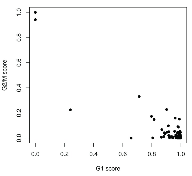
  • 5. Ding B, Zheng L, Zhu Y, Li N, Jia H, Ai R, Wildberg A, Wang W: Normalization and noise reduction for single cell RNA-seq experiments. Bioinformatics.2015;31(13) : 10.1093/bioinformatics/btv122 2225-7 10.1093/bioinformatics/btv122 [DOI] [PMC free article] [PubMed] [Google Scholar]
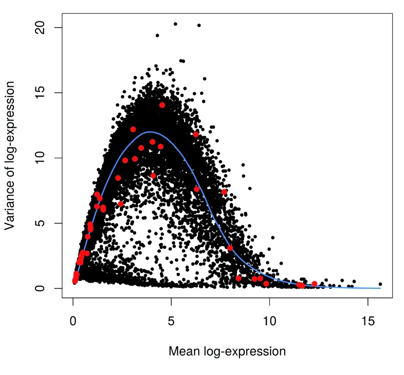
F1000Res. 2016 Oct 26.
Aaron Lun 1

Thanks for your comments, Antonio. Our responses are as below:

1. In addition to the approaches proposed by the authors to detect low quality cells, I would suggest the readers the possibility of identifying outlier cells by performing a PCA on the normalized gene expression matrix restricted to protein-coding genes (e.g. using biotype annotations from Ensembl biomart). On the one hand, outlier cells will dominate the first principal components, which will show high percentage of variances simply accounting from the separation of the outlier from the compact cloud of “normal” cells. On the other hand, a PCA analysis could suggest keeping a cell whose relative similarity to the rest of the cells in a low-dimensional space seems rather normal, even if it could still have an allegedly "bad" quality metric.

This is certainly a valid approach, though we do not mention it here for several reasons. The first reason is that there is an increased risk of being confounded by biological effects when gene expression patterns are directly used, e.g. where uncommon cell types are classified as outliers and removed. The second is that we do not want to confuse readers with a variety of possible options - while our approach is not the only way to do it, it does work, and thus serves its purpose in this workflow. Finally, the use of PCA-based outlier detection has been explored in some detail by Ilicic et al. (2016), which we have already mentioned in the text.

2. As an additional quality control check for the cells, I would also suggest to assess whether the sequencing depth was generally deep enough for most of the cells, by inspecting for instance the saturation curve of the number of detected genes (or other features like the known exon-exon junctions) as a function of the fraction of down-sampled reads.

This is an interesting idea, though it seems to be more useful as a diagnostic for future experiments rather than for an already existing dataset. Even if saturation is not reached, it would not affect the data analysis provided that the existing counts were large enough. Our diagnostics focus on the quality of the data that we currently have, rather than the potential for improving the experiment by collecting more data.

3. In the text it is proposed to filter out low-abundance genes, defined as “those with an average count below a filter threshold of 1." However, the average count is assessed before the normalization step. Would it be more meaningful to apply this filter on the normalized counts?

Unfortunately, most normalization methods (e.g. deconvolution, TMM, DESeq) perform poorly with unfiltered data due to the poor precision of low counts. This necessitates some degree of filtering prior to normalization. We do not think that this has a major effect on the mean count for most genes, given that the size factors average out to unity across all cells.

4. A priori it is difficult to rule out the possibility that the filtering of low-abundance genes could eventually hamper the identification of relevant genes in rare populations of cells. I would generally suggest being rather inclusive at this stage, especially when no clustering of single-cells has been done yet, so that it would still be possible to check whether e.g. the few cells expressing some genes -even if at low levels- are actually forming a distinctive and biologically relevant cluster.

In the context of this workflow, one of the roles of filtering is to reduce the number of genes that need to be tested as being highly variable. This improves power by reducing the severity of the multiple testing correction, increasing the chance that potentially informative genes are detected as HVGs and used in downstream analyses. Thus, while relaxing the filter may retain more genes, fewer of these genes may actually be used in the downstream analysis. (This is more likely than not - low-abundance genes are not generally detected as being highly variable, due to inherent limits on the scope of variability in count data.) Indeed, in the example of few cells expressing few genes at low levels, it is difficult to see how such genes would be detected as being significant in a HVG analysis.

5. Authors propose as an alternative approach to gene filtering, to select genes that have non-zero counts in at least n cells. As illustrated in Figure 6, the number of cells expressing a given gene may be modeled by its mean expression level. This was elegantly addressed in Shalek et al. (2014) through a likelihood ratio test comparing a null model -where all cells express a gene in a lognormal fashion- with an alternate model -where a gene is not expressed in a subpopulation of cells α (See section "Controlling for relationship between expression level and detection efficiency" in the supplementary material: http://www.nature.com/nature/journal/v510/n7505/extref/nature13437-s1.pdf). Genes for which the null model is rejected may be indicative of a subpopulation of cells not expressing the gene at a higher fraction than the one expected from technical noise (e.g. dropout events). I would suggest exploring such approach in order to avoid filtering out relevant genes due to a sharp threshold on the number of cells expressing it.

There are several arguments against using such an approach, at least during the filtering stage. Firstly, this approach specifically selects for bimodal genes whereas it is entirely possible that interesting genes could vary across a continuum of expression values (or, in fact, are bimodal at two non-zero locations). The second is that the significance threshold effectively serves the same purpose as a threshold on the percentage of expressing genes - only less interpretable, as it depends on the vagaries and assumptions of the model. Indeed, default thresholds for significance (e.g. 1%, 5%) may not be appropriate for filtering and exploratory analyses. Thus, some tuning of the significance thresholds is likely to be required, further reducing interpretability. Consequently, we feel that the approach we have suggested is more likely to be generally useful to the wider biological community.

6. In the section “Filtering out low-abundance genes”, the sentence "This provides some more protection against genes with outlier expression patterns, i.e., strong expression in only one or two cells. Such outliers are typically uninteresting as they can arise from amplification artifacts that are not replicable across cells.[...]" would be better followed by setting alt.keep <- numcells >= 2 instead of >= 10

The "ideal" threshold depends largely on the biological context. The HSC dataset contains a highly purified and homogeneous population. We would expect that most expressed genes would be present in a substantial number of these cells, hence the choice of threshold. While relaxing the filter is possible, this runs into the problems discussed above in our response to point 4. Of course, in other situations where rare cell types are present (e.g. olfactory neurons expressing unique receptors), relaxing the filter might be necessary to retain biological information. We have added a comment about this in the revised manuscript.

7. It would be interesting to complement Figure 7 and 18 with a second panel representing the correlation between size factors from deconvolution versus spike-in-specific size factors, as done in Figure 27. In the eventual case that a low correlation between them was found in a non-DE scenario, would it be advisable to neglect spike-ins from the analysis?

We considered adding this, but felt that it would make this part of the workflow somewhat difficult to follow given that we use only the deconvolution factors for normalisation of the endogenous genes. Nevertheless, we agree that this is an important point and are glad that the reviewer pointed out Figure 27 where we discuss this issue in some detail.

Low correlations between the spike-in and deconvolution size factors are not a cause for concern. As we have mentioned, this is entirely possible due to differences in total mRNA content. In terms of normalization, the two sets of size factors simply deal with different biases, so differences between them do not provide any indication of spike-in quality.

8. As pointed by the authors, spike-in molecules have been extensively used to infer the amount of variability in the expression levels of one gene that can be explained from technical noise (e.g. Brennecke et al., 2013; Grün et al., 2014; Islam et al., 2014). Ding et al. (2015) went further on the applications of spike-in levels, by using them to explicitly remove technical noise and compute de-noised gene expression levels (R software GRM, http://wanglab.ucsd.edu/star/GRM/). I would suggest the readers such possibility that could largely benefit downstream analysis such as the detection of subpopulation of cells and cell trajectories, as they would mainly rely on biological variation. This would still be compatible with an assessment of HVG only based on biological variation by fitting the trend to the variance estimates of the endogenous genes (after technical denoising).

The GRM strategy is an interesting one. However, we do not use it here because the denoising is performed based on a curve fitted to the spike-in log-FPKMs against the known concentrations. This is philosophically similar to spike-in-based normalization, in that it will preserve information about total RNA content. For example, cells with more endogenous RNA will have larger gene counts and unchanged (or smaller) spike-in counts; this results in larger de-noised expression values compared to other cells with less total RNA. Such behaviour may not be desirable in situations where cell size is not of interest.

9. Authors state that the technical component estimation through the fitting of a mean-variance trend to the spike-in transcripts “is compromised by the small number of spike-in transcripts, the uneven distribution of their abundances and (for low numbers of cells) the imprecision of their variance estimates”. Do the same remarks generally apply to a spike-in-specific normalization? And if so, should spike-in normalization be considered accurate enough when applied to cases with strong DE even if it is conceptually more appropriate than a deconvolution approach?

In general, no, the remarks do not apply for spike-in normalization. This is because spike-in normalization computes a single size factor, using information across all spike-in transcripts. As a result, the size factor is generally quite precise. Fitting of the mean-variance trend is less stable because it uses information from each individual spike-in transcript. This is subject to the issues described in the text, thus reducing the stability of the outcome.

10. In the section “Identifying HVGs from the normalized log-expression” the authors justify their choice of "the variance of the log-expression values because the log-transformation protects against genes with strong expression in only one or two cells. This ensures that the set of top HVGs is not dominated by genes with (mostly uninteresting) outlier expression patterns”. However, the filtering of genes with such patterns has already been proposed in a previous section, so those cases should no longer be a risk here.

This depends on the type of abundance filtering that was chosen. In this workflow, we performed filtering based on the average count, which does not explicitly protect against strong outliers. Thus, some additional protection is needed during the downstream analysis. If filtering was performed based on an "at least n" strategy, then outliers will be less of an issue during HVG detection. Of course, the "at least n" filter has problems of its own regarding an appropriate choice for "n", as we have discussed in the text and in our response to point 6, which is why we have not used it as the default filtering strategy.

11. The interpretability of the approach of "Identifying correlated gene pairs with Spearman’s rho" is to some extent limited without a previous analysis such as PCA, ICA or MDS, transforming the high-dimensional space into a space of independent (uncorrelated) dimensions. I would rather favor the identification of sets of genes with a high weight on each of the retained independent axis (i.e. driving the variance in such axes, and therefore disentangling sets of correlated genes for each of the orthogonal dimensions). Otherwise, the analysis could risk to be dominated by the first component, probably neglecting other relevant hidden factors.

This point of calculating these correlations is to provide a simple screen for genes that are likely to be involved in defining the substructure of the dataset. Interpretation of the cause of these correlations can then be performed using PCA, ICA, etc. as suggested on the subset of interesting genes. Without some pre-selection of genes (in terms of high variance or correlation), biological and technical noise may interfere with dimensionality reduction - see our response to point 12.

Our approach allows relevant genes to be selected in a statistically rigorous manner based on significant correlations. In contrast, it is unclear how selection would be performed based on the PCA weights. For example, what should be considered a "high weight", and from how many principal components should genes be selected? The simplicity of the calculation of significant pairwise correlations also provides a useful sanity check for conclusions drawn from more complex downstream analyses.

Finally, if there are hidden factors, these are likely to increase the correlations and cause rejection of the null hypothesis for the relevant genes. So, genes that are affected by these factors will still be retained for downstream analysis and interpretation.

12. In any case, I advise not to restrict to correlated HVGs downstream dimensionality reduction analysis such as PCA or ICA aiming at the identification of subpopulations of cells and their gene signatures. Such methods exploit correlation patterns (linear or non-linear) in a well-grounded way and they do not require a feature selection step. The sentence "We only use the correlated HVGs in plotPCA because any substructure should be most pronounced in the expression profiles of these genes" could eventually not hold true in some instances: correlated HVGs were assessed without considering those independent components, the relative contribution of each dimension to the total variance, and the relative contribution of each gene to each dimension.

The aim of selecting correlated HVGs is to reduce the amount of technical and (uncorrelated/uninteresting) biological noise in the data to be used for downstream analyses. This improves the performance of dimensionality reduction approaches, especially if the substructure is relatively weak. For example, with PCA, adding a large number of uncorrelated genes will interfere with correct placement of cells along a trajectory:

par(mfrow=c(1,2))

loc <- 1:100/100 # True placement of cells

a1 <- matrix(jitter(rep(loc, 50)), nrow=50, byrow=TRUE) # Correlated genes

x1 <- prcomp(t(a1))

plot(x1$x[,1]) # Should be on the diagonal

a2 <- rbind(a1, matrix(rnorm(100000), ncol=100)) # Adding uncorrelated noise

x2 <- prcomp(t(a2))

plot(x2$x[,1]) # Correct placing is disrupted

Similar arguments can be made for distance-based approaches like t-SNE and diffusion maps, where the nearest neighbours become more difficult to identify correctly with increasing noise.

Finally, the identification of correlated HVGs does not need to consider the nature of the substructure. We only need to identify the genes that are affected by this substructure, in one way or the other - it is the function of downstream analyses to determine what the substructure actually represents.

13. In the brain dataset, correlated HVGs genes were assessed considering the design <- model.matrix(~sce$sex); correlatePairs(sce, design=design). It would be useful to further explain here how this function accounts for the design matrix on the assessment of Spearman’s rho.

For one-way layouts, a value of rho is first computed within each group of cells. The average across all groups (weighted by the number of cells) is then used as the final value of rho for any given pair of genes. For more complex designs, a linear model is fitted to the log-normalized counts, and rho is calculated using the residuals of the model fit. (While the linear model approach also works for one-way layouts, it requires some additional assumptions that can be avoided with a simpler group-based approach.) More details can be found in the documentation for the correlatePairs() function.

14. In the brain dataset, removeBatchEffect from limma package is used to remove the sex effect. Then tSNE and PCA are applied on the sex-corrected expression values restricted to correlated HVGs. Consistently, correlated HVGs were assessed considering the very same factor: design <- model.matrix(~sce$sex); correlatePairs(sce, design=design). I would further warn the reader and stress the necessity of that consistency between both steps.

We have added a comment on this to the manuscript.

15. For consistency with the assessment of correlations based on Spearman's rho, in the heatmap I would recommend to assess first the dendrograms for the cells and the genes by using also a spearman correlation...

Our dendrograms are constructed based on the distances between cells, which is different from the correlations between genes. Using the correlations to cluster the genes makes more sense with respect to checking consistency, but the primary aim of our analysis is to identify clusters of cells (potential subpopulations) rather than clusters of genes. The latter is certainly a worthwhile analysis (e.g. to identify gene modules) but, in the context of this workflow, the differences in clustering on correlations versus Euclidean distances would only have a minor effect.

16. I would suggest explicitly mentioning in the pipeline which approaches are based on linear or non-linear assumptions. The workflow alternates methods from both categories, which should be taken into account to understand their downstream consequences...

Obviously, each computational method makes a number of assumptions. For the sake of readability and simplicity (especially for inexperienced readers), we have not discussed most of these assumptions in this workflow, except for those that are critical to choosing between methods, e.g. spike-in normalization versus deconvolution. Nonetheless, we have modified the manuscript to elaborate on the reasons for using non-linear methods such as Spearman's rho and t-SNE.

17. The use of hierarchical clustering for clustering cells into putative subpopulations is based on Euclidean distances (or correlations) assessed in a non-orthogonal space. I would rather favor an analytical clustering directly performed in a low-dimensional orthogonal space such us those led by PCA, ICA or MDS, in which the most-informative dimensions can be selected (e.g. through their eigen values in PCA).

There are many possible approaches to clustering, each with their own advantages and disadvantages. For example, pre-selection of a low-dimensional space via PCA may reduce noise during clustering, but it may also discard subtle features present in lower-ranked PCs. Our clustering approach is simple but effective enough, which is why we have used it in this workflow. Other methods may well do better, but a discussion of the pros and cons of different clustering strategies is beyond the scope of this article.

18. A PCA analysis should be accompanied by a plot representing the % of variance explained by each principal component, so that it can be judged the number of relevant dimensions to be retained while disregarding the rest as “noise”. It could be the case that more than 2 dimensions are relevant to separate subpopulations in a finer detail. The inspection of eigenvalues would help supporting that "PCA plot is less effective at separating cells into many different clusters (Figure 24). This is because the first two principal components are driven by strong differences between specific subpopulations, which reduces the resolution of more subtle differences between some of the other subpopulations."

We only use PCA for visualization, rather than selection of principal components for further quantitative analysis in low-dimensional space. For this purpose, knowing the relative contributions to the total variance from non-visualized components is less helpful. For example, even if we determined that the top 10 dimensions were "relevant", it is unclear how this would assist visualization. Nonetheless, we now mention in the text how this information can be generated and used.

19. In the brain analysis, three main steps are: 1) the deconvolution method is used to normalize expression levels. Here similar cells are clustered together and cells are normalized in each cluster. Authors state: “This improves normalization accuracy by reducing the number of DE genes between cells in the same cluster”. Clustering is performed here with the quickCluster function from scran package, where a distance matrix is constructed using Spearman’s correlation on the counts between cells. 2) A hierarchical clustering is then performed and a dynamic tree cut is used to define clusters of cells. Then, the batch(sex)-corrected expression values of the (Spearman’s rho) correlated HVG are used to build a dendogram assessed through hierarchical clustering on the Euclidean distances between cells, where clusters are defined. And 3) those clusters are used to assess DE with edgeR on the counts, normalized using the library size-adjusted size factors (if I well understood) and including all genes (not only correlated HVG). I personally found such procedure a bit cumbersome as it is relying on different types of expression matrices and metrics in each of the 3 steps (see also next comment). I also wonder to what extent the initial quickCluster results could be biasing the clusters detected downstream, and, if so, whether the normalization step would be biasing in turn the differentially expression results. The correspondence between the quickCluster results with the clusters from the dendograms should at least be inspected and discussed.

In terms of the choice of matrices and metrics, we have chosen approaches that we feel are suitable for each step of the workflow. Given that each step examines a different aspect of the data, some flexibility is inevitably required in supplying the correct input to each method.

Regarding quickCluster, Lun et al. (2016) show that unbiased size factor estimates are still obtained after clustering. This is because size factors computed within each cluster are explicitly corrected to be comparable between clusters. As for the similarity between the quickCluster results and the dendrograms, we do not believe that this provides a useful indication of method performance. Some agreement is expected, as the two methods should recover similar structure in the data. However, some disagreement is also expected, as quickCluster provides a quick-and-dirty clustering to reduce the amount of DE genes present during deconvolution, while the dendrograms are much more refined due to feature selection. Such incongruences are not a problem for normalization - even if quickCluster identifies the "incorrect" clusters, it is still adequate if it separates cells with vastly different transcriptomic profiles.

20. In line with the previous comment, in the brain analysis I wonder whether the pipeline could somehow be simplified by 1) performing spike-in normalization (which seems possible given the quality of the spike-in trend observed in Figure 21), 2) doing a PCA on the batch(sex)-corrected expression values of all genes (not only correlated HVGs), and performing clustering on the retained principal components, and 3) assessing DE with edgeR on the counts normalized using the spike-in factors.

One could certainly perform such an analysis. However, we chose to use the approach described in the workflow, because feature selection can improve the results of downstream analyses, as discussed in our response to point 12; and the choice of whether or not to do spike-in normalization depends primarily on whether total RNA content is interesting, not on the quality of the spike-ins.

21. Some code at the beginning of the analysis to check and install all the required packages would be welcome

We have added a link to the Bioconductor workflow page, which provides instructions for installing all required packages and running the workflow.

22. Everything run smoothly in our hands except for the gdata package when trying to read the xls file. The perl command interpreter was running abnormally long and it was using a large amount of RAM. We finally opened the xls file in excel and converted into tab separated file, then read it using the general read.table command.

We understand the suboptimality of dealing with Excel files in bioinformatics analysis. Unfortunately, the authors of this study provided the count data in Excel format on NCBI GEO. We decided to load the data directly rather than manually supplying the counts in a simpler format. The latter would make the workflow less generalisable as it would no longer use data from public, well-recognised sources. In our hands, loading of the Excel file usually requires a couple of minutes and 3-4 GB of RAM.

F1000Res. 2016 Oct 18. doi: 10.5256/f1000research.10234.r15991

Referee response for version 1

David duVerle 1

The pipeline described in this article seems promising. I was able to partly reproduce the results, as well as run similar treatment on a single cell dataset of my own.

However:

  • The fundamental flaws mentioned by other reviewers over a month ago, still haven't been addressed: the pipeline requires Dev versions of R and bioconductor packages, yet makes no mention of it anywhere in the article.

  • In fact, even after installing the Bioconductor Dev versions of all required modules, it would appear the pipeline no longer works with the latest versions (e.g. scran_1.1.10, with R 3.3.1):

> isSpike(sce) <- "ERCC"

Error in `isSpike<-`(`*tmp*`, value = "Spike") : 

  'isSpike' must be logical or NULL

etc.

While likely easy to fix, this type of incompatibility issues undermine the entire point of the article and perfectly illustrate the dangers of relying on development versions for this type of pipeline.

  • Additionally, the example dataset used by the article, is loaded from an Excel spreadsheet, which is generally considered extremely bad practice. It would behoove the authors of a software walkthrough aimed at somewhat-novice bioinformaticians to encourage best practices.

  • In the current conditions, and until some major revision work is done, it is impossible to properly review the pipeline and approve this article unreservedly.

I have read this submission. I believe that I have an appropriate level of expertise to confirm that it is of an acceptable scientific standard, however I have significant reservations, as outlined above.

References

  • 1. Zeeberg BR, Riss J, Kane DW, Bussey KJ, Uchio E, Linehan WM, Barrett JC, Weinstein JN: Mistaken identifiers: gene name errors can be introduced inadvertently when using Excel in bioinformatics. BMC Bioinformatics.2004;5: 10.1186/1471-2105-5-80 80 10.1186/1471-2105-5-80 [DOI] [PMC free article] [PubMed] [Google Scholar]
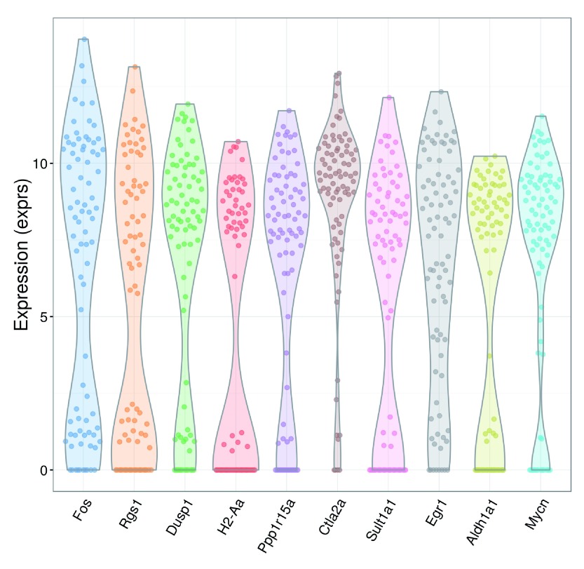
F1000Res. 2016 Oct 18.
Aaron Lun 1

Thanks for your comments, David. Regarding the incompatibility in software versions, we have been waiting for the imminent release of the latest version of Bioconductor (3.4) before revising the article. It seemed more prudent to wait for the latest software to become available, rather than making stop-gap modifications to accommodate soon-to-be-obsolete versions. We believe that this update should clear up any problems with execution of the workflow.

We agree that Excel spreadsheets are a poor formatting choice for bioinformatics work. Unfortunately, the processed dataset is provided in this format from NCBI GEO (https://www.ncbi.nlm.nih.gov/geo/query/acc.cgi?acc=GSE61533, see Supplementary files). While having to tackle Excel formatting is not ideal, it is preferable to having to re-process the entire dataset to obtain counts from the raw read sequences. Moreover, at no point do we save into Excel - analysis results are always stored in simple tab-delimited formats, and the R objects themselves are saved in serialized form.

F1000Res. 2016 Sep 30. doi: 10.5256/f1000research.10234.r16243

Referee response for version 1

Andrew McDavid 1

Lun, McCarthy and Marioni share a workflow for analysis of single cell RNAseq (scRNA-seq) data using software they have developed. The workflow is illustrated on two data sets of varying size and characteristic. The computational and statistical findings of the workflow are interpreted in their experimental context. Having a well-documented protocol for the analysis of scRNA-seq is an important contribution to the community, since it is still a wilderness in terms of methods and processing, for better or worse.That scRNA-seq is a quickly evolving discipline--and the implications this has for the workflow--forms the bulk of my criticism of this paper.

1a. The paper describes a currently-unreleased version of software. Other reviewers have indicated the difficulties this poses. I trust the authors will verify the correctness of their code and reproducibility of the analysis when their packages are finalized in Bioconductor 3.4. I also trust that this workflow will be made available as a literate (e.g knitr) document so that readers won't have to cut and paste from their web-browser. This reviewer was able to reproduce the figures reported in the first data set after loading the development version of ` scater` (now version 1.1.14).

1b. The main software package ` scater` defines a `SCESet` inheriting from `ExpressionSet`, which has been superceded by `SummarizedExperiment`. SummarizedExperiment is more likely to scale to large data sets (it can store data out of core or in sparse matrix formats). In practice, this is not such a big deal since it's relatively easy to coerce between the two object types.

2.  The title of this article stipulates that it is for "low-level" analysis of RNA-seq data, but the all-important question of how to process the data as many analysts will get them (short reads as .fasta files) is elided.  

(Pseudo)-Alignment and quantification is an important, and probably overlooked step in scRNA-seq analysis. Counting transcripts by counting overlaps with features, a la countOverlaps or htSeq is inefficient 1, since many reads (30%-80% of those that map anywhere, in this reviewer's experience) do not align uniquely. Hence the need and value to use quantification tools that respect the degeneracy of multimapping reads, ie, RSEM, Star, Kallisto, Sailfish, et al.  A low-level analysis thus may wish to consider remapping with an appropriate tool. Fortunately, it does appear that ` scater` has provisions for doing (re)-alignment with Kallisto.

3.  The authors may consider referencing other extant methods that could address areas of their workflow, especially methods that are adapted to deal with the non-normality of scRNA-seq data.

  • For normalization, there is scone, which tests many different normalization procedures and optimizes over the "best" one.

  • For identification of highly variable genes, there is Basics 2, which applies a hierarchical Bayesian model to test for over-dispersion, as opposed to modeling departures from an overall mean-variance relationship.

  • For single cell differential expression and gene set enrichment for bimodal distributions found in scRNA-seq, there is MAST 3.

  • For clustering, there is clusterExperiment.

  • For multi-dimensional scaling on bimodal data, there is ZIFA 4. All of the above, aside from ZIFA are R/Bioconductor packages.

I have read this submission. I believe that I have an appropriate level of expertise to confirm that it is of an acceptable scientific standard, however I have significant reservations, as outlined above.

References

  • 1. Li B, Dewey CN: RSEM: accurate transcript quantification from RNA-Seq data with or without a reference genome. BMC Bioinformatics.2011;12: 10.1186/1471-2105-12-323 323 10.1186/1471-2105-12-323 [DOI] [PMC free article] [PubMed] [Google Scholar]
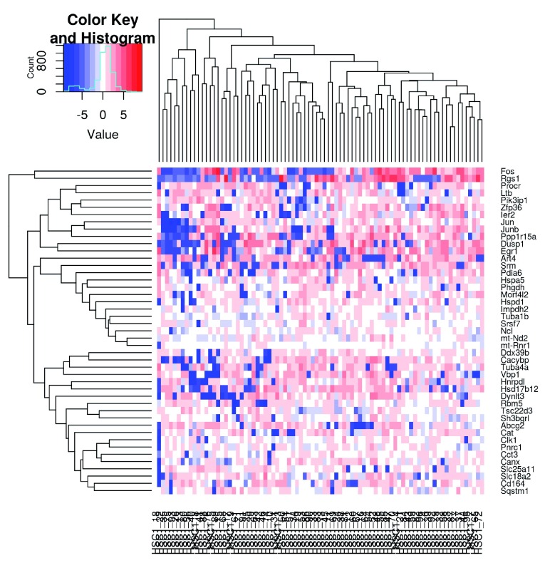
  • 2. Vallejos CA, Marioni JC, Richardson S: BASiCS: Bayesian Analysis of Single-Cell Sequencing Data. PLoS Comput Biol.2015;11(6) : 10.1371/journal.pcbi.1004333 e1004333 10.1371/journal.pcbi.1004333 [DOI] [PMC free article] [PubMed] [Google Scholar]
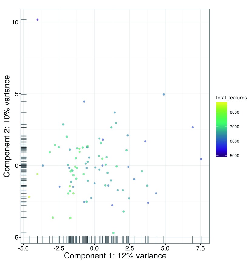
  • 3. Finak G, McDavid A, Yajima M, Deng J, Gersuk V, Shalek AK, Slichter CK, Miller HW, McElrath MJ, Prlic M, Linsley PS, Gottardo R: MAST: a flexible statistical framework for assessing transcriptional changes and characterizing heterogeneity in single-cell RNA sequencing data. Genome Biol.2015;16: 10.1186/s13059-015-0844-5 278 10.1186/s13059-015-0844-5 [DOI] [PMC free article] [PubMed] [Google Scholar]
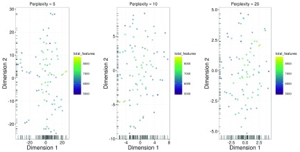
  • 4. Pierson E, Yau C: ZIFA: Dimensionality reduction for zero-inflated single-cell gene expression analysis. Genome Biol.2015;16: 10.1186/s13059-015-0805-z 241 10.1186/s13059-015-0805-z [DOI] [PMC free article] [PubMed] [Google Scholar]
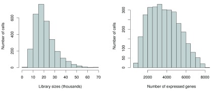
F1000Res. 2016 Oct 18.
Aaron Lun 1

Thanks for your comments, Andrew. Our responses are as below.

1a. The paper describes a currently-unreleased version of software. Other reviewers have indicated the difficulties this poses. I trust the authors will verify the correctness of their code and reproducibility of the analysis when their packages are finalized in Bioconductor 3.4. I also trust that this workflow will be made available as a literate (e.g knitr) document so that readers won't have to cut and paste from their web-browser. This reviewer was able to reproduce the figures reported in the first data set after loading the development version of `scater` (now version 1.1.14).

Yes, this was an oversight on our part. The revised verison will include a link to the Bioconductor workflow page, where users can simply run a command to automatically download the relevant data files and packages prior to running the workflow.

1b. The main software package `scater` defines a `SCESet` inheriting from `ExpressionSet`, which has been superceded by `SummarizedExperiment`. SummarizedExperiment is more likely to scale to large data sets (it can store data out of core or in sparse matrix formats). In practice, this is not such a big deal since it's relatively easy to coerce between the two object types.

We considered the practicality of storing data in sparse matrix format. Unfortunately, most existing tools for downstream data analysis require a full-sized matrix as input, so any gains in memory efficiency during storage seem to be countered by the need to (repeatedly) expand the matrix at multiple analysis steps. Moreover, a sparse matrix only improves efficiency for raw count data where unambiguous zeroes are present; upon applying normalization and transformation steps, this may no longer be the case, such that a full-sized matrix will ultimately be required anyway.

2.  The title of this article stipulates that it is for "low-level" analysis of RNA-seq data, but the all-important question of how to process the data as many analysts will get them (short reads as .fasta files) is elided. (Pseudo)-Alignment and quantification is an important, and probably overlooked step in scRNA-seq analysis. Counting transcripts by counting overlaps with features, a la countOverlaps or htSeq is inefficient1, since many reads (30%-80% of those that map anywhere, in this reviewer's experience) do not align uniquely. Hence the need and value to use quantification tools that respect the degeneracy of multimapping reads, ie, RSEM, Star, Kallisto, Sailfish, et al.  A low-level analysis thus may wish to consider remapping with an appropriate tool. Fortunately, it does appear that `scater` has provisions for doing (re)-alignment with Kallisto.

We find that conventional feature counting works quite well for read-based scRNA-seq data, having used this approach in several recent studies (Achim et al., 2015; Kolodziejczyk et al., 2015; Scialdone et al., 2016). While ignoring multi-mapped reads during quantification is conservative, we feel that it does provide a greater degree of confidence in our downstream inferences. Certainly, there may be gains in power from using tools that extract more information from multi-mapping reads, but we do not consider this advantage to be so pronounced that it should be standard procedure for all scRNA-seq data analyses. For UMI-based data, there does not yet appear to be any clear "gold standard" approach for UMI processing into counts, so we have not provided any description of that step.

In summary, we decided to start the workflow from the raw count data, rather than starting from read sequences, as conventional approaches for quantification described elsewhere seem to work well; to maintain some flexibility with respect to future developments in this field; and because our workflow focuses on the steps of the analysis that are carried out in R/Bioconductor, whereas most existing quantification tools require manual installation and execution from the command-line.

References:

  • Achim et al. (2015), Nature Biotechnology 33:503–509

  • Kolodziejczyk et al. (2015), Cell Stem Cell 17(4):471-485

  • Scialdone et al. (2016), Nature 535:289-293

The authors may consider referencing other extant methods that could address areas of their workflow, especially methods that are adapted to deal with the non-normality of scRNA-seq data.

As you have stated, there are many alternative approaches that could be used in various parts of the workflow. However, we feel that it is beyond the scope of this article to enter into discussions about the relative advantages of different methods. In fact, this may undermine the pedagogical value of the workflow by providing too many options to inexperienced users. The methods we have described work well in a variety of situations, so we have chosen them for use in the various analysis steps. We have added a sentence to the discussion about the existence of alternative methods for low-level processing, and encouraged experienced users to explore them.

F1000Res. 2016 Sep 19. doi: 10.5256/f1000research.10234.r15987

Referee response for version 1

Hongkai Ji 1

In this article, the authors introduce a computational workflow to perform low-level analysis of single-cell RNA-seq (scRNA-seq) data based on R and Bioconductor. The workflow takes a read count matrix as input, and it provides R commands for loading data, quality control, gene filtering, data normalization (with or without spike-in controls), classifying cells based on their cell cycle phase, identifying highly variable genes, analyzing genes’ pairwise correlation, and basic data exploration such as clustering and visualization. The workflow is demonstrated using a number of real data examples. Overall, I think that the workflow provides a timely and very useful guide for people who want to analyze scRNA-seq data.

This study is largely reproducible. I am able to obtain all major results in this article by running the commands provided by the authors. I have several comments and suggestions which I hope the authors can address in order to make their workflow more user-friendly.

1. It seems that installing the right version of R and Bioconductor is crucial for this pipeline to work. Some commands in the workflow depend on R version 3.3.1 or higher and the developing (devel) version of Bioconductor. The first time I tried the workflow, I encountered numerous errors. For example,

> isSpike(sce) <- "ERCC"

Error in `isSpike<-`(`*tmp*`, value = "ERCC") :

  'isSpike' must be logical or NULL

> numcells <- nexprs(sce, byrow=TRUE)

Error: could not find function "nexprs"

> sce <- computeSpikeFactors(sce, type="ERCC", general.use=FALSE)

Error in .local(x, ...) :

  unused arguments (type = "ERCC", general.use = FALSE)

It turns out that I used an older version of R and Bioconductor. I then updated my R and Bioconductor packages and still had many problems. Finally, I decided to completely remove R and Bioconductor from my computer. I then installed R 3.3.1 and Bioconductor (devel version), and the pipeline worked. Although I eventually fixed the problem, I feel that this trial and error process can be frustrating for users. I therefore suggest that the authors make the R/Bioconductor dependencies clear at the beginning of the article. It would be even better if the authors could minimize the pipeline’s dependency on certain versions of R/Bioconductor.

2. This workflow uses a number of R and Bioconductor packages. A user may not have all packages installed on their computer. Installing these packages one by one manually can be a little tedious. It would be nice if the authors can provide an R script that automatically finds missing packages on a user’s computer and install them. This could improve the pipeline’s user experience.

3. It will also be useful if the authors can provide an R file that contains all commands in the workflow so that users only need to slightly edit their code for future datasets. It might be beyond the scope of this article, but the authors may consider delivering the pipeline using an R shiny graphical user interface in the future to make it accessible to users without R coding experience.

I have read this submission. I believe that I have an appropriate level of expertise to confirm that it is of an acceptable scientific standard, however I have significant reservations, as outlined above.

F1000Res. 2016 Sep 19.
Aaron Lun 1

Thanks for your comments, Hongkai. Our responses to each of your points is below:

  1. Yes, this was an oversight on our part. The pipeline was developed using packages from BioC-devel, to take advantage of cutting-edge methods in each package. For that reason, the pipeline is strictly dependent on Bioconductor release version 3.4, a fact that we will make explicit in the next revision. We do not think that this is a major inconvenience given that the next release of Bioconductor is less than a month away.

  2. This is a good point. In fact, this article would ideally coincide with a parallel release on the Bioconductor workflow page, where the workflow installation machinery will automatically install all dependencies required for the package. Unfortunately, because this article was using packages from BioC-devel, we were unable to coordinate its release with that on the Bioconductor workflow page (which is limited to BioC-release packages). This will be fixed in the next revision where we will add a reference to Bioconductor-based installation of required packages.

  3. While we understand the convenience that an R script can offer, we feel that supplying such a script would invite attempts to blindly use the code without considering the context or caveats of the various methods. We believe that some initial copy-pasting is a small price to pay if the user is consistently reminded of how to properly interpret the output. Note that the Bioconductor workflow site and our Github page provide an Rmarkdown file containing all the necessary code blocks for easy execution of the entire workflow; if necessary, users can change the input files to generate an analysis report similar to the article. Of course, a graphical user interface is even more intuitive, but this is difficult to set up in a manner that is amenable to rigorous and reproducible data analysis.

F1000Res. 2016 Sep 9. doi: 10.5256/f1000research.10234.r15990

Referee response for version 1

Diana HP Low 1

Lun and colleagues describe a low-level analysis specific for single-cell RNA-seq experiments, using open-source packages available on Bioconductor. This paper could potentially be a valuable resource for those who want to carry out such analysis in R.

The steps are very descriptive, and they even include 2 different datasets presenting different types and conditions for analysis. They have done a very thorough job in explaining the decisions taken at each step of QC, filtering, normalization and provide some basic but important visualization examples (clustering, heatmaps) that would help in assessing not only the quality of the dataset technically, but also provided information on the outcome of the experiment itself.

Unfortunately I could not run some of the steps in the workflow which prevented me from assessing the code. Some I could figure out and "fix" in the attempt to run the code, but others not so much.

I provide some (not exhaustive) examples below to help in the troubleshooting, and if these (and the subsequent code relying on these outputts) could be solved, I would be happy to continue the review further.

  1. isSpike(sce) <- "ERCC" //worked with isSpike(sce) <- is.spike

  2. can't find the function nexprs [I had to use numcells <- rowSums(exprs(sce)!=0)]

  3. is.ercc <- isSpike(sce, type="ERCC") //worked with [is.ercc <- isSpike(sce)

  4. Could not run code from the section: Identifying HVGs from the normalized log-expression

var.fit <- trendVar(sce, trend="loess", use.spikes=FALSE, span=0.2)

Error in simpleLoess(y, x, w, span, degree = degree, parametric = parametric,  : 

  invalid 'x'

I have read this submission. I believe that I have an appropriate level of expertise to confirm that it is of an acceptable scientific standard, however I have significant reservations, as outlined above.

F1000Res. 2016 Sep 9.
Aaron Lun 1

Thanks for your comments, Diana. The code actually depends on Bioconductor version 3.4 (i.e., BioC "devel"), rather than the current Bioconductor 3.3 (i.e., BioC "release"). This allows us to include cutting-edge features from all packages to provide a high level of functionality in the workflow. However, some of these features are not present in the release version, thus leading to execution failure.

The devel versions of all packages can be easily installed by setting  useDevel() followed by  biocLite(), as described on the Bioconductor website. We will also modify the text to explicitly state that Bioconductor 3.4 is required - currently, this can only be implicitly determined from the package versions, which admittedly is not obvious to casual users.


Articles from F1000Research are provided here courtesy of F1000 Research Ltd

RESOURCES