

Abstract
Correspondence analysis is an explorative computational method for the study of associations between variables. Much like principal component analysis, it displays a low-dimensional projection of the data, e.g., into a plane. It does this, though, for two variables simultaneously, thus revealing associations between them. Here, we demonstrate the applicability of correspondence analysis to and high value for the analysis of microarray data, displaying associations between genes and experiments. To introduce the method, we show its application to the well-known Saccharomyces cerevisiae cell-cycle synchronization data by Spellman et al. [Spellman, P. T., Sherlock, G., Zhang, M. Q., Iyer, V. R., Anders, K., Eisen, M. B., Brown, P. O., Botstein, D. & Futcher, B. (1998) Mol. Biol. Cell 9, 3273–3297], allowing for comparison with their visualization of this data set. Furthermore, we apply correspondence analysis to a non-time-series data set of our own, thus supporting its general applicability to microarray data of different complexity, underlying structure, and experimental strategy (both two-channel fluorescence-tag and radioactive labeling).
Microarray technology provides insight into the transcriptional state of the cell, measuring RNA levels for thousands of genes at once. As such, it has become one of the workhorses of functional genomics. However, the technology results in large amounts of data, the interpretation of which is still a major bottleneck.
Transcriptional profiling with microarrays involves several steps. mRNA is prepared from cells growing under certain experimental conditions. For each condition, the prepared mRNA is processed separately, performing reverse transcription with radioactively or fluorescent-tag-labeled nucleotides. In case of two-channel fluorescent-tag labeling, each hybridization involves additional application of a differently labeled cDNA, stemming from a control condition. Subsequently, the labeled cDNA mixture is hybridized to the microarray. After detection of the signals, image analysis programs are used to determine spot intensities.
We refer to a set of conditions as a multiconditional experiment when all hybridizations are done with reference to one and the same control condition. Data thus produced may be regarded as a table, each row representing a gene, each column standing for an experimental condition. However, multiple measurements for each condition, involving repeated sampling, labeling, and hybridization, offer the opportunity of extracting more robust signals. When a condition is sampled repeatedly, resulting in several hybridizations, we will call the individual data set a hybridization and represent it by a separate column in the table. One condition of a multiconditional experiment can thus comprise several columns.
The intensity measurements in this table must not be taken at face value, though. Different levels of background may result in additive offsets, or different amounts of mRNA or different label incorporation rates may lead to multiplicative distortions among the hybridizations. Therefore, the columns of the table have to undergo a normalization procedure, correcting for affine-linear transformation among the columns. Subsequently, it is advisable to disregard all genes, the values of which do not change in the entirety of conditions or which do not appear to be expressed under any of the conditions.
Given a thoroughly preprocessed data set, one expects to be ready to tackle the biological questions of data interpretation. Naming all of the methods recently used for microarray data analysis would result in an outline of applied statistics, however. Most methods fall into one of three groups, namely clustering, classification, and projection methods. Examples of clustering techniques are k-means clustering (1), hierarchical clustering (2), and self-organizing maps (3). Classification methods take as input a grouping of objects and aim at delineating characteristic features common and discriminative to the objects in the groups. Examples of classification methods range from linear discriminant analysis (4) to support vector machines (5) or classification and regression trees (6, 7).
Other methods produce a low-dimensional projection of an originally high-dimensional data set. One can, e.g., represent genes as numerical vectors, with the number of elements of each vector being the number of hybridizations involved. Therefore, those vectors could be plotted as points in hybridization-dimensional space, if only the number of dimensions were small enough for visualization. Methods like multidimensional scaling (8) or principal component analysis (PCA) (9, 10), as well as the technique proposed in this paper, project these points into a two- or three-dimensional subspace so they can be plotted. Such an embedding attempts to represent objects such that distances among points in the projection resemble their original distances in the high-dimensional space as closely as possible. Singular value decomposition, which is also at the core of correspondence analysis, can be used to determine the most influential parameters for two variables. This method has recently been applied to microarray data by Alter et al. (11). Although their approach is similar to the one discussed below with respect to scaling down dimensions by decomposition into principal axes, it differs significantly by both distance measure and displayed information.
All of the above methods perform well for the analysis or visualization of either genes or hybridizations. We are particularly interested in studying associations between genes and hybridizations. Our contribution to this effort consists in the application of correspondence analysis (CA) for revealing interdependencies between two variables. CA directly visualizes associations between genes and hybridizations. It is an exploratory technique, allowing visualization of structures within the data and thus revealing which questions could be asked or which hypotheses could be put forward. Unlike many other methods, CA does not require any prior choice of parameters.
Like other projection methods, CA represents variables such as transcription intensities of genes as vectors in a high-dimensional space. In our case, the dimensionality of the space would be the number of hybridizations involved. Both PCA and CA reveal the principal axes of this high-dimensional space, enabling projection into a subspace of low dimensionality that accounts for the main variance in the data. Unlike PCA, CA is able to account for the genes in hybridization-dimensional space and the hybridizations in gene-dimensional space at the same time. Both representations of the data matrix will be projected into the same low-dimensional subspace, for example, a plane (yielding a so-called “biplot”), revealing associations both within and between these two variables.
In this paper, we will provide a short theoretical introduction into the method, demonstrate its performance on the well-known synchronized yeast cell cycle data set of Spellman et al. (12), and provide a thematically related example that we have chosen from our own collection of microarray data, produced at our center.
Experimental and Computational Methods
Sampling and Hybridization.
The yeast strains used were derivatives of W303 (ade2–1, his3–11, 15, leu2–3, 112, trp1–1, ura3, ssd1Δ, can1–100, [psi+], ho) being wild-type (WT) or overproducing after induction with respect to Cdc14p. The strains will be referred to as WT or CDC14 transgenic (ura3∷GAL1-MycCDC14-URA3 CLB2HA3). Yeast cultures of both strains were grown in complete medium plus 2% raffinose to midlogarithmic growth phase (OD600 = 0.5) when nocodazole was added to a final concentration of 15 μg/ml. Samples were taken before addition of nocodazole and when synchronization of the cell culture was proven by microscopy. For overexpression of Cdc14p, cells were induced by 2% galactose, and samples were taken after 1 h. Harvesting of cells for RNA preparation, radioactive labeling by reverse transcription, and hybridization onto the PCR-based whole-genome DNA array were performed as described (13).
Normalization.
Before high-level analysis, data have to be normalized and filtered. We largely followed the procedures described in ref. 14. Each hybridization was normalized with respect to the gene-wise median of the hybridizations belonging to the control condition (“standard hybridization”). From among the options given in ref. 14, we used the 5% quantile of each hybridization as the additive offset to subtract initially. Furthermore, because a sufficient number of nondifferential genes is available, normalization factors were computed on the basis of the majority of the spots. In contrast to ref. 14, we kept low-intensity signals to avoid missing data. Instead, we shifted all hybridizations additively to a higher range to prevent overly biasing CA by the large relative error common to low intensities. This shifting was done such that the 5% quantiles coincided with that of the standard hybridization.
Filtering.
We select genes that fulfill the following criteria: significant absolute expression level in at least one of the conditions, substantial change relative to the control condition in at least one of the other conditions, and reliable reproducibility in the separation from the control condition in at least one of the other conditions (14). Details and data are published as supporting information on the PNAS web site (www.pnas.org).
Correspondence Analysis.
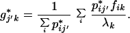
We provide here a concise summary of the technique (see refs. 15 and 16 for a thorough exposition). An informal intuitive description will be given below. The aim is to embed both rows (genes) and columns (hybridizations) of a matrix in the same space, the first two or three coordinates of which contain the bulk of the information. Let I genes and J hybridizations be collected into the I × J matrix N with elements nij. Let ni+ and n+j denote the sum of the ith row and jth column, respectively. By n++, we denote the grand total of N. The mass of the jth column is defined as cj = n+j/n++, and likewise the mass of the ith row is ri = ni+/n++. The basis for the calculation is the correspondence matrix P with elements pij = nij/n++, from which the matrix S with elements sij = (pij − ricj)/ is derived. S is submitted to singular value decomposition (18), i.e., it is decomposed into the product of three matrices: S = UΛVT. Λ is a diagonal matrix, and its diagonal elements are referred to as the singular values of S. We think of them as sorted from the largest to the smallest and denote them by λk. The coordinates for gene i in the new space are then given by fik = λkuik/
 , for k = 1,..., J. Hybridizations are viewed in the same space with hybridization j given coordinates gjk = λkvjk/
 , for k = 1,..., J. These coordinates are called principal coordinates.
To reduce dimensionality, only the first two or three coordinates of the new space are plotted. The loss of information associated with this dimension reduction is quantified in terms of the proportion of the so-called total inertia ∑k λ that is explained by the axis displayed. Total inertia is proportional to the value of the χ2 statistic, and thus the amount of information represented in, e.g., a planar embedding (λ
 + λ
+ λ )/∑k λ
 , corresponds to the proportion of the χ2 statistic explained by the embedding.
Standard Coordinates as an Aid in Visualization.
Correspondence analysis attempts to separate dissimilar objects (genes or hybridizations) from each other; similar objects are clustered together resulting in small distances. In contrast, the distance between a gene and a hybridization cannot be directly interpreted. For visualization of between-variable association in the plot, one includes virtual genes that have all their intensity focused in one hybridization (16). The coordinates of such a gene are called standard coordinates of the hybridization where this gene is expressed. Likewise, one could introduce standard coordinates for genes. The standard coordinates for the genes are computed as uik/ and for the hybridizations as νjk/
 . In practice, the spread of the set of real genes and hybridizations is much smaller than the spread introduced when including those virtual genes and hybridizations via their standard coordinates. As a consequence, the real points would shrink to a tiny area, so we rather depict the direction from the centroid of the data to the standard coordinates instead of the standard coordinates themselves.
Medians and Replicate Hybridizations in CA.
Typically, replicate hybridizations are performed for each condition under study, leading to several values for one gene/condition pair. The number of such repeated hybridizations is often small. We therefore represent these values by their gene-wise median rather than their gene-wise average, because the median is less sensitive to outliers. The need remains, though, to visualize also the original data and not only the median, because they contain valuable information about experimental variance and quality of individual hybridizations. In fact, CA offers the possibility to reflect both aspects. To this end, CA is first effected by using the gene-wise medians, determining the coordinate system to embed the original hybridization intensities. These data points are then referred to as supplementary points or points without mass. Thus the share of noise belonging to an experimental condition is shown by the spread of its hybridizations around the median. As the dimensions of the data are reduced by using medians of hybridizations per experimental condition, we refer to this strategy as hybridization-median-determined scaling (HMS).
The embedding for hybridizations without mass is computed as follows. Let the matrix N contain only the hybridization medians and let N* of elements n*ij′ be the original data matrix containing all of the hybridizations. N is submitted to correspondence analysis. Let P* have elements p*ij′ = n*ij′/n*++. The principal coordinates for the supplementary hybridizations from correspondence matrix P* are then calculated as
 |
In our own data sets, a single hybridization consists of two corresponding spot sets, because each cDNA had been spotted twice on the array. We call these spot sets primary and secondary spots. They tend to show a higher correlation than hybridizations belonging to the same experimental condition. When plotted separately (duplicating the number of supplementary points), they provide an atomic unit of distance in the biplot, where no units are assigned to the axes.
Interpretation of a Correspondence Analysis Biplot.
Correspondence analysis was originally developed for contingency tables and is intimately connected with the χ2 test for homogeneity in a contingency table. The value of the underlying χ2 statistic is high when there is an association between rows and columns of the table. In CA, points are depicted such that the sum of the distances of the points to their centroid (called “total inertia”) is proportional to the value of the χ2 statistic of the data table. The farther away a point is from the centroid, the higher is its row's contribution to the value of the statistic. In this sense, CA decomposes the overall χ2 statistic. Distances among points are not meant to approximate Euclidean distances but rather the so-called χ2 distance. This distance is low when the profiles of two vectors show similar shape, independent of their absolute values.
Together with the row-points, correspondence analysis displays points representing columns and does so by using the same χ2 criterion. This criterion also establishes the link between row and column points. If a column determines an outstanding entry of a row (and vice versa), then the corresponding row and column points tend to lie on a common line through the centroid. For a positive association like up-regulation of a gene in a particular condition, the two points will lie on the same side of the centroid, with the distance to it larger, the stronger the association. A negative association like down-regulation will cause the column-point and the row-point to lie on opposite sides of the centroid. To properly visualize associations between rows and columns, we will introduce virtual genes that are fully concentrated on one condition. They thus serve as representatives of the hybridizations in gene-space (see standard coordinates above).
Results
Spellman et al. Cell-Cycle Data.
To introduce the method, we show its performance on a well known data set before proceeding to own data. The analyzed data set comprises the hybridizations referred to by Spellman et al. (12), which are publicly available (http://genome-www.stanford.edu/cellcycle/data/rawdata/combined.txt). Spellman et al. arrested the S. cerevisiae cell cycle by four different methods, namely α factor-, CDC15-, and CDC28-based blocking and elutriation. Here and in the legend to Fig. 1, we will refer to these four methods as “alpha,” “cdc15,” “cdc28,” and “elu,” respectively. At certain timepoints after releasing the block, samples from each of the methods had been drawn and their cell-cycle phase had been classified and the transcriptional status assayed by microarray hybridization.
Figure 1.

Cell-cycle synchronization data by Spellman et al. (12). The data set composed of 800 cell-cycle-associated genes has been projected by CA as is. No HMS has been used so as not to bias the resulting plot in terms of separation of the cell-cycle phases. The outlying hybridizations have been identified to be caused by a slight phase shift of the cdc15-based synchronization visible in b Upper Right, which shows the profiles of the nine histone genes HHF1, HHF2, HHT1, HTB2, HHT2, HTB1, HTA1, HTA2, and HHO1, encircled in black in a. Additional explanation is given in the text.
The data consist of two-channel fluorescence signals. Following the original authors, we based our analysis on the logarithmic ratio of the intensities of the two channels. To make the data analyzable by CA, the data were additively shifted to a positive range. In our analysis, we gave mass to all hybridizations instead of applying HMS. The standard coordinates of the hybridization medians, on the other hand, have been computed “without mass” and are depicted as lines emanating from the centroid. We analyzed the 800 cell-cycle associated genes depicted in Fig. 1a in ref. 12 over all 73 hybridizations. Hybridizations are colored according to their phase assignment and following the color code of Fig. 1a in ref. 12 to allow for direct comparison.
The planar embedding produced by CA (Fig. 1a) shows the hybridizations clearly separated according to their cell-cycle phase. They are arranged in circular order of correct sequence. The lines denoting the direction of the hybridization medians emphasize this arrangement. The black dots correspond to genes. Genes that show strong expression in a certain phase are located in the direction determined by the hybridizations of this phase. The farther away from the center, the more pronounced is the association of the genes with that phase. Genes that are down-regulated in this phase appear on the opposite site of the centroid. As an example of strong association with the S-phase, the gene profiles for the histone gene cluster, also marked by Spellman et al. (12), have been encircled in black. Their profiles are shown in Fig. 1b, which is further subdivided according to the method of cell-cycle arrest that had been used. The red-encircled genes will be discussed in the following section in the context of CDC14 induction. Genes equally transcribed in most or all of the cell-cycle states had been removed by Spellman et al., causing a hole near the centroid of the CA plot where otherwise genes would lie that show little change.
On close inspection, the biplot reveals interesting details about the data. Notice that hybridization cdc15_30 (cdc15-based blocking, 30-min timepoint) classified as M/G1 (yellow) lies in the green (classified G1) sector rather than in the yellow one. Likewise, hybridization cdc15_70 is classified G1 but clusters together with the blue dots (S-phase), and one S-phase hybridization, cdc15_80, lies in the red sector of G2 hybridizations. All these outliers come from the series of hybridizations where cell-cycle arrest was achieved by using CDC15-based blocking. This arrangement of cdc15 hybridizations suggests an improper phase classification for these samples.
This hypothesis can be validated on the basis of the gene profiles. For the histones, the shift toward an earlier stage in cell cycle is visible in the Fig. 1b Upper Right. Timepoints cdc15_30 to cdc15_90 show the up-regulation of the histones already at the end of M/G1 (yellow) instead of G1 (green), as well as too early down-regulation: the curves intersect the zero line (identity to the control channel) at cdc15_90, classified as G2 (red) instead of M (brown), as, e.g., in the elutriation experiment. The nine histones are only a small subset of the 800 cell-cycle-regulated genes. Profiles of other genes, although different from the ones plotted, also display shifting of the above timepoints to expression patterns associated to an earlier state in cell cycle by the remaining timepoints (data not shown). CA computes the projection for timepoints cdc15_30 to cdc15_90 according to their expression patterns in the entirety of the geneset, independent of their phase classification. Fig. 1a displays them displaced in clockwise shift compared with equally colored squares, that is, in positions inconsistent with their cell-cycle state classification.
Overexpression of CDC14.
Instead of following the cell cycle through S-phase, G2, mitosis, and G1, in this experiment, we focus on the transition from mitosis to G1. In late mitosis, mitotic cyclin-dependent protein kinases have to be inactivated to exit mitosis. Cdc14p plays a major role in this transition to G1, being a dual specific phosphatase. In our approach, cells were arrested in mitotic metaphase, and CDC14 was overexpressed by inducing the controlling GAL1 promoter. Thus, one cannot directly observe the effect of CDC14 overexpression, because it will be overlaid with gene expression changes because of the presence of galactose. To subtract for these effects, WT and mutant strain were grown under repressing and inducing conditions, leading to four samples that were subjected to array hybridization: WT without galactose, WT with galactose, transgenic yeast without galactose (no induction of CDC14), and transgenic yeast with galactose.
The data, consisting of three to four hybridizations per condition, were normalized. Genes (1,400 of 6,100) were extracted for being reproducibly differential from the control condition (WT strain without induction) in at least one of the other conditions. Measurement noise was further reduced by HMS. Planar embedding by HMS (Fig. 2) explains 80.8% of the total inertia, compared with 52.5% in case of embedding all of the hybridizations separately (not shown). Hybridization medians are represented both in principal coordinates and as lines to their standard coordinates. The actual hybridizations, each separated into primary and secondary spot set, are drawn as supplementary points. They are represented only in principal coordinates, as are the genes.
Figure 2.

Overexpression of Cdc14p. In arrested yeast cultures, Cdc14p expression was induced under control of the GAL1 promoter and investigated in comparison to uninduced transgenic, uninduced WT, and inductor-exposed WT cells. Three to four hybridizations have been performed for each experimental condition. Both spot sets of the array are drawn separately for each hybridization, primary, and secondary spot set depicted in light and dark colors, respectively. The conditions are colored, and their hybridization medians are marked according to the legend in the Upper Right corner. Lines are drawn in the direction of the standard coordinates of the condition medians in appropriate colors: genes like GAL7 and GAL1 are associated with both the WT and the transgenic strain grown in the presence of galactose to an equal share. CDC14 is associated with the induced transgenic strain only.
The biplot displayed in Fig. 2 clearly shows four directions corresponding to the four conditions. Genes in the direction of galactose induced transgenic yeast are those specifically up-regulated on CDC14 induction, as opposed to genes activated by galactose also in the WT strain, like GAL1 and GAL7. This subtraction has been achieved purely computationally and is based on the provision of galactose activated genes in WT as a separate condition. The set of genes associated specifically to the Cdc14p overproducing condition comprises CDC14 itself as well as SIC1, known to be accumulated in a Cdc14p-dependent fashion (18), and CTS1, which belongs to the cluster of SIC1 coregulated genes (12). RME1, CRH1, and PST1 are known to be cell-cycle regulated with peaks in mitosis/G1 transition, G1, or late G1, respectively, but have not yet been described in association with Cdc14p activity. YBR071W, PIR1, YGR086C, YLR194C, and YFL006W have not been annotated to be cell cycle regulated, but our results show that they are. This is in agreement with the data of Spellman et al. (12) (see Fig. 1, genes marked by red circles), who also show these genes to be transcribed during mitosis/G1 transition. The role of the nuclear pore protein GLE2 in a Cdc14p activation context remains unclear.
Discussion
Traditionally, correspondence analysis has been used prevalently on categorical data in the social sciences (19, 20), but its application has been extended also to (positive) physical quantities (15) and to proteomics (21, 22). We have shown that CA applied to microarray data provides an informative and concise means of visualizing these data, being capable of uncovering relationships both among either genes or hybridizations and between genes and hybridizations. In our hands, the method turned out to be generally applicable to microarray data, regardless of whether they have been obtained by radioactive labeling or by two-channel fluorescent-tag labeling. Normalization procedures lead to intensity values that can be interpreted as being proportional to a cell's content of mRNA molecules per gene and per condition. For two-channel intensities, the log ratios of red vs. green channel appear to work just as well.
Visualization by using CA is based on representing χ2 distance among genes and among hybridizations, thus representing a decomposition of the value of the χ2 statistic. Emphasis is placed on the genes and hybridizations that contribute to this value through their association. In this respect, it resembles the doubly sorted hierarchical clusterings (23), although our examples demonstrate that CA is capable of revealing intricate detail, e.g., subtle discrepancies between phase classification and transcription pattern of hybridizations. Moreover, CA is capable of subtracting particular effects, like the influence of galactose in the medium. The emphasis on association between genes and hybridizations distinguishes CA from other embedding methods, like principal component analysis or multidimensional scaling, although these methods share the idea of representing objects in a two- or three-dimensional space that can be visualized. Although CA and PCA use the same mathematical machinery for dimension reduction and visualization, namely singular value decomposition, their difference stems from the different distances used.
Alter et al. (11) successfully applied singular value decomposition to the analysis of the same data set that we used as our first example. Their approach is based on selecting from the “eigengenes” (i.e., their expression profiles over a time course), which have been obtained by singular value decomposition, those that fit a model wave function representing the typical behavior of a cell-cycle-regulated gene. We assumed the knowledge of cell-cycle-regulated genes as our starting point and showed how CA displays the associations between genes and cell-cycle phases and identified shifts in the phase assignment of particular hybridizations. In our plots, the distance of a given gene from the centroid represents the strength of its association with a hybridization lying in the same direction and vice versa. A direct comparison with phase and radius in the visualization of Alter et al. (11) (as given, e.g., at http://genome-www.stanford.edu/SVD/PNAS/Datasets/Sort_Elutriation.txt) shows that this is not necessarily the case in the singular value decomposition alone. Moreover, CA does not depend on model assumptions, as demonstrated in our second example. There, genes have been identified, the transcripts of which are specifically up-regulated in an overexpressing mutant yeast strain that is induced by galactose, whereas they are at normal levels (or even nondetectable) in this mutant strain without galactose and likewise in WT, irrespective of the additive. Thus we find CA to be generally applicable to and particularly well-suited for gene expression data because of its capability of displaying simultaneously genes and hybridizations as well as the strength of their association.
Projection methods generally aim at explaining the major trends in the data while at the same time ignoring minor fluctuations. We have further enhanced this effect through the use of the condition medians. Our HMS technique furthermore allows the original data to be still visible in the plot, thus combining the noise reduction capability of HMS with the quality control aspect of retaining the original data. Along the same lines, the introduction of the lines representing the standard coordinates is of great help in the interpretation of the plots, relating genes and conditions to each other.
Moreover, CA is capable of simultaneous visualization of both continuous and categorical variables. We plan to include additional information like gene and experiment annotations. We are already storing such data in a form accessible to statistical analysis, and they could be integrated into extended analyses by multiple or joint CA.
Supplementary Material
Acknowledgments
We thank Wolfgang Seufert for critical discussions and Sonja Bastuck and Melanie Bier for excellent technical help. This work was supported by the German Science and Research Ministry (BMBF) as part of the German Human Genome Project and the ZIGIA Consortium, and by the European Commission under contracts BIO4-CT95–0080 and BIO4-CT97–2294.
Abbreviations
- CA
correspondence analysis
- HMS
hybridization-median-determined scaling
- PCA
principal component analysis
- WT
wild type
Footnotes
This paper was submitted directly (Track II) to the PNAS office.
References
- 1.Tavazoie S, Hughes J D, Campbell M J, Cho R J, Church G M. Nat Genet. 1999;22:281–285. doi: 10.1038/10343. [DOI] [PubMed] [Google Scholar]
- 2.Eisen M B, Spellman P T, Brown P O, Botstein D. Proc Natl Acad Sci USA. 1998;95:14863–14868. doi: 10.1073/pnas.95.25.14863. [DOI] [PMC free article] [PubMed] [Google Scholar]
- 3.Tamayo P, Slonim D, Mesirov J, Zhu Q, Kitareewan S, Dmitrovsky E, Lander E S, Golub T R. Proc Natl Acad Sci USA. 1999;96:2907–2912. doi: 10.1073/pnas.96.6.2907. [DOI] [PMC free article] [PubMed] [Google Scholar]
- 4.Fisher R A. Ann Eugen. 1936;7:179–188. [Google Scholar]
- 5.Brown M P, Grundy W N, Lin D, Cristianini N, Sugnet C W, Furey T S, Ares M J, Jr, Haussler D. Proc Natl Acad Sci USA. 2000;97:262–267. doi: 10.1073/pnas.97.1.262. [DOI] [PMC free article] [PubMed] [Google Scholar]
- 6.Breiman L, Friedman J H, Olshen R A, Stone C J. Classification and Regression Trees. Monterey, CA: Wadsworth and Brooks/Cole; 1984. [Google Scholar]
- 7.Dudoit S, Fridlyand J, Speed T P. Comparison of Discrimination Methods for the Classification of Tumors by Using Gene Expression Data. University of California, Berkeley, CA: Dept. of Statistics; 2000. , Technical Report 576. [Google Scholar]
- 8.Bittner M, Meltzer P, Chen Y, Jiang Y, Seftor E, Hendrix M, Radmacher M, Simon R, Yakhini Z, Ben-Dor A, et al. Nature (London) 2000;406:536–540. doi: 10.1038/35020115. [DOI] [PubMed] [Google Scholar]
- 9.Lefkovits I, Kuhn L, Valiron O, Merle A, Kettman J. Proc Natl Acad Sci USA. 1988;85:3565–3569. doi: 10.1073/pnas.85.10.3565. [DOI] [PMC free article] [PubMed] [Google Scholar]
- 10.Hilsenbeck S G, Friedrichs W E, Schiff R, O'Conell P, Hansen R K, Osborne C K, Fuqua S A W. J Natl Cancer Inst. 1999;91:453–459. doi: 10.1093/jnci/91.5.453. [DOI] [PubMed] [Google Scholar]
- 11.Alter O, Brown P O, Botstein D. Proc Natl Acad Sci USA. 2000;97:10101–10106. doi: 10.1073/pnas.97.18.10101. [DOI] [PMC free article] [PubMed] [Google Scholar]
- 12.Spellman P T, Sherlock G, Zhang M Q, Iyer V R, Anders K, Eisen M B, Brown P O, Botstein D, Futcher B. Mol Biol Cell. 1998;9:3273–3297. doi: 10.1091/mbc.9.12.3273. [DOI] [PMC free article] [PubMed] [Google Scholar]
- 13.Hauser N C, Vingron M, Scheideler M, Krems B, Hellmuth K, Entian K D, Hoheisel J D. Yeast. 1998;14:1209–1221. doi: 10.1002/(SICI)1097-0061(19980930)14:13<1209::AID-YEA311>3.0.CO;2-N. [DOI] [PubMed] [Google Scholar]
- 14.Beissbarth T, Fellenberg K, Brors B, Arribas-Prat R, Boer J M, Hauser N C, Scheideler M, Hoheisel J D, Schütz G, Poustka A, Vingron M. Bioinformatics. 2000;16:1014–1022. doi: 10.1093/bioinformatics/16.11.1014. [DOI] [PubMed] [Google Scholar]
- 15.Greenacre M J. Theory and Applications of Correspondence Analysis. 1st Ed. London: Academic; 1984. p. 223. [Google Scholar]
- 16.Greenacre M J. Correspondence Analysis in Practice. 1st Ed. London: Academic; 1993. pp. 181–183. [Google Scholar]
- 17.Golub G H, Reinsch C. Numer Math. 1970;14:403–420. [Google Scholar]
- 18.Morgan D O. Nat Cell Biol. 1999;1:E47–E53. doi: 10.1038/10039. [DOI] [PubMed] [Google Scholar]
- 19.Blasius J, Greenacre M J, editors. Visualization of Categorical Data. 1st Ed. London: Academic; 1998. [Google Scholar]
- 20.Greenacre M J, Blasius J, editors. Correspondence Analysis in the Social Sciences. 1st Ed. London: Academic; 1994. [Google Scholar]
- 21.Pun T, Hochstrasser D F, Appel R D, Funk M, Villars-Augsburger V, Pellegrini C. Appl Theor Electrophor. 1988;1:3–9. [PubMed] [Google Scholar]
- 22.Pleissner K-P, Reglitz-Zagrosek V, Krüdewagen B, Trenkner J, Hocher B, Fleck E. Electrophoresis. 1998;19:2043–2050. doi: 10.1002/elps.1150191124. [DOI] [PubMed] [Google Scholar]
- 23.Perou C M, Jeffrey S S, van de Rijn M, Rees C A, Eisen M B, Ross D T, Pergamenschikov A, Williams C F, Zhu S X, Lee J C F, et al. Proc Natl Acad Sci USA. 1999;96:9212–9217. doi: 10.1073/pnas.96.16.9212. [DOI] [PMC free article] [PubMed] [Google Scholar]
Associated Data
This section collects any data citations, data availability statements, or supplementary materials included in this article.