

Abstract
Summary
In translational research, efficient knowledge exchange between the different fields of expertise is crucial. An open platform that is capable of storing a multitude of data types such as clinical, pre-clinical or OMICS data combined with strong visual analytical capabilities will significantly accelerate the scientific progress by making data more accessible and hypothesis generation easier. The open data warehouse tranSMART is capable of storing a variety of data types and has a growing user community including both academic institutions and pharmaceutical companies. tranSMART, however, currently lacks interactive and dynamic visual analytics and does not permit any post-processing interaction or exploration. For this reason, we developed SmartR, a plugin for tranSMART, that equips the platform not only with several dynamic visual analytical workflows, but also provides its own framework for the addition of new custom workflows. Modern web technologies such as D3.js or AngularJS were used to build a set of standard visualizations that were heavily improved with dynamic elements.
Availability and Implementation
The source code is licensed under the Apache 2.0 License and is freely available on GitHub: https://github.com/transmart/SmartR.
Supplementary information
Supplementary data are available at Bioinformatics online.
1 Introduction
Translational research can be described as an ‘interdisciplinary branch of the biomedical field supported by three main pillars: benchside, bedside and community’ (Cohrs et al., 2015). One of the most difficult, yet most important, tasks in this field is the proper communication and knowledge exchange between the different fields of expertise. An information system that integrates all level of data (pre-clinical, clinical, OMICS, etc.) generated in research and that provides an interactive interface to explore, visualize and analyze those data will substantially increase the efficiency of knowledge exchange and hypothesis generation.
In the context of the eTRIKS (European Translational Information & Knowledge Management Services) consortium (https://www.etriks.org/, 2017) academia and pharma seek to combine their interdisciplinary knowledge to provide secure data environments and open source tools that help to answer important biological questions and enable the discovery of new scientific facts within existing studies. The tranSMART platform (Athey et al., 2013) addresses these requirements, supports a multitude of data types, has a well-established community and provides APIs, that make connections with a variety of other services possible. Detailed reasons for this choice and comparisons to other existing analytics platforms are described elsewhere (Satagopam et al., 2016). A major problem currently present in tranSMART is the lack of interactive visual-analytical functionality, which is essential for a collaborative knowledge management platform. In the present state, analytical workflows are restricted to the displaying of static images generated by the statistical programming language R. The static nature of this approach makes it very difficult to apply any post-processing analysis or to do further exploration, such as selecting a certain feature for further investigation. When confronted with this problem, one might first attempt to use existing web-visualization libraries like Highcharts (http://www.highcharts.com/, 2017), Plotly.js (Plotly Technologies Inc., 2015), or one of many BioJS (Gómez et al., 2013) components. Browsing existing heat map implementations or other basic visualizations, one can see that, although visually appealing, they lack deep integration of more than the most basic statistics. Because of the analytical limitations of the web-browser and the missing analytical engine, they cannot re-compute initial input values and therefore often chose not to display many statistics in the first place to preserve their dynamism. Another approach is to combine custom visualizations with an analytical engine as shown in DIVE (Rysavy et al., 2014), BRAVIZ (Angulo et al. 2016), HitWalker2 (Bottomly et al., 2015), or Shiny (https://shiny.rstudio.com/, 2017).
Using custom visualizations with a supporting analysis component enables the researcher to iteratively explore the data with each analysis step, in contrast to hypothesis-driven research. To make this methodology available for translational researchers, we developed SmartR, a new, highly modular, analytical framework for tranSMART, that equips the platform with interactive and dynamic visualization capabilities, built using recent web technologies.
2 Materials and methods
The tranSMART platform uses Grails (https://grails.org/, 2017) as a web-framework, which provides a plugin architecture of its own. Therefore, it was a natural choice to use Grails for the back-end of our plugin as well. This has the benefit of having direct access to internal services and APIs to ensure consistent database access across the different Oracle and Postgres versions of the platform, which helps to keep maintenance low.
To support the user graphics with non-trivial statistics, for instance clustering information, it was necessary to properly integrate a language for statistical computation, such as R (R Development Core Team, 2011), into Grails. Because Grails uses Groovy, which integrates well with most standard Java libraries, we could use the Java client for Rserve, ‘a TCP/IP server which allows other programs to use facilities of R’ (Urbanek, 2003). In other words, this allows direct read and write access with respect to the RSession via the back-end of our application.
As a base for the front-end, we decided to use the framework AngularJS (https://angularjs.org/, 2017) to enforce a MVC (Model-View-Controller) structure for each workflow. Besides the usual advantages with regard to maintenance and testability, the enforcement of a specific workflow structure helps to keep a similar structure to each workflow, even with multiple contributing developers with different levels of experience. This was a high priority goal from the outset, because it would allow the formation of a small community, which could contribute their own ideas and requirements to the plugin. Another reason for building upon an almost completely decoupled framework, rather than integrating SmartR directly into tranSMART, are the regular changes of the platform’s code base and the long list of partially outdated dependencies.
The visualizations are implemented as AngularJS directives, which enables arbitrary placement of the plots in HTML. Technically, most JavaScript visualization libraries can be used within such a directive, but we focused on the low-level library D3.js, ‘a JavaScript library for manipulating documents based on data’ (Bostock et al., 2011). While the coding effort to create even basic visualizations is quite high, D3.js gives a high level of freedom for customization and creativity to the developer. This allowed us to implement features which we found useful that were not provided by other visualization libraries. An example for this is the dynamic heat map that we created.
3 Results
The framework itself equips the tranSMART platform with a new analytical engine that is testable, maintainable, and expandable. We also provide a series of prebuilt, commonly used visual-analytical workflows. In the following, we will focus on one of these workflows, namely the interactive heat map, as an example to illustrate the interactive and dynamic nature of the platform. Videos, screenshots and links to public test servers for all created visual analytics can be found in the Supplementary Material.
Since several decades, heat maps are a common tool for analyzing gene expression data, but displaying non-static heat maps with the limited resources of a web-browser is a challenge. The SmartR heat map provides a solution by implementing a lazy-loading approach, where initially only the 100 most significant genes according to user defined ranking criteria are displayed. This reduction of displayed data lets us treat the single fields of the heat map as movable dynamic elements, rather than a static image. Doing so leads to several useful features, such as the possibility to change the clustering on-the-fly, select various color sets for different data types and accessibility (color blindness), or to sort rows and columns of the heat map. Another feature is the possibility to ‘expand’ the heat map by overlaying non-array, one-dimensional data types (see Fig. 1), e.g. phenotypic data like ‘Age’ (numerical) or ‘Tumor Type—T0’ (categorical). In this way one can directly relate clusters or single samples to certain user defined groups within the selected cohort(s), leading to a much better understanding of the data across different data types. All displayed genes can be directly linked to external annotation databases like Gene Cards and the EMBL-EBI database. This function allows the user to link the findings to much broader knowledge bases with a single click. Similar functionality is revealed when we apply a clustering to the heat map and click on one of the resulting dendrogram nodes. This will gather all genes in the respective sub-tree and trigger a KEGG pathway enrichment analysis via external tools like BioCompendium (http://biocompendium.embl.de/, 2017). This allows us to link a cluster directly to a possibly related KEGG pathway. Besides the interactive heat map, we have also provided a few other commonly used analyses like correlation analysis, where the user can select regions on the correlation plot and get updated analysis instantly, box plots, volcano plots, and line graphs for visualizing longitudinal-like data. We could not exhaust all possible analyses during our implementation but we would like to emphasis that SmartR not only provides a list of pre-built analyses but also provides a framework for easy implementation of customized workflows. To truly grasp the dynamic nature of this approach, we highly recommend watching the related videos available in the Supplementary Material.
Fig. 1.
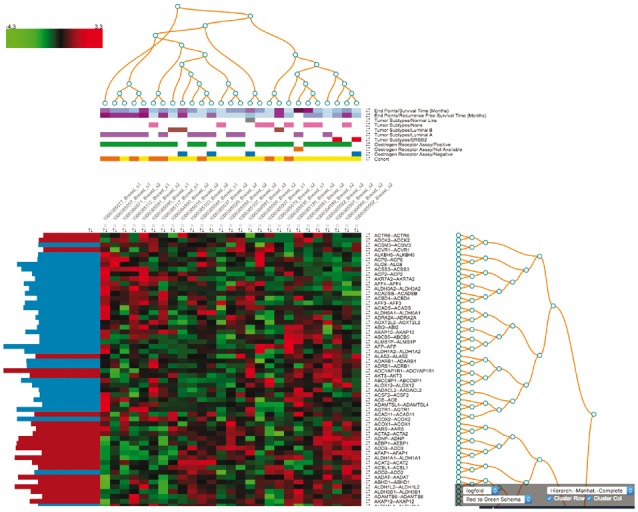
The SmartR Heat Map. Seen is the interactive heat map in tranSMART based on the breast cancer mRNA data of the GEO study GSE4382 (Sorlie et al., 2003)
Supplementary Material
Acknowledgements
The authors would like to thank Florian Guitton (ICL), Axel Oehmichen (ICL), The Hyve team, Manfred Hendlich (Sanofi), Heike Schuermann (Sanofi), Rogerio Martins (Sanofi) and Annick Peleraux (Sanofi) for their help and support.
Funding
The eTRIKS consortium receives funding from the European Union and from the European Federation of Pharmaceutical Industries and Associations as an IMI JU funded project (no.). 115446.
Conflict of Interest: none declared.
References
- Angulo D.A. et al. (2016) A multi-facetted visual analytics tool for exploratory analysis of human brain and function datasets. Front Neuroinform., 10, 36. [DOI] [PMC free article] [PubMed] [Google Scholar]
- Athey B.D. et al. (2013) tranSMART: an open source and community-driven informatics and data sharing platform for clinical and translational research. AMIA Jt Summits Transl. Sci. Proc., 2013, 6–8. [PMC free article] [PubMed] [Google Scholar]
- Bostock M. et al. (2011) D³ data-driven documents. IEEE Trans. Vis. Comput. Graph., 17, 2301–2309. [DOI] [PubMed] [Google Scholar]
- Bottomly D. et al. (2016) HitWalker2: visual analytics for precision medicine and beyond. Bioinformatics, 32, 1253–1255. [DOI] [PMC free article] [PubMed] [Google Scholar]
- Cohrs R.J. et al. (2015) Translational Medicine definition by the European Society for Translational Medicine. Nhtm, 2, 86–88. [Google Scholar]
- Gómez J. et al. (2013) BioJS: an open source JavaScript framework for biological data visualization. Bioinformatics, 29, 1103–1104 [DOI] [PMC free article] [PubMed] [Google Scholar]
- Plotly Technologies Inc. Collaborative Data Science. Montréal, QC, 2015. [Google Scholar]
- R Development Core Team (2011) R: A Language and Environment for Statistical Computing. Vienna, Austria: the R Foundation for Statistical Computing. ISBN: 3-900051-07-0. [Google Scholar]
- Rysavy S.J. et al. (2014) DIVE: A graph-based visual-analytics framework for big data. IEEE Comput. Graph. Appl. Mag., 34, 26–37. [DOI] [PMC free article] [PubMed] [Google Scholar]
- Satagopam V. et al. (2016) Integration and visualization of translational medicine data for better understanding of human diseases. Big Data, 4, 97–108. [DOI] [PMC free article] [PubMed] [Google Scholar]
- Sorlie T. et al. (2003) Repeated observation of breast tumor subtypes in independent gene expression data sets. Proc. Natl. Acad. Sci. USA., 100, 8418–23. [DOI] [PMC free article] [PubMed] [Google Scholar]
- Urbanek S. (2003) Rserve: a fast way to provide R functionality to applications In: Hornik F.L.K., Zeileis A. (Eds.) Proceedings of the 3rd International Workshop on Distributed Statistical Computing (DSC 2003), Vienna, Austria, pp. 20–22. [Google Scholar]
Associated Data
This section collects any data citations, data availability statements, or supplementary materials included in this article.