Abstract
In response to the ubiquitous graphs and maps of COVID-19, artists, designers, data scientists, and public health officials are teaming up to create counter-plots and subaltern maps of the pandemic. In this intervention, we describe the various functions served by these projects. First, they offer tutorials and tools for both dataviz practitioners and their publics to encourage critical thinking about how COVID-19 data is sourced and modeled—and to consider which subjects are not interpellated in those data sets, and why not. Second, they demonstrate how the pandemic’s spatial logics inscribe themselves in our immediate material landscapes. And third, they remind us of our capacity to personalize and participate in the creation of meaningful COVID visualizations—many of which represent other scales and dimensions of the pandemic, especially the quarantine quotidian. Together, the official maps and counter-plots acknowledge that the pandemic plays out differently across different scales: COVID-19 is about global supply chains and infection counts and TV ratings for presidential press conferences, but it is also about local dynamics and neighborhood mutual aid networks and personal geographies of mitigation and care.
Keywords: Counter-mapping, data visualization, embodiment
This article is a part of special theme on Viral Data. To see a full list of all articles in this special theme, please click here: https://journals.sagepub.com/page/bds/collections/viraldata
The pervasive yet evasive nature of a pandemic—the widespread destruction of bodies and economies wrought by an invisible, submicroscopic agent—has inspired many attempts to visualize its presence and to track its spread for the purposes of containment. John Snow’s map of London’s 1854 cholera outbreak, celebrated as a breakthrough in epidemiological cartography, has itself gone viral, inspiring a host of visualizations and maps of COVID-19 (Hempel, 2018; Johnson, 2007; Koch, 2017). Research centers and data scientists have launched dashboards and observatories (Danielson, 2020; Patel, 2020). The widespread availability of consumer-friendly mapping platforms and open data repositories has equipped cartographers and information designers to plot their own charts and graphs—some of which then circulate on social media or appear on slide shows at official public health briefings (Bazzaz, 2020; Mattern, 2020a; “Triplet Kids,” 2020). Meanwhile, data journalists have sought to break through the columnar layout of the printed page, or to exploit the interactive affordances of the screen, to reveal data in their dynamism, projecting future global epidemiological scenarios and spotlighting hyper-local impacts (Campolo, 2020; Flowing Data, 2020; Heller, 2020).
As media scholar Alexander Campolo writes: “It is both understandable and desirable that expert modelers have worked quickly to produce simulations. …However, there is also danger in the uncritical circulation of decontextualized visualizations or headline statistics.” One particular danger is that these visualizations “interpellate subjects as data points,” driving individual behavior and shaping policy, scripting our present understandings, and modeling future norms. The map becomes the territory; the projection incites a course of action that can lead to its own realization.
In response to these ubiquitous graphics, so often reflexively reified and retweeted, artists, designers, data scientists, and public health officials are teaming up to create counterplots and subaltern maps. They are providing tutorials and tools to both dataviz practitioners and their publics to encourage everyone to think more critically about how COVID-19 data is sourced and modeled and even manipulated—and to consider which subjects are not interpellated in those data sets, and why not (Taylor, 2020). These projects also remind human subjects that they are more than mere data points. People have the capacity to personalize and participate in the creation of meaningful COVID visualizations—many of which represent other scales and dimensions of the pandemic, especially the quarantine quotidian. COVID’s counter-mappers prompt their publics, whose attention is often trained on “flattening the curve,” to also look behind or under the curve, to critically assess the making of COVID-19 visualizations, and to plot curves and charts and maps of their own. Together, the official maps and counter-plots acknowledge that the pandemic plays out differently across different scales: COVID-19 is about global supply chains and infection counts and TV ratings for presidential press conferences, but it is also about local dynamics and neighborhood mutual aid networks and personal geographies of mitigation and care.
Pandemic data practice
COVID-19 presents a state of global emergency where new data are being released at an almost hourly rate, and more people than ever have access to the raw data themselves (Johns Hopkins Coronavirus Resource Center, 2020; The COVID Tracking Project, 2020a). This greater accessibility and public data consciousness (thanks to the rise of sites like FiveThirtyEight and scholarship in critical data studies) imply a simultaneous need for a Jedi Code of sorts: rather than reifying the final graphics, we must question where our data come from and how they can be analyzed and represented (D’Ignazio and Klein, 2020; Loukissas, 2019; Noble, 2018).
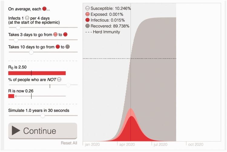
With COVID-19 data and the veritable flood of graphics being produced, we have a chance to strengthen our collective data literacy. By understanding the origins of epidemiological data and reinforcing the importance of context and non-quantitative forms of data, we can push for a richer, more diverse discourse through data visualization. A variety of tools help readers and viewers understand how to read COVID data visualizations, and what goes into making one. Nightingale: The Journal of the Data Visualization Society published “COVID-19 Data Literacy Is for Everyone,” a webcomic that helps readers ask questions about “data’s back story” and better understand graphical representation by highlighting perspectives of professionals (Alberda et al., 2020; see also Bronner et al., 2020b). Nicky Case and Marcel Salathé’s (2020) COVID data simulations, illustrated in Figure 1, explain the mechanics of epidemiological models and their impact on future COVID-19-related policy through interactive charts.
Figure 1.
An interactive graph from “What Happens Next?” allows readers to set parameters and see the impact on COVID-19 infection rates.
Source: reproduced with permission from Case and Salathé (2020).
“Why It’s So Freaking Hard to Make a Good COVID-19 Model” explains the variables and uncertainty embedded within any existing mathematical model due to differences in data entry, testing, and demographics (Bronner et al., 2020a). There is also a great deal of “map critique” in mainstream media, where pundits debate the virtues of various renderings and designers demonstrate alternatives. One can learn through Twitterthreads about the important differences between showing absolute and relative counts on a map, the challenges of making exponential growth legible to the public, and the importance of keeping published COVID-19 maps and data up to date (Paschal, 2020; Peck, 2020).
But the data professionals need to think critically about these same things, too. Feminist data practices and critical data and design studies remind practitioners of the importance of considering how data create subjectivities for the people they represent and how they empower or disempower those subjects, as well as related ethical and political issues (Costanza-Chock, 2020; D’Ignazio and Klein, 2020; Loukissas, 2019). Pairing epidemiologists and healthcare organizations with data professionals, as the Data Visualization Society’s COVID-19 matchmaking project does, offers a model for thinking about how technical skills can be used in ways that are most relevant and context-aware (Data Visualization Society, 2020). And those contextual cues might call for “not publishing your visualizations in the public domain at all,” Amanda Makulec argues (2020). Instead of making a map or a chart, technologists could use their skills to make the data more accessible. One example of this is the Accessible COVID Statistics project, which uses machine-readable HTML to make COVID-19 data intelligible to screen readers (Littlefield, 2020).
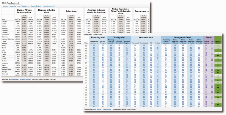
Making available datasets more inclusive also means working to better understand how different populations are affected by their representation (or lack thereof) in the data themselves. Making known the limits of our data, especially in its collection, can help uncover the ways they exclude important narratives (Onuoha, 2016). Such critical reflexivity has long been recommended as best practice, but the pandemic has reinforced the importance of asking questions about our ability to disaggregate data by slicing them into segments by race, age, sex, etc. It is impossible to report data for COVID by race, for example, if the source data shows only raw counts by zip code, which is often the case. This is why the work being done by Data for Black Lives and the COVID Racial Data Tracker (see Figure 2) to collect confirmed COVID case data by race is vitally important (Data for Black Lives, 2020; The COVID Tracking Project, 2020b). It is in prioritizing these types of disaggregation practices that we start to understand more clearly the different empirical, trackable, datafiable realities that exist in the face of this virus (see also Kendi, 2020; The Urban Systems Lab, 2020).
Figure 2.
The COVID Racial Data Tracker includes a dashboard showing daily case statistics by race for all states. Additionally, the project has created a table that shows the performance of all states across a variety of data reporting measures and assigns a grade to each state.
Source: reproduced with permission from The COVID Tracking Project (2020b).
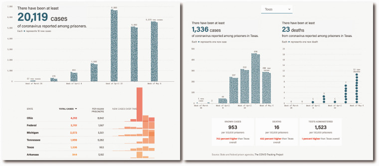
Similarly, more focused studies of singular locations help to unmask the ways that the spread of the virus concentrates in places like homeless shelters, meatpacking plants, detention centers, and prisons (Ellis, 2020; Food Environment Reporting Network, 2020; Molteni, 2020; Stewart, 2020; Trovall, 2020; Ura, 2020). Projects like COVID-19 Behind Bars push us to ask questions about the ways that using a single number to represent a geography such as a city, state, or country obfuscates variability within that area, hiding “hot spots” that push up the overall numbers (UCLA School of Law, 2020). As Figure 3 shows, The Marshall Project’s (2020) Coronavirus in Prisons visualizes the continually-updated data and allows a reader to filter by state to contextualize the numbers of cases, deaths, and tests in a particular prison system compared to the state’s broader population. Continued progress in visualizing the effects of the pandemic requires that we rely not just on “objective” data, but that we also pay attention to its spatial granularity, and to the environments that give context to those data.
Figure 3.
These screenshots from “A State-by-State Look at Coronavirus in Prisons” show the visualizations used to track COVID-19 cases reported among prison populations in the United States, broken out over time and by state. Additionally, the project allows a reader to filter results to a single state and show counts of absolute number of cases and deaths, as well as a comparison of case and death rates to the entire state’s population.
Source: reproduced with permission from The Marshall Project (2020).
Indexical landscapes
Designers and artists and media-makers have also helped us recognize how our everyday environments are themselves indexing COVID’s presence. The pandemic has rendered itself visible, audible, and tangible in our material landscapes, transforming those spaces themselves into environmental data. We just have to train ourselves how to look and listen, diagnostically and forensically, both locally and at a distance (McCullough, 2013; Weizman, 2017). Shelter-in-place orders around the globe have orchestrated a new acoustic universe, and several projects—including Cities and Memory’s global #StayHomeSounds map and Daniel Drew’s “Quarantine Supercut” collaboration with The Creative Independent and Kickstarter—capture the sounds of quarantine’s boredom and domesticity, its impatience and absurdity, its isolation and fear, and intimate sociality (Mattern 2020b; Quarantine Supercut, 2020; #StayHomeSounds, 2020). In Drew’s piece, stitched together from roughly 300 international submissions, we hear coughs and distant church bells and public address announcements reminding folks to wear face masks out of doors (see also Nakagawa, 2020). The hushed city has made it easier for people to hear their avian neighbors, so creative technologist Jer Thorp drew on an open bird sound database to make a quarantine game, Birb, that allows users to practice their birdsong identifications (Birb, 2020; Greene, 2020; Thorp, 2020; Xeno-Canto, n.d.). Meanwhile, the New York Public Library and Mother New York’s “Missing Sounds of New York” compilation reminds listeners of the city spots that are temporarily on mute, but are waiting for them in the post-pandemic world: places like music clubs, crowded parks, and baseball games (NYPL Staff, 2020). All of these projects allow listeners to hear their convalescing cities from a distance, through aggregated data sets.
Photographs, too, function as passive data visualizations in revealing how the virus reshapes spatial orders. Drone images show caskets of unclaimed COVID victims lined up for burial in the potter’s field on New York City’s Hart Island (Rosen, 2020). We see how the virus’s violence inscribes itself into the landscape. In San Antonio, TX, aerial photographs capture rows of cars lined up to claim emergency aid from the city’s food bank (Orsborn et al., 2020). In the Washington Post, stitched-together street view images and interior photographs reveal the effect of unemployment on a single block of Connecticut Avenue, a stretch densely populated with small businesses (Pecanha, 2020). Here, photojournalism doubles as cartography and serves to localize and humanize the Bureau of Labor Statistics’ line graphs of unemployment. Abstracted graphs and human narratives converge in a widely circulated stock photograph that shows laborers eating their lunch at a car factory in Wuhan, China. Clad in a grey uniform, perched atop a bright-red stool, each body inhabits a node within a vast, anonymizing grid of social distance (Juo, 2020).
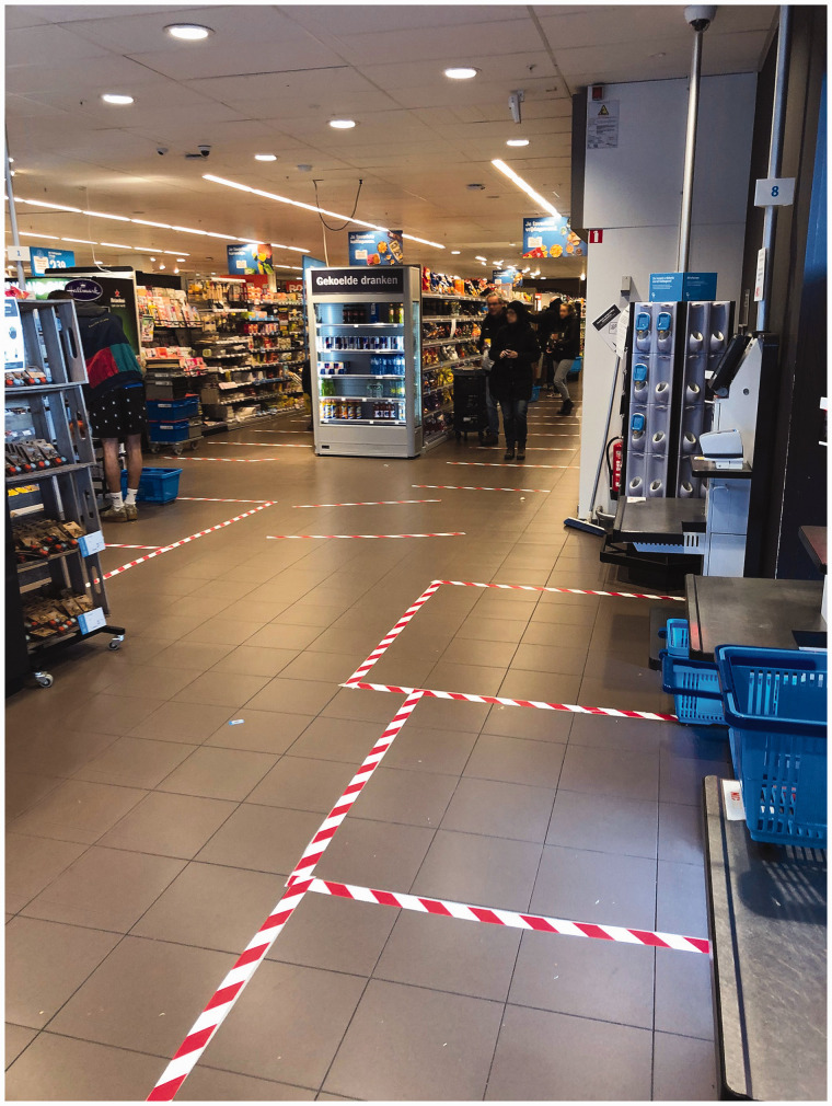
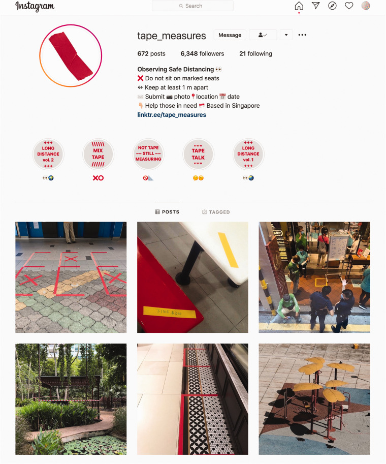
The grid itself is an indexical artifact of the pandemic: we see impromptu lattices and ad hoc hash marks charting out six-foot geographies in grocery store checkout lines and at public parks (see Figure 4). The Victoria and Albert Museum is chronicling COVID’s myriad everyday artifacts: material embodiments, like the grid, of the virus’s operational logics and affects. Among the growing Pandemic Objects (2020) collection are hand-made signs—for businesses to announce their temporary closure, for neighbors to express community solidarity—as well as jury-rigged protective door handles, toilet paper, cardboard packaging, and flour and yeast for novice home bakers (Wainwright, 2020). This collection of analog data reminds visitors of how the pandemic marks its presence in the increased prevalence and value of humble materials (see Figure 5).
Figure 4.
Taped lines on the floor of a supermarket in Amsterdam, indexing the geometry of social distancing.
Source: Photo by Hay Kranen. Public domain, via Wikimedia.
Figure 5.
The tape measures Instagram account, featuring improvisational quarantine markings.
Source: reproduced with permission from Berny Tan.
Participatory reflections
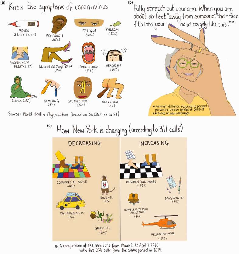
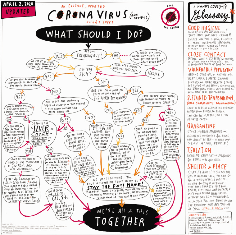
More personal, intimate, and participatory data projects have focused on COVID-19 data as tools for reflection. These engagements with the data of crisis draw out human (and sometimes non-human) stories and interactions and ask users to situate themselves within the overwhelming global narrative of emergency. Not least, in a time of anxiety and uncertainty, these reflective projects provide a much-needed venue for play, humor, and affective response. Some, like the illustrations of data journalist Mona Chalabi, humanize the statistics of COVID-19 by rendering them in hand-made drawings. Chalabi takes potentially intimidating scientific jargon and translates it into the visual language of the everyday. Figure 6(a) shows her most popular COVID-19 visualization, “Know the Symptoms of Coronavirus,” which has been translated into a dozen languages after a call on Chalabi’s Instagram yielded 344 volunteer translators (Chalabi, 2020a). An outstretched hand in Figure 6(b) lends a personal perspective to six feet of distance, while Figure 6(c), “How New York is Changing (according to 311 calls*)” reframes the virus as the daily mundane: noisy upstairs neighbors, anxiety from whirring helicopters, and feeling 64% less interested in graffiti (Chalabi, 2020b, 2020c). Work from illustrator and graphic journalist Wendy MacNaughton and infectious disease specialist Dr. Eliah Aranoff-Spencer (2020) (see Figure 7) guides the viewer through a flowchart answering the question “WHAT SHOULD I DO?,” combining tongue-in-cheek responses (“Are you freaking out?”) with useful information on symptoms and exposure. These visualizations feel personal and engaging, and they bring perspective to the vastness of the pandemic present (see also Asian American Feminist Collective, 2020; Kuo, 2010).
Figure 6.
(a) “Know the Symptoms of Coronavirus,” (b) “Distancing,” and (c) “How New York is changing (according to 311 calls*)”.
Source: reproduced with permission from Chalabi (2020a, 2020b, 2020c).
Figure 7.
Wendy MacNaughton and Dr Eliah Aranoff-Spencer’s updated “Coronavirus (aka Covid-19) Cheat Sheet”.
Source: reproduced with permission from MacNaughton and Aranoff-Spencer (2020).
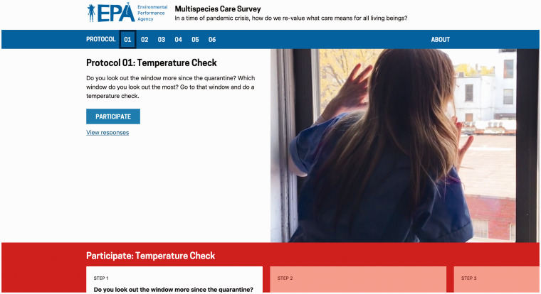
The gamifications of a cheeky flowchart and work like Nathan Yau’s “Toilet Paper Calculator” make this impossible situation feel more palpable, and perhaps also more surmountable (Yau, 2020). That feeling of control, of empowerment even, characterizes a slew of new data projects that ask users to become co-creators, observing their worlds and contributing their experiences to a collective understanding of life during COVID-19 (see also Bliss and Martin, 2020; Detroit Cultural Crisis Survey, 2020). Participation in these communal pieces has a low bar for entry, as with the incredibly shareable images generated through “Wash Your Lyrics.”. The create-your-own public service announcement lightened the mood of early March (see the State of New Jersey’s contribution), but it also matched the virus in its virality, creating a world-wide network of conscientious hand-washers, singing in solidarity (New Jersey, 2020; William, 2020). Video clips of trees performing essential labor, traces of avian pathways, and the microbiomes of windowsills populate the Environmental Performance Agency’s (EPA) “Multispecies Care Survey” (Environmental Performance Agency, 2020). The survey consists of six protocols, beginning with a “temperature check” (shown in Figure 8) that involves pressing your skin to a window, then building to engagements with the outside, like having a conversation with a nearby tree. In undertaking these protocols, participants archive their own lockdown environment and its more-than-human population. Engaging with the survey provides some catharsis in knowing that elsewhere others are making the same examinations. In addition to making space for affective responses, these projects also give participants an activity—an exercise that takes up time and breaks the tedium of quarantine. The EPA’s archive includes children drawing and parents happy to see them briefly entertained; “Wash Your Lyrics” becomes an endless twitter scroll where you can lose hours singing and laughing (and practicing good hygiene).
Figure 8.
Multispecies Care Survey, 2020. A project of The Environmental Performance Agency: http://multispecies.care.
Source: reproduced with permission from Environmental Performance Agency (2020).
Figure 9.
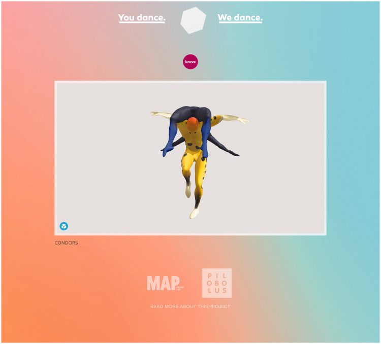
A 3D rendering showing two Pilobolus dancers moving to the prompt “Brave”. Art by Pilobolus, MAP Design Lab, Krystal Butler, Benjamin Coalter, and Nile Russell.
Source: reproduced with permission from Pilobolus and MAP Design Lab (2020).
It is not always possible, in the current climate, to be in community or find the energy to create with and for others. And that is fine. While many of the examples we have described here feature an element of data’s public performance, there are numerous COVID-19 responses that offer templates for those who wish to engage with the data of crisis through introspection. These projects also create an imagined community—a dispersed public engaged in the same activity, yet the activity remains unshared and personal. This form of personal “data processing” is just as valuable in the time of COVID-19, when multiscalar struggles are waged even at a microscopic level within our individual bodies. One such response, which pre-existed COVID-19 but has found renewed meaning in the present, is Giorgia Lupi and Pentagram’s (n.d.) “Mapping Ourselves” activities. The project offers a mechanism for visualizing personal reflections and tools for plotting the networks of care that surround us all. Recorded through guided drawing exercises, “Mapping Ourselves” can serve as a source of mindfulness while highlighting connections with those around you.
While Lupi’s mapping activities create interactions with data that are structured and codified, Pilobolus and MAP Design Lab's (2020) “You Dance, We Dance” is a COVID-19 response predicated on the imprecision and freedom of movement (see Figure 8). Combining 3D renderings of Pilobolus dancers with simple dance challenges to complete in your home, “You Dance, We Dance” correlates the sometimes-paralyzing emotions of pandemic existence with bursts of choreography. “Calm” suggests slowly inflating your body like a balloon while the rendering of an other-worldly orange dancer blooms like a flower. “Brave” sees two 3D models trust each other in a series of balances; you stand tall and strong on one leg for a minute. This form of data visceralization brings data into the physical and experiential realms, while also making it more immediate, almost “real-time” (Dobson, 2015; see also D’Ignazio and Klein, 2020). This is a private practice, done in concert with others.
We could say the same of quarantine—or of COVID-19 infection itself: we shelter or suffer in private, knowing that our sacrifices and sorrows are shared with an international community. Yet there is danger in subsuming these individual experiences under a global curve. As the projects above demonstrate, both the creators and consumers of our coronavirus maps and graphs need to attend to irregularities in demographics and geographic distribution, and to consider the politics of who or what is and is not represented in the standard datasets. And those of us who regularly consult COVID-19 heatmaps from the security of our living rooms, hoping to see an ever-flatter curve, should also recognize that those data, while seemingly distant in their abstraction, actually index themselves in our immediate material environments, inscribing their spatial logics in our grocery stores and sidewalks. We can even bring those data into our homes and personal lives, performing them, contributing to their creation, reminding ourselves and others that data is always embodied and local and present.
Supplemental Material
Supplemental material, sj-pdf-1-bds-10.1177_2053951720939236 for Learning from lines: Critical COVID data visualizations and the quarantine quotidian by Emily Bowe, Erin Simmons and Shannon Mattern in Big Data & Society
Supplemental Material
Supplemental material, sj-pdf-2-bds-10.1177_2053951720939236 for Learning from lines: Critical COVID data visualizations and the quarantine quotidian by Emily Bowe, Erin Simmons and Shannon Mattern in Big Data & Society
Supplemental Material
Supplemental material, sj-pdf-3-bds-10.1177_2053951720939236 for Learning from lines: Critical COVID data visualizations and the quarantine quotidian by Emily Bowe, Erin Simmons and Shannon Mattern in Big Data & Society
Declaration of conflicting interests
The author(s) declared no potential conflicts of interest with respect to the research, authorship, and/or publication of this article.
Funding
The author(s) received no financial support for the research, authorship, and/or publication of this article.
ORCID iDs
Emily Bowe https://orcid.org/0000-0002-2936-5754
Shannon Mattern https://orcid.org/0000-0003-4630-3982
References
- Alberda A, Alamalhodaei A, Feigenbaum A. (May 2020) COVID-19 data literacy is for everyone. Nightingale: The Journal of the Data Visualization Society Available at: www.medium.com/nightingale/covid-19-data-literacy-is-for-everyone-46120b58cec9 (accessed 19 June 2020).
- Asian American Feminist Collective (2020) Care in the time of Coronavirus. Available at: https://static1.squarespace.com/static/59f87d66914e6b2a2c51b657/t/5e7bbeef7811c16d3a8768eb/1585168132614/AAFCZine3_CareintheTimeofCoronavirus.pdf (accessed 11 May 2020).
- Bazzaz D. (2020) Avi Schiffmann, the Washington state teen behind a coronavirus website with millions of views. Seattle Times, 3 March. Available at: www.seattletimes.com/seattle-news/education/qa-avi-schiffmann-the-washington-state-teen-behind-a-coronavirus-website-with-millions-of-views/ (accessed 11 May 2020).
- Birb (2020) Available at: https://birbs.glitch.me/ (accessed 11 May 2020).
- Bliss L, Martin J. (2020) Your maps of life under lockdown. CityLab, 15 April. Available at: www.citylab.com/life/2020/04/neighborhood-maps-coronavirus-lockdown-stay-at-home-art/610018/ (accessed 11 May 2020).
- Bronner L, Koerth M, Mithani J. (2020. a) Why it’s so freaking hard to make a good COVID-19 model. FiveThirtyEight, 31 March. Available at: www.fivethirtyeight.com/features/why-its-so-freaking-hard-to-make-a-good-covid-19-model/ (accessed 13 May 2020).
- Bronner L, Koerth M, Mithani J, et al. (2020. b) A comic strip tour of the wild world of pandemic modeling. FiveThirtyEight, 13 April. Available at: www.fivethirtyeight.com/features/a-comic-strip-tour-of-the-wild-world-of-pandemic-modeling/ (accessed 13 May 2020).
- Campolo A. (2020) Flattening the curve: Visualization and pandemic knowledge. Formations, 1 April. Available at: https://sifk.uchicago.edu/news/flattening-the-curve-visualization-and-pandemic-knowledge/ (accessed 11 May 2020).
- Case N, Salathé M. (2020) What happens next? COVID-19 futures, explained with playable simulations. Available at: https://ncase.me/covid-19/ (accessed 13 May 2020).
- Chalabi M. [@monachalabi] (2020. a) If you think you might be sick and you can stay at home, then STAY THE FUCK AT HOME. Instagram, 13 March. Available at: www.instagram.com/p/B9roIwrlA2V/ (accessed 11 May 2020).
- Chalabi M. [@monachalabi] (2020. b, March 21) D I S T A N C I N G. Instagram, 21 March. Available at: www.instagram.com/p/B-AgHXalIk7/ (accessed 11 May 2020).
- Chalabi M. [@monachalabi] (2020. c) Source: NYC.gov. Instagram, 8 April. Available at: www.instagram.com/p/B-uypcBl0Db/ (accessed 11 May 2020).
- Costanza-Chock S. (2020) Design Justice: Community-Led Practices to Build the Worlds We Need. Cambridge, MA: MIT Press.
- Danielson M. (2020, March 12) Notable maps visualizing COVID-19 and surrounding impacts. Mapbox, 12 March. Available at: https://blog.mapbox.com/notable-maps-visualizing-covid-19-and-surrounding-impacts-951724cc4bd8 (accessed 11 May 2020).
- Data for Black Lives (2020) D4BL COVID-19 disparities tracker. Available at: https://docs.google.com/spreadsheets/d/1NFViedF47p-P0MKKl8_O0mKAhba0Yqn200EfUR4GlcQ/edit?usp=sharing (accessed 13 May 2020).
- Data Visualization Society (2020) Partnering health and data expertise for COVID-19. Available at: www.datavisualizationsociety.com/covid-19 (accessed 13 May 2020).
- Detroit Cultural Crisis Survey (2020) Detroit cultural crisis survey. Six Feet of Distance Available at: www.sixfeetofdistance.org/detroit-cultural-crisis/ (accessed 11 May 2020).
- D’Ignazio C, Klein L. (2020) Data Feminism. Cambridge, MA: MIT Press. [Google Scholar]
- Dobson K. (2015, April 23) Machine therapy: Subtle machines and data visceralization. In: Brown music department graduate colloquium series, Brown University, Providence, RI, USA. Available at: www.brown.edu/academics/music/events/colloquium-machine-therapy-subtle-machines-and-data-visceralization (accessed 19 June 2020).
- Environmental Performance Agency (2020) Multispecies Care Survey: Protocol 1. Available at: https://multispecies.care/protocol-01/ (accessed 11 May 2020).
- Ellis EG. (2020) For homeless people, Covid-19 is horror on top of horror. Wired, 2 April. Available at: www.wired.com/story/coronavirus-covid-19-homeless/ (accessed 13 May 2020).
- Flowing Data (2020) Coronavirus posts. Available at: www.flowingdata.com/tag/coronavirus (accessed 11 May 2020).
- Food Environment Reporting Network (2020) Mapping Covid-19 in meat and food processing plants. Available at: www.thefern.org/2020/04/mapping-covid-19-in-meat-and-food-processing-plants/ (accessed 13 May 2020).
- Greene D. (2020) “Do those birds sound louder to you?” NPR, 6 May. Available at: www.npr.org/sections/coronavirus-live-updates/2020/05/06/843271787/do-those-birds-sound-louder-to-you-an-ornithologist-says-youre-just-hearing-thin (accessed 11 May 2020).
- Heller S. (2020) The daily Heller; COVID in real times. Print, 20 April. Available at: www.printmag.com/daily-heller/covid-19-new-york-times-front-pages/ (accessed 11 May 2020).
- Hempel S. (2018) The Atlas of Disease: Mapping Deadly Epidemics and Contagion, From the Plague to the Zika Virus. London, UK: White Lion Publishing.
- Johns Hopkins Coronavirus Resource Center (2020) COVID-19 dashboard by the center for systems science and engineering (CSSE) at Johns Hopkins University (JHU). Available at: https://coronavirus.jhu.edu/map.html (accessed 13 May 2020).
- Johnson S. (2007) The Ghost Map: The Story of London’s Most Terrifying Epidemic – And How It Changed Science, Cities, and the Modern World. New York, NY: Riverhead Books.
- Juo L. (2020) China’s economy shrinks as coronavirus hits world trade. The Guardian, 17 April. Available at: www.theguardian.com/world/2020/apr/17/china-economy-shrinks-record-wuhan-covid-19-death-toll-rises-50-percent (accessed 11 May 2020).
- Kendi IX. (2020) What the racial data show. The Atlantic, 6 April. Available at: www.theatlantic.com/ideas/archive/2020/04/coronavirus-exposing-our-racial-divides/609526/ (accessed 15 May 2020).
- Koch T. (2017) Cartographies of Disease: Maps, Mapping, and Medicine (2nd ed). Redlands, CA: ESRI Press.
- Kuo A. (2010) My wheel of worry. Available at: https://explore.brainpickings.org/post/25925086935/my-wheel-of-worry-andrew-kuo-visualizes-the (accessed 11 May 2020).
- Littlefield T. (2020) Accessible COVID-19 statistics tracker. Available at: https://cvstats.net/ (accessed 13 May 2020).
- Loukissas Y. (2019) All Data Are Local. Cambridge, MA: MIT Press. [Google Scholar]
- MacNaughton W, Aranoff-Spencer E. [@wendymac][@dr_eli_] (2020) Pause from drawing dinosaurs to announce, Version 2 is here! Instagram, 2 April. Available at: www.instagram.com/p/B-fuVk6ps-K/ (accessed 19 June 2020).
- Makulec A. (2020, 11 March) Ten considerations before you create another chart about COVID-19. Nightingale: The Journal of the Data Visualization Society Available at: https://medium.com/nightingale/ten-considerations-before-you-create-another-chart-about-covid-19-27d3bd691be8 (accessed 13 May 2020).
- Mattern S. (2020. a) Andrew Cuomo’s COVID-19 briefings draw on the persuasive authority of Powerpoint. Art in America, 13 April. Available at: www.artnews.com/art-in-america/features/andrew-cuomo-covid-briefings-powerpoint-slideshow-authority-1202683735/ (accessed 19 June 2020).
- Mattern S. (2020. b, April) Urban auscultation; or, perceiving the action of the heart. Places Journal Available at: www.placesjournal.org/article/urban-auscultation-or-perceiving-the-action-of-the-heart/ (accessed 11 May 2020).
- McCullough M. (2013) Ambient Commons: Attention in the Age of Embodied Information. Cambridge, MA: MIT Press. [Google Scholar]
- Molteni M. (2020) Why meatpacking plants have become Covid-19 hot spots. Wired, 7 May. Available at: www.wired.com/story/why-meatpacking-plants-have-become-covid-19-hot-spots/ (accessed 13 May 2020).
- Nakagawa A. (2020) Social distancing, haiku and you. Alan Nakagawa. Available at: www.alannakagawa.com/#/new-gallery-3/ (accessed 11 May 2020).
- New Jersey [@NJGov] (2020) But above all this, I wish you wash your hands. Twitter, 10 March. Available at: www.twitter.com/NJGov/status/1237396464088821760 (accessed 11 May 2020).
- Noble S. (2018) Algorithms of Oppression. New York, NY: NYU Press. [Google Scholar]
- NYPL Staff (2020) Missing sounds of New York: An auditory love letter to New Yorkers. NYPL, 1 May. Available at: www.nypl.org/blog/2020/05/01/missing-sounds-of-new-york (accessed 11 May 2020).
- Onuoha M. (2016) The library of missing datasets. Available at: www.mimionuoha.com/the-library-of-missing-datasets/ (accessed 13 May 2020).
- Orsborn T, Luther W, Hui KM. (2020) “We just can’t feed this many”. San Antonio Express-News, 9 April. Available at: www.expressnews.com/news/local/article/Thousands-hit-hard-by-coronavirus-pandemic-s-15189948.php#photo-19279688 (accessed 11 May 2020).
- Pandemic Objects (2020) V&A blog. Available at: www.vam.ac.uk/blog/pandemic-objects (accessed 11 May 2020).
- Paschal O. [@oliviacpaschal] (2020) Here is what I have to say about these two maps. Twitter, 2 April. Available at: www.twitter.com/oliviacpaschal/status/1245711609890320386 (accessed 11 May 2020).
- Patel NV. (2020) The best, the worst, of the Coronavirus dashboards. MIT Technology Review, 6 March. Available at: www.technologyreview.com/2020/03/06/905436/best-worst-coronavirus-dashboards/ (accessed 11 May 2020).
- Pecanha S. (2020, April 1). This is how mass unemployment looks on the ground. Washington Post, 1 April. Available at: www.washingtonpost.com/opinions/2020/04/01/one-block-more-than-120-jobs-lost/?arc404=true (accessed 11 May 2020).
- Peck E. [@EvanMPeck] (2020) As mentioned in attached thread, I see communicating exponential growth (virus spread) as one of the key challenges to helping people understand #COVID19. Twitter, 9 March. Available at: www.twitter.com/EvanMPeck/status/1237088603160928256 (accessed 13 May 2020).
- Pentagram (n.. d) Mapping ourselves. Pentagram. Available at: www.pentagram.com/work/mapping-ourselves/story (accessed 11 May 2020).
- Pilobolus and MAP Design Lab (2020) You dance, we dance. Available at: www.youdancewedance.org/ (accessed 11 May 2020).
- Quarantine Supercut (2020) The creative independent. Available at: www.thecreativeindependent.com/events/tci-irl-1/ (accessed 11 May 2020).
- Rosen R. (2020) How COVID-19 has forced us to look at the unthinkable. New York Times Magazine, 29 April. Available at: www.nytimes.com/2020/04/29/magazine/covid-hart-island.html (accessed 11 May 2020).
- #StayHomeSounds (2020) Cities and memory. Available at: www.citiesandmemory.com/covid19-sounds/ (accessed 11 May 2020).
- Stewart N. (2020) ‘It’s a Time Bomb’: 23 die as virus hits packed homeless shelters. The New York Times, 13 April. Available at: www.nytimes.com/2020/04/13/nyregion/new-york-coronavirus-homeless.html (accessed 13 May 2020).
- Taylor L. (2020) Reassigned Florida manager told to delete coronavirus data. Government Technology, 19 May. Available at www.govtech.com/em/safety/Reassigned-Florida-Manager-Told-to-Delete-Coronavirus-Data-.html (accessed 4 June 2020).
- The COVID Tracking Project (2020. a) Most recent data. Available at: www.covidtracking.com/data (accessed 13 May 2020).
- The COVID Tracking Project (2020. b) COVID racial data tracker. Available at: www.covidtracking.com/race (accessed 13 May 2020).
- The Marshall Project (2020, 8 May) A state-by-state look at Coronavirus in prisons. Available at: www.themarshallproject.org/2020/05/01/a-state-by-state-look-at-coronavirus-in-prisons (accessed 13 May 2020).
- The Urban Systems Lab (2020) Social vulnerability, COVID-19 and climate. Available at: www.urbansystemslab.com/covid19 (accessed 15 May 2020).
- Thorp J. [@blprnt] (2020) I built a little game called … in glitch. Twitter, 3 May. Available at: www.twitter.com/blprnt/status/1257017848079269888?s=20 (accessed 11 May 2020).
- Triplet kids ‘co-author’ COVID-19 study with psychologist dad (2020) State University of New York Plattsburgh, Press Release, 24 April. Available at: https://grad.plattsburgh.edu/news/news-archive/triplet-kids-co-author-covid-19-study-with-psychologist-dad.html (accessed 11 May 2020).
- Trovall E. (2020) Texas COVID-19 cases in immigrant detention quadruple in two weeks, as ICE transfers continue. Houston Public Media, 7 May. Available at: www.houstonpublicmedia.org/articles/news/health-science/coronavirus/2020/05/07/368941/texas-covid-19-cases-in-immigrant-detention-quadruple-in-two-weeks-as-ice-transfers-continue/ (accessed 13 May 2020).
- UCLA School of Law (2020) COVID-19 behind bars data project. Available at: www.docs.google.com/spreadsheets/d/1X6uJkXXS-O6eePLxw2e4JeRtM41uPZ2eRcOA_HkPVTk/edit?usp=sharing (accessed 13 May 2020).
- Ura A. (2020) Texas investigating meat processing plants over coronavirus outbreaks. Texas Monthly, 21 April. Available at: www.texastribune.org/2020/04/21/texas-investigating-meat-processing-plants-over-coronavirus-outbreaks/ (accessed 13 May 2020).
- Wainwright O. (2020) Museum of COVID-19: The story of the crisis told through everyday objects. The Guardian, 4 May. Available at: www.theguardian.com/artanddesign/2020/may/04/museum-covid-19-v-and-a-pandemic-coronavirus-objects?CMP=twt_a-culture_b-gdnculture (accessed 11 May 2020).
- Weizman E. (2017) Forensic Architecture: Violence at the Threshold of Detectability. Cambridge, MA: MIT Press.
- William (2020) Wash your lyrics. Available at: www.washyourlyrics.com/ (accessed 11 May 2020).
- Xeno-Canto ( n.. d.). Available at: www.xeno-canto.org/ (accessed 11 May 2020).
- Yau N. (2020) Toilet paper calculator. Floating Data Available at: www.flowingdata.com/2020/03/29/toilet-paper-calculator/ (accessed May 11 2020).
Associated Data
This section collects any data citations, data availability statements, or supplementary materials included in this article.
Supplementary Materials
Supplemental material, sj-pdf-1-bds-10.1177_2053951720939236 for Learning from lines: Critical COVID data visualizations and the quarantine quotidian by Emily Bowe, Erin Simmons and Shannon Mattern in Big Data & Society
Supplemental material, sj-pdf-2-bds-10.1177_2053951720939236 for Learning from lines: Critical COVID data visualizations and the quarantine quotidian by Emily Bowe, Erin Simmons and Shannon Mattern in Big Data & Society
Supplemental material, sj-pdf-3-bds-10.1177_2053951720939236 for Learning from lines: Critical COVID data visualizations and the quarantine quotidian by Emily Bowe, Erin Simmons and Shannon Mattern in Big Data & Society


