

To the Editor:
Age-period-cohort (APC) analyses often reveal important insights into patterns of disease incidence and mortality such as cancer. A widely recognized issue in APC analyses is the identification issue caused by the inseparability of the linear effects of cohort, age and period. While analytical solutions are an active area of research1, visual displays can be useful tools to reveal patterns in these data.2 Despite their potential, to date there is a lack of APC-specific visualization tools. For example, a commonly used display of APC data is the traditional Lexis diagram (Figure 1A) which comprises of a simple two-dimensional heatmap with a field of colored square tiles representing a quantity of interest such as mortality rate. While informative, the main issue with a Lexis diagram is that a choice has to be made to represent only two of the three dimensions (often age and period) on the XY axes, leaving cohorts to be represented on the diagonal. This setup introduces substantial visual distortion in how cohort patterns are presented relative to age and period. Specifically, relative to age and period, patterns between adjacent cohorts are compressed by 30% , while patterns within each cohort are stretched by 41% . In addition to these distortions, tracing cohort patterns is further complicated because adjacent square pixels along any cohort isoline only share a single corner. Together, these distortions can substantially impede cohort pattern recognition in Lexis diagrams.
Figure 1.
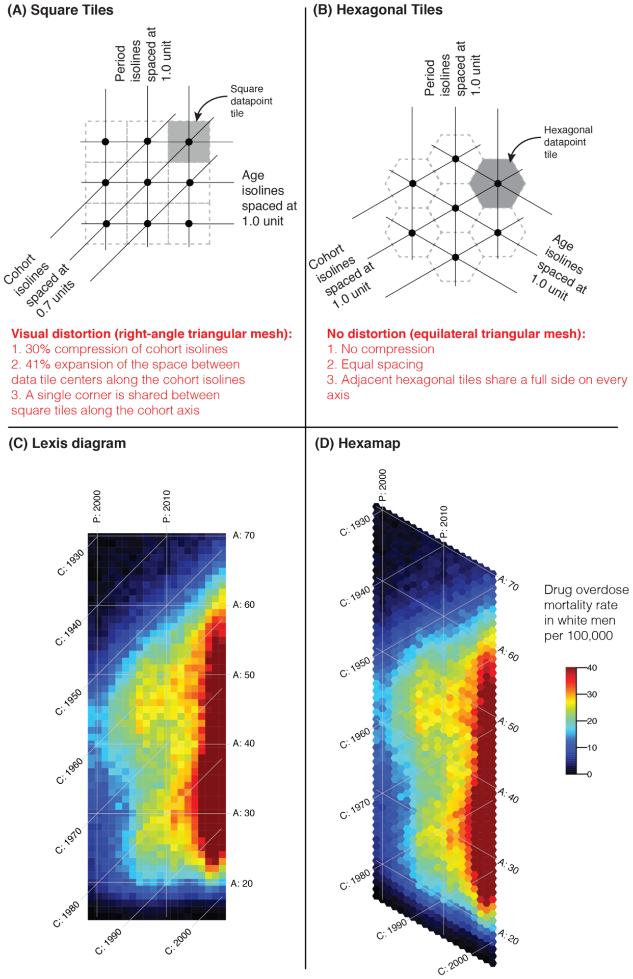
Correcting the visual distortion in Lexis diagrams by using hexamaps. (A) illustrates the distortion of cohort isolines using square tiles in a Lexis diagram; (B) corrects for this visual distortion using hexagonal tiles. (C) and (D) compare the patterns of accidental drug overdose deaths among white men in a traditional Lexis diagram versus a hexamap, respectively. [A = Age ranging from 15 through 70 years, P = Period ranging from 1999 through 2018, C = Cohort ranging from 1929 through 2003].
We developed a hexamap as a simple solution to the limitations of a traditional Lexis diagram (Figure 1B). A hexamap consists of a field of colored hexagonal tiles. Hexagons are the preferred shape for visualizing heatmaps because they are the most rounded shape that can be tiled evenly edge-to-edge.3 A hexagonal grid is especially powerful for visualizing APC data because it places all three APC axes at equal 60° angles. Because of this placement, a hexamap overcomes all the visual distortions in a traditional Lexis diagram as shown in the figure. Furthermore, the APC isolines in a hexamap produce the same equilateral triangular mesh that was studied extensively in the 19th century by Knapp (1868)4, Zeuner (1869)5, and interestingly Lexis (1875)6 who’s Figure 2 explicitly discusses the technique.2 Although contour line maps have been proposed in conjunction to this equilateral triangular mesh7, we argue that a hexamap is more effective because, unlike the contour lines, the colored hexagons do not interfere with the isolines.
Figures 1C and 1D compare a traditional Lexis diagram of accidental drug overdose deaths among white men in the US to a hexamap of the same data, respectively. Overdose deaths among white men have increased dramatically in the recent years, however the impact of birth-year is not well understood.8,9 We used CDC Wonder10 to obtain the number of overdose deaths using the international classification of disease (ICD-10) codes X40-X44. Both diagrams effectively display patterns by age and period (e.g., the rise of overdose deaths since 2015, and the lower age boundary of 18 years). However, cohort patterns are more difficult to visually trace in the Lexis diagram than the hexamap. For example, this can be seen by comparing the 1975 cohort from 1999 through 2018 in both diagrams. The stretching of individual cohort patterns, and the compression of adjacent cohorts are also obvious in the Lexis diagram. The progression of overdose deaths among the 1975 cohort seems to be slower than its progression among age 25 years although both trends span exactly 20 years and their progressions are in fact similar as shown in the hexamap.
In summary, we developed the hexamaps to overcome many of the challenges of the existing APC data visualization tools. We encourage using it as an APC-specific visualization tool, and to facilitate its adoption, we provide the Open-Source implementation in R in the Supplementary Materials.
Supplementary Material
Footnotes
Conflict of Interest: None
Data availability: All data used in this paper are publicly available from the Center for Disease Control and Prevention (CDC). In addition, the code used to illustrate the method is available as an online appendix.
References:
- 1.Chernyavskiy P, Little MP, Rosenberg PS. A unified approach for assessing heterogeneity in age-period-cohort model parameters using random effects. Stat Methods Med Res. 2019;28(1):20–34. doi: 10.1177/0962280217713033 [DOI] [PubMed] [Google Scholar]
- 2.Keiding N Statistical inference in the Lexis diagram. Philos Trans R Soc London Ser A Phys Eng Sci. 1990;332(1627):487–509. doi: 10.1098/rsta.1990.0128 [DOI] [Google Scholar]
- 3.Birch CPD, Oom SP, Beecham JA. Rectangular and hexagonal grids used for observation, experiment and simulation in ecology. Ecol Modell. 2007;206(3–4):347–359. doi: 10.1016/j.ecolmodel.2007.03.041 [DOI] [Google Scholar]
- 4.Knapp GF. Über die Ermittlung der Sterblichkeit aus den Aufzeichnungen der Bevölkerungs-statistik. Leipzig: Hinrichs, 1868. [Google Scholar]
- 5.Zeuner G Abhandlungen aus der mathematischen Statistik. Leipzig: Felix, 1869. [Google Scholar]
- 6.Lexis W Einleitung in Die Theorie Der Bevölkerungsstatistik. Strassburg, Trübner; 1875. [Google Scholar]
- 7.Weinkam JJ, Sterling TD. A graphical approach to the interpretation of age-period-cohort data. Epidemiology. 1991;2(2):133–137. http://dx.doi.org/. [DOI] [PubMed] [Google Scholar]
- 8.Jalal H, Buchanich JM, Roberts MS, Balmert LC, Zhang K, Burke DS. Changing dynamics of the drug overdose epidemic in the United States from 1979 through 2016. Science (80-). 2018;361(6408). doi: 10.1126/science.aau1184 [DOI] [PMC free article] [PubMed] [Google Scholar]
- 9.Huang X, Keyes KM, Li G. Increasing Prescription Opioid and Heroin Overdose Mortality in the United States, 1999–2014: An Age-Period-Cohort Analysis. Am J Public Heal. 2018;108(1):131–136. doi: 10.2105/ajph.2017.304142 [DOI] [PMC free article] [PubMed] [Google Scholar]
- 10.Centers for Disease Control and Prevention National Center for Health Statistics. Multiple Cause of Death 1999–2018 on CDC WONDER Online Database available from https://wonder.cdc.gov/, released 2020.
Associated Data
This section collects any data citations, data availability statements, or supplementary materials included in this article.