Abstract
Background:
Exponential-like infection growth leading to peaks (denoted by inflection points [IP] or turning points) is usually the hallmark of infectious disease outbreaks, including coronaviruses. To determine the IPs of the novel coronavirus (COVID-19), we applied the item response theory model to detect phase transitions for each country/region and characterize the IP feature on the temporal bar graph (TBG).
Methods:
The IP (using the item difficulty parameter to locate) was verified by the differential equation in calculus and interpreted by the TBG with 2 virtual and real empirical data (i.e., from Collatz conjecture and COVID-19 pandemic in 2020). Comparisons of IPs, R2, and burst strength [BS = ln() denoted by the infection number at IP(Nip) and the item slope parameter(a) in item response theory were made for countries/regions and continents on the choropleth map and the forest plot.
Results:
We found that the evolution of COVID-19 on the TBG makes the data clear and easy to understand, the shorter IP (=53.9) was in China and the longest (=247.3) was in Europe, and the highest R2 (as the variance explained by the model) was in the US, with a mean R2 of 0.98. We successfully estimated the IPs for countries/regions on COVID-19 in 2020 and presented them on the TBG.
Conclusion:
Temporal visualization is recommended for researchers in future relevant studies (e.g., the evolution of keywords in a specific discipline) and is not merely limited to the IP search in COVID-19 pandemics as we did in this study.
Keywords: burst strength, Collatz conjecture, COVID-19, infection point, item response theory, temporal bar graph
Key Points
Many mathematical COVID-19 models have been proposed in the past. None illustrated the IP determination and evaluated the containment of COVID-19 in comparison ever before, particularly using the differential equation in calculus to prove the IP determination on an ogive curve.
The Collatz conjecture is a simple but unsolved problem in mathematics. The trend of the Collatz sequences, similar to the pattern of COVID-19 pandemics, was analogous to the pandemic observed in countries/regions using the IP to represent the containment of COVID-19 in the past.
The temporal bar graph modified to display the data of COVID-19 is unique and innovative in numerous fields, such as the evolution of keywords or acronyms in disciplines that need the TBG to highlight the insights of data at a quick glance.
1. Introduction
Despite the obvious extreme importance and extensive research efforts, the inflection points (IP for short or called the tipping points or turning points in much of the existing literature[1]) turned out to be extremely difficult to estimate.[2] The enormous complexity associated with IPs makes accurate predictive modeling nearly impossible[3] (e.g., in COVID-19 situations).
Early warning signals should be developed based on the phenomenon that recovery rates from small disturbances tend to 0 when approaching a tipping point.[2,4] Some laboratory experiments and field surveys have demonstrated the so-called “critical slow down” phenomenon.[3,5,6]
Investigating the IPs of infectious disease outbreaks, including the ongoing coronavirus pandemic, falls under the domain of tipping points and critical transitions.[4–6] Although numerous researchers[7–14] have proposed using mathematical models to predict the number of COVID-19 cases and investigate the IP[15–21] as the ability of containment responding to COVID-19, none of them visualized the IP days for counties/regions in comparison of the containment against COVID-19 infections on a temporal bar graph (TBG) (e.g., numeric data over time corresponding to the area of the horizontal bars[22]). A novel mathematical model to determine the IP days for countries/regions shown on the TBF is required for development during the COVID-19 pandemic.
Nonetheless, building a predictive model for determining the IP days for visualizing the data on the TBG for countries/regions is a challenge that we encountered. Although many mathematical models have been proposed,[23,24] all of these merely emphasize the model accuracy to epidemic outbreaks instead of the data displays that are easily understood about the IP features on the TBG.
The study aims to verify the IP at the location of item difficulty based on item response theory (IRT), demonstrate the use of TBG and interpret the IP features, and compare the differences in IP and R2 (as the variance explained by the model) for countries/regions and continents when modeling COVID-19 situations.
2. Methods
2.1. Data source
Two kinds of data were applied to verify the use of TBG, including the virtual one from the Collatz conjecture[25,26] and the real one from the confirmed cases in COVID-19 from the GitHub website[27] for countries/regions (see File 1, Supplemental Digital Content). All downloaded data are publicly released on the website.[27] Ethical approval was waived since all the data were obtained from the GitHub website.
2.2. The determination of IP on a growth curve
2.2.1. Differential equation in calculus to verify the IP on 2 models
2.2.1.1. The exponential growth model
The exponential growth model (EGM) is expressed in (1)[28]:
| (1) |
where a, b, and c are non-zero constants, t denotes the time point (e.g., the infected day in COVID-19), and e is the exponential function denoted by f(x) = ex (where the argument x is written as an exponent).
The 1st- and 2nd-order derivatives f′(t) and f″(t) are expressed in (2) and (3)[29] based on the differential equation in calculus:
| (2) |
| (3) |
Given that an IP of the primitive function f(t) exists, its second-order derivative f″(t) must equal 0. As such, both (1 + be−ct)2ect and ect(1 + be−ct) in denominators cannot be 0. Because a, b, and c are non-zero constants defined in (1), we let b – ect equal 0, and then . Namely, the IP is equal to ln(b) ÷ c when referring to the EGM in (1).
2.2.1.2. The IRT model
The probability can be expressed in IRT based on (4)[15,16]:
| (4) |
The Eq. (5) can be derived from (4):
| (5) |
where a as the discrimination parameter is greater than 0, θ, as t elapsed, is the person's ability in IRT, and δ is the item difficulty (=IP days) that can be verified using the differential equation in calculus via the processes of the first- and second-order derivatives on t[30] as described below:
| (6) |
| (7) |
Let , and gain
Therefore, (–2aZ – 2aZ2) × (1 + Z)–3 = 0
Because a and Z must be greater than 0, the value of 1 – Z equals 0.
Due to a > 0, we confirm that t – δ = 0 and t = δ. Therefore, the IP (at the t point) is at the location of item difficulty (δ).
2.2.2. Comparison of IP determination in 2 mathematical models
A simulation study on IP determination based on the 2 EGM and IRT models is demonstrated with an MP4 video.[31] The comparison of IP at , or at t = δ, is verified in Sections 2.2.1 and 2.2.2.
2.3. Virtual data from the Collatz sequence
Considering an iterative method over the set of positive integers N defined in a range (e.g., 1–100),[26] if n∊N is even, we obtain the positive integer for the next step. On the other hand, if n∊N is odd, we then consider the positive integer 3n + 1 for the next step. The Collatz conjecture states that independent of the chosen initial value for n∊N, the number 1 is eventually reached. The virtual data from the Collatz sequence would be demonstrated in determining IP, drawing the TBG, and capturing the IP features.
2.4. Real data from COVID-19 on the TBG
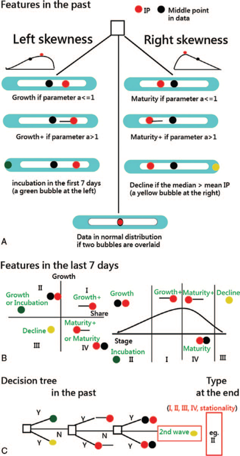
TBG has been applied to visualize the evolution of topic bursts in a bibliographical study.[28] We enhanced the TBG with IP and the middle point in the data, as described in Figure 1.
Figure 1.
IP features using the temporal bar graph to display. IP = inflection point.
2.4.1. Outer and inner boxes
The outer bar filled with the light blue stands for the data ranging from the start to the end when the inner box with data higher than a fixed value (named Xc > the maximum , where the interior colors from 0 to 256) in white was compared.
2.4.2. Heatmaps on the inner box
Geospatial visualizations often use heatmaps since they quickly help identify “hot spots” or regions of high concentrations of a given variable.[32] When adapted to temporal visualizations, heatmaps from dark to light colors in the inner box can help us identify that a large amount of data was compared within an attribute (e.g., a country or region suffering from COVID-19).
2.4.3. Bubbles on the TBG
In Part A, IP features include 3 types (i.e., left skewness, right skewness, and normal distribution) and 6 stages from incubation, growth, growth+, maturity+, maturity, and decline as the life circle in Part B, where only the last 7-day infections are focused. The 4-quadrant matrix is derived from previous studies[33,34] using the growth/share matrix (GSM) coined by the Boston Consulting Group in 1970 to classify the evolution of a specific product in features (i.e., growth on the Y-axis and share on the X-axis).[33,35,36] The decline stage is determined by the criterion in (8).
The criterion of decline exists when Nm > Nip, (8)
where Nm is the mean infection cases (=accumulative number ÷ the number of t at the middle point), and Nip is the cumulative number divided by the time points at IP days.
The burst strength (BS) was proposed to denote the critical spot[28] and defined in (8).
| (9) |
where Nip is defined in (9), and the parameter a denotes the item slope parameter in IRT.[15,16] Two features of growth+ and maturity+ are particularly emphasized by a black horizontal bar on the left (or right) beside the IP when the curve slope is greater than 1.0.
2.5. The decision rule on the TBG
The decision rule on TBG is shown in Part C of Figure 1. We examine whether either 1 green or yellow bubble exists on the TBG at first glance. Either a black horizontal bar beside the IP is next. The data skewness toward either the left or right side is the last. Otherwise, the 2nd wave might exist based on the rule: The 2nd wave is at parameter a < 0.5 and at the decline stage with 1 yellow bubble at the right-hand side on the TBG.
2.6. Comparison of IP and R2 in differences when modeling COVID-19
Comparisons of IPs and R2 among countries/regions and continents were made and shown on the choropleth map[37] and forest plot.[38]
2.7. Statistical tools and data analysis
The values of the standardized mean deviation were compared using the forest plot. A significance level of type I error was set at 0.05.
Visual representations of the forest plot and choropleth map display the comparison of IPs and R2 differences among countries/regions and continents. All figures, but Figure 1, were plotted online on Google Maps. The parameter estimation was executed in Microsoft Excel (File 1, Supplemental Digital Content) using the Solver add-in tool.[15,16]
3. Results
3.1. TBG using virtual data in the Collatz sequence
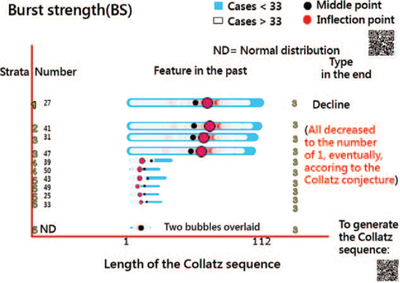
There are 10 positive integers used to generate the corresponding Collatz sequences shown in Figure 2. We can see that the number 27 at the top with the highest BC (determined by item parameter a and the number at IP in (9)) is shown in the left column. Because all Collatz(x) eventually reaches 1, the types of evolution stages are classified as Decline at the end (see the last column in Fig. 2).
Figure 2.
Features and types of Collatz sequences on the temporal bar graph. (How to read the TBG: each attribute is a horizontal bar with a specific start and end date with a text label on its left side. The area of each bar [or the IP bubble] is sized by the BS). BS = burst strength, IP = inflection point, TBG = temporal bar graph.
Some data values near the IPs in the top 4 Collatz sequences are colored in red (as heatmaps) because the data are significantly higher than others. These 4 sequences are skewed toward the left. The other 6 attributes (denoted by integers) are skewed toward the right side. The data values less than 33 (i.e., Xc = 33 in Fig. 2) imply that the blue color in the outer boxes appears in contrast to the white (or red) color in the inner box on the TBG. The data pattern and feature can be clearly observed and captured on the TBG via the outer and inner boxes with the bobble locations,
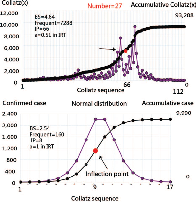
Other data normally distributed at the bottom present the 2 bubbles overlaid (i.e., the location at the middle point equals that at the IP). Readers are invited to scan the QR code at the top-right corner and examine the details about the sequence of interest on Google Maps (i.e., click on the red bobble). Another QR code at the bottom-right side corner is used to generate the Collatz sequence by inputting either an integer number (or time-series data) and then plotting the line chart we drew in Figure 3.
Figure 3.
The Collatz sequences for the initial numbers of 27 (top) and the pattern of normal distribution.
3.2. The TBG using real data from COVID-19
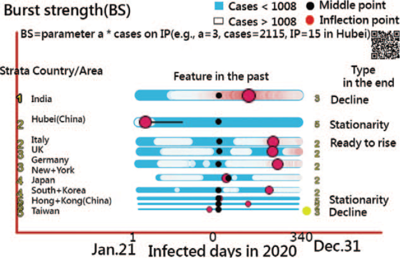
Ten counties/regions with confirmed cases in 2020 are presented in Figure 4. The top 1 with the highest BC is in India (left-skewed data at the top). Hubei Province in China, denoted by the type of maturity+ in the past and stationarity at the end, is in the second row, with right-skewed data (parameter a = 3.0, IP at 15 days, Nip = 2115, and ). Readers are invited to scan the QR code in Figure 4 and examine the details about the evolution of the COVID-19 situation in the countries/regions of interest/in 2020.
Figure 4.
Features and types of COVID-19 in 2020 for 10 countries/areas on the temporal bar graph (The 2nd wave with a yellow bubble and parameter a = 0.2 < 0.5 on the right-hand side appears in Taiwan).
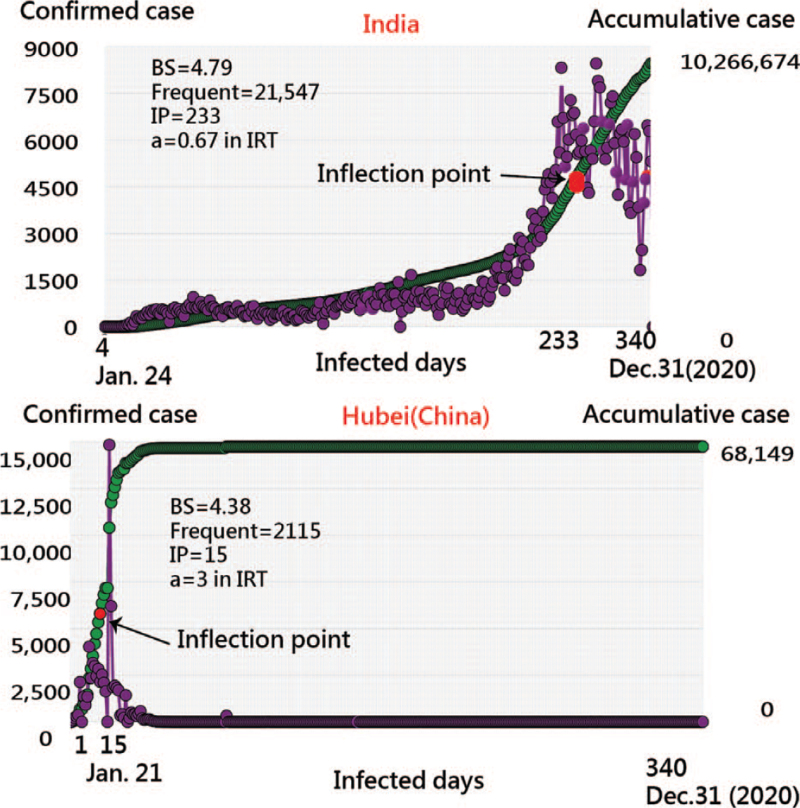
Two examples (e.g., India and China) are illustrated in Figure 5 using line charts to display the daily confirmed cases and cumulative ogive curves. The IP and the middle points correspond to the TBG in red and black bubbles for a better understanding of the IP features. Accordingly, we found that the evolution of COVID-19 on the TBG makes the data clear and easy to understand.
Figure 5.
The evolution of confirmed cases of COVID-19 in India (top) and Hubei (China) (bottom) in 2020.
3.3. Comparison of IP and R2 in differences when modeling COVID-19
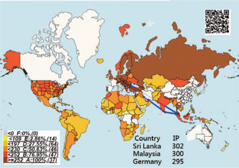
The geospatial distribution of IPs in countries/regions is shown in Figure 6. We can see that the top 3 are Sri Lanka, Malaysia, and Germany using the 3 blue lines linked together. Most regions in China have shorter IPs in white color when compared to the US states. The IP stands for the containment ability against COVID-19.[39]
Figure 6.
Geographic distribution of IP on COVID-19 in 2020. IP = inflection point
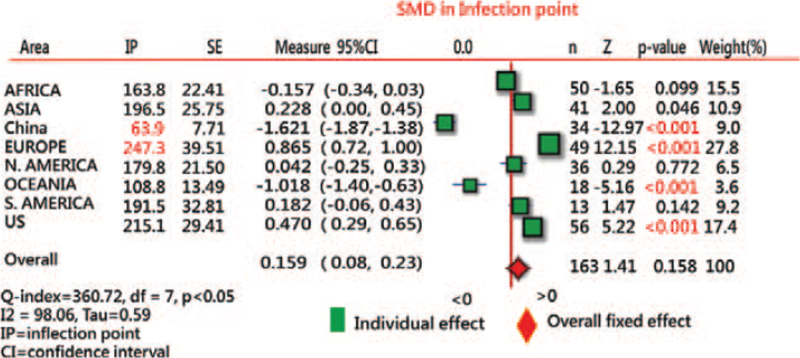
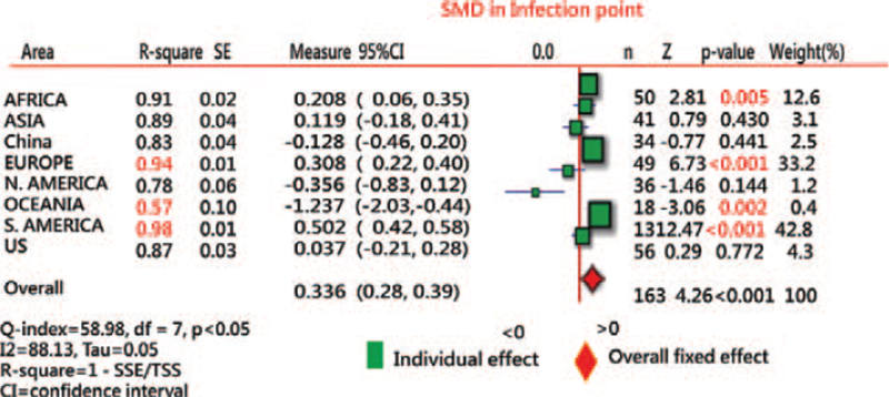
We found that (1) the shorter IP (=53.9) was observed in China and the longest (=247.3) in Europe (Fig. 7), and (2) the highest R2 (as the variance explained in the model) was in South America, with an average of 0.98 (Fig. 8).
Figure 7.
Comparison of IP days on COVID-19 ogive curves in areas in 2020 using the forest plot. IP = inflection point.
Figure 8.
Comparison of R-square for IP estimations on COVID-19 ogive curves in areas in 2020 using the forest plot. IP = inflection point.
When referring to the data in Figure 6, the provinces and areas with the lower R2 in China are Hebei (=0.7), Yunnan (=0.62), and Tibet (=0 due to only 1 case that occurred on January 24, 2020). The US states with the lower R2 are Massachusetts (=0.75), New Jersey (=0.73), and New York (=0.76).
3.4. Online dashboards shown on Google Maps
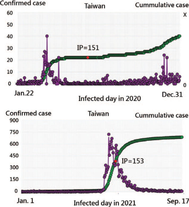
All the QR codes in figures are linked to the dashboards. Readers are suggested to examine the displayed dashboards on Google Maps. For instance, the 2nd wave in Taiwan existed in 2020 (see the top panel in Fig. 9 or a yellow bobble and parameter a = 0.2 < 0.5 at the right-hand side appears in Fig. 4), with the IP days at 151 based on the rule: the 2nd wave is at parameter a = 0.2 < 0.5 and at the decline stage with 1 yellow bubble at the right-hand side on the TBG (see the bottom in Fig. 4). In contrast, the IP at 153 for COVID-19 in Taiwan in 2021 is in the bottom panel of Figure 9.
Figure 9.
The determination of IP days in Taiwan. IP = inflection point.
4. Discussion
4.1. Principal findings
We observed that the evolution of COVID-19 on the TBG makes the data clear and easy to understand, the shorter IP (=53.9) was in China and the longest (=247.3) was in Europe, and the highest R2 was in the US, with an average of 0.98.
4.2. Contributions of the study
Previous studies[15,16] have proposed a method (such as the use of the absolute advantage coefficient[34]) to search for the IP location, which is redundant because the IP can be directly determined by observing the item difficulty parameter, as we proved in (7), using a differential equation in calculus and the MP4 video.[31]
Many researchers[7–14] have proposed the use of mathematical models to the number of COVID-19 cases, while others have investigated the IP days during the COVID-19 pandemic.[15–21] None of those studies, but the one,[21] used IP days to compare the containment ability against COVID-19 in countries/regions. Nonetheless, the study[21] did not report how to effectively determine the IP days.
On the other hand, the trend of publications on mobile health research was modeled on the EGM curve along with the IP point at 20[28] but not with the IP determination, as we did in (3),[29] using the differential equation in calculus for verification.
The TBG has been illustrated in bibliographical studies,[22,28] but no such IP points combined on the TBGs, as we demonstrated in Figures 2 and 4. As such, temporal visualization can be further improved when compared to previous studies.[40–42]
Although burst strength has been proposed in the study,[43] the calculation is not as intuitive and easy to understand as we proposed it in (9) and applied it to the TBG in Figures 2 and 4.
The choropleth map[37] can be complemented with the IP displayed on the TBG. The online forest plot[38,44] is another feature that compares the IP and R2 across countries/regions and continents. Google Maps show an online dashboard that is unique and innovative. Readers are invited to examine them in detail on their own to manipulate bubbles and icons on dashboards.
4.3. What it implies and what should be changed
Over 3188 articles published in the PubMed database were searched by using the keyword “inflection point”[45] and 106 in the title.[46] No such comparisons were made using the IP and R2 on forest plots for countries/regions in COVID-19 and model-data-fit validation until now.
The uses of novel graph-based data models[47] and recommendation techniques[48] have shown promise in recent years. The online dashboard-type representation used in epidemiology is proposed and recommended for future studies and is not limited to the COVID-19 pandemic, as we performed in this study.
The capacity for effective control against COVID-19 should be calculated as[21] reported by South Korea, which has successfully maintained a flat infection curve for more than 50 days. However, if South Korea was selected on the TBG up to the end in 2020, the IP days is 173, which is considerably longer than the IP in Hubeiina (Ch) at 15. The reason is the second wave of COVID-19 occurring in South Korea at the end of 2020.[49]
The animated dashboards designed for this study also surpass the static images in relevant articles.[50] A picture is worth a thousand views.[51] We hope that future related research will be able to make use of the TBG to display the evolution of data on dashboards, as we did in this study.
4.4. Strengths of this study
First, the IP location is proven at the item difficulty in IRT using the differential equation in calculus and makes the following analyses and visualizations possible and feasible, such as IPs on the TBG, the choropleth map, and the forest plot.
Second, the enhanced TBG with IP and other signals makes the data clear and easy to understand and contributions to public health in quantitative analysis method.
Third, the comparison of effective control against COVID-19 in countries/regions and continents can be made, which is rarely seen on the choropleth map and the forest plot in the literature.
Fourth, the abstract MP4 video on how to model the COVID-19 inflections, obtain the IP days, and draw the TBG has been given to readers for replicating the study in the future, particularly with the Solver add-in tool in the MS Excel environment, as in previous studies.[15,16,52–54]
4.5. Limitations and suggestions
Our study has several limitations that should be mentioned. First, only the IRT model was applied to determine the IP days (or locations). Future studies are required to examine more models to estimate IPs and make comparisons between models.
Second, the Microsoft Solver add-in is not a unique method to estimate model parameters. Many other methods can be applied to study, such as Warm weighted mean likelihood estimate,[55] anchored maximum likelihood estimation,[56] and weighted likelihood estimation.[57] They are worthy of comparison in future research.
Third, visual dashboards are shown on Google Maps. However, these visual presentations are not free of charge. For instance, the Google Maps application programming interface requires a paid project key for the cloud platform. Thus, the limitations of the dashboard are that it is not publicly accessible, and it is difficult to mimic by other authors or programmers for use in a short period of time. Similarly, the paid tool used for presenting online visual representations was applied to display Figures 3 and 5 through JPpower.[58]
Forth, the 2 Sections 2.2.1.1 and 2.2.1.2 are of importance to the IP determination using differential equations in calculus to verify. The limitation is hard for most readers who are medicos not familiar with math terms. Skipping the 2 sections will not deter them from understanding the meaningfulness of IP and TBG used in epidemic and public-health fields in the future.
Last, although IRT is common and popular in the educational and psychometric field, many readers in public health are unfamiliar with the application of IRT. The IRT model consists of 2 parameters used to estimate the IP that needs some effort to understand or replicate the study through the data and MP4 videos provided in Supplemental Digital Content 1.
5. Conclusion
We successfully estimated the IPs for countries/regions on COVID-19 in 2020 and presented them on the TBG. Temporal visualization is recommended for researchers in future relevant studies and is not merely limited to IP searches in COVID-19 pandemics.
Acknowledgments
We thank Enago (www.enago.tw) for the English language review of this manuscript.
Author contributions
YC developed the study concept and design. YS and TW analyzed and interpreted the data. JH monitored the process of this study and helped respond to the viewers’ advice and comments. YC drafted the manuscript, and all authors provided critical revisions for important intellectual content. The study was supervised by YC. All authors read and approved the final manuscript.
Conceptualization: Sam Yu-Chieh Ho.
Data curation: Sam Yu-Chieh Ho.
Investigation: Ju-Hao Hsieh.
Methodology: Tsair-Wei Chien, Yang Shao.
Supplementary Material
Footnotes
Abbreviations: EGM = exponential growth model, IP = inflection point, IRT = item response theory, TBG = temporal bar graph.
How to cite this article: Ho SYC, Chien TW, Shao Y, Hsieh JH. Visualizing the features of inflection point shown on a temporal bar graph using the data of COVID-19 pandemic. Medicine. 2022;101:5(e28749).
Ethics approval and consent to participate are not applicable.
All data were downloaded from the GitHub database at pubmed.com.
Consent to publish is not applicable.
The authors have no funding and conflicts of interest to disclose.
All data used in this study are available in SDC files.
The datasets generated during and/or analyzed during the current study are publicly available.
Supplemental digital content is available for this article.
References
- [1].Shang C, Yang Y, Chen GY, Shang XD. A simple transmission dynamics model for predicting the evolution of COVID-19 under control measures in China. Epidemiol Infect 2021;149:e43. [DOI] [PMC free article] [PubMed] [Google Scholar]
- [2].Scheffer M, Bascompte J, Brock WA, et al. Early-warning signals for critical transitions. Nature 2009;461:53–9. [DOI] [PubMed] [Google Scholar]
- [3].Ma ZS. A Simple Mathematical Model for Estimating the Inflection Points of COVID-19 Outbreaks. medRxiv 2020. Available at: https://www.medrxiv.org/content/10.1101/2020.03.25.20043893v1. Accessed July 29, 2021. [Google Scholar]
- [4].Scheffer M, Carpenter SR, Dakos V. Generic indicators of ecological resilience. Annu Rev Ecol Evol Syst 2015;46:145–67. [Google Scholar]
- [5].Veraart AJ, Faassen EJ, Dakos V, van Nes EH, Lürling M, Scheffer M. Recovery rates reflect distance to a tipping point in a living system. Nature 2012;481:357–9. [DOI] [PubMed] [Google Scholar]
- [6].Dakos V, Carpenter SR, van Nes EH, Scheffer M. Resilience indicators: prospects and limitations for early warnings of regime shifts. Phil Trans R Soc 2015;B370:20130263. [Google Scholar]
- [7].Perc M, Miksić NG, Slavinec M, Stožer A. Forecasting COVID-19. Front Phys 2020;8:127. [Google Scholar]
- [8].Fang Y, Nie Y, Penny M. Transmission dynamics of the COVID-19 outbreak and effectiveness of government interventions: a data-driven analysis. J Med Virol 2020;92:645–59. [DOI] [PMC free article] [PubMed] [Google Scholar]
- [9].Wu JT, Leung K, Leung GM. Nowcasting and forecasting the potential domestic and international spread of the 2019-nCoV outbreak originating in Wuhan, China: a modeling study. Lancet 2020;395:689–97. [DOI] [PMC free article] [PubMed] [Google Scholar]
- [10].Anastassopoulou C, Russo L, Tsakris A, Siettos C. Data-based analysis, modeling and forecasting of the COVID-19 outbreak. PLoS One 2020;15:e0230405. [DOI] [PMC free article] [PubMed] [Google Scholar]
- [11].Zhao S, Chen H. Modeling the epidemic dynamics and control of COVID-19 outbreak in China. Quant Biol 2020;8:11–9. [DOI] [PMC free article] [PubMed] [Google Scholar]
- [12].Rong XM, Yang L, Di Chu H, Fan M. Effect of delay in diagnosis on transmission of COVID-19. Math Biosci Eng 2020;17:2725–40. [DOI] [PubMed] [Google Scholar]
- [13].Mandal M, Jana S, Nandi SK, Khatua A, Adak S, Kar T. A model based study on the dynamics of COVID-19: prediction and control. Chaos Solitons Fractals 2020;136:109889. [DOI] [PMC free article] [PubMed] [Google Scholar]
- [14].Huang J, Qi G. Effects of control measures on the dynamics of COVID-19 and double-peak behavior in Spain. Nonlinear Dyn 2020;101:1889–99. [DOI] [PMC free article] [PubMed] [Google Scholar]
- [15].Lee KW, Chien TW, Yeh YT, Chou W, Wang HY. An online time-to-event dashboard comparing the effective control of COVID-19 among continents using the inflection point on an ogive curve: observational study. Medicine (Baltimore) 2021;100:e24749. [DOI] [PMC free article] [PubMed] [Google Scholar]
- [16].Wang LY, Chien TW, Chou W. Using the IPcase index with inflection points and the corresponding case numbers to identify the impact hit by COVID-19 in China: an observation study. Int J Environ Res Public Health 2021;18:1994. [DOI] [PMC free article] [PubMed] [Google Scholar]
- [17].Buan Q, Wu J, Wu G, Wang YG. Predication of inflection point and outbreak size of COVID-19 in new epicenters. Nonlinear Dyn 2020;101:1561–81. [Google Scholar]
- [18].Chatham WW. Treating Covid-19 at the inflection point. J Rheumatol 2020;47:01–10. [Google Scholar]
- [19].Gu C, Zhu J, Sun Y, Zhou K, Gu J. The inflection point about COVID-19 may have passed. Sci Bull 2020;65:865–7. [DOI] [PMC free article] [PubMed] [Google Scholar]
- [20].Fan RG, Wang YB, Luo M, Zhang YQ, Zhu CP. SEIR-based COVID-19 transmission model, and inflection point prediction analysis. Dianzi Keji Daxue Xuebao/J Univ Electron Sci Technol China 2020;49. [Google Scholar]
- [21].Jeong GH, Lee HJ, Lee J, et al. Effective Control of COVID-19 in South Korea: Cross-Sectional Study of Epidemiological Data. J Med Internet Res 2020;22:e22103. [DOI] [PMC free article] [PubMed] [Google Scholar]
- [22].Borner K, Polly DE. Replicable Science of Science Studies. 2014. Available at: https://www.researchgate.net/publication/281375480_Replicable_Science_of_Science_Studies. Accessed July 29, 2021. [Google Scholar]
- [23].Zheng N, Du S, Wang J, et al. Predicting COVID-19 in China using hybrid AI model. IEEE Trans Cybern 2020;50:2891–904. [DOI] [PubMed] [Google Scholar]
- [24].Ma Z. Predicting the outbreak risks and inflection points of COVID-19 pandemic with classic ecological theories. Adv Sci (Weinh) 2020;7:2001530. [DOI] [PMC free article] [PubMed] [Google Scholar]
- [25].Veritasium. The Simplest Math Problem No One Can Solve - Collatz Conjecture. Available at: https://www.youtube.com/watch?v=094y1Z2wpJg. Accessed September 21, 2021. [Google Scholar]
- [26].Machado JAT, Galhano A, Cao Labora D. A clustering perspective of the Collatz conjecture. Mathematics 2021;9:314. [Google Scholar]
- [27].Google Team. 2019 Novel Coronavirus (nCoV) Data Repository. Available at: https://github.com/CSSEGISandData/2019-nCoV. Accessed 29 July 29, 2021. [Google Scholar]
- [28].Shen L, Xiong B, Li W, Lan F, Evans R, Zhang W. Visualizing collaboration characteristics and topic burst on international mobile health research: bibliometric analysis. JMIR Mhealth Uhealth 2018;6:e135. [DOI] [PMC free article] [PubMed] [Google Scholar]
- [29].Shao Y, Chien TW. The determination of inflection curve on a given ogive curve using the second order derivative in calculus. J Bibliogr Anal Stat 2021;18:21–3. Available at: http://www.healthup.org.tw/article/articlex/inflectionpointcaculus.pdf. AAccessed July 29, 2021. [Google Scholar]
- [30].Shao Y, Chien TW. The determination of inflection point on a given ogive curve using the item response theory (IRT) model. J Bibliogr Anal Stat 2021;18:31–3. Available at: http://www.healthup.org.tw/article/articlex/inflectionIRT.pdf. Accessed July 29, 2021. [Google Scholar]
- [31].Chien TW. Simulation on IP equal in two mathematical models. Available at: https://www.youtube.com/watch?v=faExbBRTwlk. Accessed July 29, 2021. [Google Scholar]
- [32].Atlan. Visualizing Time Series Data: 7 Types of Temporal Visualizations. Available at: https://humansofdata.atlan.com/2016/11/visualizing-time-s. Accessed January 24, 2022. [Google Scholar]
- [33].Kan WC, Kuo SC, Chien TW, et al. Therapeutic duplication in Taiwan hospitals for patients with high blood pressure, sugar, and lipids: evaluation with a mobile health mapping tool. JMIR Med Inform 2020;8:e11627. [DOI] [PMC free article] [PubMed] [Google Scholar]
- [34].Yang DH, Chien TW, Yeh YT, Yang TY, Chou W, Lin JK. Using the absolute advantage coefficient (AAC) to measure the strength of damage hit by COVID-19 in India on a growth-share matrix. Eur J Med Res 2021;26:61. [DOI] [PMC free article] [PubMed] [Google Scholar]
- [35].MacMillan IC, Hambrick DC, Day DL. The product portfolio and profitability–a PIMS-based analysis of industrial-product businesses. Acad Manag J 1982;25:733–55. [Google Scholar]
- [36].Spee AP, Jarzabkowski P. Strategy tools as boundary objects. Strateg Organ 2009;7:223–32. [Google Scholar]
- [37].Chien TW, Wang HY, Hsu CF, Kuo SC. Choropleth map legend design for visualizing the most influential areas in article citation disparities: a bibliometric study. Medicine (Baltimore) 2019;98:e17527. [DOI] [PMC free article] [PubMed] [Google Scholar]
- [38].Yan YH, Chien TW. The use of forest plot to identify article similarity and differences in characteristics between journals using medical subject headings terms: a protocol for bibliometric study. Medicine (Baltimore) 2021;100:e24610. [DOI] [PMC free article] [PubMed] [Google Scholar]
- [39].Jeong GH, Lee HJ, Lee J, et al. Effective control of COVID-19 in South Korea: cross-sectional study of epidemiological data. J Med Internet Res 2020;22:e22103. [DOI] [PMC free article] [PubMed] [Google Scholar]
- [40].Revell LJ. covid19.Explorer: a web application and R package to explore United States COVID-19 data. PeerJ 2021;9:e11489. [DOI] [PMC free article] [PubMed] [Google Scholar]
- [41].Ma Q, Gao J, Zhang W, et al. Spatiotemporal distribution characteristics of COVID-19 in China: a city-level modeling study. BMC Infect Dis 2021;21:816. [DOI] [PMC free article] [PubMed] [Google Scholar]
- [42].Hu YT, Burch M, Wetering HV. Visualizing dynamic data with heat triangles. J Vis (Tokyo) 2021;01–15. [DOI] [PMC free article] [PubMed] [Google Scholar]
- [43].Kleinberg J. Bursty and hierarchical structure in streams. Proceedings of the Eighth ACM SIGKDD International Conference on Knowledge Discovery and Data Mining; KDD ’02; July 23–26, 2002; Edmonton, AB, Canada. 2002. pp. 91–101. [Google Scholar]
- [44].Stephenson J. Explaining the forest plot in meta-analyses. J Wound Care 2017;26:611–2. [DOI] [PubMed] [Google Scholar]
- [45].Pubmed Central Articles Related to inflection point. Available at: https://pubmed.ncbi.nlm.nih.gov/?term=%28inflection+point%29. Accessed September 11, 2021. [Google Scholar]
- [46].Pubmed Central Articles Related to inflection poi in Title. Available at: https://pubmed.ncbi.nlm.nih.gov/?term=%28inflection+point%29%5Btitle%5D. Accessed September 11, 2021. [Google Scholar]
- [47].Mercorio F, Mezzanzanica M, Moscato V, Picariello A, Sperli G. DICO: a graph-DB framework for community detection on big scholarly data. IEEE Trans Emerg Top Comput 2021;9:1987–2003. [Google Scholar]
- [48].Moscato V, Picariello A, Sperli G. An emotional recommender system for music. IEEE Intell Syst 2021;36:57–68. [Google Scholar]
- [49].Chien TW. COVID-19 in South Korea until the end of 2020. Available at http://www.healthup.org.tw/kpiall/wuhen2IRTonly.asp?kid=South+Korea. Accessed September 13, 2021. [Google Scholar]
- [50].Marvel SW, House JS, Wheeler M, et al. The COVID-19 Pandemic Vulnerability Index (PVI) dashboard: monitoring county-level vulnerability using visualization, statistical modeling, and machine learning. Environ Heal Perspect 2021;129:017701. [DOI] [PMC free article] [PubMed] [Google Scholar]
- [51].Oska S, Lerma E, Topf J. A picture is worth a thousand views: a triple crossover trial of visual abstracts to examine their impact on research dissemination. J Med Internet Res 2020;22:e22327. [DOI] [PMC free article] [PubMed] [Google Scholar]
- [52].Yan Y-H, Chien T-W, Yeh Y-T, Chou W, Hsing S-C. An app for classifying personal mental illness at workplace using fit statistics and convolutional neural networks: survey-based quantitative study. JMIR Mhealth Uhealth 2020;8:e17857. [DOI] [PMC free article] [PubMed] [Google Scholar]
- [53].Ma S-C, Chou W, Chien T-W, et al. An app for detecting bullying of nurses using convolutional neural networks and web-based computerized adaptive testing: development and usability study. JMIR Mhealth Uhealth 2020;8:e16747. [DOI] [PMC free article] [PubMed] [Google Scholar]
- [54].Lee Y-L, Chou W, Chien T-W, Chou P-H, Yeh Y-T, Lee H-F. An app developed for detecting nurse burnouts using the convolutional neural networks in Microsoft Excel: population-based questionnaire study. JMIR Med Inform 2020;8:e16528. [DOI] [PMC free article] [PubMed] [Google Scholar]
- [55].Linacre JM. The efficacy of Warm's weighted mean likelihood estimate (WLE) correction to maximum likelihood estimate (MLE) bias. Rasch Meas Trans 2009;23:1188–9. [Google Scholar]
- [56].Linacre JM. Estimating Rasch measures with known polytomous (or rating scale) item difficulties: anchored maximum likelihood estimation (AMLE). Trans 1998;12:638. [Google Scholar]
- [57].Warm TA. Weighted likelihood estimation of ability in item response theory. Psychometrik 1989;54:427–50. [Google Scholar]
- [58].JPgraph. A tool used for presenting online visual representations. Available at: https://jpgraph.net/. Accessed September 12, 2021. [Google Scholar]
Associated Data
This section collects any data citations, data availability statements, or supplementary materials included in this article.


