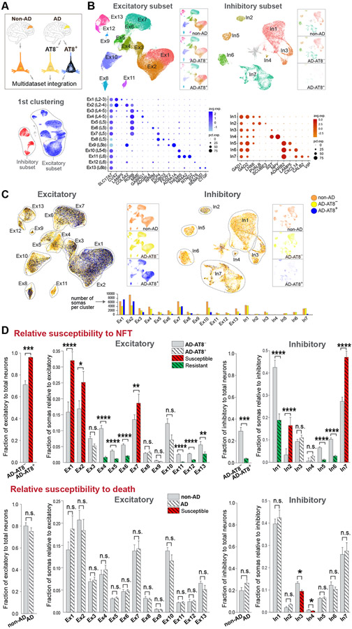
Figure 7. Uncoupling of NFT and neuronal death susceptibilities in AD.
(A and B) Integration of non-AD, AD-AT8−, and AD-AT8+ datasets. UMAP plots show unsupervised clustering of excitatory and inhibitory subsets. The three datasets are split and represented side-by-side to illustrate similar cell compositions of the non-AD and AD-AT8− datasets, and different cell compositions of the AD-AT8+ dataset. Dot plots (B) depict the expression of marker genes (x-axis) within Ex and In clusters (y-axis).
(C) UMAP plots highlighting relative contributions of non-AD, AD-AT8−, and AD-AT8+ somas to each Ex or In cluster.
(D) Bar plots showing fractions of AD-AT8+ vs. AD-AT8− somas (relative susceptibility to exhibit NFTs) and fractions of non-AD vs. AD somas (interpreted as relative susceptibility to death). The red and green colors indicate the most susceptible and resistant subtypes (adjusted p-values: *p < 0.05, **p < 0.01, ***p < 0.001, and ****p < 0.0001; n.s. = not significant; beta regression analysis). Data are represented as mean ± SEM.
See also Figures S7 and S8 and Table S6.

