Abstract
IMPORTANCE
County-level patterns in mortality rates by cause have not been systematically described but are potentially useful for public health officials, clinicians, and researchers seeking to improve health and reduce geographic disparities.
OBJECTIVES
To demonstrate the use of a novel method for county-level estimation and to estimate annual mortality rates by US county for 21 mutually exclusive causes of death from 1980 through 2014.
DESIGN, SETTING, AND PARTICIPANTS
Redistribution methods for garbage codes (implausible or insufficiently specific cause of death codes) and small area estimation methods (statistical methods for estimating rates in small subpopulations) were applied to death registration data from the National Vital Statistics System to estimate annual county-level mortality rates for 21 causes of death. These estimates were raked (scaled along multiple dimensions) to ensure consistency between causes and with existing national-level estimates. Geographic patterns in the age-standardized mortality rates in 2014 and in the change in the age-standardized mortality rates between 1980 and 2014 for the 10 highest-burden causes were determined.
EXPOSURE
County of residence.
MAIN OUTCOMES AND MEASURES
Cause-specific age-standardized mortality rates.
RESULTS
A total of 80 412 524 deaths were recorded from January 1, 1980, through December 31, 2014, in the United States. Of these, 19.4 million deaths were assigned garbage codes. Mortality rates were analyzed for 3110 counties or groups of counties. Large between-county disparities were evident for every cause, with the gap in age-standardized mortality rates between counties in the 90th and 10th percentiles varying from 14.0 deaths per 100 000 population (cirrhosis and chronic liver diseases) to 147.0 deaths per 100 000 population (cardiovascular diseases). Geographic regions with elevated mortality rates differed among causes: for example, cardiovascular disease mortality tended to be highest along the southern half of the Mississippi River, while mortality rates from self-harm and interpersonal violence were elevated in southwestern counties, and mortality rates from chronic respiratory disease were highest in counties in eastern Kentucky and western West Virginia. Counties also varied widely in terms of the change in cause-specific mortality rates between 1980 and 2014. For most causes (eg, neoplasms, neurological disorders, and self-harm and interpersonal violence), both increases and decreases in county-level mortality rates were observed.
CONCLUSIONS AND RELEVANCE
In this analysis of US cause-specific county-level mortality rates from 1980 through 2014, there were large between-county differences for every cause of death, although geographic patterns varied substantially by cause of death. The approach to county-level analyses with small area models used in this study has the potential to provide novel insights into US disease-specific mortality time trends and their differences across geographic regions.
Recent research has highlighted large, long-standing, and increasing geographic inequalities in life expectancy among counties within the United States.1,2 However, relatively little is known about geographic patterns and inequalities in mortality by underlying cause of death. Information about variation in cause-specific mortality could provide important insights into geographic inequalities and divergent trends in life expectancy. Moreover, local information about cause-specific mortality rates could be used by policy makers, clinicians, and public health professionals to inform more targeted strategies to improve health and survival and to decrease geographic inequalities in the United States.
Previous efforts3–8 to generate country-wide county-level estimates of cause-specific mortality have generally focused on only a single cause or group of closely related causes. The cause definitions used by these analyses vary widely (ie, the specific cause of death codes included for a given cause varies by analysis) as do the periods considered and the statistical methods used. Consequently, it is difficult to compare across causes that were analyzed separately. Furthermore, to our knowledge, no previous study of county-level cause-specific mortality has attempted to correct for the presence of garbage codes, that is, cause of death codes in death registration data that are implausible or insufficiently specific.9 The proportion of registered deaths that are assigned garbage codes varies by county, year, and underlying true cause, and a failure to appropriately redistribute these deaths may lead to erroneous conclusions about geographic patterns, time trends, and the relative burden of different causes of death.
This study presents a novel method using garbage code redistribution methods (methods for reassigning garbage codes) and small area estimation methods (statistical methods for estimating rates among small subpopulations) for estimating county-level cause-specific mortality rates.
Methods
Data
This analysis used deidentified death records from the National Vital Statistics System provided by the National Center for Health Statistics.10 These records covered deaths that occurred within the United States from January 1, 1980, through December 31, 2014, and included the age, sex, and county of residence at the time of death for each decedent, as well as the registered underlying cause of death, coded according to the International Classification of Diseases, Ninth Revision (ICD-9) for deaths prior to 1999 and ICD-10 for deaths that occurred in 1999 or later.11,12 Deaths were tabulated by age group (0, 1–4, 5–9, 10–14, …, 75–79, and ≥80 years), sex, county, year, and cause. This research received institutional review board approval from the University of Washington. Informed consent was not required because the study used deidentified data and was retrospective.
Annual county-level population counts by age, sex, and race from 1980 to 1989 provided by the US Census Bureau and annual county-level population counts by age, sex, and race/ethnicity from 1990 to 2014 provided by the National Center for Health Statistics were used in this analysis.13–16 Population counts in both series were summed across all race/ethnicity groups to generate annual county-level population counts by age group and sex. These 2 sources were then combined to produce a time series covering 1980 through 2014 and scaled to match the total population in each year provided by the Human Mortality Database.17
County-level covariates on levels of education, income, race/ethnicity, Native American reservations, and population density were used in the small area estimation model. These covariates were based on data provided by the US Census Bureau and the National Center for Health Statistics. Covariates related to race and ethnicity were derived from self-reported responses to the decennial census and American Community Survey and use the categories specified by the Office of Management and Budget.18 More details on these data sources are provided in eTable 1 in the Supplement.
In a small number of cases, county boundaries shifted between 1980 and the present. To account for these changes, several counties were merged to create historically stable units. Details on the merged county units are provided in eTable 2 in the Supplement. For simplicity, these units are referred to as counties throughout.
Cause List and Garbage Code Redistribution
The cause list developed for the Global Burden of Disease Study (GBD)19 was used for this analysis; it has been widely used for cause of death analyses.20,21 The GBD cause list is arranged hierarchically in 4 levels; within each level, the cause list is designed such that all deaths are assigned exactly 1 cause. As part of the GBD study, a map has been developed that allows ICD-9 and ICD-10 codes to be translated to GBD causes; eTable 3 in the Supplement lists all causes in the GBD cause list and the ICD-9 and ICD-10 codes that contributed to each cause. This analysis focuses on the 21 causes in the second level of this hierarchy (Box). This level was selected because major causes of death (eg, neoplasms, cardiovascular diseases) are distinguished but the number of causes is still relatively small, making it possible to consider all causes.
Box. Level 1 and 2 Causes of Death in the Global Burden of Disease Hierarchy.
Communicable, Maternal, Neonatal, and Nutritional Diseases (Level 1)
HIV/AIDS and tuberculosis (level 2): tuberculosis; HIV/AIDS
Diarrhea, lower respiratory, and other common infectious diseases (level 2): diarrheal diseases; intestinal infectious diseases; lower respiratory tract infections; upper respiratory tract infections; otitis media; meningitis; encephalitis; diphtheria; whooping cough; tetanus; measles; varicella-zoster virus infection; herpes zoster
Neglected tropical diseases and malaria (level 2): malaria; Chagas disease; leishmaniasis; African trypanosomiasis; schistosomiasis; cysticercosis; cystic echinococcosis; dengue; yellow fever; rabies; intestinal nematode infections; other neglected tropical diseases; Ebola
Maternal disorders (level 2): maternal hemorrhage; maternal sepsis and other maternal infections; maternal hypertensive disorders; maternal obstructed labor and uterine rupture; maternal abortion, miscarriage, and ectopic pregnancy; indirect maternal deaths; late maternal deaths; other maternal disorders; maternal deaths aggravated by HIV/AIDS
Neonatal disorders (level 2): neonatal preterm birth complications; neonatal encephalopathy due to birth asphyxia and trauma; neonatal sepsis and other neonatal infections; hemolytic disease and other neonatal jaundice; other neonatal disorders
Nutritional deficiencies (level 2): protein-energy malnutrition; iodine deficiency; iron deficiency anemia; other nutritional deficiencies
Other communicable, maternal, neonatal, and nutritional diseases (level 2): sexually transmitted diseases excluding HIV; hepatitis; other infectious diseases
Noncommunicable Diseases (Level 1)
Neoplasms (level 2): esophageal cancer; stomach cancer; liver cancer; larynx cancer; tracheal, bronchus, and lung cancer; breast cancer; cervical cancer; uterine cancer; prostate cancer; colon and rectal cancer; lip and oral cavity cancer; nasopharynx cancer; other pharynx cancer; gallbladder and biliary tract cancer; pancreatic cancer; malignant skin melanoma; nonmelanoma skin cancer; ovarian cancer; testicular cancer; kidney cancer; bladder cancer; brain and nervous system cancer; thyroid cancer; mesothelioma; Hodgkin lymphoma; non-Hodgkin lymphoma; multiple myeloma; leukemia; other neoplasms
Cardiovascular diseases (level 2): rheumatic heart disease; ischemic heart disease; cerebrovascular disease; hypertensive heart disease; cardiomyopathy and myocarditis; atrial fibrillation and flutter; aortic aneurysm; peripheral vascular disease; endocarditis; other cardiovascular and circulatory diseases
Chronic respiratory diseases (level 2): chronic obstructive pulmonary disease; pneumoconiosis; asthma; interstitial lung disease and pulmonary sarcoidosis; other chronic respiratory diseases
Cirrhosis and other chronic liver diseases (level 2): cirrhosis and other chronic liver diseases
Digestive diseases (level 2): Peptic ulcer disease; gastritis and duodenitis; appendicitis; paralytic ileus and intestinal obstruction; inguinal, femoral, and abdominal hernia; inflammatory bowel disease; vascular intestinal disorders; gallbladder and biliary diseases; pancreatitis; other digestive diseases
Neurological disorders (level 2): Alzheimer disease and other dementias; Parkinson disease; epilepsy; multiple sclerosis; motor neuron disease; other neurological disorders
Mental and substance use disorders (level 2): schizophrenia; alcohol use disorders; drug use disorders; eating disorders
Diabetes, urogenital, blood, and endocrine diseases (level 2): diabetes mellitus; acute glomerulonephritis; chronic kidney disease; urinary diseases and male infertility; gynecological diseases; hemoglobinopathies and hemolytic anemias; endocrine, metabolic, blood, and immune disorders
Musculoskeletal disorders (level 2): rheumatoid arthritis; other musculoskeletal disorders
Other noncommunicable diseases (level 2): congenital anomalies; skin and subcutaneous diseases; sudden infant death syndrome
Injuries (Level 1)
Transport injuries (level 2): road injuries; other transport injuries
Unintentional injuries (level 2): falls; drowning; fire, heat, and hot substances; poisonings; exposure to mechanical forces; adverse effects of medical treatment; animal contact; foreign body; other unintentional injuries; environmental heat and cold exposure
Self-harm and interpersonal violence (level 2): self-harm; interpersonal violence
Forces of nature, war, and legal intervention (level 2): exposure to forces of nature; collective violence and legal intervention
Abbreviation: HIV, human immunodeficiency virus.
Previous studies9 have documented the high proportion of registered deaths for which the underlying cause of death has been assigned a garbage code, that is, a code that refers to an intermediate or immediate cause of death rather than an underlying cause of death (eg, cardiopulmonary arrest) or a code that is insufficiently specific (eg, malignant neoplasm of other and ill-defined sites). Failure to appropriately redistribute garbage codes can lead to erroneous geographic and temporal patterns (as the proportion of deaths with garbage codes varies over time and place) as well as incorrect relative rankings among causes (as the likelihood that a death is assigned a garbage code varies by true underlying cause).
To address this issue, algorithms developed for the GBD study to redistribute deaths assigned garbage codes were used.19,21 First, specific garbage codes or groups of related garbage codes were assigned biologically plausible target causes. Second, deaths assigned garbage codes were redistributed to the target causes according to proportions derived in one of 4 ways: (1) published literature and/or expert opinion; (2) regression models linking changes in the proportion of deaths assigned to a given garbage code and those assigned to a given target code; (3) according to the proportions initially observed among the targets; and (4) for deaths with certain codes known to be related to human immunodeficiency virus (HIV)/AIDS, the mortality rate in each 5-year period was compared with that in 1980 and deaths beyond a 5% increase were assigned to HIV/AIDS, while the remainder were assigned to a different biologically plausible target. More details on each of these methods are provided in the eAppendix in the Supplement.
As an example, 62 deaths among men in King County, Washington, were coded to unspecified heart disease in 2013. Based on the garbage code redistribution algorithms, 48 of these deaths were reassigned to ischemic heart disease, 3 to hypertensive heart disease, 2 to atrial fibrillation and flutter, 3 to cardiomyopathy and myocarditis, 1 to rheumatic heart disease, 1 to endocarditis, and 4 to other cardiovascular and circulatory diseases. eFigure 1 in the Supplement depicts graphically how garbage code redistribution affects all cardiovascular diseases in King County. eFigure 2 and eFigure 3 in the Supplement show the percentage of deaths assigned garbage codes in each county and the effect of garbage code redistribution on total deaths by cause for the United States as a whole, respectively.
Mapping from ICD-9 and ICD-10 to the GBD cause list and redistribution of garbage codes were carried out at the lowest levels of the GBD cause hierarchy. Deaths were then aggregated to the first and second levels of the cause hierarchy.
Statistical Analysis
Bayesian spatially explicit mixed-effects regression models for all-cause mortality and each cause in level 1 and level 2 of the GBD cause hierarchy were estimated separately for males and females. The model included the following covariates: the proportion of the adult population who has graduated high school; the proportion of the population that is Hispanic; the proportion of the population that is black; the proportion of the population that is a race other than black or white; the proportion of a county that is contained within a state or federal Native American reservation; the median household income; and the population density. These covariates were chosen because they are well measured at the county level and expected to be predictive of county-level mortality rates. Further details about this model are provided in the eAppendix in the Supplement.
One thousand draws (ie, simulated values) of each model parameter were sampled from the posterior distribution and used to derive draws of the mortality rate for each county, year, and age group. To ensure internal consistency between estimates of all-cause mortality and cause-specific mortality as well as consistency with national-level estimates from the GBD study (which incorporate prevalence data for causes such as atrial fibrillation, as well as Alzheimer disease and other dementias, that cannot be used directly at the county level), the estimated mortality rates were raked (ie, scaled along multiple dimensions)22 such that the sum across all causes equaled the estimated all-cause mortality rate and that the population-weighted average of the county-level mortality rates equaled the national-level mortality rate for each cause (further details are provided in the eAppendix in the Supplement). After raking, state- and national-level estimates of the age-specific mortality rates were derived by population weighting the county-level estimates, and estimates at the county, state, and national levels were age standardized using the US 2010 census population as the standard. Similarly, years of life lost (YLLs) were calculated for each age group by multiplying the mortality rate by population by life expectancy at the average age at death from the reference life table used in the GBD study19 and then summed across all ages (additional details are provided in the eAppendix in the Supplement).
Point estimates for each quantity of interest were derived from the mean of the draws, while 95% uncertainty intervals (UIs) were derived from the 2.5th and 97.5th percentiles. When measuring changes over time, the change was considered statistically significant if the posterior probability of an increase (or decrease) was at least 95%, ie, if the mortality rate increased (or declined) in at least 95% of the draws.
The performance of the small area models was evaluated using an established empirical validation framework designed specifically for the United States.23,24 This validation framework was used to compare performance of 4 variants of the model described earlier as well as 2 previously published models1,24 in terms of bias, precision, and coverage. The selected model consistently performed as well as or better than all other models. More details about the validation methods and results are included in the eAppendix in the Supplement.
Inequality among counties was quantified by comparing the mortality rate in the 90th percentile with the mortality rate in the 10th percentile among all counties in a given year. Two types of inequality were considered. Absolute inequality, which represents the absolute magnitude of the gap between high-and low-mortality counties, was quantified as the difference between the mortality rates in the 90th and 10th percentiles. Relative inequality, which represents the relative difference between high- and low-mortality counties, was quantified as the ratio of the mortality rate in the 90th percentile to the mortality rate in the 10th percentile.
Garbage code redistribution was carried out in Python version 2.7.3 (Python Software Foundation) and Stata MP version 13.1 (StataCorp LP) statistical software. Small area estimation was carried out in R version 3.2.4 statistical software (R Foundation for Statistical Computing). Models were fit using the Template Model Builder Package in R.25
Results
A total of 80 412 524 deaths among US residents were recorded from January 1, 1980, through December 31, 2014. Of these, 19.4 million deaths were assigned garbage codes. Most of these deaths (17.8 million) were assigned codes referring to intermediate or unspecified causes presumably within the same ICD-9 or ICD-10 chapter as the true underlying cause (9.1 million in the cardiovascular diseases chapter; 2.9 million in the respiratory diseases chapter; 1.7 million in the cancer chapter; 1.1 million in the injuries chapter; 1.0 million in the infectious diseases chapter; and 1.9 million in other chapters), while the remaining 1.7 million deaths (2.1% of all deaths) were assigned ill-defined codes. Of the 19.4 million deaths assigned garbage codes, 19.1% were reassigned using published literature, 44.7% were reassigned using regression methods, 35.6% were reassigned using observed proportions among target codes, and 0.6% were reassigned to HIV/AIDS or other targets based on comparison with 1980. As a result of merging counties to address historical boundary changes, the number of areas analyzed was 3110 (compared with 3142).
The Table summarizes the results for all 21 causes of death in 2014 at the national and county levels. The first section summarizes the burden of each cause at the national level: for example, there were 846.3 thousand deaths and 11 735.8 thousand YLLs from cardiovascular diseases in 2014, with a mortality rate of 252.7 deaths per 100 000 population. The second section summarizes the distribution of counties according to the age-standardized mortality rate from each cause: for example, the lowest mortality rate from neoplasms was 70.7 deaths per 100 000 population, compared with 169.5, 204.3, and 246.3 deaths per 100 000 population in counties in the 10th, 50th, and 90th percentiles, respectively, and 503.1 deaths per 100 000 population in the county with the highest rate. This corresponds to an absolute difference of 76.8 deaths per 100 000 population between the mortality rates in counties in the 90th and 10th percentiles.
Table.
National Deaths, Years of Life Lost, Age-Standardized Mortality Rates, and Distribution of Age-Standardized Mortality Rates at the County Level, 2014
| Cause of Death | National Deaths, YLLs, and Mortality Rate | County-Level Mortality Rate | ||||||||
|---|---|---|---|---|---|---|---|---|---|---|
| Deaths, No. in Thousands (Rank) | YLLs, No. in Thousands (Rank) | Mortality Rate, No. of Deaths/100 000 Population (Rank) | No. of Deaths/100 000 Population | 90th Minus 10th Percentile, No. of Deaths/100 000 Population (Rank)a | 90th/10th Percentile, Ratio (Rank)b | |||||
| Minimum | 10th Percentile | Median | 90th Percentile | Maximum | ||||||
| Communicable, maternal, neonatal, and nutritional diseases | ||||||||||
| HIV/AIDS and tuberculosis | 8.6 (16) | 316.8 (15) | 2.7 (16) | 0.2 | 0.4 | 0.9 | 3.4 | 65.7 | 3.0 (15) | 8.5 (1) |
| Diarrhea, lower respiratory, and other common infectious diseases | 100.4 (6) | 1423.7 (10) | 30.0 (6) | 9.1 | 20.9 | 32.2 | 46.7 | 90.8 | 25.8 (6) | 2.2 (9) |
| Neglected tropical diseases and malaria | 0.2 (21) | 4.9 (21) | 0.0 (21) | 0.0 | 0.0 | 0.1 | 0.1 | 0.8 | 0.1 (21) | 4.7 (3) |
| Maternal disorders | 1.1 (19) | 58.2 (18) | 0.3 (19) | 0.1 | 0.2 | 0.3 | 0.5 | 1.5 | 0.3 (19) | 2.6 (7) |
| Neonatal disorders | 10.4 (14) | 897.2 (13) | 3.3 (14) | 1.2 | 2.1 | 3.1 | 5.2 | 10.9 | 3.1 (14) | 2.5 (8) |
| Nutritional deficiencies | 4.0 (18) | 51.2 (19) | 1.2 (18) | 0.1 | 0.8 | 1.5 | 2.5 | 7.1 | 1.6 (17) | 2.9 (6) |
| Other communicable, maternal, neonatal, and nutritional diseases | 4.5 (17) | 120.1 (17) | 1.4 (17) | 0.7 | 0.9 | 1.2 | 1.6 | 7.2 | 0.7 (18) | 1.8 (15) |
| Noncommunicable diseases | ||||||||||
| Neoplasms | 646.0 (2) | 12125.5 (1) | 192.0 (2) | 70.7 | 169.5 | 204.3 | 246.3 | 503.1 | 76.8 (2) | 1.5 (20) |
| Cardiovascular diseases | 846.3 (1) | 11735.8 (2) | 252.7 (1) | 77.0 | 209.2 | 272.3 | 356.2 | 545.2 | 147.0 (1) | 1.7 (18) |
| Chronic respiratory diseases | 177.3 (5) | 2522.2 (6) | 52.9 (5) | 14.3 | 44.1 | 62.5 | 85.2 | 161.0 | 41.1 (5) | 1.9 (13) |
| Cirrhosis and other chronic liver diseases | 56.2 (9) | 1474.1 (9) | 16.8 (9) | 6.7 | 11.5 | 17.3 | 25.5 | 192.6 | 14.0 (10) | 2.2 (10) |
| Digestive diseases | 47.4 (10) | 708.1 (14) | 14.2 (10) | 7.9 | 13.3 | 16.1 | 19.2 | 32.4 | 5.9 (12) | 1.4 (21) |
| Neurological disorders | 318.6 (3) | 2734.0 (4) | 95.4 (3) | 30.8 | 67.5 | 95.5 | 123.2 | 198.9 | 55.7 (3) | 1.8 (14) |
| Mental and substance use disorders | 43.1 (12) | 1775.6 (8) | 13.4 (12) | 3.0 | 6.5 | 11.7 | 21.5 | 73.2 | 15.0 (9) | 3.3 (4) |
| Diabetes, urogenital, blood, and endocrine diseases | 187.1 (4) | 3085.5 (3) | 55.9 (4) | 11.5 | 43.5 | 61.0 | 84.7 | 203.5 | 41.2 (4) | 1.9 (12) |
| Musculoskeletal disorders | 9.5 (15) | 184.8 (16) | 2.9 (15) | 1.3 | 2.4 | 3.1 | 4.2 | 10.6 | 1.8 (16) | 1.8 (16) |
| Other noncommunicable diseases | 18.9 (13) | 943.8 (12) | 5.8 (13) | 2.9 | 5.1 | 6.6 | 8.8 | 16.7 | 3.7 (13) | 1.7 (17) |
| Injuries | ||||||||||
| Transport injuries | 44.5 (11) | 1877.4 (7) | 13.8 (11) | 4.5 | 11.9 | 22.3 | 35.0 | 91.6 | 23.1 (7) | 2.9 (5) |
| Unintentional injuries | 63.2 (7) | 1389.5 (11) | 19.1 (8) | 7.6 | 18.3 | 23.8 | 29.9 | 69.7 | 11.6 (11) | 1.6 (19) |
| Self-harm and interpersonal violence | 63.1 (8) | 2727.4 (5) | 19.6 (7) | 7.5 | 14.4 | 21.1 | 30.3 | 118.0 | 15.9 (8) | 2.1 (11) |
| Forces of nature, war, and legal intervention | 0.2 (20) | 6.9 (20) | 0.1 (20) | 0.0 | 0.0 | 0.1 | 0.2 | 5.3 | 0.1 (20) | 4.8 (2) |
Abbreviations: HIV, human immunodeficiency virus; YLLs, years of life lost.
Measure of absolute geographic inequality.
Measure of relative geographic inequality.
The Figures in the article show the top 10 causes (in terms of YLLs) and eFigures 4–14 in the Supplement show the other 11 causes. Estimates for all causes and years are available in an online data visualization tool (Interactive).
Neoplasms
Neoplasms (Figure 1) caused 19 511 910 deaths (24.3% of all deaths) from 1980 through 2014 and were the leading cause of YLLs and the second leading cause of deaths in 2014. The mortality rate from neoplasms varied widely among counties: counties in the 90th percentile experienced mortality rates 76.8 deaths per 100 000 population higher than those in the 10th percentile. Very high mortality rates were observed in counties along the southern half of the Mississippi River, in eastern Kentucky and western West Virginia, and in western Alaska. At the other extreme, many counties in states stretching from Idaho and Wyoming in the north to western Texas in the south had mortality rates from neoplasms much lower than average. The mortality rate from neoplasms declined by 20.1% (95% UI, 18.2%–21.4%) overall between 1980 and 2014, but the mortality rate increased during the same period in 18.5% of counties (statistically significant in 5.1% of counties). Increases in mortality from neoplasms were found primarily in south-central counties, with the largest increases observed in eastern Kentucky. In contrast, the largest decreases in mortality from neoplasms were found primarily in counties in central Colorado, southern Florida, Alaska, parts of New England, and coastal counties in California.
Figure 1. County-Level Mortality From Neoplasms.
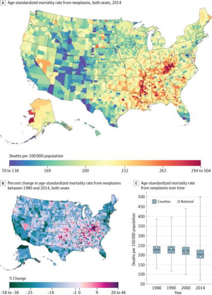
A, Age-standardized mortality rate for both sexes combined in 2014. B, Percent change in the age-standardized mortality rate for both sexes combined between 1980 and 2014. A and B, The color scale is truncated at approximately the first and 99th percentiles as indicated by the range given in the color scale. C, Age-standardized mortality rate in 1980, 1990, 2000, and 2014. The bottom border, middle line, and top border of the boxes indicate the 25th, 50th, and 75th percentiles, respectively, across all counties; whiskers, the full range across counties; and circles, the national-level rate.
Cardiovascular Diseases
Cardiovascular diseases (Figure 2) caused 31 992 547 deaths (39.8%) from 1980 through 2014 and were the second leading cause of YLLs and the leading cause of deaths in 2014. Cardiovascular diseases were an important contributor to mortality in every county: in 2014, cardiovascular diseases were the leading cause of death in 97.1% of counties and the top-ranked cause in terms of the age-standardized mortality rate in 98.5% of counties. However, the rate of death from cardiovascular diseases was far from uniform, with rates among counties in the 90thpercentile147.0deathsper100 000populationhigherthan rates among counties in the 10th percentile. The highest rates in 2014 were observed in counties in a band stretching from Oklahoma to Mississippi and in eastern Kentucky. Conversely, the lowest rates were observed in counties in central Colorado and near the border of Idaho, Montana, and Wyoming. Between 1980 and 2014, cardiovascular disease mortality decreased by 50.2% (95% UI, 49.5%–50.8%) overall. However, while nearly every county experienced a decline in cardiovascular disease mortality during this period (statistically significant in 99.9% of counties), the rate of decline was highly variable. Particularly slow rates of improvement were observed in many of the same counties in the band of south-central states stretching from Oklahoma to Alabama and Kentucky that had the highest mortality rates in 2014.
Figure 2. County-Level Mortality From Cardiovascular Diseases.
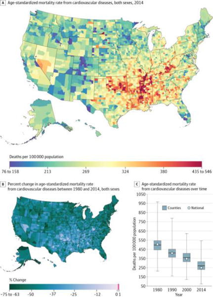
A, Age-standardized mortality rate for both sexes combined in 2014. The color scale is truncated at approximately the first and 99th percentiles as indicated by the range given in the color scale. B, Percent change in the age-standardized mortality rate for both sexes combined between 1980 and 2014. The color scale is truncated at the first percentile but not at the 99th percentile, to avoid combining counties with decreases in the mortality rate and counties with increases in the mortality rate into a single group. C, Age-standardized mortality rate in 1980, 1990, 2000, and 2014. The bottom border, middle line, and top border of the boxes indicate the 25th, 50th, and 75th percentiles, respectively, across all counties; whiskers, the full range across counties; and circles, the national-level rate.
Diabetes, Urogenital, Blood, and Endocrine Diseases
Diabetes, urogenital, blood, and endocrine diseases (Figure 3) caused 4 909 377 deaths (6.1%) from 1980 through 2014 and were the third leading cause of YLLs and fourth leading cause of deaths in 2014. In 2014, there was a difference of 41.2 deaths per 100 000 population in the mortality rates from these diseases between counties in the 90th and 10th percentiles. Counties throughout much of the south and mid-Atlantic had mortality rates that were higher than average. Mortality rates were particularly high in counties in Arkansas, Louisiana, and Mississippi along the Mississippi River and in counties in North Dakota and South Dakota with Native American reservations. The mortality rate from this cause increased by 21.0% (95% UI, 16.9%–24.9%) overall between 1980 and 2014. Similarly, 91.5% of counties had an increase in mortality rates from these diseases (statistically significant in 84.8% of counties). However, pockets of counties in Maryland, central Colorado, and north and western Alaska as well as individual counties throughout the rest of the country experienced declines in mortality from this cause during the same period.
Figure 3. County-Level Mortality From Diabetes, Urogenital, Blood, and Endocrine Diseases.
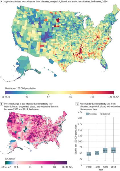
A, Age-standardized mortality rate for both sexes combined in 2014. B, Percent change in the age-standardized mortality rate for both sexes combined between 1980 and 2014. A and B, The color scale is truncated at approximately the first and 99th percentiles as indicated by the range given in the color scale. C, Age-standardized mortality rate in 1980, 1990, 2000, and 2014. The bottom border, middle line, and top border of the boxes indicate the 25th, 50th, and 75th percentiles, respectively, across all counties; whiskers, the full range across counties; and circles, the national-level rate.
Neurological Disorders
Neurological disorders (Figure 4) caused 3 971 426 deaths (4.9%) between 1980 and 2014 and were the fourth leading cause of YLLs and the third leading cause of deaths in 2014. In 2014, counties in the 90th percentile had mortality rates 55.7 deaths per 100 000 population higher than counties in the 10th percentile. Compared with most of the other causes considered, broad regional geographic trends were less prominent and there was more local geographic heterogeneity: counties with relatively high and relatively low mortality rates from neurological disorders were found throughout the country. Between 1980 and 2014, the mortality rate from neurological disorders increased by 18.7% (95% UI, 15.7%–21.9%) overall. Most counties (76.2%) experienced an increase during this period (statistically significant in 61.8%), and especially large increases were observed in southern counties stretching from eastern Texas and Oklahoma to Alabama. Notable declines in mortality were found in counties in the west stretching from central Idaho and western Montana to central Colorado.
Figure 4. County-Level Mortality From Neurological Disorders.
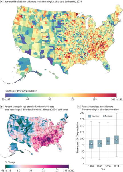
A, Age-standardized mortality rate for both sexes combined in 2014. B, Percent change in the age-standardized mortality rate for both sexes combined between 1980 and 2014. A and B, The color scale is truncated at approximately the first and 99th percentiles as indicated by the range given in the color scale. C, Age-standardized mortality rate in 1980, 1990, 2000, and 2014. The bottom border, middle line, and top border of the boxes indicate the 25th, 50th, and 75th percentiles, respectively, across all counties; whiskers, the full range across counties; and circles, the national-level rate.
Self-harm and Interpersonal Violence
Self-harm and interpersonal violence (Figure 5) caused 2 049 835 deaths (2.5%) between 1980 and 2014 and were the fifth leading cause of YLLs and the eighth leading cause of deaths in 2014. In 2014, counties in the 90th percentile had mortality rates 15.9 deaths per 100 000 population higher than counties in the 10th percentile. The highest mortality rates were observed in counties in Alaska, in Native American reservations in North Dakota and South Dakota, and in states in the southwest, while lower rates were found in the upper Midwest, New England, southwestern Texas, and southern California. The mortality rate from self-harm and interpersonal violence declined by 22.1% (95% UI, 18.9%–25.3%) overall between 1980 and 2014, but changes at the county level were highly variable, with substantial declines in counties in southern California, Texas, and states along the Atlantic coast from Florida to Virginia, while counties in Utah, Oklahoma and Kansas, along the Canadian border in North Dakota and Michigan, and parts of the Midwest and New England experienced similarly substantial increases. In total, 48.8% of counties experienced declines in mortality from self-harm and interpersonal violence from 1980 to 2014, while 51.2% experienced increases (these changes were statistically significant in 29.0% and 25.7% of counties, respectively).
Figure 5. County-Level Mortality From Self-harm and Interpersonal Violence.
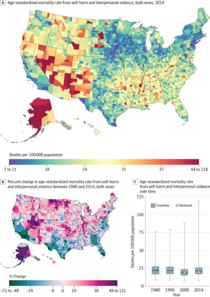
A, Age-standardized mortality rate for both sexes combined in 2014. B, Percent change in the age-standardized mortality rate for both sexes combined between 1980 and 2014. A and B, The color scale is truncated at approximately the first and 99th percentiles as indicated by the range given in the color scale. C, Age-standardized mortality rate in 1980, 1990, 2000, and 2014. The bottom border, middle line, and top border of the boxes indicate the 25th, 50th, and 75th percentiles, respectively, across all counties; whiskers, the full range across counties; and circles, the national-level rate.
Chronic Respiratory Diseases
Chronic respiratory diseases (Figure 6) caused 4 616 711 deaths (5.7%) between 1980 and 2014 and were the sixth leading cause of YLLs and the fifth leading cause of deaths in 2014. As with other causes, there was substantial between-county variation in the mortality rate, with a difference of 41.1 deaths per 100 000 population between counties in the 90th and 10th percentiles. Elevated mortality rates were observed in a prominent cluster in eastern Kentucky and West Virginia and in a second cluster in southeastern Colorado, while the lowest mortality rates were found in the Washington, DC, area, the upper Midwest, southern Florida, southern Texas, and central Colorado. Between 1980 and 2014, mortality rates increased in a majority of counties (93.2%; statistically significant in 88.3%), with particularly sizable increases observed among counties in a band through the south from northern Texas to North Carolina and South Carolina. During the same period, a smaller number of counties, primarily along the Mexico border, in northwestern New Mexico, central Colorado, and southwestern Montana, near Washington, DC, and in eastern Pennsylvania, experienced moderate declines.
Figure 6. County-Level Mortality From Chronic Respiratory Diseases.
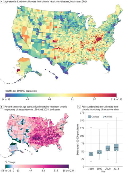
A, Age-standardized mortality rate for both sexes combined in 2014. B, Percent change in the age-standardized mortality rate for both sexes combined between 1980 and 2014. A and B, The color scale is truncated at approximately the first and 99th percentiles as indicated by the range given in the color scale. C, Age-standardized mortality rate in 1980, 1990, 2000, and 2014. The bottom border, middle line, and top border of the boxes indicate the 25th, 50th, and 75th percentiles, respectively, across all counties; whiskers, the full range across counties; and circles, the national-level rate.
Transport Injuries
Transport injuries (Figure 7) caused 1 787 070 deaths (2.2%) between 1980 and 2014 and were the seventh leading cause of YLLs and the 11th leading cause of deaths in 2014. Counties in the 90th percentile experienced mortality rates 23.1 deaths per 100 000 population higher than counties in the 10th percentile. In general, lower mortality rates were found in more urban areas, while higher mortality rates were found in more rural areas. The mortality rate from transport injuries declined for the United States as a whole by 45.4% (95% UI, 43.3%–47.5%) between 1980 and 2014. Most counties also experienced a decline during this period (98.5%; statistically significant in 93.6%), but to varying degrees. Counties in the central United States generally saw smaller improvements, while counties in the west, northern Midwest, New England, and southern Florida experienced more substantial declines.
Figure 7. County-Level Mortality From Transport Injuries.
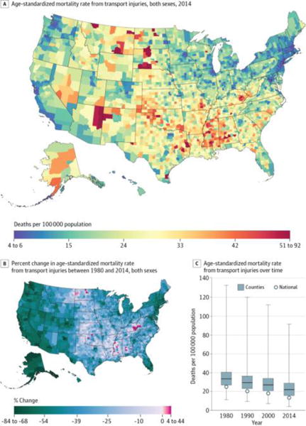
A, Age-standardized mortality rate for both sexes combined in 2014. B, Percent change in the age-standardized mortality rate for both sexes combined between 1980 and 2014. A and B, The color scale is truncated at approximately the first and 99th percentiles as indicated by the range given in the color scale. C, Age-standardized mortality rate in 1980, 1990, 2000, and 2014. The bottom border, middle line, and top border of the boxes indicate the 25th, 50th, and 75th percentiles, respectively, across all counties; whiskers, the full range across counties; and circles, the national-level rate.
Mental and Substance Use Disorders
Mental and substance use disorders (Figure 8) caused 814 391 deaths (1.0%) between 1980 and 2014 and were ranked eighth in terms of YLLs and 12th in terms of deaths in 2014. Mortality rates among counties in the 90th percentile were 15.0 deaths per 100 000 population higher than among counties in the 10th percentile. Exceptionally high mortality rates were found in a cluster of counties in eastern Kentucky and southwestern West Virginia; in counties in North Dakota, South Dakota, and southwestern states with Native American reservations; and in Alaska. Conversely, the lowest rates in 2014 were found primarily in counties in Nebraska, Iowa, and eastern South Dakota. The mortality rate due to mental and substance use disorders increased by 188% (95% UI, 160%–207%) overall between 1980 and 2014 and also increased in nearly every county (99.1%; statistically significant in 96.2%). However, the amount of increase varied dramatically across counties. In particular, there were several clusters of counties (in Kentucky, West Virginia, Ohio, Indiana, western Pennsylvania, and east-central Missouri) where mortality rates increased by more than 1000% during this period.
Figure 8. County-Level Mortality From Mental and Substance Use Disorders.
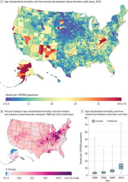
A, Age-standardized mortality rate for both sexes combined in 2014. The color scale is truncated at approximately the first and 99th percentiles as indicated by the range given in the color scale. B, Percent change in the age-standardized mortality rate for both sexes combined between 1980 and 2014. The color scale is truncated at the 99th percentile but not at the first percentile, to avoid combining counties with decreases in the mortality rate and counties with increases in the mortality rate into a single group. C, Age-standardized mortality rate in 1980, 1990, 2000, and 2014. The bottom border, middle line, and top border of the boxes indicate the 25th, 50th, and 75th percentiles, respectively, across all counties; whiskers, the full range across counties; and circles, the national-level rate.
Cirrhosis and Other Chronic Liver Diseases
Cirrhosis and other chronic liver diseases (Figure 9) caused 1 506 985 deaths (1.9%) between 1980 and 2014 and were the ninth-ranked cause of YLLs and deaths in 2014. At the county level, mortality rates in the 90th percentile were 14.0 deaths per 100 000 population higher than mortality rates in the 10th percentile. Counties in eastern Arizona, New Mexico, and south and western Texas and in selected counties in Colorado, Nevada, Wyoming, Montana, North Dakota, and South Dakota had the highest mortality rates, while counties in eastern South Dakota and Kansas as well as in Iowa and southern Minnesota had the lowest mortality rates. Between 1980 and 2014, the mortality rate from this cause declined by 15.6% (95% UI, 9.1%–26.9%) overall but increased in 69.6% of counties (statistically significant in 25.9%), with particularly large increases in southwestern Oregon and northwestern Texas.
Figure 9. County-Level Mortality From Cirrhosis and Other Chronic Liver Diseases.
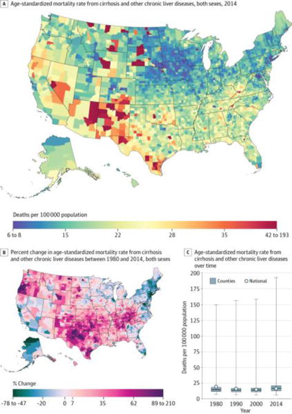
A, Age-standardized mortality rate for both sexes combined in 2014. B, Percent change in the age-standardized mortality rate for both sexes combined between 1980 and 2014. A and B, The color scale is truncated at approximately the first and 99th percentiles as indicated by the range given in the color scale. C, Age-standardized mortality rate in 1980, 1990, 2000, and 2014. The bottom border, middle line, and top border of the boxes indicate the 25th, 50th, and 75th percentiles, respectively, across all counties; whiskers, the full range across counties; and circles, the national-level rate.
Diarrhea, Lower Respiratory, and Other Common Infectious Diseases
Diarrhea, lower respiratory, and other common infectious diseases (Figure 10) were responsible for 3 234 692 deaths (4.0%) between 1980 and 2014 and were the 10th leading cause of YLLs and the sixth leading cause of deaths in 2014. Counties in the 90th percentile experienced mortality rates 25.8 deaths per 100 000 population higher than those in the 10th percentile. Mortality rates from this cause were highest in counties in southern states from Louisiana and Arkansas to Georgia, Tennessee, and Kentucky, while rates were lower than average in southern Florida, New England, the upper Midwest, central Colorado, and the Pacific Northwest. Nationally, the mortality rate from this cause declined by 22.1% (95% UI, 18.0%–26.8%) between 1980 and 2014. However, 28.3% of counties experienced increases in this mortality rate during the same period (statistically significant in 13.5%), with especially large increases found in counties in Louisiana, Arkansas, Mississippi, Alabama, southern Illinois, and eastern Kentucky.
Figure 10. County-Level Mortality From Diarrhea, Lower Respiratory, and Other Common Infectious Diseases.
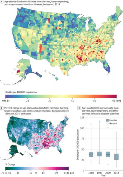
A, Age-standardized mortality rate for both sexes combined in 2014. B, Percent change in the age-standardized mortality rate for both sexes combined between 1980 and 2014. A and B, The color scale is truncated at approximately the first and 99th percentiles as indicated by the range given in the color scale. C, Age-standardized mortality rate in 1980, 1990, 2000, and 2014. The bottom border, middle line, and top border of the boxes indicate the 25th, 50th, and 75th percentiles, respectively, across all counties; whiskers, the full range across counties; and circles, the national-level rate.
Discussion
Using a novel method, this study estimated county-level mortality rates by cause for 21 major causes of death. This analysis improves on previous analyses in 3 ways. First, the scope of this analysis was much larger than in previous studies: this is the first study, to our knowledge, that considered a comprehensive set of causes over an extended period. Second, this analysis used garbage code redistribution methods to reassign deaths originally classified using insufficiently specific or implausible cause of death codes. To our knowledge, garbage code redistribution methods have not previously been used at the county level. Third, this analysis used new small area estimation methods that generated more precise estimates and more accurately quantified uncertainty compared with models previously used. As a consequence of these advances, the results of this study represent the most detailed and comprehensive accounting of county-level patterns of cause-specific mortality currently available.
Geographic patterns differed significantly across causes, underscoring the importance of considering cause-specific mortality in addition to measures of all-cause mortality such as life expectancy. For some causes (eg, cardiovascular diseases), counties in the south and Appalachia had elevated mortality, while counties in western states had mortality much lower than average, a pattern that, broadly speaking, has also been documented in maps of life expectancy as well as maps of risk factors such as smoking, physical inactivity, and obesity.1,26,27 However, other causes had very different geographic patterns. Moreover, for some causes (eg, mental and substance use disorders), there were striking clusters of counties with very high mortality rates. Geographic patterns in changes over time were similarly variable among causes.
Information on cause-specific mortality rates and rankings among causes has long been available at the national level19–21,28 and has been widely used for public health planning and policy making, but to our knowledge this analysis is the first to consider an exhaustive set of causes of death at the county level and to track changes over an extended period at this level. There are a number of potential uses for these estimates: state and county health departments could use county-level mortality estimates to identify pressing local needs and to tailor policies and programs accordingly; physicians could use these estimates to better understand the health concerns of the populations they serve; researchers could identify counties that have done unexpectedly well or poorly with regard to a particular cause of death and that warrant additional study to identify factors driving these trends; and communities can use these estimates as evidence when advocating for change. Further, for causes of death for which effective treatments are available, variation in mortality rates can highlight where access to treatment or quality of care is a pressing problem. Additionally, local-level estimates of mortality, and particularly cause-specific mortality, provide a mechanism for evaluating the effect of policies and programs implemented in some, but not all, localities. More detailed cause-specific information will further enhance the utility of this type of analysis to all of these stakeholders, and in the future we plan to carry out more detailed analyses at the third and fourth levels of the GBD cause hierarchy using the framework outlined in this analysis.
This study has several important limitations. First, the death registration data do not include deaths of US residents that occurred outside the United States, although these deaths are a very small percentage of the total. Second, the population counts were based on intercensal interpolations and postcensal projections that may be subject to error. Likewise, the covariates incorporated in the small area models were based on census and other administrative data and may also be subject to error.
Third, the garbage code redistribution methods used in this analysis have not been validated against a gold standard, such as autopsy, owing to insufficient data. However, several findings support the validity of the redistribution algorithm: redistribution reduces or eliminates discontinuities in temporal trends that coincide with revisions to the ICD for some causes (eg, ischemic heart disease), resulting in more plausible time trends9; redistribution results in more plausible geographic patterns across and within countries based on existing knowledge of the distribution of risks (eg, more reasonable patterns of ischemic heart disease mortality given knowledge of the distribution of related risk factors)29; and in a small number of cases in which hospital linkage studies have been used to examine the cause of death in cases for which death certificates list garbage codes, the results are broadly consistent with the effect of the redistribution algorithms.
Fourth, although the garbage code redistribution methods used in this analysis may be subject to error, this uncertainty is difficult to quantify and has not been accounted for in the reported UIs. Fifth, it is possible that the large increases over time observed for some causes of deaths are driven by changing registration practices and growing recognition among physicians of these particular causes of death. This is particularly true of Alzheimer disease and other dementias.30 However, the county-level estimates were raked to national-level estimates that incorporated prevalence data not subject to this same limitation, and this may have reduced this error. Sixth, small area models were used to more precisely estimate mortality rates, although there may be some situations in which these models were suboptimal. In particular, the models used in this analysis smoothed over time, space, and age group. As a result, unusually high or low mortality rates may have been attenuated, particularly in small counties, leading to an underestimation of geographic inequalities.
Conclusions
In this analysis of US cause-specific county-level mortality rates from 1980 through 2014, there were large between-county differences for every cause of death, although geographic patterns varied substantially by cause of death. The approach to county-level analyses with small area models used in this study has the potential to provide novel insights into US disease-specific mortality time trends and their differences across geographic regions.
Supplementary Material
Key Points.
Question
How do levels and trends in cause-specific mortality rates for 21 major causes of death vary by county within the United States?
Findings
Using a novel method, this analysis found significant variation in mortality rates and changes in mortality rates among counties for all causes of death. For example, in 2014, counties in the 90th percentile experienced mortality rates from neoplasms that were higher by 76.8 deaths per 100 000 population than counties in the 10th percentile.
Meaning
This method for estimating county-level cause-specific mortality rates has the potential to provide new insights into how mortality from different causes varies geographically in the United States.
Acknowledgments
Funding/Support: This work was funded by grant 72305 from the Robert Wood Johnson Foundation, grant 5P30AG047845-02 from the National Institute on Aging, and a philanthropic gift from John W. Stanton and Theresa E. Gillespie.
Role of the Funder/Sponsor: The funders had no role in the design and conduct of the study; collection, management, analysis, and interpretation of the data; preparation, review, or approval of the manuscript; and decision to submit the manuscript for publication.
Footnotes
Author Contributions: Dr Murray had full access to all of the data in the study and takes responsibility for the integrity of the data and the accuracy of the data analysis.
Concept and design: Dwyer-Lindgren, Bertozzi-Villa, Flaxman, Mokdad, Murray.
Acquisition, analysis, or interpretation of data: Dwyer-Lindgren, Bertozzi-Villa, Stubbs, Morozoff, Kutz, Huynh, Barber, Shackelford, Mackenbach, van Lenthe, Flaxman, Naghavi, Mokdad.
Drafting of the manuscript: Dwyer-Lindgren, Bertozzi-Villa.
Critical revision of the manuscript for important intellectual content: Bertozzi-Villa, Stubbs, Morozoff, Kutz, Huynh, Barber, Shackelford, Mackenbach, van Lenthe, Flaxman, Naghavi, Mokdad, Murray.
Statistical analysis: Dwyer-Lindgren, Bertozzi-Villa, Stubbs, Kutz, Huynh, Barber, Flaxman, Naghavi.
Obtained funding: Mokdad, Murray.
Administrative, technical, or material support: Morozoff, Shackelford, Mokdad, Murray.
Study supervision: Mackenbach, van Lenthe, Mokdad, Murray.
Conflict of Interest Disclosures: All authors have completed and submitted the ICMJE Form for Disclosure of Potential Conflicts of Interest and none were reported.
Contributor Information
Laura Dwyer-Lindgren, Institute for Health Metrics and Evaluation, University of Washington, Seattle.
Amelia Bertozzi-Villa, Institute for Health Metrics and Evaluation, University of Washington, Seattle.
Rebecca W. Stubbs, Institute for Health Metrics and Evaluation, University of Washington, Seattle.
Chloe Morozoff, Institute for Health Metrics and Evaluation, University of Washington, Seattle.
Michael J. Kutz, Institute for Health Metrics and Evaluation, University of Washington, Seattle.
Chantal Huynh, Institute for Health Metrics and Evaluation, University of Washington, Seattle.
Ryan M. Barber, Institute for Health Metrics and Evaluation, University of Washington, Seattle.
Katya A. Shackelford, Institute for Health Metrics and Evaluation, University of Washington, Seattle.
Johan P. Mackenbach, Department of Public Health, Erasmus MC, Rotterdam, the Netherlands.
Frank J. van Lenthe, Department of Public Health, Erasmus MC, Rotterdam, the Netherlands.
Abraham D. Flaxman, Institute for Health Metrics and Evaluation, University of Washington, Seattle.
Mohsen Naghavi, Institute for Health Metrics and Evaluation, University of Washington, Seattle.
Ali H. Mokdad, Institute for Health Metrics and Evaluation, University of Washington, Seattle.
Christopher J. L. Murray, Institute for Health Metrics and Evaluation, University of Washington, Seattle.
References
- 1.Wang H, Schumacher AE, Levitz CE, Mokdad AH, Murray CJ. Left behind: widening disparities for males and females in US county life expectancy, 1985–2010. Popul Health Metr. 2013;11(1):8. doi: 10.1186/1478-7954-11-8. [DOI] [PMC free article] [PubMed] [Google Scholar]
- 2.Chetty R, Stepner M, Abraham S, et al. The association between income and life expectancy in the United States, 2001–2014. JAMA. 2016;315(16):1750–1766. doi: 10.1001/jama.2016.4226. [DOI] [PMC free article] [PubMed] [Google Scholar]
- 3.Chien LC, Yu HL, Schootman M. Efficient mapping and geographic disparities in breast cancer mortality at the county-level by race and age in the U.S. Spat Spatiotemporal Epidemiol. 2013;5:27–37. doi: 10.1016/j.sste.2013.03.002. [DOI] [PMC free article] [PubMed] [Google Scholar]
- 4.Fabsitz R, Feinleib M. Geographic patterns in county mortality rates from cardiovascular diseases. Am J Epidemiol. 1980;111(3):315–328. doi: 10.1093/oxfordjournals.aje.a112903. [DOI] [PubMed] [Google Scholar]
- 5.Casper M, Kramer MR, Quick H, Schieb LJ, Vaughan AS, Greer S. Changes in the geographic patterns of heart disease mortality in the United States: 1973 to 2010. Circulation. 2016;133(12):1171–1180. doi: 10.1161/CIRCULATIONAHA.115.018663. [DOI] [PMC free article] [PubMed] [Google Scholar]
- 6.Rossen LM, Khan D, Warner M. Trends and geographic patterns in drug-poisoning death rates in the U.S., 1999–2009. Am J Prev Med. 2013;45(6):e19–e25. doi: 10.1016/j.amepre.2013.07.012. [DOI] [PMC free article] [PubMed] [Google Scholar]
- 7.Howard G, Howard VJ, Katholi C, Oli MK, Huston S. Decline in US stroke mortality: an analysis of temporal patterns by sex, race, and geographic region. Stroke. 2001;32(10):2213–2220. doi: 10.1161/hs1001.096047. [DOI] [PubMed] [Google Scholar]
- 8.Williams Pickle L, Mungiole M, Jones GK, White AA. Atlas of United States Mortality. Hyattsville, MD: National Center for Health Statistics; 1996. http://www.cdc.gov/nchs/products/other/atlas/atlas.htm. Accessed May 10, 2016. [Google Scholar]
- 9.Naghavi M, Makela S, Foreman K, O’Brien J, Pourmalek F, Lozano R. Algorithms for enhancing public health utility of national causes-of-death data. Popul Health Metr. 2010;8:9. doi: 10.1186/1478-7954-8-9. [DOI] [PMC free article] [PubMed] [Google Scholar]
- 10.National Center for Health Statistics. National Vital Statistics System: Multiple Cause of Death Data File, 1980–2014. Hyattsville, MD: National Center for Health Statistics; 2014. [Google Scholar]
- 11.World Health Organization. International Classification of Diseases, Ninth Revision. Geneva, Switzerland: World Health Organization; 1977. [Google Scholar]
- 12.World Health Organization. International Statistical Classification of Diseases and Related Health Problems, Tenth Revision. Geneva, Switzerland: World Health Organization; 1992. [Google Scholar]
- 13.US Census Bureau. Intercensal county estimates by age, sex, race: 1980–1989. http://www.census.gov/popest/data/counties/asrh/1980s/PE-02.html. Published October 22, 2004. Updated May 12, 2009. Accessed January 8, 2015.
- 14.National Center for Health Statistics. Bridged-race intercensal estimates of the resident population of the United States for July 1, 1990-July 1, 1999, by year, county, single-year of age (0, 1, 2, …, 85 years and over), bridged race, Hispanic origin, and sex. http://www.cdc.gov/nchs/nvss/bridged_race.htm. Published July 26, 2004. Accessed November 21, 2011.
- 15.National Center for Health Statistics. Bridged-race intercensal estimates of the resident population of the United States for July 1, 2000-July 1, 2009, by year, county, single-year of age (0, 1, 2, …, 85 years and over), bridged race, Hispanic origin, and sex. http://www.cdc.gov/nchs/nvss/bridged_race.htm. Published October 26, 2012. Accessed October 30, 2012.
- 16.National Center for Health Statistics. Vintage 2014 postcensal estimates of the resident population of the United States (April 1, 2010, July 1, 2010–July 1, 2014), by year, county, single-year of age (0, 1, 2, …, 85 years and over), bridged race, Hispanic origin, and sex. http://www.cdc.gov/nchs/nvss/bridged_race.htm. Published June 30, 2015. Accessed December 18, 2015.
- 17.University of California, Berkeley. Max Planck Institute for Demographic Research. The Human Mortality Database. http://www.mortality.org/. Accessed July 8, 2013.
- 18.Office of Management and Budget. Revisions to the standards for the classification of federal data on race and ethnicity. Fed Regist. 1997;62(210):58782–58790. [Google Scholar]
- 19.Wang H, Naghavi M, Allen C, et al. GBD 2015 Mortality and Causes of Death Collaborators Global, regional, and national life expectancy, all-cause mortality, and cause-specific mortality for 249 causes of death, 1980–2015: a systematic analysis for the Global Burden of Disease Study 2015. Lancet. 2016;388(10053):1459–1544. doi: 10.1016/S0140-6736(16)31012-1. [DOI] [PMC free article] [PubMed] [Google Scholar]
- 20.Lozano R, Naghavi M, Foreman K, et al. Global and regional mortality from 235 causes of death for 20 age groups in 1990 and 2010: a systematic analysis for the Global Burden of Disease Study 2010. Lancet. 2012;380(9859):2095–2128. doi: 10.1016/S0140-6736(12)61728-0. [DOI] [PMC free article] [PubMed] [Google Scholar]
- 21.GBD 2013 Mortality and Causes of Death Collaborators. Global, regional, and national age-sex specific all-cause and cause-specific mortality for 240 causes of death, 1990–2013: a systematic analysis for the Global Burden of Disease Study 2013. Lancet. 2015;385(9963):117–171. doi: 10.1016/S0140-6736(14)61682-2. [DOI] [PMC free article] [PubMed] [Google Scholar]
- 22.Fienberg SE. An iterative procedure for estimation in contingency tables. Ann Math Stat. 1970;41(3):907–917. doi: 10.1214/aoms/1177696968. [DOI] [Google Scholar]
- 23.Srebotnjak T, Mokdad AH, Murray CJ. A novel framework for validating and applying standardized small area measurement strategies. Popul Health Metr. 2010;8(1):26. doi: 10.1186/1478-7954-8-26. [DOI] [PMC free article] [PubMed] [Google Scholar]
- 24.Kulkarni SC, Levin-Rector A, Ezzati M, Murray CJ. Falling behind: life expectancy in US counties from 2000 to 2007 in an international context. Popul Health Metr. 2011;9(1):16. doi: 10.1186/1478-7954-9-16. [DOI] [PMC free article] [PubMed] [Google Scholar]
- 25.Kristensen K, Nielsen A, Berg CW, Skaug H, Bell BM. TMB: automatic differentiation and Laplace approximation. J Stat Softw. 2016;70(5):1–21. doi: 10.18637/jss.v070.i05. [DOI] [Google Scholar]
- 26.Dwyer-Lindgren L, Mokdad AH, Srebotnjak T, Flaxman AD, Hansen GM, Murray CJ. Cigarette smoking prevalence in US counties: 1996–2012. Popul Health Metr. 2014;12(1):5. doi: 10.1186/1478-7954-12-5. [DOI] [PMC free article] [PubMed] [Google Scholar]
- 27.Dwyer-Lindgren L, Freedman G, Engell RE, et al. Prevalence of physical activity and obesity in US counties, 2001–2011: a road map for action. Popul Health Metr. 2013;11(1):7. doi: 10.1186/1478-7954-11-7. [DOI] [PMC free article] [PubMed] [Google Scholar]
- 28.Heron M. Deaths: leading causes for 2013. Natl Vital Stat Rep. 2016;65(2):1–95. [PubMed] [Google Scholar]
- 29.Ahern RM, Lozano R, Naghavi M, Foreman K, Gakidou E, Murray CJ. Improving the public health utility of global cardiovascular mortality data: the rise of ischemic heart disease. Popul Health Metr. 2011;9:8. doi: 10.1186/1478-7954-9-8. [DOI] [PMC free article] [PubMed] [Google Scholar]
- 30.Hoyert DL, Rosenberg HM. Alzheimer’s disease as a cause of death in the United States. Public Health Rep. 1997;112(6):497–505. [PMC free article] [PubMed] [Google Scholar]
Associated Data
This section collects any data citations, data availability statements, or supplementary materials included in this article.


