Abstract
Motivation
Single-cell RNA sequencing allows us to simultaneously profile the transcriptomes of thousands of cells and to indulge in exploring cell diversity, development and discovery of new molecular mechanisms. Analysis of scRNA data involves a combination of non-trivial steps from statistics, data visualization, bioinformatics and machine learning. Training molecular biologists in single-cell data analysis and empowering them to review and analyze their data can be challenging, both because of the complexity of the methods and the steep learning curve.
Results
We propose a workshop-style training in single-cell data analytics that relies on an explorative data analysis toolbox and a hands-on teaching style. The training relies on scOrange, a newly developed extension of a data mining framework that features workflow design through visual programming and interactive visualizations. Workshops with scOrange can proceed much faster than similar training methods that rely on computer programming and analysis through scripting in R or Python, allowing the trainer to cover more ground in the same time-frame. We here review the design principles of the scOrange toolbox that support such workshops and propose a syllabus for the course. We also provide examples of data analysis workflows that instructors can use during the training.
Availability and implementation
scOrange is an open-source software. The software, documentation and an emerging set of educational videos are available at http://singlecell.biolab.si.
1 Introduction
Single-cell analytics integrate data engineering, statistics, data visualization and machine learning to uncover complex cell populations, characterize them through gene expression markers and trace cell development, among others (Satija et al., 2015; Wolf et al., 2018; Zheng et al., 2017). The past years have seen intensive research in computational techniques that address data gathered from single-cell RNA sequencing. From the viewpoint of a data scientist, single-cell data are both challenging and exciting due to sheer size. The data may contain thousands and even millions of cells, with challenging intrinsic properties such as sparseness and batch effects. Other intriguing properties include complexity, especially when considered in combination with other large datasets and available knowledge bases and ontologies. While the field is evolving, the analysis pipelines for single-cell data are gaining in complexity and variety of computational methods and approaches.
From the molecular biologists’ viewpoint, the rate of change in single-cell data analysis is bewildering. New publications on techniques for filtering, normalization, clustering, batch effect removal and cell classification appear almost weekly. Also emerging are different elaborate tools that largely rely on scripting in R or Python (Butler et al., 2018; Wolf et al., 2018). The abundance of computational techniques and their implementations in various programming languages add to the steep learning curve for the users and create a barrier between biologists and their data.
High-throughput biology is an interdisciplinary field. It was clear from the onset that data scientists had to grasp the fundamentals of biology in order to invent and implement analytical methods, but many biologists were left behind because it was difficult for them to understand the computational techniques that were required to gain insight into their data. Many colleges and graduate schools are realizing that training modern molecular biologists requires knowledge in statistics, mathematical optimization, classical and deep machine learning and data visualization. This type of training may be difficult because it requires the students to learn the data analysis concepts while programming in R and Python, mastering collection of libraries in Bioconductor and writing code for Cytoscape.
Single-cell analytics are gaining in complexity, and it is, therefore, a challenge to expose molecular biologists to elementary concepts of data processing and modeling. Ideally, and considering the busy schedules of successful scientists, we would like to train molecular biologists in data science in a relatively short time by introducing a wide scope of concepts from data analytics, in a way that will enable them to access and explore their own data and to collaborate more effectively with computational biologists. The aim of such exercise is to enable the molecular biologists to communicate with statisticians and machine learners, become familiar with possible discoveries through the use of data science, and, ultimately, to reconnect with their own data.
Data science is a field that is focused on the utility of different analytical components and their combinations. A typical single-cell analytics pipeline may start with loading the data and filtering out some poorly characterized cells and genes. Later on, the pipeline may continue with clustering, visualization and explorative analysis to characterize the cell subpopulations or find groups of genes that are related to the process under investigation (Butler et al., 2018; Macosko et al., 2015; Satija et al., 2015). A course that teaches crucial concepts in single-cell data science has to offer these components to the instructors and trainees in the most accessible form and enable their combination in any desired way to construct data analysis workflows. Most importantly, the course has to explore data visualizations, as these provide the means of communicating the results of the data analysis. For exploration, data display need to support interaction (Sacha et al., 2017). For example, choosing a subpopulation of cells from the t-SNE plot or selecting the cells from a branch of a hierarchical clustering dendrogram should allow the user to characterize them through a set of differentially expressed genes and related Gene Ontology terms. The type of tools that are suitable for such tasks are workflow management systems, preferably those that already deal with data science, like SPSS Modeler, KNIME or RapidMiner, but with an additional requirement: interactive visualizations.
Here, we report on scOrange, a recently developed tool that can support short and intuitive hands-on workshops for single-cell analytics. Our software tool, scOrange, is an extension of Orange (Curk et al., 2005; Demšar et al., 2013), a general-purpose data mining software that features visual programming and interactive analytics. One of the unique features of Orange is that it was designed by educators to teach essential concepts in machine learning without the need for knowledge in programming. With the single-cell extension scOrange, we can now explain the essentials of single-cell analytics, maximizing the focus on the concepts while minimizing the need for technical training. We aimed to design scOrange for:
short workshops that typically last from 3 to 10 h,
workshops that cover most major topics in single-cell gene expression analytics, including data preprocessing, clustering, cluster analysis, differential gene expression analysis and various means of visualization,
hands-on teaching, in which students start with analyzing scRNA-seq data from the first minute of the workshop; the data analytics methods are presented through solving particular data analysis problems,
focusing on biological intuition rather than on mathematical and algorithmic foundations,
training in practical applications of data analytics, allowing the workshop participants to analyze their own data after completing the course without additional training or elaborate consultation with documentation,
motivating the audience to explore and evaluate different analysis workflows and combinations of components of the analysis pipeline,
inspiring the audience by showing them how to construct informative visualizations of data and analyses within minutes of work,
educating on potential missteps in the data analysis procedures, such as overfitting,
emphasizing the need for reproducibility and sharing of data and results of the analysis.
Below, we report on the elements of scOrange that enable such training and provide an overview of a recommended one-day single-cell analysis workshop. The tool and the corresponding seminars are not meant to replace classical, methodology-oriented training of data scientists. The teaching and courses that use scOrange should instead complement the bioinformatics educational spectrum and introduce non-experts to concepts and possibilities. We have designed the workshop for an audience that does not specialize in mathematics and computer science, or for an audience that would like to explore practical and interactive ways of communicating the results and approaches of data science to domain experts.
2 Toolbox design
The design of scOrange targets the aims itemized in Section 1 to provide the tool for teaching the concepts of single-cell data science within a short hands-on course. The overall design follows that of Orange (Curk et al., 2005; Demšar and Zupan, 2013), a data mining toolbox that has been in development in the past two decades, and adds components that are specific for single-cell gene expression analysis. Below, we list the most important design choices and discuss how they address various teaching goals.
2.1 Workflow assembly by visual programming
The tool scOrange provides data analysis components, also called widgets that are assembled into a data analysis workflow through visual programming. The components typically encapsulate some data processing or modeling method; they receive data on the input and submit the results to the output. Widgets in scOrange are represented with icons with an input slot on the left side and the output slot on the right side of the icon (Fig. 1). Users design the workflow by connecting the inputs and outputs of the widgets, thus establishing the data and information processing pipeline. The system processes the workflow on-the-fly: as soon as the widget receives the information it would process it and send out the results. This feature is particularly important in combination with interactive visualizations, as we describe below.
Fig. 1.
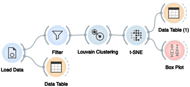
An example workflow in scOrange consisting of seven widgets: Load Data widget reads the data from the input files and assembles the data matrix that is then sent to the Data Table for inspection and to the Filter for selection of cells or genes. Louvain Clustering finds clusters of cells and sends cluster-augmented data matrix to t-SNE visualization. In the visualization, the user can select a subset of cells whose data are then inspected in Data Table (1) or summarized with descriptive statistics in the Box Plot
The workflows in scOrange are usually constructed in the order of data processing, starting from reading the data and continuing with widgets for data visualization, modeling and interpretation. In this way, users can check the output of each processing step, and verify that the format and results of the processing comply with expectations. For instance, in the workflow in Figure 1, a widget Data Table displays the data read from the input files. Data selected in t-SNE plot was also sent to another Data Table (1), where the user could reaffirm that the selected data is indeed sent to the output of this widget and that clustering information was correctly added to original data matrices.
Orange decouples the workflow from data visualizations and from parameters of each of the methods. To reveal these, double-clicking on a widget opens a window showing parameters of specific widget any corresponding visualization. Figure 2 shows several such displays from the workflow in Figure 1. Workflow-content separation allows the instructor to, on one side, hide the details and focus on the big picture—the workflow, and on the other side focus on possibly only one or a few selected components and their visualizations. Workflow construction and detail hiding support storytelling, as discussed below.
Fig. 2.
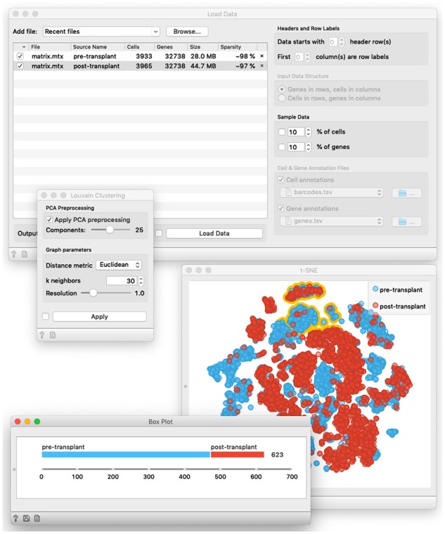
Contents of selected widgets of the workflow from Figure 1. Load Data widget loads the data from two separate data files in 10X Genomics matrix format. The widget for Louvain Clustering displays parameters of this network-based clustering method. In t-SNE visualization, every point refers to a specific cell. The user has selected a group of cells from the top of the visualization (points outlined in yellow). The phenotype class distribution of selected cells is displayed in the Box Plot
2.2 Method compartmentalization
Workflows in scOrange are constructed by visual programming, that is, by selecting and connecting the widgets. Just like with Lego Bricks, there should be enough building blocks to address most of the problems from the chosen domain. But how many building blocks are enough? And, again like in Lego Bricks, do too many of the highly specialized building blocks overburden the user and replace creativity with the need to sip through the plethora of components to find just the right one for a specific situation?
In scOrange, and its originating platform Orange, we have minimized the number of widgets, and within compartmentalize specific methods of data analysis. For instance, scOrange does not include widgets that implement control statements and elementary operators on data structures. Workflows are directed acyclic graphs and do not contain loops. Widgets encapsulate as much functionality as possible while trying not to co-implement several conceptually different approaches (see Fig. 3). For instance, k-means clustering widget implements both the clustering procedure and offers an algorithm to find the appropriate number of clusters but does not include the 2D display of the data to visualize the results of the clustering. Data visualization and projection is implemented in another widget, like t-SNE, which would support the selection of data points, but would defer analysis of the selected data instances to widgets on its output. The output of clustering can be visualized in t-SNE, but so can the output of cell filtering, gene selection or any widget that alters the data.
Fig. 3.
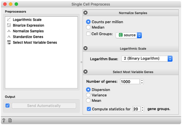
Single-Cell Preprocess widget is an example of method compartmentalization. The widget includes standard approaches for single-cell data preprocessing and allows the user to select different preprocessing steps, define the order in which they are executed and set their parameters. By default, the choice and the order of the preprocessing steps follows that from Seurat (Butler et al., 2018). Alternatively, we could break this widget into many different ones, one for each preprocessing operation, but that would unnecessarily increase the number of widgets in the toolbox and complexity of the workflows
The compartmentalization of functionality in Orange is most similar to that of workflow-based data analysis systems KNIME and RapidMiner, but is very different to Taverna (Wolstencroft et al., 2013). scOrange currently includes only 10 widgets specialized for single-cell data analysis and 10 more widgets that deal with gene expression analysis. Orange, as a data mining platform, contains about a 100 widgets that cover most of the standard data visualization and machine learning operations. Complex workflows in scOrange would typically include about a dozen widgets. This is quite different from Taverna, whose library includes possibly thousands of components and where workflows are visual alternatives to script-implemented computer algorithms. A typical Taverna’s workflow consists of tens, perhaps hundreds of components.
With a rather small number of different components in scOrange we reduce the steepness of the learning curve. In a typical workshop, the users would get familiar with about 20 different widgets, and there is a good chance they would be able to use them after the course without the need to consult additional documentation. The challenge here is if these 20 widgets are enough to solve practical problems from single-cell analytics, and we show that this number suffices in the section on the course structure.
2.3 Datasets
An essential part of any course in single-cell data analytics is showing the participants how to prepare and load their own data. The data formats in single-cell are limited in variety; scOrange reads standard matrix (.mtx), Loom, textual tab-delimited and Excel files, so that during the workshop instructors can use the data from, say, Single-Cell (https://portals.broadinstitute.org/single_cell) or 10X Genomics Dataset (https://support.10xgenomics.com/single-cell-gene-expression/datasets) portals. Besides, scOrange maintains its database of single-cell datasets that can be accessed through Single-Cell Datasets widget.
2.4 Access to knowledge bases
Gene expression data analytics relies on gene name resolution and access to external knowledge bases such as Gene Ontology (Ashburner et al., 2000). To convert gene names to standard notation, scOrange maintains a lookup table from Entrez Molecular Sequence Database (Agarwala et al., 2016) and uses a Gene Name Matcher widget to annotate the input data. Widgets for Gene Ontology analysis and cluster characterization access the knowledge bases by downloading preprocessed information stored on Orange’s servers. The access to these datasets is seamless and performed automatically, and does not additionally burden the workshop.
2.5 Interactivity and interactive visualizations
Crucial to the proposed training with scOrange are interactive visualizations. Nearly every widget in our software that visualizes the data is interactive. Users can select parts of the scatter plots, groups of bars in the bar charts, subtrees of hierarchical clustering dendrogram or items in gene ontology trees. Every selection would trigger the widget to output the data that are associated with the selected items, and the refreshed widget’s output would tell downstream widgets to recompute their analysis. The updates travel from the onset widget all the way to the last widgets of the workflow.
Interactivity brings workflows to life and turns a seemingly static data analysis pipeline into a tool for interactive data exploration. Consider the workflow from Figure 4, where we combined a data visualization widget, differential expression analysis and gene ontology browser into a tool to characterize cell clusters. With any change of selection of cells in the scatter plot, gene ontology browser would update its list of common annotations of differentially expressed genes. The particular combination of widgets forms together a ‘tool’ that was not coded in scOrange, but rather designed by means of visual programming and workflow assembly.
Fig. 4.
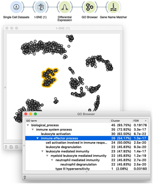
Interactivity turns scOrange’s workflows into an explorative data analysis tool. Shown is a simple workflow that loads the data and displays it in the t-SNE plot. The plot supports the interactive selection of cells (dots marked in yellow). The t-SNE widget outputs annotated data matrix with cells labeled based on the selection. The selection-annotated data are passed to the widget that outputs a set of differentially expressed genes, whose common annotation is then displayed in the GO Browser. A list of genes annotated with the selected term (line in blue) is then passed to Gene Name Matcher that displays the list of genes and provides links to their home page (not shown here). The user can interact with this setup by changing the selection of cells, or selecting different GO terms. In both cases, changed selection triggers the update of the downstream components of the workflow, thus enabling on-the-fly explorative data analysis
Interactions with visualizations and information displays are central to explorative data analysis and visual analytics (Sacha et al., 2017), where the user takes an active role in selecting what is exciting and what to explore further. With interactions, the user takes control over the data analysis, and through a selection of items of interest implicitly combines one’s prior knowledge with the observed data. During the training, it is the interactions with visual displays that make analysis interesting and raise the motivation of workshop participants.
2.6 Storytelling
According to the review by Bowne-Anderson (2018), the critical skill of data scientists is communication, rather than experience with statistical models. An essential part of the communication is to explain how we got to the results, that is, what was done to the data to infer the resulting patterns. As nicely stated by Kosara and MacKinlay (2013), ‘stories also offer an effective means of packaging information and knowledge in a way that is easy for another person to understand’. Single-cell analytics relies on possibly complex pipelines, and to tell the story often requires observing several visualizations at once. Our tool scOrange supports storytelling by explicitly exposing the workflow, and then focusing on essential details of the workflow by observing a selection of visualizations.
During the workshops with Orange and scOrange, we learned through the requests of the class that the workflow should always be visible and exposed, as it provides the backbone of the story. We also often go back to the workflow to expose this backbone and to remind ourselves what are the goals of the analysis and what is the current analysis path that was pursued. Orange supports annotating of the workflows by adding the notes and arrows. During the past workshops, we have often seen students using this feature to write a story about the data processing pipeline and to expose the key components and results.
2.7 Reproducibility
Perhaps crucially exposed by the report of Ioannidis et al. (2009), repeatability of computational analysis has become an important criterion for solid publications in bioinformatics. This report was not only interesting because of a low rate of reproducibility, where the goal was to replicate the analysis that led to a single figure from any of 18 published articles, but the sheer effort to repeat the analysis procedure. Workflow-based systems should ease the reproduction of the data analysis by saving every aspect of the analysis, from the data, the parameters of the methods, to all interactive selections of the user. Orange, and with it scOrange, conforms to these criteria and supports saving of the workflow and its entire current state. The workflow file can then be published online, or shared with colleagues for reproduction and further analysis.
When lecturing on single-cell data analytics, reproducibility issues have to be exposed. Saving of the work, sharing it with colleagues and being able to restart the analysis precisely at the point it was last left are the topics that have to be covered even in a short workshop. With scOrange, this topic is straightforward from the user’s perspective as it only involves saving and opening of the workflows. Ensuring the reproducibility, however, involved substantial planning, implementation and testing effort at the side of developers.
2.8 FAIR principles
FAIR guiding principles (Wilkinson et al., 2016) were primarily set for data management, but, as their authors also intended, can be applied to analytical data pipelines. Users of scOrange can visually connect the interoperable components to construct reusable workflows that were designed with the emphasis on reproducibility and use of standardized, literature-supported approaches and parameters. scOrange assumes no programming knowledge and is accessible to a broader audience than programming language-specific packages. scOrange’s design hence closely follows FAIR principles.
3 The course structure
Our aim for scOrange was to design an interactive, easy-to-use yet flexible tool for single-cell gene expression analytics that can address most of the current data analysis tasks from the field. With that and the aim for the tool to be particularly useful for educators and students, we can in principle compose any coursework that addresses general topics from the field or focuses on a particular problem. Here, we lay out an example course structure that was first used for a 5 h workshop at Janelia Research Campus in Ashburn, Virginia in February 2018 (https://blog.biolab.si/2018/03/05/single-cell-analytics-workshop-at-hhmi-janelia/). A typical introductory course on single-cell gene expression analytics with scOrange can include the following sections:
Introduction to workflows, where instructors can use a small gene expression dataset to explain the mechanics of Orange and introduce the File widget for loading of the data, Data Table for spreadsheet display of the data, and widgets Scatter Plot, Box Plot and Distributions for visualizations of data summary statistics.
Preparing and working with custom data, and instructions on saving, loading and sharing of the workflows. We would typically use external spreadsheet editor (e.g. Excel) and a File widget to load the data, and then explore the data with widgets from the introduction to workflows. Time permitting, we would also visit any of the single-cell data repositories, download the files and load them with the Load Data widget.
Basic exploration and visualization of single-cell datasets with principal component analysis and 2D embedding (e.g. t-SNE). The data at this stage can be accessed through Single Sets Datasets widget and then either projected on a 2D plane using a combination of PCA and Scatter Plot widget or embedded into t-SNE or MDS space. We use this part of the workshop to explain the difference between data transformation by principal components and data embedding by t-SNE, and, time allowing; also comment that t-SNE can display clusters where there are none in the original data. In a Paint Data widget the workshop attendees can paint their dataset and check the t-SNE projection, possibly designing the data that exposes some potential dangers of overinterpretation of t-SNE displays.
Single-cell data preprocessing, where we address the sparsity of the data and show how to filter out poorly represented cells or genes with the Filter widget. We would also discuss the typical normalization steps as implemented by Single-Cell Preprocess widget, and observe the effects of filtering and normalization in the changes of the clustering structure within PCA or t-SNE cell maps.
Marker genes and cell scoring, where we show how to score the cells based on the expression of selected marker genes (the widget Score Cells). We would preferably pick a published dataset where the effects of scoring would be pronounced, and use both pre-defined selections of marker genes (the widget Marker Genes) or a custom list of markers edited in Excel and loaded with the File widget. Workshop participants often enjoy an interactive interface (see Fig. 6) that combines gene marker selection and rendering of the cells with expressed markers, and ability to easily add new groups of marker genes (widgets File and Gene Name Matcher).
Cell clustering, where we propose to explore both k-means and network-based clustering (the widgets k-Means and Louvain Clustering). This part of the workshop also overviews how to remove small clusters through interactive use of the Box Plot widget. In addition and time permitting, we would also pick a dataset with a smaller number of cells and perform hierarchical clustering (widgets Distances and Hierarchical Clustering).
Cluster characterization which involves selecting of the group of cells and characterizing it through differential gene expression analysis (Differential Expression widget) and gene set enrichment (e.g. GO Browser). Cluster characterization can also pursue an alternative workflow that uses any of the clustering method and Cluster Analysis widget that combines differential gene expression and term/pathway enrichment analysis. Time permitting, it is also educational to show the enrichment analysis with a custom set of gene groups defined by participants.
Cell classification with a quick introduction to concepts from machine learning. We propose to start with a simple gene expression dataset where cells have already been classified, build a classification tree (Tree widget) and use it for prediction (Prediction widget) on a hold-out dataset, likely using a Sample widget to split the data into training and test set. It is useful to see how the prediction accuracy varies through samples, leading to the utility of cross-validation (Test & Score widget), and to use of more accurate classification techniques like random forest and logistic regression. This part of the workshop can be dense and should be only executed during longer workshops.
Fig. 6.
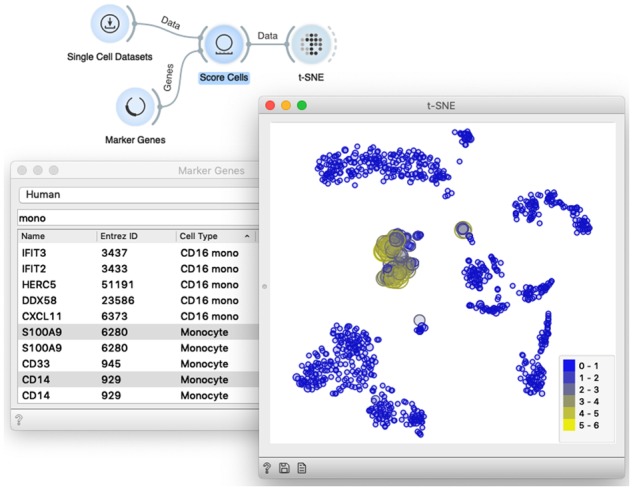
Marker genes and cell scoring. The widget Score Cells accepts the data and a list of marker genes and adds a meta attribute with cell’s score to the data matrix. The scores correspond to the average expression of the marker genes. We expose the cells with expressed markers by instructing t-SNE or any point-based visualization to adjust the size or the color of the data point to the score. The workflow shown here is a good example of interactivity in scOrange, as any change in the selection of markers automatically triggers a change in the scatter plot, highlighting the corresponding cells in accordance to the selection
More advanced topics that are not included above but are supported in scOrange and can be carried out time permitting are batch effect removal and discovery of developmental trajectories and inference of pseudo time. Below, we illustrate selected sections of the proposed course with example workflows and their brief descriptions.
3.1 Introduction to visual programming and interactive analytics
In this 15 min segment, we use the preloaded dataset on bulk gene expression in yeast (Brown et al., 2000) that is available from the File widget. We display the data in the Scatter Plot, and then show how to select the data from the scatter plot and feed it to the Data Table for viewing it in a spreadsheet or to the Box Plot and Distributions widgets to report on summary statistics. We also use this part of the lecture to show how to feed the selected data subset from the Data Table to the Scatter Plot to expose the selected items in the visualization (Fig. 5).
Fig. 5.
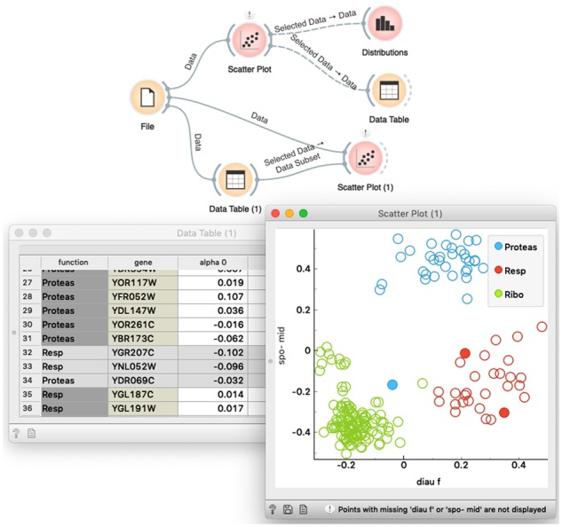
A workflow to introduce concepts of visual programming and interactive data analytics. The upper branch of the workflow is used to display the data in a scatter plot and then analyze the selected data subset in two widgets that display summary statistics. The lower branch of the workflow shows hot to highlight the selection of the data from the Data Table in the Scatter Plot visualization
3.2 Cell maps and marker genes
We can continue the workshop with an exploratory analysis of a sampled dataset from Zheng et al. (2017) on gene expression in bone marrow mononuclear cells from a patient with acute myeloid leukemia and two healthy donors. The sampled dataset comes with scOrange and is available through Single-Cell Datasets widget. This dataset exposes clusters that are well related to markers for different blood cell types, and is well suited for the workflow that maps the cells to 2D display (e.g. t-SNE widget) and marks the cells that express selected markers (Fig. 6).
3.3 Data filtering and preprocessing
In this section of the workshop, we pay attention to the sparseness of the single-cell data. Typical single-cell analysis workflow would remove poorly characterized cells, that is, cells with only a few expressed genes, and remove genes that have been expressed in only a few or in most of the cells (Butler et al., 2018). We would also introduce various preprocessing and data normalization techniques, and resort to those that are standard in the field (Butler et al., 2018) (see Fig. 3). The effects of filtering and preprocessing can be explored by observing the changes in raw data or in the resulting data visualizations (Fig. 7).
Fig. 7.
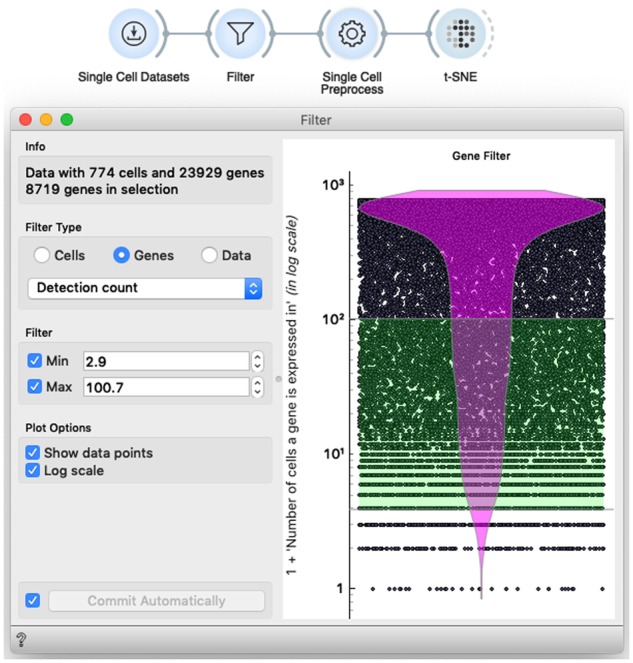
Gene and cell filtering in scOrange has a standard functionality, wrapped into an interactive implementation of the violin plot
3.4 Cell clustering
Orange supports different types of clustering, including k-means, hierarchical clustering and network-based approaches. During the course, we would most often use network-based clustering (Blondel et al., 2008). All clustering widgets in Orange consider input data matrix and add a meta variable with cluster identifier to row profiles. The output of these widgets is again a data matrix, and thus amenable for any widget that course participants are at this stage already familiar with. In an example on Figure 8, we feed the clustered data to the Box Plot to display the cell cluster frequency and select only most populated clusters, potentially removing outliers or simply focusing on prevailing cell groups.
Fig. 8.
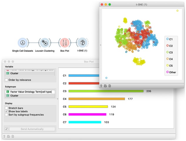
The workflow for cell clustering. We have used the data from Li et al. (2017) and clustered cells based on their expression profile similarity. Louvain Clustering implements network-based clustering, and adds a meta-column with cluster IDs to the cell-gene data matrix. In the workflow, we selected six most frequent clusters through interactive Box Plot widget, and feed these into t-SNE visualization
3.5 Cluster characterization, gene set enrichment and discovery of putative marker genes
Clustering, or any identification and selection of cells, is useful in combination with methods to characterize cell groups. Groups of cells can be characterized with a set of differentially expressed genes, and these with a set of common gene terms or pathways. An example of such a workflow is shown in Figure 4, and can be exercised during the workshop using various means of selection of groups of cells, either by selection in the cell maps, through clustering or selection of cells by some explicit criteria based on expressions of marker genes (Select Rows widget, not shown here for brevity).
3.6 Batch effect removal
The observed variation between cells can be influenced by undesired technical or other confounding factors, referred to as batch effects. Here, we introduce Batch Effect Removal widget that uses a linear regression model to decorrelate batch variables from gene expressions. An illustrative example of batch removal can use data on mouse embryonic stem cells (mESC) that are sampled at different developmental stages, with their expressions expected to be confounded by cell cycle phase (Fig. 9) (Macosko et al., 2015; Nestorowa et al., 2016). By combining Marker Genes and Score Cells, we obtain an estimated inclination of each cell toward G2M and G1/S cell cycle phases and decorrelate their gene expressions from this expected confounder. A similar regression-based approach can be used when we expect a cell type-specific response to, say, a drug treatment, but can only estimate the cell type through marker genes. The training thus focuses on exploiting data from existing sources to obtain a correct interpretation of the data.
Fig. 9.
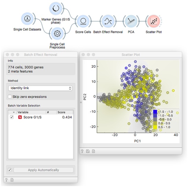
Batch Effect removal workflow estimates the inclination toward G1/S cell cycle phase by combining Marker Genes and Score Cells. The Batch Effect Removal reports 43% of genes are significantly correlated with the derived cell cycle phase estimator. After removing this source of variance, the PCA plot is not confounded by cell cycle phase
3.7 Cross-dataset modeling and prediction
Another type of batch effects arises when combining data from different protocols or studies. Here, the workshop can resort to a case study to classify cells to different cell cycle phases, with training and test datasets coming from a Fluidigm and Quartz-Seq protocols, respectively (Fig. 10). The gene expression profiles can be aligned with Dataset alignment widget, that implements canonical correlation analysis and dynamic time warping to find matching subpopulations in two or more datasets (Butler et al., 2018). By using this tailored preprocessing approach, we are able to predict cell cycle stages across different datasets with AUC 0.92, which is significantly higher than without the preprocessing (AUC 0.62). In this final tutorial, the users learn to combine the necessary preprocessing and alignment, train and also quantitatively evaluate predictive models.
Fig. 10.
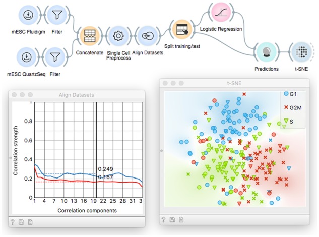
Workflow that showcases the inference and utility of cell classification model. Here, we predict cell cycle phase by learning a model on one dataset and applying it on another one. Gene expressions are made comparable with Align Datasets. A logistic regression model is trained on the mESC Fluidigm dataset (Buettner et al., 2015) and the cell cycle phase is predicted for mESC Quartz-Seq (Sasagawa et al., 2013). The predicted values (colors) almost exactly match the ground truth (symbols) in the t-SNE plot
4 Discussion
Above, we have laid out the design choices that make scOrange a suitable tool for the overview, hands-on workshops on single-cell data analytics. We also presented a syllabus for the course and provided examples of the workflows we use during the practical training sessions.
In the past years, we have been designing courses of this type but have targeted general data science audience (see https://blog.biolab.si/?s=workshops), and have only recently started with specialized courses for single-cell data analytics. We carried out an early assessment of the single-cell analysis workshop at Howard Hughes Medical Institute’s at Janelia Research Campus in March 2018. The workshop helped us to identify the weaknesses of the tool and curricula. The improvements of both were tested in the second workshop at the University of Pavia in February 2019, resulting in the broader scope of covered concepts and smoother execution of the workshop due to increased computational speed of the tool, improved interface and better integration with bioinformatics databases. We run surveys at the end of all our data science workshops; besides high satisfaction of participants, the surveys show that the biggest gain in the proposed teaching is the wide scope of covered topics and sparked enthusiasm of participants about data science. In an informal communication with attendees, we have learned that covering the broad scope of concepts helps engaged students to dive deeper through programming in R and Python, returning to Orange to benefit from interactive data analytics and engaged explorative communication with data owners or domain experts. We need more workshops to draw similar conclusions for scOrange. We plan to organize them regularly at selected institutions and meetings and encourage and support educators to adopt the tool and curricula through sharing of the teaching material that includes workshop notes, educational videos and example workflows on scOrange’s website.
We accompany the courses with lecture notes that include all the course workflows and additionally describe the widgets and their methods. For a 5 h course, lecture notes would usually contain about 50 pages. We seldom follow these notes strictly throughout the workshop, as the workshops progress are often also driven by questions from the audience that we try to answer with a particular combination of widgets not included in the original workshop plan. We found that the notes are more useful after the course and serve as a reminder of a covered topic and help workshop participants in reviewing the concepts covered during the training.
Single-cell data analysis workshops proposed here is practical, and the training is hands-on. Participants would most often attend the workshop with their laptops and have scOrange installed before the course. The instructor would then use Orange and project his computer screen, and occasionally use the flip-charts or blackboard to help in explanation. We avoid using PowerPoint slides, as they would only pose a distraction. The only ‘presentation tool’ we recommend to use during the course is scOrange. With this, we emphasize its use in storytelling and focus only on data, analysis and visual results.
We have been carrying-on the workshops of the type proposed here for the audiences from 10 to up to a 100 participants. Even for smaller groups, the lecturer needs a company of an assistant. Participants would sometime get stuck or would have a question that would apply to their version of the workflow, and would hence require individual help. In practice, for a group of every 20 participants, there should be one additional assistant present in the classroom.
The scOrange toolbox is a stand-alone application that runs on all major operating systems. Implemented in Python, it runs locally and only interfaces with our servers for an exchange of standardized datasets or knowledge bases. Typically, we would hence consider just smaller datasets with up to a few ten-thousands of cells, and for reasons of speed and responsiveness of the interface would often pick datasets that include ‘only’ few thousands of cells. The proposed course focuses on concepts of data science, and consideration of much larger datasets—albeit potentially useful—would not be practical during the training.
5 Conclusion
Workshops, especially short ones, have to motivate and engage the learners. Especially if designed for end-users who are not experts, such as data mining for molecular biologists, they have to be practical and dive into exciting problems from the beginning. One way of achieving excitement from the audience is through using the right training tools. In this paper, we propose one. The tool, scOrange, aims at single-cell gene expression analytics and stands on the shoulders of Orange, the data science toolbox that has been in the making since the early 2000s (Demšar and Zupan, 2013). Also, the type of the teaching—a hands-on workshop—that we advocate in this paper, has been practiced by our group in the past decade, but most intensively in the past 3 years. Orange was designed by educators: when constructing any of its components, we kept the user and the practicing student in mind. Like in Orange, we have designed widgets in scOrange to serve storytelling, and to provide explainable insights. Our tool development and instruction methods follow the motto that data science is about communicating the data patterns to the end user (Bowne-Anderson, 2018).
Funding
This work was supported by the Program Grant P2-0209 and the Bilateral Project [Grant BI-US/17/014] from the Slovenian Research Agency. The first two single-cell analytics workshops with scOrange were supported by Janelia Research Campus and EU ERASMUS teaching mobility program.
Conflict of Interest: none declared.
References
- Agarwala R. et al. (2016) Database resources of the National Center for Biotechnology Information. Nucleic Acids Res., 44, 7–19. [DOI] [PMC free article] [PubMed] [Google Scholar]
- Ashburner M. et al. (2000) Gene ontology: tool for the unification of biology. Nat. Genet., 25, 25–29. [DOI] [PMC free article] [PubMed] [Google Scholar]
- Blondel V.D. et al. (2008) Fast unfolding of communities in large networks. J. Stat. Mech.: Theory Exp., 2008, P10008. [Google Scholar]
- Bowne-Anderson H. (2018) What data scientists really do, according to 35 data scientists. Harv. Bus. Rev., 8 Retreived at https://hbr.org/2018/08/what-data-scientists-really-do-according-to-35-data-scientists. [Google Scholar]
- Brown M.P. et al. (2000) Knowledge-based analysis of microarray gene expression data by using support vector machines. Proc. Natl. Acad. Sci. USA, 97, 262–267. [DOI] [PMC free article] [PubMed] [Google Scholar]
- Buettner F. et al. (2015) Computational analysis of cell-to-cell heterogeneity in single-cell RNA-sequencing data reveals hidden subpopulations of cells. Nat. Biotechnol., 33, 155–160. [DOI] [PubMed] [Google Scholar]
- Butler A. et al. (2018) Integrating single-cell transcriptomic data across different conditions, technologies, and species. Nat. Biotechnol., 36, 411–420. [DOI] [PMC free article] [PubMed] [Google Scholar]
- Curk T. et al. (2005) Microarray data mining with visual programming. Bioinformatics, 21, 396–398. [DOI] [PubMed] [Google Scholar]
- Demšar J. et al. (2013) Orange: data mining toolbox in Python. J. Mach. Learn. Res., 14, 2349–2353. [Google Scholar]
- Demšar J., Zupan B. (2013) Orange: data mining fruitful and fun—a historical perspective. Informatica, 37, 55–60. [Google Scholar]
- Ioannidis J.P. et al. (2009) Repeatability of published microarray gene expression analyses. Nat. Genet., 41, 149–155. [DOI] [PubMed] [Google Scholar]
- Kosara R., MacKinlay J. (2013) Storytelling: the next step for visualization. Computer, 46, 44–50. [Google Scholar]
- Li H. et al. (2017) Classifying Drosophila olfactory projection neuron subtypes by single-cell RNA sequencing. Cell, 171, 1206–1220. [DOI] [PMC free article] [PubMed] [Google Scholar]
- Macosko E.Z. et al. (2015) Highly parallel genome-wide expression profiling of individual cells using nanoliter droplets. Cell, 161, 1202–1214. [DOI] [PMC free article] [PubMed] [Google Scholar]
- Nestorowa S. et al. (2016) A single-cell resolution map of mouse hematopoietic stem and progenitor cell differentiation. Blood, 128, 20–31. [DOI] [PMC free article] [PubMed] [Google Scholar]
- Sacha D. et al. (2017) What you see is what you can change: human-centered machine learning by interactive visualization. Neurocomputing, 268, 164–175. [Google Scholar]
- Sasagawa Y. et al. (2013) Quartz-Seq: a highly reproducible and sensitive single-cell RNA sequencing method, reveals non-genetic gene-expression heterogeneity. Genome Biol., 14, R31. [DOI] [PMC free article] [PubMed] [Google Scholar]
- Satija R. et al. (2015) Spatial reconstruction of single-cell gene expression data. Nat. Biotechnol., 33, 495–502. [DOI] [PMC free article] [PubMed] [Google Scholar]
- Wilkinson M.D. et al. (2016) The FAIR guiding principles for scientific data management and stewardship. Sci. Data, 3, 160018.. [DOI] [PMC free article] [PubMed] [Google Scholar]
- Wolf F.A. et al. (2018) SCANPY: large-scale single-cell gene expression data analysis. Genome Biol., 19, 15.. [DOI] [PMC free article] [PubMed] [Google Scholar]
- Wolstencroft K. et al. (2013) The Taverna workflow suite: designing and executing workflows of Web Services on the desktop, web or in the cloud. Nucleic Acids Res., 41, W557–W561. [DOI] [PMC free article] [PubMed] [Google Scholar]
- Zheng G.X. et al. (2017) Massively parallel digital transcriptional profiling of single cells. Nat. Commun., 8, 14049.. [DOI] [PMC free article] [PubMed] [Google Scholar]


